29.11.11

Colo[u]r Keeping Us Occupied


Spent the last bunch of weeks printing the third volume in Barbara Hodgson & Claudia Cohen's color series. (Apologies for the inconsistent use of the superfluous Oxford u in the title word on this blog and the HM site. We're Webster all the way, but Barbara is Canadian, & Canadians like to straddle Oxford and Webster. Claudia doesn't care either way.) Occupied By Colour is the first volume in the series to be printed at HM on the handpress; the first two were printed by David Clifford at Black Stone Press with a Heidelberg.

Like the previous two volumes in the series, the book is designed and set (in Fournier) by Barbara, and printed from polymer plates. Numerous illustrations are incorporated throughout, and once printed essentially serve as keylines for the subsequent coloring and embellishment Barbara does by hand for each page. The second volume in the series, After Image, required about three months of handwork after printing (and before binding; that was another few months of work); Occupied By Colour is expected to take at least the same amount of time to complete.


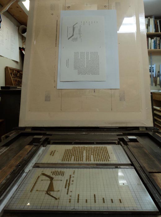
We're working off two sheets a week. Most are single black runs, but a few have illustrations with large black areas, so those are broken into two runs. Last weekend we printed a page that included a spectral representation of light. The text was printed first, then (same day) we lathered the ink onto the slab & printed the black bands.  Printing on dampened paper allows one to use much less ink than printing dry, and so when amping up for large black areas it can be alarming how much more ink than usual is required.


Semi-related, the CBC Radio show Ideas is currently running a three-part documentary on color. (Being the CBC, they'd probably want the u.) It's available by podcast from the show's site.

26.11.11

Oddball in Toronto


Oddball's author & artist Jim Westergard takes his show on the road this weekend, appearing at an event in Toronto tomorrow (Sunday 27 November). Jim will take part in panel discussions with author Jon Evans, whose book Beasts of New York Jim illustrated with original wood engravings; and with Toronto printmaker George Walker, about the art and craft of wood engraving. Details can be found here.

Beasts of New York was published by Porcupine's Quill, with the wood engravings reproduced offset. Fans of wood engraving, and Jim's wood engravings in particular, should note that copies of the original prints, pulled and signed by him (in editions of 25), are available. He also assembled ten complete sets of the prints, along with an original drawing, in a slipcase. A few of these are still available directly from Jim.

23.11.11

A Thoroughly Bad Decision at Oxford


Earlier this week book dealer Oliver Clark sent out an exhaustive report from the recent Oxford Fine Press Fair, highlighting the books that received recognition, and providing his own thoughts on what the judges got right and what they got wrong. "The Parrot prize for the best illustration in any medium is worth a real and sweaty £500 and this year was awarded by Leo de Freitas and John “Fawkes” Vernon Lord in what was a thoroughly bad decision." The newsletter is not directly downloadable from his site, so you'll have to send an email request to get on the list to read the rest of his thoughts on the Parrot Prize.

Oliver also reports that the organizer, "based on return slips, [said] this fair did better than the last – but only just. That was not the impression many had. Indeed, with some presses trying every trick short of gluing feathers onto their books in order to get them noticed in recessionary Oxford, many felt that the fair was struggling just a little in money terms, a shame for what is normally a hot-ticket event."

Whether fully plumed or plucked, press fairs usually seem to be dominated by the usual suspects, and so it was with Oxford. But Oliver's missive also includes notes on a few names that might be less widely known, at least on this side of the Atlantic. He mentions a new book from Susan Allix (Myth, shown above), whose work has been generating much interest & enthusiasm among those deeply in the know for some time.

17.11.11

Printing in the Third Dimension


This post isn't about impression, although most of you should be printing with a bit more impression than you are. If it was good enough for Harold McGrath (him up there)...


Before launching into the printing of Occupied By Colour, we finally got around to an upgrade of the speaker system in the studio. Retrieving one of the many old speakers from the attic, we ginned up this trick first learned from our vinyl copy of Eno's On Land, way back when it came out:


The two stereo speakers in the HM studio are over the bench, at the end opposite from the press. Printing a sheet entails two round trips from the press to the bench & back (getting the roller, returning with the roller & getting a sheet). We placed the third speaker over the press, playing the mixed signal back at the stereo pair. So now, while walking to and from the press, the aural mix of a song changes as you move through the space, and the overall sound is more three-dimensional (no more walking towards & away from the music).
Music is the fuel that keeps the press running at HM. This probably is true for most printers. (Or at least some distraction: for Jim Rimmer, it was VHS copies of movies from the '30s and '40s.) At HM, there actually are two categories of music, depending on what's happening. While setting things up, doing makeready, figuring out problems etc, we prefer glacial and expansive compositions. Stars of the Lid, most of Harold Budd's albums (check out his latest, above; an inspiration for those who strive to never repeat themselves), Johann Johannsson & William Basinksi are frequently called upon. When all cylinders are firing and we're just into production (remember, however, that "production" on a handpress in a one-man shop is still a pretty sedate activity), the BPM can creep up to a saunter, and the pace can liquify from permafrast to tundra. Harold's album with Eraldo Bernocchi, Music for "Fragments from the Inside" keeps things moving. So does the Orb. On particularly belligerent days, G!YBE.


There are a few artists whose work can fit both needs. All of Loscil's recordings. Bill Laswell, but you have to pick your albums carefully. And now we have a new double-CD for the shortlist: Bloemfontein's The Longer Now. This was a $1 gamble from a shop's discard bin, noted for its sleeve design, chosen because the mix of instruments promised to appeal (especially the lack of vocals). Wonderful stuff. Eight compositions, each about 15 minutes long. All of them can be heard here. Sadly, it seems the band ceased to exist with no other releases.

9.11.11

A New Magazine Called Codex

Moving at the speed of a handpress (which is this & only this:


Not this, [which is a common press, i.e. similar design & operation, but made from wood]:


Nor any of these, which are presses operated by hand, but that does not make them a handpress:


A handpress is something like this, made from iron, with whatever you're printing inked by hand and then rolled under a platen lowered by pulling a bar:


And preferably it's something exactly like the above, what we use at HM, an Ostrander-Seymour Extra-Heavy. But that photo isn't ours. It's much prettier than ours. Probably not a spot of oil or grease on the thing...)

ANYHOW, moving at the speed of a handpress, our friend David at Black Stone Press tipped us to the arrival on the scene of a new mag about type, printing, calligraphy etc etc titled Codex. At the risk of confirming exactly how hors courant we are by posting this a few months after its publication, here's the site. Take a look, think about ordering a copy. All of us who appreciate the printed word have to admire a group of people who go the old-fashioned, ink-on-paper route.

4.11.11

Ink Should Be Sticky, Not Bouncy


Surprised and a little alarmed to recently learn that a number of "fine press" (awful term) printers are using rubber-based inks. Some claim they achieve better results than with oil-based ink (hmmm), some admit they just like being able to leave the ink on the rollers for a few days.


Ink, as a contributing element to printing, probably doesn't get as much attention as it should. Wondering if our prejudice against rubber ink was warranted or not, we did some snooping around. Preliminary results tumbled us to Brian Donnell's excellent primer site on letterpress, which includes a short but insightful comment on oil vs rubber inks:

"Use oil-base inks for quality work. Rubber-base inks may print satisfactorily, but their drying properties make them suitable only for imprinting business forms, numbering, proofing, etc., and they do not dry on coated stock."

That's just an excerpt; the site offers more details. Coated stock isn't really a concern or issue at HM, but we wonder if the same drying problem would result on the highly sized paper we prefer for printing damp.


We'll be spending the rest of 2011 printing the third volume in the Hodgson/Cohen color series, Occupied By Colour. (The self-portrait above was taken while rolling out the ink for today's run, a page on the development of hair dyes.) But when we get a few days off, we're thinking of getting a can of rubber ink and doing some comparison printing. Be interesting to see how the rubber stuff works when printing damp... Meanwhile, we will reread Colin Bloy's A History of Printing Ink.