30.5.13

Letterpress is Really Really Old


Here's a kool short film profiling David Clifford of Black Stone Press. Beautifully shot & edited, plus it captures David's quiet charm.


Here's a newly announced book for Pixies geeks (which we mention here because, while not geeks, we certainly have been fans of the band). Currently soliciting for "crowd-source" funding. The publishing trade used to call that subscribers, and sometimes they'd even print subscribers' names in the book. That's another trick the Pixies publishers are offering. Unfortunately the publishers appear to have chosen an oblong (i.e. landscape) format for the book. For aesthetic and practical reasons, books should never be oblong: first, if you shelve an oblong book with others of similar height, it sticks way out. Second, the wider page format puts much more stress on the spine and hinges, as the far-away fore edges of the pages pull down. Trade books are always just slapped into a case binding, and so the pages very quickly start to pull the case apart like a wave of mutilation. Third, when open, an oblong book is really wide; it's unwieldly. But for people who are into what this book will offer (and the publisher has almost hit his $150,000 target), it's all moot. Sail away.

27.5.13

Squaring Up for Tearing Down


Plugging away on Paper Should Not Always Be White. Double & triple checking all ideas & plans before we actually start tearing down the paper, and as a result some of the logistics have been revised.

We'd initially intended to print the sheets in quartos (four-up), allowing us to print work-and-turn (i.e immediately back a sheet up). But some of the paper can't be torn down into quartos, which would have meant printing those two-up, which would in turn have meant changing the forme. Since the premise of the project is to change nothing but the paper upon which the text is printed, that threatened to be a problem. It'll take longer, but we're resigned to printing two-up.


Since we have no experience printing many of these papers, and we have very few sheets to work with, we've also abandoned the idea of deciding at the start how big the edition will be, or what  additional papers will be included in the deluxe edition. We'll get through all the printing, take a look at what we have that's good enough to issue, and then make decisions. But our hope continues to be an edition of about 30 copies, each containing at least 15 different papers; with perhaps as many as half of the edition being a deluxe variant (deluxe because it has between 5 and 10 additional papers).


Part of the work this past week has been identifying or confirming the types of paper we have on hand. Some came to us with the makers' original labels and details, while others have been hiding in drawers for decades, with nothing more than a watermark for identification (and in two cases, not even that). It's been fun pulling out our various references books for paper, and even more fun using this as an excuse to buy a new one (more about that in a week or so, when it arrives). Meanwhile, the little Cadenza Press volume is full of useful information, & kudos to the printer for printing it on an Adana 5 x 8. We know from experience how much fun printing a book on those tabletops can be...


The Horne & Co. book isn't very useful for this project, as it is about machine-made papers available for commercial printing c.1950, but it's still fun to flip through all the samples.

23.5.13

Shinsuke Minegishi Solos, Fisher Denies Death


Lots of bookish exhibitions happening. First, HM friend & longtime collaborator Shinsuke Minegishi is having his first solo show, at the Burnaby Art Gallery. It covers the full spectrum of his printmaking, with the books he's done with HM featured prominently. The gallery is publishing a catalogue for the show; we'll have some details about that after the opening (a week today: Thursday 30 May). Shin will also be giving a talk on the following Saturday afternoon. We'll try to get a summary or recording of that available.


To help mark & celebrate the show, we printed a broadside (approx. 9 x 12 inches) using the frontis engraving Shin made for Barbara Hodgson's Good & Evil in the Garden (published 10 years ago!). We managed to yield about 20 or 25 decent copies, all of which are being given to Shin to distribute as he desires. Requests for a copy will be passed along for consideration.


Being pretty lazy, we set the press up to print the text and the block at the same time. Inking the type & block all together wouldn't work: the block needs more ink than the type, plus that mass of stuff down the middle throws everything off balance. So we built a forme that, when locked up, allowed just enough play to slide the block away from the type, so it could be inked separately.
 

Meanwhile, over in the middle of the country, the Thomas Fisher Rare Book Library has organized an exhibition titled A Death Greatly Exaggerated: Canada's Thriving Small & Fine Press. Kind of an apples & oranges pairing (pearing?) in that title, but it certainly will provide a broad spectrum of books. HM's in it, but don't know exactly which titles.


The image above was grabbed from the library's site. The file name includes "rueter_tunnel." Don't think we've ever seen one of his tunnel books. The exhibition was curated by John Shoesmith, Outreach Librarian. There's a catalogue.

20.5.13

Seeing Music, Again


In thanks for his contribution to last spring's Codex Miscellany, we editioned loscil's two photautogram prints (combined on a single sheet, as they were in the book) for his personal distribution. We also printed a stiff paper folder.


The prints (an edition of 20, signed "S Morgan" aka loscil) are available through his site. We'll be doing more phonautograms with him, for the third volume in our Artist's Pamphlet Series. Probably a combination of relief and at least one intaglio for that. Late fall?


In more music-related news. HM fave Harold Budd has a new album coming out (Jane 1 -11), a series of compositions for 10 short films by Jane Maru. The album can currently be streamed at the Darla site, which also has an interesting brief commentary by Harold about the over-arching process he conceived to create each piece. When HM recently met with loscil to discuss his two prints, the conversation ended up ranging far & wide, with an extended & interesting stop at the topic of if/when/how/why describing the creative process adds to one's appreciation for, or interpretation of a work of art. And if it does, is the work diminished by the prerequisite?

16.5.13

Getting Loopy With Paper


This blog isn't entirely off topic; it explains how HM's books are inspired by specific kinds of music, above everything else; and how this inspiration is reflected more directly in our newest project than in any of the previous ones...


The aesthetic possibilities of repetition have long been a source of particular interest at HM. We were introduced to the concept & possibilities through music, many years ago. And as readers of this blog already know, music is the most sustained creative influence on HM's work. We played with loops (actual big loops of quarter-inch tape, and some early digital samples) way back in our youth, 30 years ago: however mundane they sounded to others, the loops were endlessly (ha!) engaging & hypnotic for us: car races, the heavens, merry-go-rounds, donuts - despite the fact that we know in exact sequence what comes up next clearly does not dull our interest in loops. Meditating to a mantra is just a loop, with the potential for nirvana. Is it any wonder that we saw such creative potential in Harold Budd's arabesques?


Steve Reich's tape loops were among the first sustained explorations of loops, but those actually dealt more with phasing and aural decay than pure repetition. Philip Glass likewise explored the potential of repetition, with slight changes over time. Terry Riley's In C - is there a more joyous song? All of those composers we discovered only because our ears were first opened by Eno's (no pussyfooting) and Discreet Music: the latter, released in 1975, included a schematic that was our first insight to the process of looping. Loops made from audio tape offered someone who couldn't play an instrument (i.e. HM) the opportunity to make music: it had to be cut & spliced by hand, and often spooled by hand - or many hands - depending how long the loop was. 


Then came the drones! Even bagpipes are tolerable if they avoid notes and just play long, sustained tones. One of the koolest musical experiences we've collectively had here at HM was participating in Phil Kline's Unsilent Night (organized by Colin MacDonald): the 45-minute piece was composed to be played on multiple tape decks, with everyone pressing PLAY at the same time, and beginning a walk through a neighborhood in the weeks before Christmas. While not loops per se, the composition's slight changes in rhythms and orchestration over many bars, combined with both the boom boxes' natural fluctuations in playing speed and the machines being strung out over a block or more (depending how many people turn up), create a beautiful reverberation. (Deep snow drifts improve the performance by dampening random street sounds, but sadly, deep snow is not something Vancouver often gets in the weeks before Christmas.)


THE POINT BEING, the creative potential of loops and repetition has been a primary interest at HM since before HM even existed. Printing itself is a repetitive task. In broad strokes the mechanics are the same day after day; all that changes is the formes. With a handpress, that repetition - the challenge of achieving consistent results with nothing but your own hands controlling the contributing parts - is the core of the bliss and the struggle. Each successful impression does not guarantee the next, and each flawed attempt leads to another chance. The concentration required can begin to falter by the late afternoon (one reason our editions peak at around 50 copies = the number of good impressions we can pull in a day). Sticking to an exact sequence of operations is crucial; become distracted and - wait - have I inked the forme already? I can't remember. Looks like maybe but not sure. Shite. Have to pull a waste impression, just in case. Pay attention, pinhead.


And so, for our next book, we will finally implement a plan we've been toying with since working on Elements in Correlation: to reprint the same page of text on a collection of different (handmade) papers, just to see how changing nothing but the paper affects the appearance of the text/type. We sort of did this with the deluxe copies of Types/Paper/Print, but that was just three different papers. This new book takes the idea as far as we can (i.e. minimizing the text and including as many different interesting papers as we can find).


As mentioned in a previous, recent post, while searching for suitably playful quotations to incorporate in our next type specimen book - showing the metal types held at HM - we re-encountered D.B. Updike's essay "The Seven Champions of Typography." The fifth champion he records is paper, and its (too often under-appreciated) influence on how any typeface looks when printed. He mentions Caslon by way of example; a bit unfortunate that, since we despise all Caslons (all due regard to the man, but the types are uniformly homely). This essay, combined with access to a large collection of handmade papers - none in sufficient quantity to use in a book, but combined they make for a who's who of 20th-century papermakers - revived the idea of the project.

The book takes its name from the first line in Updike's essay: 
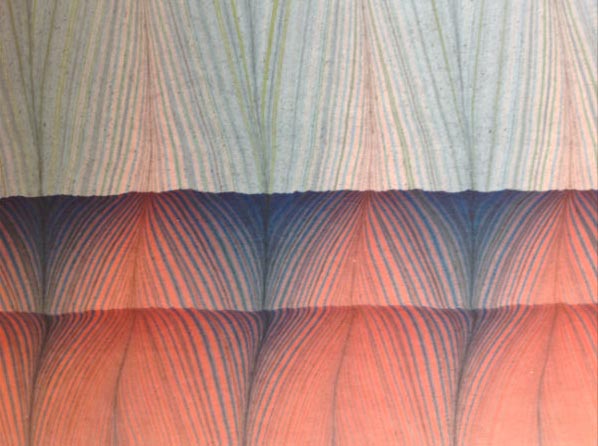
"Paper should not always be white…" Some of the papers we'll use are white, some off-white, some cream, and at least one is blue. A partial list includes six different Barcham Greens, an Amalfi, a Velke Losiny, two F.J. Heads, Van Gelder, a Griffen Mill, and a few we're trying to identify. The papers are still being gathered; as we sort through what's on hand, the first challenge is to calculate page dimensions that yield (1) a page of reasonable size, and (2) enough pages [folios] to print more than just a few copies. The entire endeavor will be limited by the paper that is most scarce. We may end up issuing the book in two states, one with a few more samples than the other. However things work out, we don't expect the edition to exceed 30 copies.


Right now it looks like the average page size will be 5 x 7 inches, with each copy containing at least 15 different paper samples. The preliminary material probably will be printed on Reg Lissel's HM Text. Each sample sheet will be printed in folio, with the paper's name on the first recto, and the extract from Updike's essay (set in 12-pt Caslon) on the second recto. Each verso facing Updike will be printed with an arrangement of printer's flowers, an arrangement that will "grow" as the book progresses.


The book will be bound by Claudia Cohen: right now we're thinking of a structure much like the color series of books: a long-stitch that allows the book to open flat, with quarter leather over boards. The final edition size won't be determined until we've printed all the papers. Price, we cannot be exact at this moment: the papers weren't cheap, and we won't know the printer's final bar tab until his work is completed. Suffice to say it's at least Types/Paper/Print, but it's not Oddballs. As per usual, first dibs go to our usual customers, and they can reserve copies & make final decisions once we finalize the IPO.


With luck, we'll start the printing next week. Stay 'tooned for updates & images.

13.5.13

The Wasted Book


Took a trip over the weekend, to gather papers for Paper Should Not Always Be White. Got some truly uncommon specimens; more on that project later this week. During our travels we also encountered a cardboard box full of mostly 18th century books. All in pretty rough shape - boards detached or missing. There was a 16mo copy of Gulliver's Travels, the complete tale, but missing its boards and title page. There was a complete (but boardless) pocket-size copy of Erasmus from 1561, and a few volumes of The Spectator. There was the inventory of a gentleman; the page shown above seemed apropos for the whole lot. None of the books justified - in monetary terms - the cost of restoration, but neither can they be treated like a box of soggy paperbacks. These things have lasted centuries. How many other books find themselves in similar straits. Millions...


Printed the above yesterday, a folder for copies of loscil's two prints which were included in the HM Codex Miscellany. We printed 20 copies of just the prints, for him to edition & issue. A thank-you for his participation. (We'll be doing the same with Harold Budd's shaped poem, "The Desert Tramp," as a broadside.) We'll post images of the complete set later this week, along with contact info for anyone interested in following up.

9.5.13

Distributing Colors


Since Claudia & Barbara started their color series, we've been keeping an eye open for books to add to their reference collection. Just what we needed: another vein to spike the collecting jonez. Here's something being auctioned at Swann's in New York this very minute:


(COLOR THEORY.) Hayter, Charles. A New Practical Treatise on the Three Primitive Colours . . . with some practical rules for reflections and Sir Isaac Newton's distribution of the colours in the rainbow . . . Second Edition, with Improvements. Engraved frontispiece, one text illustration, and 4 hand-colored engraved plates. 8vo, later 1/4 navy morocco over pebble cloth with calf gilt cover label, worn; scattered toning and offsetting, splits between some gatherings with contents slightly shaken, portion of rear endpaper excised. (IO). London: John Booth, 1830.  Estimate $300-400

scarce early edition of a major treatise on primary color theory. It was originally published in 1826 and was reprinted in six editions through 1845. Hayter was an architect and miniature painter and drawing master to Princess Charlotte, the only child of George IV. The study's main importance is in Hayter's very clear exposition of contemporary color theory which became an essential part of the education of British design students following the founding of the Government School of Design in 1837, most notably famed Victorian authority on color and design theory, Owen Jones, who printed the plates in later editions of this work. NUC locates only one copy.


Anyone who wants to purchase this item & donate it to B & C's library, do so quickly please, and send it along.

6.5.13

Paper Should Not Always Be White


Continuing work preparing for our metal types sample book. Right now it looks like it will contain 16 different primary faces, augmented by perhaps 10 secondary (generally smaller in size, smaller in quantity available, too ugly or not ugly enough for a page of their own). Some of the primary faces to be shown are Anker Romanisch, De Vinne (the original), Unciala and American Uncial, Gallia, Rubens, Monument and Verona.


Rather than simply displaying the alphabet with each face, the plan remains to use the letterforms to create multi-colored patterns or borders, accompanied by a brief quote that is somehow related to, or reflective of the face. The types will be printed on eight different papers (most of them vintage handmades), and so the page size will vary from 6 x 9 inches up to 7 by 10 inches. There will be a deluxe issue, which will have an additional section (probably three signatures) printed on an 18th-century laid paper. More about that later. Those copies will be bound in quarter leather by Claudia Cohen; the "regular" copies will be cased in marbled paper over boards at HM. We hope to issue the book in early fall, 2013.


That deadline got pushed back a little last week, when our search for interesting quotes to use with the types led to D.B. Updike's essay "The Seven Champions of Typography," and revived the idea for a project we've long wanted to undertake. The fifth section of Updike's essay discusses the effect paper has on a typeface (he makes particular reference to Caslon, as an example). While working on Elements in Correlation, we considered experimenting with printing the same forme on a series of different handmade papers, to see how each responded to damping and printing. Just a few days before reading Updike's essay last week, a friend reported acquiring a large collection of vintage handmade papers, but not enough of anyone to use on a book project. With the perfect text in hand, and access to a unique collection of papers to conduct the experiment, our friend was recruited and the project launched. 


Paper Should Not Always Be White (the title is taken from the essay's opening line) will consist of Updike's comments set in 10-point Caslon on a single page, repeatedly. Each four-page section will be made up from a different handmade sheet in folio (we anticipate a page size up about 5 x 7 inches). The first recto of each section will identify the paper, and the following recto will present the extract. (We'll add some simple flower arrangements to the two versos in each section, just for fun.) The paper's will all be dampened the same way (between boards), and printed with the same ink on the same forme in the HM handpress. So far we're up to 12 different papers, but we're still snooping around. The edition will be limited by whichever paper we have the fewest sheets of, but we're expecting to produce around 25 copies. Claudia Cohen, who shares our passion for paper, has agreed to bind the edition, uniformly, in quarter leather.


We expect to have copies of Paper Should Not Always Be White issued by the end of the summer.

2.5.13

Claudia Cohen Shows Off Her Paper Stash


Claudia Cohen is turning Seattle's Paper Hammer Gallery into what might be the world's largest paper sampler this week. She has culled her studio to assemble an exhibition of decorated papers from all over the world, and arranged, hung and displayed them around the gallery for a show titled The Pleasure of Pattern.
 

Claudia's been collecting paper over 30 years, to use for covering boards, as endsheets, and box linings. The papers on display date from the 19th century to the present, and represent a variety of techniques, including lithography, offset and block printing, marbling, stenciling, and paste paper (most on display Claudia's own designs).

The show opens tonight (May 2) and runs through the month.