29.10.10

Our Second Attempt at a Broadside


After too long a delay in production (HM's fault, no one else's), we are pleased to announce that HM will be publishing a broadside featuring a text titled "Uncommon Dieties" by David Sylvian, and an original drawing titled "The Botanist"  by Atsushi Fukui (whose work has been featured on David's albums Blemish and Manafon, both released by his label samadhisound). This project was sparked thanks to Harold Budd, who mentioned HM's interest in publishing something to David. The text - sort of a free-verse rumination on the artist's work, influences, and influence - was originally written as an introduction for a catalogue to be published in conjunction with a show of Fukui's work, but that publication did not materialize. At David's request, Fukui created a large drawing (based on the original painting, also titled "The Botanist," shown below) around which the text will be arranged on the broadside, and several incidental drawings of mushrooms.


This will be just the second proper broadside ever attempted at HM (the first being the Tabula Smaragdina Hermetis [The Emerald Tablet of Herme] for Ouroboros Press some years ago). The sheet will measure 20 inches wide, 13 inches tall. The text is set in Dante and Dante Titling, and will be printed at HM in two colors on dampened Arches paper with the Washington press. The edition will be just 30 copies, signed by the author and artist. For all intents and purposes, this project will be hors de commerce: the edition will be shared equally among the author, artist and publisher. A few copies from HM's share will be offered to our regular customers.

Printing will be completed before the end of October, but then the sheets must circumnavigate the globe, to be signed by David and Fukui, so it will be some months before we have finished copies in hand. But we look forward to showing it off when the time comes. Meanwhile, check out some of the very cool new releases, like Sleepwalkers, from David's label.

26.10.10

A Birthday Bouquet for Bob Reid


This is Robert R. Reid's birthday. How fitting that it coincides with the opening of a new show of watercolors by his one-time partner in printing, Takao Tanabe. We'll be enjoying a dinner, and then attending the opening tout en masse. Although the last thing Bob needs is another book in his apartment, HM found one that was too appropriate for marking the occasion (& sufficiently diminutive) to pass up: Printers' Flowers - Whimsicalities from the Windsor Press.

The book is a slim 16mo (18 pp.) published in an edition of 150 copies in 1933. It is quarter bound in cloth with a patterned paper printed in several colors. Part of the great fine press community that was so intensely active in San Francisco during the early 20th century, the Windsor Press was the imprint of two Australian brothers, James and Cecil Johnson. They seem to have started work around the mid-1920s. In 1929 they became one of the first "second generation" printers (the Grabhorns, John Nash and Taylor & Taylor being the first) tapped to print one of Book Club of California's limited editions (Witter Bynner’s The Persistence of Poetry). The Johnsons' imprint continued to appear on BCC books and ephemera up to 1943. Lawton Kennedy worked for the Johnsons, at least during 1929, when he is credited as pressman on Nocturne in St. Gauden's.

The little volume at hand was written by brother James, and set in Nicolas Cochin, although a number of other types makes appearances throughout. It essentially is a brief history of printer's flowers, and how their style and use have reflected typographic trends through the years. The writing is as florid as the title, and often interferes with whatever point the author is making. But the book is redeemed by its playfulness of design and color. A visual delight to mark the birthday of a man whose love for type and typography has spanned his entire nine decades. Happy birthday Bob!


22.10.10

Another Lowe at HM


Professional musician, avocational binder and chronic bibliomaniac Keith Lowe was at HM the other day, sewing up the edition of Harold Budd's 4. It was through Keith that we were first introduced to Harold, back in 2008, and so it was appropriate (and always fun) to have him involved in this latest project.


As the first volume in what will be the occasional, ongoing Artist Pamphlet Series, 4 will serve as the format model  for future collaborators: a single signature, two sheets (8 pages). Thus, sewing the edition of 50 copies (plus 10 A.P.) was not terribly onerous for Keith, which is good because his window of availability between tours was tight. He'd just come back from several weeks playing U.S. gigs (including a Jimmy Fallon show appearance) with Stone Gossard's band Brad, and he now leaves for a few weeks touring Holland with Jim Byrnes, Steve Dawson, and The Sojourners.

While working at the studio, Keith treated us to several tracks he recorded with Harold at a session in Seattle last January (release plans still TBD), and tracks from a session of Keith alone playing piano, recorded a few years ago. Fantastic stuff. Music for binders.

21.10.10

Francesco Griffo Rediscovered


Scans of the entire contents of the Francesco Griffo - Fragments and Glimpses, published in 1999 by HM's precursor imprint, have been posted on Simon Fraser University's special collections site. We'd forgotten giving permission for this, & discovered its presence only when hunting around for samples of Tak Tanabe's printing (see the last post). We're also a little confused about the identity of the felon shown in the photo beside the HM heading, and what his relationship might be to us. Perhaps he is one of the people who helped move the Washington into the HM studio (an event that, oddly, antedates the Griffo project by about two years).


Griffo was one funky project, begun in the earliest days of our exploits with printing: set in 8-pt type (Bembo) and printed on a Kelsey 5 x 8 tabletop. And to make things really interesting, the paper (Lana Wove) was dampened (truthfully, it often was wet), which further funkified progress. But beautiful bindings by Natasha Herman and Helene Francoeur. Its many setting & printing flaws aside, this remains - as far as we know - the only book publication dedicated to the life and work of Aldus' typecutter.

20.10.10

A Takao Tanabe Treasury


Best known now as a painter of muted and sublime Canadian West Coast vistas, Takao Tanabe paid the rent during the earliest days of his career as a job printer in Vancouver (having been introduced to the trade by Robert Reid). Under his own Periwinkle Press imprint he issued a handful of poetry chapbooks and broadsides, in addition to titles produced for other West Coast literary publishers. As illustrated in a new book featuring many samples of his printing from those days, he brought an artist's sensibility and creativity to his work, producing typography that ranged from austere to playful.

Printing ceased to be part of Tak's creative life about 45 years ago, but his reputation as a designer with type persists. Tak recently donated a large collection of his printing work and ephemera to Simon Fraser University. Drawing from this extensive collection, Robert Reid and the Alcuin Society have just completed Takao Tanabe: Sometime Printer reproducing a selection of examples from the SFU collection. From the book's prospectus:

"Tak not only printed books, which one expects from a “Private Press,” but was a master at Job Printing. His typographic imagination could run riot, producing an abundance of invitations, birth announcements, Christmas cards and ephemeral printing for Vancouver’s sophisticates, who had the sensibilities to recognize a master at work in the 1950s and '60s." 

Sometime Printer is 156 pages of reproductions from books and job printing, all in full colour, with 19 tip-ins. It is similar in format and production to the Alcuins' previous publications, Duthie Bookmarks and Dorothy Burnett Bookbinder. The edition is 50 copies, priced at $185.00. Contact --- for further details, and inquire about the possibility of obtaining a copy signed by Tak. Or, get one before October 26, when a show of new watercolors by Tak opens at the West Vancouver Gallery, and ask him to sign your copy at the opening.

19.10.10

A New Book from Sarah Horowitz's Weisedruck


ARCHEOLOGIES OF LOSS        

An new artist book by Sarah Horowitz from her press, Weisedruck. With poems by Sarah Lantz and remembrance by Eleanor Wilner

Archeologies of Loss deals with collective memories, their loss and disintegration but also their rediscovery and unearthing through individual histories - those of Sarah Lantz and her poems. Lantz, who passed away suddenly in September 2007 just after the publication of her first book, Far Beyond Triage, explores themes of the passing of time, absence, deterioration and loss in her poems.

Seven poems by the late writer Sarah Lantz were reproduced from her book Far Beyond Triage with permission from Calyx Books and her family. Eleanor Wilner wrote the remembrance for this collaboration of words and images in memory of Sarah Lantz. Ten etchings were drawn, etched and printed by Sarah Horowitz on handmade Japanese gampi paper. The Centaur types were cast by Michael & Winifred Bixler and printed on Somerset satin wove paper by Art Larson of Horton Tank Graphics in Hadley, Massachusetts. Julia Weese-Young (a former apprentice of Claudia Cohen's) boxed and bound the book at her home in St. Louis, Missouri. Archeologies of Loss was designed and produced by Sarah Horowitz of Wiesedruck in Portland, Oregon. The edition is 25 copies (plus several proof copies for the collaborators). An additional set of individual etchings has been printed in an edition of 12.

More details can be found at the Weisedruck site. Sarah does beautiful work, and her books are always exemplars of the crafts involved. 

18.10.10

A Printing of Poetry That's Odd


An unusual item recently added to HM's collection of books about printing: Walter de la Mare's The Printing of Poetry, a paper read before the Double Crown Club, London 12 February 1927. Printed for the Club at the University Press, Cambridge by W. Lewis 1931. Issued in an edition of 90 numbered copies. It's a simple 16mo in size, 34 pages, cased in blue cloth adorned with just a leather spine label stamped in gold. The printing and paper are nothing special.

De la Mare (1873-1956) was an English poet and novelist who probably is best remembered today for his supernatural fiction. The first half of the text is given over to much false modesty and bloviating at the feet of his audience, before arriving at his central point:

"The very glimpse of verse, then, on the printed page extorts a definite response in the mind...If, however, we detest the very word poetry, the more a book looks like a book that contains it the more odious will that book appear to be. If we delight in poetry, the more abject will be our disappointment on finding that the verse within is merely rouge, patch and powder."

Here's a line we liked, the author quoting an (un-named) member of the club: "Poets are best bound hand and foot."

It's only in the last seven pages that he gets down to the topic at hand in real terms, and then only by offering a paragraph each to such topics as type, setting, layout etc. (He skips right over printing.) And here's an interesting little bit of disingenuity:

"It is something of a mystery who buys limited and expensive editions of books - since men of taste are seldom greedy of publicity; it is even more of a mystery who reads in them."

Disingenuous for two reasons: one suspects that many of the members of the Club he was addressing had at least a few limited or expensive editions on their shelves; but more to the point, those editions are exactly the manner in which one is most likely to encounter de la Mare today! Lots of limp vellum and gilt edges out there with his name stamped on the spine.

Despite its lack of real insight to the design concerns of printing poetry, and general oddness, a fun little addition to HM's library.

17.10.10

Vancouver Fares Well


The first book fair held in Vancouver for about a quarter century seems to have been a success. A couple of exhibitors told HM that sales were slow, but when don't booksellers say that? (Although the summer of 2010 does seem to have marked a new low for booksellers across the board.) A collection of photos from the fair can be seen on the Alcuin Society's Flickr page. All of the exhibitors were Canadian (the sales tax issue making participation by foreign dealers too much hassle). Traffic was neither crushing nor sparse, but appeared constant on the Friday afternoon and Saturday. The show leaned heavily toward travel/exploration, modern firsts and true antiquarian items; there was essentially no contemporary fine press material on offer.


Charles van Sandwyk and his partner in Savuti Press, Waisiki Doughty were there (as part of Joyce William's booth) with a large selection of Charles' books and prints, including a copy of the out-of-print deluxe issue of Wind in the Willows, issued by the Folio Society in 2008.


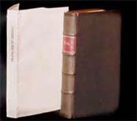
Steve Lunsford had just a few items on offer, each one unique or essentially so, such as a signed, presentation large-paper copy of On the Economy of Machinery and Manufactures by the father of the modern computer, Charles Babbage. It was accompanied by a hand-cranked computer of German manufacture c.1900, a thing of Art Deco beauty (and function, above).


John King had a copy of the Aldine 1518 edition of Opera Omnia Soluta Oratione Composita in a period binding by Courtland Benson (who was responsible for rebinding and restoring the collection of Aldines presented to Simon Fraser University in the 1990s). The book was printed in the Aldine italic, and concluded with a simple colophon over which each of the sorts in the font (i.e. including the ligatures) were simply displayed on a few lines.

A visiting bookseller had on hand a copy of Humphry Ditton's 1712 edition of A Treatise of Perspective  Demonstrative and Practical, extensively illustrated. This was of interest because of HM's upcoming project with sculptor Geoffrey Smedley, which will draw from a long essay exploring aspects of portraying, or representing, perspective. The Treatise on offer had recently been rebound in a manner that may not have been entirely successful from a historical perspective, but was nonetheless a tempting book. 


Additions to HM's library were limited to a single, inexpensive item: the 1964 edition of Wm Blake - Poet/Printer/Prophet, purchased for details included in the introductory essay about Blake's printing methods. Inexplicably, this otherwise well-produced book basically is perfect bound, with the text printed on folios that are not sewn, but simply glued up (and thus, popping loose). But it was cheap, and an interesting companion to one of the jewels in HM's collection, the Gehenna Press edition of Poe's essay Anastatic Printing.

Don't know what, if any plans the Alcuin mob has to repeat the fair, but hopefully this latest incarnation was sufficiently successful to justify a second. Perhaps they will alternate years with the Alcuin Wayzgoose. Be interesting to hear how the Toronto fair compares in a week's time. HM hopes to have one or two agents file reports.

14.10.10

Shinsuke Minegishi Exhibition


A show of new works by past & future HM collaborator Shinsuke Minegishi has opened in Vancouver. The show is called "Transfer and Transformation," a title intended to be reflective of printmaking, the process, and of the artist.  Transfer refers to printmaking; a mirror image is transferred from a matrix onto another surface. Transformation refers to the stages of printmaking but also to the artist who evolves and changes with every new project.

The show is being held at Art Beatus Gallery, which was founded in Hong Kong in 1992. With the addition of the  Vancouver gallery in 1996, Art Beatus became the first gallery of its kind operating simultaneously on both sides of the Pacific. Art Beatus represents and promotes International modern and contemporary art with a unique focus on contemporary Chinese art. Shin's exhibition runs through December. 

HM's next project with Shin (it's been five years!) is planned for the fall of 2011, when we will publish a retrospective collection of wood engravings spanning the first 15 years of his career, with a new essay by him about printmaking. 

13.10.10

A Wunderful Weekend


Last weekend we, accompanied by Barbara Hodgson, delivered the completed sheets for The WunderCabinet to her Seattle-based collaborator Claudia Cohen, for binding. Not entirely by coincidence, this was the weekend of the Seattle Antiquarian Book Fair. We took the opportunity to preview the book for a few bookseller friends who were in town for the fair. As was the case with Barbara & Claudia's previous collaborations, The Temperamental Rose and After Image, The WunderCabinet is almost impossible to explain or describe: it has to be seen to be believed.


The pages were printed at HM over a period of three months earlier this year (and before that, Reg Lissel spent a  year making the 1,000 sheets of paper required for the project). Printing two-up, just black, we were able to work off about two sheets each week. Barbara then spent four months coloring, collaging, and assembling the various pages and associated items. While this was happening, Claudia began making the boxes that would hold the books, each copy accompanied by a unique assortment of curiosities - its own curiosity cabinet. The boxes use various wood veneers to create geometric patterns; the leather binding will likewise incorporate wood veneers and gilt tooling. The edition is just 30 copies, and the first ten will form a deluxe state, with a more elaborate binding (full leather with geometrical trompe l'oeil onlays) and a two-tiered box that includes a more extensive collection of objects.


Thanks to our friends at Vamp & Tramp, The WunderCabinet will be debuting at the Codex fair in Berkeley next February. All of our booksellers who have ordered a copy will receive it in for the ABA fair, which immediately follows Codex.


The opportunity to display the book (or at least, the finished sheets) last weekend let people fully appreciate how Barbara and Claudia have outdone themselves yet again. We are currently finalizing orders, and the edition is almost fully subscribed. Any interested collectors or institutions who have not already spoken to one of our regular booksellers about reserving a copy should do so soon.

12.10.10

Boxed in Seattle


In addition to an advance copy of Harold Budd's 4, the recent Seattle book fair marked the release of a second HM-related title. HM Box Set No. 1, initiated & published by Wessel & Lieberman Booksellers, is a two-volume record of work spanning the studio's first decade. Issued in an edition of just five sets (only 3 for sale), the set includes a copy of Checklist Number 3 (a.k.a. HM=X), specially bound in a marbled paper case. Unlike the 26-copy edition issued y HM, these 5 copies do not include the section of six sample pages at the back. Instead, each set includes a second volume containing 25 samples. The sample volumes include a specially printed title page and brief introduction. The samples are hinged or mounted (as appropriate) on consecutive rectos, with the book's title printed on the facing verso, and in some cases a brief comment about the project or sample. These special sample volumes also include a frontis ("Our Founder & Patron") originally planned for inclusion in the checklist, but ultimately not used.

The books are sewn on tapes, with boards attached, and put into limp cases made from (different from complementing) hand-marbled papers. The paper used throughout is vintage Guarro laid, printed damp; the sample volume uses alternating gray and pale green sheets. Each set is housed in a clamshell box covered in blue silk. HM Box Set No. 1 is available exclusively from Wessel & Lieberman.


The idea for HM Box Set 1 grew from a similar, less ambitious project undertaken during the Olympic shut-down of our city this past winter, when HM produced an enjoyably diverting precursor to the checklist: a boxed collection of ephemeral pieces spanning HM's first decade, issued by London booksellers Collinge & Clark. The idea was sparked last year, when Oliver Clark asked if a few lots of ephemera could be assembled to interest collectors unfamiliar with HM's work. The result, titled Twelve from Ten, is a collection of prospectuses, pamphlets and broadsides from a dozen different projects (including the first appearance of the name Heavenly Monkey). The collection is detailed in a contents sheet printed on Reg Lissel's handmade HM Text paper, with a press-numbered colophon. The whole lot is wrapped in a printed chemise, and kept in a clamshell box with an inlaid title label on the front. Number 1 stayed with us, numbers 2-5 where shipped off to Messers Collinge & Clark in March. Contact them if interested in more details. As far as we know, no copies have travelled back west across the Atlantic, hence Wessel & Lieberman's interest in publishing something similar.


HM Goes to University

In addition to marking HM's tenth anniversary earlier this year with a new checklist of all our publications to date, with selected samples included, we were also pleased to have our archives and working papers (including proofs, sketches, and correspondence) spanning the period acquired by the Rare Books & Special Collections Division of the University of British Columbia's Library. UBC was among HM's first supporters, and has continued with that role in various forms over the years, so we could not be more pleased with this arrangement. And further collaborations are already in the works, including a project about George Wither's A Collection of Emblemes, Ancient and Moderne, with one (and possibly several) original leaves from the 1635 edition included in each copy. More details to follow as the project develops.

An Edible Alphabet


A new creation from HM collaborator & friend, Claudia Cohen. Similar in spirit to her Bookbinding Ephemera and Chasing Paper, An Edible Alphabet combines her love for letterforms, fanciful page compositions, and binding structures that convey intimacy when held. Each page reproduces from stencils a letter in three alphabets, surrounded by the names of foods starting with that letter. These words are taken from Claudia's large collection of early 20th-century rubber stamps, used in restaurants to create the daily menu. Some words are also written in her own elegant cursive. The paper used in a wafer-thin vintage laid, French folded and sewn long-stitch on to a vellum structure with three slips, and laced into an outer case made from pieces of 18th- and 19th-century parchment documents. The edition is 30 copies, priced at $500. Copies are available from some HM booksellers, and from Claudia directly (ccbookbinder [at] msn.com).

HM Artist Pamphlet Series Starts


HM has just completed the first title in what will be an occasional, ongoing series of pamphlets published in collaboration with artists from outside the book arts community. 4 is a collection of four new poems by musician and composer Harold Budd, accompanied by four new etchings. These etchings, which continue to explore his enigmatic "arabesque" designs previously featured in the CARNIVAL suite (and other places), are named after avant garde film directors: Akerman, Cocteau, Jarman and Anger.


Each title in the series will be limited to our usual 50 copies, within the first ten being offered for sale to patrons, and the remaining copies being shared between HM and the artist, strictly for private distribution. The poems were set in printed and printed on dampened Arches Wove. The Patron copies of 4 feature all four of Harold's etchings, with the frontis etching being initialed by him. The remaining hors de commerce copies feature just one of the etchings, as a frontis (although which of the four etchings varies from copy to copy). The entire edition is sewn into a printed handmade paper wrap; the Patron copies are further covered in a transparent tissue chemise.

Harold remains busy in his real life as a musician. News of some of his adventures in recording can be seen on Robin Guthrie's site. We continue to look forward to a formal recording by Harold and HM collaborator Keith Lowe (currently on tour with Stone Gossard's band Brad).

A Book Fair Ransom


Stumbled across a sublime item at the Seattle Book Fair. Despite its diminutive size, it stood out from everything else in a glass case. The bookseller, a friend & expert scout, provides the following bibliographic description:

A Vision and the Dream of Petrarca, by Walter Savage Landor.
Will H. Ransom, Chicago, 1903. 7" x 5". 22pp. Gathered and sewn signatures. With a note by Thomas Wood Stevens. Handcolored title decorations and opening initials. Faint soiling to outer blanks, else near fine condition. First edition in this format; Ransom's third imprint. Ransom's first two books appeared under the imprint of the Handcraft Shop from Snohomish, Washington. This work appeared shortly after his move from the northwest to Chicago. It seems likely that the project began in Snohomish. The edition was to be limited to 165 copies, but according to Ransom only 10 copies were completed and distributed. This copy is not numbered, but is complete and colored. Kreisman and Mason discuss the book, but report that the book appeared under the Handcraft Shop imprint. It wasn't until 1921 that Ransom undertook the printing of another book. [See Ransom 3 and Kreisman & Mason, The Arts and Crafts Movement In the Pacific Northwest.].

The pages and location of the pin holes tell us it was printed on a handpress, four up. The presswork is impeccable. The sections are sewn on three vellum tapes. Far too lovely a thing to be left naked, we have made a simple paper wrap to keep it safe.