30.9.13

Deluxe Variations


Deluxe copies of Paper Should Not Always be White get closer every day. Claudia leaked the above photo last week, showing three variations on her binding design. How could anyone pick a favorite? Stand by to see which one she chose...

26.9.13

Everything's Gone Green


Received an update from Barbara this week on her progress with Around the World in Colour:

"I haven't yet run across any specific recommendations for producing dye green on paper. So, I've been experimenting with all of the combinations suggested in the literature for cloth dyeing, as there is no one magic natural green. None of the combinations worked. Either the overbath stripped the first colour, leaving a non-descript shade, or the second colour sat on the first in a kind of mottled attempt at green. The eureka moment came after a chance visit to a Chinatown apothecary shop, looking for another elusive dye: gromwell. The apothecary asked what I wanted it for, as she measured out two 'doses.' When I said it was for dyeing, she began pulling jars off the shelves. She gave me gardenia, which I had read about, and Rubia cordifolia (a form of madder that I hadn't yet tried), and a couple of others.

"I'm not ready to divulge the name of the dye that worked so well to make green. That will have to wait for the book."


Kool stuff to look forward to when the book is published next year. 

24.9.13

Be Wary of Those Bearing Prizes


An off-schedule blog, the topic being competitions and "prizes" in the arts.

Canada has an annual music prize, the Polaris prize, for the "best" album of the year. Similar to the U.K.'s Mercury prize. "Best" at Polaris seems to be defined however each of the dozens of judges (media types, flacks, etc etc) chooses - there proudly is no criteria.

The point being, Godspeed You! Black Emperor won last night, and the group's reaction was spot on. The very idea of turning the arts into a foot race is pathetic. (It's not even a foot race - at least that would be quantitative. To paraphrase Woody Allen, it's a beauty contest.) These competitions are never about the work or artists nominated & awarded; they're about the tastes and agendas of the people doing the judging.

Thanks be to Godspeed for the music, and for once again speaking truth. Whether you are artist or audience, be your own critic; don't let others dictate your tastes and interests. 

23.9.13

Paper Chase


Since this is books-about-paper month at HM, thought we'd post links to a few sources of handmade paper...


Barcham Green stopped making paper in the mid-1980s, but Simon Green has keeping the firm's history alive, and is also selling off what stock remained. Here's a list of what's available and the prices. Simon also collaborated with Claire Van Vliet's Janus Press to publish Papermaking at Hayle Mill 1808-1987, which is an excellent history of the firm.

Whimsie Studio is a Florida-based site that offers a wide range of arts and crafts-related materials, including a selection of vintage English handmade papers. They also have some interesting print- and paper-related books on offer (like this one).


 Ireland's Griffen Mill continues to make a wide range of papers; ones suitable for printing can be seen here.

The University of Iowa's Center for the Book is making some beautiful Western & Japanese handmade papers, under Timothy Barrett's direction. HM's latest, Paper Should Not... includes a sample of their Chancery paper. They don't have lots of stock lying around at any given time, but they can make batches to order, and at very reasonable prices for what they're producing.


Atlantic Papers carries Vekle Losiny, but it's hard to tell from their site if they carry anything suitable for (book) printing; seems to mostly be stationery.

Twinrocker continues making lovely papers. It is, however, the one contemporary mill not included in our Paper Should Not..., but that's only because none of us had a stash of their paper small enough to contribute to the project.


Montreal's St Armand can make paper to a wide range of specifications. They don't generally have stacks of white book-weight lying around for a project, mainly because people ordering that kind of quantity want the paper customized to their needs and preferences.

And of course, HM's own favorite, Reg Lissel, can be contacted through this page. Think he's again made paste papers for the special copies of the next issue of Parenthesis...

This list is far from exhaustive. However, while papermaking remains a lively craft, few people seem willing & able to make a simple white sheet, consistent & in sufficient quantity for printing a book.

19.9.13

Loosing Marbles to the World


The first batch of Paper Should Not Always Be White, in the quarter leather millimeter binding, went out this week. Claudia's dipping into her stash of old Eva Van Bruegel marbled papers to cover the boards, so the pattern varies from copy to copy. Now she's ploughing through the deluxe copies (Get it? The binder is ploughing through the copies. Clever.) so they'll be ready before the Seattle Antiquarian Book Fair next month. Several of HM's booksellers will be exhibiting there. We'll post photos of the full leather deluxe copies when we have some. As previously reported, the edition is OP, but copies can be reserved through HM's regular booksellers. Likewise with Uncommon Papers, which actually was over-subscribed by one copy (our mistake). We had to give up one of the two edition copies we normally keep, and be satisfied with the trial binding copy in its place.

16.9.13

Uncommon Case Closed (By End of the Day)


Casing in miniature books takes pretty much the same amount of time as casing in regular books, which is one more reason not to miniaturize a book. If anything it can take longer because you're fingers keep getting in the way. The point being, we'll finish casing Uncommon Paper today, no matter what it takes.


Hate big squares (the amount the board exceeds the dimensions of the text block) on cases & bindings; very much of the Claudia Cohen school in this matter - a few millimeters is sufficient. With Uncommon Paper we have perhaps come as close as is possible to eliminating a square altogether, and the deckles on some bottom and fore edges do protrude a little, which is fine for a book about paper.


Copies will be shipped out starting this week. Forgot to previously mention, all copies are spoken for. As usual, if interested, contact one of the booksellers listed at right.

12.9.13

A Designer Must Do It All, At Least Once


No news from or about HM - everything's happening as previously discussed & promised - so here's this:


Found a few years ago on the shelves of the excellent Seattle bookseller John Michael Lang, excellent in particular because of his scouting prowess - with every visit to his shop you will encounter at least one item you have never even heard of before.

Looking for some content for today - anything! - we rummaged across the shelves and pulled this pamphlet out. Issued in 1948, printed by Crimilda Pontes in an edition of 100 copies. The paper is a lovely handmade, watermarked Arches [France]. Unfortunately she didn't dampen it for printing, so the presswork is a bit weak and inconsistent, but not awful. The joy to be had is in her mis-en-page.


Doing some very quick searching for details on the translators, Rev. Henry K. Pierce seems to have been an Episcopalian minister in NYC; Erich Taylor went on to become a Rhode Island state senator; and John Benson, although last on the list, may be of greatest interest for this post: his career seems to have been devoted to working at the John Stevens Shop, and his son became one of the foremost American calligraphers, stone carvers and type designers in the 20th century.


Over at Biblio, an interesting item is listed, along with a brief biography of Pontes:

"PONTES, Crimilda (1927-2000) Award-winning American graphic designer and calligrapher who specialized in book covers and dust jackets, mainly for Yale University Press; a pupil of renowned calligrapher John Howard Benson, she was a designer for the Smithsonian Institute for 23 years. Signed First Day Cover, 6½" X 3½", cancelled in Washington, DC on 1968 November 4 and with "First Day of Issue" boldly stamped. Single 6-cent "Chief Joseph" stamp at upper right. Fine. At lower left, in black fineline, Pontes signs handsomely in her lovely calligraphic script. Pontes did the lettering for this stamp. Small portion of original transmittal envelope also present"


The pamphlet, which includes several full-page and numerous marginal illustrations, remains a valuable introduction to the materials and techniques of calligraphy. But it also is interesting as an example of a young graphic designer conceiving, planning and executing a project entirely on her own. The direct experience of setting type, working with paper, running a press and binding is invaluable for someone who will later play one specific role in the overall process; an appreciation for the practicalities of the other steps will make a better designer. Setting even a few lines of metal type, and having to letterspace headings with coppers and brass based on your best judgment in the stick (and then refine it once you've pulled a proof), will make for a more nuanced and aware typographer at the keyboard.

An Abe.com search for The Instruments of Writing initially was disappointing: there were a few copies, all priced less than ours cost. But closer reading identified these as a second (1953) printing of 300 copies, done by Meriden Gravure. It too is on Arches, but probably not the handmade. The 1948 original, printed by Pontes, is referred to as "very rare." The '53 re-issue looks to be identical, right down to the wrap, and it's cheap at the prices. Aside from the re-issue, this is the only title that shows up in Abe for Berry Hill Press, so maybe, having done it all once, Pontes decided to focus on the part that interested her the most. Crimilda's kool.

9.9.13

A Letter from David Ferry, & A Papier P.S.


Remember that Sea Pen Press & Paper Mill post from a while back? Well, we spent last Saturday printing a sort-of collaboration with that imprint, and through it, with American poet David Ferry. In 1981 Sea Pen published a collection of Ferry's poems titled A Letter, And Some Photographs in an edition of 120 signed copies. It included two stone lithographs by Sea Pen's Suzanne Ferris. As so often happens with small- and fine-press projects, not all of the copies were bound at the time. In fact, 46 remained in sheets, packed away.

Since 1981, Sea Pen's Ferris and papermaker Neal Bonham closed the mill, and Ferry went on to accumulate awards and honors, most recently the National Book Award for Poetry. With some encouragement from Mark Wessel, Ferris and Bonham decided to make the remaining copies of A Letter... available, to celebrate Ferry's career.

The copies issued in 1981 were bound in quarter vellum by Gray Parrot (per the colophon). The 2013 copies are being bound - differently - by Andrea Kohler: black paper cast specially for this binding by Bonham, with a ibyx laser-cut into the front board, and the boards edged top & bottom in leather (a millimeter-style binding).


HM's small contribution was a printed leaf to be inserted at the front of the book, explaining the history of these last 46 copies. The text was set in Bembo (same as the poems) and printed on kitakata. We also printed a folded prospectus that includes the text from the insert; this was printed on pieces of a lovely laid paper made by Glenn Wark, whose long-defunct Leaf Paper Mill also provided the paper for the book. The prospectus paper is a laid sheet, quite smooth (appears cold pressed), with inclusions. This same paper is being used as endsheets in the binding by Kohler. (In typical HM fashion, there are fewer copies of the prospectus - I think we managed 35 - than there are of the piece on offer. Prospectuses are very boring to print.)

According to Ferris, Leaf Paper closed down a few years after publication of A Letter..., and Wark disappeared from sight long ago. Too bad, because he made beautiful paper. The poems in A Letter... were printed by Ferris on a heavy (200 g?), very white & smooth sheet (dampened).

These remaining copies are available only from Wessel & Lieberman, Booksellers, priced at $200. More details and some images are (or will soon be) available on their site.

P.S. you guys liked last week's le Clert post; our biggest seller ever. A thought occurred, post-posting, that puts the publication into some contemporary context: Each copy has about 540 pages (including blanks). Assume each page is one-quarter of a full sheet of handmade paper (i.e. each full sheet was torn in half to make a book sheet, and each copy needed 270 book sheets). That's 135 full sheets per copy. Assume you could get full sheets of that beautiful paper for $5 per (which is ludicrous; they'd be closer to $10). Let's say they printed off 725 copies (allowing for minimal wastage). That means today, just the paper alone for a project like Le Papier would cost almost half a million dollars, and probably closer to twice that. 

5.9.13

Louis Le Clert's Monumental "Le Papier"


A recent post's musings on the long-term commitment of taking in new books - like adopting a puppy or having a kid - were perhaps sparked by the combined weight of a two-volume set recently carried home: Louis Le Clert's monumental Le Papier. Had to restack a bunch of books to accommodate the set. To give a sense of scale, here they are beside Everson's Psalter (left), and one of Nash's folios (second to right).


The books are the culmination of 40 years of research by Le Clert (credited as honorary conservator at the Troyes museum) into the history of papermaking in the Troyes region of France. The first papermill in France is believed to have been established in Troyes in 1348. The books have been described as the French version of Dard Hunter's Mountain House volumes, and if they were in English they would command the same prices. But because they're in French - and 20th century books produced in France are some of the best bargains to be found in North America - the set can be had for a fraction of a Hunter volume.


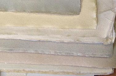
Maybe not a set exactly like this: most copies currently listed are in traditional printed paper wraps (like the set shown at the top of this post), which for a book this size is not ideal. (These are the books that the bookdealer who posted them described as "the size of a small sheep.") They really need a proper binding to provide support and protection, and the set we found seems to be a variant in an original (publisher's) quarter vellum and buckram binding.
 

Whether you can read French or not, just flipping through the books is an education in history, papermaking, and most especially book production. (And if you have high school French, you can muddle through; it's not Proust.) The scope and depth of the book not only provides a comprehensive study of the making of paper, but also an broader & engaging survey of French history during the period. Being lazy sods, we lift verbatim the Veatchs' description of the book:

"Volume one covers technical considerations including watermarks, size & format, and social and economic conditions. It discusses some 30 paper mills in the area. Volume Two is devoted to all known artisans who worked in the mills, plus apprentices and paper merchants. The fifteen folding plates are watermarks formed in the paper. Wood engravings in the text are by Burnot. Color plates after watercolors were printed by Jacomet. Printed by Protat in a re-casting of Deberny types on Canson et Mongolfier paper handmade for this edition. Headpiece borders and tailpieces are combinations of Garamond ornaments (each a variation on a theme) composed at Lanston Monotype"


Le Clert and his publisher did not stint on including illustrations of all kinds, starting with the hand-colored frontis reproducing the coat of arms of Troyes from a 17th century stained glass window...


Several maps of the region, also hand colored:


In addition to the watermarks formed in fold-out sheets (vol. 2), dozens also are reproduced both within the text and as plates printed in yellow ink...


Half-tone reproductions of historical documents, maps and plans...


Another hand-colored reproduction of a stained glass window, this one from the Arquebusiers Hotel in that town and exhibited today in the grand room of the Municipal Library.


An oddity we haven't encountered previously: the colophon states the edition is 675 numbered copies, but the number actually appears at the end of the Table of Contents.


It's a spectacular example from the height of printing and book design during the wave of bibliophilia that surfed into the start of the last century. It's the kind of production, in ambition and execution, we really haven't seen in 50 years or more. (There certainly are outlier exceptions; Robert Reid's Lande Bibliography of Canadiana would be one fine example.) Plus, Le Clert is packed with information about paper, which is totally HM's thing.

To conclude, an attempt at translating the colophon:


"This work, the result of 40 years of research, may not have been possible without the initiative of Mr. Georges Mennesson, who had specially made by the famous Manufactures Royales Canson and Montgolfier, at Vidalon-lès-Annoyay, a pure rag paper. The typographical execution is by the famous printing firm [of Jules] Protat, which cast for this volume for this character called "Deberny old [style]." The headbands and tail-pieces were composed from sketches of the sixteenth century revived by the Lanston Monotype Corporation. The wood engravings were cut by Mr. Burnot of Lyon. The watermarks reproduced [cast] in plates LXIII to LXVIII were executed by Rai-Tillières in Paris. The collotype plates, facsimiles and reproductions after watercolors by Mr. Joseph Sima, have been printed under the direction of Mr. Henri Stein, honorary curator at the National Archives, teacher the Ecole des Chartes; by Mr Louis Morin, City Archivist, [deputy] librarian at Troyes;  Mr Pierre Pietresson of Saint-Aubin, departmental archivist of [at] Aube,  and Mr. Jean Latour. The index was prepared by Mrs. Blake-Bucquet under the direction of Ernest Coyecque, Honorary inspector of libraries for the city of Paris and the Seine. 675 numbered copies book are offered for sale, published in Paris by The Sign of Pegasus, Mr. J Holroyd-Reece proprietor. Printing was completed 30 November 1926, the day the author went into his ninety-second year.

Interesting that it's the same publisher who issued one of HM's cornerstone handpress books, The Officina Bodoni - The Operation of a Hand-press during the first six years of its work (1929).

2.9.13

It's September: Cover Up


Got sidetracked over the weekend making a frontis for Uncommon Paper. Can you tell who we've been hanging around? It's made up from pieces of nine of the 12 papers used in the book. There are better ways to go blind.


Also printed the paper to cover the boards. Tried it in silver but didn't look good. Black always looks good. Now that the cover paper's been printed, we'll case in the test copy & see what adjustments need to be made. Barbara has warned that PVA reacts with the natural pigment used to dye the paper, so it'll have to be wheat paste. One problem miniature books can have is a tendency to not lie flat; they're always a little popped open. Part of the problem is the lack of weight from boards. Trying to minimize, or eliminate that altogether (without resorting to quarter-sewn oak boards).


As reported, the edition is 26 lettered copies. Some of those have to be given to collaborators on Paper Should Not Always Be White*, so we'll probably have only about 18 to offer. Price will be $300.

* Speaking of, first copies of the regular edition will be shipped from Claudia's studio this week. We'll send a note out to everyone as/when their copies are posted, so they can be on alert. The deluxe copies are underway & remain on track for end of the month-ish.