27.1.14

Wil Hudson's Life in Print


With no specific topic planned for today's post, I was just handed one, albeit with a sad undertone: former Vancouver printer Wil Hudson died earlier this month, at his home in Creston, B.C. For a time in the 1960s and early '70s, Wil arguably was The printer in Vancouver capable of letterpress printing worthy of the label "fine press."

The Creston Valley Advance has an obituary about Wil, with some biographical details. The Flickr link takes you to a collection of photos of Wil at work (but don't click on the link to his "final letter to the editor" - it takes you to a BS subscription page).


Anyone interested in the history of printing in Vancouver (all three of us!) or fine press printing in Canada (a couple more) will know Wil's name. The Alcuin Society, which is Canada's only national bibliophile group, was created in 1965 by a handful of Vancouver collectors primarily as an excuse to come up with interesting printing projects for Wil. The Society was modelled after the Book Club of California, and in the first five years of its life issued a number of B.C.-related historical reprints as "fine press" limited editions, all printed by Wil. (The editions always were too large, and the execution too commercial in materials and design, but the intentions were pure and Wil's skill at the press never in question.)


 One of the Alcuin founders was Basil Stuart-Stubbs, the University of British Columbia's first Head of Special Collections. He and Wil collaborated on a number of small publications issued through the library (like the Eric Gill item below), and Wil also printed more mundane items, like letterhead.


Not sure about this Samuel Johnson broadside, but I'd bet it also was funded, or at least initiated by BS-S/UBC.


The earliest sample of Wil's printing I've found is a 1964 pamphlet publication of Bertolt Brecht's poem "To Posterity;" a "limited edition of 125 impressions," with the imprint "Printed at Grouse Mountain' (one of the mountains in North Vancouver). I've found no other publications using this imprint. 


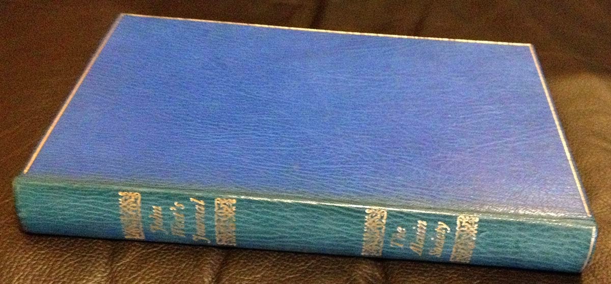
This lovely four-page pamphlet (250 numbered copies) from 1966 probably was done, at least ostensibly, to advertise his printing prowess, but it also illustrates his interest in being more than a job printer. (p.s. there's one copy of this title listed on Abebooks...)

 
Robert Reid's early books led me to explore other letterpress printers who had worked in Vancouver. It's a short list and Wil's name came up often. Aside from the books and ephemera he did for the Alcuin Society, examples of his non-commercial printing are not easily found, especially examples printed after he left Vancouver for the north.


The federal government had launched a project to promote and develop the work of Inuit artists, particularly by introducing them to printmaking techniques. Wil was recruited to be the master printer/instructor at what became Kingait Press &Studio in Cape Dorset. The Creston paper's obituary says he was in Baffin Island in the 1960s, but I thought he went up around 1974 or '75, and stayed for only a few years.


When I first went into David Clifford's shop (Black Stone Press) in the late '90s, he had a Little Giant cylinder press taking up too much space in his shop. He adopted it a few years earlier, to save it from the scrap heap, in part because of its history: the press (which weighed a few tons) had been taken up to Baffin Island by (or at least with) Wil, to be used at the studio. Some letterpress printing was accomplished by him there, but it didn't really take off. After Wil left, somehow & for some reason, the press was shipped back to Vancouver. Must have cost a fortune. Before it reached David, I think it spent some time lying inert at Barbarian Press. Ultimately, to no one's satisfaction but everyone's understanding, it ended up being broken up for parts. Not positive, but I think it's the same press as the one shown here, from his Vancouver studio c.1970.


I am frequently surprised to encounter people who claim to be book collectors, yet they have no working relationships with booksellers. They have no appreciation for the profession. Here's one reason you want to get chummy with some booksellers: once they know (& hopefully like) you, all kinds of surprising things begin to emerge from boxes and secret stashes. It seems that while he was up north, Wil did some "job" printing for the studio and local groups (be interesting to know more about the Inuktitut type)...


...as well as a few items for his own amusement, including another edition of Three Egyptian Letters...


...and the year before, C.P. Cavafy's poem "The God Abandons Antony" printed in an edition of just six copies.


Leslie Boyd Ryan's Cape Dorset Prints is one of the standard histories of printmaking in Cape Dorset. Interesting that Kingait gets an extra N from the letterhead & card Wil printed. 

http://dorsetfinearts.com/publications/1.php

Perhaps the most personal example of Wil's printing I have is the one below, from 1986 - the last date I have on any of his printing. It's printed french-fold, four pages.


From the obit, it sounds like Wil found other passions to channel his creativity after withdrawing from printing. A loss, but one of the kool things about printing is that people who knew you are left with words to remind them of your company, and people who never knew you (as I never met Wil) have the opportunity to imagine they did.  

And Another Thing


You will never, ever have a better reason for visiting Milwaukee than you do now: HM alumna Briony Morrow-Cribbs has a solo show of new works opening in a week at the Tory Folliard Gallery. Opening is Saturday 8 February. Briony's stuff is superkool. Might HM do another book with her one day? We keeping bugging her about it...


Things are happening with volume four in the color series, Around the World in Color. David Clifford is more than halfway through printing the text at Black Stone, and last week a fold-out map of the world, which will be colored to show where various natural dyes and pigments are found, was printed at HM - in fact, it's the last thing printed on the Washington before the studio gets taken apart in a month or so.

20.1.14

Repetition & Reduction


The patterned paper used to case Metal Type (& line the boxes of the deluxe copies) was designed by artist & HM friend Dana Cromie. (See bottom of this post for details on a small number of these sheets issued as signed prints.) I first saw the general scheme he used for repeating the components last summer, in mock-ups for a series of large prints/collages he was planning for a show the Beaty Biodiversity Museum on the campus of the University of British Columbia.


The show, titled Remnants, opens at the end of this month. The focus is Dana's "reaction to the ongoing reduction by human activity of natural habitat." In recent years Dana's art has focused primarily on detailed (but usually quite spare) botanical watercolors. For Remnants, however, he explored a new medium, creating a series of five collages, each composed of prints of natural components arranged and repeated in the same manner as the paper used for Metal Type, and layered with prints of anthropogenic activities. 

"Twenty-six original drawings have been letterpress printed, hand cut into 1,500 pieces and glued into five portraits. The sources for the nature drawings are mostly archival, some from the Internet, some from the cabinets of the Beaty Biodiversity Museum, and a few from nature. What is always missing is context. The design of the man-made elements in the style of traditional wallpaper is Cromie's response to the appropriation of ‘Green’ currently utilized to promote everything from gasoline to urban towers. Humans are absent in the portraits because as individuals we do not see our relationship to the changes in the environment." 


The natural drawings used to create the five collages (18 in all, ranging in size from 2 x 2 inches to 6 x 6 inches) have also been printed individually on Somerset Velvet paper, in editions of 20 signed and numbered by Dana. These prints will be available for purchase at the Beaty during the show (prices range from $65 to $125). 


All of the relief printing was done by Yasmine Franchi at Black Stone Press, with Dana's original drawings reproduced from polymer at one-half scale. Each of the finished collages measures 59 x 39 inches. Dana's sister was enamoured of the larger format of the original natural drawings, so they were silk-screened with indigo ink on while bull denim. She then sewed a traditional quilt of 8 x 10 feet to hang at the entrance to the exhibit.


Metal Type is not HM's first collaboration with Dana. A couple of years ago we printed a series of four line drawings for him, each in an edition of 12. Titled Dance Recital, the series was "a music concert interpreted in line and colour." Each printed was inspired by a particular piece of music (above is Philip Glass's opera The Photographer, based on the homicide trial of photographer Eadweard Muybridge). The prints were the individually colored by Dana (they're available uncolored, but since the color is half of the premise for the images, it's a waste).


Not a printer per se, Dana has ink in his veins: his family owned the Vancouver Sun for many years. In addition to his own art & a couple of cool early Joe Average paintings (he and Dana ran in the same circles), one of the notable pieces on Dana's walls is a menu from the MGM Studio cafe, c.1935 signed by a number of famous actors, including Nelson Eddy, Mickey Rooney and Jimmy Stewart.  Turns out back in the day, Dana's grandmother used to winter in L.A., along with her son (Dana's dad). One day they were noshing at MGM, and got the actors to sign the menu on their lunch break. The menu alone is a great piece of job printing from the era, the other side reset with the specials every day.


We had a handful of extra sheets of the fonts paper printed for Metal Type. Rather than putting them away in a box, we decided to issue them as prints, suitable for framing. The edition is 10, each signed & numbered by Dana. The sheets (Guarro laid off-white) measure 12.5 x 17 inches, with an approx. 0.75 inch border around the image. They're available from Dana, price is $75.

Remnants will be up through April. Dana will be posting images of the pieces created for the show on his site after the opening.

P.S.

Interesting notice of the recent sale at auction of the Kelmscott Goudy Albion press on the Wessel & Lieberman home page. Also, a longer piece in The New York Times. Neil Shaver's Yellow Barn Press published an interesting and, as with all his books, beautifully printed book about the press. In view of the hammer price, maybe HM unfairly criticized the asking prices of some handpress on eBay last year...

http://printinghistory.org/kelmscottgoudy-press/

New releases from Harold Budd's back catalogue recently. And a new release through Darla expected soon.


loscil tours Europe next month. See him if you can. (Apparently he still has a couple of the portfolios containing two original prints, produced with Heavenly Monkey, which might be available at the merch table...)


Signed copies of Aimee Lee's book Hanji Unfurled - the first English-language book about Korean handmade paper (according to the blurb) - are available through the author's site. The book's received strong reviews. Unfortunately no deluxe or special edition with samples was issued. Regardless, if you're buying contemporary trade books, you should get signed copies whenever possible.
This series of portraits is Cromie's reaction to the ongoing reduction by human activity of natural habitat. Built using the small pieces of the contemporary viewing pane, these collage quilts pay homage to traditional home economics and to the Arts and Crafts movement of the late 19th century. The vertical format reflects the traditional portrait proportions of influential individuals. The repeated use of small pieces relates to how we build our impression of the world without experiencing it.
Twenty-six original drawings have been letterpress printed, hand cut into 1,500 pieces and glued into five portraits. The sources for the nature drawings are mostly archival, some from the internet, some from the cabinets of the Beaty Biodiversity Museum, and a few from nature. What is always missing is context. The design of the man-made elements in the style of traditional wallpaper is Cromie's response to the appropriation of ‘Green’ currently utilized to promote everything from gasoline to urban towers. Humans are absent in the portraits because as individuals we do not see our relationship to the changes in the environment.
- See more at: http://www.beatymuseum.ubc.ca/remnants#sthash.97XmWIUg.dpuf

13.1.14

Things Are Going To Change Around Here


For those who haven't already heard, HM is going walkabout in 2014. The timing is typical HM: the last post (Faking It) scored the highest view numbers since this blog started. Leave on a high.


This is a bit of a forced break, as the current premises must be vacated while a new HQ is built. The time will be spent developing the next few publications (including the long-promised George Wither emblem leaf book). I'll be taking over blogging duties during the break. My first official act is to reduce posts to once a week (Monday).


There will be some updates on the HM projects in development, but most of this year I'd like to spend seeking out people making interesting books and art that I don't already know about, the ones who aren't mentioned in every article about "fine press" and letterpress printing. There's a lot going on out there. Much of it isn't as innovative or unusual as the people doing it think; much of it lacks knowledge of the tradition people are working in; much of it is just dull. The fun lies in finding the exceptions. Tips, leads and even self-promotion will be appreciated &, if fruitful, properly acknowledged. The email address is down the right column. Till next week - Rollin

10.1.14

Faking It


http://www.newyorker.com/reporting/2013/12/16/131216fa_fact_schmidle

The December 19, 2013 issue of The New Yorker included an interesting article by Nicholas Schmidle about forging antiquarian books. The focus of the story was a copy of Galileo's Sidereus Nuncius (the 1610 first edition) that appeared on the market in 2005 and included what were thought to be original watercolor illustrations (vs the engravings in the published edition) by the author. If the book was right, and the illustrations could be proven to be by Galileo, the copy's value would catapult from six figures well into the sevens.

The copy was subjected to extensive forensic and academic scrutiny by scholars "using such tools as long-wave ultraviolet radiation (to identify inks) and X-ray fluorescence (to determine the paper's composition." It was known that about 30 proof copies had been sent to Galileo, all lacking the engraved illustrations. The hypothesis, which the experts ultimately endorsed, was that this was a proof copy that had been embellished with original watercolors that were then copied by the engraver. (This claim that it was a proof subsequently allowed the experts to dismiss inconsistencies with authentic copies.) With these bona fides in place, the bookseller who owned the copy planned to offer it for $10 million.

The copy had come to the bookseller from an Italian dealer-cum-impresario named Marino Massimo De Caro. It won't ruin Schmidle's article to report that this copy of the Sidereus Nuncius was a forgery conceived and orchestrated by De Caro, and that its eventual discovery contributed to his conviction earlier this year of embezzlement (selling books he stole from libraries).


Getting to the point: reading the article, it sounds as if the only person who didn't look at the Sidereus Nuncius was someone who knows anything about printing. Obviously that cannot be the case, but some of the details leave one wondering. The answer probably is that the technical details were glossed over by the magazine - after all, it's not a printing journal - and this post is the equivalent of complaining about the logic of time travel in a Star Trek episode. Nonetheless...

Schmidle succeeded in getting De Caro to discuss his forgery, which was achieved in Buenos Aires. De Caro had visited papermills in Italy over the years and studied how artisans "recreated seventeenth-century watermarks and other vintage elements. He took this knowledge to Buenos Aires" and worked with a local artisan to make paper that looked authentic (i.e. 17th century).

Stop right there: making paper that can pass inspection by some of the world's leading booksellers and scholars isn't something you do easily. Making a good sheet of paper, and then repeating that sheet a few hundred times, is not a skill one picks up quickly.

Reproduction of 16th century engraving printed at HM from polymer plate for The WunderCabinet (2011)

Carrying on: De Caro scanned a copy of the Sidereus, "cleaned" the scanned letterforms, and made polymer plates of each page. To replicate ink of the era, he found bottles of 19th-century India (i.e. writing) ink at an antique shop.

Stop again: writing ink and printing ink are very different. One's runny & one's sticky.

After inking a plate, De Caro "misted the paper with a spray bottle to prevent cracked paper and bleeding ink. ('That was one of the secrets," he said.) They lined up a plate on a page and applied pressure; after a few seconds, they removed the plate. The process left impressions slightly deeper than those of seventeenth-century letterpress, but De Caro believed the effect was accurate enough to pass off onto an unsuspecting client."

Couple problems there, but this could be where the editors were going for brevity in a part of the story that won't really matter to the majority of readers. One doesn't "mist" paper to prevent "cracking." If cracking was a concern, the paper they were making would never be confused for the lovely linen paper being made in 17th-century Italy. This matters because the feel of the paper tells you as much as what's printed on it.


The description of printing sounds like they did it one page at a time, with the back of a spoon. That cannot have been the case: there's no way it would have fooled anyone.

The issue of impression is an interesting one. Unless there was dramatically more, or an almost complete absence of impression, that probably wouldn't raise any flags. A bigger concern would be a noticeable difference in the quality of inking from copy to copy: that's a much harder factor to copy and maintain than impression.

One final nit to pick: a scholar identified another of De Caro's forgeries - or possibly an adulteration - in which the date on the title page had been "inked over," adjusting the date from 1649 (third edition, $) to 1640 (second edition, $$$$$). That should probably have read "over inked:" a strategic blob of ink, as if from poor inking, on the 9 could make it look like a 0.

For our immediate purposes, here's the particularly interesting aspect of the article: the use of photopolymer to reproduce metal type. De Caro's play was ultimately unravelled thanks to the work of a scholar from Georgia State named Nick Wilding. He wasn't included in that initial brain trust that certified the Sidereus (and then took great offense when Wilding began to question their conclusions). He seems to be the first person in the story who knows how to look at letterpress printing:

"In 1610, when a printer was inking his lead type, ink occasionally seeped into crevices along the edges of the type*; during printing, this caused splotches and faint lines to appear along the 'shoulders' of the page. Such marks lacked the depth of letterpress type. But, if someone used a high-resolution image of the original page to create photopolymer plates, the polymer would make the black marks equal in depth to the text."
* ink doesn't seep. It's too stiff - HM

This is a technical issue with any kind of letterpress printing. Here's how Rummonds explains it in Printing on the Iron Handpress (p. 277):

"Even with type-high roller bearers, the roller will have a tendency to bump on and off the type blocks as it moves across the type, causing the first and last letters in each line [i.e. the 'shoulders' mentioned in the above quote] to be over-inked. A smoother transition can be gotten by putting small pieces of masking tape with feathered edges on the bearers, aligning the first piece of tape with the first and last letters of the lines of type..."


Ink should be applied only to the face of a piece of type. Over-inking causes some ink to adhere to the edge, or "neck" of the type. (The above image is taken from A Short History of the Printed Word, W. Chappell & R. Bringhurst, Hartley & Marks, p. 56.) As shown above, the neck slopes out and down from the face to the shoulder; it's not perpendicular to the face. This is why some ink can squeeze (or 'seep') down from an over-inked roller (or ink ball). The photo below help illustrate the point: look along the right shoulder, and particularly the bottom right corner. It's not the most egregious example on HM's shelves, but it's the closest to hand (a 1940s reprint of Poe's essay on anastatic printing).


When the type is impressed to a sheet, all of the ink is transferred, resulting in a letterform that is thicker than it should be, like the difference between a regular and bold face. But the inked shoulders would not leave impression as deep as the face. Here's a photo of a particularly grungy piece of type (not HM's!) to further illustrate the point:

http://kordalski.net/?p=251

If you were printing from the original text block, and took care, this over-inking of the shoulders could be eliminated. If, however, you were reproducing in polymer a page that had been over-inked on the shoulders, the polymer would reproduce the source page exactly as it was printed, over-inking and all. (And if you aren't careful in printing the polymer, you could amplify this same over-inking.)

A related issue with all platen-type presses, whether they be of the common or handpress style or more modern clamshell, is that the shoulders of a form receive greater force (impression) from the platen. Even if inking is consistent across the form, this will result in the edge letters printing more heavily. Here's an example from a 1711 book on Roman coins; note the visible impression from the other side, especially along the outer shoulder.


This is easily fixed with the makeready and, on a handpress, platen bearers.

Wilding understood how to look at the back (i.e. verso) of a letterpress page, and distinguish impression caused by the face of a type verses the (lesser) impression caused by the neck; and how this would be different when looking at a polymer reproduction of an over-inked original.

In actuality, however, comparing & discerning these variations in impression would be difficult, and variations from one copy to another could legitimately be the result of the way printing was done in the 17th century. (To this day that's the trick of using a handpress; minimizing variation from impression to impression where everything is controlled entirely by the printer's hand and eye.) The kind of paper and the method of printing (damp vs dry) have much greater influence on the fidelity of a type's reproduction. Dampened paper requires significantly less ink and gentler impression than dry, and demonstrably gives the sharpest result. As Schmidle's article details, there were much more obvious signs of forgery in the Sidereus that should not have been so quickly dismissed.

Which brings us to this: as characterized by De Caro in the article, the forging comes off sounding like a lark. But without even trying to commit deception, making paper that could pass for what was being made in 17th century Italy; printing on it in a manner that would pass for authentic; and then binding the pages in a style that is makes it look 400 years old, all take a small team of highly skilled craftspeople. There's no way the people who were fooled, starting with the bookseller who purchased the forgery, would have been easily fooled. Morals and ethics aside, this book was a technical accomplishment any printer would be proud of. It seems that, like many forgers, De Caro's ultimate undoing was at least partially the result of his own pride in the work.

Geek-out completed. Track down Schmidle's article, it's an engaging read with interesting insights to the rare book world and the economics of forging. If you want to read a great novel about forging antiquarian books, check out Arturo Perez-Reverte's The Club Dumas (1993). But don't watch the film adaptation. And don't bother with John Dunning's novel about forging, The Bookman's Wake, which suggests an implausible degree of ignorance about how printing is actually done from an author who'd once been a bookseller.

6.1.14

An Autumn Pall for Winter


Most of you are getting to enjoy some authentic winter fun but it's just a bit foggy and frosty around here (which is why we live here). A couple of quicks, both for later follow-up:

Above is one of the last items printed & issued by Roy A. Squires. Due to its ephemeral nature, it's taken a long time to track one down. Set in Narrow Bembo Italic. The first publication of a very early poem by Clark Ashton Smith, back when he was on his way to becoming a protege of George Sterling. 

We're posted about Squires before. For the past 10 years we've been collecting his books, and whatever letters to subscribers and similar ephemera comes our way, with the hope of one day compiling the story of Squires work as a printer. To that end, we probably will be starting a separate blog & invite other people to share whatever odd bits of printing and anecdotes they have.


Second quick: The December 19, 2013 issue of The New Yorker included an interesting article by Nicholas Schmidle forging antiquarian books. The focus of the story was a copy of Galileo's Sidereus Nuncius (the 1610 first edition) that appeared on the market in 2005 and included what were thought to be original watercolor illustrations (vs the engravings in the published edition) by the author. If the book was right, and the illustrations could be proven to be by Galileo, the copy's value would catapult from six figures well into the sevens. On Thursday we'll be posting some comments related to the technical aspects of forging discussed in the article. Schmidle's article is a great piece of reporting, so check it out & be ready to discuss.

2.1.14

Nefarious Sources


A follow-up of to Monday's post: securing a copy of Martin Aston's Facing the Wrong Way. We heard about the book last summer through Slicing Up Eyeballs ("the legacy of '80s college rock" - it's a Pixies quote: how HM appropriate), which reported the deluxe issue could be pre-ordered through Amazon.uk. So we pre-ordered a copy.


Early last month we received an update from Amazon saying the book would be delivered by early January. Kool. Over the holidays, poking around to see what people who'd already received copies of the book had to say, we stumbled across a 4AD fan's blog, 4adfirstdecade. Horrible design, completely unreadable all-caps Comic Sans or some such, BUT one immediately useful piece of information (typographically converted for easier reading):

"As a warning to all those looking to try and pre-order the the book, be aware that Amazon do not have copies of the limited edition on order to sell to pre-orders made on Amazon. Amazon may get some copies if the publishers don't sell all the limited editions and have some left to pass on. I fell into this trap with Amazon before when they list something they may likely never get their hands on......so buyers beware."

Huh. Having bought through Amazon only a couple of times in the past decade, we weren't hip to its nefarious ways & this was news. Checking the status of our Amazon.uk order (which, remember, we'd been told would arrive around now), we discovered the book hadn't even shipped yet, i.e. they didn't even have copies.


Luckily copies are still available through the publisher's site & we seem to have secured one that way. All of which is to say, shame on Amazon for appearing to guarantee orders it cannot; beware when dealing with portals like Amazon; always go directly to the source when possible; HM is not a source; contact our booksellers if you're interested in one of our titles.