

Got a company vehicle. Could do deliveries now. Won't. Vespas are one of the greatest designs ever.

Can't spend all my time riding. Contrary to the normal schedule for this blog, there may be a couple of brief post-scripts during August. FYI.

The paper for HM’s next project has been on order for the past few months, with no guarantee it would materialize anytime soon. Yesterday I received notice that it has shipped, and so I can broadcast details of the project. As previously mentioned, it will be another leaf book, this time featuring pages from the Kelmscott Press’s Golden Legend (1894) and the Doves Press’s English Bible (vol. I, 1901), with an essay about the two presses written by the English bibliophile Edward Pollard.
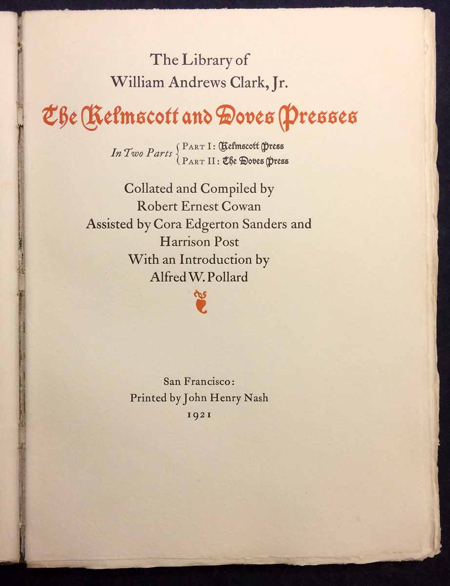
Pollard’s essay was written for the catalogue of William Andrews Clark Jr.’s collection, published in 1921 by John Henry Nash. Rather than a straight historical account of the two presses, Pollard offers a meditation on their influences and influence, particularly in matters of design and typography. He also makes specific, & reverential, mention of Edward Johnston’s opening calligraphy for the Doves Press’s edition of Paradise Lost, which sparked in me the idea to recruit Canadian calligrapher Martin Jackson for the project. Martin and his wife emigrated from England in 1968, and he established a career and reputation as a versatile and creative calligrapher. He has helped on a few HM projects (most recently editioning copies of Aurora Teardrops), and I have been looking for a project that would more expansively feature his work. Luckily the Pollard essay, and my ideas for how to incorporate Martin, appealed to him. During May and June we had several meetings to discuss design ideas and options, which for me were like a master class in visual structures, layout and letterforms.

The page for the new book is very large (10 x 15 inches) to accommodate the Doves leaf (about 9 x 13.25 inches). Martin’s calligraphy – printed in red, from polymer plates – will be featured on the title page, the essay’s opening, at least one initial letter in each spread, and the page numbers. He will also edition (number) the books. After trials with a few different types, we settled on Centaur, which may seem a cliché or safe choice, but really was the face that best suited the text, and complimented (rather than clashed with) the calligraphy and the types on the Kelmscott and Doves leaves. The choice of paper was affected by a special consideration: I knew I wanted some small portion of the edition to have the calligraphy actually done by Martin, rather than printed, so the paper had to be suitable for his pens. Arches text (the 120 g weight) has become my preferred commercial paper, and Martin is happy to work on the Arches wove sheets in any weight, but I was concerned that the book’s large page required a heavier sheet. I often find the 200 g feels too heavy – too rigid – for books, and was happy to discover that Arches makes a 160 g weight. Then everything ground to a halt when I was told it was on back-order.

Printing will start in September. The book runs to just 30 pages, plus the leaves, and each sheet will go through the press four times, so six to eight weeks of printing. Per the number of Golden Legend leaves available, the edition will be 50 copies (1 – 50), plus five hors de commerce (I – V). In the edition’s first 12 copies (& three H/C) Martin will add all of the calligraphic parts by hand, and sign the colophon. We are calling these the “Written” issue. They will be specially bound by Claudia Cohen in handmade paper over boards, embellished with gold tooling, and housed in a box. The “Printed” issue (copies 13 – 50) will be cased at HM with decorated paper over boards. Copies of the Printed issue will ship early in 2019. The Written copies will be issued in the spring.
