Welcome to the quincentenary post from the HM blog. I didn’t realize it was due until I noticed that last month’s guest post from Barbara Hodgson was #499. Her post enjoyed loadsatraffic, so I’ll ask her back when the book’s issued. The guest blogger dodge worked well – lots of views & no work for me – so I have a few more lined up for later in the year.
That’s the binding for my copy of the Stockton book above. The spine is a strip of blue vellum that’s been kicking around for years, the paper is a blotter from when I was painting the actual cover sheets & I just liked how it ended up looking, one side with an orange splotch and the other with a blue splotch.
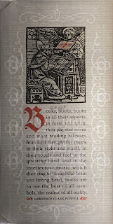
Cameron Treleaven, of Calgary’s Aquila Books, has been helping with the Rimmer project, and sent along the above keepsake with a collection of the ornament cards recently. The keepsake was printed by Brian Queen, on paper he made. The particularly interesting aspect of this sample is the laid screen on which the paper was cast was created using 3D printing technology, which allowed Brian to incorporate the watermark. I haven’t seen 3D being used to make screens like this before. Apparently papermaking is Brian’s avocation; I hope to connect with him for a future blog post.
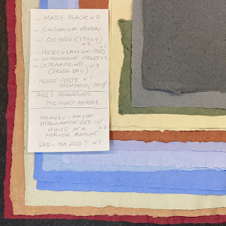
That’s a bunch of Reg Lissel’s HM Text, all vat-dyed for BH’s Around the World in Colour book. She personally “imported” the pigments from Sennelier, in the 7th arrondissment of Paris. Each jar glass jar weighed almost a kilo, and she bought six and then had to get them home without any colorful disasters in an airport. We’ll be including samples in the book about Reg’s adventures in papermaking, which – after years of attempts – is finally coalescing. I once saw a copy of it in 2024, so maybe it’ll be there when we pass through.
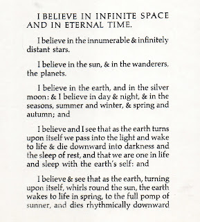
I had cause to be rooting through my Doves shelf this past week, and rediscovered these two slips of tissue with what looks like a trial setting/proof of Cobden-Sanderson’s Credo. I found them in a bookseller’s ephemera bin, years ago. No idea who was responsible or if the text ever got properly printed. Will R. thought the type looks like Zapf’s Aldus. Could be – the & looks particularly right – but the e leaves me wondering...
That’s a tray full of 14-pt Trajanus roman. When the great Will Rueter wound down his studio last year, he very kindly let me take over conservatorship of his entire Trajanus family, sizes 12 to 54, roman & italic. It’s a beautiful face and not often encountered in press books. I have a plan for a get-to-know-you project with it; you never really know a type until you’ve set & printed it.
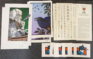
That’s some of the original material that will be included with copies of an upcoming book about Jim Rimmer’s Pie Tree Press & Type Foundry. Each copy will include an original, multi-color linocut, initialed by Jim, from one of his books, plus a few additional items. That might be the next project in the press, or it could be Barbara H’s marbling book (see last month's post). Either way, both should be issued sometime in the fall.
Cameron Treleaven, of Calgary’s Aquila Books, has been helping with the Rimmer project, and sent along the above keepsake with a collection of the ornament cards recently. The keepsake was printed by Brian Queen, on paper he made. The particularly interesting aspect of this sample is the laid screen on which the paper was cast was created using 3D printing technology, which allowed Brian to incorporate the watermark. I haven’t seen 3D being used to make screens like this before. Apparently papermaking is Brian’s avocation; I hope to connect with him for a future blog post.
That’s a bunch of Reg Lissel’s HM Text, all vat-dyed for BH’s Around the World in Colour book. She personally “imported” the pigments from Sennelier, in the 7th arrondissment of Paris. Each jar glass jar weighed almost a kilo, and she bought six and then had to get them home without any colorful disasters in an airport. We’ll be including samples in the book about Reg’s adventures in papermaking, which – after years of attempts – is finally coalescing. I once saw a copy of it in 2024, so maybe it’ll be there when we pass through.
I had cause to be rooting through my Doves shelf this past week, and rediscovered these two slips of tissue with what looks like a trial setting/proof of Cobden-Sanderson’s Credo. I found them in a bookseller’s ephemera bin, years ago. No idea who was responsible or if the text ever got properly printed. Will R. thought the type looks like Zapf’s Aldus. Could be – the & looks particularly right – but the e leaves me wondering...


