

A few quick notes on some books & other things to read, but first: HM's hometown team rools. Go 'hawks.(Note to Vancouver: see how they didn't destroy their own city afterwards?)

David Clifford loaned me his copy of The Book of Books: 500 Years of Graphic Innovation (M. Lommen, ed., Thames & Hudson 2012). Drawing on the impressive collection at the University of Amsterdam, which goes back to the first days of the printed book, the 450-page book contains excellent reproductions of pages & spreads from several hundred books. There's very little text, which might be just as well: the book is primarily structured around specific printers, publishers and (for the last 100 years) designers, and the few paragraphs that accompany each subject offer nothing new to readers familiar with the subject, and are also too abbreviated to be useful to readers wanting an introduction. (Is it an accomplishment or aberration that Aldus Manutius is covered in three paragraphs?) Who that leaves as an audience is anyone's guess. Other reviewers have already noted the mistake of not including a glossary. What writing there is has the overall quality of a first-year term paper groping for some insight or conclusion:
"This book [Aldus' Hypnerotomachia Poliphili] has been highly influential in the arts, especially in iconography. Among book collectors, it is still a sought-after object."
"The Doves Press used handmade paper; the vellum binding is simple."
About Joan Blaeu's atlas: "No other printer was capable of such a monumental performance." I don't quibble with the statement, just its lack of elegance.

Part of the problem with the writing may be that this is a translation; maybe the text seems less abrupt and awkward in the original Dutch. The book's strength really is the number and quality of the reproductions. Including more detailed texts about the printers etc. would have made it unwieldy or cut into the number of illustrations. Those historical and biographical details can be found elsewhere easily enough. Maybe the better solution would have been to include only the bibliographic descriptions of the books shown, and eliminate the brief, subjective and awkwardly written contextual blurbs altogether.

The chapters covering books up to 1900 are mostly filled with the usual suspects; the ones covering the past 100 years offer more surprises. The focus is on design and innovation, with the books included covering a broad spectrum, from Tschichold's Penguin paperbacks to an atlas to corporate hagiography to Monty Python's Big Red Book.

It's a big book, physically. (And like just about every trade book published now, the money went into the printing and they cheaped-out on the binding: the heavy coated-paper text block is already pulling itself out of the case & tipped-on endsheets.) If you're like me, real estate on your shelves carries a premium, so any new additions must be worth the space. If you need a detailed visual reference for books printed since 1450, this is a good candidate. If you're already a student of printing history, this probably won't be much use.
KEEP LOOKING, THIS AIN'T RIGHT
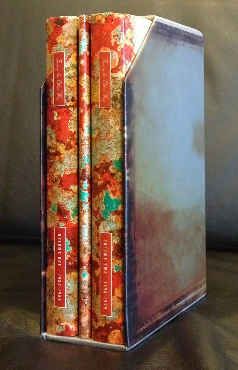
There have been a few excited posts on this blog about Martin Aston's recently published history of the British label 4AD, Facing the Other Way, specifically the deluxe edition of 1,000 copies signed by Aston Vaughan Oliver, the graphic artist for creating the label's distinctive esthetic. Well, the copy we ordered last summer (pre-publication) finally pitched up (I was massively overcharged for shipping), all the way from Germany, in the flimsiest of boxes. Amazing the thing wasn't mashed; I would have been screwed if it had been, as there is absolutely no customer service contact info for HarperCollins. It's always better to buy from a professional bookseller, someone who understands how to ship, talk to customers, etc. but it wasn't an option with these deluxe copies; they seem to have sold out.

Since I've found no comments or reviews about the deluxe issue online yet, I'll offer up a few immediate thoughts about the design and presentation. Eh. I was expecting more. With so much of the label's mystique tied to its visual esthetic, there's a paucity of examples. Each of the two volumes gets one 8-page section of photographs. Granted, this is a book about the label, not Oliver and the other visual artists, and their work has been well recorded in several other publications, but still: the distinctive 4AD album covers were a big part of the label.
The slipcase is one of only two parts of the publication actually designed by Oliver. It's attractive, but the lopped-off top corner looks cutesy and diminishes the case's ability to serve its sole function - protect the contents.
The printing is disconcertingly inconsistent, the text's black ranging from strong to washed out. The paper looks cheap.

The limitation sheet, signed by Aston and Oliver, is tipped into the front of the first volume. It's a screen one-color (black) reproduction of the cover art. Looks like a bad photocopy. You'd think they could have paid for some color and asked Oliver to come up with something interesting.

The deluxe issue comes with a folder containing two compact discs with music by 4AD bands, with a pamphlet listing the artists and contents laid in. The music offers nothing new to the geeks who would have bought this set (they picked "Tony's Theme" for the Pixes cut?!) - why didn't they look in the vaults for live tracks or out-takes? The pamphlet is the other piece of original Oliver/23Envelope design, and it's immediately recognizable as such. The text is printed in metallic colors on semi-opaque paper, one side only, the sheets folded and sewn along the open edge.
I've only dipped into the actual content, so I'll reserve judgment on that. It seems Aston managed to interview the many key names associated with the label, and at least a few seemed willing to speak candidly.
AND ANOTHER THING
Received a note from Robert Reid about a recent study published in Scientific American:
"The November 2013 issue of Scientific American has an article by Ferris Jabr entitled 'Why Brains Prefer Paper' and is a summation on research in various parts of the world on reading information on paper and reading it in digitized form on line. They say, 'Books and magazines may be old fashioned, but they have one big advantage over text that appears in digital media - the mind can more easily grasp the concepts they convey.'

"I'm inclined to extend this finding to oral information as well, because I have just finished reading the reprint of Scott McIntyre's speech given to members of the Alcuin Society last May of 2013. I was at the meeting, looking forward to hearing him talk about the publishing business because Douglas & McIntyre had just gone bankrupt, to the consternation of all of us. Besides I knew him personally through his publication of a book I did on World War II. BUT WHEN I READ THE ALCUIN ARTICLE I REALIZED THAT I HAD RETAINED NOTHING OF HIS SPEECH. IT WAS ALL NEW TO ME, AS IF I'D NEVER BEEN THERE.
"Then, recalling the Scientific American article, I realized how difficult it is to retain anything that isn't written or printed on paper, when all the factors that contribute to memory are present. We have five senses, all of which the mind brings to bear on memory through the relationships of one to another. Holding a book or booklet or sheaf of papers, there is 'heft' or weight to remember, The pages make a sound when turned or shuffled. The 'feel' of the paper is also a factor (smooth, rough, hard, soft, limp, stiff). With books there is even the "smell" of the glue, the book cloth, the paper. About the only sense that isn't involved is 'taste.' This is how we remember: by relationships. Einstein was right: it's relativity all the way down. So, sitting in a room listening to someone talk has its inherent pitfalls too, as the set of relationships one retains in one's memory is not the single intellectual content of the talk, but all the other things going on in the room at the same time which do not add to ones retention."
So, if you found anything of this post interesting, go print it out now.
