Showing posts with label Aurora Teardrops. Show all posts

6.12.16

Aurora Borealis...


...appeared on the wall beside my bed last week.

Quickly...

David Sylvian kindly posted a note about Aurora Teardrops on his Facebook page last week, which prompted some action. Just to clarify/confirm: some copies a still available from Books Tell You Why and Vamp & Tramp, though not many. Probably better to go directly to their sites than work through something like Abebooks.

https://www.abebooks.co.uk/great-polyglot-Bibles-including-leaf-Complutensian/17009913329/bd

Alert!

A copy of a great Allen Press (leaf) book is listed kinda cheap on ebay right now: The Great Polyglot Bibles Including A Leaf From The Complutensian Of Alcalá, 1514-17. Beautifully printed on a handpress (the book & the original leaf!) etc etc. Listed here for probably less than half the usual price, probably because the box looks like it has a few marks etc. But that's what boxes are for! This isn't something I have an interest in, other than aesthetic. (I already have a copy or I wouldn't be telling you about this one.) If you'd rather have the whole thing instead of just a page, here's a facsimile set (check out the raised bands on the deluxe binding - yikes!)...

Apologia (sort of)...

I scorned the recently published Godfather diary in the last post, especially the paperback version. I have since seen a copy, and must dial back my scorn - not fully, but some. It's not really a paperback: it's sewn and put into a case of laminated flexible boards. It still probably isn't skookum enough for the text block's weight, but it's not a "paperback." So all comments about the publisher still stand.

7.11.16

Bed's Too Big...


Saw this in a local "emporium." Caught my eye because book presses aren't often seen around here, and also because the parts seems so out of proportion from each other: why is the base so much bigger than the platen?At first I wondered if it was a Frankenstein's monster, with maybe just the platen being original and the rest ginned up in a metal shop. But there's (faded) scrollwork on the frame, it all looks legit. Why two colors, and why is that base so big? It adds so much weight without apparent purpose. The platen can accommodate at best a small quarto. I'm wondering if it's a copy press, and the larger base is for spreading out (say) a folio document, to be copied one side at a time? Dunno. (But speaking of copy presses, check this out; what every well heeled gent needs...) If anyone wants more photos or info, don't panic: this will be in the shop for a long time, because they've priced it at C$1,295. Good luck with that.

AND ANOTHER THING!


Finally have another batch of Aurora Teardrops (Collector issue) ready to ship out. The cover paper is Guarro laid, from the huge c.1960s stash I've been working my way through. I've never had a use for this yellow sheet before, but it was perfect for Aurora. The paper is quite hard, which makes it ideal for covering boards. It also took the painting treatment well.

Each sheet was individually painted (I use that term loosely) in a two-stage process. First, a sheet was thoroughly soaked in water, and laid out on an acrylic board. As much surface water was retained/sustained as possible. Then metallic gold ink mixed with thinner was dripped on the sheet. Because oil and water don't mix, the gold ink flowed around in random patterns. Then the sheets were dried (that takes about a day), soaked a second time, and sprinkled with metallic bronze acrylic paint diluted in water. The area covered with gold ink repelled the water-based paint, resulting in a two-tone "marbled" effect.

31.10.16

The Point I Was Trying to Make...


This is a coda to last week’s mess of a blog about limited edition books by (or “by”) musicians. I was aware while writing the post that it was failing to address the fundamental questions, So what and Who cares? My task of casing the Collector’s edition of Aurora Teardrops seems to stretch on to oblivion (that's a stack of cases waiting for textblocks, above), so I had a lot of time while standing at the bench since last Monday to ponder exactly what point I was trying to make. It boils down to the concept of the limited edition book.

The editions published by HM are constrained by time and resources. The calculus for balancing edition size and issue price is determined by a number of factors, some quantitative (cost of materials & labor) and some qualitative (how eagerly, or not, the market is anticipated to welcome the publication). The best case is when you bet low and the edition gets snapped up. Too many presses moan about lost profits when this happens, & if only they’d priced the book higher. These people are fools. Too many bet high, & also moan; they too are fools. At HM, production (i.e. printing) is broken into day-sized chunks: each run must be completed in a day. To get an edition of 50 I probably would print 70; allowing for set-up and makeready, 70 impressions of hand-inked type, printed on a handpress, dealing with damp paper, takes me eight to ten hours. If a run takes more than a day, you may as well let it take up all of the second day; that would mean an edition of 100 copies. Now you have 100 copies to sell, instead of just 50. That means more up-front costs, more time, more sales work, more shipping, and a lower issue price because then it’s a larger edition.

(This matter of printing damp is not inconsequential to the production flow: when working off a sheet over four days instead of two, it’s much trickier to sustain the paper’s dampness. It already goes to three days when adding a second color, and by then the sheets are noticeably drier than the day before. A handpress can only accomplish so much in a day.)


By letting production be limited to how many impressions can be pulled in a day, HM’s editions fall into some natural number. The more complicated the printing, the smaller the edition. Aurora Teardrops, which totalled 100 impressions per day (to yield 26 Deluxe and 50 Collector’s copies) pushed things to a limit; there were some long days. The constraints are different for people using mechanized presses (Vandercooks, Heidelbergs, etc etc) because so much of the work is being done by the press - that’s the point of a machine. And this is how most letterpress publishers print these days - they can burn off hundreds of impressions in the time is takes me to get my 70. But they still have material costs, and that tricky calculus of the optimum number to produce. Just because you can easily print more copies doesn’t mean you should.


But none of the books mentioned last week were letter/private press-type books. They were all commercially-produced books printed by off-set litho, some of them from publishers for whom production costs are not a primary concern (ahem Simon & Schuster). The limiting of these editions really comes down to market demand. Except maybe the Dylan lyrics book: 50 signatures is maybe all the time & attention they could get out of Bob.

That book is a good example of my complaint about many of the publications: aside from a mostly arbitrary production limitation and a signature, the publisher doesn’t put any effort into making the book distinct from the usual trade books. There is no interest in making the book itself special or luxe, beyond the famous person’s signature. At its most egregious, it’s blatant profiteering, jacking the price for what essentially is the exact same book as the trade edition, but for the signature. Herb Yellin, the proprietor of Lord John Press, played around with this a bit in the '90s, arranging to buy a few hundred copies of a new trade book in sheets from the publisher, inserting a limitation sheet signed by the author at the front signed, putting it in a slightly better cloth case, and selling it for five or ten times the price of the trade issue (which often where the true firsts). He told me he got bored doing that pretty fast, like shooting fish in a barrel I think he maybe said.


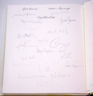
(Yellin produced the greatest of all books that exist only to present the signatures of famous people. It literally is just a collection of original signatures by famous [mostly American] people. That was the last LJP book. I’ll let you ponder whether that’s cautionary or laudatory…)

I haven’t seen it, but that Dylan book looks like all people got for the extra $4,800 was his signature on one of the preliminary pages. Same binding (a flat-back case for a book that is much too big & heavy) and contents as the other 2,950 copies produced. People who’d pay $5,000 would have paid $7,500, and then they could have had their copy in a beautiful, rounded & backed leather binding, something suitable for the size and weight of the textblock (and that premium is way more than needed per copy for such a binding…).

http://www.printninja.com/printing-resource-center/printing-options/book-services/specialty-options/rounded-case-binding

Returning to last week’s examples, Kevin Haskins’ Bauhaus book at least is physically different than the cheaper trade edition, and seems to be doing creative things with graphics and format. Please just make sure the slipcase is big enough. You don’t even really need one: cloth-bound books get worn from the slipcase. If the book is really so precious, it should be in a box. Slipcases are best suited for something like books in limp vellum. No cloth-bound hardcover really needs one. Put the money into a kool jacket instead.


I shaded Genesis Publications a bit last week, but at least they are doing what I’m asking for here: creating books with special, unique content, only part of which is the famous person’s signature. And it looks like they care about things like printing & binding. There may be a little reverse engineering happening - working back from access to the signature to book conception - but they have produced some books that look like fun.

So that’s my point: contemporary commercial publishers should explore opportunities to issue some books in a special, “limited” and luxe format, when the content warrants and the market is interested. I like signed books, especially commercially published ones because it may be the only time a human touched the thing. But don’t be lazy: don’t just stick in a signature. Get a designer with some thoughts - and preferably some knowledge about book binding - involved. Make it worthy of the limitation (however arbitrary that may be) and the signature.

12.9.16

Caseload


Churning through binding copies of Aurora Teardrops, despite constant distractions around here (the most recent, & most distracting of all, is shown at bottom; wasn't my idea). It's a little difficult to get a photo that shows off the interplay of the Deluxe binding's acrylic boards and the vellum prints beneath, but here are a couple of attempts.


Despite being a basic case binding, there are some fussy aspects that have made the first few copies slow work. It's all to do with how acrylic boards are attached to the Japanese paper spine, and then how the textblock is attached to the case (since there isn't a traditional pastedown). Everything hinges on the hinge.


Although I won't be doing the Collector's copies until after the Deluxe, I did one up just to ensure my plan was correct. The cover paper is Guarro laid decorated with a sort-of "direct marbling" technique: a sheet is soaked in water, and then oil paint is dripped on to the surface, diffusing above the water. The sheet is dried, soaked again, and a second application (different color) is added, and then again for a third color. Thus, each copy will be cased in a unique sheet.


Each of the Deluxe copies includes an original watercolor frontis by Jane Maru (with a sewn-in tissue guard). The frontis in the Collector's copies will be one of the two cover prints used in the Deluxe copies (i.e. either the front or rear print, it'll be a coin toss which you get).


The copies shown here haven't had their spine labels added yet. Also, the Deluxe copy will be protected in a slipcase covered in a lovely green Guarro sheet. The first batch should be going out by the end of this week. 

AND ANOTHER THING

HM's new VP Security & Assoc. Dir. Fun. (Nothing's worse than when you have to hire family...)


6.9.16

Aurora Teardrops A Thru Z


Today I picked up what I'm calling the limitation page for the deluxe copies of Aurora Teardrops, from calligrapher Martin Jackson. (This page appears at the front of the book, stating the edition size & the copy's letter within the edition, above the signatures of Harold Budd, Jane Maru & David Sylvian. There also is a colophon, at the back of the book, with the usual details about printing, materials, etc.) Martin is THE calligrapher in western Canada, has been for ages. He previously helped HM on the deluxe copies of Good & Evil in the Garden (he did the titles on the spines of the 10 vellum-bound deluxe copies), and also on Charles van Sandwyk's The Mouse & The Lizard (titles and initial letters). The scope and depth of his talent are incredible, plus he's a prince of a guy. Having him edition the deluxe copies of Aurora Teardrops is just the finishing touch they needed.


29.8.16

Bronze is OK


Been experimenting with decorated papers for binding the Collector's issue of Aurora Teardrops. The one below is getting close (this is image is not very accurate, colorwise). Made with the same bronze ink used in the book. I like the one above but can't recreate it. No clue what was going on there.


Some other experiments below. The Deluxe issue of Aurora Teardrops is now fully subscribed, and about two-thirds of the Collector's is taken up. That doesn't mean you can't get a copy: HM distributes its books through professional booksellers, and that's where most copies are going. If you want a copy of either version, contact one of these booksellers: Books Tell You Why, Vamp & Tramp, or Bromer Booksellers.


Pretty much into the grind of binding copies now. Still have hundreds of prints to trim down; I do them in batches, to preserve fingers & sanity. Not much to say about binding once you're into it: just like printing, grinding out sausages.

http://www.bibliotecapleyades.net/ciencia/esp_ciencia_manuscrito07d.htm

Couple of interesting book stories this past week. The planned publication of a facsimile of the Voynich Manuscript got lots of press. The "English" option on the site of the publisher (Siloe) isn't terribly useful, and the link to information about the facsimile just throws up a low-rez PDF, so I couldn't find the kind of production and material information I was looking for. Many of the mainstream reports parroted this line about the book being printed on a paper developed by Siloe: "Made from a thick paste, the paper will be treated so that the final product has the stiff feel of the Voynich vellum." I guess pulp could be described as a thick paste, and Reg Lissel made beautiful "vellum" paper by over-beating abaca fiber. Maybe they're referring to the surface size being applied to sheets? Dunno.


Other bit of news that got lots of coverage in these parts: Special Collections at the University of British Columbia acquired a copy of the Kelmscott Chaucer. That, plus the large Morris/Kelmscott collection (sans Chaucer) acquired by Simon Fraser University a few years ago, should keep students of Morris et al happy & busy. Just don't feel the need to revive his revival (neither the Chaucer nor any Kelmscott book is the most beautiful book ever printed). Congrats to Rare Books head Katherine Kalsbeek. She's kool (and not just because she's been a supporter of HM).


In case you haven't already heard, Jason Dewinetz is working on a book showing/playing with the various types he has at Greenboathouse Press, including many that he's been casting himself with Jim Rimmer's old equipment. I confess that this is the first new "press" book I've encountered in some long time that's caught my interest, and I look forward to getting my copy. The deluxe issue is sold out, but he still has some of the regulars unreserved. Due before the end of the year. Recommended.

22.8.16

Jane Maru's Prints


Back in the saddle: came home to 600+ Jane Maru prints for Aurora Teardrops. Above is the first complete (i.e. with the prints) copy of the book. We'll do a test binding over the next couple of days to confirm all the final measurements, then into production. Ditto for the Collector's edition (I'm still fussing over the cover paper for that issue; couple of ideas being kicked around). I have promised a second Newsletter, focusing on the binding, and hope to have something ready by this time next week.

The prints are all larger than final size, and I plan on trimming each one differently, so they'll differ slightly (around the edges) from copy to copy. The vellum paper that the prints are on is impossible to trim cleanly (without snags) on a guillotine, so each one has to be done individually, with a blade. I hope I'm not underestimating how much time that'll add to things.

An update regarding availability of copies: most of the 26 deluxe copies are now committed to people who pre-ordered through Books Tell You Why, or to HM's other regular booksellers (who will be happy to sell one to you; if you're having trouble finding with a bookseller who can provide one, send HM a note and we'll connect you).

I'll post any interesting progress photos this week on HM's facebook page.

AND ANOTHER THING

The LA Record ran this interview with Harold in advance on last weekend's show at Whittier College, AND it includes a stream of the first recording that I know about, of music performed at an Aurora Teardrops performance! I think it's a live recording from when he was in Vancouver last January, performing with Veda Hille. She's read the second through fifth poems in the book: Sundown, Solstice, Shadow, & Winds. Kool kool kool...


17.8.16

Gone Fishing


I have not absconded: I'm on vacation this week (not saying where), and had been scrambling with post-printing details for Aurora Teardrops the previous two weeks. One scramble was finalizing the files and materials for the reproductions of Jane's paintings. That got done, and the 600+ prints needed for the editions will be completed when I get back next week. The details of the structure for the Deluxe binding are set (most of the experimenting had to do with how to attach the Plexiglass boards to the spine, and then how to secure the textblock in the case since there can't be traditional pastedowns). Both editions have been collated (the sheets folded & assembled into copies, ready for sewing); I just have to insert the prints. It all got done. I've narrowed down the cover paper options for the Collector's copies, but must now pick one. All in all, we remain on schedule to begin shipping copies in September. For now, leave me alone.

25.7.16

Putting Things Together


Those are three of the 34 full-page watercolors Jane Maru created as frontispieces for the Deluxe copies of Aurora Teardrops. Have started collating copies. The Deluxe binding structure has been tested & finalized; things are happening. Below is a simulacrum of the spread with Harold's score for "It's Steeper Near the Roses" opposite the first poems in the collection, showing how Jane's prints on semi-transparent vellum will overlay the text.


19.7.16

Ta-done (bronzed)


An off-schedule update: With the names in bronze, it is done.


18.7.16

Too Tired to Think of a Clever Title


So this is the next week foretold in last week's post, and we are indeed printing the very last sheet for Aurora Teardrops. It includes the first page of David Sylvian's introduction, and the title page. Tomorrow we'll print the second color on the title page & that'll be that. Wuhoo.

I think all of the discounted pre-publication copies available through Books Tell You Why have been reserved, but copies of both editions (at issue price) can still be reserved. 

11.7.16

Aurora Teardrops Pre-Orders


The first Aurora Teardrops newsletter, with details for reserving copies, went out last week. A couple of the copies offered at a discounted prepublication price remain: contact books@bookstellyouwhy.com for information. If you would like a copy of the newsletter, send an email to us (HM [at] heavenlymonkey.com) with Aurora Teardrops in the subject line.

Production proceeds. Printing will be completed - dei gratia - by the end of next week. 

6.7.16

Steamrolling Ahead


Been printing the preliminary pages for Aurora Teardrops - David Sylvian's introduction, and the short introductions Harold & Jane wrote for each other. That's a detail of "About Jane," above, showing the Cancelleresca Bastarda type used for the book.


Each copy of Aurora Teardrops will include double-page reproductions of Jane's batik paintings, printed on drafting vellum, nested between text pages. Being semi-transparent, these prints both interrupt and overlay Harold’s poems, creating an interaction between the two artists similar to their live musical performances of the Aurora Teardrops poems.


Here's a shot of the press in action last week. The sheet shown includes the page with the score for "It's Steeper Near The Roses."

AND ANOTHER THING!


Peter Braune and his New Leaf Editions gang were making big prints again over the Canada Day weekend, and they had a bigger press (i.e. steamroller) than last time. They also had more artists involved this year.


20.6.16

Books (& etc) by Composers


If asked, Harold Budd describes himself first as a composer, and only second as a performing musician.

One of HM’s founding goals was to work with people - typically visual artists - interested in creating books, but not already working in that realm. That goal, and an introduction through musician Keith Lowe, is how HM connected with Harold Budd and his poetry. I can’t recall how I was first introduced to his arabesque drawings, but that opened the door for experimenting with printmaking, which Harold was game to try. For the deluxe edition of our first collaboration, Colorful Fortune, we experimented with printing photo-engravings of his original drawings. The chapbook “4” and the Carnival portfolio took the next logical step, presenting original copperplate engravings (i.e. intaglio prints) by Harold - he did them directly on the plates with a needle, and we etched and printed them in Vancouver. For Aurora Teardrops, I asked him to create eight new arabesque drawings to be included throughout the book; these are being printed as line engravings (a relief process). I also (finally) talked him into letting me print one of his scores.

All of this is a prĂ©cis to this week’s post, something that’s been an interest of mine: printmaking and similar visual experiments by composers and musicians.


John Cage’s interest in printmaking and graphics is well known. He experimented with printmaking at San Francisco’s Crown Point Press, including setting fire to things. Some of his prints are still available, and you can see (buy) them here but not for cheap. A number of his books present his mesostic texts, but no one seems to have used these as a basis for anything more than a standard trade publication. The only limited edition of his that I’ve been able to find is Mud Book, a (not terribly interesting) youthful collaboration with the artist Lois Long published in an edition of 500 copies in 1983 (and subsequently published in a trade edition). Despite the relatively large edition, the signed copy is uncommon; I can’t find one offered at the moment, and the most recently catalogued copy I found (2007) was $1,500. Granary published a book called Nods in a very small edition, but it seems more an “inspired by” project than an actual book by/with Cage. Good luck finding a copy.


Brian Eno was a painter who started making music, and he has continued creating visual art throughout his career (perhaps most famously his 77 Million Paintings). His 2010 a deluxe edition of his album Small Craft on a Milk Sea was issued, with an original screenprint (not a reproduction: similar to come of his strategies for working in a recording studio, he used a small number of screens to create different visual combinations). That project seems to have got him on a printmaking kick: he created more than a dozen silkscreen prints over the next few years, & it looks like he was using the same process of playing with different screens to build up an image. The prints were issued to coincide with installations, but are also available from his online gallery.


But he hasn’t really played around with creating a book in the same way. The only real “limited edition” book with his name attached that I know of is More Dark Than Shark (discussed in this old post). Chronicle should have done something fun with a few hundred copies of Visual Music (I told you all to buy a copy when you had the chance), but like More Dark… that isn’t technically a book by Eno. He has issued a few different editions of his Oblique Strategies cards over the years, but none of the ones I’ve seen look especially lovely. So, as far as we know, no Eno livre d’artiste to date.


Genesis, in the UK, has established a reputation for publishing elaborate limited-edition books by and with (rock) musicians (mostly ones who emerged in the '60s and early '70s, maybe because that’s the age demographic with the interest and cash to buy the books). They seem well produced, but they’re still just commercial coffee-table books printed offset. Not better or worse, but distinctly different than a book produced letterpress, by hand.

Over in Paris First Third Books is mining a similar musical vein, but with the generation that followed Bowie & the Stones. Again, interesting looking, but still commercially/mechanically produced.


Steering back toward composers, pre-1900 most of the printed materials by or related to composers were scores. Above is a nice little two-page Beethoven doodle. I know of a few interesting books from the first half of the last century. Random House issued a limited edition of the score for Porgy & Bess in 1935, signed by the Gershwin. From pictures it looks like a lovely production (especially the binding), but maybe not easy to find in good condition. Merle Armitage published a tribute to Arnold Schoenberg in 1937, and there 50 special copies signed by the composer, but there's nothing terribly remarkable about the book itself. The most interesting thing I can find from Steve Reich is a facsimile of his score for Drumming, issued in 1972 with two vinyl recordings, limited to 500 copies.


Philip Glass published a sort-of musical autobiography in 1987 (Music By Philip Glass). There was a signed edition of 250 copies issued with a laid-in facsimile page from his score for Akhnaten, but it’s just a trade book tarted up. A more interesting publication is the record of his Einstein On The Beach collaboration with Robert Wilson, published in trade & limited editions by Editions Dilecta. Copies of the limited edition (40 for sale) still seem to be available (at 1,200 Euros), but you’re limited to a maximum of two. And again, it’s really just a well-made trade book, not something created entirely by hand.

http://www.abebooks.co.uk/servlet/BookDetailsPL?bi=17940233317&searchurl=sortby%3D17%26an%3Deileen%2520hopper

AH Allen is an interesting project that involved a number of musicians and composers, including Glass (& Joe Strummer!). It was a tribute to Allen Ginsberg, with contributions by over 40 of his peers and friends. This is what I’m talking about when I use the phrase livre d’artiste: it was set in metal type and printed letterpress by Leslie Miller, beautifully hand-bound by Claudia Cohen, and issued in an edition of just 200 copies signed by the contributors (a lotta signatures). Beyond the content, the book was an expression of fine bookmaking, both in materials and execution. (There are three copies offered online right now, starting at $6,000. I know of a copy going for about half that, if you’re interested…) 


So that’s a brief tour through contemporary publishing by and with composers and musicians. Lots of the books seem to be little more than a signature added to a regular (& often indifferently designed & printed) hardcover. Eh. Aurora Teardrops, on the other hand, was created in deep collaboration with Harold and Jane Maru over the past three years. We explored a number of different design ideas and formats, working toward something that fully exploits the technical and artistic opportunities that doing everything by hand offers. Printing & binding the edition will take over 2,000 hours of labor (contrary to what the prices might suggest, no one gets into this for the money; the guiding principle at HM for these kinds of collaborations is, we’ll all be equally underpaid). The first newsletter to subscribers will go out soon, with details for pre-ordering. Of the 26 deluxe copies, only 20 will be offered for sale; 40 of the 50 regular copies will be offered. A limited number of copies from each issue will be available at a discounted price for pre-order. Details to follow...

17.6.16

Eight Drawings by Harold Budd


I have an interesting post in the works, about books by composers and musicians. But it's taking longer to find all the bits I want to include - plus I'm still printing - so for this week just have a look the eight original drawings by Harold that are being reproduced in Aurora Teardrops. Come back Monday, I promise it'll be interesting.

6.6.16

Long & Short of It


One reason HM has traditionally not published much poetry is that it's harder to print pages with big variations in line lengths than it is to print justified text. The physics of inking with a handroller, and how pressure is distributed over a platen, combine to make the longest lines print heavier, so you have to spend a lot of time fussing with makeready and adjusting the ink bearers to get everything evened out. Most of Harold's poems have quite short lines, but then he likes to throw in at least one really long one on every page. It makes designing a page to accommodate this variation, and then printing it interesting challenges.


A lot of people who have tuned into this blog specifically because of Aurora Teardrops aren't familiar with letterpress printing, & even if they are, they probably aren't familiar with the unique aspects of using a handpress (vs something like a Vandercook or Heidelberg press where inking, and sometimes even feeding the paper, is automated). So, here's a quick overview...

As explained in this post, I always finish a run the same day it starts. The drawings by Harold that appear in Aurora Teardrops were printed before I started the text, so a run means one side of a sheet (two pages). Once the text for a spread is set up in the press, I spend a couple of hours pulling proofs and making adjustments to the ink, makeready (shown below) and roller bearers.


Aurora Teardrops is being printed on paper that is dampened prior to printing (see here for details). This makes it more receptive to ink, meaning less impression and less ink are required, yielding sharper letterforms compared to printing dry (this is why it's such a waste when people don't dampen traditional Western handmade papers when printing).

After the type has been inked, the sheets is placed on the tympan, using the register pins...


...the frisket is lowered to hold the sheet in place...


...the tympan is lowered over the type, the bed rolled in, and an impression is pulled:


Repeat one hundred times. For Aurora Teardrops I print off the Golden Hind sheets for the regular copies first (60 sheets), then the T.H. Saunders for the deluxe copies (40 sheets). A good days lasts seven hours; anything over nine hours is a bad day (& there have been a few). Just over a third of the way through at this point.

I'll soon be sending the first newsletter e-mail out to those who requested a copy. It will include more details, including the prices and a pre-publication discount offer.