Showing posts with label Paper Should Not Always Be White. Show all posts

18.11.13

Monday Mash


Odds & ends to start the week. That's another shot of Claudia Cohen's binding for the deluxe issue of Paper Should Not Always Be White above. One aspect of the binding she was particularly pleased with was using very thin boards (without any warping), making the small 8vo-sized book feel light & comfortable in the hands. Below are the three tooling variations used.


One of our stringers sent this link for a film by David Lynch, a short documentary about a proper lithography studio in Paris.

Speaking of Lynch, we got a copy of his album Good Day Today in the "limited edition" version designed by Vaughan Oliver. Here's an interview with Oliver about working on the project.


Speaking of Oliver, Facing The Other Way, the 4AD history we mentioned last summer, has been released. The 1,000-copy deluxe version - issued in two volumes, which seems a good idea since it apparently is over 800 pages - is supposed to be shipping by the end of this month. So we'll hopefully have our copy under the tree for Xmas. The second consecutive Oliver-related Xmas!
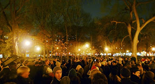
http://taylordavidson.com/2011/unsilent-night

Speaking of Xmas and 4AD, put this joyous sound in your ears, and then this, when you can no longer stand the few dozen marketing-approved tunes we'll suffer through ad nauseum during the next six weeks. And then get this free app, organize a few neighbors on a snowy evening, and do something that's as close to spiritual as a secular humanist can get. Then go home & watch Eraserhead on Xmas Eve.

14.11.13

The Finest Traditions in Hand-Set Type


How's that for a mouthful of busted chiclets? Oddly, it takes more time to set & lock-up a disaster like this than setting it properly. Part of the genius of movable type: it resists being used improperly. But we showed this Garamont who's boss.

All in aid of the new book, which has (yet another) new tentative title: Improvised Impressions. The title reflects the process that came to be used for displaying each face in the book: While there was some general design conceived in advance for each page, the details were worked out on the bed of the press, as the type was set. Where books typically are exhaustively planned in advance, the complete lack of continuity in content or form from page to page in this collection of types allowed (& often required, due to a shortage or complete absence of one letter or another) an improvisational approach. Intuition was the guiding principle. Each page was created in the moment, each step and decision a response to the one preceding it, working within the constraints of the page and what was available in (& lacking from) any given drawer of type.
The entire undertaking is underscored by an impish attitude toward the types on display: respect, but not reverence. Improvising is an act of the moment; the printed pages in this book are permanent records of the improvisations. 

Down to the last few sheets now: the foreword, title page & colophon. The edition will be 35 copies, with the first 15 being a deluxe issue. These will be bound in full vellum by Claudia Cohen, and contain two additional sections (16 pp.), per the last post here. As the image above suggests, the second of those sections gets a bit unruly.


Speaking of Claudia, did you know there actually are three variations to the deluxe binding for Paper Should Not Always Be White? She came up with three designs for tooling the front board & we couldn't pick a favorite, so she did all three. Two of them are shown above. There's no priority or preference (except one's own). We'll post some more images of the deluxe binding next week.

30.9.13

Deluxe Variations


Deluxe copies of Paper Should Not Always be White get closer every day. Claudia leaked the above photo last week, showing three variations on her binding design. How could anyone pick a favorite? Stand by to see which one she chose...

23.9.13

Paper Chase


Since this is books-about-paper month at HM, thought we'd post links to a few sources of handmade paper...


Barcham Green stopped making paper in the mid-1980s, but Simon Green has keeping the firm's history alive, and is also selling off what stock remained. Here's a list of what's available and the prices. Simon also collaborated with Claire Van Vliet's Janus Press to publish Papermaking at Hayle Mill 1808-1987, which is an excellent history of the firm.

Whimsie Studio is a Florida-based site that offers a wide range of arts and crafts-related materials, including a selection of vintage English handmade papers. They also have some interesting print- and paper-related books on offer (like this one).


 Ireland's Griffen Mill continues to make a wide range of papers; ones suitable for printing can be seen here.

The University of Iowa's Center for the Book is making some beautiful Western & Japanese handmade papers, under Timothy Barrett's direction. HM's latest, Paper Should Not... includes a sample of their Chancery paper. They don't have lots of stock lying around at any given time, but they can make batches to order, and at very reasonable prices for what they're producing.


Atlantic Papers carries Vekle Losiny, but it's hard to tell from their site if they carry anything suitable for (book) printing; seems to mostly be stationery.

Twinrocker continues making lovely papers. It is, however, the one contemporary mill not included in our Paper Should Not..., but that's only because none of us had a stash of their paper small enough to contribute to the project.


Montreal's St Armand can make paper to a wide range of specifications. They don't generally have stacks of white book-weight lying around for a project, mainly because people ordering that kind of quantity want the paper customized to their needs and preferences.

And of course, HM's own favorite, Reg Lissel, can be contacted through this page. Think he's again made paste papers for the special copies of the next issue of Parenthesis...

This list is far from exhaustive. However, while papermaking remains a lively craft, few people seem willing & able to make a simple white sheet, consistent & in sufficient quantity for printing a book.

19.9.13

Loosing Marbles to the World


The first batch of Paper Should Not Always Be White, in the quarter leather millimeter binding, went out this week. Claudia's dipping into her stash of old Eva Van Bruegel marbled papers to cover the boards, so the pattern varies from copy to copy. Now she's ploughing through the deluxe copies (Get it? The binder is ploughing through the copies. Clever.) so they'll be ready before the Seattle Antiquarian Book Fair next month. Several of HM's booksellers will be exhibiting there. We'll post photos of the full leather deluxe copies when we have some. As previously reported, the edition is OP, but copies can be reserved through HM's regular booksellers. Likewise with Uncommon Papers, which actually was over-subscribed by one copy (our mistake). We had to give up one of the two edition copies we normally keep, and be satisfied with the trial binding copy in its place.

2.9.13

It's September: Cover Up


Got sidetracked over the weekend making a frontis for Uncommon Paper. Can you tell who we've been hanging around? It's made up from pieces of nine of the 12 papers used in the book. There are better ways to go blind.


Also printed the paper to cover the boards. Tried it in silver but didn't look good. Black always looks good. Now that the cover paper's been printed, we'll case in the test copy & see what adjustments need to be made. Barbara has warned that PVA reacts with the natural pigment used to dye the paper, so it'll have to be wheat paste. One problem miniature books can have is a tendency to not lie flat; they're always a little popped open. Part of the problem is the lack of weight from boards. Trying to minimize, or eliminate that altogether (without resorting to quarter-sewn oak boards).


As reported, the edition is 26 lettered copies. Some of those have to be given to collaborators on Paper Should Not Always Be White*, so we'll probably have only about 18 to offer. Price will be $300.

* Speaking of, first copies of the regular edition will be shipped from Claudia's studio this week. We'll send a note out to everyone as/when their copies are posted, so they can be on alert. The deluxe copies are underway & remain on track for end of the month-ish. 

26.8.13

All in the Family


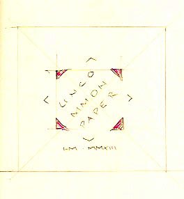
From a sketch at the dinner table last Wednesday night, to setting & printing on Thursday:


We like. Left the imprint & date off; made things too busy. Put those details instead in the colophon. We managed to push the edition up to 26 copies, so we press lettered them in a second color, using Unciala.


The editioning marked HM3's debut at the handpress; she operated the Pratt Albion while HM1 did the inking. Just like the old days.


Barbara reports the cover papers have been dyed & will be delivered later this week. Before then we'll sew the book up & set the ornaments & text for printing on the dyed cover papers. Copies ready next week?

22.8.13

Paper Should Not and Should


That's the trial binding for the quarter leather copies (numbers 11 - 30) of Paper Should Not Always Be White. Claudia will be dipping into her stash of kool marbled papers, so they won't be the same one on every copy.


We'd intended to issue the full leather copies with the seven extra paper (1 - 10) first, but there's been a delay with the leather. These quarter leather copies will start appearing after Labor Day.


While Claudia's working on the bindings, up here at the studio we're on track to finish our miniature book using the off-cuts from Paper Should Not... Printed the preface yesterday, on some unknown (but possibly Italian) bits of a lovely laid paper. As promised, we now have a title for the miniature: Uncommon Papers. Here's the sketch done at dinner last night for a layout.


The decision on a title was goosed by the fact that the only things left to print are the title page and colophon. Looks like the edition will be 25, as planned. Yesterday we sent Barbara Hodgson pieces of thin linen paper made by Reg Lissel (leftovers from The WunderCabinet). She very kindly has agreed to dye them a lovely deep copper-gold, as part of her ongoing dyeing activities for Around the World in Colour. Once dyed, we'll print a pattern of diamond ornaments (like the ones printed inside each paper sample in the book) on the sheets, and use them to cover the thin boards for casing the books in. 

19.8.13

Stripping


Part of the inspiration behind Paper Should Not Always Be White was putting to good use the small batches HM and others had accumulated over the years - a few sheets of this, a few of that. But some of the sheets (about half) had to be slightly trimmed to fit the book's page dimensions. We allowed some variation in width and height, but there's a limit to that before binding becomes overly complicated and, rather than being charming, the book looks like Frankenstein's monster.

Cleaning up the studio after the sheets had been collated & shipped to Claudia, we were left with long, narrow strips of 12 different papers; some Barcham Greens, a few early 20th century sheets, even the remaining scraps of the Blaeu atlas pages. About half were handmade and half mould. All of them much too lovely to discard or abandon. So, we're making another book.

The paper strips range in width (i.e. height) between 2 and 3 inches, so making the book a miniature was obvious. That's a format we've flirted with in the past but aren't really endeared with: too small & fiddly. But in this case, it works. Each sheet is presented as a folio, like they were in Paper Should...., with the maker's name printed on the first recto, and a diamond shaped pattern on the second recto. Some of the strips are wider, and those samples will include a fold-out at one edge to fit the book.


The page will measure just under 3 by 3 inches (as big as we can go while keeping it legitimately miniature). Because the strips were so long, we're able to print with a side-by-side work & turn form. And, it was the perfect project for the little Pratt Albion,* which hasn't been used since its inauguration about a year ago. Yesterday was the first day or printing - we ran off the Amalfi, Warren H. Colson and Blaeu sheets - and the Albion was great. The width between the roller bearers is short enough, and the area being inked small enough, that we're able to use a hand prayer instead of the big roller. The only problem is that the bed doesn't glide back and forth like the Washington; it takes some cranking. There's no shortage of oil in the rails; I think the rails and the bottom of the bed just need to be polished with a few thousand passes. 


The current plan for binding entails Barbara Hodgson dyeing some of Reg Lissel's paper, as part of her current research for Around the World in Colour, printing it at HM with a pattern and title, and then putting it over thin boards for a case binding. There will be a dozen different papers (48 pp.), with a two-page preface. The text is set by hand in Perpetua, and printed in different colors. The edition will be 25 copies; all will have a dozen paper samples, but they won't all have the same 12 samples. Hope to get the printing finished before the end of the week, and have the whole thing wrapped up before Labor Day. It's proving to be a good warm-up for the type sample book, which still doesn't have a title. Nor does this latest distraction, but we should have one by Thursday's post.


* We very briefly toyed with the thought of hauling out the old Kelsey 5 x 8 toy press and using that to print this book. After all, we were so committed to it all those years ago! Plus, printing would be a lot faster. But crappy, too: the Kelsey was hauled out last month to help a bored teenager pass a few summer afternoon hours, and we were reminded of just how useless & weak those things are. But the Heavenly chimp did set and print her first project, a coupon. The text occurred while walking through our colorful (i.e. sketchy) neighborhood on a hot summer day; the layout and setting are all her (limited to the drawers of type she was allowed to use....). When it was done, chimp said - in a polite way - that she hadn't realized how fussy & boring printing was.

22.7.13

Updike's Fifth Champion of Typography


Here are the business details on the new book: it's 30 numbered copies, 20 with 15 paper samples and ten with an extra seven samples. See details for the boosted copies back here.

Copies 1 - 10 (with the extra seven samples) will be in full leather, embellished with gilt as the spirit strikes Claudia when she gets into it. PLEASE NOTE: these copies are fully subscribed.

Copies 11 - 30 will be in a quarter leather binding with the leather extending in a thin strip along the upper and lower edges of the boards, and the boards covered in hand-marbled papers (not all the same pattern). A millimeter-style binding. Ten of these copies remain available as of 24.07.13.

And just to help you imagine how fantastic the bindings will be, up above is the sad-sack copy made up from waste sheets that we (HM) did for our studio copy. Rest assured that Claudia's bindings will look nothing like what you see here.

Copies of the book should be ready for shipping by the end of August. If you're interested, contact one of the booksellers listed opposite; as usual, they get first dibs on new publications from HM, and the edition pretty much looks to be fully subscribed. 


It occurred that posting the extract from Updike's essay that we've printed in the book might help explain the concept, so here it is, taken from ‘The Seven Champions of Typography’ (In the Day’s Work, Harvard University Press, 1924):

"Though ink must be black, paper should not always be white. The somewhat irregular Caslon type (and some ‘period’ and  transitional types) appears much more agreeably when printed on a slightly rough paper of a cream tint. Caslon’s types in his day were printed on wet paper, which thickened their lines and roughened the paper, so that we get more nearly the effect that he meant them to have when we print them on toned, rough paper. If smooth white paper is used for old style types, it exposes their slight crudities of form in a disagreeable way, & accents   too much the shape of individual letters. This is understood by some typefounders, who for that reason often display their old style types on toned paper. Many people prefer a smooth and pure white paper (or think they do) because they look at the paper alone, and do not realize that its color makes any difference in the effect of printing. Some of the lighter modern-faced types look well on a paper that is nearly white; for they are more clean cut, more regular in shape, and have not the irregularities which such a paper reveals. For these types the paper should look white. There are, fortunately, few absolutely white printing papers."

18.7.13

The Royals, Colville & Slow Synthesizers


Plans to do a book marking the birth of the new prince fell through. The family was totally cool, but the agents messed things up. So we're getting to work with the long-promised showing of metal types held at HM. Spent the past few days cleaning up the mess left from Paper.... and also sewing up one set of sheets to be kept in the studio for future reference.


Alex Colville died, alas. Heard some egghead talking about him on public radio last night: eggy mentioned how Colville used "arcane mathematical algorithms, like the Golden Section" to compose his paintings. Who knew anyone who designs anything was an arcane mathematician? 


Someone who wanted us to print something for them suggested we get a Vandercook, to speed up production. We asked why they even wanted to work with HM, since they so clearly didn't understand the fundamental role the handpress plays in what we do. They shrugged. We drive a truck & they want us to play a synthesizer....

15.7.13

Blah Blah Blog


We post every Monday-ish. Blogging is starting to feel very ten-years-ago...

It's too hot to do anything. Sun is counter-productive. We need a good gloom.

The Substrata Festival is this week, in Seattle, but we can't make it, which sucks. Fantastic line-up.

Everyone go check out Ellsworth Kelly.

Paper Should Not Always Be White: the whole edition now rests in Claudia's capable hands. She'll tell us what her final binding decisions are later this week. That's the title page above: very un-HM with all the adornment. Below is our practise page for the colophon. Trying different pens. Eh.

4.7.13

Deluxe Copies Are All Colors


Printed the sheets that will be included in the deluxe copies (only) of Paper Should Not Always Be White over the long weekend. Couldn't be sure how many would make the book in the end until the work had been done, or even how many deluxe copies there would be. It all depended on how many decent impressions from each type of paper we got (or more precisely, the smallest number of good impressions from any one of the sheets).

These extra sheets in the deluxe copies are not an arbitrary limitation: they are papers that we had just a few sheets each of, not enough for the entire edition (which is already small enough). With all the samples now printed, we can report that Updike's words are printed on a total of 15 papers; the deluxe copies will have an additional seven sheets. These are:

Three Barcham Greens: Saunders Blue and Maidstone (both taken from a sample pack sent out from Spicer's - a Canadian paper supply company - in the 1970s), and Turner Grey, a package of which was sent from our friend Will Rueter's collection (along with the original label). It actually is green...


Some very thin J. Whatman mould made, with the date 1958 in the watermark. This means the paper was some of the last made by the original mill before closing in 1963. The name, and cylinder machines, were revived in the 1980s...


And perhaps most unusual of all, a sheet culled from one of Joan Blaeu's Atlas Maior (printed c.1665).


Before you recoil in alarm, these sheets came from a collection of pages from a volume (The Payes Baxos, from the Spanish edition of the atlas) that were found in the scrap bin at a restoration binder's workshop. Apparently the complete volume had survived intact until the late 1990s, when it was found by some barbarian who proceeded to cut out all of the maps and more interesting text pages. He presented the remaining, amputated pages to the binder, knowing they could be used for paper repairs etc. which indeed they were, before we found what was left.


Last run of the book today: the Everson quote (shown at top), which precedes the title page. The prelims are being printed on Arches Wove 120 g, which is heavier than most of the sample papers. To to keep the sections reasonably consistent in thickness, we're printing the prelims (the title page sheet and the two-page foreword) as folios.

The deluxe copies are rounded out with a beautiful cream sheet of Chancery, made at the University of Iowa's Center for the Book (more on that in a future post), and a very blue sheet from Griffen Mill.

With everything now said and done, we can reliably report that the edition will be 30 numbered copies (plus four A.P.). The first ten will include the seven additional papers, and be more elaborately bound. Everything lands in Claudia's bindery next week.

24.6.13

Not All of These Papers Are White


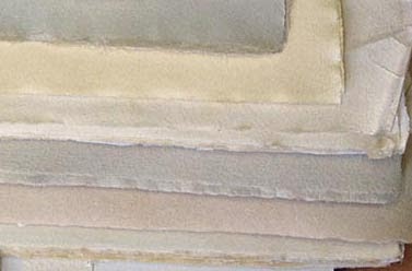
So here's where we're at with the book: above are all but two of the sheets we've printed so far. Today we have to change the points on the press, to go form printing four-up to just two-up, because the remaining sheets came to us in dimensions too small for work-&-turn. Means we'll have to keep them damp between printing the inner and outer formes, but c'est la vie. The sheets still to be done are an unknown, possibly Italian, with a beautiful watermark; some very thin Whatman; the previously mentioned kaichu shi; and a handful of 17th century sheets that will be included in the deluxe copies.


With fingers crossed from the remaining runs, it's looking like the edition of Paper Should Not Always Be White will be 30 copies, with the first ten being a deluxe issue containing (about) six additional samples, bound more elaborately. Price is still tbd (binding structure, materials etc. to be finalized).

20.6.13

4AD-O-RAMA


That's right, professor! A monster book due out this fall will chronicle the history of legendary UK label 4AD. Written by Martin Aston, and embellished with new art & layouts by Vaughan Oliver, Facing the Other Way will be a lap-crushing 800 pages. In addition to the trade edition, there will be a limited edition of 1,000 copies with additional art and two compilation CDs. Copies can be pre-ordered through Amazon. Koolkoolkool.


We've printed a total of 16 different papers for the new book. Above is Griffen Mill (& it looks much more blue in life than here) and below an unidentified Barcham Green. Looks like we'll end up with an edition of at least 30 copies, with about half of those being a deluxe version that includes six additional sheets. Claudia is still pondering the binding. 


17.6.13

Lifting Weights 16 Ounces at a Time

Look, there just isn't that much to write about today. Things go well with the new book: paper is being printed, each different kind adding another example to Updike's essay about the interplay of paper and type. But we're supposed to post something on Mondays, so here's this:


The Arc cross trainer. This has proven to be the solution to the problem of severe right-shoulder joint pain that results from printing with a handpress, particularly when one doesn't print for a few months and then jumps right into a new project. It's been a problem for a few years. Trying to stay in shape during the non-printing stretches through weight training didn't really help. But this Arc thing seems to do the trick, primarily because the hand/arm handles work the same group of muscles as pulling the bar on a handpress. So, there you go: the reason we're keeping up a steady pace on the new book. No, we're not shilling. Just scratching for content. That's what journalism is: making sausages with whatever you got at hand. Sometimes it's real meat, sometimes it's filler...

13.6.13

More Papers & Patterns


Making progress through the stack of papers for the new book. The sheet above bears the watermark of  William H. Colson, Boston, though the paper was made in France. This is the same c.1905 paper that Baskin used for Flosculi Sententarum!

 Today's effort: Crown & Sceptre...


Thinking up different more than 20 different patterns with our meager collection of flowers & ornaments is going to be a challenge. Most start by arranging sorts on the table, fleshing out a general idea, and then doing the actual setting. Here's the "sketch" for what was used on the BG Dover sheet. It had to be revised after a proof pull because two of the six large circles were damaged:


This is BG's Saunders Blue. We had exactly three full sheets from an old paper seller's sample collection...