Showing posts with label Barbara Hodgson. Show all posts

1.8.24

What Happens After The Dunwich Horror?

 
I’ll be updating the The Dunwich Horror site this month, with a few images of a bound copy. Above & below are a few glimpses at the first bound copy with slipcase. Brionys completed printing all the aquatints and covers, so now its all on me to make with the thread, glue & boards. 


I am disinclined to show much of the book before publication
, particularly the prints. For now, below (taken through a glassine filter) is all you get. I want the first experience for people who’ve ordered it to be the complete book held in their hands, not select parts on a screen. Plus, I take lousy photos (again, see above). Once it’s issued I’ll update the Dunwich site a final time, with photos of the prints & bindings. Then the site goes away in January, to be replaced by something new. Exactly what the something new will be is getting much attention recently. Working on Dunwich with Briony has reminded me how much fun we have, and how we we bring the inspire each other to dig deeper. So I’m hoping – her schedule and interest pending – to do several more projects with her over the next year or two. My eyes are failing, my body aches (the handpress takes a toll), I may only have a few more ambitious publishing projects in me (given that a “few projects” would span five years or more), so I want to take advantage of Briony answering my phone calls as much as I can during that time.


I have three projects planned that will pair a brief (& narratively self-contained) excerpt from a novel with original prints, a different artist for each one. The brevity of these texts will allow me to play with some different types and papers, without having to devout an entire year of my life to the project. I think I’ll call them HM XRTS, although Intersticials is good too. We’ll see. The first one should will be ready by the start of next summer. Details to follow. I’m still talking to artists for the other two.


For years Reg Lissel and I have been idly talking about publishing a book about his adventures in papermaking, loaded with samples. I think we’ve finally settled on what the text could be. The next step is for each of us to pull out our stashes of his various papers, sort through them, and figure out what will be included, and how. I’d like to print that book in 2025, and issue it in early 2026. We’ll see.

Before any of these things happen, I’ve promised to print Byzantium’s next book. Titled Textile Designs on Paper: An Archive from Early 19th-Century France, it will continue their exploration of historical methods and materials in the graphic arts. In November 2023, the two were invited by textile historian Susan Meller to look at her collection of 19th-century French pattern books. These large, timeworn albums were filled with small, exquisite gouache designs painted on paper and created as patterns for printed cotton. The idea of combining paper with fabric arts was instantly beguiling, and so their next project began. Each copy of Textile Designs on Paper (4to, approx. 56 pp. + samples) will include approximately one hundred of these gouache paintings, along with an essay by Susan on the history of the designs, techniques and uses of printed French textiles; and an essay by Barbara on the pigments and dyes used to produce the paintings and the related fabrics. 


Each book will also include textile swatches that complement the gouache designs, and a dye book, containing cotton samples of the hues typical of the time. Claudia will bind the edition, in two formats: deluxe (copies 1–10) and regular (copies 11–26). Publication is slated for the second half of 2025.

AND ANOTHER THING!

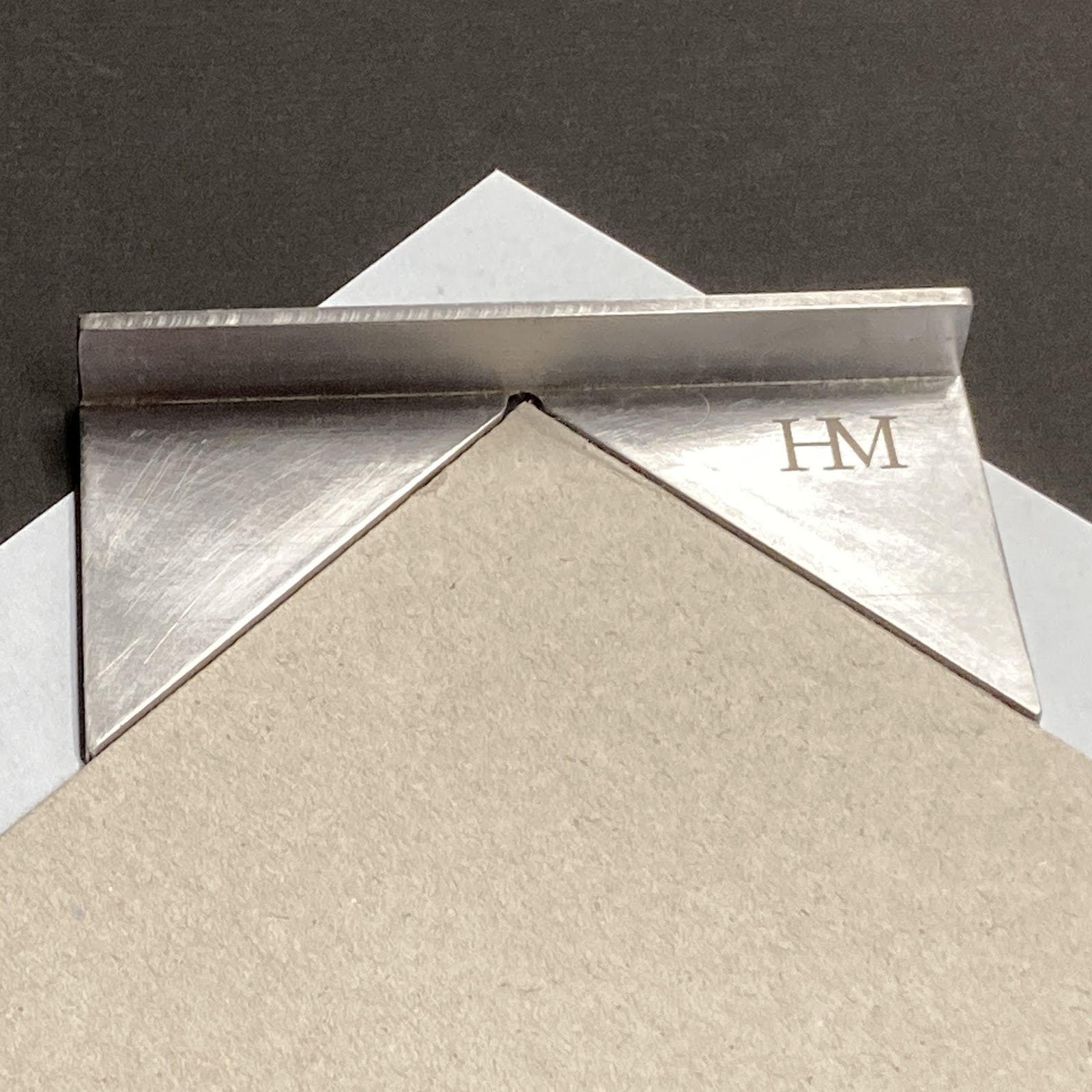
I had a local metal fabricator make this cool jig for trimming the corners of my turn-ins. I’m sure real binders can just eyeball it. We might make a few more, now that he has the pattern on file; send a note if interested.
1.1.24

Barbara’s Marbles


Byzantiums second publication was issued in late November. I got my Printers Copy. Its a study of how the paper used affects the results when marbling. Octavo in format, 35 leaves from frontis (i.e. the marbled sheet facing the title page) to colophon. The type is Fournier, the paper Arches Text. Before you get excited, its OP. 


The title page was marbled before printing. I was concerned the colors might flow when the sheets were dampened for printing, but she was using acyrilics (and she did a test). 


Barbara made the sections initial letters by laying a “mask” cut to the shape of the letter on the marbled surface, then laying down the sheet. Its amazing what clean edges she achieved.
 

The four samples on this spread were all made by Reg Lissel. The one lower left is part of a leftover from Jim Rimmer’s Duensing Titling (HM 2003).


This spread is from the section on Western mouldmade papers, which Barbara
s deemed the most succussful as a group for marbling. At left is a piece of blue Fabriano Ingres, at right is cream MBM Ingres dArches (plain samples below marbled of each).


Barbara made me sign the colophon. She might have done that once before. I don
t think the printer has any reason to sign but shes just making me feel included.


Claudia bound the books in a russet goat with her glorious tooling. Combining those two materials seamlessly is the kind of subtle and seemingly simple detail that delight the experienced eye. 


A THIS & A THAT
 
Stay tuned for an announcement later this month about HMs next project. A sort-of return/coda to 2005? 
 
The day my copy of Marbled Papers arrived, I also got my personal & unique copy of HM=XX, specially bound in full goat with inlays and tooling, by Claudia Cohen. The box for my copy was a half-inch deeper than the others, to accommodate some extra loose samples.

1.6.23

Adagio's C-S , The Master Craftsman


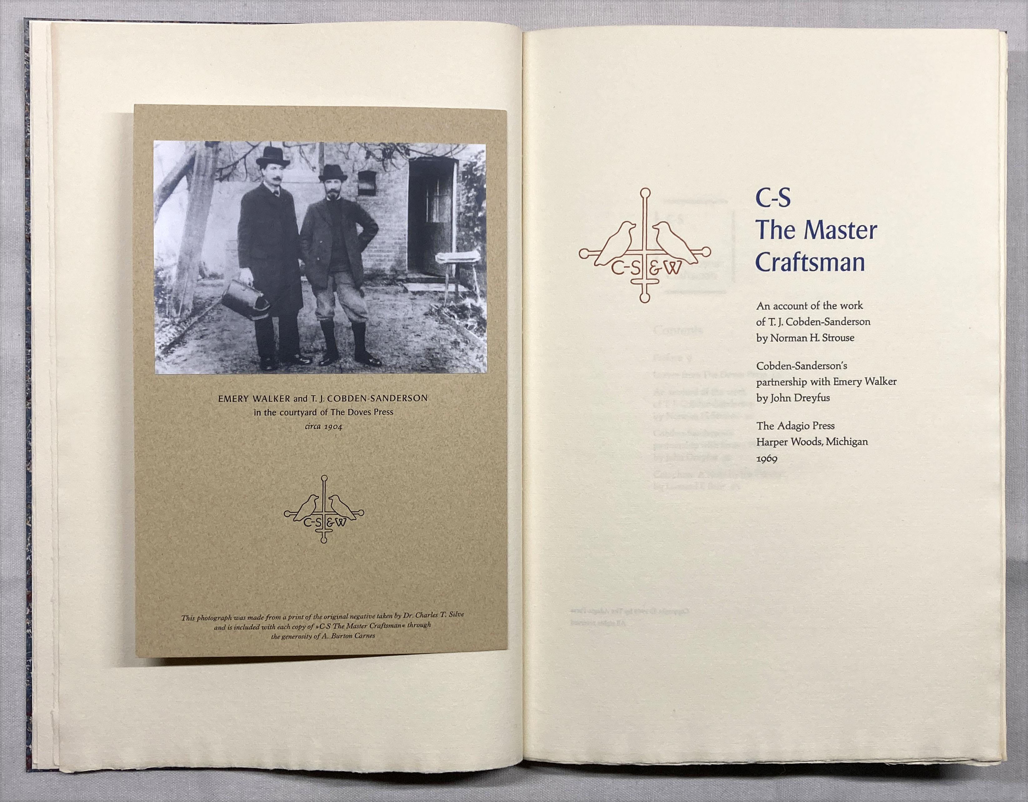
I had a couple of days between projects last month so I attended to a few binding projects. I’d recently acquired a copy of Leonard Bahr’s C-S, The Master Craftsman (Adagio Press 1969) in sheets. I’d seen the book over the years but never felt the beed to own a copy. The copy in sheets was cheap, plus it included several proof and trial-setting sheets, including a completely different title page, which are always of interest to a printer. 


The two Doves leaves required were lacking, but there are enough Doves leaves kicking around HM from the Pollard project Ideal Book projects to easily fix that shortcoming. 


One of the two sheets included in the edition was from the Bible. I still have some of those and chose a bifolium (half a printed sheet; the Bible was printed four up) that showed some of the foxing for which Vol. 1 is infamous.  For the second I acquired a leaf from Paradise Regain
d from the excellent Kelmscott Bookshop.
 

It’s not an uncommon book, copies can be found. It seems to have been bankrolled by the bibliophile Norman Strouse, who provided the leaves and a brief essay about Cobden-Sanderson’s career. There’s nothing new in his essay but it’s engaging enough, and includes a paragraph on
the purpose and value of leaf books, for the boneheads who need it explained. John Dreyfus contributed a more penetrating essay, about the partnership between C-S and Emery Walker, with some speculation  – based on previously unpublished legal documents – on why it disintegrated and C-S later dumped all the Doves type and matrices in the Thames. It paints a sympathetic but not apologetic portrait of C-S. 


This was Bahr’s most ambitious project. The Adagio Press was a private endeavor, a break from the duller jobbing work that paid his bills. (See Will Rueter’s Pressing Matters for more about Bahr and Adagio.)

It’s all the more ambitious when one reads, in his colophon, that whatever he was printing with could only manage a single page at a time, which means each bilofium sheet had to go thru the press four times just for the black, and most sheets have one, sometimes two additional colors! He explains that printing each sheet took so long that dampening the handmade Tovil paper, although preferable, was impossible. At least he acknowledges this shortcoming, and his results were acceptable enough. 


One of the things I didn’t like about the book as issued was the inclusion of a sheet with a photo of C-S and Walker tipped on. (C-S always looks like an insufferable ponce.) This sheet was simply laid into the book. I suspect it might have been an afterthought. I really don’t like books with items laid in (unless there
s a box, and even then...), so I mounted the sheet in my copy opposite the title page. 
 

There were 10 copies  “retree” copies bound up at some time by Campbell-Logan. My copy includes the little slip inserted identifying these as such, so I guess my copy was part of that exercise (i.e. an extra set beyond the 10). I annotated it so as not to defame Campbell-Logan.

AND ANOTHER THING!


Before I got to the binding, I printed the seven sheets that make up the text for Byzantium’s upcoming book about marbling on different papers. For the title page Barbara marbled the sheet, leaving a blank area for the text. She used acrylics so I was able to dampen the sheets for printing (as I did with all the others) without everything running. Each copy will include original marbled samples on at least 51 different papers, grouped by type (handmade, mouldmade, machine-made) and source (Western or Eastern). I believe the edition of 17 copies, uniformly bound by Claudia, will be ready for issue in the fall. 

This month I start printing the next HM book, which also should be ready for publication in the fall. 

Last months Agrippa symposium in London has sparked some requests for copies of HMs About Agrippa. The edition was exhausted some years ago, but Im considering a second printing. If interested send an email please (address at right somewhere).

Next month Ive lined up another guest, Will Rueter, who will share some details and images about what will be The Aliquando Press final book, and an updated bibliography. 


1.5.23

Agrippa (A Book of the Dead) Lives!


A two-day symposium (actual & virtual) about the infamous disappearing Agrippa: A Book of the Dead will be held this month in London. The event addresses some of the many conceptual questions the project sparked, or at least brought into sharp relief: what is a book? What is a book in the digital age? 

The text of Agrippa, published in 1992, was a long free-verse poem by cyberpunk author William Gibson. It was to have been issued in two versions, both limited in number, presenting the same concept: a physical book whose printed text was essentially gibberish, with accompanying etchings by David Ashbaugh. Gibson’s poem was included on a 3.5 computer disc that would auto-encrypt itself after being read once. Similarly, the prints were supposed to have been photo-sensitive, so just opening the book would initiate a change the art. So, Agrippa would present a “reader” with a conundrum: opening the book would change its printed pages irrevocably. Booting the disc to see if Gibson’s text could be read would result in permanently encrypting the text (if it hadn’t already been).  


The symposium is being organized by a PhD candidate, Justine Provino, and most of the participants are scholars who have thought & written deeply about the broad questions Agrippa posed. I’ve been included  because (I think) I’m one of few people interested strictly in the physical aspects of its production, i.e. the most traditional and perhaps mundane aspects. But these mundane aspects posed a number of technical problems to the publisher, and I’m fascinated by the stories about the making of a book, particularly when things go wrong. (See here for a long post about Agrippa and an account of its production I wrote in 2015). 


How much of what was promised in Agrippa’s prospectus ended up happening was long a matter of debate, and answering some of these questions was the focus of my monograph. They couldn’t get the photo-sensitive concept to work, but someone came up with a clever alternative that achieved much the same result. I’ve never been clear on whether the self-encrypting program worked; the copies of Agrippa I’ve seen were issued without a disc. The whole endeavor became somewhat shambolic in the end, but its ambition and provocation inspired many broader discussions (and graduate degrees). 


Agrippa
wouldn’t be classified as fine press by the people who made it or people for whom that phrase means something specific: the production was not the finest. It’s more firmly in the artist’s book realm. Copies rarely come to market. When I wrote my monograph, I found two listed in recent years. One sold on Abebooks for about $5,000, from a bookseller who had it on commission and didn’t really know what it was. The other sold in a modern art auction, for a paltry $800, once again showing that books aren’t really considered art by the market.

If you’re interested in discussions around artists books, what constitutes a book, what is the role of physical books in the 21st century etc etc, this free symposium might be worth dialing in. 
 
AND ANOTHER THING!
 

I
ll print Barbara Hodgson’s Marbling Paper: Experiments to Show That Paper Really Does Matter this month. That’s the title page above: she’ll marble the sheet, then I'll print the text in the white areas. We’ll see how that goes...


1.3.23

Byzantine Marbling in Miniature


I recently realized that inviting other people to write this blog would make my life a lot easier. The first installment of this exciting new strategy goes to Barbara Hodgson, long-time HM collaborator and now master of her own imprint, Byzantium. Her debut publication, Paper Botanists, was issued last year, continuing her long partnership with binder Claudia Cohen. They currently are at work on another major work, but during the interim will be issuing a book collecting Barbara’s recent experiments marbling in miniature...
 

In 1853, English marbler and author of The Whole Art of Marbling, Charles Woolnough, wrote of marbling as a kind of “dark” art. The process was kept so secret that apprentices were taught only one style, in order to keep them from opening up their own workshops. (The image above is French, or Shell, marble pattern, fig. 28a from his book.)  Woolnough declared that manuals published in the years before his own were so “utterly ridiculous” they must be “treat[ed] with contempt.” After the first edition of his book appeared, Woolnough was lambasted by master marblers, convinced that his clear instructions would bankrupt them.
 
Marbling is no longer held to be such an alchemical wonder. Esoteric ingredients such as ox gall—a product produced in the bladder of animals, which is bought from butchers and which is “none the worse for stinking,” as Woolnough claimed—has been replaced with commercial wetting agents to aid dispersal of the colours. Grinding colours is now a job only for purists, as modern prepared paints are as fine as any marbler could ask for. Collecting Scotch or Iceland moss and boiling and straining it to make the mucilaginous carrageenan for the marbling bath needs only a trip to an art store where it is found in powder form.
 
As a decorative book art, marbled papers are reserved for occasional use in limited edition publications; as a craft, they are found as wrapping for boxes and frames. But marbling continues to fascinate, partly because each piece produced is unique, and partly because of its inherent unpredictability. 
 
The following three images show a 5-1/2 x 3-1/2 inch marbling bath in three stages of preparation, with Prussian blue, burnt sienna, raw sienna, quinacridone red, chrome green and titanium white combined and drawn through. The fourth image shows the result on St Armand Old Master’s drawing paper.
 

It is the element of surprise that drew me to the idea of marbling a series of miniature samples on different papers (the image at top of this post shows a piece of Reg Lissel’s gampi, before & after marbling). I had already experimented with ebru, Turkish marbling, and suminagashi, Japanese marbling with ink, after finishing my part of Decorating Paper, a collaboration with Claudia Cohen, in 2014. Following a kind of tradition that began with a three-copy miniature version of our book, The Temperamental Rose, and continued with the more ambitious eight-copy mini WunderCabinet, it seemed fitting to make the suminagashi experiments in miniature form. The resulting book, in an edition of 12 copies, measured just 2-1/4 x 2-7/8 inches.
 

I planned to make Marbling: Paper & Colour, as it is tentatively titled, to be a same-sized companion to Suminagashi, with some 20 samples on a variety of papers, some single page; others double width for spreads or foldouts. The text would be a (very) brief description of the papers and colours used. This plan remained firmly in place until I made a mockup, at which time the idea fell apart. At the miniature size, the pages—which range from 1920s Airmail flimsies to Hahnemühle Ingres—are awkward to turn, the foldouts difficult to fold out and impossible to fold back in. 
 

Now Marbling has been resized to 7 x 9 inches, with two to four safely anchored samples per page. Multiple examples of some 25 to 30 different paper types will be included in each copy. There will be a short foreword and descriptions of the papers and colours, with all text to be printed at Heavenly Monkey. The edition will be a maximum of 20 copies, probably fewer, all uniformly bound in leather by Claudia Cohen. Publication is planned for late 2023.
 

1.4.22

Botany, Paper & Byzantium

Sometime toward the end of this month copies of the debut publication from a new Canadian private press will begin shipping from a bindery (in Seattle). Titled Paper Botanists, it is the latest collaboration from Barbara Hodgson and Claudia Cohen, and continues their tradition of delving into specific topics related to the graphic arts, richly illustrated and elaborately produced. It is also the first of their books published by Barbara’s own imprint, Byzantium.

Like all of their previous collaborations, Paper Botanists delves into an aspect of the graphic arts that appeals to their shared passion for history, materials, methods, and interesting stories. The book charts the history and development of how plants have been represented by artists who struggled to capture realism while aiming for an aesthetic ideal. The books chapters explore the primary techniques that have been used for visually recording flora, from herbaria (pressed plants) through drawing, various forms of printing, to photography and photomechanical reproductions. The text of each chapter is accompanied by a wealth of examples of techniques, about 140 in total. Some of these are historical pieces that the authors (primarily Claudia) have collected in sufficient number for the edition (the oldest included is a hand-colored woodcut from a mid-16th century edition of Hieronymous Bock’s Neue Kreuter Buch), some are illustrations printed with the text and then hand colored (e.g. all colors except black on the title page, at top, were applied by hand), and some are original prints by Barbara, tipped in.

Since at least the 1980’s I’ve been buying herbaria as well as books, prints and drawings of a botanical nature, for pure pleasure,” Claudia says. “When Barbara and I began contemplating this project, more than two years ago, I started scouring eBay sites – British, American, German and French – for ‘orphan’ lots of botanical images from books, as well as interesting, affordable botanical tomes that were usually falling apart or incomplete wrecks/remnants. I also found items in Dutch auction house catalogues. Paper Botanists took shape as many thousands of samples accumulated. We chose what was best and I continued to search for specific samples where they seem to be needed.


A few years ago I purchased a small etching press, thinking I might get around to printing a book that combines letterpress and intaglio on a page. I never did and it was taking up space. In the early stages of developing Paper Botanists Barbara borrowed it to play around and found she had a talent for printmaking (quel surprise). So she adopted the press and ran many hundreds of sheets through it over the past two years, both relief and intaglio, which are included as samples in the book (see bottom of this post for more about her printmaking).

One of the first questions that must be answered when designing a book that will include leaves or samples from other sources, especially a variety of sources, is page size: is it dictated by the dimensions of the largest leaf? Folding samples down isn’t always ideal, especially if two perpendicular folds are required.
I try to be prepared to accommodate samples in ways that show them at their best; in other words, in proportion to the book and without trimming or folding. However, it is next to impossible to exclude an important example just because it does not fit as anticipated. The best way to get around the issue is to remain flexible about the book size for as long as possible,” Barbara says.


Byzantium is the imprint Barbara established in the mid-1990s, when her career expanded from commercial book design to creating her own works. Over the next 14 years Byzantium packaged her four novels and 11 non-fiction books, along with titles by other authors. Those last few years overlapped with an introduction to private press publishing by way of her first collaborations with HM: Good & Evil in the Garden and EXPRESSed: Ten Philatelic Fictions. When HM editions was wound down after the publication of their last book, PatternPattern, in 2019, Byzantium was revived with a new focus. 


My introduction to Barbara’s work was her debut novel, The Tattooed Map (1995). It wasn’t simply a text with accompanying illustrations, it was a book in which the author tells the story with a combination of the two elements. The imagery included original works by Barbara, found items, and collages. Her talent for combining visual and textual elements to create a narrative continued to develop in her subsequent novels, The Sensualist (1998) being my particular favorite. By their very nature her non-fiction books were more traditional in the use of images to support the text, but her passion for deep historical research (finding the most obscure images possible), and her additional role as designer, created lively and engaging works on topics ranging from soporifics (In the Arms of Morpheus, Opium) to peripatetic feminists (No Place for a LadyDreaming of East). 


Barbara’s trade books were expensive to produce – all that color printing, plus die-cuts and other tricky bits in some of her novels. By the mid-aughts the publishing industry was severely contracting (Vancouver’s Raincoast Books went from being one of the country’s largest publishers to defunct within a year of Harry Potter – on whom the company’s entire wealth seemed to stand – vanquishing Voldemort). Barbara was finding more labor, less joy and less remuneration in the work, and designing other people’s books had lost its appeal. Without it being an entirely deliberate decision, she started focusing on books that would fall under the general heading of
fine press.

Part of this move was the association with HM, but an equal influence was connecting with bookbinder Claudia Cohen. The two discovered shared passions for all things graphic and a steady stream of ideas for engrossing projects. Their first was The Temperamental Rose, which presented, and expanded on, intriguing references to color from Western sources. For example, Dante’s The Divine Comedy was represented as a hand-colored pop-up of Purgatory as a pyramid. It was colored with the hues used by Dante in his descriptions of the seven levels that mark the rise from the Inferno to Heaven.


The edition for Paper Botanists is 30 copies plus six artist proofs (i.e. hors commerce), which has been established as the upper limit for how many they can reasonably produce, given the amount of adornment to the printed sheets and the number of historical samples that must be sourced for inclusion. It was designed and set by Barbara in Fournier, printed at HM on dampened Arches cover, and bound & boxed by Claudia. The book will be issued in two states, each with an accompanying portfolio of additional samples: 20 copies will be bound in quarter leather with paste-paper sides (shown at top of this post); 10 will be extra-bound in full leather with additional samples.


Some cataloguers have referred to their books as “artists’ books,” but it’s not a term they use. “
I think of our books as traditional BOOKS, not ‘artist books.’ But it’s like a discussion about religion: there is no conclusive answer and everyone decides for themselves," Claudia says.
 
“The term suggests a focus on art at the expense of words, which is the opposite of what we are trying to achieve with our books,” Barbara says. If forced to adopt any label, she would accept private press – books by and for the primary enjoyment of the creator. Sustaining this enjoyment is one reason the editions are kept to only 30 copies. 

“The original goal of being able to devote unheard amounts of time on painstaking original work continues to hold its appeal. Paper Botanists reaffirmed the pleasure of such labor. In the past, I would occasionally consider slightly increasing the number of copies of a new work, but 30 copies continues to be the realistic maximum,
Barbara says


Too often the small editions and cost of books like the ones they have produced are the first thing remarked upon by people who think all books should cost the same and it shouldn’t be much. Strangely these people don’t have the same reaction when discussing other art forms, such as painting (which by definition is much more exclusionary, there only ever being an edition of one). To this Barbara counters that many of their books end up in the kind of institutions whose purpose is to make them accessible. 

“To those who ask why our books aren’t more widely available, I suggest, if it is feasible, to visit one of the libraries that hold one or more of our books. Even though the books are held in Special Collections, getting to see them usually isn’t as difficult as it sounds, as librarians are generally pleased to be able to show books to interested patrons. There are also fortuitous encounters: I was astounded by the number of people from all over North America who told me they had seen The WunderCabinet on exhibit at the Huntington Library.” 

Details for Paper Botanists can be seen here. Copies should begin shipping by the end of this month. 

AND ANOTHER THING!

Next month HM=XX will be out, so I'll show some pictures & etc. Also, RIP Philip Jeck (see link at right).

APP. 1: BOTANICAL PRINTMAKING 
 
A few of Barbaras adventures in printmaking that are included in Paper Botantists...


A Van Dyke print from an early 20th-century glass negative (5 x 7 inches) that Claudia found on eBay. Its a plant pathogen called Guignardia that attacks grapes.

Image from a stochastic plate. The multiple colours on the plate are applied at the same time for one pass through the press. A sap green/ umber mix is put on in the background, then wiped; a carmine red/ Indian yellow/white mix is put on the flower area, then wiped. A bit of green fading into the edges of the petals helps give them a transparency.

An etching on thin brass.

A linocut adapted from a section of an illuminated manuscript of Bocaccios Famous Women.

Nature print of a magnolia grandiflora ‎leaf.