Showing posts with label George Wither's Book of Emblemes. Show all posts

2.7.18

Augustine Mathewes, Printer (& Rascal)


This month’s post reprints a short preliminary chapter from HM’s recent publication, Labour Vertue Glorie. It’s a biographical sketch of Augustine Mathewes - aka Mathews, Matthews, & A.M. - the man who printed George Wither's A Collection of Emblemes (1635). I won’t be posting any other chapters, and have selected this one simply because it should be of general appeal to anyone interested in printing. Mathewes' printing in A Collection is not an example of the best work being done at the time, not even for England. It’s workmanlike. But the amount of setting and printing involved, with the conditions and equipment of the day (how did anyone see anything?), and his productivity make me feel feeble & lazy. But my printing is better.

The device included on the title page of Labour Vertue Glorie was adapted/appropriated from Mathewes’ own, as it appears on the title pages in A Collection’s four books (i.e. parts). The references included here have been renumbered from what they are in the book, just for simplicity.


AUGUSTINE MATHEWES took his freedom as a Stationer in 1615. The first book he entered to the Register, in 1619, was Thomas Decker’s O per se O, or the belman of London. By 1620 he was working in partnership with John White, who had inherited the printing house of his father, William. In 1624 Mathewes assumed control (“farmes his printing house of John White”) in exchange for an annuity.[1] Mathewes’ name made regular appearances in the Register for the next two decades, sometimes for printing unlicensed works (not an entirely unusual occurrence at the time).

https://en.m.wikipedia.org/wiki/File:Othello_Q2_TP_1630.jpg

Notable books that Mathewes printed include Lady Mary Wroath’s The Countesse of Mountgomeries Urania (1621), which featured a frontis engraved by Crispin de Passe’s son, Simon, and is considered the first published prose romance written by an English woman; an edition of The Troublesome Raigne of John, King of England (1622) with a title page that mis-attributes it to William Shakespeare; and the second quarto of Othello (1630). Mathewes also published two editions of William Haughton’s comedic play Englishmen for My Money, one in 1626 for John Norton (whose name appears as printer on the title page), and the second in 1631 for himself.[2] The original license lay with William White, and must have come to Mathewes when he assumed the business (and its licenses) from son John.


William White had printed George Wither’s fourth book, The Shepherds Hunting, in 1615; it may have been through his association with White that Wither met Mathewes. The printer’s first recorded work with Wither was in 1622, when he printed Cantica Sacra, the publication that prefaced Wither’s protracted patent dispute with the Stationers’ Company.

https://archive.org/details/firstsecondparto1622shak

Things seem to have started going badly for Mathewes in 1636. In the Registers of the Stationers’ Company is a record of Sir John Lambe, who was then investigating London’s printing industry, referring to Mathewes as a “pauper,” followed by the ambiguous statement “(let them agree who shall be, they have now 3: presses:).” The same record states that Marmaduke Parsons “hath kept matthews printing house.”[3]

In 1637 a Star Chamber decree tightening controls on access to presses and printing of all kinds was passed, in part a response to Puritans’ challenges to the Church of England. One of the most notorious Puritan pamphlets inciting the decree was The Holy Table, written and published anonymously by John Williams, bishop of Lincoln. “Williams in essence challenged the policy of calling the holy table an altar and of insisting that parish communion tables must be placed altarwise, at the end of chancels…The revised Short-Title Catalogue lists seven separate editions of this work, all dated 1637, but none of them provide information about stationers in the imprint.”[4] One of the stationers was Mathewes, who was caught printing the tract.


A record in the Stationers’ Register dated July of that year includes a letter written by John Lambe, the Dean of the Arches, addressed to himself. He states that “the forbidden book which must forever be associated with this Decree was The Holy Table,” and lists those “worthy to be authorized printers under the increasing durance to which the Press was now to be subjected.” The letter includes a brief statement about Mathewes: “he was taken reprinting of ye Holy Table. Marmaduke Parsons hath long had his presse and priu[v]ledg[e] made over to him and is most fitt to be in his Roome.”[5] Mathewes was out and Parsons was in. 

http://www.earlyprintedbooks.com/wroth_urania_1621_2o2r/

States Papers Domestic for July, 1637 includes two entries mentioning Mathewes. The first summarizes Lambe’s letter of printers “worthy to be authorized.” The second summarizes Mathewes’ plea for clemency to the commissioners overseeing the printers of London, for his transgression with The Holy Table: “Understanding he has committed a great error, he prays the commissioners to be a means with Archbishop Laud that he may be admitted as a master printer.”[6]

His plea was unsuccessful, and Mathewes seems to have been made an example for the new decree: his name disappears from the Stationers’ Register for the next fifteen years. In 1653 he entered a copy of William Johnson’s book Vocabula Chimica, then oblivion.


1. Arber, E., ed. A Transcript of the Registers of the Company of Stationers of London, 1554-1640 A.D. vol 3. Privately printed, 1876. 700
2. Baugh, A. C. Introduction to Wm. Haughton’s Englishmen For My Money, or A Woman Will Have Her Will. Privately printed, 1917. 92
3. Arber. Registers of the Company of Stationers, vol 3. 704
4. Towers, S. M. Control of Religious Printing in Early Stuart England. Boydell Press, 2003. 241
5. Arber. Registers of the Company of Stationers, vol. 4. 1877. 528
6. Bruce, J., ed. Calendar of State Papers, Domestic Series, of the Reign of Charles I, 1637. Longmans, Green, Reader, & Dyer, 1868. 344 


Here's a P.S. found after publication of LVG...

2.2.18

Potential Bibliomania Outbreak Threatens India


The author & journalist Pradeep Sebastian is based in his homeland of India, but has had several extended sojourns to the United States in recent years. It was during one of these visits, about three years ago, that he contracted what appears to be chronic bibliomania, specifically the strain privata torcular. India, as he’ll discuss in the Q&A below, does not really have a tradition of book collecting (much less bibliophilia), and the modern fine press movement never got a toe-hold. Being already bookishly inclined, he was primed for seduction by the materials, methods and aesthetics of private press books.

Pradeep used his new-found passion as the basis for his first novel, The Book Hunters of Katpadi. The book was published in hardcover in late 2017 by Hachette, but available in India only so far. The story centers around an antiquarian bookshop in Chennai (the capital of the Indian state Tamil Nadu), its owner Neela and her apprentice Kayal, and the discovery of an apocryphal manuscript by the English explorer Richard Burton (below). Events are populated with the kind of odd, colorful and scheming characters that anyone who’s spent time at book fairs or in shops will recognize (including the bookseller who tells you that, while everything in the shop is for sale, unfortunately the book you’re interested in isn’t, no matter which book it is; see here for an account of Pradeep's real-life encounter with one such wastrel).


Pradeep’s novel, like Neela, has an underlying activist agenda: to develop and promote a culture of book collecting in India. Pradeep’s strategy to achieve this in the novel is to liberally sprinkle bibliographic arcana & asides throughout the well-plotted and quickly paced book. (Mentions of HM in the novel brought it to my attention, but I wouldn’t be posting this interview with Pradeep if I hadn’t enjoyed the book. Plus, he just seems such an enthusiastic and joyful person, two adjectives – and possibly the noun too – that would never be used to describe HM.)

Pradeep is back in India at the moment, so we conducted this interview by email.


HM: Give us the short version of your life, particularly when, where & how books (or more specifically, book collecting) came into it. 

Pradeep Sebastian: I became a collector the day I happened on my first fine press book. I had no desire (or the financial resources) to be a collector, but the beauty and brilliance of press books compelled me to begin collecting them. It happened by chance. One day, using a university’s Interlibrary Loan service, I requested a copy of Joel Silver’s Dr. Rosenbach and Mr Lilly, and instead of sending me the trade edition, they sent me the letterpress Bird and Bull edition! I relished everything about it, and if I recall correctly, I held on to it as long as I could, using up my two renewals. I returned it reluctantly. I felt as if an exotic, strange and exciting creature had flown away from me. Could I get one for myself? No; even the lowest priced copy on the antiquarian market was beyond me. At that point the most expensive book I had bought couldn’t have been more than twenty dollars. I now have a copy of that B&B book, but the purchase would come only after nearly two years of dreaming about it.

HM: How did being in the U.S. change your collecting? Did your condition worsen? I know that the start of my collecting overlapped with a period of frequent travel to the U.S., and exposure to all the shops there (vs what we had in Canada) was too much to resist.


PS: It was the example and environment of collecting and dealing that exists in the U.S., Canada and the U.K. that fueled my collecting and bibliomania. It was here that I first encountered the world of the book arts: antiquarian bookshops and fairs, private press printers, rare book dealers and librarians, typographers, book artists, calligraphers, wood engravers, rare book schools and seminars, and several other practitioners of the arts of the book. I was really quite beside myself trying to take it all in. In India we don’t have such a lively, vibrant and ingrained tradition of the Book Arts. As a columnist in India for The Hindu’s Literary Review I had mainly focused on books about books. Time spent in the U.K. and U.S. exploring the rare book world has changed that focus to a column now on the book arts called ‘A Typophiles Notes.’ 

HM: One of the potential risks of writing anything that delves into a specific field of expertise, particularly one involving collecting, is getting some passing detail wrong. Your book deals with the antiquarian book trade, book collecting, one particular & long-established seam in book collecting, and fine & private-press printing. Presumably many of the potential readers of
Book Hunters will consider themselves knowledgeable, and ready to pounce at the first perceived mis-step. Did you find yourself having to consciously balance how much detail to include as the story progresses, i.e. did you find yourself having to pull back sometimes.

PS: I’m afraid I didn’t pull back at all. I wanted to introduce the Indian bibliophile to this world of antiquarian book culture that I had become so intoxicated with, and since it has myriad aspects or levels to it – wealthy collectors, scholar-book dealers, fine press printers, auction houses, and bibliophile societies – I tried to get them all in. So, it’s quite possible mis-steps and some details could be wrong because of this rather overwrought scheme I stuck with.

HM: One of the book’s protagonists is an Indian antiquarian bookseller who wants to promote and develop a culture and tradition of book collecting in her country. I suspect that might be a mission you share with her. What is the current state of book collecting and the antiquarian trade in India?

PS: Yes, yes, I do share that mission with her! Presently, there is a growing interest in rare books among Indian readers and booksellers. There are even a couple of book auction houses. While we do have serious collectors, there is frustratingly no established antiquarian trade or market in the country. Our collectors largely depend on online dealers to fulfill their wants or areas of specialization and focus.


HM: I liked that your book included a few illustrations. It struck me as appropriately anachronistic for the type of story it is. Did you have any input to that, or was it down to the publisher?

PS: My publisher felt illustrations in a book that revolved around the art of the printed book would be a nice addition. The publisher and I offered the illustrator a few references for the kind of bookish images we wanted; however, the credit for the illustrations goes fully to the illustrator [Sonali Zohra].

HM: Would you like to write more adventures for Neela and Kayal? Is there any possibility of your book being published in the U.S.?


PS: It would be nice to imagine up another bibliophilic adventure for Kayal and Neela, though there are no plans for a sequel. I haven’t yet looked into the possibility of a U.S. edition, though bibliophiles in the U.S. and U.K. who’ve read the book are encouraging me to think of one. It would depend on a publisher there being interested enough in the book to acquire it.


HM: Have you heard from any of the English or American booksellers – including Bromers, the Veatchs, Claude Cox, and Vamp & Tramp – you mention in the book? It’s pretty cool being woven into a work of fiction – it probably will be HM’s best hope for posterity, for which I thank you.

PS: No, I haven’t – though that’s probably because none of them know they are in the book! Not only that, I’m sure they don’t even know of my book, there being only an Indian edition. As for HM’s hope for posterity resting with my book – ha-ha.

HM: You clearly are a bibliophile, and possibly a bibliomaniac. I know you’re interested in fine press books, but just how widely beyond that do your acquisitive tendencies range? And is that something you, as a collector, wrestle with – the question of how focused or cohesive your collection should be? 

PS: Yes, I do have it bad for press books, and you are spot on in sensing this. I’m still in the throes of discovery, so I tend to gush and sound breathless in talking about them, having encountered fine press books only some three years ago (you’ve recalled how it was for you in the early years). The discernment that helped me not buy anything and everything that was or is finely printed is deciding on my focus early: collecting fine press books on the books arts, and my collection has largely stuck to this, though in the first year I bought some fiction and poetry.

My bibliomania is unleashed only where fine press book and original leaves or fragments of early printed books and medieval illuminated manuscripts are concerned. I have no interest in modern first editions. If I were to accidentally stumble on some very high spot in that line of collecting, I would in a second trade the damm thing for a bunch of fine press books. Thirty to fifty thousand for one edition makes me only shake my head and think of how many lovely press books one could buy instead for that money. I am by sensibility not a completist collector, so that spares me from having to get the entire output of an author or a press. My focus from the start has been limited to fine press books on the book arts. Fine books on fine bookmaking. And I’ve tried within my collecting budget to acquire the best press books in this field, from modest productions to sumptuous ones. The illuminated and incunabula leaves are a recent interest and more a passing fancy than a focus. Once you get to chasing quires of illuminated manuscript leaves you are in the full grip of bibliomania. These days I’ve learnt to say, ‘Enough’. There is something enticing and promising about contemplating and toying with buying some highly desirable press book and then holding back - the idea of some unseen typographic beauty sitting there waiting to be plucked is more fun than actually getting hold of it.

http://www.leifnorman.net/road-trip-out-west-may-17-2017/

HM: Early in the book you describe Biblio, the book shop where much of the story unfolds. The description starts with something another bookseller had once said to Neela, Biblio’s owner: “ 'The moment I shelve everything, customers stop coming. Now I leave everything lying around and they’re happy.’ As charming and welcoming as that might seem to casual browsers, Neela knew that an antiquarian bookshop that served the serious book collector couldn’t afford to have books lying around in joyful chaos.” That resonated for me because Vancouver’s last remaining downtown used bookshop (image above) is infamous for often being impenetrable due to towers of books and boxes clogging the aisles. Of those two extremes, which do you find more fun to explore?

PS: I still like the sight of bookshops (and rooms in houses) with overflowing shelves, packed aisles and shelving up to the rafters, but purely for aesthetic reasons and the browsing pleasures they seem to offer – but as a collector I know exactly what I am looking for and would like to be shown straightaway to the shelf where the kind of books I am hunting for are kept. Thus, now I prefer the ordered and finely appointed antiquarian bookshop where I am more likely to find what I have come in search of, rather than having to rummage through piles of books to unearth something desirable. The first time I looked at photographs of British antiquarian stores in the two-volumed pictorial record of The London Bookshop, I remember saying to myself, ‘Good God, they more resemble a tidy office! Featuring a couple of desks, some furniture, glass cabinets, and a large but empty (except perhaps for a table) floorspace, and not at all the storybook or Dickensian version of a cosy, dusty, overcrowded bookshop we’ve assumed they must be.’

HM: Who in India is currently making or publishing books that you find interesting in what we’d call a book-arts way? I understand there hasn’t been a fine/private press tradition in the country – your book touches on that – but is that changing? If not fine press, then maybe more in the artists’ book realm?

PS: No one I know, at least in the way I like my book arts printed. There are perhaps one or two small presses or publishing collectives that make handmade books, but their work has not interested me. It’s possible that in the artists book realm there could be more potential because of a long interest and tradition in handcrafted things. But letterpress book arts, no. 


HM: Have you ever been tempted to buy a press and some type…?

PS: More than a temptation it is a fantasy, and will probably remain one because I’m sure I’ll have no talent or eye for it, even though there would be the passion. And then there is the wild goose chase aspect of going round and round in search of a suitable working hand-press, not to mention cases of fine hot metal type in India…..

HM: Your book also touches on the history of type and typography in Indian publishing. Could you recommend one or two titles for people interested in knowing more about that history?

PS: Three essays by Fiona Ross on Indian type in various Matrix issues and her book The Printed Bengali Character and its Evolution would be a good place to start, and for related aspects of Indian book history, a handful of notable books would be: Moveable Type, The Province of the Book, The History of the Book In South Asia, An Empire of Books, and Founts of Knowledge. There could be other more recent titles, but I am forgetting.

HM: What is your greatest find from India? (I mean a book found in India, not necessarily an Indian book.)

PS: My answer will best illustrate the vacuum we have in rare book dealing and collecting here in India – alas, not one interesting find, let alone a great find. Of course, one could turn up rare or interesting antiquarian editions printed in India or about India in India, but they are bound to be mostly in poor condition. All the best Indian manuscripts and books are with dealers abroad or rare book institutions there. What I’ve never found – and likely to never find – is a fine press book here. In the novel, Kayal’s evangelical zeal in trying to stock the bookshop with press books is Biblio’s desperate attempt to help fellow Indian bibliophiles discover the world of fine printing.

Copies of The Book Hunters of Katpadi can be purchased from booksellers in India through Abebooks. But maybe one of the American booksellers mentioned in the novel should bring over a few dozen, and have Pradeep sign them the next time he’s over. If you enjoyed John Dunnings' books, Book Hunters is much much much much much much much better, in the details & plot. Just thinking about all Dunning got wrong in Bookman’s Wake still pisses me off…

AND ANOTHER THING!

Some binding production details & photos for Labour Vertue Glorie will going up over the next 6–8 weeks. Claudia's about to attack the Series 1 and 2 copies. I just have to attach all the spinners (below) to the volvelles first...

1.9.17

The Man in the Window...


…and other stories.

This post might atone for the lightweight stuff that’s been going up over the summer.

Sometimes while at work, particularly when doing detailed, picky stuff, my brain needs a break. If I’m at the computer, one distraction I occasionally indulge is surfing the local craigslist for “letterpress,” or “book press,” or my favorite, “etching.”

I happened to have heard recently an interview on Fresh Air with Robert Wright. He’s a visiting professor of science and theology at Union Theological Seminary, and the author of a recent book (Why Buddhism Is True) that examines connections between Buddhism and Darwin’s theory of evolution, to explain why we seek pleasure but are never satisfied. Speaking to Terry Gross he said:

“The problem of paying attention is a problem of controlling your feelings. If I’m working on a piece of writing, and it’s getting to this problematic stage where I don’t know what to do next, that starts feeling unpleasant. Then suddenly it pops into my mind that there’s this smartphone I want to research because I need a new smartphone. And I enjoy that, I like researching smartphones, and that’s a good feeling. If you really pay attention to what’s going on, when you get distracted and fire up your browser, it’s just a contest of feelings. There’s a kind of thirst you’re surrendering to.”

So that explains the craigslist surfing. But just for printing equipment and prints, nothing else. 

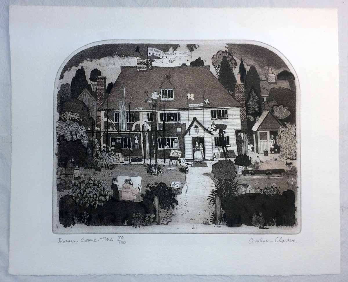
I got distracted from the point of this post, which is a print I found: Scrolling through the dreck posted for sale, I spotted one print unlike the others, most immediately because of the shape of the image area: the top was arched. I’d seen prints like this years ago, the shape and the style, at the home of Jan and Crispin Elsted, aka Barbarian Press. I recognized the artist’s name from their prints: Graham Clarke. I’m not a particular fan of his work, it’s too folksy in content and execution for me. (Folk, as an adjective, is a word I pronounce with a sustained short U substituted for the ol: uuuuu…) It reminds me of Rigby Graham, and I never understood his appeal either.


This particular print of Clarke's also reminds me of the newspaper cartoonist Giles, for the level of activity crammed in. Every anglo kid who grew up in Canada in the ‘70s had at least one, often many, copies of the Giles annuals published at Christmas. They often ended up in the bathroom, and with nothing else to do, kids looked through them. We were oblivious to the specific political or social topics, but his cartoons were great for being packed with all kinds of visual gags and details. There was a shaggy little doughboy with a jacket that was held closed with a safety pin. He didn’t seem to be part of the “Giles” family, but he was always in the background. A proto-Bart Simpson without any speaking lines. I liked him.

Anyway, what really caught my attention about this Clarke print on offer was a sheet attached to the back of the frame. I append it here; see if you can spot what caught my attention…


Pip is what Crispin’s family and friends call him. I knew he and Jan were in the UK in 1978, that’s when they first got into printing. And they were introduced to it by Graham Williams, of the Florin Press. Now we’re getting to what really interested me about this print: not so much the etching, but this sheet on the back, printed by Williams.


One of the first press books I bought, and to this day one of the best I’ve ever bought, was a copy of Monica Poole, Wood Engraver, beautifully printed by Williams on not just one but three handpresses - a Columbian and two Albions. Poole’s work was stunning in detail and execution, and not dull pastoral studies seen in too much wood engraving. Even when her images do stray to the countryside, there’s a sense of menace, and often details that almost seem surreal. Very kool.


The book was set in Optima, which might seem an incongruous choice but it works. Fantastic book, immaculate printing. A cornerstone of the HM Handpress Library. I’d love to get my hands on a deluxe copy, which includes an extra section by Williams about printing the blocks. He was actively printing and publishing through the 1980s, but seems to have devoted himself primarily to sculpting.


I sent Crispin a photo of the print and sheet, and asked specifically about the plans for Clarke & Elsted. My inquiry generated one of his charming notes in reply, part of which I share here (with his blessing): 

"I remember the print. In fact we have one inscribed to us by Graham with its original title, which was "Restoration Comedy", but his dealer in Cranbrook, Kent, thought that it was a bit too lofty, so Graham changed it. We were staying with Graham and Wendy when he made the etching (we were looking in the area for a place to live) and I guess he thought the two names sounded euphonius! The job in question was in fact some restoration work on the front of their cottage, which dates from the 15th century (there’s a date carved in the mantel) in which they still live.

Graham Clarke continues to issue prints, and prices for earlier ones (his career seems to date from around 1971) start at a few hundred pounds. The print on craigslist was just a few pounds, so I bought the thing. I’d thought of laying the text sheet into my copy of the Poole book, a kool piece of (unrelated) Florin ephemera, but it’s slightly too big for that. The print I extracted from its acidic matting. I’ve wondered if finding someone who can cut the arched window in a mat would be difficult, but it’s moot for now.

AND ANOTHER THING!

Francesca's An Alphabetical Accumulation is being sewn & stuffed into limp vellum covers as this is being posted. Copies should be on display at next month's book fair in Seattle. I've added a page on the HM site, under books, with some photos.

I have likewise added a pre-publication page for the Rollenhagen/Wither leaf book, Labour Vertue Glorie, with some production and edition details. I'll be posting images of the book as work progresses, illustrating some of the specific parts, like the working lotterie volvelles.

Anyone interested in either book should get in touch with one of HM's booksellers; they'll have all the details and can assist in reserving a copy.

17.5.17

Like Father


Working away on the Rollenhagen/Wither project, getting close to the press.

The Dutch artist Crispin van de Passe, who is credited with doing the copperplate engravings for Gabriel Rollenhagen's two emblem books, fathered four children, all of whom went on to establish their own reputations as engravers (Simon and William being the best known of the group). They learned working in their father's studios, first in Cologne and later in Utrecht. Crispin's influence on their work was such that scholars and print aficionados have questioned whether prints attributed to the father - like some of the engravings in Rollenhagen's books - were actually done by his children. Perhaps one clue to different hands could be found in the variation of calligraphy for the epigrams. The majority employ a lovely hand like the one shown above. But there are a few that exhibit a different, and less polished, hand. Three like this:


 And then, for something completely different, this one:


Even if slightly wonky compared to the majority of the plates, the calligraphy is a wonderful component of the graphic; shame on whoever decided to cut them out of Wither's book. 

2.1.17

Start with ABCs, Finish with Some Moralls


We’re going to maintain the momentum (finally!) achieved in 2016 through the New Year, with three major publications for 2017.

First in the press, but probably the last of the three to be issued, will be Francesca Lohmann’s calligraphic ABC book, An Accumulated Alphabet. This was originally created in 2014 as three manuscript copies. Over 26 leaves (rectos only) Francesca renders the alphabet, nestled among leafy vines, each page adding the next letter to the sequence. For HM’s printed edition, the previous page will be printed (in black) from polymer plates, and the new letter will be added (in red) by Francesca. Thus, each copy will contain, over 26 leaves, a complete calligraphic alphabet. The title page and colophon will also feature her original embellishments.


The reason this book is first up & last out is all the work to be done by Francesca after the printing, then the binding by Claudia Cohen, who is still pondering the details but has been making vague comments about limp vellum structures. The book will be 28 printed leaves (approximately 5 x 7 inches), the paper being a combination of Crown & Sceptre, T. H. Saunders, and Whatman handmades. The edition will be 30 numbered copies and six A.P. Hopefully issued, through HM Editions, by the end of 2017.


The first book that will be issued in 2017, by HM Editions, is the latest collaboration between Barbara Hodgson and Claudia Cohen: Folding Paper: Technique, Design, Obsession. In a similar manner and format as Cutting Paper, the book explores the art of folded paper, and presents a collection of samples on the pages and laid into the accompanying box. Brief essays discuss approaches to folding techniques, the process of creating illustrated pieces, and paper choices. Interspersed will be over 150 tipped-in examples from pleating, education, computational geometry, toy making, origami and packaging (some examples will be presented shown in progress, as well as finished pieces, in a variety of papers).


Folding Paper (9.5 x 12.5 in., 80 pp.) was designed and set in Monotype Fournier by Barbara. It has been printed on 200 g Arches Wove by David Clifford at Black Stone Press. (For technical reasons, the title page - which will itself be a piece of folded art - was printed at HM on the handpress.) Copies will be uniformly bound by Claudia, with an accompanying two-piece box. The box that will also contain about 15 three-dimensional pieces and a separate Zhen Xian Bao (a magical Chinese thread box). All of the pieces will be created specifically for the book. The edition will be 30 numbered copies, signed by both contributors, plus six A.P. copies. Publication is planned for late spring/early summer. 


The long-promised book featuring original leaves from George Wither’s Collection of  Emblemes Ancient & Moderne (England, 1635) is finally going to hit the press. Details are still being finalized, but at this point we can report that the book will be approximately 8 x 12 inches, 50 pages (plus sample leaves), issued in two states from a total edition of 66 copies.

This is the start of the new publishing schedule, so this is it until he start of February, at which time I'll be posting more images & details about Folding Paper. Please note that if you have any interest in that book, contact one of the booksellers listed to the left for details and discuss reserving a copy.