Showing posts with label Wither's Emblem Book. Show all posts
1.9.17
The Man in the Window...
…and other stories.
This post might atone for the lightweight stuff that’s been going up over the summer.
Sometimes while at work, particularly when doing detailed, picky stuff, my brain needs a break. If I’m at the computer, one distraction I occasionally indulge is surfing the local craigslist for “letterpress,” or “book press,” or my favorite, “etching.”
I happened to have heard recently an interview on Fresh Air with Robert Wright. He’s a visiting professor of science and theology at Union Theological Seminary, and the author of a recent book (Why Buddhism Is True) that examines connections between Buddhism and Darwin’s theory of evolution, to explain why we seek pleasure but are never satisfied. Speaking to Terry Gross he said:
“The problem of paying attention is a problem of controlling your feelings. If I’m working on a piece of writing, and it’s getting to this problematic stage where I don’t know what to do next, that starts feeling unpleasant. Then suddenly it pops into my mind that there’s this smartphone I want to research because I need a new smartphone. And I enjoy that, I like researching smartphones, and that’s a good feeling. If you really pay attention to what’s going on, when you get distracted and fire up your browser, it’s just a contest of feelings. There’s a kind of thirst you’re surrendering to.”
So that explains the craigslist surfing. But just for printing equipment and prints, nothing else.
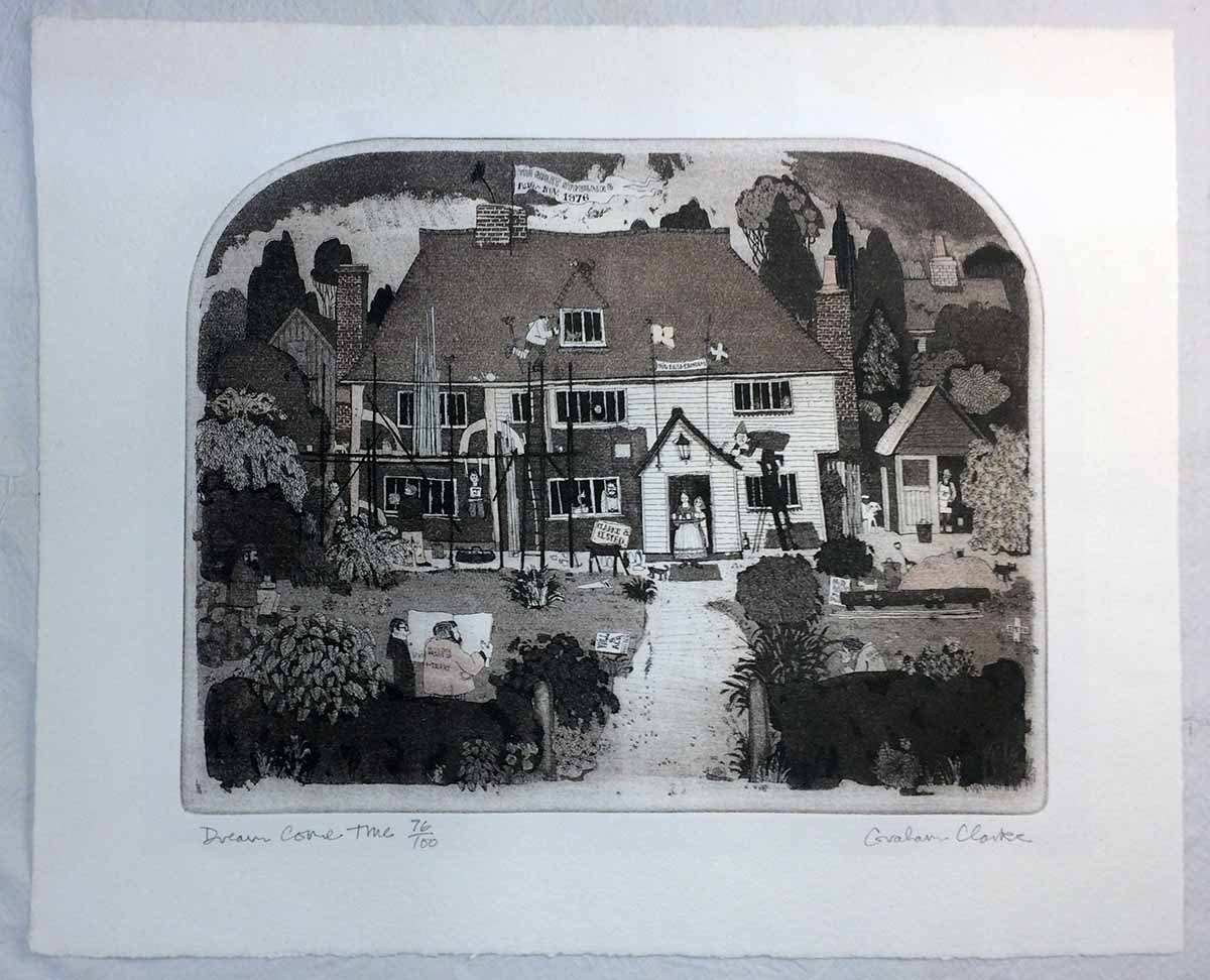
I got distracted from the point of this post, which is a print I found: Scrolling through the dreck posted for sale, I spotted one print unlike the others, most immediately because of the shape of the image area: the top was arched. I’d seen prints like this years ago, the shape and the style, at the home of Jan and Crispin Elsted, aka Barbarian Press. I recognized the artist’s name from their prints: Graham Clarke. I’m not a particular fan of his work, it’s too folksy in content and execution for me. (Folk, as an adjective, is a word I pronounce with a sustained short U substituted for the ol: uuuuu…) It reminds me of Rigby Graham, and I never understood his appeal either.
This particular print of Clarke's also reminds me of the newspaper cartoonist Giles, for the level of activity crammed in. Every anglo kid who grew up in Canada in the ‘70s had at least one, often many, copies of the Giles annuals published at Christmas. They often ended up in the bathroom, and with nothing else to do, kids looked through them. We were oblivious to the specific political or social topics, but his cartoons were great for being packed with all kinds of visual gags and details. There was a shaggy little doughboy with a jacket that was held closed with a safety pin. He didn’t seem to be part of the “Giles” family, but he was always in the background. A proto-Bart Simpson without any speaking lines. I liked him.
Anyway, what really caught my attention about this Clarke print on offer was a sheet attached to the back of the frame. I append it here; see if you can spot what caught my attention…
Pip is what Crispin’s family and friends call him. I knew he and Jan were in the UK in 1978, that’s when they first got into printing. And they were introduced to it by Graham Williams, of the Florin Press. Now we’re getting to what really interested me about this print: not so much the etching, but this sheet on the back, printed by Williams.
One of the first press books I bought, and to this day one of the best I’ve ever bought, was a copy of Monica Poole, Wood Engraver, beautifully printed by Williams on not just one but three handpresses - a Columbian and two Albions. Poole’s work was stunning in detail and execution, and not dull pastoral studies seen in too much wood engraving. Even when her images do stray to the countryside, there’s a sense of menace, and often details that almost seem surreal. Very kool.
The book was set in Optima, which might seem an incongruous choice but it works. Fantastic book, immaculate printing. A cornerstone of the HM Handpress Library. I’d love to get my hands on a deluxe copy, which includes an extra section by Williams about printing the blocks. He was actively printing and publishing through the 1980s, but seems to have devoted himself primarily to sculpting.
I sent Crispin a photo of the print and sheet, and asked specifically about the plans for Clarke & Elsted. My inquiry generated one of his charming notes in reply, part of which I share here (with his blessing):
"I remember the print. In fact we have one inscribed to us by Graham with its original title, which was "Restoration Comedy", but his dealer in Cranbrook, Kent, thought that it was a bit too lofty, so Graham changed it. We were staying with Graham and Wendy when he made the etching (we were looking in the area for a place to live) and I guess he thought the two names sounded euphonius! The job in question was in fact some restoration work on the front of their cottage, which dates from the 15th century (there’s a date carved in the mantel) in which they still live.”
Graham Clarke continues to issue prints, and prices for earlier ones (his career seems to date from around 1971) start at a few hundred pounds. The print on craigslist was just a few pounds, so I bought the thing. I’d thought of laying the text sheet into my copy of the Poole book, a kool piece of (unrelated) Florin ephemera, but it’s slightly too big for that. The print I extracted from its acidic matting. I’ve wondered if finding someone who can cut the arched window in a mat would be difficult, but it’s moot for now.
AND ANOTHER THING!
Francesca's An Alphabetical Accumulation is being sewn & stuffed into limp vellum covers as this is being posted. Copies should be on display at next month's book fair in Seattle. I've added a page on the HM site, under books, with some photos.
I have likewise added a pre-publication page for the Rollenhagen/Wither leaf book, Labour Vertue Glorie, with some production and edition details. I'll be posting images of the book as work progresses, illustrating some of the specific parts, like the working lotterie volvelles.
Anyone interested in either book should get in touch with one of HM's booksellers; they'll have all the details and can assist in reserving a copy.
7.6.17
Red Letter Day
Haven't been completely lazy. Printed two broadsides last month, one for a symposium being held at UBC in the fall. They wanted something Victorian - not my favorite aesthetic, but it's their broadside (and it's appropriate for the symposium's focus). The border was ginned up from a stretch of vines in a Kelmscott book. I also printed a few copies of a different idea that was proposed (by me, above).
The broadsides were good exercise in advance of the Wither/Rollenhagen project, Labour Virtue Glorie, which will be a marathon of printing. It's almost ready for the press; doing final tweaks to the setting & layout. I've been stuck on the question of how and where to use a second color, in the context of a leaf book. How much should the book being published reflect, or at least not clash with, the aesthetic of the book(s) from which the leaves are taken? Pastiche is never a good strategy, but there must be cohesion. Wither's book used a lot of rules on every page; the layouts for L-V-G incorporated a head rule on every page, but it never sat right with me - it looked too much like some contemporary book from a university press. I removed it just recently, and the whole spread just opened up and breathed.
While waiting for a better idea, I had been setting the chapter heads in red - how exciting, another letterpress book with red as a second color. It was looking like a university press book with a generous enough budget for two colors! Again, neither Wither nor Rollenhagen used a second color in their books, but leaving everything just black seemed a bit grim and boring.
It takes me a while, but I usually get there: I had incorporated three-line initial letters, taken from Wither's book, into the layout for Labour Virtue Glorie (chapter openings). The original woodcut letters are open - I could just hand-color them! I did a few tests with different media and tools, and it's looking good. Metallic acrylic paints (the ones I used to decorate the Aurora Teardrops cases) work well. I experimented laying them over a flat (red) base. There are nine letters in each copy, so I may end up only doing them all in the deluxe copies, and maybe just the first in the regulars. We'll see.
2.5.17
Labour Virtue Glorie
Progress on the Rollenhagen/Wither leaf book continues, and we’re in the final editing and setting stages. This much I can report with confidence: the title is Labour Virtue Glorie, taken from Emblem 5, Book I (shown above, superfluous u and all). The text will be set in Monotype Garamond (several sizes) on a page that measures 8 x 12 inches (slightly larger than the Wither page). It will contain reproductions of portraits of both authors; facsimile settings of an emblem (i.e. page) each from Andrea Alciato’s Emblematum Liber (1531)and Charles Quarles’ Emblems (1635); the two volvelles from Wither’s book and the lottery volvelle from the book that inspired Wither, all with working spinners; and brief essays about the books and their production. The edition will be 50 copies, mas o menos, issued in two states: About 20 copies will be issued with leaves containing the same emblems from Rollenhagen and Wither, to allow for comparing the state and printing of the same plates. A mocked-up example is shown below. These copies will be bound in quarter leather by Claudia Cohen. The remaining copies will contain a single leaf from each book, with different emblems, and be cased in decorated paper over boards at HM.
Last month I promised to highlight of few of my favorite leaf books, so we’ll start with the Ashendene Bibliography. Technically this may not be considered a leaf book, since the samples included actually are resettings, but it provides a wonderful overview of the press’s work all in a single volume. It should be the model for anyone doing a press bibliography. Neil Shaver, whose Yellow Barn Press I admired very much, did not include samples in his bibliography, I know not why, but that is the main reason I have never purchased one.
By the way, a leaf is not a page; a page is one side of a leaf. This I was reminded of when consulting John Carter’s ABC for Book Collectors for another matter.
One point about any leaf book, but press bibliographies in particular (they are among the worst offenders in this matter): sample leaves should be attached to a hinge, so that they can be turned like any leaf in the book, and both sides easily viewed. Too many presses opt for the fast and easy alternative of tipping the samples down, making it very difficult to view the verso without creating a new fold or crease.
The Officina Bodoni issued two kool leaf books. The first, in 1929, is the Operation of a Handpress at the Officina Bodoni. Copies are not impossible to find. It was issued in a simple case binding with dustjacket. I found one in busted & bruised boards, and had it rebound by Claudia: beautiful. The other O.P. leaf book is the 1980 bibliography, which is pretty common in the single-volume issue, but there also was a two-volume version in quarter leather, the second volume containing about a dozen sample leaves. That is the version you want.
Jim Rimmer’s Leaves from the Pie Tree is as fun as the man who made it - printed by him in types he designed and cast, and bound by him as well. About the only thing he didn’t do is make the paper. A trade edition was published but, rather than being a facsimile, it was completely redesigned, losing the charm of the original along the way. Jim asked me to proofread the copy for his original; I thought he meant the setting copy, but it turned out that he composed the book while he composed the book, if you follow my meaning. I found a number of niggly style and setting things, and when I took my photocopied sheets over to run through them with Jim, he became increasingly agitated. He finally - in his quiet way - exclaimed that he wasn’t going to reset the whole damn book, and I assured him that many of my red marks were “just personal preferences,” and that the typos were the most easily fixed. I had a box made for my copy of Leaves, to include all the ephemera I’d collected from him over the years.
One of HM’s first projects was Reid’s Leaves, with samples from the private press of Robert R. Reid. If I’d known then how much I did not know, I’d never have undertaken a project of that scope. The large format was dictated by the largest sample leaf, from Kuthan’s Menagerie. After publication, a commercial book designer who was looking through it asked, critically, why the book had to be so big? Which raises another criteria: do not fold a sample unless there is no other option, up to & including not using it. A more satisfactory leaf book from HM, in terms of execution, was Elements in Correlation (above), where the leaves were used to illustrate different physical aspects of printing (specifically handpress printing).
A few years ago I found in a bookseller’s odds & ends bin a yellow card-stock folder, printed in red, A Leaf from the Aldine Press 1535. A keepsake issued by the Friends of the Library at Southern Oregon State College, 1986. Laid loose inside the triptych folder was a leaf from L. Coelii Lactantii Firmiani Divinarum Institutionum…, the collected writings of one Mr Lactantius. The yellow folder is roughly printed letterpress (why in red?!), and a short bibliographic note is laid in, a photocopy reduction from a typed (i.e. typewriter) original. Aldus spun.
This illustrates the point that, if entering the disputed waters of leaf books, one must present the samples with the respect due the publication, printer & author from which they come. An excellent overview of the issues surrounding the ethics and practises of leaf books can be found in Disbound & Dispersed, the catalogue from the Caxton’s Club’s 2005 exhibition. Aldus deserves a better ending than that little yellow folder, so here’s this: Nicolas Barker’s study of the Aldine Greek types, the first edition of which included leaves from four books. The book was well produced at Stinehour - not letterpress, not flashy, but solid in all aspects. Barker himself admits he is not a fan of leaf books, but recognized the value of actual samples appended to his essay. My one criticism: the leaves are tipped to pages instead of hinged. Alas.
Propitius esto scripturam errata.
30.3.17
No to Cannibals, Yes to Leaf Books
Leaf books are going to be a topic around here for the next few years, so I thought I’d do a short introduction to the genre because many people, even those who are interested in printing and press books, don’t know what they are. We’re in the early stages of producing a book that will present leaves from both Gabriel Rollenhagen’s book of emblems (1611) with copperplate engravings by Crispin de Passe, and George Wither’s A Collection of Emblemes (1635), which used the same de Passe plates. Emblem books are a field unto themselves - a black hole if you’re not careful - and Wither’s book in particular is notable for several reasons. For reasons that will become clear below, I’ll start by saying that the leaves we’ll be including with our publication came from broken, incomplete and poorly-treated copies.
A leaf book is a book about another book, one usually published sufficiently long ago that copies are now rare, or at least scarce. Rarity alone, however, isn’t really justification enough for a leaf book: the source book must also be remarkable for some specific reason. The defining feature of a leaf book is that it contains a leaf from the source book. Ideally these are bound in, attached to a hinge to make viewing both sides convenient. Many publishers get lazy and tip the leaf to a page, making it awkward to view the verso. Some books include the leaf in a pouch at the back board (ugly and untidy - too easy for the leaf to become separated from the book), or in a companion folder (better than a pouch, but being bound into the book is always the best course). The content generally consists of some bibliographic details and a discussion of why the book is noteworthy. For example, the spread at top is from a recent score, the first edition of Nicolas Barker's Aldus Manutius and the Development of Greek Script & Type in the 15th Century, which includes leaves from four Aldine books.
Many people, particularly those who are not book collectors or students of printing history, immediately react with horror at the idea of cutting up one book to make another. My usual response to comments like this is, You just don’t understand, it's never about cutting up a complete copy, go away. That, however, isn’t a useful response, especially in the case of leaf books because the criticism is a fair one, and the genre must be approached with sensitivity to its fundamental dichotomy: celebrating printing history while at the same time pulling a piece of it apart.
The first thing to understand is that leaf books typically are a solution to a problem, the problem being what to do when one is presented with an already broken & incomplete copy of an important book. While I’m sure there have been some exceptions, the vast majority of leaf books get their leaves from an already broken copy. That’s one reason why leaf books typically are issued as a limited edition, and the editions are some strange number - the quantity is determined by the number of leaves available.
The Caxton Club mounted an exhibition of leaf books in 2005, and published the excellent catalogue Disbound and Disbursed. It includes an introduction by Christopher de Hamel, which addresses the tricky status of leaf books, and also the fact that “leaf books, for the most part, have themselves been limited edition productions of private presses.” There’s a reason most leaf books have been published by private presses, beyond the fact that private presses typically have a fundamental interest in printing and its history: the edition of a leaf book is limited by the number of leaves available, and private presses exist to publish small (i.e. limited) editions of specialized interest, and in a manner that compliments the leaf being celebrated.
Some of the ethical discomfort with leaf books is discussed in two blog posts by Adam Hooks, an associate professor at the University of Iowa’s Center for the Book. The posts, which are worth reading, have an underlying tone of disapproval, but they also suggest some subtle misunderstandings about book production, publishing, and collecting that are not uncommon among people for whom “book” primarily signifies the content, not the form.
His lead for a post about the 1640 edition of Ben Jonson’s Works includes a comment about the owners of rare books “keen to sell off their copy bit by bit.” This kind of comment comes from someone who is not a collector of books, and does not understand people who are. No collector who owns a complete book is going to break it apart in the hope of selling the bits for more than the whole is worth. It is true that this detestable practise has happened, but usually by nefarious dealers cutting prints or maps out of books, not pages of text. Starting around the middle of the last century, the print and bookselling trades, along with private and institutional collectors, began to actively discourage the practise. Unfortunately, it went on for long enough that in some cases, complete copies of a title are now more valuable than the sum of the parts because so many have been cannibalized.
In a subsequent post that is more specifically about leaf books, Hooks’ unfamiliarity with the genre, and private press publishing in general, are reflected in comments about the book Original Leaves from the First Four Folios of William Shakespeare (1935) like “Why did the Grabhorn Press decide to publish such a book?” and “There is also, alas, more work to do in order to explain how and why The Grabhorn Press got into the business of Breaking Shakespeare Apart.” To begin, the Grabhorn brothers did not decide to print such a book: they were commissioned to produce it by David Magee, a San Francisco bookseller with whom they had a long and interesting collaborative relationship. Just like the Second Folio was printed by Thomas Cotes for Robert Allot, a senior member of the Stationers’ Guild at the time (and one of the five publishers of Wither’s Collection of Emblemes - more on that in coming posts). It seems likely that Magee was the source of the leaves, and that he would have encountered them through his ongoing business. (Likewise the Grabhorns didn’t publish Leaves of Grass; they designed and printed the edition for Random House, and making 1930 the culmination of their careers is premature. I would argue that their magnum opus was the three-volume bibliography of their work, with many sample pages included - an extensive and glorious leaf book!) The fact that the edition consists of only 73 copies (not a nice round number, like 70 or 75) tells us that no books were broken for the leaves, but that Magee (or someone) saved the fragments of a copy from the scrap bin (look through the scrap paper box of any binder who specializes in restoration, you’ll be amazed what you’ll find).
All of which is quibbling and not entirely on point. Hooks’ concern for protecting books from cannibalizing is right and just. But publishers of leaf books are not cannibals, they’re preservationists and geeks for printing history. Leaf books are a solution for what to do when you are presented with a damaged, incomplete copy of a rare book. If it’s in the category of an early Shakespeare folio, or just about any incunable, you probably have a box made and be happy for the parts you have. Depending how much is missing, you could potentially have facsimiles of the missing pages made, and have the book reconstituted. On one hand, digital printing makes this easier than ever, but on the other good facsimiles should be (relief) printed, like the original sheets, and on similar paper. Just having a leather spine rebacked will cost a few hundred dollars. If you start getting into complete rebinds, with paper repairs, by a binder knowledgeable of the period materials and techniques, you’ll be over a grand fast. There’s the rub: the cost of conservation or restoration (not the same things), versus the market value of the book. If a complete copy could be sourced for (say) $10,000, and any restoration work would cost even a quarter of that, you’re better off buying the original; a reconstituted copy will always be a distant second in terms of both reference and monetary values.
So, what to do with a book like George Wither’s Collection of Emblemes, when the copy lacks the title page, frontis engraving and numerous other pages, is badly stained and edge-worn in places, with most of the remaining pages detached at the center fold? Strictly speaking it isn’t a rare book: at least one copy usually can be found on the market, probably in the range of $5,000 - $10,000 if complete. Even without replacing the lost pages with facsimiles, just repairing the pages remaining and having them put into some kind of appropriate binding would cost a few thousand dollars. Isn’t worth the outlay. But you can’t just bin the pages! Using them as the basis for a leaf book is much more interesting than selling them off piecemeal. It’s also more respectful to the work, especially when the pages offer an opportunity to explore aspects of the book beyond its content, such as when, how & why it was produced, and by whom. These are the kinds of details that appeal to people interested in printing history generally, plus all the others who will be interested in whatever specific topic the book discusses. It’s not about collecting relics, it’s about using the fragments to sustain a connection with the original work.
In the next month or so I’ll post some of my favorite leaf books.
AND ANOTHER THING!
Speaking of leaf books and Whitman and grass leaves, I remembered this was tucked on one of my shelves. It's not really a leaf book, because the contents were printed specifically for this, but the contents also are pages from the Grabhorn's edition of Leaves of Grass. Does that pencil mark on the lower right corner look like it might be Valenti Angelo's signature?
30.5.16
Golden Sheets
Got a bunch of pages from a broken copy of the Kelmscott Press' Golden Legend, enough (50) to publish some kind of leaf book. Question is what text to put with it, especially since Neil Shaver already did a (beautiful) publication about the Golden Legend, with a leaf. We'll think of something. Have to finish our other promised leaf book first, George Wither's 1635 book of emblems. That one hopefully will hit the press this fall.
The poor copy these sheets came from seems to have never even been read before it lost its spine - some of the sheets are uncut at the head. You can see the register-pin holes at the folds (book was printed in quarto).
Not much actual news to report from Aurora Teardrops, other than printing proceeds on schedule.
7.4.14
Leaves from Wither's Book of Emblemes
Finally digging into the project about George Wither's 1635 A Collection of Emblemes, Ancient & Moderne. Whole sections of libraries are filled with books about the history, tradition, iconography etc etc of Renaissance emblem books; the focus of HM's project will be Wither's book itself, the story of its production, with each copy containing one (possibly two) leaves from a broken copy that was presented to HM by a longtime patron who knows of my interest in printing history & leaf books.
There have been several facsimile editions of Wither's book, notably from the Scolar Press and the University of South Carolina, but the reproductions really don't do the book justice. The original's letterpress is a bit rough, but the engravings by Crispin van de Passe are stunning in execution & printing. The original leaves included in the HM project will give readers the opportunity to admire them first-hand, as well as scrutinize the 17th-century combination of letterpress and intaglio printing, the paper, the type and ornaments.
Part of the process for planning this publication entails deciding what parts of the book are worth reprinting. The original frontis, by William Marshall, is a likely candidate, if only to juxtapose the (historically well regarded) image with Wither's passive-aggressive full-page Preposition on this Frontispiece, in which he explains that he didn't actually like the image Marshall created, but included it anyway. Nice guy.
Other parts of Wither's preliminaries offer interesting insights to the book's conception and production, and those also are candidates for reprinting (not in facsimile; newly set). It might be fun to reproduce all of the initial letters used in the mottoes, together on a spread. And the various head- and tailpieces could be incorporated to any newly set text. As for original content, I plan on including a survey & discussion of what various academic and bibliophilic sources have written about Wither's book of emblems since its publication.
One of the unique elements of Wither's book is the inclusion, at the back, of a "lottery" - a parlour game people could play, spinning pointers on two volvelles included at the back of the book, the results sending them to a particular "lot," or emblem, in the collection. Most existing copies of Wither's book lack the volvelle page, or have it in facsimile - proof of its popularity with readers. The HM book will include our own facsimile of the volvelles (reproduced from a complete copy kindly made available to HM by the staff at the University of British Columbia's Special Collections & Rare Books Library), along with the two-line mottos that serve as titles for each of the 200 emblems, so people can at least play an abbreviated version of the game.
The page size will be slightly larger than that of the broken copy providing sample leaves, about 7 x 11 inches. Some of the leaves are in rough shape (like the pair above, which even include some old casting repairs), and may require washing and resizing before being attached to a tab & sewn into the HM book (they will not be tipped in, which is the laziest & least useful way to insert sample sheets to a book.) The edition size will be determined by how many leaves can be salvaged from the pile we have, but I expect it to be 50 copies, with a portion of these forming a deluxe issue containing additional leaves and a more elaborate binding. Ready for early 2015?
Subscribe to:
Posts (Atom)


