Showing posts with label Will Rueter. Show all posts

3.7.26

Art vs Illustration (& etc.)

 
The past month has been so busy I forgot I had a July 1 deadline for this blog. I'm sure what follows will read like something bashed out in a hurry...

Most of the recent activity was related to issuing and shipping Sci-Fi Violence. Thanks to everyone who sent comments and thoughts about the poem and the book; apologies to all who didnt get a chance to order a copy. For those who responded to reserve a copy of the chapbook reprinting, its in the press right this minute, but Briony needs a month or so to finish the frontis. Copies will be ready by the end of the summer.

The next HM publication is in the pre-press stage. The artist has signed on and were finalizing things, foremost the paper(s) well use. I won’t share details of the who and what until its closer to publication, but I will share that the book feels like a complementary follow-up to Sci-Fi Violence in tone and ambiguity (although it is prose). Its a story Ive wanted to print for some years but only last year did the artist whose work suited appear. 
 

Beyond that, 
Im hoping to a series of books, each one a collaboration with an artist featuring new, small prints around some theme or topic or their choice. The format is entirely inspired by (copied after) Barry Mosers Cirsia. Intaglio prints will be featured but its not a requirement. There will be no text beyond a title page, a very brief introduction, and colophon. Each print will be presented on a recto. The editions will be small – probably no more than 30 copies – because the artist will be doing all their own printing, and uniformly bound at HM (that is to say, each edition will be uniformly bound, but series will not be uniform in size or binding).
 
 
On that point, a quick aside: I had an interesting conversation with an artist today (not the one wholl be collaborating on the new book) about how operations like HM approach the incorporation of art (i.e. prints*) to a project. If the word illustration is used in a books description, I think it says a lot about how much freedom the artist is given to respond to, or expand on the text. Ive never seen the point of inviting an artist to contribute, and then telling them what to do. I've also never been interested in publishing books with images that simply & literally illustrate what's happening in the text. There are logistical issues and physical parameters that need to be set down – e.g. page size, the number of prints, how & where theyll be inserted to the text block   all ideally decided in consultation with the artist. However, in terms of what their contribution – the art – ends up being, the publishers role is to pick the artist and then stay out of their way. I didnt see any of the prints, or even sketches, for Sci-Fi Violence until they all arrived, ready for binding. We discussed how many prints, the paper, and whether the double-page prints should fold out or be presented as two halves, but ultimately these decisions were hers. I can imagine instances when illustration is what the publisher wants, but in that case you dont need an artist. This is basically the story of Barry Mosers dis-satisfaction with his experience working with Andrew Hoyem on the Arion Moby-Dick. Ive always wondered if Hoyem didnt fully explain to Moser from the start what he wanted (historically accurate technical illustrations), or if Moser didnt fully hear or believe what Hoyem said. 

* Unless the original image matrix is digital (like Scotts were for Epilogue), photo-offsets and digitals arent prints, theyre reproductions. Combining letterpress with photo-offset reproductions seems contradictory. Unless its what the artist wants to do, in which case it might be interesting. But if the artist wants to do it because they dont know how to make actual prints, its just reproductions. 


I
ve also been pulling together items for the promised summer book sale on the HM site. Its gotten bigger than originally planned, for a few reasons. In addition to a group of books pulled off my own shelves, and a small group of HM titles (last copies mostly), there will be a number of HM titles from the library of long-time HM friend David Clifford, plus an interesting group of Aliquando Press books that fell out of Will Rueters move to a new studio. Ill be sending a notice out to the mail list when the sale pages go live (before the end of July). 
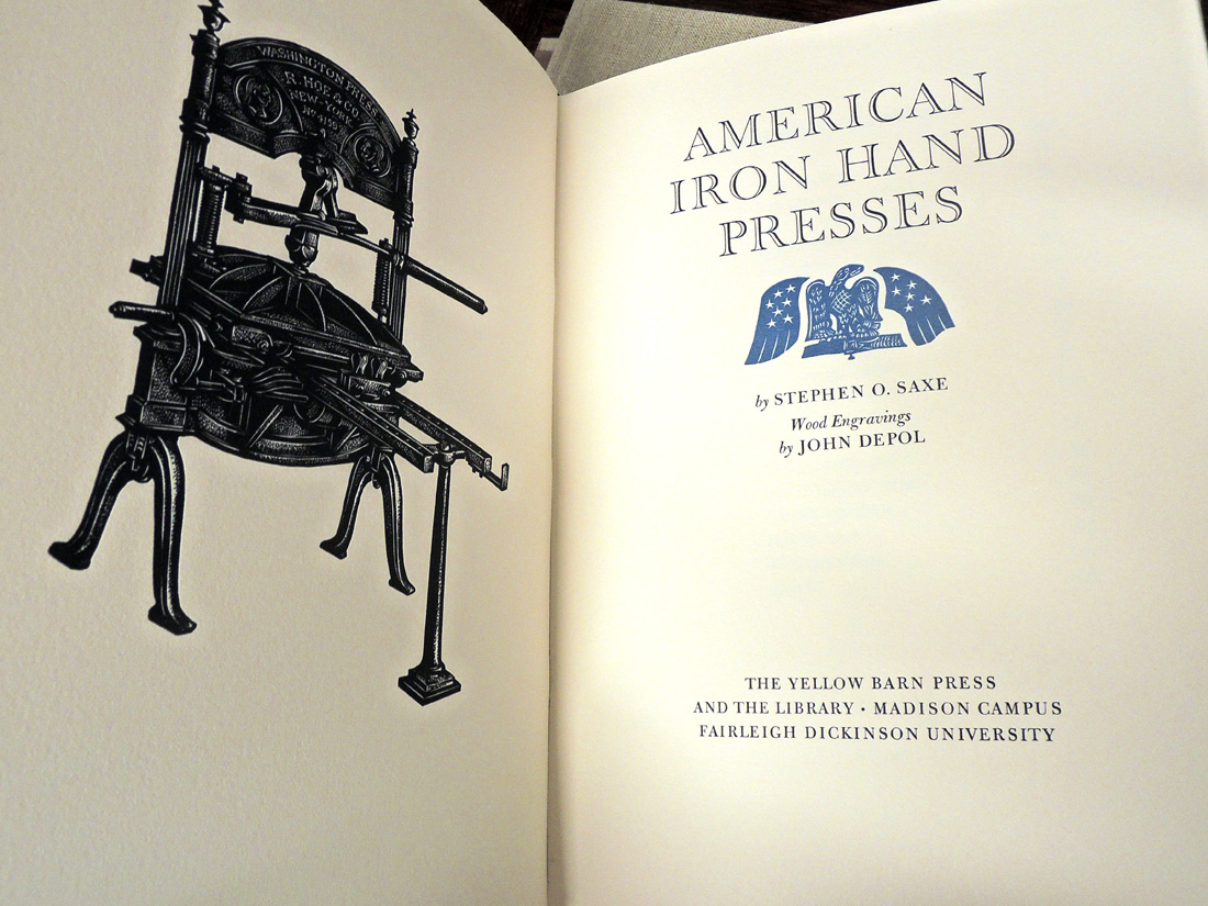

Finally, another conversation I had since the last post, about the phrase handpress, as in printed with a handpress: a handpress is a type of press wherein what
s being printed is inked by hand, rolled under a platen (by hand), and printed (by hand). A press operated by hand is not necessarily a handpress: a Kelsey or Adana tabletop, or even a C&P treadle, is not a handpress (even though the printer is risking their hand every time they feed a sheet into the clamshell). I guess a Vandercook with its inking unit removed (so the type is inked by hand) would be a handpress, but I dont think may people use Vandercooks that way. When all this started, I was offered a beautiful Korrex Nürnberg Hand press gratis but for reasons that remain vague, I wanted to print on a handpress. So I gave the Korrex away and spent loadsadough to buy my big ugly & beautiful green & yellow O-S. Life could have been so much easier with the Korrex, but probably less fun. Having said that, if anyones looking for a big green & yellow press, get in touch... 

Much of this post must sound dogmatic, for which I do and do not apologize. In pursuits like this, one needs clear definitions and opinions. I promise not to miss the October 1 deadline. 
 

1.8.23

Will Rueter's Last Aliquando Book (not really)


Another guest blog, this month Will Rueter of The Aliquando Press, writing about his avocation of six decades, over 100 books, and his latest & last (sort of)...
 
 + + +
 
Thanks to the suggestion (and generosity) of Our Heavenly Monkey himself, this is my first blog. I’m very honoured to use this space to celebrate The Aliquando Press’ 60th anniversary.
 
In December of last year The Aliquando Press completed the printing of its last book. My concentration needed for longer-term projects was diminishing, my eyesight wasn’t good enough for setting small sizes of type, and the realities of life outside my private press world needed more attention. It was time to stop printing before I really screwed up. 
 

For almost five months before and after the Press’ closure I packed, distributed, founted, and helped move seemingly tons of type and equipment, and then unpacked countless boxes in our basement, where I continue to discard detritus from the Press. (Moral: When in doubt - or not –
THROW OUT! You really can’t print on postage-stamp-sized offcuts or use two-decades-old grotty ink.) Happily, the temporal Press in all its manifestations has found good homes, most specifically at Massey College, University of Toronto, where students will be able to use my collection of typefaces that represents more than five centuries of letterform design. The idea of the Press and its potential remain with me, but I haven’t had time to grieve over its demise.
 
The last Aliquando Press book, Serious Play, is the summation of an idea that took root in December 1962. At art school I realized that I had found a passion for typographic design and specifically that I wanted to make books. Operating a private press as an avocation allowed me to learn the basic skills of book making and create books for pleasure. My fascination with book design led me to a career designing academic books for the University of Toronto Press and my naive early attempts at printing became a life-long obsession.

For about ten years I klutzed about, enjoying choosing texts, collecting and experimenting with type, colour, and paper, and learning simple binding. Eventually I realized that the pleasure element, while still evident, was giving way to the challenge of producing more serious books and printing.
 
I’ve always been obsessed with the austere beauty of books from T.J. Cobden-Sanderson’s Doves Press. His book design is magnificently minimal. In my own printing I’ve tried to strike a balance between C-S’s vision of the Book as a pure, sin-free ideal and the raucous, get-your-hands-dirty approach of the printer who actually enjoys printing. The truth lies somewhere in between.

For six decades the Press has been an alter ego, reflecting (I hope) my better qualities and tolerating my more objectionable ones. It has taught me as much patience and curiosity as I am ever likely to have. Through its activity I have met and made friends that I never expected, and I have been able to admire and (full disclosure) envy the work of many private presses. The solitary nature of operating a private press has been balanced by the Press’ many friends and mentors, from whom I have learned so much and whose camaraderie I value greatly.
 
HM asked me to add photos and comments about some recent Aliquando Press books that might be of interest to viewers. The final book from the Press is Serious Play, cobbled together from Daniel Berkeley Updike’s Printing Types: Their history, forms and use. I hadn’t paid much attention to Updike’s writings until relatively recently. His passion for typefaces, well-made books, and Doing.Things.Right. increases my respect for him. I added a fairly brief Afterword to Updike’s text as a ‘memoir’ of the Press and how much it has meant to me.

The book (25.5 x 16.5 cm, 41 pages) was set in Jim Rimmer’s  Nephi Medieval and Duensing Titling types and printed on Zerkall and Hahnemuhle papers. I played with Glint ornaments (the first ornaments bought for the Press decades ago) to create the initials. There are also a few photos showing my old studio. As with most Aliquando Press books, the edition is 40 copies, quarter bound in linen cloth with my own decorated paper on the boards.


In contrast, Steale Not Thys Book (11.5 x 9.5 cm, 31 pages) has gone over to the truly ridiculous side. It’s a small book of warnings and invectives, printed on Hahnemuhle  Archiv paper and using the full arsenal of the Press’ type, cuts, and ornaments, and bound in various marbled and decorated papers. Whenever I look at it I’m reminded why private printing is also supposed to be fun.


I’ve always enjoyed alternating the printing of prose and poetry. A chance encounter with Michelangelo’s sonnets in translation made them the perfect choice for a late Aliquando Press book. Beauteous Art’s Embrace (18 x 12cm, 28 pages) is set in Blado italic with Hadriano initials and Primula ornaments, printed on mouldmade Zerkall Nideggen paper, and quarter bound in Nepalese ‘sun print’ paper. I find Michelangelo’s thoughts on art and life very comforting at this stage of my life.


Having printed a number of Cobden-Sanderson’s thoughts on books and printing over the years, I wanted to complete the cycle with something more intimate. My final C-S book, Work & Beauty: Selected writings of Thomas James Cobden-Sanderson (16 x 11 cm, 33 pages) is set in the beautiful Trajanus type of Warren Chappell, printed on vintage Golden Hind paper, and produced to match – more or less – the format of C-S’s octavo Doves Press books.


William Morris has also received late attention from the Press. In A Visit with William Morris (16 x 12 cm, 41 pages) I reconstructed his words from four contemporary interviews to reveal an informal side of the master printer. The book was set in a version of his Kelmscott type and it includes my Cavatina ornaments and a reproduction of a wood-engraved portrait of Morris. It’s bound with a medieval-style overlapping cover.
 
I have loved music all my life and several Aliquando books have been inspired by music. My final offering is Laudes Musicae: Words in praise of music (18 x 12.5 cm, 45 pages), a compendium of quotations using a wide variety of type, paper, and ornaments. It’s my homage to the most consistent, comforting, and sustaining of the arts.


The general typographic style of The Aliquando Press has always been on the conservative side of conservatism (thanks to Cobden-Sanderson’s influence), but over the years I’ve enjoyed experimenting with ornament combinations, colour, formats, and papers. One of the biggest challenges has been to create bindings that were conduits to the text, yet were appropriate to the author’s ideas. I’ve run the gamut of experimental bindings and have found myself (as I do now) with printed sheets to bind after new projects are begun. An edition is only controllable if you completely bind at least ten copies reasonably promptly, then concentrate on completing each binding stage with the remaining copies before moving on to the next step. That approach seems to make edition binding less onerous: a fact I’m finally learning.
 
For anyone who fantasizes about letterpress and the craft aspect of relief printing, you would be well advised to think carefully before investing in what has become an obsolete craft. Some art schools have letterpress equipment and a good university may offer courses and/or equipment as part of a bibliography program. Staining your fingers with ink and producing an image from letterforms is addictive but it requires serious commitment as well as good humour and patience – and, always, love of the craft rather than hope of financial return.


Though I would never call myself a particularly good printer or binder, it’s been fun finding interesting texts to print and, I hope, being a reasonably good steward to the author’s words. Very sadly, I think the Golden Age of Letterpress has gone. But the Book as an ideal of perfection remains, and I hope the physical book will continue to inspire, delight, offend, and enlighten us all for many decades to come.
 
If you are interested in any Aliquando Press books still on hand or want to chat, send an email to me at dovecotte[at]cogeco.ca.