Showing posts with label Printmaking. Show all posts

3.7.26

Art vs Illustration (& etc.)

 
The past month has been so busy I forgot I had a July 1 deadline for this blog. I'm sure what follows will read like something bashed out in a hurry...

Most of the recent activity was related to issuing and shipping Sci-Fi Violence. Thanks to everyone who sent comments and thoughts about the poem and the book; apologies to all who didnt get a chance to order a copy. For those who responded to reserve a copy of the chapbook reprinting, its in the press right this minute, but Briony needs a month or so to finish the frontis. Copies will be ready by the end of the summer.

The next HM publication is in the pre-press stage. The artist has signed on and were finalizing things, foremost the paper(s) well use. I won’t share details of the who and what until its closer to publication, but I will share that the book feels like a complementary follow-up to Sci-Fi Violence in tone and ambiguity (although it is prose). Its a story Ive wanted to print for some years but only last year did the artist whose work suited appear. 
 

Beyond that, 
Im hoping to a series of books, each one a collaboration with an artist featuring new, small prints around some theme or topic or their choice. The format is entirely inspired by (copied after) Barry Mosers Cirsia. Intaglio prints will be featured but its not a requirement. There will be no text beyond a title page, a very brief introduction, and colophon. Each print will be presented on a recto. The editions will be small – probably no more than 30 copies – because the artist will be doing all their own printing, and uniformly bound at HM (that is to say, each edition will be uniformly bound, but series will not be uniform in size or binding).
 
 
On that point, a quick aside: I had an interesting conversation with an artist today (not the one wholl be collaborating on the new book) about how operations like HM approach the incorporation of art (i.e. prints*) to a project. If the word illustration is used in a books description, I think it says a lot about how much freedom the artist is given to respond to, or expand on the text. Ive never seen the point of inviting an artist to contribute, and then telling them what to do. I've also never been interested in publishing books with images that simply & literally illustrate what's happening in the text. There are logistical issues and physical parameters that need to be set down – e.g. page size, the number of prints, how & where theyll be inserted to the text block   all ideally decided in consultation with the artist. However, in terms of what their contribution – the art – ends up being, the publishers role is to pick the artist and then stay out of their way. I didnt see any of the prints, or even sketches, for Sci-Fi Violence until they all arrived, ready for binding. We discussed how many prints, the paper, and whether the double-page prints should fold out or be presented as two halves, but ultimately these decisions were hers. I can imagine instances when illustration is what the publisher wants, but in that case you dont need an artist. This is basically the story of Barry Mosers dis-satisfaction with his experience working with Andrew Hoyem on the Arion Moby-Dick. Ive always wondered if Hoyem didnt fully explain to Moser from the start what he wanted (historically accurate technical illustrations), or if Moser didnt fully hear or believe what Hoyem said. 

* Unless the original image matrix is digital (like Scotts were for Epilogue), photo-offsets and digitals arent prints, theyre reproductions. Combining letterpress with photo-offset reproductions seems contradictory. Unless its what the artist wants to do, in which case it might be interesting. But if the artist wants to do it because they dont know how to make actual prints, its just reproductions. 


I
ve also been pulling together items for the promised summer book sale on the HM site. Its gotten bigger than originally planned, for a few reasons. In addition to a group of books pulled off my own shelves, and a small group of HM titles (last copies mostly), there will be a number of HM titles from the library of long-time HM friend David Clifford, plus an interesting group of Aliquando Press books that fell out of Will Rueters move to a new studio. Ill be sending a notice out to the mail list when the sale pages go live (before the end of July). 
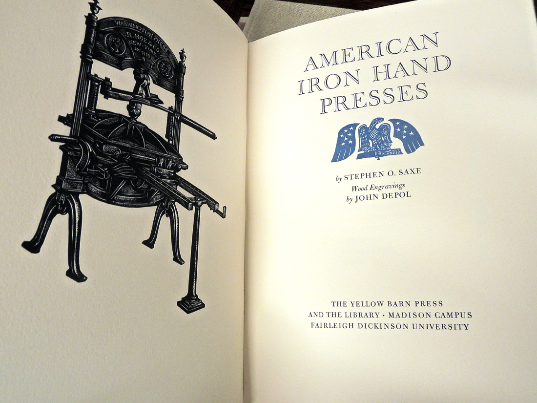

Finally, another conversation I had since the last post, about the phrase handpress, as in printed with a handpress: a handpress is a type of press wherein what
s being printed is inked by hand, rolled under a platen (by hand), and printed (by hand). A press operated by hand is not necessarily a handpress: a Kelsey or Adana tabletop, or even a C&P treadle, is not a handpress (even though the printer is risking their hand every time they feed a sheet into the clamshell). I guess a Vandercook with its inking unit removed (so the type is inked by hand) would be a handpress, but I dont think may people use Vandercooks that way. When all this started, I was offered a beautiful Korrex Nürnberg Hand press gratis but for reasons that remain vague, I wanted to print on a handpress. So I gave the Korrex away and spent loadsadough to buy my big ugly & beautiful green & yellow O-S. Life could have been so much easier with the Korrex, but probably less fun. Having said that, if anyones looking for a big green & yellow press, get in touch... 

Much of this post must sound dogmatic, for which I do and do not apologize. In pursuits like this, one needs clear definitions and opinions. I promise not to miss the October 1 deadline. 
 

1.9.25

Polymergravure is the word


That title will make sense in a few paragraphs...
 
An update from the studio: publication of Josh Bell’s poem Sci-Fi Violence has been pushed back to early 2026, to give Briony Morrow-Cribbs more time to work on the aquatints. I’ll include a progress update in the December post.
 
This opened a window to complete another project that was waiting in the wings: the epilogue to H.G. Wells’ The War of the Worlds, with two intaglio prints by Scott Morgan. I have been interested in printing extracts from longer works, fragments I think stand on their own from a narrative perspective, or maybe are simply engagingly ambiguous when removed from their original context.


Scott is primarily known as the recording artist loscil, and has released more than two dozen albums over the past 25 years (depending how you count LPs, EPs, digital only & etc.), all of which have received heavy rotation at HM. His live shows are accompanied by his original videos, many incorporating photographs or videos he’s shot (see here). The first ones I saw were from his 2014 Sea Island tour. There have been some recurring images and elements in his videos, particularly the inclusion of geometric negative spaces in the screen’s center. Wells’ epilogue ruminates on how terrible events inflicted on earth and humanity might affect the decisions we make for our future; I thought it somewhat apropos. I asked Scott if he might want to contribute one or more original images, and luckily he shared my enthusiasm for the text.

His first question was what? and his second was how? The first was easily answered. For the second I took him to meet Peter Braune at New Leaf Editions. The two images Scott settled on started as (film) photos, which he then digitized and adapted using the same software he uses for his videos. So basically we had two monochrome images with tremendous tonal detail. Rather than using the traditional copper plates, Peter recommended printing from intaglio polymer plates, also known as polymergravures. These are essentially the same as a metal plate, the main difference being in how the tonal effect is achieved. Rather than paraphrasing others, I’ll quote from Keith Taylor’s 2020 blog post on the topic:

“[Polymergravure] involves printing the image directly on a plate using the front manual feed of the [inkjet] printer. The microscopic dots from the printer’s stochastic pattern acting like, and replacing the need for, an aquatint screen.”
 
A polymergravure plate for one of Scott’s images is shown at the top of this post. In edition to Taylor’s post, an excellent illustrated article describing the process can be found here


Once the plates were made we assembled at New Leaf to pull some proofs and consider ink variations. Both the text and etchings are printed on Barcham Green’s Royal Watercolour Society handmade paper, the text on a NOT (i.e. slightly rough) sheet, the prints on a hot pressed sheet. Neither is pure white. Some of the proofs were pulled on sheets closer to pure white, and the difference slight variations in a paper’s hue had on the result was significant. This isn’t news but we briefly discussed pulling a few sets of proofs on five or six different white sheets, simply to illustrate how the paper affects the printed image. Sort of like PSNABW but for intaglio.

The two prints book-end the text, one a frontis, the other facing the last page of text. The text was set by hand in 18-pt Perpetua and printed with a second color on the title page epilogue opening. The edition (7.5 x 11 inches, 8 leaves) of 30 numbered copies (+ six hors commerce), all signed by Scott, will be uniformly cased in boards, but some of those details are still being hammered out. I’m not sharing images of the prints here, but I’ll add an image or two to this post when a dummy is completed.
 
If interested in receiving a notice when the edition is offered for purchase (some time in October), send HM an email with War of the Worlds, or loscil, in the subject line.
 
For anyone in Europe reading this, Scott will be on a short tour over the next few weeks. His shows are always engaging, contemplative and sonically immersive events, highly recommended.


AND ANOTHER THING!

Barbara Hodgson’s Byzantium imprint will be launching a new web site this fall, to coincide with publication of its latest book, Textile Designs on Paper: An Archive from Early 19th-Century France. I’ll add a link when it’s up and running.
 
Briony Morrow-Cribbs currently has a show of new works at Next Stage Arts, in Putney VT, for the next two months. Some of the new works have been added to her sites home page.


I’ve always felt slightly baffled by being human—as if this form came too soon, and I should’ve had at least one more round as a gopher, a wren, or maybe a fox. By making work based on animal forms, I’ve found a way to try on their shapes, slip into their skin, follow their instincts, and experience the world through their eyes. These animal-based images let me explore alternate incarnations—and facets of myself otherwise eclipsed by the human experience. In creating these creatures—sometimes real, sometimes imagined—I find a place to remember what it feels like to move through the world with certainty and grit.
– Briony Morrow-Cribbs

1.5.24

Briony’s Books & Art

 
Text printing for The Dunwich Horror was completed in a couple of weeks ago, and Briony’s working on the aquatint plates. This month’s post is a quick tour through some of her adventures in printmaking. 
 
The February post featured Buzz II, the print that made me think of recruiting Briony for Dunwich. Going through my Briony box for this post, I found a couple more prints with coincidental associations. Doesn’t the guy above look a little like Lovecraft? And the guy below looks like a Buzz’s cousin!


I met Briony through David Clifford (Black Stone Press), when he was teaching a book arts class at Emily Carr. He told me about one student whose work really stood out from the crowd, and that he was printing text sheets for her book of etchings of weird creatures. It was part of a larger graduate project/installation. Once I saw the book, titled The Cat Skinner Press Catalogue of Quixotic Chimera, I had to have a copy. The book consists of 12 etchings printed on kitakata (the same paper she’s using for Dunwich), each accompanied by a brief taxonomic description printed by David on Mohawk. Briony’s non-adhesive binding features Japanese cloth over boards, each folio sheet sewn with a running stitch. There were only 8 in the edition, and I can’t remember what I said or offered to get one. Fun & hilarious fact: Briony bound one copy, for the grad project, and then lost the text sheets before she got around to binding the rest! David had to reprint them. So I guess all but the one copy are second printings.


In 2009 Briony was commissioned to create illustrations for a book titled Wicked Plants, by Amy Stewart. The illustrations in the book are reproductions of 40 etchings Briony created. At the time I thought it was unfortunate the original prints wouldn’t get wider exposure, and suggested she issue them as a suite. Amy wrote a brief introduction, Briony printed an edition of 40, and Claudia Cohen made the box and chemise that held each suite. 


Briony often adds vibrant, rich watercolors to her prints. I suggested she paint one complete set of the botanical prints, and put one of the colored prints in each of the 40 sets. So each set has its own unique colored print.


For a few years in the mid-’00s Briony issued an annual suite of botanical prints, in editions of 20. For a bit extra you could have your prints colored. I weaseled into the act by offering to print the title and colophon sheets. 


I once saw, but do not own a copy of, a chapbook with a couple of drawings & taxonomic descriptions of quixotic creatures that were attributed to Briony. It was a tiny edition, and I’m not sure it was ever actually issued; I’ll have to ask her about it...

1.3.24

Dunwich Report No. 1


Printing The Dunwich Horror is underway, one sheet down, 12 more plus a few extras (incl. a prospectus) to go. I’m printing two up = two pages on each side of a sheet, folded to make 4 pages. Two sheets to each section. I can work off one side of a sheet in a day, so a sheet takes two days to complete. Unless there’s a second color, which adds a third day. I need to maintain some routine to life, so one-color sheets will get printed Monday/Tuesday, two-color sheets on Thursday/Friday/Saturday. Wednesday and Sunday are resupply days (groceries, wine), plus an hour to dampen the paper for the next day’s run. 


The paper is laid: I have to keep track of rough and smooth sides, so that verso and recto of each opening match (and thus alternate through the book, smooth/rough/smooth etc etc). Luckily the Hayle paper I’m using has two watermarks that make it easy. 
 
 
Winter in Vancouver is a good time for printing, it’s easy to keep the sheets damp. My system involves simply keeping the two stacks of paper - to be print & printed - under very thick cotton towels that have been soaked and thoroughly wrung out. They get spritzed with water a few times during the day, if & as required. Overnight the stack simply stays wrapped in a towel and put in a contractor-grade (= thick) garbage bag. 


I heard second-hand that Jim Rimmer counselled starting a new book somewhere in the middle, to bury any initial hiccups. I always start with the center opening from a section: since the two pages will be facing each other, it’s a good place to establish your color (impression, inking) for the project. 

Briony’s well into making sketches for her aquatints, but we’re not sharing those, at least not for now. (The image at top is an old plate, a test of paper to be used for covering the boards.)

The dunwich.ca site will be updated later this month with all the project details. Unlike previous HM books, this one will be available for direct reservation and purchase, and there will be a pre-publication discount.

Above is one of the book
s eight tailpieces concocted from Bodoni ornaments. These will be printed in bronze (how I will be spending my Saturdays).

1.11.23

Lines, Blocks, Colors


That’s one of the five (i.e. six, with one H.C. copy) boxed copies of Jim Rimmer’s Pie Tree Press. 
 
 
In addition to the book, it includes the 12-page prospectus Jim printed for Leaves from the Pie Tree; a copy of a small broadside, featuring a Robert Kroetch poem, illustrated & printed by Jim (and signed by him and the poet); a complete set of the 13 “unobtainable ornament” cards he issued in 1981 (each set has at least one card in facsimile); and a few pages of Jim’s text from the miniature book Duensing Titling (HM 2003). With that, all of the copies from the edition have been issued and I’m moving on to the next project. 


The first page of the JR book starts with a quote from him about why he found linocuts such a satisfying and expressive medium. Its taken from an interview he did with Jessica Spring in 2008, available on the Boxcar Press site.

Most of his prints were created from up to seven different blocks, each one printing different elements of the final image in a specific color. I’ve been looking at a number of his prints over the past month, and been fascinated by his composition, his ability to see how the different layers (i.e. colors) will combine, how one color will overlay another in some places to create a third hue.
Whether intentional or a happy accident, this overlapping style meant printing the blocks usually didn’t require terrifically tight registration when printing. Given the number of extra prints he made for his projects (viz. all the ones I found and used for the new book) I think he really enjoyed printing them, and didn’t just stop when he had enough for the edition.  Plus he was always giving things away to the many people who visited his studio. He probably liked having something on hand to give. 


You don’t see a lot of multicolour lino prints in contemporary press, compared to wood engravings. (Nor do you see a lot of multicolour engravings; it’s a lot of fussy work.). Because the material and tools required can be quite simple, I think some people have dismissed lino as too coarse or unrefined for a Fine Press Book. (To be fair, there are a lot of books out there with indifferent or sloppy linocuts.) I don’t know what those people would say to Picasso. When I was working on Oddballs with Jim Westergard, he told me he could achieve the same detail in lino as he could in wood; the tricky part would be how the Lino would hold up when printing. We talked about doing an experiment where he’d engrave the same image on wood and lino, and we’d print them side by side, to see if people could tell which was which. Unfortunately we never got around to it. But here
s an example, by Clifford Cyril Webb, of the detail that can be achieved with lino (sadly he doesnt seem to have done many prints like this, perhaps too labor intensive):


All that got me thinking, what are the top books with multicolour linocuts I can think of? Here’s my list. It’s completely subjective and doesn’t include any of the many books and artists I don’t even know about. 


First has to be Kuthan’s Menagerie, for obvious corporate reasons. Like Jim, Georges Kuthan seems to have found tremendous expression in the medium. He died in 1966, but I believe Jim knew him at least in passing, and would have seen his linocuts.  


Jim’s Tom Sawyer would be my pick from his bibliography, if only for the 50+ images printed within the text, in addition to the multicolour prints tipped in. 


Lincouts are included in a number of Walter Bachinski’s Shanty Bay books, but perhaps most prominently in their spectacular Circus: The Artist as Saltimbanque. (A saltimbanque is a travelling or street performer; I had to look it up.)


Vance Gerry’s Selected Shore Plants of Southern Califonia (Weather Bird Press, 1992) is worth including in this list. I had a copy, bought in the early years of my education. Copies were around and cheap for years but now it seems to have gotten some recognition. I eventually found the text printing too weak, the face ugly, and the paper too thick. But he was a handpress printer, and the linocuts are lovely. 


Tom Killion’s Fortress Marin seems to be the only book published that features his multicolor linos. I like that he let the images offset to the versos, although I also wonder if this was an unintentional result of lazy printing. I have used this technique when printing wood engravings on thin Japanese paper, to achieve greater opacity (you pull an inked impression without paper in the press, so it prints to the packing; the you pull an inked impression on paper, and the image simultaneously offsets to the very from the packing). I haven’t been able to find the source, but I’m sure I first learned of this in something William Everson wrote. Since Killion was in Everson’s orbit, it’s entirely possible he got the idea the same way. 

Richard Tetrault is a Vancouver artist who has been working with multiblock linocuts for years, but I don’t believe he’s done any books (there are a couple that reproduce his linocuts, but that doesn’t count). 


I’m going to end with a cheat, a book with and about multicolor wood engravings: Whittington Press’s Pastorale (2011), specifically the issue in full vellum. The focus of this book — how the paper used affects the printed image – is a long-standing interest of mine. I’ve lusted for this book for several years, but always end up being put off by what I think is an anemic type (Caslon). John Randle might consider those fighting words. Jim Rimmer would have for certain.

1.2.23

A Lady, a Tiger, a Sword: What To Do?


Copies of what I’m calling the Stockton book will ship out this month. It includes two linked short stories, ‘The Lady, or the Tiger?’ and ‘The Discourager of Hesitancy’ by Frank L. Stockton. Although the latter story was ostensibly written as a sequel, they can be read in either order and the book is designed to encourage that choice: it has two fronts and no back. Like those paperback Ace doubles from the 1960s (the proper term is tête-bêche, not to be confused with dos-a-dos, an ungainly structure that has two spines). But in this case each story leads to the other, like a kind of ouroboros.
 
 
I was introduced to the stories in the mid-’80s by a recording (vinyl) with Toyah reading the text while Robert Fripp (her spouse; they were having fun together long before the covid kitchen sessions) noodled away in the backgroud. Unfortunately the flip side, with ‘The Discourager,’ was less aurally interesting, but the stories lodged in me somewhere. Here’s a link to the recording, but the stories are more fun to read first. 


The stories were published in The Century Magazine in the 1880s, and the first one’s unresolved ending made Stockton famous. Like Doyle killing off Holmes, however, he was constantly pestered by readers wanting to know “what happened?” Eventually he provided a sort-of answer with ‘The Discourager,’ and people realized he wasn’t going to give the kind of answer they wanted.
 
 
These two stories were the high points of Stockton’s writing career: they remained widely known and anthologized well into the first half of the 20th century. I was surprised to discover while working on this project that the author and these two stories are now barely known among American librarians, booksellers or readers.
 
When I started making books, I had the idea of printing the stories as two separate pieces that meet in a middle. I also had the idea for frontispieces that echoed this invertible presentation, like playing cards.
 
 
Over the years I approached one or two artists but the stories didn’t grab them, and the project remained at the bottom of the pile. I pulled it out again a few years ago and started poking around with the idea of maybe using early playing cards as the illustrations. That led me on a distracting but fun tour through the history of playing cards. I didn’t surface with any art I could pilfer, but I did have some examples that caught the spirit I was after. One of them in particular reminded me of someone, and after much head pounding, I realized it was Walter Bachinski.   
 
 
In June of 1997 I attended the first week-long letterpress intensive offered by Jan & Crispin Elsted, at their Barbarian Press. Janis Butler was one of the three other students. She and her partner Walter had come out from Ontario, and while she learned the basics of letterpress, Walter, a professional artist and teacher, roamed the area with a sketch pad. During that week he made a linocut, possibly his first, and the Elsteds pulled a proof. It was very cool.
 

Janis and Walter went home & began publishing books under the imprint Shanty Bay Press, which from the start enjoyed wide acclaim, particularly for Walter’s vibrant pochoir and relief prints. (Janis does the setting, printing & binding.) We weren’t really in touch during the intervening years, but it was always good to see them when our paths crossed.
 
So when out of the blue I sent Walter a note, with the stories attached and an outline of my concept, I tempered any hope that he might want to get involved – he doesn’t need HM if he wants to do a book project. But the stories did resonate, and better still, so did my idea for their presentation.
 

Initially the plan was for him to create and print just the two frontispieces, but as I got into the design I wanted to incorporate more Walter (and thus more color) to the text, and asked if he could do some simple drawings that I could play with. Again he happily (and promptly) agreed, sending 12 pieces that played with elements in the frontispieces. By coincidence the drawings could be ordered to reflect aspects of the stories ­– not illustrations but perhaps evocations?


Heres a brief description from Walter about the process for editioning pochoirs (printing isnt quite the right word) & an image of him at work:
 
“I have worked out a master drawing before I begin any pochoir. When I lay out the image on the page I first establish the rectangle with a light pencil outline. I then trace on mylar the different colours that make up the image. In this case there is a stencil cut for each colour. I print the colours using acrylic ink (Heavy Body Golden Acrylic Paint). The key block for each of your  frontispieces was a type high maple block that I cut out to establish the black border. I printed that at the end with an oil based relief ink.

“I use a variety of stencil brushes and it is a dabbing motion of strokes. Even though the areas are flat they are subtle irregularities  that reflect the brushstrokes. This makes it different from the  mechanical flatness of a silkscreen surface.

“Pochoir appeals to me because there are no limitations as to what you can do with the image. In my books the pochoirs have areas of flatness, areas of blending colour into colour, wash effects and much freehand drawing.  I prefer pochoir to lino for an image with multiple colours because I can control the overall effect of the image much better and in finer detail.”


I’ve wanted to use Weiss in a project for years but the right one hadn’t come along until now. It’s legible and has the kind of strong body I like to print, but it’s also just unusual enough to limit its use. The text was printed damp, on handmade Barcham Green Canterbury paper. The frontispiece pochoirs were done by the artist on Arches wove. The edition is 30 press-numbered copies (+ six hors commerce I – VI), all signed by the artist on a colophon found in the middle of the book
(6 x 9 inches, 15 leaves).
 

The edition was uniformly sewn and cased in quarter cloth, the boards covered in a sheet painted black. One side has a pattern printed in black, the other has two paper inlays. (The size & placement of the inlays will be consistent, but there will be a few variations of the inlays themselves, just for fun.) The slipcase is the same painted paper. To emphasize the where’s the front? design, only the slipcase has a spine label. (NOTE: when a book has a slipcase, shelve it with the book’s spine in, to prevent fading.)
 
Simple as the binding may seem, it’s taking me ages to get it done. Lots of fiddly bits. But this month...
 
p.s. Walter & Janis have recently finished a new Shanty Bay Press publication, My Landscape; see here for details.
 
AND ANOTHER THING!
 
Pradeep Sebastian, author of the bibliomystery The Book Hunters of Katpadi, has a new book out. The Book Beautiful (Hachette 2023) recounts some of his adventures with fine press & rare book collecting. More on that to come...