Showing posts with label David Sylvian. Show all posts
16.5.16
It's Steeper Near The Roses
Last week we proofed a large version of Harold's manuscript score for "It's Steeper Near the Roses." A slightly smaller version will appear in Aurora Teardrops. The piece (from his album Avalon Sutra) was dedicated to David Sylvian, which is why we chose it to include in the book. (Also, the first poem, opposite which the score will appear, begins with the lines "I could compose a love poem / (if I were in love - I may be close) / Were it sung by David Sylvian / it would enter Paradise...") Just a handful of the larger versions of the score were proofed, for sharing among the collaborators.
As previously posted, the eight arabesque drawings by Harold that appear throughout the book have all be printed, and we're into the text now: 16 sheets two-up (two pages on each side of a sheet, folded to make a total of four book pages). All of the text has been set, so we pulled one complete proof of the book just to check everything one last time. It's not meant to be lovely, so don't look to close.
See the previous post (below) if you are interested in receiving updates on Aurora Teardrop's progress and publication details. We expect to be issuing copies starting in September.
4.4.16
Signed, Sealed, Delivered
Aurora Teardrops is only just getting into the press but it's already clocked over 10,000 miles. The sheets with Harold and Jane's signatures were printed in January, with the plan being for them to sign while in town for their performance. That only half-happened after Jane's trip fell through. So, the sheets got shipped to her in Joshua Tree.
We had hoped David Sylvian (author of the book's introduction) would also be able to sign, but coordinating with his travels was the challenge. While the sheets were in Joshua Tree he wrote to say he'd be stationary for the week, and if we could get the sheets to him in time he'd sign. So, Jane scrambled to get the sheets to David, who very kindly & promptly signed the ones to be included in the 26 copies deluxe.
The sheet on the right (above), with just Jane & Harold's signatures, is for the 50 other copies, i.e. not part of the deluxe issue, mouldmade instead of handmade paper, not as many prints, a simpler binding. I refuse to call these "regular" copies; we'll think of an appropriate designation. Both sheets will be calligraphically editioned (A thru Z and 1 thru 50) when the books are bound.
The sheets flew back to Jane, who then bundled them up with the original watercolors she did, one to be included as a frontis in each of the deluxe copies, and sent the lot back to HM. Now I just have to make sure they don't get destroyed or lost while the rest of the book is being produced...
7.3.16
A New Harold Budd Page
Longtime HM bookseller Books Tell You Why, Inc. has just launched a page on their Web site dedicated to our publications with composer/musician Harold Budd. This is the first time all of his poetry collections are available in one place, along with some biographical details, videos, and links to longer articles about him.
There've been a few other Budd-related developments recently for the upcoming Aurora Teardrops. Both are also David Sylvian-related. First, we confirmed that David will be signing the 26 deluxe copies, which is kool. And second, we're going to include a copy of the manuscript score for Harold's composition "It's Steeper Near the Roses" (Dedicated to David Sylvian) from the Avalon Sutra album. I've been wanting to print a score of Harold's for ages, and the why & how have finally come together. The piece is just over a minute, so the score fits neatly on a single sheet.
My interest in printing a score goes back to the Carnival project, for which Harold created six copper plate engravings, each one named for a Renaissance composer. One of them - Baude Cordier - sometimes wrote shaped scores (like shaped typography) that are beautiful, and sparked the idea of printing scores in Harold's delicate hand (his scores aren't shaped, but they include interesting, non-traditional elements). Then I found this (below) in a Berkeley paper ephemera shop: a 19th century score for the first horn (trumpet?) from Barber of Seville.
Printed from engraved plates (look at the lettering!), both sides, on a beautiful, thick & textured handmade sheet. Eight pages total, sewn in a practical (& lovely) stiff holland paper wrap.
Anyway, along with the 59 poems and Jane Maru's art that you'll find in Aurora Teardrops, there also will be a facsimile Harold Budd score. Score! Till then, go shopping at the Books Tell You Why page.
There've been a few other Budd-related developments recently for the upcoming Aurora Teardrops. Both are also David Sylvian-related. First, we confirmed that David will be signing the 26 deluxe copies, which is kool. And second, we're going to include a copy of the manuscript score for Harold's composition "It's Steeper Near the Roses" (Dedicated to David Sylvian) from the Avalon Sutra album. I've been wanting to print a score of Harold's for ages, and the why & how have finally come together. The piece is just over a minute, so the score fits neatly on a single sheet.
My interest in printing a score goes back to the Carnival project, for which Harold created six copper plate engravings, each one named for a Renaissance composer. One of them - Baude Cordier - sometimes wrote shaped scores (like shaped typography) that are beautiful, and sparked the idea of printing scores in Harold's delicate hand (his scores aren't shaped, but they include interesting, non-traditional elements). Then I found this (below) in a Berkeley paper ephemera shop: a 19th century score for the first horn (trumpet?) from Barber of Seville.
Printed from engraved plates (look at the lettering!), both sides, on a beautiful, thick & textured handmade sheet. Eight pages total, sewn in a practical (& lovely) stiff holland paper wrap.
Anyway, along with the 59 poems and Jane Maru's art that you'll find in Aurora Teardrops, there also will be a facsimile Harold Budd score. Score! Till then, go shopping at the Books Tell You Why page.
14.12.15
Harold Budd in Print
Update: see the article about Harold & his Aurora Teardrops gigs in today's Guardian...
The next two projects in the press come from the pen of Harold Budd. This week he and Bradford Ellis will perform at The Kitchen, accompanied by Jane Maru reading selected poems from HM's upcoming publication Aroura Teardrops. Below is a shot from their performance earlier this fall in Joshua Tree...
To mark the trio's appearance in Vancouver next January, HM will be publishing a chapbook with eight poems selected from Colorful Fortune, 4, Angel and Aurora Teardrops, plus two that will be unique to this collection. The book, titled Sunblind Highway, is offered as an introduction to Harold's poetry, and an affordable alternative to the more costly original publications for his admirers.
Sunblind Highway (6 x 10 inches, 16 pages plus cover) will be printed by hand, letterpress, at Heavenly Monkey, in exactly the same manner as Aurora Teardrops. One of Harold's distinctive arabesque drawings is reproduced as a frontispiece. The text will be set in Bodoni types and printed in two colors. The edition will be 100 numbered copies. The first 20 (Publisher's copies) will be signed by Harold & printed on Arches wove paper, sewn into a handmade paper wrap. Copies 21-100 (Author's copies) will be printed on Somerset Book paper, sewn into a stiff printed paper wrap.
Copies of Sunblind Highway will be available for purchase at the Vancouver show. Any remaining copies will be offered for sale; details to follow.
Aurora Teardrops (8 x 10 inches, approximately 80 pages) will be set in Cancelleresca Bastarda and Umbra types, printed on dampened Arches Wove paper. The text pages will also feature details from four of Harold's arabesque drawings, treated with color paint washes, bleeding off the edges. Inserted between text spreads will be full-page bleed reproductions of Jane Maru's intense and mesmerizing batik paintings, printed on semi-transparent vellum paper that replicates the original silk's quality of seeing the painting from either side.
We're particularly pleased that the new collection includes to include a two-page introduction by David Sylvian, Harold's friend and colleague. Written in David's characteristic evocative style, it is a beautiful encapsulation of the poetry and the poet.
Aurora Teardrops as described above will be published in an edition of just 26 press-lettered copies (plus 8 numbered contributor copies) signed by Harold and Jane. We do, however, have plans to to publish a second edition in a simpler format, but printed at the same time, the same way, from the same setting. While this edition will probably not number more than 50 copies, it will offer Harold's admirers a more affordable option for securing their own copy of his most extensive collection of poetry to date.
Aurora Teardrops is scheduled for publication in Spring, 2016.
29.10.15
Hypergraphia, anticipated
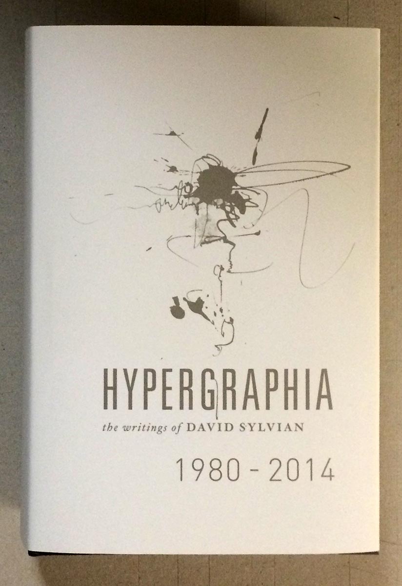
It's not supposed to be released until next week, but my copy of David Sylvian's massive, beautiful, incredible new book Hypergraphia arrived via Royal Mail today. I've had a chance only to flip through it; what follows is superficial, except for the enthusiasm.
Sylvian's longtime designer, Chris Bigg, did a brilliant job with what must have been a mind-boggling amount of source material. Sylvian's art has always extended to the visual, both his own work and in collaborations with painters, photographers and graphic designers. The image below might sum up the degree of detail invested in the publication of Hypergraphia: the outside of the jacket is Sylvian's characteristic hazy cool, and the inside is also printed, with a contrasting collage of darks.
Look who appears neat the front of the book - Atsushi Fukui's original painting of "The Botanist," which previously appeared as a simple line drawing in HM's publication of Sylvian's prose poem Uncommon Deities (of which I still have one copy of, FYI...).
The book is published in an edition of 3,000 copies, and seems to already be nearing depletion. (Five hundred copies from the edition were signed by Sylvian and Bigg, & if you have one of those, call me.) It's priced just over C$100, which is nothing considering what producing the thing must have cost. (My only quibble is that the thing is so thick - over 600 pages of heavy coated paper - the text block is already straining from its case. Rounding could have helped tremendously, but who knows if that's even something commercial binderies can do these days.) Hypergraphia could genuinely be called an artist's book, a term I generally despise but which seems apropos here, in content & form. If you have any interest in Sylvian, 23 Envelope/Chris Bigg, or just kool things, hunt a copy down.
AND ANOTHER THING
Though it is dull & meager by comparison, I finally got around to printing the "jackets" for the 12 deluxe large-paper copies of An Anticipated History.
It's a lovely handmade gampi, with the printed title positioned to perfectly overlay the same line on the Roma wrap. Because the gampi is so thin, it's a little tricky fitting it around the book & getting it to stay in place - keeping the two lines in register - while sewing.
Here's the extra sheet included, with the leaf from a deluxe copy of XI LXIVMOS hinged to the verso.
12.10.15
A Future History
Spent the past week printing up an 8-page advance history of HM's anticipated doings for the next two years. Will be sending copies out to our regular booksellers this week. Ended up with forty-some completed; some will be available to purchase for a nominal sum.
Most were printed on off-cuts of the afore-mentioned Golden Hind, along with a sheet of Arches Wove (about the best over-the-counter text sheet for letterpress around these days, in our opinion).
Had some slightly larger offcuts of BG Bodleian 80 g handmade from some previous project (Metal Types? dunno), enough to make up 12 copies, so I did. These "large paper" copies include a leaf from the Deluxe edition of XI LXIVMOS hinged in.
The cover paper is Roma Fabriano. It's a bizarre sheet in a patently non-HM color (pink), purchased for pennies on the dollar at the bankruptcy sale. The laid sheet (probably machine-made, doubtfully mould) has an exaggerated screen side that makes it useless for printing. It's been in the studio for ages. But the color matches nicely with HM's newly acquired stock of bronze ink, which will be re-appearing in the upcoming Harold Budd project.
1.9.11
Uncommon Deities at Punkt
The Punkt Festival kicks off tonight in Norway with the a performance (if that's the correct word) of David Sylvian's "Uncommon Deities" audiovisual installation, featuring artwork by Atsushi Fukui. A description of the installation can be found here. David has also curated an evening of music (Saturday) by a variety of artists, and will perform "Plight & Premonition" with John Tilbury, Philip Jeck, Eivind Aarset, Jan Bang and Erik Honoré. The Punkt festival program sounds extremely cool in its breadth & depth; we especially like the idea of the Alpha Room, wherein "the concerts on the main stage are remixed, and the audience may listen to the remixes immediately after each concert." In case you happen to be in Norway this weekend. Meanwhile, our last two copies of the Uncommon Deities broadside are available from Wessel & Lieberman Booksellers, in Seattle.
20.5.11
Uncommon Deities Portfolio Released
The ten copies of David Sylvian's broadside "Uncommon Deities" which have been put into a special triptych portfolio case were received from Claudia Cohen's bindery this week. The case is covered in a black Japanese book cloth, with a printed label set on the front board and spine. For these portfolio copies (numbers 1 - 10 from the edition of 30), the broadside was trimmed in thirds. Closed, the portfolio measures approximately 6.5 by 12.5 inches; when opened, it measures approximately 19.5 by 12.5 inches. Just four of the ten portfolio copies are being offered for sale; the other six are for the publisher, author and artist.
20.4.11
Uncommon Exhibition
22.1.11
Cut But O.K.
Having delayed it for as long as possible, we finally had to play slice & dice with 10 copies of the David Sylvian broadside, Uncommon Deities. These ten (numbers 1-10) are being put into a triptych portfolio case, made by Claudia Cohen. Which means that each copy had to be cut into three pieces. As they have already circumnavigated the globe, to be signed by David and Fukui, our hesitancy to cut them up is understandable. We are happy to report that all went well, and the ten copies are packed & ready for delivery to Claudia next week.
These photos are the paper design dummy made up Claudia, using one of the makeready proofs (hence all the scribbling & marks). Closed, the case will measure approximately 6.5 by 12.5 inches. It will be made from thin board covered in cloth (color TBD). The front board has a print of one of Fukui's mushrooms inset. The inner board has a sort-of colophon inset, explaining how & where these 10 copies fall within the total edition of 30. And inside, mounted on the three boards, is the broadside.
However much fun they may be to produce, broadsides can be problematic if one's walls are already fully populated. This portfolio format offers an alternative, allowing one to both store the broadside on a bookshelf, but also keep it easy to access (i.e. as compared to having it packed in a box under the bed). And can also be opened and easily displayed, as a triptych.
Two of the ten copies being cased up will go to David, and two to Fukui. The remainder are HM's, and a couple will be offered for sale. We'll post details here when we know them.
These photos are the paper design dummy made up Claudia, using one of the makeready proofs (hence all the scribbling & marks). Closed, the case will measure approximately 6.5 by 12.5 inches. It will be made from thin board covered in cloth (color TBD). The front board has a print of one of Fukui's mushrooms inset. The inner board has a sort-of colophon inset, explaining how & where these 10 copies fall within the total edition of 30. And inside, mounted on the three boards, is the broadside.
However much fun they may be to produce, broadsides can be problematic if one's walls are already fully populated. This portfolio format offers an alternative, allowing one to both store the broadside on a bookshelf, but also keep it easy to access (i.e. as compared to having it packed in a box under the bed). And can also be opened and easily displayed, as a triptych.
Two of the ten copies being cased up will go to David, and two to Fukui. The remainder are HM's, and a couple will be offered for sale. We'll post details here when we know them.
13.1.11
Mushroom Surprise
It's been years since we did a secret book. The most recent was produced at the end of last year, but we couldn't tell anyone until it reached the person for whom it had been made, Atsushi Fukui. Today we received word from him that it (all of them, actually) arrived safely in Japan.
Last year, when David Sylvian asked Fukui to create some incidental drawings for possible inclusion in the "Uncommon Deities" broadside, Fukui sent nine mushrooms. Only two ended up being used in the broadside, and it seemed a waste for the other seven to be left unused. So, we struck upon the idea of printing all nine in a small book, which we titled Basidia, and giving the entire edition (just 10 copies) to Fukui, to do with whatever he will, in thanks for his contribution to the project.
The book (4 x 6.5 inches) was printed on sheets of Reg Lissel's HM Text paper. What text there is (just the title page and colophon) is set in Dante. But all we had was white, which needed toning down to suit the book's content, so we tea stained it. We'd initially thought we'd have to dry it down after staining, and then redamp for printing; but looking at the stack of stained sheets after they'd pressed for a bit, we decided to just push ahead with the printing, and all worked out beautifully.
The book was printed eight-up (work & turn) on full sheets, then trimmed for binding. It was sewn in three signatures (integral endsheets) and put into a case made from Reg Lissel's heavier, colored papers, and lined with thin card.
15.11.10
Big Printing
Over two days this past week we printed the broadside Uncommon Deities, with a text by David Sylvian and illustrations by Astushi Fukui. In a previous post about this project, we stated it was just our second attempt at a broadside. That's incorrect; it's our third. We'd forgotten about this lovely Alice broadside printed for Mariko Ando.
Uncommon Deities was, however, certainly the largest piece we've ever printed on the Washington. The sheet measures 22 x 15 inches; the text area is 16 x 9 inches. The set-up of the press had to be completely changed to accommodate the piece. The platen bearers had to be relocated to fall outside the area of the sheet, and the points had to be positioned on the far side of the tympan, where the top of the sheet would be (the top inch of each sheet, where the pin holes lie, will be trimmed off). None of our roller bearers were long enough for the form, so we had to cobble a straight run of 20 inches on either side of the forme from shorter pieces of 12-pt rule.
The text lies in two columns, each with one or two lines that extend well beyond the rest. This always makes even inking and impression a challenge, but five hours of makeready and using layers of tape to build up the roller bearers at the extremities of the forme evened things out. So, having started at 9:30 a.m., we were able to begin pulling usable impressions by 3 p.m. The edition is 30 copies, but with three runs per sheet and our general ineptitude, we printed 50 to allow for spoilage. We finished printing the black shortly after 8 p.m. on the first day. Nothing happens quickly at HM.
The text was set in 14-pt Dante and Dante Titling. The 200-g Arches paper was printed damp. Using quite a dry ink slab, the roller was charged twice for each impression (we ascribe to Harold McGrath's strategy of using as little ink as possible on the roller, and building it up on the letterforms with successive passes). The photo above shows part of the ink slab, the roller, and the two piles of paper during the last run: the sheets to be printed (covered by damp towel), and the printed sheets (stacked between blotters, the first step in drying them down).
The second day went more quickly, with just two lines of red in the second run, and two lines of small type (the copyright & limitation statements) printed in blind at the bottom. The photos above & below show a sheet in the press after the last run.
The sheets must now circle the globe to be signed first by David, and then Fukui. Will spent the weekend building a big box strong enough to protect them during their travels.
29.10.10
Our Second Attempt at a Broadside
This will be just the second proper broadside ever attempted at HM (the first being the Tabula Smaragdina Hermetis [The Emerald Tablet of Herme] for Ouroboros Press some years ago). The sheet will measure 20 inches wide, 13 inches tall. The text is set in Dante and Dante Titling, and will be printed at HM in two colors on dampened Arches paper with the Washington press. The edition will be just 30 copies, signed by the author and artist. For all intents and purposes, this project will be hors de commerce: the edition will be shared equally among the author, artist and publisher. A few copies from HM's share will be offered to our regular customers.
Printing will be completed before the end of October, but then the sheets must circumnavigate the globe, to be signed by David and Fukui, so it will be some months before we have finished copies in hand. But we look forward to showing it off when the time comes. Meanwhile, check out some of the very cool new releases, like Sleepwalkers, from David's label.
Subscribe to:
Posts (Atom)