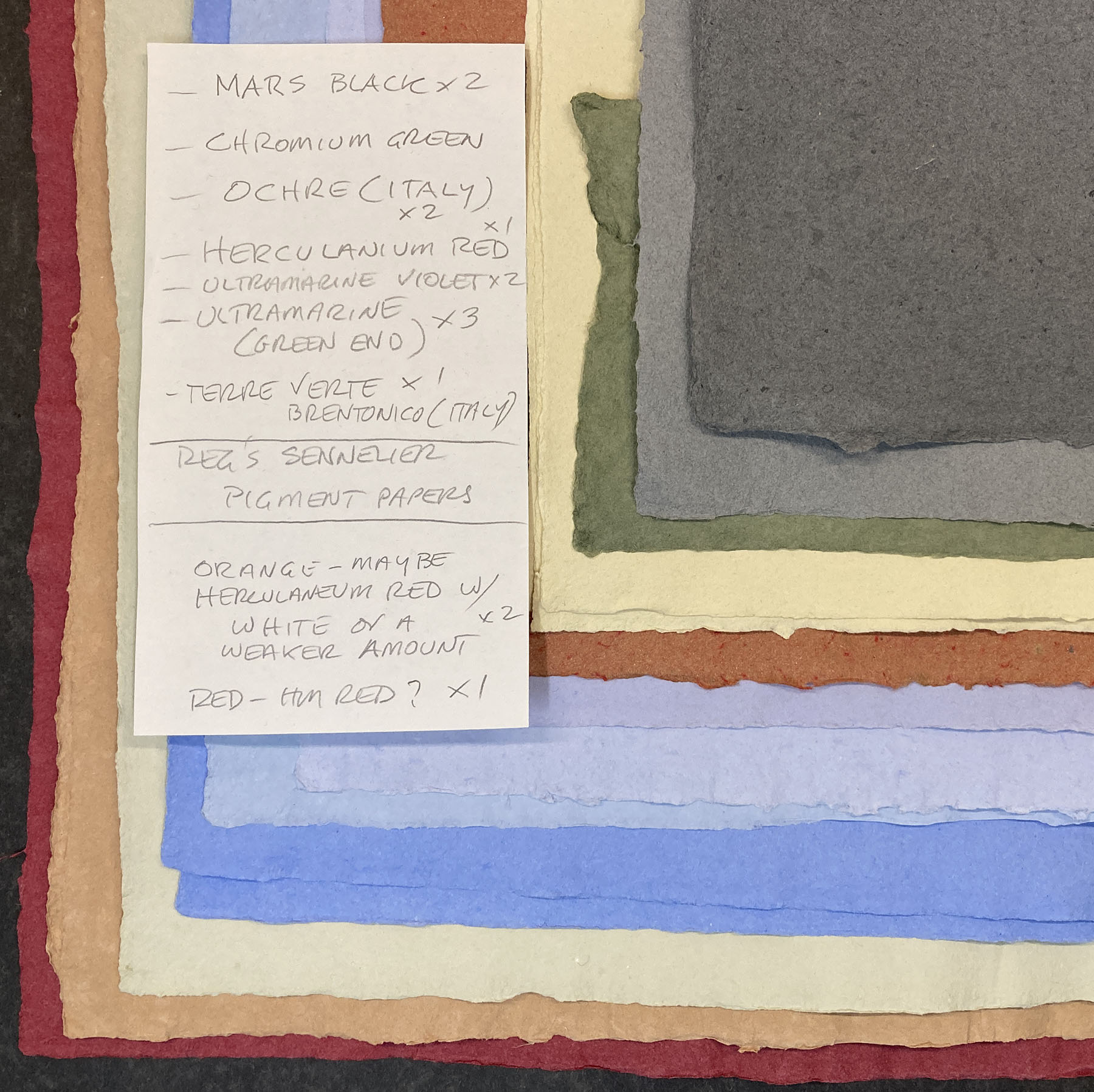
That’s one of the five (i.e. six, with one H.C. copy) boxed copies of Jim Rimmer’s Pie Tree Press.

In addition to the book, it includes the 12-page prospectus Jim printed for Leaves from the Pie Tree; a copy of a small broadside, featuring a Robert Kroetch poem, illustrated & printed by Jim (and signed by him and the poet); a complete set of the 13 “unobtainable ornament” cards he issued in 1981 (each set has at least one card in facsimile); and a few pages of Jim’s text from the miniature book Duensing Titling (HM 2003). With that, all of the copies from the edition have been issued and I’m moving on to the next project.
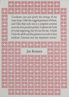

The first page of the JR book starts with a quote from him about why he found linocuts such a satisfying and expressive medium. It’s taken from an interview he did with Jessica Spring in 2008, available on the Boxcar Press site.
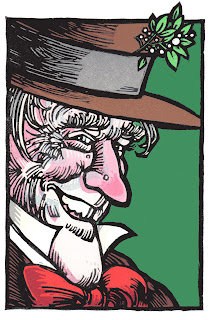 Whether intentional or a happy accident, this overlapping style meant printing the blocks usually didn’t require terrifically tight registration when printing. Given the number of extra prints he made for his projects (viz. all the ones I found and used for the new book) I think he really enjoyed printing them, and didn’t just stop when he had enough for the edition. Plus he was always giving things away to the many people who visited his studio. He probably liked having something on hand to give.
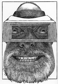
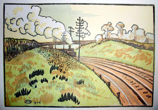
You don’t see a lot of multicolour lino prints in contemporary press, compared to wood engravings. (Nor do you see a lot of multicolour engravings; it’s a lot of fussy work.). Because the material and tools required can be quite simple, I think some people have dismissed lino as too coarse or unrefined for a Fine Press Book. (To be fair, there are a lot of books out there with indifferent or sloppy linocuts.) I don’t know what those people would say to Picasso. When I was working on Oddballs with Jim Westergard, he told me he could achieve the same detail in lino as he could in wood; the tricky part would be how the Lino would hold up when printing. We talked about doing an experiment where he’d engrave the same image on wood and lino, and we’d print them side by side, to see if people could tell which was which. Unfortunately we never got around to it. But here’s an example, by Clifford Cyril Webb, of the detail that can be achieved with lino (sadly he doesn’t seem to have done many prints like this, perhaps too labor intensive):

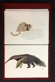
First has to be Kuthan’s Menagerie, for obvious corporate reasons. Like Jim, Georges Kuthan seems to have found tremendous expression in the medium. He died in 1966, but I believe Jim knew him at least in passing, and would have seen his linocuts.

Jim’s Tom Sawyer would be my pick from his bibliography, if only for the 50+ images printed within the text, in addition to the multicolour prints tipped in.
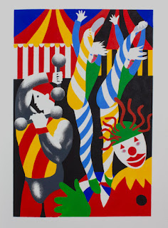
Lincouts are included in a number of Walter Bachinski’s Shanty Bay books, but perhaps most prominently in their spectacular Circus: The Artist as Saltimbanque. (A saltimbanque is a travelling or street performer; I had to look it up.)
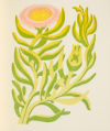
Vance Gerry’s Selected Shore Plants of Southern Califonia (Weather Bird Press, 1992) is worth including in this list. I had a copy, bought in the early years of my education. Copies were around and cheap for years but now it seems to have gotten some recognition. I eventually found the text printing too weak, the face ugly, and the paper too thick. But he was a handpress printer, and the linocuts are lovely.
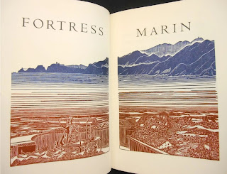
Tom Killion’s Fortress Marin seems to be the only book published that features his multicolor linos. I like that he let the images offset to the versos, although I also wonder if this was an unintentional result of lazy printing. I have used this technique when printing wood engravings on thin Japanese paper, to achieve greater opacity (you pull an inked impression without paper in the press, so it prints to the packing; the you pull an inked impression on paper, and the image simultaneously offsets to the very from the packing). I haven’t been able to find the source, but I’m sure I first learned of this in something William Everson wrote. Since Killion was in Everson’s orbit, it’s entirely possible he got the idea the same way.
I’m going to end with a cheat, a book with and about multicolor wood engravings: Whittington Press’s Pastorale (2011), specifically the issue in full vellum. The focus of this book — how the paper used affects the printed image – is a long-standing interest of mine. I’ve lusted for this book for several years, but always end up being put off by what I think is an anemic type (Caslon). John Randle might consider those fighting words. Jim Rimmer would have for certain.
Most of his prints were created from up to seven different blocks, each one printing different elements of the final image in a specific color. I’ve been looking at a number of his prints over the past month, and been fascinated by his composition, his ability to see how the different layers (i.e. colors) will combine, how one color will overlay another in some places to create a third hue.


You don’t see a lot of multicolour lino prints in contemporary press, compared to wood engravings. (Nor do you see a lot of multicolour engravings; it’s a lot of fussy work.). Because the material and tools required can be quite simple, I think some people have dismissed lino as too coarse or unrefined for a Fine Press Book. (To be fair, there are a lot of books out there with indifferent or sloppy linocuts.) I don’t know what those people would say to Picasso. When I was working on Oddballs with Jim Westergard, he told me he could achieve the same detail in lino as he could in wood; the tricky part would be how the Lino would hold up when printing. We talked about doing an experiment where he’d engrave the same image on wood and lino, and we’d print them side by side, to see if people could tell which was which. Unfortunately we never got around to it. But here’s an example, by Clifford Cyril Webb, of the detail that can be achieved with lino (sadly he doesn’t seem to have done many prints like this, perhaps too labor intensive):

All that got me thinking, what are the top books with multicolour linocuts I can think of? Here’s my list. It’s completely subjective and doesn’t include any of the many books and artists I don’t even know about.

First has to be Kuthan’s Menagerie, for obvious corporate reasons. Like Jim, Georges Kuthan seems to have found tremendous expression in the medium. He died in 1966, but I believe Jim knew him at least in passing, and would have seen his linocuts.

Jim’s Tom Sawyer would be my pick from his bibliography, if only for the 50+ images printed within the text, in addition to the multicolour prints tipped in.

Lincouts are included in a number of Walter Bachinski’s Shanty Bay books, but perhaps most prominently in their spectacular Circus: The Artist as Saltimbanque. (A saltimbanque is a travelling or street performer; I had to look it up.)

Vance Gerry’s Selected Shore Plants of Southern Califonia (Weather Bird Press, 1992) is worth including in this list. I had a copy, bought in the early years of my education. Copies were around and cheap for years but now it seems to have gotten some recognition. I eventually found the text printing too weak, the face ugly, and the paper too thick. But he was a handpress printer, and the linocuts are lovely.

Tom Killion’s Fortress Marin seems to be the only book published that features his multicolor linos. I like that he let the images offset to the versos, although I also wonder if this was an unintentional result of lazy printing. I have used this technique when printing wood engravings on thin Japanese paper, to achieve greater opacity (you pull an inked impression without paper in the press, so it prints to the packing; the you pull an inked impression on paper, and the image simultaneously offsets to the very from the packing). I haven’t been able to find the source, but I’m sure I first learned of this in something William Everson wrote. Since Killion was in Everson’s orbit, it’s entirely possible he got the idea the same way.
Richard Tetrault is a Vancouver artist who has been working with multiblock linocuts for years, but I don’t believe he’s done any books (there are a couple that reproduce his linocuts, but that doesn’t count).

I’m going to end with a cheat, a book with and about multicolor wood engravings: Whittington Press’s Pastorale (2011), specifically the issue in full vellum. The focus of this book — how the paper used affects the printed image – is a long-standing interest of mine. I’ve lusted for this book for several years, but always end up being put off by what I think is an anemic type (Caslon). John Randle might consider those fighting words. Jim Rimmer would have for certain.