Showing posts with label Color Series. Show all posts

9.11.15

Piling Up & Cutting Out


Entering a less verbal, more visual period for the blog ... Sheets for Barbara Hodgson's Mrs Delany Meets Herr Haeckel are piling up. Most (i.e. the ones shown here that are mostly border, with just brief captions at the bottom) will have her original papercuts mounted on them. Same for a frontis across from the title page.


She comes by once a week to pick up the latest batch, goes home & sets to the painstaking work of finishing & mounting the cuts.


Found this gem about rocks last week. Should probably go to Barbara's color reference library. We'll see. For now it's mine.


Not only is it a kool color-related book, it was printed by Enschedé! Sort of: I can't find anything in English that explains what Huyskes-Enschedé was, but it seems to have been some kind of publisher specializing in geological topics. In Holland with Enschedé attached, it has to be tied to the foundry somehow.


Barbara never reads this blog, so I have no fear about her finding out I have the thing & demanding I had it over. Same with Claudia.


Remember, if you're in LA tomorrow, that Barbara will be giving this year's Lieberman Lecture, talking about The WunderCabinet. Claudia, who claims she can't speak in public, will be hiding in the audience, no doubt piping up with questions & comments.

29.11.13

What Are Pleasant Colors?


"Healthy people wear pleasant colors." That wasn't covered in Occupied By Colour. Brown definitely does not qualify, and that includes shoes.

There's some rule prohibiting posting on Thanksgiving, so up it goes today. Speaking of the colo[u]r series, David Clifford is gearing up to start printing the last instalment, Around the World in Colour. It might even be completed before the Xmas break, but that still leaves a few months of fabulizing by Barbara & Claudia before it gets issued; late spring '14, as promised. And before David dives into that, he has to print the patterned paper that will be used for the case bindings of Metal Types. That'll happen next week. The last two sheets will be printed by Monday's post. Back to it.

26.9.13

Everything's Gone Green


Received an update from Barbara this week on her progress with Around the World in Colour:

"I haven't yet run across any specific recommendations for producing dye green on paper. So, I've been experimenting with all of the combinations suggested in the literature for cloth dyeing, as there is no one magic natural green. None of the combinations worked. Either the overbath stripped the first colour, leaving a non-descript shade, or the second colour sat on the first in a kind of mottled attempt at green. The eureka moment came after a chance visit to a Chinatown apothecary shop, looking for another elusive dye: gromwell. The apothecary asked what I wanted it for, as she measured out two 'doses.' When I said it was for dyeing, she began pulling jars off the shelves. She gave me gardenia, which I had read about, and Rubia cordifolia (a form of madder that I hadn't yet tried), and a couple of others.

"I'm not ready to divulge the name of the dye that worked so well to make green. That will have to wait for the book."


Kool stuff to look forward to when the book is published next year. 

2.9.13

It's September: Cover Up


Got sidetracked over the weekend making a frontis for Uncommon Paper. Can you tell who we've been hanging around? It's made up from pieces of nine of the 12 papers used in the book. There are better ways to go blind.


Also printed the paper to cover the boards. Tried it in silver but didn't look good. Black always looks good. Now that the cover paper's been printed, we'll case in the test copy & see what adjustments need to be made. Barbara has warned that PVA reacts with the natural pigment used to dye the paper, so it'll have to be wheat paste. One problem miniature books can have is a tendency to not lie flat; they're always a little popped open. Part of the problem is the lack of weight from boards. Trying to minimize, or eliminate that altogether (without resorting to quarter-sewn oak boards).


As reported, the edition is 26 lettered copies. Some of those have to be given to collaborators on Paper Should Not Always Be White*, so we'll probably have only about 18 to offer. Price will be $300.

* Speaking of, first copies of the regular edition will be shipped from Claudia's studio this week. We'll send a note out to everyone as/when their copies are posted, so they can be on alert. The deluxe copies are underway & remain on track for end of the month-ish. 

4.8.13

1 + 1 = Green


 On the grand tour. Found this. Can we think of anyones who might covet it? (See previous post...)

p.s. this isn't news, but iPads reallyreallyreallyreallyreallyreallyreallyreallyreally suck for blogging. 

1.8.13

Weld, Woad, Lac, Madder & etc.


If you don't know those words, you will by this time next year. Over the last three weeks, as a slave to the colour vats, Barbara Hodgson has dipped more than 700 sheets of Reg Lissel's paper into a variety of natural dyes, including annatto, logwood, cochineal, cutch, henna, pomegranate, weld, brazilwood, madder, lac, woad and indigo. This venerable and intensive process gave her plenty of time to finally settle on the title for the fourth and last book in the colour series: Around the World in Colour: A Multi-Hued Tour of Ochres, Oxides, Roots and Bugs.

Although Barbara admits to being loathe to disperse the stack, each copy of the book will include a sampling of these sheets, both full page and smaller swatches, to illustrate the richness of traditional colours found in regions such as Southeast Asia, the Near East and Central America.

The writing is mostly completed and she's focusing on the layout now. (Claudia, as binder, has the unenviable position of always being last in the production line, so she's still finishing up copies of their last project, Cutting Paper, while Barbara forges ahead.) Printing will happen late this year & early next, with the book slated for publication in late spring of 2014.

9.5.13

Distributing Colors


Since Claudia & Barbara started their color series, we've been keeping an eye open for books to add to their reference collection. Just what we needed: another vein to spike the collecting jonez. Here's something being auctioned at Swann's in New York this very minute:


(COLOR THEORY.) Hayter, Charles. A New Practical Treatise on the Three Primitive Colours . . . with some practical rules for reflections and Sir Isaac Newton's distribution of the colours in the rainbow . . . Second Edition, with Improvements. Engraved frontispiece, one text illustration, and 4 hand-colored engraved plates. 8vo, later 1/4 navy morocco over pebble cloth with calf gilt cover label, worn; scattered toning and offsetting, splits between some gatherings with contents slightly shaken, portion of rear endpaper excised. (IO). London: John Booth, 1830.  Estimate $300-400

scarce early edition of a major treatise on primary color theory. It was originally published in 1826 and was reprinted in six editions through 1845. Hayter was an architect and miniature painter and drawing master to Princess Charlotte, the only child of George IV. The study's main importance is in Hayter's very clear exposition of contemporary color theory which became an essential part of the education of British design students following the founding of the Government School of Design in 1837, most notably famed Victorian authority on color and design theory, Owen Jones, who printed the plates in later editions of this work. NUC locates only one copy.


Anyone who wants to purchase this item & donate it to B & C's library, do so quickly please, and send it along.

28.1.13

The HM Codex Codex


HM doesn't do many book show-type events. They're a lot of work and hassle. Some people enjoy the socializing & interaction, showing & talking about their books; for the most part, we'd rather just be working. Or playing. But not standing at a table in an exhibition hall. Why, then, did we sign up to participate in this year's Codex book fair in Berkeley? Especially since it's not in its usual spot on the UC Berkeley campus, but five miles away in a commercial exhibition space, in a part of town that even friends of ours from the Bay Area say they've never been to?


The main reason was to take the opportunity to show the collaborations between Barbara Hodgson and Claudia Cohen published by HM since 2007. Particularly their latest - Cutting Paper - which will make its debut to everyone (including its publisher) at the Codex fair.


We'll also be displaying the three volumes in their color series published to date, and The WunderCabinet. The reputation established by their first collaboration, 2007's The Temperamental Rose, has ensured that every book they've published since has been over-subscribed before publication. Copies can be found in institutional collections across North America, but Codex will be the first (and only, at least for a long while) time that the creators and all of their books will be on display, together, in one place. It will be an opportunity to not only see the books, but talk to Barbara and Claudia about their collaborations.*


At the edges of our table, we'll also show a couple of other HM books published in the past few years, including Harold Budd's Angel, Jim Westergard's Oddballs, Elements in Correlation, Types/Paper/Print, and the two volumes in our Artists' Pamphlet series published to date. But most important of all, we'll be schilling our HM Codex MMXIII Miscellany, a fundraiser to cover the costs of living in the manner to which we are accustomed while at the show.


The HM Codex Miscellany contains new works by four of our friends: a previously unpublished (& saucy) poem by Harold Budd...


two phonautographic prints by Scott Morgan (whose work will be further explored in Artist's Pamphlet #3 later this year)...


a brief chimerazoological report by Briony Morrow-Cribbs...


a piece taken from Barbara Hodgson's private museum (an original painting of a Bird of Paradise egg, tipped into each copy)...


The book also contains a full page displaying two of Hermann Ilhenburg's types (Bradley Series, and the less known Columbus)...


and a foundling wood engraving (c. 1950s) attributed to British Columbia artist Jessie Webb...


Each of the three sheets that make up this 12-page book is a different paper: Roma, Barcham Green Canterbury, and Arches Wove, all printed damp. To gild the lily, the wrap for each pamphlet is taken from a series of very large etchings created by Gordon Smith in recent years. State and registration proofs of these etchings were kindly donated by the artist and the studio where they were printed (New Leaf Editions), to be cut into sections for use as cover wraps (inside a glassine jacket). Thus, each copy of the HM Codex Miscellany includes a piece of a proof of an original Gordon Smith etching.


The HM Codex Miscellany will be offered for sale at the book fair, at the discounted price of $150 net. Any copies remaining after the fair will be priced at $225. The book is 6.5 x 10.25 inches, 12 pages, set in Centaur and Arrighi, with Margery used in the Budd poem, and 36-pt Columbus and 24-pt Bradley Series in the Ihlenburg spread. The edition is 50 copies, with the first 10 hors de commerce for contributors.

* Other than the HM Codex Miscellany, we won't actually be offering any of the books on display for purchase. They're all out of print, or in the case of Cutting Paper, fully subscribed. However, Vamp & Tramp will be participating at Codex, and as one of our regular booksellers, they have some HM titles in stock. Inquiries can also be made with our other regular booksellers (see the Friends page). 

5.4.12

With Occupied Over, It's Time to Start Cutting


Copies of Occupied By Colour have been traveling to their new homes over the past couple of weeks. The book is bound in quarter leather, with the head and foot of the boards edged in leather (with leather onlay and gilt tooling). The boards are covered in Claudia's custom paste papers upon which she has hand-tooled a progression of circles.


The cloth box (edged with the same paste paper) contains a crystal prism; a pamphlet briefly recounting the history of hair dye, along with three actual samples (ick); and a vintage dye-test thread card from the Courtauld Co. (early 20th century?).


As with previous volumes in this series, the first eight copies in the edition form a deluxe issue. These copies feature a more elaborate binding, and an original color analysis of a different historical work of art. The color analysis process is based on the work of Emily Noyes Vanderpoel, as found in her idiosyncratic book Color Problems (1901). Shown below is the analysis of Ingres' The Grand Odalisque.


While Claudia is completing the deluxe bindings, Barbara is diving into the writing and planning of their next collaboration (which will not be part of the color series). Cutting Paper, a miscellany of cut-paper art ("scherenschnitt") from Claudia Cohen & Barbara Hodgson, the team behind our ongoing color series and 2011's WunderCabinet. This venerable art form – practised everywhere paper is found – requires no more than scissors and knives and any kind of paper. Each copy of Cutting Paper will include approximately three dozen examples of archival and original cut-paper art. Brief essays will describe the techniques, the variations found around the world, and the history of the art form. There will also be an extensive bibliography. The book will be printed at Heavenly Monkey on a variety of handmade papers, and issued in an edition of 30 copies (including 10 deluxe).

p.s. apologies to all the 99 percenters whose search inquiries lead them to our Occupied posts. An unfortunate, but humorously ironic juxtaposition of meanings.

26.2.12

Occupied Demonstration

Occupied By Colour is in the final stretch: after spending the past four months working on the printed sheets, Barbara recently them to Claudia, who has further work to do on some of them. While Barbara was coloring Claudia was planning the boxes and bindings, and getting materials ready. Before taking the sheets away, Barbara took a few snaps of the completed pages & sent them along with some notes....


Color Etymologist: The Language of Color: The meanings of our present-day words for various colors - from the everyday red, green or blue, to the less frequently heard scarlet, cerulean or vermilion - have their roots in Latin, Greek, Arabic, Sanskrit or Old German. This page, created with watercolor washes, shows the actual color of these words and traces their derivations.


Spectrum: Newton's "Crucial Experiment," shown at the top of this page, was instrumental in showing how light consists of component colors, which we now call the "spectrum."  The spectrum analysis of various sources, including the sun, nitric peroxide and rubidium. This page was printed twice, once for the fine lines and once for the black bars. It was then painted in washes of water colors.


Illumination: A facsimile of an illuminated border by Pseudo-Jacquemart de Hesdin, from Petites Heures, c. 1385-90. The mediaeval book illuminator's color palette consisted of a limited number of colours, including azurite, orpiment, minium and lapis lazuli. For this image, we prepared these traditional colors by grinding the pigments and adding gum arabic as a binder.


Bauer Shade Card: A facsimile of a color guide created by 18th-century botanical artist Ferdinand Bauer. Bauer travelled to both the Mediterranean and Australia in search of botanical specimens. Because of the difficulties of painting in the field, he devised a "shade card" to keep track of the colors of the plants he drew. Each color area on a sketch was numbered with the appropriate color on the card. Our facsimile is based on that found in Madrid's Archivo del Real Jardin Botánico and has been painted with watercolors. Bauer's original was probably painted with gouache.

29.11.11

Colo[u]r Keeping Us Occupied


Spent the last bunch of weeks printing the third volume in Barbara Hodgson & Claudia Cohen's color series. (Apologies for the inconsistent use of the superfluous Oxford u in the title word on this blog and the HM site. We're Webster all the way, but Barbara is Canadian, & Canadians like to straddle Oxford and Webster. Claudia doesn't care either way.) Occupied By Colour is the first volume in the series to be printed at HM on the handpress; the first two were printed by David Clifford at Black Stone Press with a Heidelberg.

Like the previous two volumes in the series, the book is designed and set (in Fournier) by Barbara, and printed from polymer plates. Numerous illustrations are incorporated throughout, and once printed essentially serve as keylines for the subsequent coloring and embellishment Barbara does by hand for each page. The second volume in the series, After Image, required about three months of handwork after printing (and before binding; that was another few months of work); Occupied By Colour is expected to take at least the same amount of time to complete.


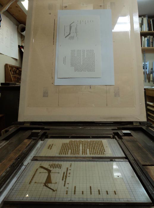
We're working off two sheets a week. Most are single black runs, but a few have illustrations with large black areas, so those are broken into two runs. Last weekend we printed a page that included a spectral representation of light. The text was printed first, then (same day) we lathered the ink onto the slab & printed the black bands.  Printing on dampened paper allows one to use much less ink than printing dry, and so when amping up for large black areas it can be alarming how much more ink than usual is required.


Semi-related, the CBC Radio show Ideas is currently running a three-part documentary on color. (Being the CBC, they'd probably want the u.) It's available by podcast from the show's site.