Showing posts with label Paper. Show all posts

31.5.25

The Printers’ Blues


What follows is a long-winded announcement for a new chapbook from HM, with some additional information on the topic it addresses appended...
 
 
The first blue paper copy of a book I saw was not auspicious: it was Black Sparrow Press’ 1973 edition of D. H. Lawrence’s The Escaped Cock. The blue paper looked like cheap copy stock. But it started me wondering about blue paper copies. Why blue?
 
That was about 30 years ago. I didn’t spend all that time pondering blue copies, but the question did recur a few years ago while working on the Griffo project – Aldus was the first publisher to issue a few copies of a new book printed on blue paper – and I did some searching. I thought surely some academic or bibliophile would have researched the whys & hows of blue paper copies, but apparently not, or at least not the answer to my specific question of Why blue? I did find an essay in the 1959 edition of Gutenberg Jahrbuch by Wisso Weiss (a German paper historian & “watermarker” among other vocations), but it didn’t seem to ever have been translated from the original German. So I had our new AI overlords do a quick pass, just to get a sense of the article.
 
It is broader in scope than simply why blue, but a few sections speak to it directly. This month HM issues a chapbook printing English translations of these sections, along with a foreword and postscript that provide some historical context and additional details. 
 

The chapbook is similar in form and style to Francesco Griffo’s Foreword to Petrarch (2021), although sewn in a handmade paper wrap rather than cased in boards. Like that book, it is set in Pablo Impallari’s digital version of Cancelleresca Bastarda. It was printed on my small stash of blue-tinged J Whatman mouldmade paper. Not as blue as Aldus’ blue paper, but blue enough. Given my unreliable printing, I anticipated getting no more than 40 acceptable copies from the paper available, but I actually netted 42. Each copy is sewn in a wrap of Reg Lissel’s handmade rag paper that has been dyed blue. The cover and text pages have been enlivened with calligraphic flourishes taken from J.B. Preusse’s Vollständige Anleitung zum Schreiben für die Land-Schulen (1792) and G. Bickham’s The Universal Penman (1733).
 
The Whatman paper is very thin and therefore somewhat transparent, more than one might ideally want, but it prints beautifully. I’d been hording it for years, and there was just enough for this small project, so I just decided to live with the transparency.  
 
The HM email list was offered pre-publication purchase, with a discount, and those copies have all been shipped. The remaining copies are available priced at US$150 plus shipping. A page with some photos has been added to the HM site. 
 

A FEW INTERESTING BLUE PAPER COPIES

Blue is not the only color to be used for a few special copies: pink, yellow and red are also known, but blue has been the most common colored paper used. While the examples of blue paper copies I’ve seen do have an intriguing appearance, the blue doesn’t seem to make the printing more legible or beautiful in any way. Book collectors being what they are, that intriguing oddness probably is all it took to make the practise a satisfying addition for publishers. I’ve answered my own question.
 
The study of blue paper has become an active field of research over the past few decades, something Weiss anticipated in his article. In recent years there was a large symposium on the topic, coinciding with an exhibition at the Getty. But if the answer to my question lies in the sympoisum papers, I have not found it. One academic, Paolo Sachet, touches on the question in his paper ‘Exploiting Antiquarian Sale Catalogues: A Blueprint for the Study of Sixteenth-Century Books on Blue Paper,’ and provides what probably is the best answer we’ll have (which is included in the new chapbook), barring the discovery of some note from Aldus explaining why he decided to add a few blue sheets to the pile when he was printing Scriptores rei rusticae in 1514 (a plain, boring white paper copy shown below).
 

Printing a few ‘special’ copies on blue paper was clearly inspired by artists who had begun using it for drawings and prints, experimenting with the tonal effects that could be achieved. Using it for type quickly spread from Adlus to other printers in Venice, then across Italy & into France over the next century, and then to other European printing centers through the 19th century. But it seems to have largely died out during the 20th century; I’d have thought the fine press revival of the early 20th century would have been ripe for blue copies, but seems not. The use of special, or at least different, paper for a few copies persisted, but not blue so much. Corvinus Press issued a few copies of Lawrence of Arabia (1936) on blue paper, but also used three other papers for the edition, which makes the blue variant a little less notable.


Incline Press printed a small volume on blue paper in 2013, celebrating Boccaccio
s birth, but it seems the entire edition of 250 copies was printed on the same paper, so not just a few special ones.

Tragara Press printed a short essay (Autumn Thoughts) on blue paper in 1975, but again the entire edition of 90 copies, not just a few.  
 
Here are some links to a few interesting blue paper copies...


A forged blue copy Aldine! I’d have thought the easiest way to forge a blue copy would be to simply dye the sheets of a regular copy, but apparently this an actual printed forger. Seems a lot of effort. 
 

PrPh Books has issued one catalogue devoted to blue paper copies, and another catalogue with many examples included. Lots of great images. The book above is the first and only edition of the heroic poem that recounts the true events of a duke
s fall from his horse during a tournament, said duke being the authors patron. Ripe for translation & reprinting. 

The first Italian edition of Euclid’s Elements, printed in Urbino, 1575. 

 
I found a reference stating the 1553 edition of Ludovico Dolce’s translation of Metapmorphosis is the earliest known fully illustrated book printed on blue paper, but I can’t find anything to back that claim up. Either way, lovely book. 

Two Essays on Slavery (Gehenna Press) includes an 8-page section at the end printed on blue paper. The text in this section is set in 8-pt type, which combined with the dark blue paper doesnt make for easy reading. The books title page is dated 1970, but the blue section includes the colophon, which is dated 1975. 
 
Just to tie things off, I wasn’t the only person wondering about blue paper. Thea Burns has just published a much more thorough investigation, Blue Paper: The Overlooked History of a Drawing, Printing & writing Material 1400-1600. Probably a good thing I didn’t know about it until after printing my measly 12 pages. 
 
See you in September, by which time I should have news about another project moving through the press.

1.12.24

The Allen Press’ Pernicious Paper


When I finished printing Dunwich, I collected some of the Bodoni ornament tailpieces used in the book into a single broadside. Twenty-five were editioned, and numbers 1 through 20 were issued with the corresponding book. I also pulled some initial proofs and a handful of extras, all on a variety of papers. I have a small pile of miscellaneous sheets, generally decent sheets but insufficient in quantity to be useful for a project. The 25 numbered copies were printed on Golden Hind; there were proofs on hosho, and exactly 8 on a handmade sheet that was showing significant foxing caused by something in the pulp. It was clearly a handmade sheet, about 150 g, without much (or any) size (i.e. soft). 

These four sheets came in a strange group of papers I acquired from the home of a deceased printmaker in town. He had a hoard of interesting papers, but being a printmaker, none in great quantity. The four foxed sheets split to the size of the broadside, and the foxing seemed appropriate for a Dunwich poster, so I added them to the proofing pile. 

 
I obviously didn’t look past all the foxing. I marked the verso of these eight broadsides Pernicious Paper. It was only when I was trimming one down to fit inside a box that I noticed the watermark:


It is also watermarked British Hand Made.

Huh. According to the Allen Press bibliography, the first book they issued with their watermark was Murders at the Rue Morgue, in 1958. It was made by Richard de Bas (probably in 1957, since it would have had to be ready before they started printing the book). They say it was the most beautiful paper they ever used, so probably not what we have here. Plus, wrong country. 

For 1968’s The Brothers they switch to a custom sheet from Wookey Hole. I checked that book, it’s a different watermark. 

They stick with that until 1972’s The Bacchae, which goes back to R. de Bas. 

1974’s Temptation of St Anthony introduces a mouldmade sheet [!], then 1975’s Quartet was printed on a new custom sheet from the St Cuthbert mill. 

I lost interest at that point in the pursuit. The real question is, how did a few sheets of the Allens paper wind up in the home printing studio of a Vancouver artist who had nothing to do with books or letterpress? We’ll never know, and that’s my favorite kind of ending.

1.9.24

The Dunwich Papers


More than a decade ago, I saw a craiglslist posting for about 170 sheets of Barcham Green Hayle paper offered at the low low price of C$2 per. Apparently the seller was clearing out her dead father’s basement, or something like that. Not believing my luck in being the first to contact the seller, the sheets went into the storage locker where most of my paper is stashed, waiting for the right project to come along.

The tricky part of buying stacks of vintage or odd-lot paper like this is, you need a project that will use most of what you have, and have dimensions that suit whatever the sheet folds down to (e.g. folio, quarto, etc). Theres no point in using just a portion, then having to wait for another project that will accommodate the remainder. Otherwise youre just wasting the paper. 

(The 2021 reprinting of Francesco Griffos foreword to his 1501 Petrarch is an example of a project conceived simply to make good use of a small stash of paper: Years ago I inherited about a dozen sheets of Richard de Bas. Lovely paper, but what do you do with a dozen sheets? I finally decided to think of something before it got lost or damaged.) 

For most HM projects, the one factor thats essentially set from the beginning is the edition size: 50 is a typical maximum, and fewer copies is OK too. Ive gotten a little better at printing over the years, and can now feel reasonably confident Ill end up with 50 good sheets from a run if I print 65 (for a long time Id print 75, because I was a crap printer). So, if my edition is going to be 50, I need enough paper to print at least 65 copies of each sheet. 

It was not my initial intention to use the Hayle for Dunwich. It was only after Id been playing with design and format options for a while that I realized it would fit the page proportions I had settled on perfectly. And I had enough sheets to make 56 copies (the editions 50 numbered copies and the contributors six H.C. copies), with about 20 sheets left over to cover disasters. Almost: with the way I had the text run out, I was short one leaf (two pages), either the first (title page and ©) or last (storys ending and colophon). I probably could have revised the setting to cram the text enough to free up two pages, but that wouldnt be satisfactory. My solution was to print the title page on a leaf of different Barcham Green paper, Penhurst. Its about the same weight as the Hayle, but a cream hue. Ive always liked books that mix different papers, and I liked the way the title page stands out this way. 

Then another problem popped up: somewhere along the way, the number of sheets listed on the wrapper of my Hayle stash and the actual number decohered: I actually had only enough to make 52 copies. That meant (1) no mistakes, and (2) four of the 56 copies had to be on some other paper. 

Hmmm. 

I was already planning on using my old standby, Guarro laid, for the necessary initial sheets printed while fine-tuning the inking and makeready, so I could just add a few more sheets and make the four needed copies from Guarro. 


While pondering all this, I found in the paper vault a slim package with another English handmade, F. J. Head. It was about the same weight as the Hayle, but a cream hue, and just slightly smaller in one dimension. I had enough to print just three copies of Dunwich. That
s why in the end, 48 of the numbered copies and four of the H.C. are printed on Hayle; two of the numbered and one H.C. on F.J. Head, and one H.C. on Guarro. (If Id had any disasters during printing, the number of copies on Guarro would have gone up.) The colophons of copies not printed on Hayle note which paper was used. From the exterior, the only way to tell is the FJH copies are about 1/8" narrower. 

So thats a few downstream issues to be aware of if you start hording odd packages of old paper for use one day...

DUNWICH DETAILS

Ill update dunwich.ca this month with photos of Brionys prints and the completed book. We remain on track to issue copies in November. Meanwhile, the bookseller Jacob Quinlan will have a copy (ARC/NFS) on display at the Thomas Fisher Press Fair on September 7th. If youre in Toronto, drop by. Jacob always has cool stuff.

1.1.24

Barbara’s Marbles


Byzantiums second publication was issued in late November. I got my Printers Copy. Its a study of how the paper used affects the results when marbling. Octavo in format, 35 leaves from frontis (i.e. the marbled sheet facing the title page) to colophon. The type is Fournier, the paper Arches Text. Before you get excited, its OP. 


The title page was marbled before printing. I was concerned the colors might flow when the sheets were dampened for printing, but she was using acyrilics (and she did a test). 


Barbara made the sections initial letters by laying a “mask” cut to the shape of the letter on the marbled surface, then laying down the sheet. Its amazing what clean edges she achieved.
 

The four samples on this spread were all made by Reg Lissel. The one lower left is part of a leftover from Jim Rimmer’s Duensing Titling (HM 2003).


This spread is from the section on Western mouldmade papers, which Barbara
s deemed the most succussful as a group for marbling. At left is a piece of blue Fabriano Ingres, at right is cream MBM Ingres dArches (plain samples below marbled of each).


Barbara made me sign the colophon. She might have done that once before. I don
t think the printer has any reason to sign but shes just making me feel included.


Claudia bound the books in a russet goat with her glorious tooling. Combining those two materials seamlessly is the kind of subtle and seemingly simple detail that delight the experienced eye. 


A THIS & A THAT
 
Stay tuned for an announcement later this month about HMs next project. A sort-of return/coda to 2005? 
 
The day my copy of Marbled Papers arrived, I also got my personal & unique copy of HM=XX, specially bound in full goat with inlays and tooling, by Claudia Cohen. The box for my copy was a half-inch deeper than the others, to accommodate some extra loose samples.

1.4.23

HM, World Celebrate 500th Anniversary


Welcome to the quincentenary post from the HM blog. I didn’t realize it was due until I noticed that last months guest post from Barbara Hodgson was #499. Her post enjoyed loadsatraffic, so Ill ask her back when the books issued. The guest blogger dodge worked well  – lots of views & no work for me – so I have a few more lined up for later in the year. 

Thats the binding for my copy of the Stockton book above. The spine is a strip of blue vellum thats been kicking around for years, the paper is a blotter from when I was painting the actual cover sheets & I just liked how it ended up looking, one side with an orange splotch and the other with a blue splotch. 


Thats a tray full of 14-pt Trajanus roman. When the great Will Rueter wound down his studio last year, he very kindly let me take over conservatorship of his entire Trajanus family, sizes 12 to 54, roman & italic. Its a beautiful face and not often encountered in press books. I have a plan for a get-to-know-you project with it; you never really know a type until youve set & printed it.

 
Thats some of the original material that will be included with copies of an upcoming book about Jim Rimmers Pie Tree Press & Type Foundry. Each copy will include an original, multi-color  linocut, initialed by Jim, from one of his books, plus a few additional items. That might be the next project in the press, or it could be Barbara Hs marbling book (see last month's post). Either way, both should be issued sometime in the fall. 


Cameron Treleaven, of Calgary
s Aquila Books, has been helping with the Rimmer project, and sent along the above keepsake with a collection of the ornament cards recently. The keepsake was printed by Brian Queen, on paper he made. The particularly interesting aspect of this sample is the laid screen on which the paper was cast was created using 3D printing technology, which allowed Brian to incorporate the watermark. I havent seen 3D being used to make screens like this before. Apparently papermaking is Brians avocation; I hope to connect with him for a future blog post. 


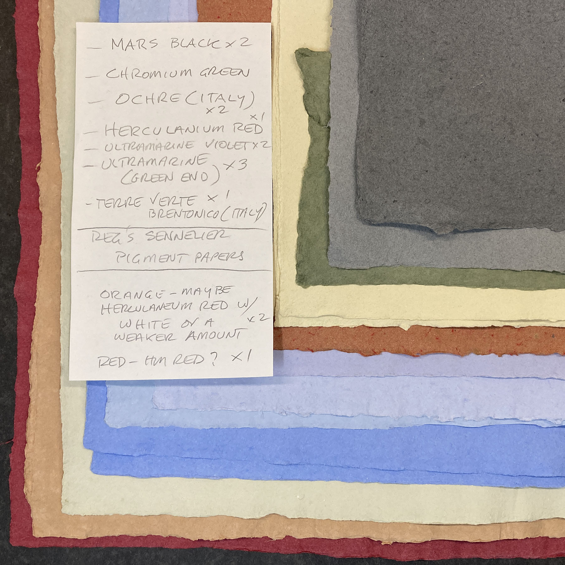
That
s a bunch of Reg Lissels HM Text, all vat-dyed for BHs Around the World in Colour book. She personally “imported” the pigments from Sennelier, in the 7th arrondissment of Paris. Each jar glass jar weighed almost a kilo, and she bought six and then had to get them home without any colorful disasters in an airport. Well be including samples in the book about Regs adventures in papermaking, which – after years of attempts – is finally coalescing. I once saw a copy of it in 2024, so maybe itll be there when we pass through. 


I had cause to be rooting through my Doves shelf this past week, and rediscovered these two slips of tissue with what looks like a trial setting/proof of Cobden-Sanderson
s Credo. I found them in a booksellers ephemera bin, years ago. No idea who was responsible or if the text ever got properly printed. Will R. thought the type looks like Zapfs Aldus. Could be – the & looks particularly right – but the e leaves me wondering...
 

1.3.23

Byzantine Marbling in Miniature


I recently realized that inviting other people to write this blog would make my life a lot easier. The first installment of this exciting new strategy goes to Barbara Hodgson, long-time HM collaborator and now master of her own imprint, Byzantium. Her debut publication, Paper Botanists, was issued last year, continuing her long partnership with binder Claudia Cohen. They currently are at work on another major work, but during the interim will be issuing a book collecting Barbara’s recent experiments marbling in miniature...
 

In 1853, English marbler and author of The Whole Art of Marbling, Charles Woolnough, wrote of marbling as a kind of “dark” art. The process was kept so secret that apprentices were taught only one style, in order to keep them from opening up their own workshops. (The image above is French, or Shell, marble pattern, fig. 28a from his book.)  Woolnough declared that manuals published in the years before his own were so “utterly ridiculous” they must be “treat[ed] with contempt.” After the first edition of his book appeared, Woolnough was lambasted by master marblers, convinced that his clear instructions would bankrupt them.
 
Marbling is no longer held to be such an alchemical wonder. Esoteric ingredients such as ox gall—a product produced in the bladder of animals, which is bought from butchers and which is “none the worse for stinking,” as Woolnough claimed—has been replaced with commercial wetting agents to aid dispersal of the colours. Grinding colours is now a job only for purists, as modern prepared paints are as fine as any marbler could ask for. Collecting Scotch or Iceland moss and boiling and straining it to make the mucilaginous carrageenan for the marbling bath needs only a trip to an art store where it is found in powder form.
 
As a decorative book art, marbled papers are reserved for occasional use in limited edition publications; as a craft, they are found as wrapping for boxes and frames. But marbling continues to fascinate, partly because each piece produced is unique, and partly because of its inherent unpredictability. 
 
The following three images show a 5-1/2 x 3-1/2 inch marbling bath in three stages of preparation, with Prussian blue, burnt sienna, raw sienna, quinacridone red, chrome green and titanium white combined and drawn through. The fourth image shows the result on St Armand Old Master’s drawing paper.
 

It is the element of surprise that drew me to the idea of marbling a series of miniature samples on different papers (the image at top of this post shows a piece of Reg Lissel’s gampi, before & after marbling). I had already experimented with ebru, Turkish marbling, and suminagashi, Japanese marbling with ink, after finishing my part of Decorating Paper, a collaboration with Claudia Cohen, in 2014. Following a kind of tradition that began with a three-copy miniature version of our book, The Temperamental Rose, and continued with the more ambitious eight-copy mini WunderCabinet, it seemed fitting to make the suminagashi experiments in miniature form. The resulting book, in an edition of 12 copies, measured just 2-1/4 x 2-7/8 inches.
 

I planned to make Marbling: Paper & Colour, as it is tentatively titled, to be a same-sized companion to Suminagashi, with some 20 samples on a variety of papers, some single page; others double width for spreads or foldouts. The text would be a (very) brief description of the papers and colours used. This plan remained firmly in place until I made a mockup, at which time the idea fell apart. At the miniature size, the pages—which range from 1920s Airmail flimsies to Hahnemühle Ingres—are awkward to turn, the foldouts difficult to fold out and impossible to fold back in. 
 

Now Marbling has been resized to 7 x 9 inches, with two to four safely anchored samples per page. Multiple examples of some 25 to 30 different paper types will be included in each copy. There will be a short foreword and descriptions of the papers and colours, with all text to be printed at Heavenly Monkey. The edition will be a maximum of 20 copies, probably fewer, all uniformly bound in leather by Claudia Cohen. Publication is planned for late 2023.