Showing posts with label Metal Types & Some Paper. Show all posts

21.9.15

A Golden Hind Trove


Received 250 full & 200 quarter sheets of Golden Hind mouldmade paper, courtesy of Takao Tanabe. It's a beautiful text-weight laid sheet that prints beautifully. Perhaps the best surprise was that the paper retained its original wrapping, with the maker's label, thereby answering my long-standing question of who made Golden Hind.

I know of Golden Hind because it's what Robert Reid had Kuthan's Menagerie of Interesting Zoo Animals printed on in 1960. As Bob explained in the introduction for Kuthan's Menagerie Completed, he felt the paper was too translucent for George Kuthan's bold & colorful linocuts, so he printed on one side of the sheet only, and bound the book along the open edge.

http://www.heavenlymonkey.com/Newlove.htm

When Tak called to tell me about the stash of Golden Hind he'd found in his studio, it got me wondering what mill it came from. Tak got into job printing in the '50s, initially being mentored by Bob. Tak's artistic talents quickly showed through in a series of typographically creative and playful broadsides and poetry chapbooks he designed and printed. In the early '60s he got a Canada Council grant to study in Japan, and his vocation as a printer was displaced by a career as one of Canada's most important painters.

Tak guessed that the Golden Hind he dropped off last week was purchased mid- to late-1950s, when he was printing. It was being distributed by a paper supplier in Toronto. I asked Bob Reid about how the paper came to his attention:

"Somebody in Toronto alerted me to the fact that a paper house there had this gorgeous mould-made British paper that was mouldering in their warehouse because nobody in Toronto wanted to use it. So we bought all they had. They must have kept stocking it for us, if Tak was buying more of it years later. You are so lucky to be able to get some of it now."


A search for "Golden Hind paper" yields surprisingly few results. The most useful is Papermaking at Tuckenhay Mill, a reasonably full account of the mill's history, which ended in 1970. I can't find any specific mentions of Golden Hind on the site.


I initially wondered if the paper had any connection to Arthur Rushmore's press, but apparently not. An Abe keyword search for the paper turns up just one other book printed on the paper: Philip Levine's On The Edge, printed by Kim Merker in 1963. Interesting that it's around the same time that Bob and Tak were using it. Perhaps the paper was a new sheet introduced by the mill in the '50s to complement (or as an alternative to) its handmade products. Will Rueter printed 10 special copies of Ten Songs (The Aliquando Press, 1987) on Golden Hind; he may have gotten it from Gus Rueter, whose private press was active in the late '50s and early '60s.


I've printed on Golden Hind twice so far. The first time was Kuthan's Menagerie Completed, which included a two-page intro by Bob printed on blank sheets that had been stored with the unbound copies we were releasing. Some printed sheets had been balled up and used as packing in the box; these we used for the colophon. They were dampened for printing, and dried in the usual manner, under pressure, which helped smooth out the wrinkles.


The second time I printed on Golden Hind was for Metal Type. For some reason, one page of text (set in Perpetua) from Kuthan's Menagerie had been overprinted; I guess they didn't like something about it. So I had all these copies of the same page of text on one side and blank on the other (They'd been stuffed in with the unbound copies I had in 2003). Metal Type combined a number of different papers, so it provided an opportunity to use up the Menagerie waste sheets: I used the blank side to print a Muhammad Ali quote I've always liked. On the printed side I displayed my own 18-pt Perpetua, intermingled with Bob's original.


The paper prints beautifully. It's relatively soft, but not too much. Like most papers, it prints better damp, but it doesn't require a lot of damping.

So, huge thanks to Tak for thinking of HM. I've promised him a copy of whatever I print on the paper. The problem is, when you get a stash like this, once it's used you'll never get more so you never use it! We'll see...

20.1.14

Repetition & Reduction


The patterned paper used to case Metal Type (& line the boxes of the deluxe copies) was designed by artist & HM friend Dana Cromie. (See bottom of this post for details on a small number of these sheets issued as signed prints.) I first saw the general scheme he used for repeating the components last summer, in mock-ups for a series of large prints/collages he was planning for a show the Beaty Biodiversity Museum on the campus of the University of British Columbia.


The show, titled Remnants, opens at the end of this month. The focus is Dana's "reaction to the ongoing reduction by human activity of natural habitat." In recent years Dana's art has focused primarily on detailed (but usually quite spare) botanical watercolors. For Remnants, however, he explored a new medium, creating a series of five collages, each composed of prints of natural components arranged and repeated in the same manner as the paper used for Metal Type, and layered with prints of anthropogenic activities. 

"Twenty-six original drawings have been letterpress printed, hand cut into 1,500 pieces and glued into five portraits. The sources for the nature drawings are mostly archival, some from the Internet, some from the cabinets of the Beaty Biodiversity Museum, and a few from nature. What is always missing is context. The design of the man-made elements in the style of traditional wallpaper is Cromie's response to the appropriation of ‘Green’ currently utilized to promote everything from gasoline to urban towers. Humans are absent in the portraits because as individuals we do not see our relationship to the changes in the environment." 


The natural drawings used to create the five collages (18 in all, ranging in size from 2 x 2 inches to 6 x 6 inches) have also been printed individually on Somerset Velvet paper, in editions of 20 signed and numbered by Dana. These prints will be available for purchase at the Beaty during the show (prices range from $65 to $125). 


All of the relief printing was done by Yasmine Franchi at Black Stone Press, with Dana's original drawings reproduced from polymer at one-half scale. Each of the finished collages measures 59 x 39 inches. Dana's sister was enamoured of the larger format of the original natural drawings, so they were silk-screened with indigo ink on while bull denim. She then sewed a traditional quilt of 8 x 10 feet to hang at the entrance to the exhibit.


Metal Type is not HM's first collaboration with Dana. A couple of years ago we printed a series of four line drawings for him, each in an edition of 12. Titled Dance Recital, the series was "a music concert interpreted in line and colour." Each printed was inspired by a particular piece of music (above is Philip Glass's opera The Photographer, based on the homicide trial of photographer Eadweard Muybridge). The prints were the individually colored by Dana (they're available uncolored, but since the color is half of the premise for the images, it's a waste).


Not a printer per se, Dana has ink in his veins: his family owned the Vancouver Sun for many years. In addition to his own art & a couple of cool early Joe Average paintings (he and Dana ran in the same circles), one of the notable pieces on Dana's walls is a menu from the MGM Studio cafe, c.1935 signed by a number of famous actors, including Nelson Eddy, Mickey Rooney and Jimmy Stewart.  Turns out back in the day, Dana's grandmother used to winter in L.A., along with her son (Dana's dad). One day they were noshing at MGM, and got the actors to sign the menu on their lunch break. The menu alone is a great piece of job printing from the era, the other side reset with the specials every day.


We had a handful of extra sheets of the fonts paper printed for Metal Type. Rather than putting them away in a box, we decided to issue them as prints, suitable for framing. The edition is 10, each signed & numbered by Dana. The sheets (Guarro laid off-white) measure 12.5 x 17 inches, with an approx. 0.75 inch border around the image. They're available from Dana, price is $75.

Remnants will be up through April. Dana will be posting images of the pieces created for the show on his site after the opening.

P.S.

Interesting notice of the recent sale at auction of the Kelmscott Goudy Albion press on the Wessel & Lieberman home page. Also, a longer piece in The New York Times. Neil Shaver's Yellow Barn Press published an interesting and, as with all his books, beautifully printed book about the press. In view of the hammer price, maybe HM unfairly criticized the asking prices of some handpress on eBay last year...

http://printinghistory.org/kelmscottgoudy-press/

New releases from Harold Budd's back catalogue recently. And a new release through Darla expected soon.


loscil tours Europe next month. See him if you can. (Apparently he still has a couple of the portfolios containing two original prints, produced with Heavenly Monkey, which might be available at the merch table...)


Signed copies of Aimee Lee's book Hanji Unfurled - the first English-language book about Korean handmade paper (according to the blurb) - are available through the author's site. The book's received strong reviews. Unfortunately no deluxe or special edition with samples was issued. Regardless, if you're buying contemporary trade books, you should get signed copies whenever possible.
This series of portraits is Cromie's reaction to the ongoing reduction by human activity of natural habitat. Built using the small pieces of the contemporary viewing pane, these collage quilts pay homage to traditional home economics and to the Arts and Crafts movement of the late 19th century. The vertical format reflects the traditional portrait proportions of influential individuals. The repeated use of small pieces relates to how we build our impression of the world without experiencing it.
Twenty-six original drawings have been letterpress printed, hand cut into 1,500 pieces and glued into five portraits. The sources for the nature drawings are mostly archival, some from the internet, some from the cabinets of the Beaty Biodiversity Museum, and a few from nature. What is always missing is context. The design of the man-made elements in the style of traditional wallpaper is Cromie's response to the appropriation of ‘Green’ currently utilized to promote everything from gasoline to urban towers. Humans are absent in the portraits because as individuals we do not see our relationship to the changes in the environment.
- See more at: http://www.beatymuseum.ubc.ca/remnants#sthash.97XmWIUg.dpuf
This series of portraits is Cromie's reaction to the ongoing reduction by human activity of natural habitat. Built using the small pieces of the contemporary viewing pane, these collage quilts pay homage to traditional home economics and to the Arts and Crafts movement of the late 19th century. The vertical format reflects the traditional portrait proportions of influential individuals. The repeated use of small pieces relates to how we build our impression of the world without experiencing it.
Twenty-six original drawings have been letterpress printed, hand cut into 1,500 pieces and glued into five portraits. The sources for the nature drawings are mostly archival, some from the internet, some from the cabinets of the Beaty Biodiversity Museum, and a few from nature. What is always missing is context. The design of the man-made elements in the style of traditional wallpaper is Cromie's response to the appropriation of ‘Green’ currently utilized to promote everything from gasoline to urban towers. Humans are absent in the portraits because as individuals we do not see our relationship to the changes in the environment.
- See more at: http://www.beatymuseum.ubc.ca/remnants#sthash.97XmWIUg.dpuf

13.1.14

Things Are Going To Change Around Here


For those who haven't already heard, HM is going walkabout in 2014. The timing is typical HM: the last post (Faking It) scored the highest view numbers since this blog started. Leave on a high.


This is a bit of a forced break, as the current premises must be vacated while a new HQ is built. The time will be spent developing the next few publications (including the long-promised George Wither emblem leaf book). I'll be taking over blogging duties during the break. My first official act is to reduce posts to once a week (Monday).


There will be some updates on the HM projects in development, but most of this year I'd like to spend seeking out people making interesting books and art that I don't already know about, the ones who aren't mentioned in every article about "fine press" and letterpress printing. There's a lot going on out there. Much of it isn't as innovative or unusual as the people doing it think; much of it lacks knowledge of the tradition people are working in; much of it is just dull. The fun lies in finding the exceptions. Tips, leads and even self-promotion will be appreciated &, if fruitful, properly acknowledged. The email address is down the right column. Till next week - Rollin

26.12.13

A Heavenly Monkey Miracle


Some kool books found under the tree, as foretold. Details next week, after there's been time to soak them up. Till then, something to admire: the cover of Claudia's test binding for the deluxe copies of Metal Type. Vellum, and all that tooling is by hand. Stunning.


And there's this too, an Xmas present from HM2, found in a "vintage" (i.e. second-hand) shop: a blanket made in Japan (doesn't look terribly old), 100% wool and incredibly soft, bearing a familar ligature...


A Christmas miracle?

16.12.13

It's A Wrap


Some hasty snaps of the test binding for the copies of Metal Type being cased at HM (vs the ones being bound in vellum by Claudia). The design that Dana Cromie created for the cover paper was printed in blackest black by David Clifford at Black Stone Press, and looks fantastic. Completely unlike any previous HM book.


We printed it on the same Guarro laid used in the book. It's a very hard paper that prints beautifully when damp, but can be difficult to print dry (which is how David had to print it). But this is the same quality that makes it good for casing in: it's tough paper.


Couple of small adjustments to make, dimensions and figuring a way to place the labels on the boards exactly beneath the placement on the jacket. Speaking of the jacket, it's masa, a semi-transparent machine-made sheet. Smooth on the printed side, rough on the inside, so it won't slide off the boards when being handled. Dana's design is so brilliant that giving it a sheer wrap hinted at the riot beneath, emphasizing its impact when the jacket is lifted away.


So that's the book. The edition is fully subscribed, but that just means most copies will soon be in booksellers' hands. Please contact any of HM's regular dealers listed at right to inquire about availability.

12.12.13

Skewed Patterns


That's David Clifford's Vandercook with one of the plates used to print the patterned paper we'll be covering the boards of the Press copies of Metal Type. The pattern is called "Fonts" and was designed by artist & HM friend Dana Cromie. (Dana has a big show opening in January, and he's also working with David Clifford/Black Stone Press to print a series of multiples that are being assembled into huge repeating images.) Think it's the first time HM has resorted the private press cliché of patterned paper over boards, but in our typically skewed way. If all goes well, we'll have snaps of the test binding next week.

9.12.13

Metallic North


Folding & sorting. Collating copies of Metal Types. Those are the Deluxe copies above. A sheet of millboard laid over the bed of the Washington makes a good table. Let's make today's topic technical: here's one of the additional pages included in the Deluxe copies.


It features Robert Reid's font of Columbus (displayed, with a brief history, in HM's Codex Miscellany), a face offered for only about 10 years on either side of 1900. As you can see, all of the Q sorts from Bob's case were lost over the years (it has travelled across Canada twice in its lifetime). This kind of thing - one letter completely missing - happened with several of the faces displayed in the book.


The Columbus is printed over an old & very worn map of what appears to be central Canada, as it includes Hudson's Bay. Old because there's a lot of "these parts unknown." The map (a zinc plate) was split across two separate blocks, each about 6 x 10 inches. Printing it as a bleed on the Washington would have required completely changing the form lock-up, which was not an option (half the book still to be printed), so it was printed with one of our large book (i.e. copy) presses.


The blocks were secured (taped) to a plexiglass base, and inked with a hand brayer. The paper was simply laid over the blocks, then the base was slipped into the press & the platen screwed down (tight). Voila. The map was so eroded that getting a good & even impression wasn't really an issue, and the slight variations between pulls (screws?) were interesting.

5.12.13

Keeping Books Warm & Stylish


Printed the colophon for Metal Type. Set it in Gill Sans, simply because it hadn't been used anywhere else and we have some the right size (12 pt). Used De Roos italic to press-number the edition. The text for the Deluxe copies is slightly different than the text for the Press copies. Also printed the publisher's and binder's names for their (hors de commerce) copies.


Should be getting the patterned paper for covering the cases this week. Playing with ideas for a printed dust jacket too. People don't play with dust jackets enough.


The screen-printed jacket for Girl With the Mask of a Crow, and the (massive) etched jacket for Iskandariya were brilliant (and both entirely the work of the artist, so we're not boasting).

29.11.13

What Are Pleasant Colors?


"Healthy people wear pleasant colors." That wasn't covered in Occupied By Colour. Brown definitely does not qualify, and that includes shoes.

There's some rule prohibiting posting on Thanksgiving, so up it goes today. Speaking of the colo[u]r series, David Clifford is gearing up to start printing the last instalment, Around the World in Colour. It might even be completed before the Xmas break, but that still leaves a few months of fabulizing by Barbara & Claudia before it gets issued; late spring '14, as promised. And before David dives into that, he has to print the patterned paper that will be used for the case bindings of Metal Types. That'll happen next week. The last two sheets will be printed by Monday's post. Back to it.

25.11.13

The Sky's Gone Out


This'll be another quick one: have to get printing. Finally seeing some light through the trees: settled on a title for the new book, if only because everything but the title page & introduction are printed. Tried something for the intro this weekend: spent Saturday setting a spread, Sunday proofing & doing makeready. Then binned it all: not at all right (visually) for what follows.

So, faced with a ticking clock, a new scheme was hatched, one that resolved how to handle both the title (what it is, not how it's set on the page) and the introduction (content & layout). A minimalist scheme. During every attempted solution for this preliminary section, cutting it down to the most basic, fundamental information was in the back of the mind, yet things kept getting busy. Anyway, the paper from yesterday (Reg Lissel's HM Text is used for the 8-page preliminary section) is still damp and must be worked off today, both sides, so pressing on (ha!).


For short, let's just call the book Metal Type. That's what will be printed on the first page in the book (note we don't say "title page").

The book (7 x 10 inches, 40 pp.) is printed on nine different hand- and mouldmade papers. It will be published in an edition of 35 numbered copies, issued in two versions.

Deluxe Issue: Copies 1-15 will include two additional sections [16 pp]. The first will present four uncommon foundry types (Anker Romanisch, Carolus, Gallia & Kabel) in display sizes, borrowed from the collections of several friends, each printed in two colors on Barcham Green handmade paper. The second extra section will present titling (i.e. large) fonts of eight faces already shown in the book, printed on Barcham Green & Roma papers. (Close readers may find one or two other additions...) These copies will be bound in full vellum (a structure similar to the one she used for HM's Iskandariya, below) with gilt embellishments by Claudia Cohen, presented in a cloth traycase.


Press Issue: Copies 16-35 will be sewn & cased at HM. The (thin) boards will be covered in a printed patterned paper created by artist Dana Cromie. (The same paper will also be used to line the boxes for the deluxe copies.) The book will be wrapped in a semi-transparent printed paper jacket.

At this time, all of the deluxe copies are reserved for HM's regular distributors, as is a significant portion of the press copies. For anyone from outside the trade who is interest in securing a copy, the surest way is to contact one of our booksellers (listed at right).

Some of the Press copies will be issued before the end of the year. The rest, and all of the Deluxe ones, will be issued in early 2014.

Gotta get to work...

22.11.13

Perpetua(l) Knot


Didn't post yesterday because we're busy printing some pages for the deluxe copies of the type book. Closer & closer. Also finalizing plans for the printed paper to cover the boards of the press issue; it'll feature a pattern created by friend & kool artist Dana Cromie. The paper will also be used to line the boxes for the deluxe copies. Not posting it here; you'll have to wait & see it in person.

Title of the book remains elusive. Less is always more: am now trending toward simply calling it METAL. 

How about some holiday shopping tips today...
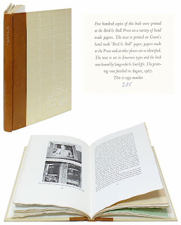
http://www.bibliopolis.com/main/books/1133287.html

Henry Morris's Omnibus. Copies seem inexplicably plentiful & thus ununreasonably cheap. Abebooks it. Great book, printing by him on his handmade paper. Lots of practical information about printing.

Harry Duncan's Doors of Perception, the limited edition printed by Carol Blinn & published by W. Thomas Taylor. Beautifully printed & bound, an excellent collection of essays about printing, with particular focus on the use of the handpress. Taylor also issued a paperback version; same content. But the limited edition is, like Omnibus, a very good buy (probably below issue price) right now.

http://designarchives.aiga.org/#/entries/%2Bid%3A1058/_/detail/relevance/asc/0/7/1058/porter-garnett-philosophical-writings-on-the-ideal-book/1

Porter Garnett's Philosophical Writings on the Ideal Book, a collection of pre-WW2 essays from the man who started the Laboratory Press, and also some by other well-known names of that period. Great book, ridiculously cheap. For that matter, many of the Laboratory Press publications can also be found at friendly prices.

14.11.13

The Finest Traditions in Hand-Set Type


How's that for a mouthful of busted chiclets? Oddly, it takes more time to set & lock-up a disaster like this than setting it properly. Part of the genius of movable type: it resists being used improperly. But we showed this Garamont who's boss.

All in aid of the new book, which has (yet another) new tentative title: Improvised Impressions. The title reflects the process that came to be used for displaying each face in the book: While there was some general design conceived in advance for each page, the details were worked out on the bed of the press, as the type was set. Where books typically are exhaustively planned in advance, the complete lack of continuity in content or form from page to page in this collection of types allowed (& often required, due to a shortage or complete absence of one letter or another) an improvisational approach. Intuition was the guiding principle. Each page was created in the moment, each step and decision a response to the one preceding it, working within the constraints of the page and what was available in (& lacking from) any given drawer of type.
The entire undertaking is underscored by an impish attitude toward the types on display: respect, but not reverence. Improvising is an act of the moment; the printed pages in this book are permanent records of the improvisations. 

Down to the last few sheets now: the foreword, title page & colophon. The edition will be 35 copies, with the first 15 being a deluxe issue. These will be bound in full vellum by Claudia Cohen, and contain two additional sections (16 pp.), per the last post here. As the image above suggests, the second of those sections gets a bit unruly.


Speaking of Claudia, did you know there actually are three variations to the deluxe binding for Paper Should Not Always Be White? She came up with three designs for tooling the front board & we couldn't pick a favorite, so she did all three. Two of them are shown above. There's no priority or preference (except one's own). We'll post some more images of the deluxe binding next week.

11.11.13

Weirder & weirder


This are getting strange around here. Above is a page from the second of two extra sections that will be included in the deluxe copies of the new book. This section features display sizes of eight faces already shown in the book. The paper for this sheet is Roma.

New working title for the book: Improvised Impressions. Explanation to be included in the foreword.

Details for both states of the book have been hammered out; we'll post them on Thursday. Gotta get back at it now.

7.11.13

She's A Rainbow


Tried something for the first time this week. Turned out really well. Printing with a rainbow roller. Also known as a split [ink] well. It was for the Gallia display page in the new book. The type's name was set in 36-pt in the middle. Above & below, the alphabet (no lowercase for Gallia) & numbers, with leading decreasing as you approached the top & bottom.


Three colors: black for the Gallia (i.e. in the middle), gold for the upper portion, red for the lower. Measured the height of the form, in inches. Laid down a piece of masking tape on the glass slab & marked borders between the colors. Laid down a second piece of tape, perpendicular, along the left side, as a guide to keep the roller in the same place when charging it. Rolled out the inks.


Naturally the inks would blend where they met. Trick was not letting the black overwhelm the other two, especially the red. Adjusted each of the colors as we went, in exactly the spot (i.e. line) on the roller that needed a boost.


Another thing that might be easier to do with a handpress, or at least hand inking, than with a mechanized press. Need to do more. Rainbows everywhere!