Showing posts with label Labour Vertue Glorie. Show all posts

1.9.22

Why No Intaglio?


Books that combine letterpress and intaglio printing, particularly on the same page, have always intrigued me. It was, if not common, at least frequently encountered in books from the sixteenth through eighteenth centuries, when engraving on metal was the best method for repeating detailed, fine-line images. But the modern English-language fine press has largely overlooked intaglio, in favor of woodcuts and wood engravings. 


The advantage of relief methods is that they can be locked up and printed with the text, no need for separate runs, much less different equipment. And relief printing is much faster than intaglio (wiping an engraved or etched plate takes much longer than beating ink on to a form of type). 


I’ve spent some hours over the years trying to find historical sources describing how early publishers went about combining the two printing methods, with little luck. The best modern single source is Gabriel-Rummonds’ Nineteenth Century Printing Practices, but all it has to say is the completed letterpress sheets were sent off to another shop to have the intaglio added. That at least provides one piece of information, the sequence. The pages of George Wither’s book of emblems (see Labour Vertue Glorie) show this to be the case: the intaglio lines often lie over the (letterpress) borders.  


It’s what I suspected: it’s easier to drop an intaglio image into a printed text sheet than visa versa. Intaglio is much more time consuming (and thus expensive) than letterpress, and you wouldn’t want to waste any good prints from bad inking or some other flaw in the handpress. Plus the intaglio could be done in several different runs for an edition, as copies were sold. That kind of “as needed” printing isn’t practical with type and letterpress. 
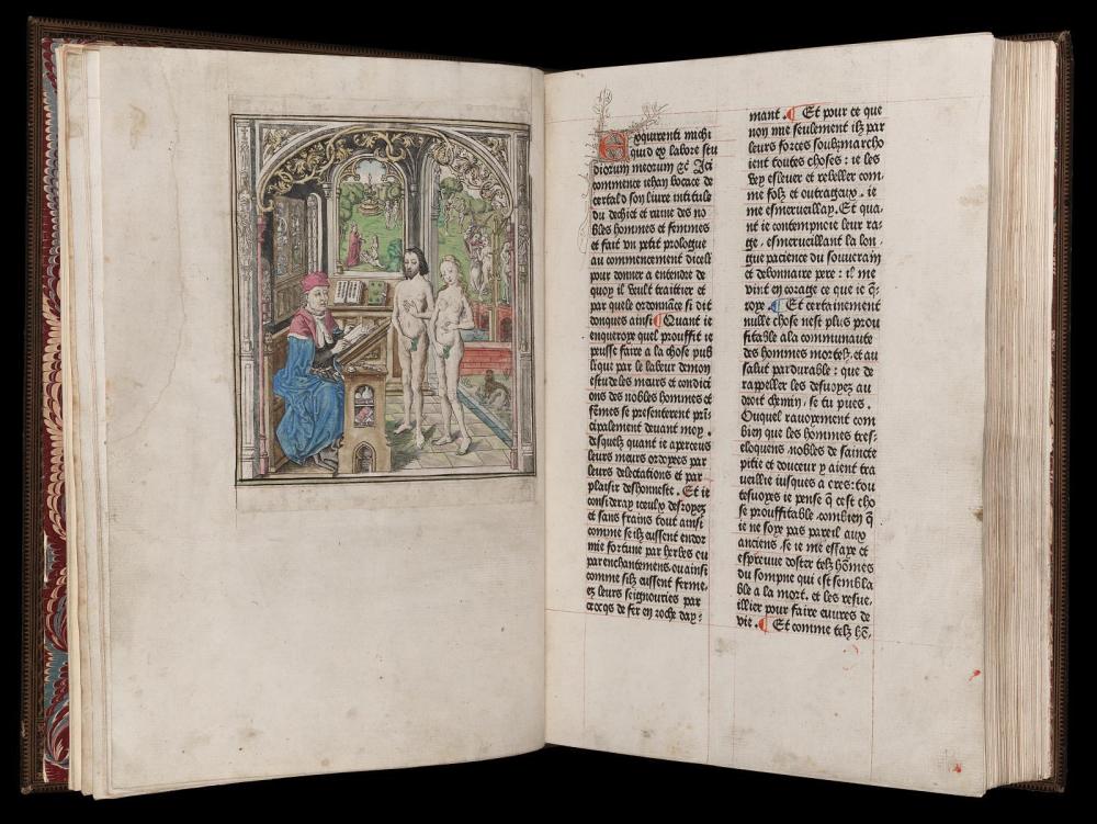


The earliest known book illustrated with copper plates was a French translation of Boccaccio’s Casibus Virorum Illustrium (De la Ruine des Nobles hommes et femmes), published by Colard Mansion (Bruges, 1476). However, the nine engravings were actually printed separately from the text sheets and tipped (pasted) in, which is why they are lacking in many of the 60 extant copies. I’m still chasing down the first book that combined letterpress and intaglio on the same sheet, but it was soon after.  


In 1481 an edition of Dante’s Comedia was printed in Florence by Niccolò di Lorenzo della Magna, with copper engravings based on drawings by Botticelli. Some copies had the engravings printed on the text sheet, some had them pasted in, and some are blank (either intentionally, to have the images added by hand, or simply because the intaglio was never added). 


An objection some people make to having intaglio on a letterpress page is the plate mark; they find it objectionable on both the verso and recto of the leaf. Some intaglio printers do print with a deeply debossed plate mark, but this is not necessary for good printing, any more than deep impression is required (or desired) for letterpress. I’ve always been more concerned about the loss of the letterpress impression as a result of wetting the sheets again and running them through an etching press (what is basically a mangle), squashing all the life out of the letterpress. 


This is one of the oldest books that includes intaglio in my collection: De M. Aurelii Antonini... (Florence, 1711), in which Benedictine of Brescia proposes a chronology of the reign of Heliogabalus based on coins issued during his reign. The book includes eight engravings of ancient coins. These photos won’t show it well, but the impression on the leaves that include an engraving has definitely been flattened out, however I can’t say the actual printed text looks glaringly different. It would show if you pulled out a loupe, but people who walk around with loupes to pull out are a bore.


Despite this historical precedence, the only modern source for combining the two methods I’ve found is Rummond’s Printing With the Iron Handpress. It counsels the historical precendent’s opposite, laying down the intaglio first. His primary reason seems to be to preserve the impression from letterpress. He also recommends using a different damping technique for letterpress, one that is messier but which retains the plate mark (the preferred method of damping with blotters would flatten it out). 


Many printers have side-stepped this question by simply not combining the two methods on the same sheet: the intaglio prints are inserted, as plates. It’s essentially the strategy I chose for Iskandariya (2007), for several reasons. The primary one was that the intaglio was to be done by the artist, and she was 3,000 miles away. I didn’t (and probably still don’t) have the courage to add the letterpress after her intaglio – my wastage was much too high when we did that book. And we couldn’t come up with a satisfactory way to deal with the plate mark on the verso of a sheet. Our solution was to interleave the etchings between each opening, and print two on a sheet that was then folded and bound at the open edge, so that the plate marks where hidden within the folded sheet. (Image below shows how the two halves of the open edge where folded to make a tab used to sew the sheet in.) This allowed the letterpress and intaglio to proceed independent of each other, and on different papers. It was an elegant solution for that book, but I still hanker to make a book that combines the two methods on at least a few pages. It might happen yet. 


Here are a few contemporary press books/printers I know that that combine intaglio and letterpress: 


Sherwin Beach Press Ballet for Opening Day. This book doesn’t combine intaglio and letterpress on the same sheet, but they came up with a brilliant way to integrate the two: sewing them together like the stitching on a baseball. This also allowed them to use one paper best suited for the letterpress, and a different one best suited for the intaglio. 


Leonard Baskin
s Jewish Artists of the Early & Late Renaissance is a master class in what can be done with patience and skill. (Note that it avoided the plate-mark issue by printing rectos only.)


Bob Wakefield has been printing both the letterpress and intaglio in his Chevington Press books since the 1980s. Beautiful & unique work. 

I’m sure there are many others unknown to me; send names & links, I’ll add to the list. If you’re interested in reading more, see this page from the Folger Library, or this one from Cambridge


AND ANOTHER THING!


The above was recently spotted by HMs London agent. If Im not related to these people, I will be soon...

2.7.18

Augustine Mathewes, Printer (& Rascal)


This month’s post reprints a short preliminary chapter from HM’s recent publication, Labour Vertue Glorie. It’s a biographical sketch of Augustine Mathewes - aka Mathews, Matthews, & A.M. - the man who printed George Wither's A Collection of Emblemes (1635). I won’t be posting any other chapters, and have selected this one simply because it should be of general appeal to anyone interested in printing. Mathewes' printing in A Collection is not an example of the best work being done at the time, not even for England. It’s workmanlike. But the amount of setting and printing involved, with the conditions and equipment of the day (how did anyone see anything?), and his productivity make me feel feeble & lazy. But my printing is better.

The device included on the title page of Labour Vertue Glorie was adapted/appropriated from Mathewes’ own, as it appears on the title pages in A Collection’s four books (i.e. parts). The references included here have been renumbered from what they are in the book, just for simplicity.


AUGUSTINE MATHEWES took his freedom as a Stationer in 1615. The first book he entered to the Register, in 1619, was Thomas Decker’s O per se O, or the belman of London. By 1620 he was working in partnership with John White, who had inherited the printing house of his father, William. In 1624 Mathewes assumed control (“farmes his printing house of John White”) in exchange for an annuity.[1] Mathewes’ name made regular appearances in the Register for the next two decades, sometimes for printing unlicensed works (not an entirely unusual occurrence at the time).

https://en.m.wikipedia.org/wiki/File:Othello_Q2_TP_1630.jpg

Notable books that Mathewes printed include Lady Mary Wroath’s The Countesse of Mountgomeries Urania (1621), which featured a frontis engraved by Crispin de Passe’s son, Simon, and is considered the first published prose romance written by an English woman; an edition of The Troublesome Raigne of John, King of England (1622) with a title page that mis-attributes it to William Shakespeare; and the second quarto of Othello (1630). Mathewes also published two editions of William Haughton’s comedic play Englishmen for My Money, one in 1626 for John Norton (whose name appears as printer on the title page), and the second in 1631 for himself.[2] The original license lay with William White, and must have come to Mathewes when he assumed the business (and its licenses) from son John.


William White had printed George Wither’s fourth book, The Shepherds Hunting, in 1615; it may have been through his association with White that Wither met Mathewes. The printer’s first recorded work with Wither was in 1622, when he printed Cantica Sacra, the publication that prefaced Wither’s protracted patent dispute with the Stationers’ Company.

https://archive.org/details/firstsecondparto1622shak

Things seem to have started going badly for Mathewes in 1636. In the Registers of the Stationers’ Company is a record of Sir John Lambe, who was then investigating London’s printing industry, referring to Mathewes as a “pauper,” followed by the ambiguous statement “(let them agree who shall be, they have now 3: presses:).” The same record states that Marmaduke Parsons “hath kept matthews printing house.”[3]

In 1637 a Star Chamber decree tightening controls on access to presses and printing of all kinds was passed, in part a response to Puritans’ challenges to the Church of England. One of the most notorious Puritan pamphlets inciting the decree was The Holy Table, written and published anonymously by John Williams, bishop of Lincoln. “Williams in essence challenged the policy of calling the holy table an altar and of insisting that parish communion tables must be placed altarwise, at the end of chancels…The revised Short-Title Catalogue lists seven separate editions of this work, all dated 1637, but none of them provide information about stationers in the imprint.”[4] One of the stationers was Mathewes, who was caught printing the tract.


A record in the Stationers’ Register dated July of that year includes a letter written by John Lambe, the Dean of the Arches, addressed to himself. He states that “the forbidden book which must forever be associated with this Decree was The Holy Table,” and lists those “worthy to be authorized printers under the increasing durance to which the Press was now to be subjected.” The letter includes a brief statement about Mathewes: “he was taken reprinting of ye Holy Table. Marmaduke Parsons hath long had his presse and priu[v]ledg[e] made over to him and is most fitt to be in his Roome.”[5] Mathewes was out and Parsons was in. 

http://www.earlyprintedbooks.com/wroth_urania_1621_2o2r/

States Papers Domestic for July, 1637 includes two entries mentioning Mathewes. The first summarizes Lambe’s letter of printers “worthy to be authorized.” The second summarizes Mathewes’ plea for clemency to the commissioners overseeing the printers of London, for his transgression with The Holy Table: “Understanding he has committed a great error, he prays the commissioners to be a means with Archbishop Laud that he may be admitted as a master printer.”[6]

His plea was unsuccessful, and Mathewes seems to have been made an example for the new decree: his name disappears from the Stationers’ Register for the next fifteen years. In 1653 he entered a copy of William Johnson’s book Vocabula Chimica, then oblivion.


1. Arber, E., ed. A Transcript of the Registers of the Company of Stationers of London, 1554-1640 A.D. vol 3. Privately printed, 1876. 700
2. Baugh, A. C. Introduction to Wm. Haughton’s Englishmen For My Money, or A Woman Will Have Her Will. Privately printed, 1917. 92
3. Arber. Registers of the Company of Stationers, vol 3. 704
4. Towers, S. M. Control of Religious Printing in Early Stuart England. Boydell Press, 2003. 241
5. Arber. Registers of the Company of Stationers, vol. 4. 1877. 528
6. Bruce, J., ed. Calendar of State Papers, Domestic Series, of the Reign of Charles I, 1637. Longmans, Green, Reader, & Dyer, 1868. 344 


Here's a P.S. found after publication of LVG...
4.5.18

Labour Vertue Glorie


This month's post is a few days late but with good reason: we've been shipping out the Series 1 and Series 2 copies of Labour Vertue Glorie. Then I was taking photos of Claudia Cohen's beautiful bindings, which I saw for myself the first time (in person) just this week. All of these copies were subscribed before publication, with most of them going to HM's established booksellers. So, we don't have any copies, but there should still be some available from the booksellers (links at right).


The Series 1 and 2 copies were bound in quarter vellum, with Karli Frigge's marbled papers over boards. The books were sewn on five vellum slips, which were then laced through the joints.Claudia relinquished the last of her stock of Karli's beautiful papers, so every copy is unique in the edition (four of them shown below).


By advance order, Series 1 copies could be extra-bound, although we hadn't settled on a clear plan for what the binding would be when we took the orders. I wanted something that included some of the elements of the quarter-bound copies, and we settled on a three-piece structure with a vellum spine and boards covered in black leather, tooled in gilt and blind. These copies (of which there were seven, numbers 1 - 7) included a second Wither emblem leaf, opposite the colophon.


The Series 1 copies also included a leaf from the preliminaries of Wither's emblem book, as a frontis. The image above is my own copy, so naturally I got the coolest leaf, the portrait of Wither by John Payne.


The Series 1 copies were distinguished by matching the two Crispin Van de Passe engravings on the Wither leaf, with the same plates from the Rollenhagen book (for which the engravings were originally commissioned). This allows for comparison of the two images printed at different times, in different places, on different papers, and presented in very different ways.


Again, being the printer, I had the pick of the litter, so my copy includes a conjugate leaf from Rollenhagen, with the duplicate image having been printed upside down!


So the long-promised Wither leaf book is finally & fully finished. We're into the fiddly details of the Kelmscott/Doves leaf book, which is going to be alarmingly large to accommodate the Bible leaf. More to follow...

15.4.18

A Stack of Books


Down to the last strokes of finishing off Labour Vertue Glorie. Just have to attach the spinners to the volvelles in these copies (has to be done after casing-in & pressing or the spinners will deboss the facing sheet, even with the spacer leaf). It's fiddly work but mostly mindless: I can let my mind ponder elements of the upcoming Kelmscott/Doves leaf book....

1.3.18

A New Leaf Book from HM


Time for an update on Labour Vertue Glorie: that’s the trial binding for the 25 copies (Series 3, numbers 24—48 from the edition of 48) being cased at HM. It’s similar in appearance (but not execution, alas) to the quarter-vellum copies being bound by Claudia Cohen. She’s progressed farther with her work, but we’ll both be wrapping things up over the month of March, and copies will be shipping in April.


To recap the project, George Wither’s A Collection of Emblemes Ancient & Moderne shares the milestone for first emblem book printed in England with his contemporary Francis Quarles. Wither’s book, however, is distinguished by, among other features, its more lavish format and the quality of its copper-plate engravings, the same plates commissioned from Crispin van de Passe for Rollenhagen’s Nucleus Emblematum Selectissimorum.  


L-V-G presents leaves from both books, side by side, illustrating the technical, physical, and conceptual similarities and differences. Although the history and elements of emblems pre-date the Renaissance, the most commonly recognized form — an image, a motto, and an epigram, which combined make the emblem — appeared in Andrea Alciato’s Emblematum Liber (1531). The form flourished through the 16th century, but was already considered somewhat old-fashioned by the time Wither and Quarles wrote their books. Enough time had passed by the late 19th century for emblems to be rediscovered, and they have since become a field of lively academic study.


The focus of L-V-G (the title is taken from Wither, Book 1, emblem V), however, is not the content or interpretations of the two authors’ emblems, but the production and form of the books from which these sample leaves come. To that end, the book reprints three of Wither’s prefatory notes from A Collection: one about William Marshall’s engraved frontispiece (a reproduction of which is included), one about the “game of lots” included in the book, and “To The Reader” in which he discusses at length the book’s intent and creation. Each of these is appended with comments from a variety of sources, discussing and sometimes disputing the author’s words. L-V-G’s own prefatory material includes brief biographies of Rollenhagen and Wither; some bibliographic details about the two books; a history of Augustine Mathewes, the printer of A Collection; and the story of Wither’s protracted patent dispute with the Stationers’ Company, and how it relates to the publication of A Collection of Emblemes. Engraved portraits of both authors are reproduced, along with facsimile settings of an emblem (i.e. page) each from Alciato’s Emblematum Liber and Quarles’ Emblemes.


In addition to de Passe’s elegant engravings, Wither’s book was noteworthy for including a game at the back: two volvelles with spinners that would direct players to a specific emblem in the book for their personal consideration. Most existing copies of the book lack this final leaf with the volvelles. L-V-G will reproduce both, with working spinners, and the volvelle from an earlier work, by the Jesuit Jan David, which is thought to have been the model for Wither’s lotterie.


Like any leaf book, the format of L-V-G was determined by the size of the largest leaf. The text was set in Monotype Garamond (several sizes) on a page that measures slightly larger (8 x 12 inches) than Wither’s quarto. Like the books from which the leaves came, the type was inked and printed by hand, with a handpress, on dampened paper (Arches Text wove for the introductory material, Golden Hind laid for Wither’s commentaries). A number of decorative initial letters from A Collection were incorporated to the setting, along with various patterns made up from the single printer’s flower used in that book. In Series 1 and 2 copies, the initial letters (a total of nine per copy) have been illuminated with metallic bronze paint.

Aside from brief preliminary material, Rollenhagen’s book is entirely intaglio, printed rectos only. Wither’s book combines the intaglio plates with extensive letterpress on each page, and is printed on both sides; thus, one Wither leaf presents two emblems (recto and verso), while one Rollenhagen leaf presents one emblem (recto only). With these different formats in mind, L-V-G is being issued in three states:


SERIES 1: Copies 1—16 with leaves containing the same emblems from Rollenhagen and Wither (i.e. two Rollenhagen leaves bookending a Wither leaf, presenting the same plate from each book side by side, as shown above), to allow for comparing the state and printing of the same plates. Also included will be a text leaf, from the preliminary notes and dedications in Wither’s book, as a frontis. These copies will be bound by Claudia Cohen in quarter vellum with Karli Frigge marbled paper over boards.

(* By advance subscription, copies 1—7 are being extra-bound by Claudia, with a vellum spine and gilt- & blind-tooled black leather over boards. These copies also include a second leaf of emblems from Wither’s book, opposite the colophon.)


SERIES 2: Copies 17—23 with a leaf from Rollenhagen paired with the same plate on a Wither leaf (recto or verso, as the case may be). Bound in quarter vellum by Claudia Cohen with Karli Frigge marbled papers.

SERIES 3: Copies 24—48 with a leaf from both Rollenhagen and Wither (but no duplication of plates). Cased in decorated paper over boards at the HM studio.


I’ve been telling people the papers used for the Series 3 copies was recently discovered at an Old Montreal customs house, in a basement room that had been walled off & forgotten sometime before WW I. That's a bit fat porky pie, but a fun story. They actually were made up at the studio, with acrylic paints and a grid of butcher’s string glued to a sheet of plexi.


As usual, contact any of HM’s booksellers (listed at right) if you’re interested in acquiring a copy.  

AND ANOTHER THING!

Looks like next in the press will be another double leaf book, this one featuring the Kelmscott & Doves presses and an essay by Alfred Pollard. Like to have copies of that out by the end of the year; see how we go. And then - in 2019? — the long-promised expanded, illustrated second edition of Fragments & Glimpses


31.12.17

Printing Music


Printing for Labour Vertue Glorie is now completed & we’re in the (early) binding stage (vellum spine of Claudia's first dummy for Series 1 and 2 copies above). The printing took a little more than 300 hours, spread over four months. It’s a lot of time standing at the press, rolling out the ink and cranking the bed back & forth. None of that time was spent in silence: there were some podcasts, but most of the time was spent listening to music. Once makeready is done and the ink adjusted for a form, printing is pretty dull: you have to pay attention, but not really do much thinking, so one’s mind tends to wander. One day I found mine playing the Desert Island Discs game: what ten albums would I choose if I were to be marooned on an island with no expectation of rescue?

It’s been my experience that many printers place particular importance on music, and that music often crosses into their projects, whether overtly or tangentially. Both scores and pages are composed, and both grapple with decisions around balance, color, harmony and space. While playing my game, I got to wondering what 10 albums printers I know, or at least whose work I know, would choose. So I invited some of them to play the game, and here present their lists.

https://reviews.headphonecommute.com/2017/05/10/max-richter-sleep-live-at-old-billingsgate-presented-by-barbican/

The rules were simply ten albums, and album is defined as a single cohesive work. The three discs in Einstein in the Beach would count as one choice, but Sony’s 24-CD collection of Philip Glass would not. (I admit to considering the complete eight-hour recording of Max Richter’s Sleep, but decided it was a stretch; also, I won’t need help nodding off while lost on a desert island.) No explanations or justifications were required.

Readers familiar with this blog will know it does not invite comments, since people have proven they can’t act decently on the Internet. However, if anyone would like to add their own list to this collection, it can be emailed to me (see address lower right) and I will append it (or at least a few interesting ones). Please include your full name, location, and press name/affiliation if any. Don’t bother sending comments or critiques on any of the posted lists, we’re not getting into a debate over choices.

This turned out to be a lot of fun, since several of the lists included choices that were all unknown to me. The game also underscored the wide range of tastes at work, and the place music holds in the lives of the responding printers. (Jason Dewinetz, who prints on a Vandercook, raised a point I had not considered: a mechanized press makes noise, which could impede listening, or at least limit choices. My handpress makes no noise, and I’d go loopy without music while printing.)


Will Rueter (The Aliquando Press)
  1. J. Bach - Goldberg Variations. A dead heat among three interpretations: Simone Dinnerstein, Glenn Gould’s 1959 Salzburg recital, and Pieter-Jan Belder’s most recent recording. At the moment, Belder’s harpsichord version wins by a micro-hair.
  2. J. Bach - Mass in B minor. My current favourite version is by the Netherlands Bach Society.
  3. F. Schubert - String Quintet in C (Emerson Quartet, Rostropovich).
  4. M. Haydn - Requiem. Solosits, King’s Consort. An unknown gem.
  5. L. Janáček - The Cunning Little Vixen. Vienna Philharmonic, Mackerras. A comic strip about animals made into a profound opera. If there was a CD of Weinberg’s The Passenger, it would have absolute first place.
  6. M. Ravel. Anything, but especially Daphnis et Chloe, with choir.
  7. C. Monteverdi - Vespers of 1610, with Gardiner. Or any opera. Or madrigal.
  8. Leonard Cohen - Probably Ten New Songs
  9. D. Shostakovich - My musical hero for so many years. Impossible to choose, but probably Symphony #7 ‘Leningrad’ or any of the quartets.
  10. Jacques Loussier - Any record of his riffs on Bach; he’s beyond brilliant.

Crispin & Jan Elsted (Barbarian Press)
Before you put the question, neither of us had really thought very much in any systematic way about what we play when working. The daily programming runs fairly true to a pattern. We often begin the day with an opera, these days tending towards the bel canto (we're particularly fond of Donizetti, Bellini, and Rossini) but we're also devoted to Verdi, Puccini, Massenet, and Mozart. Then we'll usually segue into orchestral music, usually late romantic or modernist - let's say from Tchaikovsky through to Shostakovich, Janacek, or Walton. (20th century English music is a shared pleasure, and ballet scores are too.) Towards the end of the day, when energy is flagging more than somewhat, we often switch from classical to jazz (some of which we've mentioned), rock (the Stones, CCR, Beatles), old rock 'n' roll (pre-1960 Elvis, the Everly Bros., or mixes I've put together), or electric blues (Tommy Castro, Muddy Waters, Studebaker John, Junior Wells and the like), just to keep the blood flowing.

Jan and I both made lists, and it was interesting for each of us to look at the other's once they were done. Our tastes coincide about 90% of the time. Jan’s choices reflect more of the later afternoon repertoire, which is probably due to her requests for the bouncy stuff dominating the playlists from about 3 p.m. on. The Mozart, Bellini, and Netrebko recital she's chosen are all music we know well, and except for the recits in the Mozart they are all pretty energetic and audible even over a Vandercook, I guess.

As for my final choices, they are largely representative of groups of possibilities. For instance, while Der Rosenkavalier is certainly one of my top ten favourite operas, and I might have chosen another in that slot - Die WalkĂĽre, AĂŻda, or Il barbiere di Siviglia spring to mind -- Rosenkavalier is more complex and would probably have more staying power once it had been plugged into the nearest palm tree on that island of yours. Ask me next year, and the list would probably alter in particulars, but in the main would remain as it is.


http://www.radiolab.org/story/217340-unraveling-bolero/

Crispin’s list:
  1. I. Stravinsky - Firebird and Petroushka (Columbia Symphony Orchestra, Stravinsky con.)
  2. W. Walton - Symphony #1 (London Symphony Orchestra, A. Previn con.)
  3. P. Tchaikovsky - Symphony #3 (London Symphony Orchestra,  V. Gergiev con.)
  4. Shelley Manne & His Men - Live at the Blackhawk
  5. Gerry Mulligan - The Concert Jazz Band Complete Recordings
  6. M. Weinberg - Symphony #2 & Chamber Symphony #2 (UmeĂĄ Symphony Orchestra, T. Svedlund con.) 
  7. A. Bruckner - Symphony #4 (MĂĽnchner Philharmoniker, S. Celibidache con.)
  8. M. Ravel - Daphnis et Chloe (Berlin Philharmonic, P. Boulez con.)
  9. L. Janáček - Opera suites incl. The Cunning Little Vixen; From the House of the Dead; The Excursions of Mr Broucek (Prague Symphony Orchestra, J. Bělohlávek con.)
  10. R. Strauss - Der Rosenkavalier (Vienna Philharmonic Orchestra, G. Solti con.)

Jan’s list:
  1. W.A. Mozart - Le Nozze di Figaro (Philharmonia Chorus & Orchestra, C. M. Giulini con.)
  2. Gilbert & Sullivan - The Gondoliers (Glyndebourne Festival Chorus & Pro Arte Orchestra, M. Sargent con.)
  3. Ella Fitzgerald - The George & Ira Gershwin Songbook
  4. Benny Goodman - Carnegie Hall Concert
  5. V. Bellini - I Capuleti e i Montecchi (A. Netrebko, E. GaranÄŤa, et al., F. Luisi con.)
  6. A. Netrebko -  Opera Arias (Vienna Philharmonic, G. Noseda con.)
  7. The Rolling Stones - Hot Rocks
  8. various - Forrest Gump (film soundtrack) 
  9. Paul Simon - The Essential Paul Simon
  10. S. Rachmaninov - Dances (Philharmonia, N. Järvi con.)


Sarah Horowitz (Wiesedruck)
I thought I’d have to think about my list, but I didn’t once I looked at what I had. It’s all over the map. I grew up as a teenager with the Beatles, Stones, Jefferson Airplane, Morrison, Hendrix and Janice (yes, in the ‘80s, so I didn’t exactly fit in). Over the last 10 years I have tended towards dark, depressing classical music, but I can’t just listen to that so bits and pieces of all the phases I went through in between have stuck with me - klezmer, latin, old time…
  1. W.A. Mozart - Requiem
  2. Hilliard Ensemble - Motets of Guillaume de Machaut
  3. O. Golijov - Yiddiishbbuk
  4. A. Pärt - Tabula Rasa 
  5. Portland Cello Project - (anything)
  6. Regina Spektor - Regina Spekor and Soviet Kitch
  7. Paul Cantelon with Gogol Bordello - Everything is Illuminated (movie soundtrack)
  8. Orishas - A Lo Cubano
  9. Golden Delicious - Old School
  10. Shakira - Laundry Service by Shakira. Because everyone needs to tango a little while printing, especially when it’s been a long day…


Bob McCamant (Sherwin Beach Press & emeritus editor of Parenthesis NA.)
  1. Darlingside - Birds Say
  2. Tarkan - Dudu
  3. fun. - Aim & Ignite
  4. Nick Lowe - Labour of Lust 
  5. John Grant - Pale Green Ghosts
  6. Jane Siberry - Bound by the Beauty
  7. Graham Parker - Howling Wind
  8. The Beautiful South - Quench
  9. L. van Beethoven - Symphony #7 (Tbilisi Symphony Orchestra)
  10. G. Handel - Judas Maccabaeus (Philharmonia Baroque)


Jason Dewinetz (Greenboathouse Press)
I rarely listen to music while working; I like quiet, and I also like to hear and feel what the machine is doing: the hiss of the ink, the rumble of the cylinder rolling over type, the click and clank of the casting machine. All of these sounds tell me things about how the work is going, and often I make adjustments (to ink, to the speed of the casting machine, etc.) based on these sounds. That said, occasionally I do put some music on, although I tend to turn it off again after half an hour because it starts to get on my nerves.
  1. The Smiths - The Queen is Dead
  2. SNFU - And No One Else Wanted to Play
  3. Liz Phair - Whip-Smart
  4. Violent Femmes - Violent Femmes
  5. Tom Waits - Frank’s Wild Years
  6. Pixies - Doolittle
  7. Skip James - Blues from the Delta
  8. Metallica - Master of Puppets
  9. The Cramps - Bad Music for Bad People
  10. PJ Harvey - Rid of Me

https://www.youtube.com/watch?v=XQ7z57qrZU8

HM’s List
I have found four streaming “radio” stations that have effectively made my own music collection excess to requirement. Like the Elsteds, my listening during a day of printing has an arc, which these four stations neatly span: Ambient Sleeping Pill and/or Drone Zone for the first few hours, while getting a form set up and printing right; Deep Space One mid-day; and Space Station Soma for the final push. But with no Internet on the island, my playlist is comprised of albums that aren’t necessarily favorites, but ones I know would withstand repeated listenings over the years.
  1. Kyle Bobby Dunn - Kyle Bobby Dunn & The Infinite Sadness
  2. Harold Budd & Brian Eno - The Pearl 
  3. Stars of the Lid - The Ballasted Orchestra. Hard to choose one SOTL album, but the song titles alone make this a fun choice…
  4. loscil - Plume
  5. Bill Laswell & Style Scott - Dub Meltdown
  6. Harold Budd & Eraldo Bernocchi - Music for “Fragments from the Inside”
  7. Miles Davis - Sketches of Spain
  8. The Rolling Stones - Some Girls
  9. Aphex Twin - Selected Ambient Works 2. Despite a couple of clunker tracks…
  10. Fatboy Slim vs HM - The Mix Tape. This was never released, exists only as a lathe-cut test pressing, and is impossible to find. The only known copy will be with me, thereby assuring people will come looking, rescue me, and I won’t be stuck on an island with just ten albums for eternity.
Next up: news of this fun new, fine-press fixated bibliomystery