Showing posts with label This Monkey's Gone to Heaven. Show all posts

1.1.24

Barbara’s Marbles


Byzantiums second publication was issued in late November. I got my Printers Copy. Its a study of how the paper used affects the results when marbling. Octavo in format, 35 leaves from frontis (i.e. the marbled sheet facing the title page) to colophon. The type is Fournier, the paper Arches Text. Before you get excited, its OP. 


The title page was marbled before printing. I was concerned the colors might flow when the sheets were dampened for printing, but she was using acyrilics (and she did a test). 

Barbara made the sections initial letters by laying a “mask” cut to the shape of the letter on the marbled surface, then laying down the sheet. Its amazing what clean edges she achieved.
 

The four samples on this spread were all made by Reg Lissel. The one lower left is part of a leftover from Jim Rimmer’s Duensing Titling (HM 2003).


This spread is from the section on Western mouldmade papers, which Barbara
s deemed the most succussful as a group for marbling. At left is a piece of blue Fabriano Ingres, at right is cream MBM Ingres dArches (plain samples below marbled of each).


Barbara made me sign the colophon. She might have done that once before. I don
t think the printer has any reason to sign but shes just making me feel included.


Claudia bound the books in a russet goat with her glorious tooling. Combining those two materials seamlessly is the kind of subtle and seemingly simple detail that delight the experienced eye. 


A THIS & A THAT
 
Stay tuned for an announcement later this month about HMs next project. A sort-of return/coda to 2005? 
 
The day my copy of Marbled Papers arrived, I also got my personal & unique copy of HM=XX, specially bound in full goat with inlays and tooling, by Claudia Cohen. The box for my copy was a half-inch deeper than the others, to accommodate some extra loose samples.

1.8.22

Leftovers Again!?

A big part of the planning for This Monkeys Gone to Heaven was sorting through all the remaining sheets from old projects, seeing what I had in sufficient quantity for an edition of XX copies (TBD in large part by the number of sheets available for any given project the proof etchings from Iskandariya turned out  to be the limiting factor). When all was done, I still had some sheets from a few projects, and in a few cases more than enough to relegate them to the recycle bin.*

* Unused sheets at HM dont actually go into recycling. The papers too nice. At the very least, printed sheets get used to line binding boards. If the sheet is big enough and not too heavy, it gets painted or somehow decorated, and used to cover boards. Ive also experimented with dyeing (printed) sheets black, and then printing on them in gold or silver. But the dyeing is messy and a lot of work.

 
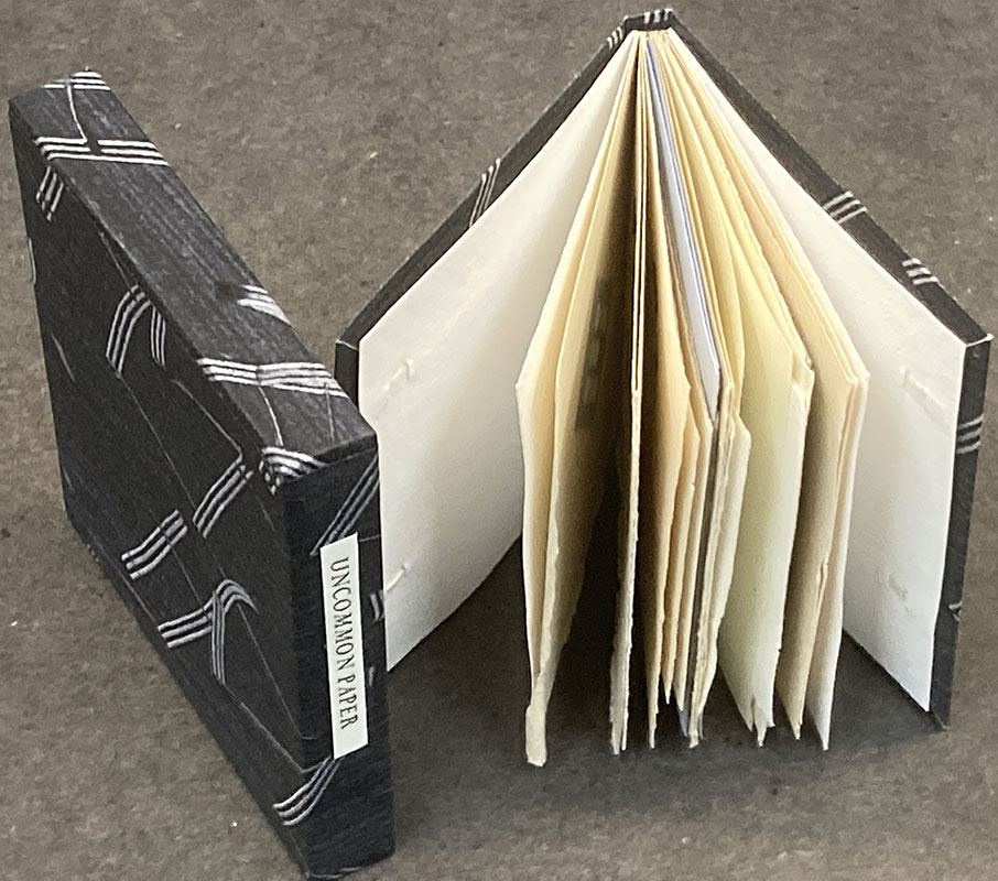
Despite the admonition at the start of the bibliography, Ive had a few inquiries about availability of old books. That gave me the idea to gather some of the remaining sheets to make an "excerpts," shown here. Above is a copy made up from various sheets included in Uncommon Paper, sewn on two long vellum slips, laced into a limp case made from the HM paste paper Claudia Cohen created for the binding of Elements in Correlation

Cobden-Sanderson did something like this and called them “retree” copies. Thats not what these are, not least because Im no Cobden-Sanderson. These are just some random leaves from a project, at best a consecutive portion such as an introduction or chapter. 
 

I made three excerpts from Metal Types and Some Paper. One includes 13 sheets, one 11, and one just nine. All are cased in a sheet of painted HM Text that had been printed on one side (Elements in Correlation, a bad run that had to be redone). Held in the right light, you can see the burnishing of the paper caused by the type on the other side. Its lovely paper. 


I had a complete set of preliminary sheets from Oddballs – title, Barry Mosers intro and Jim Westergards foreword – plus one of Jim’s engraving and (by chance) its accompanying text sheet. Those all got sewn on vellum and laced into a case of painted handmade paper over very thin board.


Similar situation with Elements – I had a set of everything to the end of the first chapter (which includes Andrea Taylor’s glorious linocut portrain of Reg.) This ones just a straight limp case, and once again using some of Claudia's paste paper. 


I had three sets of the frontis, title page and introduction (which actually starts on the title page) for Types/Paper/Print. The deluxe copies of that book included the full text repeated on two other papers, to demonstrate how the papers affect the appearance of a type. For the three excerpts, I had a copy of one leaf on all three papers to include.


I’ve put all these up on the &etc. “garage sale” page of the HM site, along with a couple of other HM titles. These are followed by a section of non-HM books I’ve culled from my shelves. I’ve tried to price them below market price; see what you think, if anything interests send me a note, we can talk. 

AND ANOTHER THING!

Maybe you saw one of the reviews of Marius Kociejowskis new book, A Factotum in the Book Trade. I read the one in the NY Times. The quotes made me laugh whos ever heard of a snarky Canadian? And I was intrigued by mention that he has, or did have, a press, but could not find anything hes associated with printing. But the more I thought about his belittling comments of customers, and everyone, the more I wondered how he was any different from all the Comic Book Guys out there? They are tiresome people.

1.6.22

Everything Went Green


The 10 “boxed” copies of HM=XX were finally assembled & issued at the end of May. Each one contains between 35 and 40 loose sample leaves in printed folders, along with the book. If the source book wasn’t obvious a note was added in pencil.

The five copies issued in a slipcase were also finished. These contain an accompanying portfolio with eight loose samples, all from projects not included in the bibliography due to their ephemeral or hors commerce nature. I had fun painting the papers to cover the portfolios and slipcases this project turned out to be much greener than had been my initial intent. As usual, things just started & then went in a direction.


I told someone that HM=XX had rid me of my fascination with press bibliographies. Despite that, I acquired two last month. Both had been on my want list for ages, and by coincidence copies appeared almost simultaneously.

Memorials of C.H.O. Daniel is neither uncommon nor expensive. It was printed in 1921 in an edition of 560 copies, many many many of which are for sale today. It includes a bibliography of his eponymous press, about which I know nothing because I haven’t read the book yet. Over a decade ago I saw a listing from (the very cool) Michael R. Thompson for a large-paper copy with extra samples, but it was gone by the time I inquired. Since then I’ve kept my eyes peeled but not until a few weeks did one appear. Which explains why I bought it despite being in boards that appear to have been chewed by rodents (the book itself is fine – that’s what bindings are for).


The collection of facsimile pages at the back were printed by collotype (cool) or letterpress.
These large-paper copies were printed on A. Millbourn & Co. handmade paper, and include ten extra facsimiles and complete folded octavo sections from three of his books bound in. Cool! Plus it appears he did his printing with a handpress, so he must have been a good egg.

A possible Vale Press project has been orbiting for a few years, and as a result I’ve been looking for a copy of the bibliography. It’s online, and there’s a facsimile from the 1970s, but if your primary interest is printing, you need the original (as I explained to my accountant). So I got that too.


Ricketts’ style of ornamentation (= maximal) is not my scene, but I don’t find his work as heavy and intruding as Morris’. It was interesting to see that the bibliography’s title page incorporates the start of the text. This is something I did on Types Paper Print. I never imagined I was an original in doing this, but I hadn’t run into another example until now. I think I did it because it was the only way to make the text fit on the following three pages (i.e. typical HM laziness).


AND ANOTHER THING!

Here’s the lesson from HM=XX I offer to young printers: throw a copy of the title page from every book you publish in a file. I didn’t do that and wish I had.

1.5.22

HM Turned 20 (Two Years Ago)


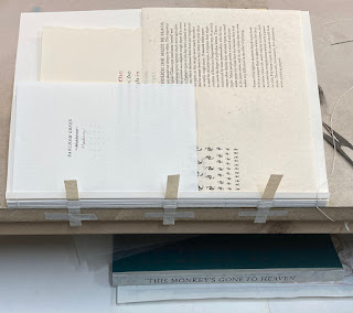
I’m (finally) mailing out copies of the HM bibliography, This Monkeys Gone to Heaven, this month. As I told a friend, I’ll have to come up with a new excuse for what’s taking up all my time.

I have never been interested in talking about my books. The fun of a book is opening it up and figuring it out for yourself. But I need to post something, and the marketing dept. says it should tie in with the new book, so here are a few anecdotes about some of HM’s books, not included in the bibliography...


The first HM book was the bibliography of books published by Charles van Sandwyk. At the time, and I suspect to this day, he didn’t understand why anyone would care, but we had fun and I think it’s a creditable first effort, especially from a handpress. I should see if he wants to do an updated version. Did you know he’s opened a charming storefront in downtown Vancouver? 


When I was binding copies of Good & Evil – HM’s first collaboration with Barbara Hodgson – I had decided the text on spines should read up, in the European manner. I think my reasoning was people’s heads more naturally tilt to the left when looking at a shelf of book spines, making reading up easier. Barbara objected emphatically, and requested that her copies at least read the other direction. I have come around to that way of thinking. 


The idea to have Briony create an etching to be used as the jacket for Iskandariya was inspired by the fold-out etching in Vija Celmins book The Stars (which Claudia had shown me because she bound the edition). And Briony really went to town with the idea. 


With the publication of The Temperamental Rose, lots of people (including booksellers) realized they didn’t know how to spell temperamental.


Reg Lissel made two different kinds of paper for The WunderCabinet, one entirely cotton and one (roughly) half cotton and half linen. His cotton paper is very easy to dampen, it relaxes without any issues, but the linen paper wanted to cockle. Basically it required a higher ratio of dry sheets to damping blotter, but even still it was tricky. There’s one leaf in HM=XX that is repeated, the extra being printed on some of Reg’s linen paper, to illustrate how paper can affect the look of a printed page. 


One of the coolest aspects of HM’s past was the days a poem by Harold Budd would arrive without warning.

I never take my own books off the shelf, not even the ones I’m happy with. In fact, it’s getting to the point that I don’t even have a copy of some books, and that’s OK.


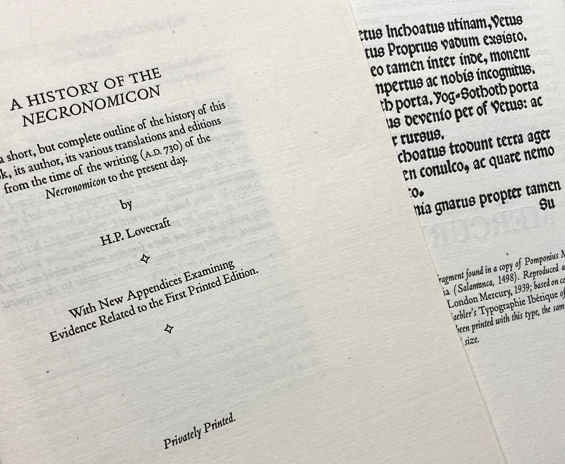
The printer of the pamphlet “A History of the Necronomicon” included in HM’s 2020 collected Lovecraft remains unidentified...

AND ANOTHER THING!

Barbara & Claudias new book, Paper Botanists, appears to be fully subscribed. A great debut for Byzantium.

1.3.22

Parrot’s Uncommon Thorny Book

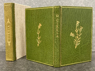
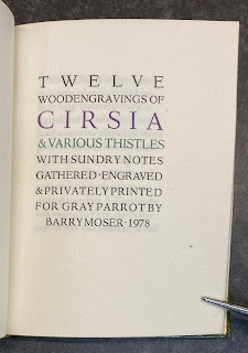
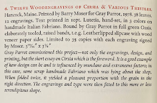
I have a new strategy for posting when there’s not a lot of news coming out of the studio. More by coincidence than intent, over the years I has acquired a number of publications by well known people and presses, which were issued as a very small edition. So small they could almost count as hors commerce “just for fun” projects, except some copies were sold or found their way into booksellers’ catalogues. For the inaugural post in this occasional series, Barry Moser’s Cirsia....


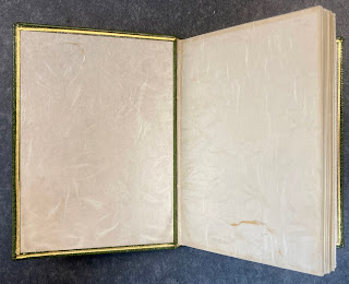
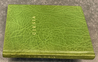
This is an interesting project on a number of fronts. It a sort-of collaboration with the binder Gray Parrot, who bound some of Moser’s Pennyroyal books in the 1970s. As such, it’s a small-scale example of Pennyroyal at its most luxe
typography, art, printing, materials, binding. I’m a big admirer of Moser and GP, plus I like botanical art and uncommon books of just about any type.
 

To be accurate, Pennyroyal is nowhere mentioned or credited. The book is included in the Miscellany section of the 1986 Pennyroyal checklist.


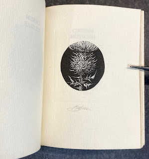
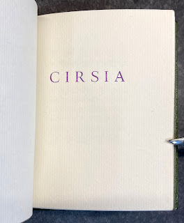
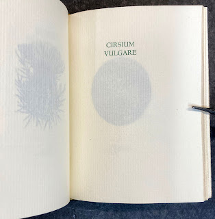
The title on the spine is 12 Cirsia. Each of the engravings is preceded by a page with the plant
s Latin name printed in green. Five of the 12 engravings are black line, the balance white.


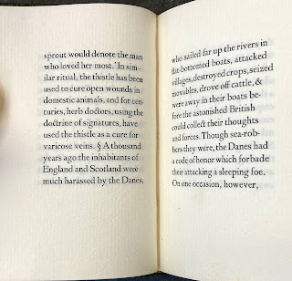
The plates (as they are called) are preceded by seven pages of notes on the topic, freely adapted from Field, Forest & Wayside Flowers by E.M. Hardinge (1899). Books like this always have to find some text, however brief and/or tenuously relevant, because no one seems to want a book of just prints. People want there to be some text, just so they can skip over it and get to the prints. 


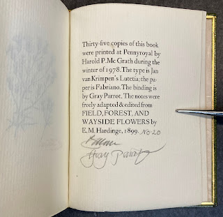
The production details are laid out in the colophon, which is signed by Moser, as are each of the prints. Another piece of lovely Harold McGrath printing. The binding is everything you would expect and want in a GP binding. 
 

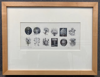
My copy of the book came with a proof sheet of all 12 engravings, which has been one of our favorite pieces since it went on a wall. 
 

I especially like that, even in a project of such comparatively small scope, people like Moser and McGrath can let a setting error escape their attention
that were a wrong sort. Makes me feel better about all of the ones I’ve racked up...


Now here’s an odd addendum: I have a second copy. It looks to have been made up from proofs or waste sheets. It has just 11 engravings (Cirsium virginianum – the one shown top left on the proof sheet
is lacking) and there are some odd blanks in the collation. The engravings all look good but some of the text pages are slightly under-inked. The colophon is signed by Moser but not the individual prints. Interestingly, it includes a half-title (which is followed by a blank) that does not appear in my numbered copy from the edition. 


The binding is a puzzle too. The leather is similar to that used by GP, but not exactly. The spine’s head and tail are rounded, like GP’s, but the actual spine is flat; little or no attempt was made to pare the leather. The endpapers are tipped on (boo). 
 
 
The endbands are made, not sewn. The head has been left unadorned. The book does not want to stay open. Overall it looks like something done by an amateur with some skills but new to leather, maybe someone who took lessons from GP using sheets he pulled out of his recycle bin. 

AND ANOTHER THING!
After this post first went up, one of HMs friendly correspondents wrote to say he also had a copy of Cirsia and that it differed in several ways from mine....


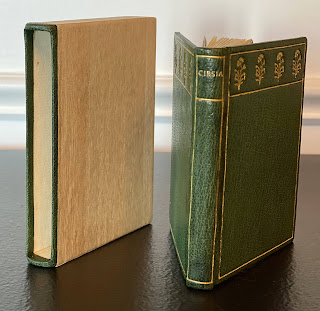
The leather looks the same, but the tooling is completely different and it has a (very attractive) slipcase instead of a clamshell box...
 

and the endpapers are marbled, not Japanese. So it seems Gray was having fun as he bound the edition, trying different things, which maybe was part of the projects purpose & appeal for him in the first place.

IN CONCLUSION...
There will always be someone who moans Why did they make so few copies? and/or Why does it have to cost so much? I do not have the patience or ability to explain in a way that would help them understand. Part of the appeal of a project like this is you’re just making copies for yourself and a few people you think might share your enthusiasm for it. And the short answer to why so few copies is the amount of labor involved in making each copy. It’s not a question of just keeping a machine running for a few extra minutes. As I make my way through sewing copies of HM=XX I frequently think 40 copies is more than I have the patience for. It takes forever to sew just one copy, due to all the odd sample sheets incorporated to the text block. Good thing I bought the boards last year: apparently mill board is becoming a scarce commodity across North America.  
 

So, obscure or – better still – unannounced or anonymous publications from interesting presses are almost always worth keeping an eye open for. Maybe later this year I’ll be able to write a post about Gray Parrot’s impossible-to-find marbled paper sampler (I don’t have a copy, but I know where one is...).