21.12.22

Peace Out 2022


Merry merry to all, happy New Year, see you in January.


1.12.22

Cut It Out


Spent last month printing, now I have to get into the binding. One of the secret weapons in the studio is the acrylic (i.e. plastic) sheet. There’s a supplier nearby that will cut them to any dimension. I have 13 x 18" sheets for damping and drying sheets of paper while printing, and also just shuffling around stacks of sheets or leaving them under light weight while waiting to be collated. But it’s especially useful for making a jig when you have to trim a bunch of sheets or boards to exact dimensions with square edges. I always get 1/4" because the 1/8" has some flex that isn’t helpful when you’re wanting to press folded sheets flat. 

For the current book, for reasons that will be obvious later, all three edges will be trimmed, with the final size being 6 x 9 inches. Sections are collated and then trimmed, with the fold flush to a straight edge (I use long pieces of old metal furniture), the acrylic jig is laid over and the section is trimmed, one at a time. (I don’t have a guillotine because they aren’t precise enough.) No rulers or measuring required, which is good for me because I couldnt measure & cut two things to the same size if my life depended on it.


I have another jig for the boards, which are trimmed the same way (but slightly different dimensions). My board supplier won’t trim to dimensions below 1/8" (even then a batch won’t be consistent), and my boards usually end up having a 16th inch at least one direction, so I order them slightly over-sized and then trim down. 

So after I finish painting 160 sheets (both sides) for endsections, I’ll start collating and trimming sections, then get to work on the boards. Hopefully I’ll have a copy to show by the start of next year. Till then, be nice to everyone, especially the people who don’t make it easy. 

1.11.22

The Five Books That....


I’ve started printing the new book and don’t really have much to share, so in the time-honored fashion of new media, here are some lists, all pertaining to fine press books & printing....
 
A. The five books to have if you are interested in contemporary handpress printing:
1. Printing with the Iron Handpress (Oak Knoll, 1998). Anyone who claims to be interested in “fine printing” should at least skim this book.
2. Printing with the Handpress (Allen Press, 1969). Get the original if you, not the facsimile, so you can actually see what you’re reading about.
3. On Printing (BCC, 1992)
4. The Technology of Hand Printing (Abattoir Editions, 1980)
5. The Officina Bodoni: The Operation of a Hand-press... (At The Sign of The Pegasus, 1929).

 
B. The five books to have that people will have never seen: 
1. Seven Pillars of Wisdom (US copyright edition) 
2. Agrippa – A Book of the Dead. 
3. The Earthly Paradise, that complete edition with all of Burne-Jones’ illustrations. 
4. Kafka: An Ancient Manuscript (Aliquando Press, 1997). There are two books in this list I own; this is one of them. 
5. William Everson’s “Baby” Psalter. I had the “complete” version for a few years (eventually sold with some of the proceeds used to acquire F.3, below), of which there were 48. I saw a baby listed in a catalogue once, but never since & never an actual copy. 

 
C. The five books I should have bought in 1995 so I could reap the capital gains now:  
1. Moby-Dick (Arion Press, 1979). There was a copy for $6,000 I seriously considered for about a minute that year, but it probably would have precluded the down payment for a house a few years later. 
2. Neuromancer (Gollancz). I had a choice between this true first (in the boring Gollancz yellow jacket) & the much flashier American first, a limited edition. Both same price. I live with the shame of my choice (but not the book, it left years ago). 
3. Just about anything from Kelmscott or Doves. 
4. Any of the signed books from Michael J. Thompson’s catalogue of unique William Hope Hodgson books. 
5. The facsimile edition of Stehen King’s My Pretty Pony, which were being remaindered all over the place.

D. Five books I had & wish I hadn’t sold (or sold too soon): 
1. Frankenstein (Pennyroyal, 1983). I found a sort-of cheap copy at Powells back when you could take in a few boxes of decent books and get a grand in trade. But the quarter leather binding was a problem: where the cloth overlaid the leather, the edge was left exposed & it would fray easily. Poor workmanship for an otherwise monumental book. 
2. The Man Who Died (Yolla Bolly Press, 1992). I must have had a fever. 
3. Tower of Babel (Janus Press, 1975). Another fever. Found for a pittance on the shelves of Powell’s, back in the pre-Internet days when the shelves were stuffed with treasure.   
4. Shadow Over Innsmouth (2002 edition). I traded my last copy away for my first deluxe Gehenna publication, which turned out to be a pretty commonly found book.  
5. Do Androids Dream of Electric Sheep? (UK first) truth be told, its endpapers had been renewed by the bookseller from whom I bought it. It was my first lesson in binding: he sliced the book out of its case, tipped new endpapers to the text block, then pasted them back into the case. I was agog.

E. The five books I should have not bought in 1995: 
1. Neuromancer (Phantasia Press, 1986). See above. One point, whether good or bad depends who in the family you ask: it was the first time I paid more than $100 for a book, and it took some time to talk myself into it. After that the flood gates opened... 
2. Typologia (U California Press, 1940; edition of 300 signed copies). I didn’t know it was supposed to have a (signed) colophon – these were early days for me. When I discovered the leaf had been sliced out, I contacted the (Seattle) bookseller – who’d priced it as if it were complete – but they told me to eat it. Unfortunately they’re still in business and their reputation has not improved. The book’s great but I wish I didn’t have a defective copy! 
3. (title withheld) I was still very new to printing & press books and was easily beguiled. This one was a very small edition, recently published, with etchings (yeah!), bound in a side-stab fashion between actual wood boards (completely inappropriate for the kind of paper used)... It was a learning experience. 
& etc. There were lots of others but most are long gone & forgotten.
 
F. If I could only keep five of the books on my shelves, they would be:
1. Printing with the Handpress 
2. The three Doves books in brown morocco: In Principio, Credo, and Laudes Creaturarum.
3. More Dark Than Shark (cloth edition, with print by Russell Mills). When I got the paperback version, in 1986, I noticed mention of a cloth version. That actually was one of my first instances of noticing not all books are equal.
4. An Essay on Typography (1931, Sheed & Ward). Even tho Gill was a despicable human, the content & production of this book are inspiring.
5. Zapf’s Civilité Disclosed (Gehenna, 1995). 
 
 
G. My five favorite HM books (in chronological order):
1. Iskandariya
2. XI LXImos
3. Aurora Teardrops
4. Pollard
5. Wither
5.1 Griffo
 
2015–2020 I had a good run.

H. The five books I hope to acquire in the next year:
No comment, but there aren’t five, just two.
 
Dont take parts B thru F too seriously. Next month: maybe some images of the new project.

1.10.22

Faking It (A Different One)

Ever since I first heard about Robert Green’s project to create a digital version of the Doves type, I’d wondered if anyone (besides Green, presumably) had used it to recreate an original Doves letterpress page, to see how the two compare. If anyone has, I don’t know about it. So I finally decided to give it a try, partly as a limbering-up exercise before starting to print the next HM project (I haven’t done any extended printing since the end of last year).
 
The first question was, how to conduct the experiment. Ideally my facsimile setting could be directly compared to the original. Since part of the experiment is for people to see how the digital compares to the metal original, it seemed appropriate to pick a work that was reasonably well known. I thought about Credo (1908), but all those I believes get tiresome. So I settled on The Ideal Book. It’s just 10 pages, so three sheets.

But the idea of being able to compare my facsimile directly to the original lingered. Some years ago I acquired a few dozen copies of Cobden-Sanderson’s “Note on a Passage in Anthony and Cleopatra” (1913) This is one of the ephemeral parerga C-S issued over the years. The copies have been lost & rediscovered on my shelves a few times, and I finally had an idea for putting them to use: I could set the first page in facsimile, and present it opposite a copy of the original. I have 25 copies of the Note...so it will be included in that many copies of my Ideal Book facsimile. 
 

I grabbed the text for Ideal Book from a digitized copy online, then went through and found all the scanning errors. The digital text conveniently had breaks at the end of each printed line, so that work was already done for me. I pulled out my copy of the original, and measured the page, the margins, the line measure, the type size, and the leading. 
 
In using these measurements to create a digital version, I had to take into consideration the shrinkage of the paper after printing. Like all good handpress printers, Cobden-Sanderson’s paper was dampened for printing, which causes it to expand. When dry it contracts, thereby shrinking whatever was printed ever so slightly. In general I have found paper shrinks 1 – 1.5%. The text line in the book measured exactly 4 inches, so I made the measure in my file 4-1/16 inches to allow for the shrinkage.


The photos above illustrate the shrinkage. For each the ruler’s 4-inch mark is centered under the period at the end of the line (despite what the first image suggests). The second image shows the line on a sheet of proofing paper (i.e. printed dry), measuring just past the 8-inch mark (i.e. a little over 4 inches long). The third image is a sheet of the Saunders paper, printed damp and then dried; it shows the same line ending just under the 8 inch mark, a difference of about 1/16 inch.The fourth is the Barcham Green paper, likewise just under 4 inches. The last picture is the Doves original.  
 
I use Affinity Publisher for doing layouts, & its a poor substitute for InDesign. I created a document with page size 6.5 x 9.25 inches. By my estimate, the printed (metal) type equated to 16.1 pt in digital; the leading was 15.4 pt. Kerning was off (I never use auto or font kerning), just as it would be when setting metal.  
 
I dumped the digital text into the text boxes, and was surprised at how well it all fit right off the bat. When it didn’t it was because the word spacing resisted (there are some very tightly-set lines), so I had to make those adjustments as required.  
 
While all of the lines fell into the measure easily enough, what I noticed was very slight variations in where a given letter in the line fell with relation to the ones above and below. Sometimes a hair or two ahead, sometimes behind. Much of this I put down to discrepancies in the word spacing, and I wasn’t going to attempt a facsimile setting to that degree of detail. 
 
The italic words in “Note...” posed a problem: As everyone knows, there is no italic companion to the Doves roman. When an italic was required, C-S used one provided by the Miller & Richard foundry. The closest approximation of it I could find (digitally) was Garamond; without the actual face, my setting can’t really be called a facsimile. 
 
I also had to come up with a pilcrow. Green’s font doesn’t include one, so I simply scanned one from “Note...” and dropped it in.  
 
When output to my cheap Epson inkjet printer, the text looked a little heavy, but I put that down to the printer.  
 
As with all my polymer printing, the plates are KF 95 plastic backed. The slim plates (vs the thicker 152 used by most letterpress shops) allow for sharper details (e.g. serifs) and finer lines without risk of breaking. I have my plates made by a nearby commercial letterpress shop that I’m not naming because they do it as a favor to me and don’t want to be in the plate-making business.  
 
I pulled plate proofs on newsprint with no makeready or particular care, I’m just looking to see if there are any flaws. The type in the proofs looked noticeably heavier than the metal original. I hoped this was due to my offhand proofing, but knew it could also be a result of decisions Green made.


To make the comparison as accurate as possible, the digital version needed to be printed the same way the original was – inked by hand, and printed on a handpress – on paper as close as possible to the original used. The image above shows (l to r) the roller, ink slab, and pile of damp paper under a towel waiting to be printed. 
 
The Doves books were printed on a laid sheet made by Batchelor & Son. I couldn’t get any of that. I did have paper that the (old) wrapping in which it was found claimed to be Saunders c.1950s, but there is no watermark. It’s more cream than the Doves, which might be described as off-white, but it has a similar weight and finish. It was dampened in the usual manner, with blotters, five printing sheets per blotter. I also had a few sheets of Barcham Green Bodleain, also more cream than white, laid, and with a little more tooth than the Doves or Saunders sheets. I printed five copies on this paper. 
 
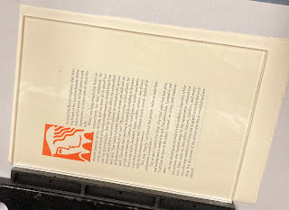
I started printing with the facsimile page from “Note...” Because of the potential thickening issue, I’d decided to print with as little ink as possible, which thus might require more impression than normal. I rolled out a minimal amount of ink – less than I have ever used to print – and pulled an impression. It was essentially perfect. This never happens for me; there are always agonies and torments getting a form to print well. The impression was good – about the same as on the Doves original – and the ink coverage was solid. And the type still looked thicker than the original. 
 
I checked with the person who made the plates, in case something in how the plate was made (i.e. exposed) would noticeably affect a type’s weight. She compared what I’d printed with a digital print from their good printer, and the two were the same – the type was printing as it was designed to look. So Green had thickened up the strokes, which is not an unusual decision when adapting a metal face for use in offset, digital or Web use. 


The image above shows a form being printed. The four red squares at the corners highlight the platen bearers, the two rectanular squares show the roller bearers with tape added in places to adjust the inking in those areas.
 
 
Printing a sheet at HM typically take two days, one for each side. It takes two to three hours in the morning to get a form set up and the makeready settled (sample below), then I average about 15 impressions an hour. I have printed up to 120 impressions in a day, but am not good for much the next day. After backing up, the sheets are (gently) pressed between blotting boards overnight, to dry. They usually require drying in a second set of boards for another day. (Note that it’s not the ink that’s drying – it’s dry almost as soon as it’s printed – it’s a question of extracting the moisture that was added to the fibers for printing.)
 

The 25 copies with the “Note...” facsimile and leaf (above) will be cased in printed blue paper over thin boards. I ended up with another 13 copies, which have been sewn into a painted handmade paper wrap (see top for both versions). 
 
So that’s the experiment. My conclusion is that, if you wanted to use the digital Doves font to make a truly accurate facsimile, you’d have to make some alterations to the font to decrease the stroke weight. And I can’t really think of a legitimate use for the font outside a facsimile. Cobden-Sanderson went to such lengths to prevent its use by others (unscrupulously, given the agreement he had made, in my opinion), that appropriating it for some other use would be jarring. I considered using it for the Pollard project, for about a minute, before realizing it was just a bad idea. 


Attempting to replicate someone else’s setting of type ended up being an interesting exercise. It resulted in a deeper understanding of C-S’s aesthetic through all the small decisions involved. Several of his lines are set so tight the words have to be picked apart, while others employ an ampersand when there was plenty of room for the word and. I imagine it’s similar to young writers typing out their favorite novel, to gain some insight to the author’s process. 
 
I feel limbered up and am looking forward to the new project, which will entail printing more colors than any five previous HM books combined! 
 
AND ANOTHER THING!
 
I’m sorry for all of you not in Vancouver tonight because you’ll miss the loscil/RafaelAnton Irisarri double bill. An ambient mega-bash.

1.9.22

Why No Intaglio?


Books that combine letterpress and intaglio printing, particularly on the same page, have always intrigued me. It was, if not common, at least frequently encountered in books from the sixteenth through eighteenth centuries, when engraving on metal was the best method for repeating detailed, fine-line images. But the modern English-language fine press has largely overlooked intaglio, in favor of woodcuts and wood engravings. 


The advantage of relief methods is that they can be locked up and printed with the text, no need for separate runs, much less different equipment. And relief printing is much faster than intaglio (wiping an engraved or etched plate takes much longer than beating ink on to a form of type). 


I’ve spent some hours over the years trying to find historical sources describing how early publishers went about combining the two printing methods, with little luck. The best modern single source is Gabriel-Rummonds’ Nineteenth Century Printing Practices, but all it has to say is the completed letterpress sheets were sent off to another shop to have the intaglio added. That at least provides one piece of information, the sequence. The pages of George Wither’s book of emblems (see Labour Vertue Glorie) show this to be the case: the intaglio lines often lie over the (letterpress) borders.  


It’s what I suspected: it’s easier to drop an intaglio image into a printed text sheet than visa versa. Intaglio is much more time consuming (and thus expensive) than letterpress, and you wouldn’t want to waste any good prints from bad inking or some other flaw in the handpress. Plus the intaglio could be done in several different runs for an edition, as copies were sold. That kind of “as needed” printing isn’t practical with type and letterpress. 


The earliest known book illustrated with copper plates was a French translation of Boccaccio’s Casibus Virorum Illustrium (De la Ruine des Nobles hommes et femmes), published by Colard Mansion (Bruges, 1476). However, the nine engravings were actually printed separately from the text sheets and tipped (pasted) in, which is why they are lacking in many of the 60 extant copies. I’m still chasing down the first book that combined letterpress and intaglio on the same sheet, but it was soon after.  


In 1481 an edition of Dante’s Comedia was printed in Florence by Niccolò di Lorenzo della Magna, with copper engravings based on drawings by Botticelli. Some copies had the engravings printed on the text sheet, some had them pasted in, and some are blank (either intentionally, to have the images added by hand, or simply because the intaglio was never added). 


An objection some people make to having intaglio on a letterpress page is the plate mark; they find it objectionable on both the verso and recto of the leaf. Some intaglio printers do print with a deeply debossed plate mark, but this is not necessary for good printing, any more than deep impression is required (or desired) for letterpress. I’ve always been more concerned about the loss of the letterpress impression as a result of wetting the sheets again and running them through an etching press (what is basically a mangle), squashing all the life out of the letterpress. 


This is one of the oldest books that includes intaglio in my collection: De M. Aurelii Antonini... (Florence, 1711), in which Benedictine of Brescia proposes a chronology of the reign of Heliogabalus based on coins issued during his reign. The book includes eight engravings of ancient coins. These photos won’t show it well, but the impression on the leaves that include an engraving has definitely been flattened out, however I can’t say the actual printed text looks glaringly different. It would show if you pulled out a loupe, but people who walk around with loupes to pull out are a bore.


Despite this historical precedence, the only modern source for combining the two methods I’ve found is Rummond’s Printing With the Iron Handpress. It counsels the historical precendent’s opposite, laying down the intaglio first. His primary reason seems to be to preserve the impression from letterpress. He also recommends using a different damping technique for letterpress, one that is messier but which retains the plate mark (the preferred method of damping with blotters would flatten it out). 


Many printers have side-stepped this question by simply not combining the two methods on the same sheet: the intaglio prints are inserted, as plates. It’s essentially the strategy I chose for Iskandariya (2007), for several reasons. The primary one was that the intaglio was to be done by the artist, and she was 3,000 miles away. I didn’t (and probably still don’t) have the courage to add the letterpress after her intaglio – my wastage was much too high when we did that book. And we couldn’t come up with a satisfactory way to deal with the plate mark on the verso of a sheet. Our solution was to interleave the etchings between each opening, and print two on a sheet that was then folded and bound at the open edge, so that the plate marks where hidden within the folded sheet. (Image below shows how the two halves of the open edge where folded to make a tab used to sew the sheet in.) This allowed the letterpress and intaglio to proceed independent of each other, and on different papers. It was an elegant solution for that book, but I still hanker to make a book that combines the two methods on at least a few pages. It might happen yet. 


Here are a few contemporary press books/printers I know that that combine intaglio and letterpress: 


Sherwin Beach Press Ballet for Opening Day. This book doesn’t combine intaglio and letterpress on the same sheet, but they came up with a brilliant way to integrate the two: sewing them together like the stitching on a baseball. This also allowed them to use one paper best suited for the letterpress, and a different one best suited for the intaglio. 


Leonard Baskin
s Jewish Artists of the Early & Late Renaissance is a master class in what can be done with patience and skill. (Note that it avoided the plate-mark issue by printing rectos only.)


Bob Wakefield has been printing both the letterpress and intaglio in his Chevington Press books since the 1980s. Beautiful & unique work. 

I’m sure there are many others unknown to me; send names & links, I’ll add to the list. If you’re interested in reading more, see this page from the Folger Library, or this one from Cambridge


AND ANOTHER THING!


The above was recently spotted by HMs London agent. If Im not related to these people, I will be soon...

1.8.22

Leftovers Again!?

A big part of the planning for This Monkeys Gone to Heaven was sorting through all the remaining sheets from old projects, seeing what I had in sufficient quantity for an edition of XX copies (TBD in large part by the number of sheets available for any given project the proof etchings from Iskandariya turned out  to be the limiting factor). When all was done, I still had some sheets from a few projects, and in a few cases more than enough to relegate them to the recycle bin.*

* Unused sheets at HM dont actually go into recycling. The papers too nice. At the very least, printed sheets get used to line binding boards. If the sheet is big enough and not too heavy, it gets painted or somehow decorated, and used to cover boards. Ive also experimented with dyeing (printed) sheets black, and then printing on them in gold or silver. But the dyeing is messy and a lot of work.

 
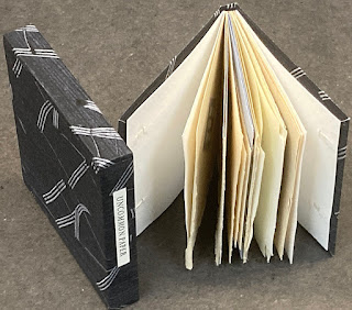
Despite the admonition at the start of the bibliography, Ive had a few inquiries about availability of old books. That gave me the idea to gather some of the remaining sheets to make an "excerpts," shown here. Above is a copy made up from various sheets included in Uncommon Paper, sewn on two long vellum slips, laced into a limp case made from the HM paste paper Claudia Cohen created for the binding of Elements in Correlation

Cobden-Sanderson did something like this and called them “retree” copies. Thats not what these are, not least because Im no Cobden-Sanderson. These are just some random leaves from a project, at best a consecutive portion such as an introduction or chapter. 
 

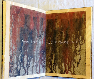
I made three excerpts from Metal Types and Some Paper. One includes 13 sheets, one 11, and one just nine. All are cased in a sheet of painted HM Text that had been printed on one side (Elements in Correlation, a bad run that had to be redone). Held in the right light, you can see the burnishing of the paper caused by the type on the other side. Its lovely paper. 


I had a complete set of preliminary sheets from Oddballs – title, Barry Mosers intro and Jim Westergards foreword – plus one of Jim’s engraving and (by chance) its accompanying text sheet. Those all got sewn on vellum and laced into a case of painted handmade paper over very thin board.


Similar situation with Elements – I had a set of everything to the end of the first chapter (which includes Andrea Taylor’s glorious linocut portrain of Reg.) This ones just a straight limp case, and once again using some of Claudia's paste paper. 


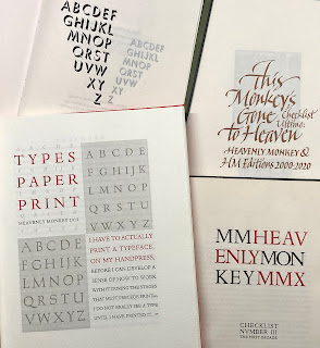
I had three sets of the frontis, title page and introduction (which actually starts on the title page) for Types/Paper/Print. The deluxe copies of that book included the full text repeated on two other papers, to demonstrate how the papers affect the appearance of a type. For the three excerpts, I had a copy of one leaf on all three papers to include.


I’ve put all these up on the &etc. “garage sale” page of the HM site, along with a couple of other HM titles. These are followed by a section of non-HM books I’ve culled from my shelves. I’ve tried to price them below market price; see what you think, if anything interests send me a note, we can talk. 

AND ANOTHER THING!

Maybe you saw one of the reviews of Marius Kociejowskis new book, A Factotum in the Book Trade. I read the one in the NY Times. The quotes made me laugh whos ever heard of a snarky Canadian? And I was intrigued by mention that he has, or did have, a press, but could not find anything hes associated with printing. But the more I thought about his belittling comments of customers, and everyone, the more I wondered how he was any different from all the Comic Book Guys out there? They are tiresome people.