29.10.15

Hypergraphia, anticipated


It's not supposed to be released until next week, but my copy of David Sylvian's massive, beautiful, incredible new book Hypergraphia arrived via Royal Mail today. I've had a chance only to flip through it; what follows is superficial, except for the enthusiasm.

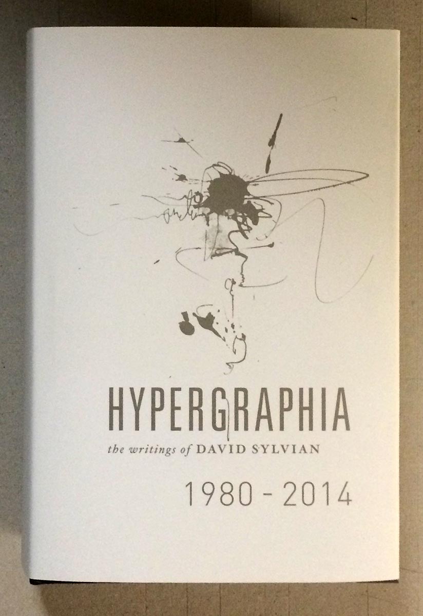
Sylvian's longtime designer, Chris Bigg, did a brilliant job with what must have been a mind-boggling amount of source material. Sylvian's art has always extended to the visual, both his own work and in collaborations with painters, photographers and graphic designers. The image below might sum up the degree of detail invested in the publication of Hypergraphia: the outside of the jacket is Sylvian's characteristic hazy cool, and the inside is also printed, with a contrasting collage of darks.


Look who appears neat the front of the book - Atsushi Fukui's original painting of "The Botanist," which previously appeared as a simple line drawing in HM's publication of Sylvian's prose poem Uncommon Deities (of which I still have one copy of, FYI...).


The book is published in an edition of 3,000 copies, and seems to already be nearing depletion. (Five hundred copies from the edition were signed by Sylvian and Bigg, & if you have one of those, call me.) It's priced just over C$100, which is nothing considering what producing the thing must have cost. (My only quibble is that the thing is so thick - over 600 pages of heavy coated paper - the text block is already straining from its case. Rounding could have helped tremendously, but who knows if that's even something commercial binderies can do these days.) Hypergraphia could genuinely be called an artist's book, a term I generally despise but which seems apropos here, in content & form. If you have any interest in Sylvian, 23 Envelope/Chris Bigg, or just kool things, hunt a copy down.

AND ANOTHER THING


Though it is dull & meager by comparison, I finally got around to printing the "jackets" for the 12 deluxe large-paper copies of An Anticipated History.


It's a lovely handmade gampi, with the printed title positioned to perfectly overlay the same line on the Roma wrap. Because the gampi is so thin, it's a little tricky fitting it around the book & getting it to stay in place - keeping the two lines in register - while sewing.


Here's the extra sheet included, with the leaf from a deluxe copy of XI LXIVMOS hinged to the verso.


19.10.15

Vintage Papers in the Stacks


Had to kill some time at the University of British Columbia last weekend. Went to the general stacks to peruse the "history of printing" section. In about 10 lateral feet of shelving was a fantastic cross-section of vintage European handmade papers, many used in relatively pedestrian books. For example, the above census of books printed by William Caxton.


A census basically is simply a list of all known copies in collections. The book contains about a dozen facsimile pages from Caxton books, primarily illustrating the different types, but after that it makes for very dull reading. Nonetheless, the publisher deemed it worthy of printing on a lovely laid paper bearing the watermark Chiers. That's the name of a river that passes through Belgium and France, but a lazy Google search turns up no specific references (there were numerous papermills along the river). Pulling out Le Clert's Le Papier is always fun, but shed no light on the question (probably because his book focuses on papermaking in a different part of France).


On another shelf I spotted some lovely deckles poking out from a tattered buckram case binding, inside which was a more engaging book than the Caxton census, printed on an even lovelier paper. H.C. Brooks' 1927 study of books printed by Giovanni Bodoni remains a primary resource on the influential Italian printer, in part because it was produced in a manner appropriate for the topic.


The bulk of the edition was printed on a handmade laid (vergata) sheet, but this copy is one of 50 printed on a opaque wove sheet with a hard, smooth surface (e.g. calendered) and a large gothic watermark (all were partials, along the fore edges). A few copies of this book are listed on Abe, but all seem to be from the main edition.


As shown above, the name of the recipient (probably a subscriber) was printed on the limitation page, and it gives this copy an interesting provenance. Winship was a famous American librarian and scholar of printing history. He also was a private pressman who published under the imprint Sign of the George. How his copy of Brooks' Bodoni got to Vancouver is a wonder (or not; bookseller catalogue issued some time after his death in 1952?).


The smooth Fabriano sheet shows off the facsimiles, some of which include intaglio illustrations, beautifully.


There's a brief section on types at the back, plus - for those of you excited by Barbarian Press' current fundraising campaign for their book about Curwen Press borders - a few pages showing samples of borders used by Bodoni. If you've seen the horrible Taschen edition of Bodoni's Manual of Typography, indifferently printed on blinding-white paper & stuffed into a case binding that isn't up to the task, Brooks' book is a balm for your eyes.


Both the Caxton & the Bodoni books are in the most mundane and purely functional case bindings that reflect exactly what these books are: reference materials. At the time they were published, handmade paper was sufficiently available and affordable that using it for a book was not a deluxe affair.

AND ANOTHER THING!
Barbara Hodgson has been invited to give this year's J. Ben Lieberman Lecture for the American Printing History Assoc! She'll be talking about her collaboration with Claudia Cohen for The WunderCabinet. She's an engaging public speaker, and this will be a rare opportunity to gain first-hand insight to their work. Claudia will there but I can't go: have to stay home & work at printing her next book...


12.10.15

A Future History


Spent the past week printing up an 8-page advance history of HM's anticipated doings for the next two years. Will be sending copies out to our regular booksellers this week. Ended up with forty-some completed; some will be available to purchase for a nominal sum.


Most were printed on off-cuts of the afore-mentioned Golden Hind, along with a sheet of Arches Wove (about the best over-the-counter text sheet for letterpress around these days, in our opinion).


Had some slightly larger offcuts of BG Bodleian 80 g handmade from some previous project (Metal Types? dunno), enough to make up 12 copies, so I did. These "large paper" copies include a leaf from the Deluxe edition of XI LXIVMOS hinged in.


The cover paper is Roma Fabriano. It's a bizarre sheet in a patently non-HM color (pink), purchased for pennies on the dollar at the bankruptcy sale. The laid sheet (probably machine-made, doubtfully mould) has an exaggerated screen side that makes it useless for printing. It's been in the studio for ages. But the color matches nicely with HM's newly acquired stock of bronze ink, which will be re-appearing in the upcoming Harold Budd project.


5.10.15

An Anticipated History


Printing a 12-page pamphlet chronicling HM's plans for the next two years. First out will the XI LXIVMOS, copies of which are being bound up by Sarah Creighton as I type. As soon as the pamphlet is finished I'll start printing a new book by Barbara Hodgson (see image below); more about that next week. Then a new collection of poems by Harold Budd, to be issued early next year. I tried out my can of very expensive bronze ink for the first time (and yes, there was a titling figure mixed in with the ranging two's)...


Unrelated, I was going through a stack of old Type & Press that David Clifford gave me years ago, copies 84 to 100 (the last issue published, Summer 2000). Tucked into a couple of the older copies were elaborate promotional broadsides from Phillip Ambrosi. Based in Regina, Saskatchewan he was a job printer who also specialized in (Linotype) rule casting. The broadsides are beautifully printed on an onion skin-type paper. He closed his shop down just last year; there's a brief article about him on the last page of this paper.


This stack of Type & Press makes for great reading. Nothing precious or "fine" about it, just old-school job printing, with headlines like "Moving Printing Equipment Easily!" (but no mention of handpresses in that one) and "The Pearl - A Jewel of a Press." One headline that caught my eye was on the front of issue 94 - Who Designed Times Roman? The article detailed American typographer Mike Parker's research & claim that the face had been "designed by an obscure American artist and produced by the Lanston Monotype Co. of Philadelphia, and not by the British Monotype Co., which for over 50 years had claimed credit for designing this famous face."

I particularly enjoyed this paragraph, in which the odious Giampa™ appears:

"Parker's interest was ignited when Canadian designer Gerald Giampa, owner of the remnants of the Lanston Monotype Machine Co. of Philadelphia, showed him a set of letters representing a familiar roman and an unfamiliar italic. Together they discovered that the letters were linked with a W. Starling Burgess, better known as a 'naval designer.' When Giampa found documents that bound him to silence of the subject of Burgess and his typefaces as owner of the Lanston remnants, he was forced to bow out."

Whatever reason Giampa had for bailing, it wasn't respect a contractual requirement. A summary of Parker's research is included in this history of Times Roman.