29.11.13

What Are Pleasant Colors?


"Healthy people wear pleasant colors." That wasn't covered in Occupied By Colour. Brown definitely does not qualify, and that includes shoes.

There's some rule prohibiting posting on Thanksgiving, so up it goes today. Speaking of the colo[u]r series, David Clifford is gearing up to start printing the last instalment, Around the World in Colour. It might even be completed before the Xmas break, but that still leaves a few months of fabulizing by Barbara & Claudia before it gets issued; late spring '14, as promised. And before David dives into that, he has to print the patterned paper that will be used for the case bindings of Metal Types. That'll happen next week. The last two sheets will be printed by Monday's post. Back to it.

25.11.13

The Sky's Gone Out


This'll be another quick one: have to get printing. Finally seeing some light through the trees: settled on a title for the new book, if only because everything but the title page & introduction are printed. Tried something for the intro this weekend: spent Saturday setting a spread, Sunday proofing & doing makeready. Then binned it all: not at all right (visually) for what follows.

So, faced with a ticking clock, a new scheme was hatched, one that resolved how to handle both the title (what it is, not how it's set on the page) and the introduction (content & layout). A minimalist scheme. During every attempted solution for this preliminary section, cutting it down to the most basic, fundamental information was in the back of the mind, yet things kept getting busy. Anyway, the paper from yesterday (Reg Lissel's HM Text is used for the 8-page preliminary section) is still damp and must be worked off today, both sides, so pressing on (ha!).


For short, let's just call the book Metal Type. That's what will be printed on the first page in the book (note we don't say "title page").

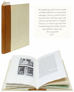
The book (7 x 10 inches, 40 pp.) is printed on nine different hand- and mouldmade papers. It will be published in an edition of 35 numbered copies, issued in two versions.

Deluxe Issue: Copies 1-15 will include two additional sections [16 pp]. The first will present four uncommon foundry types (Anker Romanisch, Carolus, Gallia & Kabel) in display sizes, borrowed from the collections of several friends, each printed in two colors on Barcham Green handmade paper. The second extra section will present titling (i.e. large) fonts of eight faces already shown in the book, printed on Barcham Green & Roma papers. (Close readers may find one or two other additions...) These copies will be bound in full vellum (a structure similar to the one she used for HM's Iskandariya, below) with gilt embellishments by Claudia Cohen, presented in a cloth traycase.


Press Issue: Copies 16-35 will be sewn & cased at HM. The (thin) boards will be covered in a printed patterned paper created by artist Dana Cromie. (The same paper will also be used to line the boxes for the deluxe copies.) The book will be wrapped in a semi-transparent printed paper jacket.

At this time, all of the deluxe copies are reserved for HM's regular distributors, as is a significant portion of the press copies. For anyone from outside the trade who is interest in securing a copy, the surest way is to contact one of our booksellers (listed at right).

Some of the Press copies will be issued before the end of the year. The rest, and all of the Deluxe ones, will be issued in early 2014.

Gotta get to work...

22.11.13

Perpetua(l) Knot


Didn't post yesterday because we're busy printing some pages for the deluxe copies of the type book. Closer & closer. Also finalizing plans for the printed paper to cover the boards of the press issue; it'll feature a pattern created by friend & kool artist Dana Cromie. The paper will also be used to line the boxes for the deluxe copies. Not posting it here; you'll have to wait & see it in person.

Title of the book remains elusive. Less is always more: am now trending toward simply calling it METAL. 

How about some holiday shopping tips today...

http://www.bibliopolis.com/main/books/1133287.html

Henry Morris's Omnibus. Copies seem inexplicably plentiful & thus ununreasonably cheap. Abebooks it. Great book, printing by him on his handmade paper. Lots of practical information about printing.

Harry Duncan's Doors of Perception, the limited edition printed by Carol Blinn & published by W. Thomas Taylor. Beautifully printed & bound, an excellent collection of essays about printing, with particular focus on the use of the handpress. Taylor also issued a paperback version; same content. But the limited edition is, like Omnibus, a very good buy (probably below issue price) right now.

http://designarchives.aiga.org/#/entries/%2Bid%3A1058/_/detail/relevance/asc/0/7/1058/porter-garnett-philosophical-writings-on-the-ideal-book/1

Porter Garnett's Philosophical Writings on the Ideal Book, a collection of pre-WW2 essays from the man who started the Laboratory Press, and also some by other well-known names of that period. Great book, ridiculously cheap. For that matter, many of the Laboratory Press publications can also be found at friendly prices.

18.11.13

Monday Mash


Odds & ends to start the week. That's another shot of Claudia Cohen's binding for the deluxe issue of Paper Should Not Always Be White above. One aspect of the binding she was particularly pleased with was using very thin boards (without any warping), making the small 8vo-sized book feel light & comfortable in the hands. Below are the three tooling variations used.


One of our stringers sent this link for a film by David Lynch, a short documentary about a proper lithography studio in Paris.

Speaking of Lynch, we got a copy of his album Good Day Today in the "limited edition" version designed by Vaughan Oliver. Here's an interview with Oliver about working on the project.


Speaking of Oliver, Facing The Other Way, the 4AD history we mentioned last summer, has been released. The 1,000-copy deluxe version - issued in two volumes, which seems a good idea since it apparently is over 800 pages - is supposed to be shipping by the end of this month. So we'll hopefully have our copy under the tree for Xmas. The second consecutive Oliver-related Xmas!

http://taylordavidson.com/2011/unsilent-night

Speaking of Xmas and 4AD, put this joyous sound in your ears, and then this, when you can no longer stand the few dozen marketing-approved tunes we'll suffer through ad nauseum during the next six weeks. And then get this free app, organize a few neighbors on a snowy evening, and do something that's as close to spiritual as a secular humanist can get. Then go home & watch Eraserhead on Xmas Eve.

14.11.13

The Finest Traditions in Hand-Set Type


How's that for a mouthful of busted chiclets? Oddly, it takes more time to set & lock-up a disaster like this than setting it properly. Part of the genius of movable type: it resists being used improperly. But we showed this Garamont who's boss.

All in aid of the new book, which has (yet another) new tentative title: Improvised Impressions. The title reflects the process that came to be used for displaying each face in the book: While there was some general design conceived in advance for each page, the details were worked out on the bed of the press, as the type was set. Where books typically are exhaustively planned in advance, the complete lack of continuity in content or form from page to page in this collection of types allowed (& often required, due to a shortage or complete absence of one letter or another) an improvisational approach. Intuition was the guiding principle. Each page was created in the moment, each step and decision a response to the one preceding it, working within the constraints of the page and what was available in (& lacking from) any given drawer of type.
The entire undertaking is underscored by an impish attitude toward the types on display: respect, but not reverence. Improvising is an act of the moment; the printed pages in this book are permanent records of the improvisations. 

Down to the last few sheets now: the foreword, title page & colophon. The edition will be 35 copies, with the first 15 being a deluxe issue. These will be bound in full vellum by Claudia Cohen, and contain two additional sections (16 pp.), per the last post here. As the image above suggests, the second of those sections gets a bit unruly.


Speaking of Claudia, did you know there actually are three variations to the deluxe binding for Paper Should Not Always Be White? She came up with three designs for tooling the front board & we couldn't pick a favorite, so she did all three. Two of them are shown above. There's no priority or preference (except one's own). We'll post some more images of the deluxe binding next week.

11.11.13

Weirder & weirder


This are getting strange around here. Above is a page from the second of two extra sections that will be included in the deluxe copies of the new book. This section features display sizes of eight faces already shown in the book. The paper for this sheet is Roma.

New working title for the book: Improvised Impressions. Explanation to be included in the foreword.

Details for both states of the book have been hammered out; we'll post them on Thursday. Gotta get back at it now.

7.11.13

She's A Rainbow


Tried something for the first time this week. Turned out really well. Printing with a rainbow roller. Also known as a split [ink] well. It was for the Gallia display page in the new book. The type's name was set in 36-pt in the middle. Above & below, the alphabet (no lowercase for Gallia) & numbers, with leading decreasing as you approached the top & bottom.


Three colors: black for the Gallia (i.e. in the middle), gold for the upper portion, red for the lower. Measured the height of the form, in inches. Laid down a piece of masking tape on the glass slab & marked borders between the colors. Laid down a second piece of tape, perpendicular, along the left side, as a guide to keep the roller in the same place when charging it. Rolled out the inks.


Naturally the inks would blend where they met. Trick was not letting the black overwhelm the other two, especially the red. Adjusted each of the colors as we went, in exactly the spot (i.e. line) on the roller that needed a boost.


Another thing that might be easier to do with a handpress, or at least hand inking, than with a mechanized press. Need to do more. Rainbows everywhere!

4.11.13

Kay, Abe & El


The deluxe copies of the new book will include an additional section showing four uncommon, foundry titling-sized faces on loan to HM from friends: Anker Romanisch, Coralus, Gallia and Kabel. Above is the 72-pt Kabel. Isn't it clever?

More details about the deluxe issue soon. Pretty much settled on an edition of 35 copies total, with the first 15 being deluxe. These will be bound in full vellum by Claudia Cohen. Copies 16 - 35 will be cased at HM in marbled paper over boards, similar in style to Types/Paper/Print. Been pushing to get copies out before the end of the year, but decided to slow down about, enjoy the work, and issue the book in January 2014. More as it happens...