Showing posts with label XI LXIVmos. Show all posts
1.2.16
The Story of 11 Small Books
The regular copies of XI LXIVmos will be shipping soon. Deluxe copies showed up here a few weeks ago but I was swamped by Sunblind Highway, and waited till it was done to see how Sarah Creighton's deluxe bindings turned out. Not a surprise that she did a beautiful, meticulous job on the bindings.
The book's 14 signatures were elegantly rounded & backed, and put into a German case binding with the thinnest possible boards. Each copy contains five samples taken from four of the Bromers' books: a complete (4-pg) copy of Henry Morris' prospectus for his V-109 (1978), trimmed at the margins to fit; a page from The Remarkable Story of Chicken Little (1979); two pages from Edward Gorey's Eclectic Abecedarium (1982); and a page from the maybe/probably not Shakespeare Shall I Die? Shall I Fly (1986).
All of the pages are hinged to semi-transparent Japanese paper, as they were too small to simply be bound in, and I didn't want the blank versos that would result from attaching them to a sheet of the text paper. With the Japanese paper, the spreads are not interrupted.
In addition to the sample pages, these deluxe copies all feature original calligraphy by Francesca Lohmann, Claudia Cohen's studio assistant. I knew of her work as an artist and printmaker, but became aware of her calligraphy only just before starting XI LXIVmos. As a result, we will be collaborating on an entire ABC book of her original calligraphy over the next year, to be bound by Claudia. Details to follow...
Sarah's boxes for the deluxe copies is covered in an elegant contrasting red cloth, lined with a dark gray buckram. All in all, a good project to get HM up & running again, with fun people involved, most of all Anne Bromer.
All of HM's copies of XI LXIVmos - deluxe and regular - are gone. The Bromers may still have a deluxe, and definitely have some of the regulars.
26.11.15
A Flash of Red
XI LXIVMOS update: that's one of the deluxe copies above, being sewn up by Sarah Creighton. Check out the peak at Francesca Lohmann's calligraphy on the title page... All of the deluxe copies available from HM are reserved; Bromers may still have one or two available. We expect to be shipping them in early January.
Recently acquired a copy of Dard Hunter's Papermaking in India. It came with a pre-publication letter from the publisher, which was accompanied by a clipping from the New York Times Magazine from May 15, 1938. It's an article by DH about his trip. Kool. I'll post something about this book & its companion (Japan, Korea & China), specifically about the challenges of binding paper samples of different sizes into a book.
29.10.15
Hypergraphia, anticipated
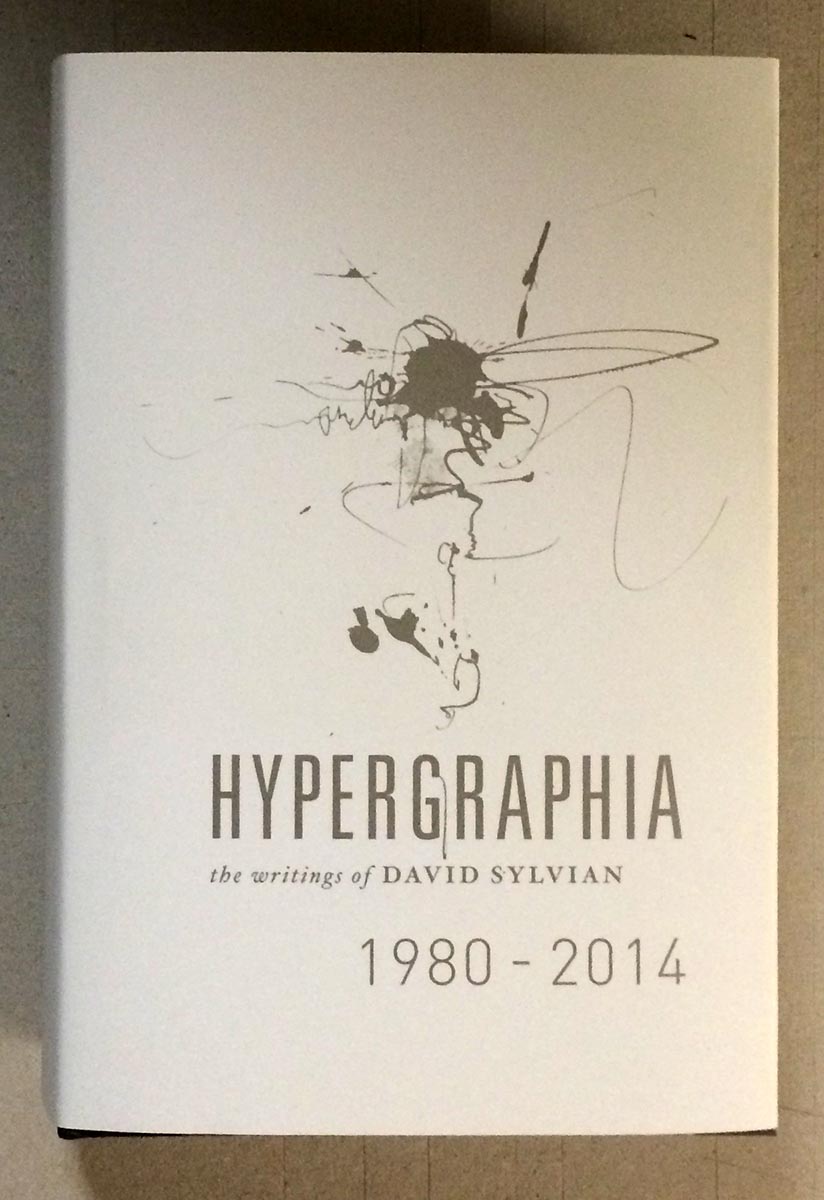
It's not supposed to be released until next week, but my copy of David Sylvian's massive, beautiful, incredible new book Hypergraphia arrived via Royal Mail today. I've had a chance only to flip through it; what follows is superficial, except for the enthusiasm.
Sylvian's longtime designer, Chris Bigg, did a brilliant job with what must have been a mind-boggling amount of source material. Sylvian's art has always extended to the visual, both his own work and in collaborations with painters, photographers and graphic designers. The image below might sum up the degree of detail invested in the publication of Hypergraphia: the outside of the jacket is Sylvian's characteristic hazy cool, and the inside is also printed, with a contrasting collage of darks.
Look who appears neat the front of the book - Atsushi Fukui's original painting of "The Botanist," which previously appeared as a simple line drawing in HM's publication of Sylvian's prose poem Uncommon Deities (of which I still have one copy of, FYI...).
The book is published in an edition of 3,000 copies, and seems to already be nearing depletion. (Five hundred copies from the edition were signed by Sylvian and Bigg, & if you have one of those, call me.) It's priced just over C$100, which is nothing considering what producing the thing must have cost. (My only quibble is that the thing is so thick - over 600 pages of heavy coated paper - the text block is already straining from its case. Rounding could have helped tremendously, but who knows if that's even something commercial binderies can do these days.) Hypergraphia could genuinely be called an artist's book, a term I generally despise but which seems apropos here, in content & form. If you have any interest in Sylvian, 23 Envelope/Chris Bigg, or just kool things, hunt a copy down.
AND ANOTHER THING
Though it is dull & meager by comparison, I finally got around to printing the "jackets" for the 12 deluxe large-paper copies of An Anticipated History.
It's a lovely handmade gampi, with the printed title positioned to perfectly overlay the same line on the Roma wrap. Because the gampi is so thin, it's a little tricky fitting it around the book & getting it to stay in place - keeping the two lines in register - while sewing.
Here's the extra sheet included, with the leaf from a deluxe copy of XI LXIVMOS hinged to the verso.
12.10.15
A Future History
Spent the past week printing up an 8-page advance history of HM's anticipated doings for the next two years. Will be sending copies out to our regular booksellers this week. Ended up with forty-some completed; some will be available to purchase for a nominal sum.
Most were printed on off-cuts of the afore-mentioned Golden Hind, along with a sheet of Arches Wove (about the best over-the-counter text sheet for letterpress around these days, in our opinion).
Had some slightly larger offcuts of BG Bodleian 80 g handmade from some previous project (Metal Types? dunno), enough to make up 12 copies, so I did. These "large paper" copies include a leaf from the Deluxe edition of XI LXIVMOS hinged in.
The cover paper is Roma Fabriano. It's a bizarre sheet in a patently non-HM color (pink), purchased for pennies on the dollar at the bankruptcy sale. The laid sheet (probably machine-made, doubtfully mould) has an exaggerated screen side that makes it useless for printing. It's been in the studio for ages. But the color matches nicely with HM's newly acquired stock of bronze ink, which will be re-appearing in the upcoming Harold Budd project.
13.8.15
Holiday Photos
Took off to Seattle for a short break from it all. Major scores at the many excellent music shops down there - a trove of Bill Laswell discs. And a few other finds...
...Hopefully this isn't referring to Barbara...
...One Claudia's all I can keep up with...
Spent an evening looking through a copy of the Pennyroyal Caxton Bible, primarily at the text printing. It was done by Bradley Hutchinson and is a model of consistency and clarity. The printing took 30 months, which makes my recent whinings about long days particularly lame. I believe the sheets were printed damp: the edition was 400 copies, plus 30 deluxe on different paper, so to allow for wastage etc he probably was running at least 500 sheets. I'd be interested to know what it's like printing damp sheets on a mechanized press, and just how he managed the logistics of damping & drying that many sheets.
Got the title pages for the deluxe copies of XI LXVImos to Francesca, who will begin the calligraphy on each.
AND ANOTHER THING!
The image at the top looks like a marbled paper, but it ain't. At least, not yet.
4.8.15
Didn't Die Trying
XI LXIVmos is done. At least all the heavy lifting (for me: Francesca Lohmann has a month of calligraphy now, and then Sarah Creighton has a few months of binding, but that's all their problem). That's a collated deluxe copy above. Today I'm getting these deluxe sheets ready to send to Francesca, who will add the title calligraphically to each copy, and number the edition (I-XXXV).
Luckily I remembered not to print the (second color) title on the deluxe sheets, after finishing the regulars. That's exactly the kind of stoopid thing I would do. Was a little concerned that getting the XI between the vines would be wonky, but no worries.
Spent some time thinking about how we'll include the sample pages to the deluxe copies. They'll appear in their appropriate sections, i.e. not loose, in a sleeve at the back of the book of some such inelegant tactic. The folded strips in the photo are sections from Edward Gorey's The Eclectic Abecedarium. Most samples are just a little smaller than the bibliography's page, and can simply be sewn in with the signatures, but the Gorey pages are quite small. I'll probably insert a blank leaf to the section, and have the sample mounted (i.e. hinged) to it. Stay tuned.
27.7.15
New Limits Imposed
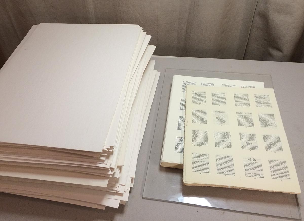
Sorry kids, I don't have time for much this week. Well into XI LXIVmos. That's the first run above, stacked beside the pulp boards used to dry the sheets. I'm pulling 160 impressions a day, which is outrageous by HM standards. Takes 12 hours, without any hassles thrown in. New top limit forever & always: 100 pulls. Even that's too much. Scheduled to be finished by this time next week, or die trying.
20.7.15
Damping & Drying Paper at HM
* UPDATE *
This week's post (below) mentions some difficulty getting the F.J. Head to dampen without cockling. As I suspected, increasing the number of sheets in the stack helped eliminate the problem. I also used thicker pulp boards, and really let the water soak in so there was almost no surface moisture. I then put the stack into the press immediately. The result was perfectly smooth & evenly dampened sheets (that's one below, on the tympan) that print beautifully.
* *
HM hasn't previously used either of the two papers we'll be printing on for XI LXIVmos - Somerset Book 115g (the white sheet above), and a very light (80 g?) F. J. Head laid (the cream sheet) that looks & feels like it was calendared. I didn't know how either paper would react when dampened, so I did a small test last week.
The book will be printed 16-up, four sections on each sheet (each section is eight pages). The sheets we'll be printing on are approximately 10 x 12 inches, and they'll be trimmed down.
I use the classic method for damping described in Gabriel Rummonds' book: paper interleaved in groups between damp pulp boards. Damping and drying takes a lot of boards. I have a few hundred on hand. Treated well, they can last you a long time (at least four projects). I've standardized sizes as much as possible, to simplify handling. The boards are all 13 x 18 inches (big enough to accommodate Reg Lissel's standard foolscap sheet). I also have sheets of quarter-inch Plexiglass to aid in handling & bookend paper stacks while being pressed.
(I have a larger set of boards and plexi for the very odd project that exceeds these dimensions.)
The "tub" is simply a plastic storage box a bit bigger than the boards, filled with clean water. Each board is immersed in the water for a few seconds, removed & the surface water allowed to run back into the tub, and then stacked on a sheet of plexi.
One of the tricks to damping is figuring out how many printing sheets to stack between each pair of boards. With Reg's paper, which was heavily sized, I settled on three sheets. I suspected the Somerset and Head papers would want more sheets per group, or they'd end up too damp. I settled on four sheets per group, just to see.
The boards are left in a stack, placed in a humidor (i.e. a thick plastic bag), and left under some weights. You need all the water to be absorbed into the boards. If any remains on the surface, you'll get cockling problems with your paper. I usually leave the boards for about an hour.
Damping: have your paper counted out into groups of appropriate number. Lay down one of your damp boards, place a group of paper on it (centered), lay another board on top, & repeat until all paper is in the stack. Place a sheet of plexi on top, put the whole thing in your humidor, place some medium weight on it, walk away.
About two hours later, put the whole lot in a press & screw the platen down quite hard. Leave it overnight.
Before putting the test batch in the press, I had a peak: as I suspected, the Head was cockling a bit. There wasn't enough paper in the stack to accommodate the amount of hydration from the boards, and cockling is the result. I'll increase the stacks to six sheets and see how that helps.
I used some raking light to show the cockling in this photo. It isn't actually as bad as it looks. Putting the sheets in the press overnight helped reduce it somewhat - nothing I'd have trouble printing on. And the cockles can be removed when the sheet is dried.
The Somerset, on the other hand, dampens like a dream, easy & flat. It'll be like printing on butter.
A properly dampened sheet isn't wet; it's cool to the touch & completely relaxed. You can see in this photo how the Head sheet drapes over my hand when held. The point of damping is to relax the paper's fibers, making it more receptive to impression and ink (i.e. less impression and ink is required compared to printing dry, giving you a crisper result).
Drying is almost the same process in reverse. The sheets must be kept damp while being printed (in this case, over a period of two days). After the last run, each sheet is placed on a dry pulp board, and a stack is built up. When finished, the whole thing is put in the press, screwed down very tight, and left overnight. The next day the sheets are dry and perfectly flat (below). Then you have to all those boards before they can be used again...
With that test completed, and the entire book set & ready, printing starts. Come back next week to see how we go. If there's no post, you'll know it wasn't good.
13.7.15
A New LXIVmo from HM
New book announcement. First publication from the new studio*. A collaboration with Bromer Booksellers of Boston.
[* First publication au commerce; there was a hors, which I'll talk about next week.]
A descriptive bibliography of the 11 miniature books published by Anne & David Bromer from 1977 - 1989. The book will, of course, be a miniature itself. So much for swearing to never print another miniature after last summer’s Suminagashi. As Henry Morris previously observed in regard to the miniature he printed for the Bromers, it’s hard to say no to Anne.
We’ve been going back and forth with the manuscript and galleys for a few months now. Printing will start next week. The page measures 2.25 inches wide, 2.75 inches tall - that’s about the maximum dimension for a miniature in Anne’s opinion. I tried a variety of faces, testing legibility at such a small size. I didn’t want to go below eight point, and I needed a good roman and italic to differentiate the commentaries from the bibliographic descriptions. Ultimately I settled on Centaur and Arrighi, the same pair (and size) I used for my first publication, El Autobus Azul.
In addition to the 11 printed books the Bromers published, they also issued three calligraphic books in editions of between 30 and 40 copies: each copy was completely rendered by hand, no printing. (These are also described in the bibliography.) This appreciation for the calligraphic arts gave me the idea of including some in the bibliography. By happy coincidence, I learned that Claudia Cohen’s current studio assistant, artist Francesca Lohmann is a fantastic calligrapher. (More about that later this summer.) She was recruited to create a number of drawings of vines to be used as interstials in the text, as well as a large pattern that will appear on the book’s cover. She will also be rendering the name on the title page by hand in each of the deluxe copies, and numbering the colophons.
We chose vines because the Bromers did two books with Edward Gorey, and he liked vines.
The edition size was a point of much discussion with Anne: she wanted more copies than HM usually prints, and being lazy, I wanted to do even less. We compromised: I’m printing more than I would if left to my own devices, and she’s not getting as many copies as she’d ideally like.
I’ll be splitting the edition with the Bromers (the bulk of the copies going with them). HM’s regular booksellers will be able to get copies from me; collectors, institutions and anyone else will be able to reserve or order copies from Bromers.
As alluded to above, there will be two states, regular and deluxe. The regular issue (85 copies) will be printed on Somerset Book, and cased in Francesca’s vine pattern (printed in gold on vintage green Guarro laid) over boards. Issue price $150.
Both states will be bound by the excellent Sarah Creighton, with whom HM has been wanting to work for years. Printing of this little 72-page book will be done (16 up!) with the huge Ostrander-Seymour handpress, on dampened papers. Publication is scheduled for mid-autumn. A printed prospectus will be available later this summer. I’ll post some production photos when we get into it.
AND ANOTHER THING!
It's the plural for 64mo, the format of a miniature.
Subscribe to:
Posts (Atom)