Showing posts with label De-acquisitions. Show all posts

3.7.26

Art vs Illustration (& etc.)

 
The past month has been so busy I forgot I had a July 1 deadline for this blog. I'm sure what follows will read like something bashed out in a hurry...

Most of the recent activity was related to issuing and shipping Sci-Fi Violence. Thanks to everyone who sent comments and thoughts about the poem and the book; apologies to all who didnt get a chance to order a copy. For those who responded to reserve a copy of the chapbook reprinting, its in the press right this minute, but Briony needs a month or so to finish the frontis. Copies will be ready by the end of the summer.

The next HM publication is in the pre-press stage. The artist has signed on and were finalizing things, foremost the paper(s) well use. I won’t share details of the who and what until its closer to publication, but I will share that the book feels like a complementary follow-up to Sci-Fi Violence in tone and ambiguity (although it is prose). Its a story Ive wanted to print for some years but only last year did the artist whose work suited appear. 
 

Beyond that, 
Im hoping to a series of books, each one a collaboration with an artist featuring new, small prints around some theme or topic or their choice. The format is entirely inspired by (copied after) Barry Mosers Cirsia. Intaglio prints will be featured but its not a requirement. There will be no text beyond a title page, a very brief introduction, and colophon. Each print will be presented on a recto. The editions will be small – probably no more than 30 copies – because the artist will be doing all their own printing, and uniformly bound at HM (that is to say, each edition will be uniformly bound, but series will not be uniform in size or binding).
 
 
On that point, a quick aside: I had an interesting conversation with an artist today (not the one wholl be collaborating on the new book) about how operations like HM approach the incorporation of art (i.e. prints*) to a project. If the word illustration is used in a books description, I think it says a lot about how much freedom the artist is given to respond to, or expand on the text. Ive never seen the point of inviting an artist to contribute, and then telling them what to do. I've also never been interested in publishing books with images that simply & literally illustrate what's happening in the text. There are logistical issues and physical parameters that need to be set down – e.g. page size, the number of prints, how & where theyll be inserted to the text block   all ideally decided in consultation with the artist. However, in terms of what their contribution – the art – ends up being, the publishers role is to pick the artist and then stay out of their way. I didnt see any of the prints, or even sketches, for Sci-Fi Violence until they all arrived, ready for binding. We discussed how many prints, the paper, and whether the double-page prints should fold out or be presented as two halves, but ultimately these decisions were hers. I can imagine instances when illustration is what the publisher wants, but in that case you dont need an artist. This is basically the story of Barry Mosers dis-satisfaction with his experience working with Andrew Hoyem on the Arion Moby-Dick. Ive always wondered if Hoyem didnt fully explain to Moser from the start what he wanted (historically accurate technical illustrations), or if Moser didnt fully hear or believe what Hoyem said. 

* Unless the original image matrix is digital (like Scotts were for Epilogue), photo-offsets and digitals arent prints, theyre reproductions. Combining letterpress with photo-offset reproductions seems contradictory. Unless its what the artist wants to do, in which case it might be interesting. But if the artist wants to do it because they dont know how to make actual prints, its just reproductions. 


I
ve also been pulling together items for the promised summer book sale on the HM site. Its gotten bigger than originally planned, for a few reasons. In addition to a group of books pulled off my own shelves, and a small group of HM titles (last copies mostly), there will be a number of HM titles from the library of long-time HM friend David Clifford, plus an interesting group of Aliquando Press books that fell out of Will Rueters move to a new studio. Ill be sending a notice out to the mail list when the sale pages go live (before the end of July). 
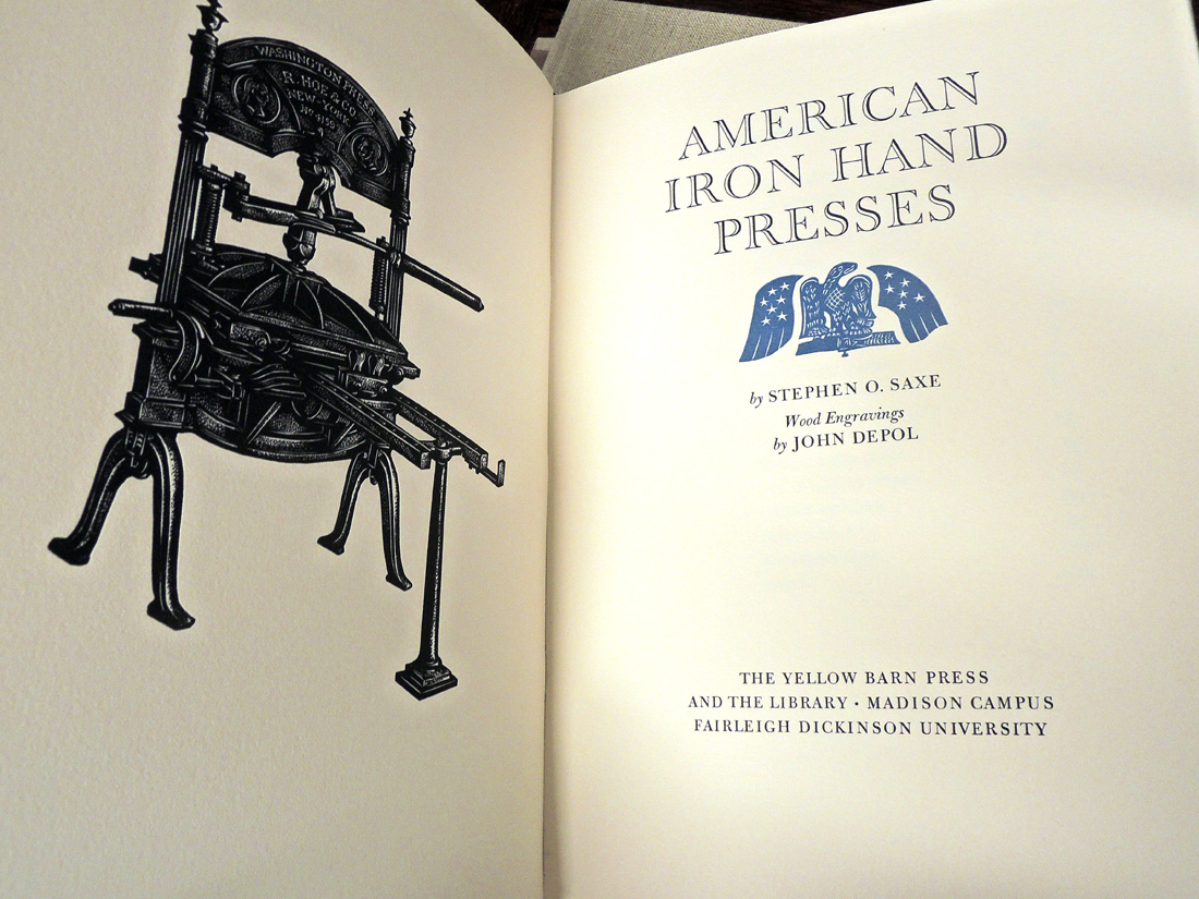

Finally, another conversation I had since the last post, about the phrase handpress, as in printed with a handpress: a handpress is a type of press wherein what
s being printed is inked by hand, rolled under a platen (by hand), and printed (by hand). A press operated by hand is not necessarily a handpress: a Kelsey or Adana tabletop, or even a C&P treadle, is not a handpress (even though the printer is risking their hand every time they feed a sheet into the clamshell). I guess a Vandercook with its inking unit removed (so the type is inked by hand) would be a handpress, but I dont think may people use Vandercooks that way. When all this started, I was offered a beautiful Korrex Nürnberg Hand press gratis but for reasons that remain vague, I wanted to print on a handpress. So I gave the Korrex away and spent loadsadough to buy my big ugly & beautiful green & yellow O-S. Life could have been so much easier with the Korrex, but probably less fun. Having said that, if anyones looking for a big green & yellow press, get in touch... 

Much of this post must sound dogmatic, for which I do and do not apologize. In pursuits like this, one needs clear definitions and opinions. I promise not to miss the October 1 deadline. 
 

1.7.24

[no title given]


[Warning: this post assembled during day 5 of a wild summer not-covid-but-crazy-flu trip. Treat all claims accordingly...]

This month’s post features some ephemeral drawings by Briony Morrow-Cribbs, never published before & probably never to be seen again. They adorned the box that delivered 20 sets of first-state proofs (i.e. etchings) of her eight prints for The Dunwich Horror. She also sent a set of the prints after aquatinting. These first-state proofs, which will be included with the 20 boxed copies, will offer an engaging opportunity to see the tonal and depth qualities that aquatint adds to an etched plate. The image above is a detail from one. Right this minute Briony’s working on the etching that will be printed on the sheets for the quarter binding, and she reports that it is so sexy. The last I heard, her plan was for it to be a tangle of thorns, but if anyone could make that sexy it’s BMC. 


My brain fever was preceded by one of my frequent bouts of feeling overly encumbered with stuff, and I decided to clear out any books I haven’t looked at in over a year, especially big ones - they take up so much real estate. (To be clear, I’m talking about things I’ve “collected” over the years, not HM books.) Some have gone to a local bookseller interested in book arts, design & etc. The more obscure titles have been wrangled into a list, which can be seen here. Tell any & all friends who might be interested - highly motivated seller. This is the link to the list.


(p.s. to kind people who want to send me books or etc., thank you but please don’t! I’m entirely focused on losing the psychic and actual weight of possessions. I want to get my books down to a single small shelf, and my wardrobe to a single narrow rack.)

With luck and industry, I may have a complete, bound copy of Dunwich to show for the August blog. 


1.8.21

Out With the Old, In With the Older

[This post ☟ has nothing to do with that ☝︎ image, but this isnt the place to come for narrative cohesion. Scroll down to second last paragraph to see how you can help clear space...]

I think the resource-gathering phase of my still vaguely defined Gutenberg project has come to a logical completion, with the addition of Joseph Ames’ Typographical Antiquities (1749). I found a lovely copy. I wanted this book, rather than the more expansive Dibdin version, because I simply prefer the printing, the paper and the types. To my eye, an increasingly mechanical ugliness crept into English books in the 19th century, and the paper often was not nearly as good as that used in books from the previous century. 


Most of the book consists of short biographies of printers, ordered chronologically, along with lists of their publications. 
 

Some of these biographies include woodcut portraits, which came from the Harleian collection. This collection was purchased by the British Library four years after Ames' book was issued. It's not clear whether he purchased the blocks from the estate, or  borrowed them. I guess if they're included in the BL's holdings, it would be the latter, but I can't be bothered to chase that down today. It's hot and muggy. 


This device has been penciled on to the front flyleaf. Someone who acquired the copy in 1946? 


I also added a copy of Gerard Meerman’s Origines Typographicae (Hague, 1765). This is the text that was translated (in greatly condensed form) in Bowyers’ Origin of Printing. My copy is ex-library, but aside from (too many) Brooklyn Library blind stamps, it’s in fine condition, and interesting to examine next to the Ames: the paper, printing and type are all superior, but English printing almost always comes up short during that period. I’m not exactly expecting to muddle through the main text, which is in Latin, but the many references and footnotes will be useful for pointing me in directions. Plus, it’s a cool book. 


As my book interests become increasingly antiquarian, I become increasingly impatient with books outside this realm taking up space on my shelves. To that end I have just posted a number of new titles to the Etc. page on the HM site, books that need new homes, and which I have tried to offer at tempting prices (if insufficiently so, we can talk). Please take a look, tell all your friends etc etc. Unfortunately, with this lot I’ve culled about as much as I can without cutting into specific topic areas. 


Here’s something that might be of interest, one of the best gifts I ever received, courtesy of Will Rueter: a set of four brass rules or varying widths (1/8 inch, 1/4, 1/2 and 3/4). Infinitely useful, especially when when making cases and boxes.
(Also great for holding pages flat while taking photos.) No measuring, just lay one of these down and make your marks. Especially useful for setting the joint distance between spine and board, if the joint is 1/8 or 1/4 inch; too often mine end up being 3 or 5/16, and in those cases I turn to my almost-as-useful table saw set-up blocks. These are pieces of aluminum precisely machined to widths from 1/16 to 11/16 inch, which can be used singly or combined. Available from Lee Valley.

23.3.15

Eastern Corp's Typographic Broadsides


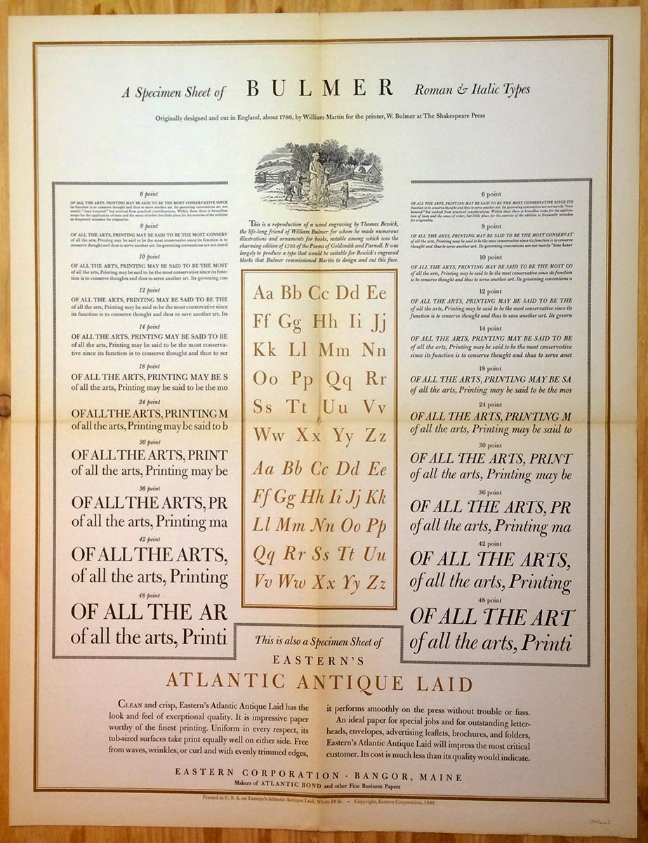
In the late 1940s the Eastern Corporation, an American commercial papermaker, issued a series of elaborate typographic broadsides, ostensibly to promote the papers they were printed on. Each broadside displayed a typeface, with the designs being commissioned from a who's who of mid-century American typographers and graphic designers. To the best of my knowledge, there were a total of 26 issued. Individual broadsides from the series pop up often enough, but my problem is I have an almost complete set (25 of the 26) and they take up too much space: I need to find them a new home. In aid of that, and for posterity's sake, I'm posting here images of all 25.

Each of the broadsides (which measure 17 x 22") was issued with an 8.5 x 11" sheet with biographic details of the designer on one side, and Eastern Corp. marketing info on the other. These seem less common than the broadsides, but I have them as well. I include images of these for two broadsides that are signed/inscribed by the designer...

Baskerville designed by T. G. Bixler of Edwin H. Stuart, Inc. (Is there a connection to Michael Bixler?):


Bernhard Modern designed by G. H. Petty:


Types cast by Binny & Ronaldson of Philadelphia, designed by P. J. Conkwright ("born in Indian Territory in 1905"):


Bodoni designed by George F. Trenholm:


Bulmer designed by T. J. Cleland:
 

Calligraphy designed by Raymond F. DaBoll:


Caslon designed by Carl Purington Rollins. There is a second Caslon broadside in the series, with the word Caslon printed in red. I believe it was designed by T. J. Cleland. This is the only broadside in the series I know of which is lacking from this set.


Centaur designed by Bruce Rogers.


Cloister Black designed by Joseph Thuringer. I like Cloister, especially the italic, if only for how it looks in Nash's book about the Doves Press, but this broadside looks cheap and ugly:


Cheltenham designed by W. A. Dwiggins:


Fairfield designed by Rudolph Ruzicka (one of the few broadsides in which the type's designer was recruited to display his work):


Alternate Gothic & Franklin Gothic designed by Frank Kofron. This is one of the two I have that are signed (see detail):


Here's the bio sheet issued for Kofron:


 Futura designed by Kurt Volk:


Garamont designed by Ben Wiley (the bio sheet refers only to Garamond):


 Goudy Old Style types designed by Archie J. Little:


Grayda & Barnum (designed by Frank Riley, who was a disciple of Goudy, and issued by ATF) designed by Richard N. McArthur:


Janson designed by Fred Anthoensen:


The "lost" Goudy types (the ones destroyed by fire at the Village Press in 1939) designed by Howard Coggeshall:


Lutetia designed by Edwin & Robert Grabhorn:


Lydian (by Warren Chappell) designed by John Lamoureux:


Old-fashioned types (80 on the one sheet - who said never enough?) designed by Frederic Nelson Phillips Sr:


Perpetua designed by Helen Gentry:


Radiant designed by R. Hunter Middleton. I like Radiant. This is the other broadside that's signed (inscribed actually, in a beautiful hand, to G. H. Petty, designer of Bernhard Modern, above): 


Here's Middleton's bio sheet:


Square serif faces designed by Charles R. Jaquish ("descended from French Huguenots" !). This one ties Cloister in the race to ugly:
 

Weiss designed by good old Ward Ritchie:


Most of these are printed on a bond sheet made by Eastern, & it's not the greatest (commercial wood pulp). The sheets were originally folded for mailing (with the bio sheet), and some have started to fail along parts of the folds. But they're all complete, and there are duplicates of the Lost Goudy, Janson & Garamont sheets.

I have no idea what these might be priced at retail. A set of 20 ("hole punched in top margins" !!) sold at auction in 2004 for $270 (more than twice the estimate). My set is safely collected in the mylar sleeves of an artist's portfolio, with the accompanying biography sheets. It all takes up too much room, so they're on the block for $350 plus shipping. Lemme know if you're interested.  Sold.

AND ANOTHER THING

If you want your own set of these broadsides, contact the Veatchs. I think they have a complete set.