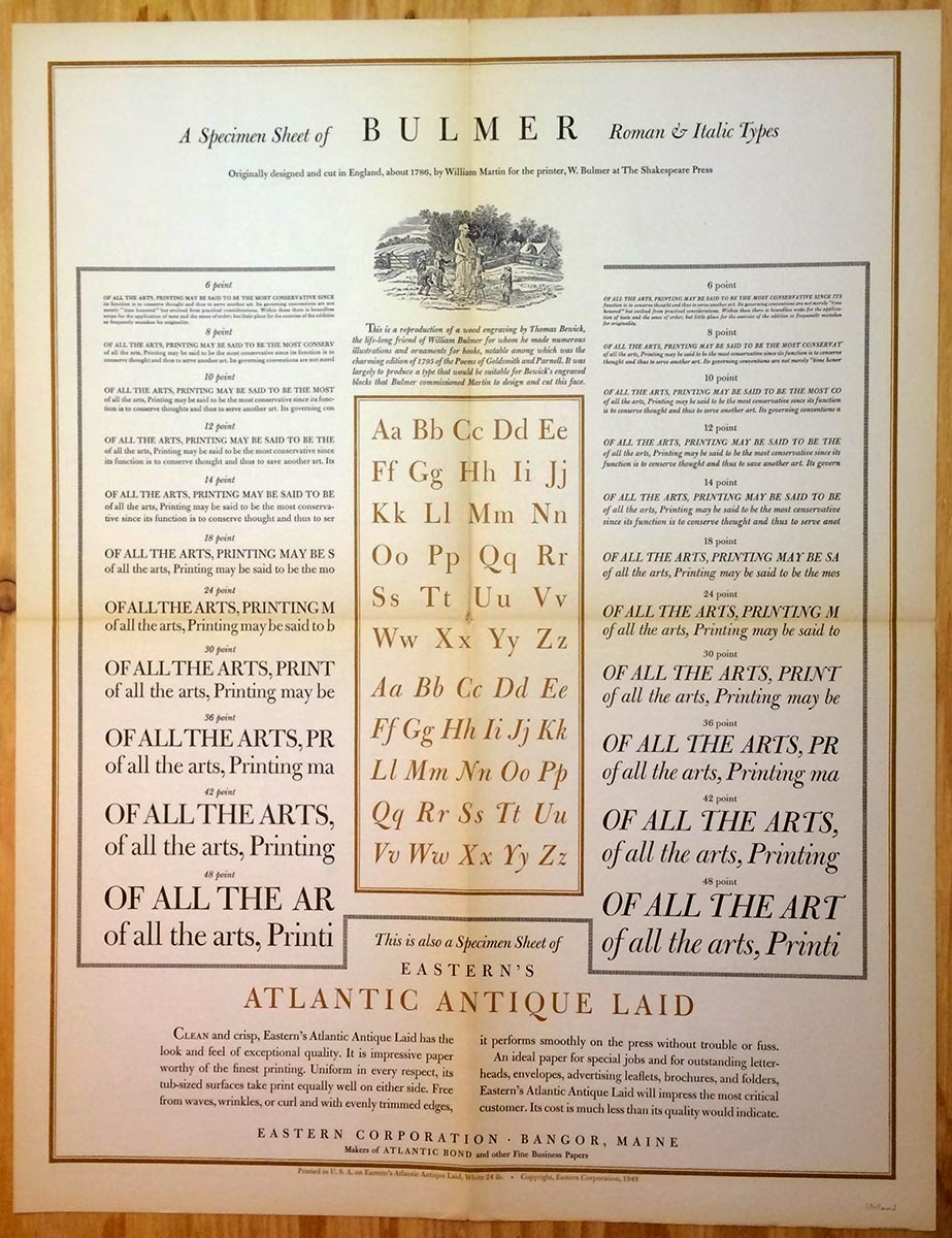
In the late 1940s the Eastern Corporation, an American commercial papermaker, issued a series of elaborate typographic broadsides, ostensibly to promote the papers they were printed on. Each broadside displayed a typeface, with the designs being commissioned from a who's who of mid-century American typographers and graphic designers. To the best of my knowledge, there were a total of 26 issued. Individual broadsides from the series pop up often enough, but my problem is I have an almost complete set (25 of the 26) and they take up too much space: I need to find them a new home. In aid of that, and for posterity's sake, I'm posting here images of all 25.
Each of the broadsides (which measure 17 x 22") was issued with an 8.5 x 11" sheet with biographic details of the designer on one side, and Eastern Corp. marketing info on the other. These seem less common than the broadsides, but I have them as well. I include images of these for two broadsides that are signed/inscribed by the designer...
Baskerville designed by T. G. Bixler of Edwin H. Stuart, Inc. (Is there a connection to Michael Bixler?):
Bernhard Modern designed by G. H. Petty:
Types cast by Binny & Ronaldson of Philadelphia, designed by P. J. Conkwright ("born in Indian Territory in 1905"):
Bodoni designed by George F. Trenholm:
Bulmer designed by T. J. Cleland:
Calligraphy designed by Raymond F. DaBoll:
Caslon designed by Carl Purington Rollins. There is a second Caslon broadside in the series, with the word Caslon printed in red. I believe it was designed by T. J. Cleland. This is the only broadside in the series I know of which is lacking from this set.
Centaur designed by Bruce Rogers.
Cloister Black designed by Joseph Thuringer. I like Cloister, especially the italic, if only for how it looks in Nash's book about the Doves Press, but this broadside looks cheap and ugly:
Cheltenham designed by W. A. Dwiggins:
Fairfield designed by Rudolph Ruzicka (one of the few broadsides in which the type's designer was recruited to display his work):
Alternate Gothic & Franklin Gothic designed by Frank Kofron. This is one of the two I have that are signed (see detail):
Here's the bio sheet issued for Kofron:
Futura designed by Kurt Volk:
Garamont designed by Ben Wiley (the bio sheet refers only to Garamond):
Grayda & Barnum (designed by Frank Riley, who was a disciple of Goudy, and issued by ATF) designed by Richard N. McArthur:
Janson designed by Fred Anthoensen:
The "lost" Goudy types (the ones destroyed by fire at the Village Press in 1939) designed by Howard Coggeshall:
Lutetia designed by Edwin & Robert Grabhorn:
Lydian (by Warren Chappell) designed by John Lamoureux:
Old-fashioned types (80 on the one sheet - who said never enough?) designed by Frederic Nelson Phillips Sr:
Perpetua designed by Helen Gentry:
Radiant designed by R. Hunter Middleton. I like Radiant. This is the other broadside that's signed (inscribed actually, in a beautiful hand, to G. H. Petty, designer of Bernhard Modern, above):
Here's Middleton's bio sheet:
Square serif faces designed by Charles R. Jaquish ("descended from French Huguenots" !). This one ties Cloister in the race to ugly:
Weiss designed by good old Ward Ritchie:
Most of these are printed on a bond sheet made by Eastern, & it's not the greatest (commercial wood pulp). The sheets were originally folded for mailing (with the bio sheet), and some have started to fail along parts of the folds. But they're all complete, and there are duplicates of the Lost Goudy, Janson & Garamont sheets.
I have no idea what these might be priced at retail. A set of 20 ("hole punched in top margins" !!) sold at auction in 2004 for $270 (more than twice the estimate). My set is safely collected in the mylar sleeves of an artist's portfolio, with the accompanying biography sheets.
AND ANOTHER THING
If you want your own set of these broadsides, contact the Veatchs. I think they have a complete set.


