Showing posts with label Around the World in Colour. Show all posts
30.6.14
Colour in Deluxe
The eight deluxe copies of Around the World in Colour have been completed and shipped out. Inkeeping with the style and approach to previous deluxe versions from the series, these eight copies have been extra-bound in full salmon-colored leather with multiple leather and vellum onlays and hand-tooled gilt embellishments. The doublures incorporate an intricate weave of various papers.
Bound at the back, immediately before the colophon, is a two-page manuscript sheet containing notes and color tests for the book. For these deluxe copies, the pamphlet with samples of natural-dye papers and manuscript notes (each copy unique) included with all copies in the edition, contains additional samples.
With that, the colour series comes to a conclusion. Our thanks to everyone who has expressed their interest and support since The Temperamental Rose (Vol. 1) appeared, seven years ago. Barbara & Claudia aren’t taking any time to stop for a breather: they’re deep into their book about decorated papers, and trying not to be distracted by the other book ideas that keep occurring. Stay tuned…
AND ANOTHER THING
Anyone know what "haliod" means, specifically in the context of "haliod dyes"? Google gives me just one reference for the word, in a title to a composition by Alva Noto (which is oddly appropriate, since he's an admired musician around here). The piece is "Haliod Xerrox Copy 1" and that Xerox reference would actually make sense in the context that I originally encountered the word (prints that incorporated photocopy toner image transfers). Any other info or tips appreciated.
19.5.14
Around The World on Tour
Copies of Around the World in Colour are being shipped out. More still to come, with the eight deluxe copies issued last (due to the additional work).
While Claudia was putting the finishing touches on the bindings , Barbara completed a series of dye-sample swatch sheets to be inserted into the eight deluxe copies. The swatches were originally created because of the need to organize the dyes, mordants and modifiers.
For this book they ultimately dyed 1,060 sheets of various kinds of paper in 53 distinct dyebaths. Some papers were pre-soaked (mordanted) in alum, or tannin or both; others went straight into the dye. Some underwent multiple dips in the same dye, others were dipped in two or more dyes. Although most of the dyed papers used in the book were unmodified, we also experimented with traditional modifiers, such as cream of tartar, calcium carbonate and iron.
Keeping the swatches up to date ended up being a project in itself, threatening to overtake the production of the book. Categories of dyes became overwhelming, splitting into ever more precise subcategories, including kinds of paper, timing and combinations of dyes.
24.3.14
Siht Si Eht Eltit
A Monday mélange...
First, something to watch: a short film by David Lynch taking you on a tour of a small printshop in Paris. An old mechanized stone litho press at work. Makes sense that the inverted images of printing would appeal to the director who gave us the Black Lodge.
Second, I am a dumbass: there is a page with some info about the printer of last week's Royal Bank book. My excuse for not seeing it before is twofold: it's in a weird place, and the book is so painfully dull that I couldn't force myself to flip through all the prelims. As expected, it was printed in Montreal, by the great Ronalds Printing. I also was wrong about the letterpress & intaglio being done in different shops. Dumbass.
Interesting factoid: my introduction to printing was a tour of the Ronalds plant in Montreal, c.1989 (I worked for a
Third, fellow handpress printer Paul Ritscher (Devil's Tail Press) sent a note after reading the Light & Simple post, with some news about the Pratt Albion: while Pratt Wagon Works will continue to operate under Steve's son Ben, he won't be making any more presses. A loss for us all.
Fourth, & this should probably be first since it's actually about HM but we've already established that I am a dumbass: publication notice about the final volume in Barbara & Claudia's colo[u]r series went out to subscribers last week. Around the World in Colour is in the bindery & copies will begin to appear in May. The edition is completely subscribed. Get in touch with HM's booksellers (listed at right) if interested.
27.1.14
Wil Hudson's Life in Print
With no specific topic planned for today's post, I was just handed one, albeit with a sad undertone: former Vancouver printer Wil Hudson died earlier this month, at his home in Creston, B.C. For a time in the 1960s and early '70s, Wil arguably was The printer in Vancouver capable of letterpress printing worthy of the label "fine press."
The Creston Valley Advance has an obituary about Wil, with some biographical details. The Flickr link takes you to a collection of photos of Wil at work (but don't click on the link to his "final letter to the editor" - it takes you to a BS subscription page).
Anyone interested in the history of printing in Vancouver (all three of us!) or fine press printing in Canada (a couple more) will know Wil's name. The Alcuin Society, which is Canada's only national bibliophile group, was created in 1965 by a handful of Vancouver collectors primarily as an excuse to come up with interesting printing projects for Wil. The Society was modelled after the Book Club of California, and in the first five years of its life issued a number of B.C.-related historical reprints as "fine press" limited editions, all printed by Wil. (The editions always were too large, and the execution too commercial in materials and design, but the intentions were pure and Wil's skill at the press never in question.)
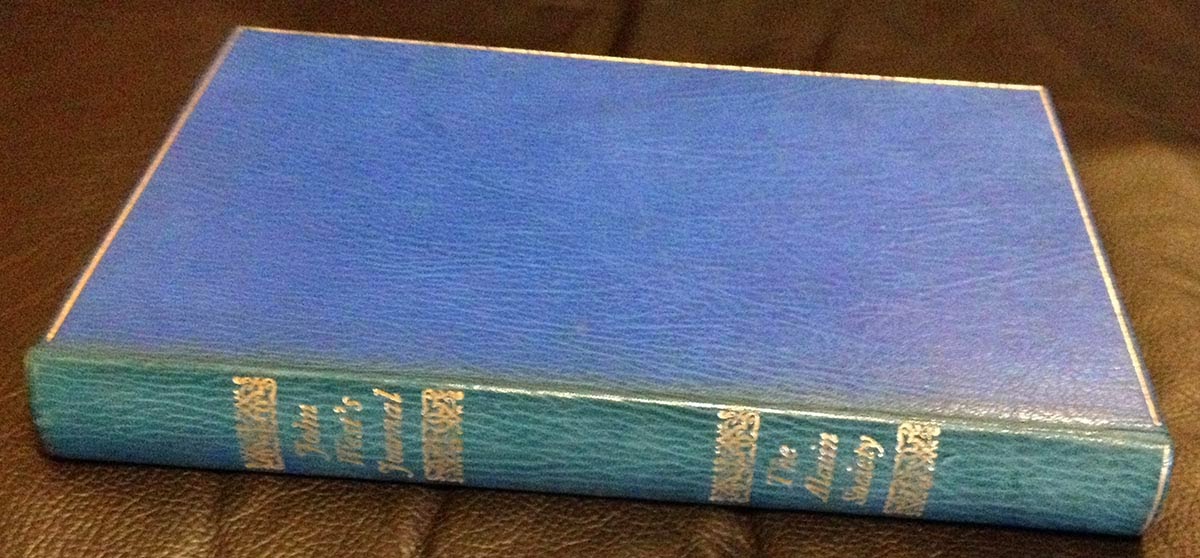
One of the Alcuin founders was Basil Stuart-Stubbs, the University of British Columbia's first Head of Special Collections. He and Wil collaborated on a number of small publications issued through the library (like the Eric Gill item below), and Wil also printed more mundane items, like letterhead.
Not sure about this Samuel Johnson broadside, but I'd bet it also was funded, or at least initiated by BS-S/UBC.
The earliest sample of Wil's printing I've found is a 1964 pamphlet publication of Bertolt Brecht's poem "To Posterity;" a "limited edition of 125 impressions," with the imprint "Printed at Grouse Mountain' (one of the mountains in North Vancouver). I've found no other publications using this imprint.
This lovely four-page pamphlet (250 numbered copies) from 1966 probably was done, at least ostensibly, to advertise his printing prowess, but it also illustrates his interest in being more than a job printer. (p.s. there's one copy of this title listed on Abebooks...)
Robert Reid's early books led me to explore other letterpress printers who had worked in Vancouver. It's a short list and Wil's name came up often. Aside from the books and ephemera he did for the Alcuin Society, examples of his non-commercial printing are not easily found, especially examples printed after he left Vancouver for the north.
The federal government had launched a project to promote and develop the work of Inuit artists, particularly by introducing them to printmaking techniques. Wil was recruited to be the master printer/instructor at what became Kingait Press &Studio in Cape Dorset. The Creston paper's obituary says he was in Baffin Island in the 1960s, but I thought he went up around 1974 or '75, and stayed for only a few years.
When I first went into David Clifford's shop (Black Stone Press) in the late '90s, he had a Little Giant cylinder press taking up too much space in his shop. He adopted it a few years earlier, to save it from the scrap heap, in part because of its history: the press (which weighed a few tons) had been taken up to Baffin Island by (or at least with) Wil, to be used at the studio. Some letterpress printing was accomplished by him there, but it didn't really take off. After Wil left, somehow & for some reason, the press was shipped back to Vancouver. Must have cost a fortune. Before it reached David, I think it spent some time lying inert at Barbarian Press. Ultimately, to no one's satisfaction but everyone's understanding, it ended up being broken up for parts. Not positive, but I think it's the same press as the one shown here, from his Vancouver studio c.1970.
I am frequently surprised to encounter people who claim to be book collectors, yet they have no working relationships with booksellers. They have no appreciation for the profession. Here's one reason you want to get chummy with some booksellers: once they know (& hopefully like) you, all kinds of surprising things begin to emerge from boxes and secret stashes. It seems that while he was up north, Wil did some "job" printing for the studio and local groups (be interesting to know more about the Inuktitut type)...
...as well as a few items for his own amusement, including another edition of Three Egyptian Letters...
...and the year before, C.P. Cavafy's poem "The God Abandons Antony" printed in an edition of just six copies.
Leslie Boyd Ryan's Cape Dorset Prints is one of the standard histories of printmaking in Cape Dorset. Interesting that Kingait gets an extra N from the letterhead & card Wil printed.
Perhaps the most personal example of Wil's printing I have is the one below, from 1986 - the last date I have on any of his printing. It's printed french-fold, four pages.
From the obit, it sounds like Wil found other passions to channel his creativity after withdrawing from printing. A loss, but one of the kool things about printing is that people who knew you are left with words to remind them of your company, and people who never knew you (as I never met Wil) have the opportunity to imagine they did.
And Another Thing
You will never, ever have a better reason for visiting Milwaukee than you do now: HM alumna Briony Morrow-Cribbs has a solo show of new works opening in a week at the Tory Folliard Gallery. Opening is Saturday 8 February. Briony's stuff is superkool. Might HM do another book with her one day? We keeping bugging her about it...
Things are happening with volume four in the color series, Around the World in Color. David Clifford is more than halfway through printing the text at Black Stone, and last week a fold-out map of the world, which will be colored to show where various natural dyes and pigments are found, was printed at HM - in fact, it's the last thing printed on the Washington before the studio gets taken apart in a month or so.
29.11.13
What Are Pleasant Colors?
"Healthy people wear pleasant colors." That wasn't covered in Occupied By Colour. Brown definitely does not qualify, and that includes shoes.
There's some rule prohibiting posting on Thanksgiving, so up it goes today. Speaking of the colo[u]r series, David Clifford is gearing up to start printing the last instalment, Around the World in Colour. It might even be completed before the Xmas break, but that still leaves a few months of fabulizing by Barbara & Claudia before it gets issued; late spring '14, as promised. And before David dives into that, he has to print the patterned paper that will be used for the case bindings of Metal Types. That'll happen next week. The last two sheets will be printed by Monday's post. Back to it.
26.9.13
Everything's Gone Green
Received an update from Barbara this week on her progress with Around the World in Colour:
"I haven't yet run across any specific recommendations for producing dye green on paper. So, I've been experimenting with all of the combinations suggested in the literature for cloth dyeing, as there is no one magic natural green. None of the combinations worked. Either the overbath stripped the first colour, leaving a non-descript shade, or the second colour sat on the first in a kind of mottled attempt at green. The eureka moment came after a chance visit to a Chinatown apothecary shop, looking for another elusive dye: gromwell. The apothecary asked what I wanted it for, as she measured out two 'doses.' When I said it was for dyeing, she began pulling jars off the shelves. She gave me gardenia, which I had read about, and Rubia cordifolia (a form of madder that I hadn't yet tried), and a couple of others.
"I'm not ready to divulge the name of the dye that worked so well to make green. That will have to wait for the book."
Kool stuff to look forward to when the book is published next year.
22.8.13
Paper Should Not and Should
That's the trial binding for the quarter leather copies (numbers 11 - 30) of Paper Should Not Always Be White. Claudia will be dipping into her stash of kool marbled papers, so they won't be the same one on every copy.
We'd intended to issue the full leather copies with the seven extra paper (1 - 10) first, but there's been a delay with the leather. These quarter leather copies will start appearing after Labor Day.
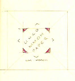
While Claudia's working on the bindings, up here at the studio we're on track to finish our miniature book using the off-cuts from Paper Should Not... Printed the preface yesterday, on some unknown (but possibly Italian) bits of a lovely laid paper. As promised, we now have a title for the miniature: Uncommon Papers. Here's the sketch done at dinner last night for a layout.
The decision on a title was goosed by the fact that the only things left to print are the title page and colophon. Looks like the edition will be 25, as planned. Yesterday we sent Barbara Hodgson pieces of thin linen paper made by Reg Lissel (leftovers from The WunderCabinet). She very kindly has agreed to dye them a lovely deep copper-gold, as part of her ongoing dyeing activities for Around the World in Colour. Once dyed, we'll print a pattern of diamond ornaments (like the ones printed inside each paper sample in the book) on the sheets, and use them to cover the thin boards for casing the books in.
19.8.13
Stripping
Part of the inspiration behind Paper Should Not Always Be White was putting to good use the small batches HM and others had accumulated over the years - a few sheets of this, a few of that. But some of the sheets (about half) had to be slightly trimmed to fit the book's page dimensions. We allowed some variation in width and height, but there's a limit to that before binding becomes overly complicated and, rather than being charming, the book looks like Frankenstein's monster.
Cleaning up the studio after the sheets had been collated & shipped to Claudia, we were left with long, narrow strips of 12 different papers; some Barcham Greens, a few early 20th century sheets, even the remaining scraps of the Blaeu atlas pages. About half were handmade and half mould. All of them much too lovely to discard or abandon. So, we're making another book.
The paper strips range in width (i.e. height) between 2 and 3 inches, so making the book a miniature was obvious. That's a format we've flirted with in the past but aren't really endeared with: too small & fiddly. But in this case, it works. Each sheet is presented as a folio, like they were in Paper Should...., with the maker's name printed on the first recto, and a diamond shaped pattern on the second recto. Some of the strips are wider, and those samples will include a fold-out at one edge to fit the book.
The page will measure just under 3 by 3 inches (as big as we can go while keeping it legitimately miniature). Because the strips were so long, we're able to print with a side-by-side work & turn form. And, it was the perfect project for the little Pratt Albion,* which hasn't been used since its inauguration about a year ago. Yesterday was the first day or printing - we ran off the Amalfi, Warren H. Colson and Blaeu sheets - and the Albion was great. The width between the roller bearers is short enough, and the area being inked small enough, that we're able to use a hand prayer instead of the big roller. The only problem is that the bed doesn't glide back and forth like the Washington; it takes some cranking. There's no shortage of oil in the rails; I think the rails and the bottom of the bed just need to be polished with a few thousand passes.
The current plan for binding entails Barbara Hodgson dyeing some of Reg Lissel's paper, as part of her current research for Around the World in Colour, printing it at HM with a pattern and title, and then putting it over thin boards for a case binding. There will be a dozen different papers (48 pp.), with a two-page preface. The text is set by hand in Perpetua, and printed in different colors. The edition will be 25 copies; all will have a dozen paper samples, but they won't all have the same 12 samples. Hope to get the printing finished before the end of the week, and have the whole thing wrapped up before Labor Day. It's proving to be a good warm-up for the type sample book, which still doesn't have a title. Nor does this latest distraction, but we should have one by Thursday's post.
* We very briefly toyed with the thought of hauling out the old Kelsey 5 x 8 toy press and using that to print this book. After all, we were so committed to it all those years ago! Plus, printing would be a lot faster. But crappy, too: the Kelsey was hauled out last month to help a bored teenager pass a few summer afternoon hours, and we were reminded of just how useless & weak those things are. But the Heavenly chimp did set and print her first project, a coupon. The text occurred while walking through our colorful (i.e. sketchy) neighborhood on a hot summer day; the layout and setting are all her (limited to the drawers of type she was allowed to use....). When it was done, chimp said - in a polite way - that she hadn't realized how fussy & boring printing was.
1.8.13
Weld, Woad, Lac, Madder & etc.
If you don't know those words, you will by this time next year. Over the last three weeks, as a slave to the colour vats, Barbara Hodgson has dipped more than 700 sheets of Reg Lissel's paper into a variety of natural dyes, including annatto, logwood, cochineal, cutch, henna, pomegranate, weld, brazilwood, madder, lac, woad and indigo. This venerable and intensive process gave her plenty of time to finally settle on the title for the fourth and last book in the colour series: Around the World in Colour: A Multi-Hued Tour of Ochres, Oxides, Roots and Bugs.
Although Barbara admits to being loathe to disperse the stack, each copy of the book will include a sampling of these sheets, both full page and smaller swatches, to illustrate the richness of traditional colours found in regions such as Southeast Asia, the Near East and Central America.
The writing is mostly completed and she's focusing on the layout now. (Claudia, as binder, has the unenviable position of always being last in the production line, so she's still finishing up copies of their last project, Cutting Paper, while Barbara forges ahead.) Printing will happen late this year & early next, with the book slated for publication in late spring of 2014.
Subscribe to:
Posts (Atom)