Showing posts with label HM Library. Show all posts

4.1.21

Presents for the Printer (Pt. 3)

Last post on this topic for a while. Found under the tree last Xmas morning: the two-volume large-paper set of The Annals of Scottish Printing (1890). I can spend hours with books like this. Vol. 1 is largely based on the original work of Robert Dickson, prepared for publication here by John Philip Edmond, who completed the project and wrote the chapters in Vol. 2.  

Vol. 1 has numerous facsimile reproductions from blocks made for Dickson; unfortunately Edmond didn't have the energy or means to repeat this in his volume, which contains very few illustrations. 

 
I'm generally not a fan of buckram, but this set is attractively bound in a tan variety, sewn on cords and laced-on boards. Haven't found a watermark yet, but the printing is typical for the better types of these books from the time. 
 

One of the problems for printers publishing a book about printing is, they're printing had better be more than adequate. Also under the tree was Early Nottingham Printers & Printing, printed for private circulation by Thomas Forman & Sons in 1942. A loose sheet laid in at the front shows a family tree for this firm going back to 1710. 
 

The text is printed, indifferently and inconsistently, on Arnold Unbleached paper, a mouldmade wove sheet. The facsimiles, however, are well printed. The type bears some resemblance to Cochin, and might look attractive if better printed. The italic is fun. Despite my production complaints, this also is exactly the kind of book I can get lost in. Thanks Santa.
 

6.6.18

Got No News, Here Are Some Pictures of Books


Labour Vertue Glorie has enjoyed some attention & kind words over the past month, but enough coasting, time to start the next one. I'll have more complete details by next month, but for now here is what I can commit to:


That's a quarto sheet from The Golden Legend (Kelmscott Press, 1892). The sheet measures approx. 16 x 22.5 inches, which folds down to a page approximately 8 x 11 inches.


That's a quarto sheet from the English Bible, vol. I (Doves Press, 1902). The sheet measures approx. 18.25 x 26.5 inches, which folds down to a page approx. 9 x 13 inches.

In both sheets, if you look hard & imagine, you can see the two registration-pin holes along the vertical fold (i.e. separating the opposing heads to create the top margin), roughly aligned with the outer edges of the text blocks. That's how you print with a handpress and ensure consistent registration (especially with dampened paper).


HM's next book is tentatively titled simply The Kelmscott & Doves Presses, and will reprint an article on those topics by Alfred Pollard (see above), accompanied by a leaf from the Kelmscott Golden Legend and the Doves English Bible. It will be a large book (10 x 15 inches, printed in folios), to accommodate the Bible leaf. The paper will be Arches, printed damp. Unless we scrap everything & start all over, the text will be set in Centaur, with a calligraphic title page, opening, and initial letters throughout. The calligraphy will be done by Martin Jackson, and we're currently at work finalizing how it will look and integrate with the typeset material.

HM has previously recruited Martin for a few small projects - most notably The Mouse & The Lizard and the special copies of El Autotubus Azul (2nd ed.) - and I've been wanting to undertake a proper collaboration with him for years, one that fully incorporates and displays his talents, and this will be the project.

The edition will be 50 copies, plus five HC. The book is scheduled to be printed in September and October. Each sheet will have a second color on both sides, which means three consecutive days of printing per sheet. Because the sheets will be bigger than my preferred maximum size  to date (13 x 18 inches, the size of Reg Lissel's foolscap sheets), I must acquire a complete new set of boards for damping and drying, and at least one more book press large enough to accommodate them. A few copies might leak out in time for Christmas, but I'll put 2019 on the title page.


Pollard's essay is primarily typographic in focus, and he had (and admits to) a preference for the Kelmscott books and types. Nash's original printing doesn't rank with his best work - Pollard's essay is set in italic Caslon (the dreaded Caslon...), sometimes in lines with almost no word spacing - but whaddaya want for a catalogue. It's an excellent bibliographic reference for the two presses. I found my copy with the kind help & indulgence of Carol Sandburg and Michael R. Thompson.

AND ANOTHER THING!
I don't have anything else interesting to report or axes to grind, so I'll pad the rest of this month's post with images of things from the HM shelves that might be of interest...


When I acquired the Golden Legend leaves, a few years ago, I knew I'd be stumped for how to use them, given that Neil Shaver had already done an excellent & beautifully-produced leaf book on the subject (printed damp on Batchelor & Son laid paper c.1940; Neil was the last printer in North America I can think of who regularly dampened his paper for printing). Why there are so many loose leaves from the Golden Legend floating around I don't know. The fact that it's a three-volume tome probably has something to do with it. But I was even more potentially snookered than I'd realized: I'd forgotten that, tucked beside my copy of Neil's book, was a pamphlet printed by Grabhorn-Hoyem for a Roxburghe dinner in 1966, with a Golden Legend leaf! It also reprints an extract from Chapter Six of Thorstein Veblen's 1899 essay "The Theory of the Leisure Class" in which he expresses a dim view, from economic and sociological perspectives, of the kind of books Morris produced. The pamphlet consists of four sheets (16 pp) of English handmade wove paper. Beautiful initial letter (engraved, I'm guessing). Edition of 116 copies, self-wraps, quarto, 16 pp.


I plan on publishing an illustrated, expanded & larger-format second edition of my Francesco Griffo bibliography-in-quotations, possibly as soon as next year. I've started poking around for sources I couldn't get or didn't know about when I did the first edition. This is one little item that's cropped up (& is one of the sources responsible for Griffo's work being credited to the wrong person for some time).


Found this on the shelves of Serendipity Books during one of Peter Howard's famous pre-ILAB fair pig roasts, the year of the first Codex fair (2007?). Lazy pressman was being a bit cavalier when putting the paper in the press, but a cool book nonetheless. I love even the most commercial of French printing right up to the mid-20th century, and I miss Peter & Serendipity.


Let's end with a bouquet, Printer's Flowers - Whimsicalities from The Windsor Press (1933, 150 copies). Quite small (24mo?), charming patterned paper over boards, a lively typographic frolic. Exactly the kind of book I don't have the talent, mind or patience to create.

1.10.17

"In Original Binding"


Similar to last month’s post, this one’s about a book, The Allen Press Bibliography (1981). It’s also about a specific copy of that book, one I found in sheets and took the opportunity to grainger. That isn’t a proper verb, but it’ll become clear.

I don’t remember how the Allen Press first became an interest for my collecting pursuits, in the early 1990s. It probably was a result of my education being confined to dealers down the West Coast, especially in California, where Lewis & Dorothy had been at the center of the fine printing clique since the 1950s. I likewise don’t exactly remember why, when I decided to start printing in earnest, it had to be with a handpress, but the Allens’ books certainly must have influenced that prejudice.


In the early aughts, while my collecting muscles were still in regular use, I set my sights on what I considered to be, for me, three foundational contemporary handpress books (i.e. books displaying the excellence that can be achieved only with a handpress, hand inking and dampened paper): Everson’s Psalter, Baskin’s Jewish Artists, and Allen’s Printing with the Handpress. A facsimile of that last book was published shortly after the Allen’s original, but a book about printing on the handpress really needs to be printed on a handpress. I eventually (actually, pretty quickly) got copies of all three, and found myself looking around and wondering, what now?


Press bibliographies are a particular interest to me, especially if they include sample leaves of the books listed. It’s like having a mini-exhibition of the press’s work in your hands. (This is why I still have not acquired a copy of Neil Shaver's Yellow Barn Press bibliography, despite my regard for his work - no sample leaves!!) The model for most press bibliographies has been that of the Ashendene Press (below), although the samples in that book are facsimiles (resettings) of pages, not actual leaves from the original printing. It contains brief comments from Hornby about each title, along with the bibliographic specifics. The Allen’s bibliography received much praise when it was published, enough that the Book Club of California produced a facsimile (which also had sample leaves!) worthy of the original, in execution and materials, just four years later, in a much larger edition (750 copies; see last image below) than was usual for that group.

https://www.jonkers.co.uk/rare-book/4625/a-descriptive-bibliography-of-the-books-printed-at-the-ashendene-press-mdcccxcv-mcmxxxv/ashendene-press

Binding was the role of Dorothy in the Allen partnership, and she was competent at making flat-spined case bindings. The material or paper used to cover the boards seems to have been the source of greatest interest; the cases are perfectly fine but not quite on par with the printing. Nonetheless, the bindings became part of the Allens’ overall aesthetic, and their books often are immediately identifiable among a row of spines on a shelf. Which makes the matter of my copy of the bibliography, found in sheets, tricky.

The sheets came with 6 original leaves - I think that’s how many each copy contained (more on that in a minute). One of the sheets in my copy was a Picasso lithograph from Goll’s Four Poems of the Occult (1962, shown at top of this page), which is pretty kool. To these I added six more samples, all prospectuses. The technical term for this is “to grainger,” - adding additional (related) content to a book. Originally this generally implied additional copies of prints in the book, e.g. state proofs or colored copies. But it has since been applied more widely, to any additional content that makes a copy unique. 


And I’d lined up a binder worthy of the book: Hélène Francoeur, of Quebec. She and I had both attended the first week-long printing course offered at Barbarian Press (1996?), and she did (does) beautiful work. My budget stretched to a full-goat binding, but with minimal tooling & certainly no inlays etc. I came up with the stylized AP to be debossed in the boards. Dealing with all the salted-in samples was a bit of a challenge, especially the folded prospectuses which added that much more bulk to an opening. And I wanted everything sewn in (i.e. tipped to hinges), at the appropriate place, by the book’s listing, not stuffed in a pouch at the back. She got it all done, lots of shims & guards, and a few months later a beautiful, sober, solid volume arrived.


I can’t remember if it was before or after, but I also got a copy of the BCC facsimile edition. It was never a rare book, given its large edition. I probably thought it would be useful to have a reference copy, to save my graingered copy the wear & tear. A few years ago the price on these facsimiles bottomed out and copies seemed to be everywhere; I see several copies listed online today under $100, which makes them a steal: the book is beautifully produced, and an engaging read for anyone interested in printing & fine-press publishing.


Sometime later, and again I don’t remember when or why, I encountered a bound copy of the original edition, and bought it. It must have been priced cheaply, or come from someone who had an outstanding invoice. It is bound in quarter-cloth, with block-stamped cloth over boards. Dorothy liked block-stamped fabrics. It’s quite plain next to the copy bound by Hélène, but it also is more obviously & genuinely an Allen Press book.


(Taking photos for this post, I discovered this funkiness in Dorothy's sewing of the first signature - what's going on here?! It looks like she was using doubled thread - which I've never encountered - and one has broken but the other is still intact. I dunno.)


Over the past few years I’ve been shedding as much stuff as possible, trying to pare down to just what’s regularly useful or necessary, as opposed to nice to have around. I’ve long had a general rule for non-reference books: if they haven’t been taken off the shelf in over a year, then maybe they can move on to a new home. (And if a book isn’t going to a be useful reference in one way or another, it doesn’t even get into the house now.) All of which brought my attention to the three copies of The Allen Press Bibliography taking up shelf space.

Culling the facsimile would be the easiest decision, but with cheap copies abundant, no one needs mine. Which of the two originals to let go? The one to which I added all the extra samples and had bound in full goat would seem the likely candidate to keep, but there’s something about a press book in the publisher’s original binding. I pretty quickly decided that was the copy to keep. If you disagree with this line of thinking, and are interested in a unique copy of The Allen Press Bibliography, with an original Picasso litho & six extra sample sheets added, in an austere bespoke binding by one of the best binders working in Canada today, it’s yours for US$1000. Lemme know. You didn’t realize this was one long advertisement, did you. The book has moved along to a new home.

AND ANOTHER THING!

Come back next week, I'll have a cool type thing to share...


21.9.15

A Golden Hind Trove


Received 250 full & 200 quarter sheets of Golden Hind mouldmade paper, courtesy of Takao Tanabe. It's a beautiful text-weight laid sheet that prints beautifully. Perhaps the best surprise was that the paper retained its original wrapping, with the maker's label, thereby answering my long-standing question of who made Golden Hind.

I know of Golden Hind because it's what Robert Reid had Kuthan's Menagerie of Interesting Zoo Animals printed on in 1960. As Bob explained in the introduction for Kuthan's Menagerie Completed, he felt the paper was too translucent for George Kuthan's bold & colorful linocuts, so he printed on one side of the sheet only, and bound the book along the open edge.

http://www.heavenlymonkey.com/Newlove.htm

When Tak called to tell me about the stash of Golden Hind he'd found in his studio, it got me wondering what mill it came from. Tak got into job printing in the '50s, initially being mentored by Bob. Tak's artistic talents quickly showed through in a series of typographically creative and playful broadsides and poetry chapbooks he designed and printed. In the early '60s he got a Canada Council grant to study in Japan, and his vocation as a printer was displaced by a career as one of Canada's most important painters.

Tak guessed that the Golden Hind he dropped off last week was purchased mid- to late-1950s, when he was printing. It was being distributed by a paper supplier in Toronto. I asked Bob Reid about how the paper came to his attention:

"Somebody in Toronto alerted me to the fact that a paper house there had this gorgeous mould-made British paper that was mouldering in their warehouse because nobody in Toronto wanted to use it. So we bought all they had. They must have kept stocking it for us, if Tak was buying more of it years later. You are so lucky to be able to get some of it now."


A search for "Golden Hind paper" yields surprisingly few results. The most useful is Papermaking at Tuckenhay Mill, a reasonably full account of the mill's history, which ended in 1970. I can't find any specific mentions of Golden Hind on the site.


I initially wondered if the paper had any connection to Arthur Rushmore's press, but apparently not. An Abe keyword search for the paper turns up just one other book printed on the paper: Philip Levine's On The Edge, printed by Kim Merker in 1963. Interesting that it's around the same time that Bob and Tak were using it. Perhaps the paper was a new sheet introduced by the mill in the '50s to complement (or as an alternative to) its handmade products. Will Rueter printed 10 special copies of Ten Songs (The Aliquando Press, 1987) on Golden Hind; he may have gotten it from Gus Rueter, whose private press was active in the late '50s and early '60s.


I've printed on Golden Hind twice so far. The first time was Kuthan's Menagerie Completed, which included a two-page intro by Bob printed on blank sheets that had been stored with the unbound copies we were releasing. Some printed sheets had been balled up and used as packing in the box; these we used for the colophon. They were dampened for printing, and dried in the usual manner, under pressure, which helped smooth out the wrinkles.


The second time I printed on Golden Hind was for Metal Type. For some reason, one page of text (set in Perpetua) from Kuthan's Menagerie had been overprinted; I guess they didn't like something about it. So I had all these copies of the same page of text on one side and blank on the other (They'd been stuffed in with the unbound copies I had in 2003). Metal Type combined a number of different papers, so it provided an opportunity to use up the Menagerie waste sheets: I used the blank side to print a Muhammad Ali quote I've always liked. On the printed side I displayed my own 18-pt Perpetua, intermingled with Bob's original.


The paper prints beautifully. It's relatively soft, but not too much. Like most papers, it prints better damp, but it doesn't require a lot of damping.

So, huge thanks to Tak for thinking of HM. I've promised him a copy of whatever I print on the paper. The problem is, when you get a stash like this, once it's used you'll never get more so you never use it! We'll see...

28.4.14

Wait, What's the Book's Title?


I promised some news about our old friend Francesco Griffo. There will be, just not this week. But, related, here's a recent acquisition: Giovanni Mardersteig's Piero Fransoso. Before you Mardersteig fans run to your shelves wondering how this title could have escaped your attention, it's because this book is better known as The Remarkable Story of a Book Made in Padua in 1477. That's what appears on the title page. I got a copy because Griffo makes an appearance and I've been reading up on him again.

 
The book isn't uncommon, but only one copy listed online mentioned having a jacket, so I got that one. You can see it above. The book is cased in paper vellum, with PIERO MAUFER on the spine (the name of the printer of the book in question), with a facsimile of the signature Peiro Fransoso stamped on the front board. All the same guy, Mardersteig just couldn't settle on using the Latin, Italian or a combined version of his name.


The book was published by Nattali & Maurice and distributed by Putnam. Never encountered the N&M imprint before. This copy contains a prospectus for the book (as do most copies currently on offer), listing on the verso some upcoming typographic titles.


That's the bottom corner of the rear flap above. In addition to the prospectus, tucked into this copy was a pre-publication notice to booksellers. Isn't "exposed for sale" a very odd phrasing? This must have been before the age of Big Marketing, whose boffins would have preferred  "offered" or "presented."


All I've been able to find about N&M is buried in this page at the Tate site: the imprint originated with one Armand Maurice, whose business was taken over by Putnam's 1931 and renamed Nattali & Maurice.  The Bodley Head acquired Putnam's and Nattali & Maurice in 1962. I can find no titles published by N&M after 1969 (Oliver's got a typo in the listing for his copy of P. Fransoso; I've written to tell him).

Seems unnecssary to add that the book is beautiful: 200 copies designed by Mardersteig and printed at Stamperia Valdonega. Probably one of the nicest books issued by N&M. And it's an interesting story for fans of publishing history: "The most complete bibliographic of any book made before 1500." Some interesting commentary on productivity rates of handpresses.


About Griffo: I need to get my hands on another of Mardersteig's books, the Officina Bodoni 1969 edition of Pietro Bembo's De Aetna (or the 1970 German version). Apparently there is an afterword by the printer in that discusses the original edition, Aldus, Griffo etc, and I need to read it. Thought I had a line on a copy but nyet. If anyone out there can forward scans/photos of these pages from the book, it would be much appreciated & perhaps even somehow rewarded. My email is over on the right side of the screen.


STICKING WITH PUBLISHING for this week's theme, a friend loaned me his copy of Drif Field's Not 84 Charing Cross Road. I was unaware of the antiquarian book thread in the story of Michael Milken's unravelling, and Field's account is entertaining and not at all unbiased. Field is (was? don't know) a legendary U.K. book scout whose other DIY publications are guides to used bookshops. His knowledge of the trade, from a scout's perspective, is deep, and he pulls back lots of curtains. Content aside, the book is an exercise in critical reading, as his spelling, setting and grammatical mistakes often confuse the exact meaning of a sentence. Less writing at or after the pub would have greatly increased clarity. Reading Is further challenged by "setting" the text with some first-generation word processing program, the auto-justifying creating some pages that are variously mesmerizing, distracting or ugly patterns. (I won't even start with the blank spreads between sections: don't ever have a blank recto in a book, unless you specifically mean to.) Check out the stacking on this page!


That pedantry aside, it was an entertaining read. As a piece of reportage it falls short - the exact basis for the trial that occupies the final third of the book isn't stated clearly until almost the end - but as a glimpse into an esoteric subculture it's full of insider information. (FYI, in the U.K. the preferred term is bookdealer, never bookseller.) Highly recommended to anyone considering becoming a bookseller (if that still happens), interested in starting to collect books, and those already afflicted with either condition. Also useful to anyone going into business of any kind.

A fun coda: the copy loaned to me had a photocopy sheet laid in with the text of a letter from bookseller Louis Weinstein, of L.A.'s Heritage Books. The letter was a published in 1994, shortly after Not 84... came out. Weinstein plays a tangential role in the story, and in his letter he questions the veracity of Field's account of events. But what's interesting is that this letter was published in the trade journal The Bookdealer, which also makes a cameo in Field's book, an appearance that puts any letters it might publish into a certain context:

"There is no trade magazine for Bookdealers [sic]. There is a magazine called the Bookdealer which is issued weekly which any sensible person would expect would keep the trade informed but its main interest in life is complaints about the postal rates to Zamboanga..."(p. 100).  He then goes on to makes comparisons between the journal and a fictional Mrs Whitehouse, which I'll let enjoy when you get your hands on a copy of the book.

16.3.14

A Canadian Bank, Spanish Paper, & Marks


America was built by cowboys and oilmen, Canada was built by bankers and insurance salesmen. Something like that. Here's a story to illustrate the point.

Walked by a local used book shop last week. Chalkboard sign out front announced "Antiquarian Sale." There was a table of dreck inside: orphans from sets, a few books in polished leather bindings with the boards detached, general detritus. Most interesting thing I saw was a monograph titled Esoteric Astrology. Talking to the very pleasant woman who seemed to own the place, she explained they were getting out of antiquarian books, focusing just on newer used books. I wasn't sure they'd ever been in the antiquarian books business, but whatever. I spied, at the bottom of a tottering pile behind her desk, a slipcase. What's that? It was this:


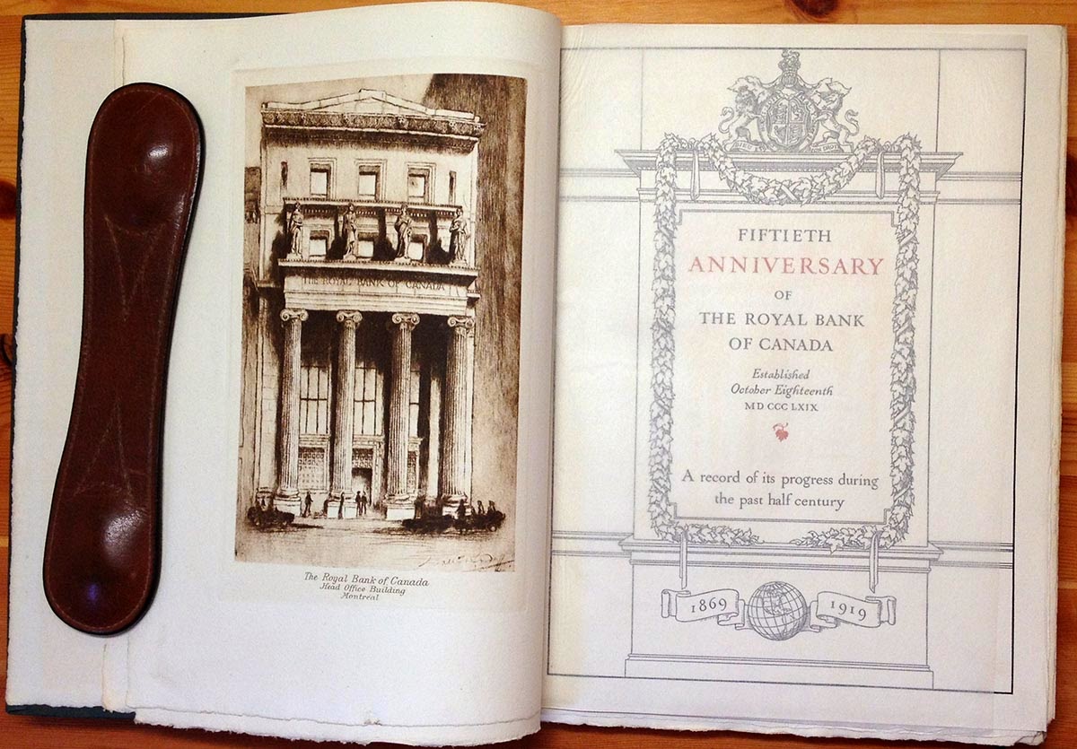
And first glance, and even second, the book is deathly dull, lying somewhere between annual report and a high school yearbook. But for thems like us, before you even get to the title page & realize what a bore it is, you notice the paper, and the watermarks:


None other than the same Guarro mill that provided the 1960s mouldmade upon which HM has published several books over the past ten years, including Oddballs and Types/Paper/Print. (My suspicion about the nice lady's bona fides as an antiquarian bookseller were confirmed when she asked, What's a watermark?) I have previously seen just one full sheet of handmade paper bearing the Guarro watermark, at an intaglio studio. I've never seen a book printed on handmade Guarro. I tried to resist, but for $25 I was saving a fortune in beautiful paper from the scrap heap.


As a piece of publishing, it's an interesting specimen (I'm not justifying the $25 here: I'm justifying the space this thing will take up in my life). There's a copyright (Montreal, 1920) but no colophon or information about the printer. The typography is functional and of a journeyman caliber for the period. The text is set in some Caslon variant, the word spacing none too carefully attended. The text was not printed damp as it should have been on this lovely paper, trop mal. Maybe that's why they used the hot pressed surface for the text, but still.


The numerous photogravures, however, are beautifully printed on the NOT paper (damp, as this method would require), rectos only, and nested into signatures to alternate with text pages. They are protected by sewn-in sheets of whisper-thin handmade gampi (looks like; might be kozo, but I think gampi). Most of the images - various directors & other important personages - are interesting only for the glimpses into muttonchop fashions of the time, but there are also some images of the bank's various offices near & far that are skillfully rendered and architecturally interesting. So, for someone simply interested in printing, it's worth $25.


Laid into this copy is a presentation card from one Mr E. L. Pease. Flipping through the book we find he was Managing Director of the head office when this book was issued.


Old Peasey was even high enough on the ladder to get his mugshot in the book:


I've not seen the José watermark on any of the (admittedly few) Guarro sheets that have come my way. The book appears to be printed on two different stocks of wove, of approximately 120-150 grammage: the text on a hot pressed stock, and the intaglio on a cold pressed (i.e. textured) stock. The watermarks are identical on both. The book seems to have been printed on half-sheets (i.e. full sheets printed in quarto). On the pages that bear a mark, Guarro or José is roughly centered, reading vertically. There also was a watermark in the center of the full sheet. I couldn't find a complete mark anywhere, but the pieces include a crown, a shield, and the designation 1a.


Trawling the Web for information about Guarro handmade paper, only a few reference come up. The company still exists, but in a very different form from its glory days as a maker of fine papers. No mention on their history page of a José Guarro.
 
No surprise that lots of books printed in Spain (pre-Civil War) used Guarro paper. Here's a link to a fantastic 144-pg catalogue from a Barcelona auction house's 2013 catalogue: lots of images and more than a few mentions of Guarro (including the lady above).

http://www.britishmuseum.org/research/collection_online/collection_object_details.aspx?objectId=764817&partId=1&searchText=caprichos+34&view=list&page=1

At the British Museum, an early 20th century impression of a plate ("Las reinde el sueño") from Goya's 1799 series Los Caprichos is noted to be printed on paper with the watermark. According to the description of a copy of the suite offered at auction by Sotheby's in 2008, those early 20th century impressions were from a 10th edition of the suite, and all were printed on paper with the José Guarro watermark (and a watermark portrait of Goya wearing a cap).


There was also published, in Madrid in 1916, an edition of Goya's Los Proverbios: 50 sets, all 18 etchings with aquatint and drypoint, on laid paper watermarked "José Guarro Catalunya." The image above is one of the plates from the edition offered by Davidson Galleries of Seattle: excellent dealer of prints from all periods, including new works by HM fave Briony Morrow-Cribbs.

 
Apparently the 11th edition (1929) of Los Proverbios also used (different) laid paper with a Guarro watermark. Sample above: not as elaborate as the ones in our book.


Perhaps oddly, perhaps not, one of the handmade Guarro references that turns up has a Canadian angle: The Canadian poet Francis Sherman (1871-1926) had a few things printed on José Guarro paper. Turns out poetry was his avocation, while his vocation (or profession) was banking: he was even the Royal Bank's man in Havana in 1899. (He may have had a poem printed by Will Bradley, in 1897: see here for that story.) According to a Sherman bibliography on the Canadian Poetry site, the bank's archive still holds manuscripts and some unique copies of Sherman's books. Look, he's even listed in the book, right under our benefactor Mr Pease:


Here's a twist in that plot line: the two pieces of Shermania printed on José Guarro paper ("In The South" and the collection Canadian Calendar: XII Lyrics) were printed in Havana, in 1899 and 1901. When the bank decided to print a book to mark its diamond jubilee, might the powers have turned to their in-house poet & bibliophile to suggest how the book might be made suitably luxe? Might he have suggested they use his old printer in Havana? That seems unlikely, given the distance and the ready availability of printers in Montreal at the time. But he could have suggested the paper. If, however, Sherman the bibliophile was involved in the planning, you'd think a colophon, or some mention of the printer (printers; the letterpress & photogravures probably were done by different companies) and production would have been included.

No other information about José Guarro handmade paper, laid or wove, has bubbled up since acquiring the book. Why so much was spent on what really is an exercise in corporate vanity, who knows. One partial reason might be the recent end of the Great War: a significant portion of the book is dedicated to listing the names & regiments of employees who served. But bibliophilia was fashionable among the professional & commerce class in 1920 - think of all the books John Henry Nash talked rich patrons into commissioning - so there probably was some showing off involved. To this day, much of the value & growth in the Canadian economy comes from the financial sector. Our banks consistently report some of the highest profits for the industry internationally. The previous governor of the Bank of Canada was recruited last year to become the first foreign Governor of the Bank of England. Buried in the Royal Bank's financial report for 1919, in small type, is a hint at how this future success would be achieved: