Showing posts with label Book news. Show all posts

1.8.23

Will Rueter's Last Aliquando Book (not really)


Another guest blog, this month Will Rueter of The Aliquando Press, writing about his avocation of six decades, over 100 books, and his latest & last (sort of)...
 
 + + +
 
Thanks to the suggestion (and generosity) of Our Heavenly Monkey himself, this is my first blog. I’m very honoured to use this space to celebrate The Aliquando Press’ 60th anniversary.
 
In December of last year The Aliquando Press completed the printing of its last book. My concentration needed for longer-term projects was diminishing, my eyesight wasn’t good enough for setting small sizes of type, and the realities of life outside my private press world needed more attention. It was time to stop printing before I really screwed up. 
 

For almost five months before and after the Press’ closure I packed, distributed, founted, and helped move seemingly tons of type and equipment, and then unpacked countless boxes in our basement, where I continue to discard detritus from the Press. (Moral: When in doubt - or not –
THROW OUT! You really can’t print on postage-stamp-sized offcuts or use two-decades-old grotty ink.) Happily, the temporal Press in all its manifestations has found good homes, most specifically at Massey College, University of Toronto, where students will be able to use my collection of typefaces that represents more than five centuries of letterform design. The idea of the Press and its potential remain with me, but I haven’t had time to grieve over its demise.
 
The last Aliquando Press book, Serious Play, is the summation of an idea that took root in December 1962. At art school I realized that I had found a passion for typographic design and specifically that I wanted to make books. Operating a private press as an avocation allowed me to learn the basic skills of book making and create books for pleasure. My fascination with book design led me to a career designing academic books for the University of Toronto Press and my naive early attempts at printing became a life-long obsession.

For about ten years I klutzed about, enjoying choosing texts, collecting and experimenting with type, colour, and paper, and learning simple binding. Eventually I realized that the pleasure element, while still evident, was giving way to the challenge of producing more serious books and printing.
 
I’ve always been obsessed with the austere beauty of books from T.J. Cobden-Sanderson’s Doves Press. His book design is magnificently minimal. In my own printing I’ve tried to strike a balance between C-S’s vision of the Book as a pure, sin-free ideal and the raucous, get-your-hands-dirty approach of the printer who actually enjoys printing. The truth lies somewhere in between.

For six decades the Press has been an alter ego, reflecting (I hope) my better qualities and tolerating my more objectionable ones. It has taught me as much patience and curiosity as I am ever likely to have. Through its activity I have met and made friends that I never expected, and I have been able to admire and (full disclosure) envy the work of many private presses. The solitary nature of operating a private press has been balanced by the Press’ many friends and mentors, from whom I have learned so much and whose camaraderie I value greatly.
 
HM asked me to add photos and comments about some recent Aliquando Press books that might be of interest to viewers. The final book from the Press is Serious Play, cobbled together from Daniel Berkeley Updike’s Printing Types: Their history, forms and use. I hadn’t paid much attention to Updike’s writings until relatively recently. His passion for typefaces, well-made books, and Doing.Things.Right. increases my respect for him. I added a fairly brief Afterword to Updike’s text as a ‘memoir’ of the Press and how much it has meant to me.

The book (25.5 x 16.5 cm, 41 pages) was set in Jim Rimmer’s  Nephi Medieval and Duensing Titling types and printed on Zerkall and Hahnemuhle papers. I played with Glint ornaments (the first ornaments bought for the Press decades ago) to create the initials. There are also a few photos showing my old studio. As with most Aliquando Press books, the edition is 40 copies, quarter bound in linen cloth with my own decorated paper on the boards.


In contrast, Steale Not Thys Book (11.5 x 9.5 cm, 31 pages) has gone over to the truly ridiculous side. It’s a small book of warnings and invectives, printed on Hahnemuhle  Archiv paper and using the full arsenal of the Press’ type, cuts, and ornaments, and bound in various marbled and decorated papers. Whenever I look at it I’m reminded why private printing is also supposed to be fun.


I’ve always enjoyed alternating the printing of prose and poetry. A chance encounter with Michelangelo’s sonnets in translation made them the perfect choice for a late Aliquando Press book. Beauteous Art’s Embrace (18 x 12cm, 28 pages) is set in Blado italic with Hadriano initials and Primula ornaments, printed on mouldmade Zerkall Nideggen paper, and quarter bound in Nepalese ‘sun print’ paper. I find Michelangelo’s thoughts on art and life very comforting at this stage of my life.


Having printed a number of Cobden-Sanderson’s thoughts on books and printing over the years, I wanted to complete the cycle with something more intimate. My final C-S book, Work & Beauty: Selected writings of Thomas James Cobden-Sanderson (16 x 11 cm, 33 pages) is set in the beautiful Trajanus type of Warren Chappell, printed on vintage Golden Hind paper, and produced to match – more or less – the format of C-S’s octavo Doves Press books.


William Morris has also received late attention from the Press. In A Visit with William Morris (16 x 12 cm, 41 pages) I reconstructed his words from four contemporary interviews to reveal an informal side of the master printer. The book was set in a version of his Kelmscott type and it includes my Cavatina ornaments and a reproduction of a wood-engraved portrait of Morris. It’s bound with a medieval-style overlapping cover.
 
I have loved music all my life and several Aliquando books have been inspired by music. My final offering is Laudes Musicae: Words in praise of music (18 x 12.5 cm, 45 pages), a compendium of quotations using a wide variety of type, paper, and ornaments. It’s my homage to the most consistent, comforting, and sustaining of the arts.


The general typographic style of The Aliquando Press has always been on the conservative side of conservatism (thanks to Cobden-Sanderson’s influence), but over the years I’ve enjoyed experimenting with ornament combinations, colour, formats, and papers. One of the biggest challenges has been to create bindings that were conduits to the text, yet were appropriate to the author’s ideas. I’ve run the gamut of experimental bindings and have found myself (as I do now) with printed sheets to bind after new projects are begun. An edition is only controllable if you completely bind at least ten copies reasonably promptly, then concentrate on completing each binding stage with the remaining copies before moving on to the next step. That approach seems to make edition binding less onerous: a fact I’m finally learning.
 
For anyone who fantasizes about letterpress and the craft aspect of relief printing, you would be well advised to think carefully before investing in what has become an obsolete craft. Some art schools have letterpress equipment and a good university may offer courses and/or equipment as part of a bibliography program. Staining your fingers with ink and producing an image from letterforms is addictive but it requires serious commitment as well as good humour and patience – and, always, love of the craft rather than hope of financial return.


Though I would never call myself a particularly good printer or binder, it’s been fun finding interesting texts to print and, I hope, being a reasonably good steward to the author’s words. Very sadly, I think the Golden Age of Letterpress has gone. But the Book as an ideal of perfection remains, and I hope the physical book will continue to inspire, delight, offend, and enlighten us all for many decades to come.
 
If you are interested in any Aliquando Press books still on hand or want to chat, send an email to me at dovecotte[at]cogeco.ca.

1.2.23

A Lady, a Tiger, a Sword: What To Do?


Copies of what I’m calling the Stockton book will ship out this month. It includes two linked short stories, ‘The Lady, or the Tiger?’ and ‘The Discourager of Hesitancy’ by Frank L. Stockton. Although the latter story was ostensibly written as a sequel, they can be read in either order and the book is designed to encourage that choice: it has two fronts and no back. Like those paperback Ace doubles from the 1960s (the proper term is tĂȘte-bĂȘche, not to be confused with dos-a-dos, an ungainly structure that has two spines). But in this case each story leads to the other, like a kind of ouroboros.
 
 
I was introduced to the stories in the mid-’80s by a recording (vinyl) with Toyah reading the text while Robert Fripp (her spouse; they were having fun together long before the covid kitchen sessions) noodled away in the backgroud. Unfortunately the flip side, with ‘The Discourager,’ was less aurally interesting, but the stories lodged in me somewhere. Here’s a link to the recording, but the stories are more fun to read first. 


The stories were published in The Century Magazine in the 1880s, and the first one’s unresolved ending made Stockton famous. Like Doyle killing off Holmes, however, he was constantly pestered by readers wanting to know “what happened?” Eventually he provided a sort-of answer with ‘The Discourager,’ and people realized he wasn’t going to give the kind of answer they wanted.
 
 
These two stories were the high points of Stockton’s writing career: they remained widely known and anthologized well into the first half of the 20th century. I was surprised to discover while working on this project that the author and these two stories are now barely known among American librarians, booksellers or readers.
 
When I started making books, I had the idea of printing the stories as two separate pieces that meet in a middle. I also had the idea for frontispieces that echoed this invertible presentation, like playing cards.
 
 
Over the years I approached one or two artists but the stories didn’t grab them, and the project remained at the bottom of the pile. I pulled it out again a few years ago and started poking around with the idea of maybe using early playing cards as the illustrations. That led me on a distracting but fun tour through the history of playing cards. I didn’t surface with any art I could pilfer, but I did have some examples that caught the spirit I was after. One of them in particular reminded me of someone, and after much head pounding, I realized it was Walter Bachinski.   
 
 
In June of 1997 I attended the first week-long letterpress intensive offered by Jan & Crispin Elsted, at their Barbarian Press. Janis Butler was one of the three other students. She and her partner Walter had come out from Ontario, and while she learned the basics of letterpress, Walter, a professional artist and teacher, roamed the area with a sketch pad. During that week he made a linocut, possibly his first, and the Elsteds pulled a proof. It was very cool.
 

Janis and Walter went home & began publishing books under the imprint Shanty Bay Press, which from the start enjoyed wide acclaim, particularly for Walter’s vibrant pochoir and relief prints. (Janis does the setting, printing & binding.) We weren’t really in touch during the intervening years, but it was always good to see them when our paths crossed.
 
So when out of the blue I sent Walter a note, with the stories attached and an outline of my concept, I tempered any hope that he might want to get involved – he doesn’t need HM if he wants to do a book project. But the stories did resonate, and better still, so did my idea for their presentation.
 

Initially the plan was for him to create and print just the two frontispieces, but as I got into the design I wanted to incorporate more Walter (and thus more color) to the text, and asked if he could do some simple drawings that I could play with. Again he happily (and promptly) agreed, sending 12 pieces that played with elements in the frontispieces. By coincidence the drawings could be ordered to reflect aspects of the stories ­– not illustrations but perhaps evocations?


Heres a brief description from Walter about the process for editioning pochoirs (printing isnt quite the right word) & an image of him at work:
 
“I have worked out a master drawing before I begin any pochoir. When I lay out the image on the page I first establish the rectangle with a light pencil outline. I then trace on mylar the different colours that make up the image. In this case there is a stencil cut for each colour. I print the colours using acrylic ink (Heavy Body Golden Acrylic Paint). The key block for each of your  frontispieces was a type high maple block that I cut out to establish the black border. I printed that at the end with an oil based relief ink.

“I use a variety of stencil brushes and it is a dabbing motion of strokes. Even though the areas are flat they are subtle irregularities  that reflect the brushstrokes. This makes it different from the  mechanical flatness of a silkscreen surface.

“Pochoir appeals to me because there are no limitations as to what you can do with the image. In my books the pochoirs have areas of flatness, areas of blending colour into colour, wash effects and much freehand drawing.  I prefer pochoir to lino for an image with multiple colours because I can control the overall effect of the image much better and in finer detail.”


I’ve wanted to use Weiss in a project for years but the right one hadn’t come along until now. It’s legible and has the kind of strong body I like to print, but it’s also just unusual enough to limit its use. The text was printed damp, on handmade Barcham Green Canterbury paper. The frontispiece pochoirs were done by the artist on Arches wove. The edition is 30 press-numbered copies (+ six hors commerce I – VI), all signed by the artist on a colophon found in the middle of the book
(6 x 9 inches, 15 leaves).
 

The edition was uniformly sewn and cased in quarter cloth, the boards covered in a sheet painted black. One side has a pattern printed in black, the other has two paper inlays. (The size & placement of the inlays will be consistent, but there will be a few variations of the inlays themselves, just for fun.) The slipcase is the same painted paper. To emphasize the where’s the front? design, only the slipcase has a spine label. (NOTE: when a book has a slipcase, shelve it with the book’s spine in, to prevent fading.)
 
Simple as the binding may seem, it’s taking me ages to get it done. Lots of fiddly bits. But this month...
 
p.s. Walter & Janis have recently finished a new Shanty Bay Press publication, My Landscape; see here for details.
 
AND ANOTHER THING!
 
Pradeep Sebastian, author of the bibliomystery The Book Hunters of Katpadi, has a new book out. The Book Beautiful (Hachette 2023) recounts some of his adventures with fine press & rare book collecting. More on that to come... 

1.12.22

Cut It Out


Spent last month printing, now I have to get into the binding. One of the secret weapons in the studio is the acrylic (i.e. plastic) sheet. There’s a supplier nearby that will cut them to any dimension. I have 13 x 18" sheets for damping and drying sheets of paper while printing, and also just shuffling around stacks of sheets or leaving them under light weight while waiting to be collated. But it’s especially useful for making a jig when you have to trim a bunch of sheets or boards to exact dimensions with square edges. I always get 1/4" because the 1/8" has some flex that isn’t helpful when you’re wanting to press folded sheets flat. 

For the current book, for reasons that will be obvious later, all three edges will be trimmed, with the final size being 6 x 9 inches. Sections are collated and then trimmed, with the fold flush to a straight edge (I use long pieces of old metal furniture), the acrylic jig is laid over and the section is trimmed, one at a time. (I don’t have a guillotine because they aren’t precise enough.) No rulers or measuring required, which is good for me because I couldnt measure & cut two things to the same size if my life depended on it.


I have another jig for the boards, which are trimmed the same way (but slightly different dimensions). My board supplier won’t trim to dimensions below 1/8" (even then a batch won’t be consistent), and my boards usually end up having a 16th inch at least one direction, so I order them slightly over-sized and then trim down. 

So after I finish painting 160 sheets (both sides) for endsections, I’ll start collating and trimming sections, then get to work on the boards. Hopefully I’ll have a copy to show by the start of next year. Till then, be nice to everyone, especially the people who don’t make it easy. 

31.8.21

The Printer in Bronze


That’s what was staring back at me when I was cleaning my roller one day last month. Never looked better...

The start of fall seems a good time to offer some details on what HM will be up to for the foreseeable future....

 
The summer was spent printing HM = XX, a.k.a. Checklist No. 4, a.k.a. This Monkey’s Gone to Heaven. It is a bibliography of the 62 books published by Heavenly Monkey and HM Editions (2000–2020), the listings liberally interleaved with samples from 16 of the titles. The edition is 40 copies, the first ten being issued in a box along with additional samples. The books will be quarter bound with papers that have been painted and printed. But not till early next year: the sheets have been tucked away, as I must immediately turn my attention to printing another book...

 
Paper Botanists will be the debut publication from Barbara Hodgson’s imprint, Byzantium. Her ongoing collaboration with Claudia Cohen continues, this time exploring “everything to do with paper and botany, especially the arts of illustrating plants on paper: drawing, painting, printing and photography.” The text covers these media across eight chapters, each one to be illustrated with samples culled from historical sources (e.g. prints from broken copies of notable herbaria) and original works created by the authors. I’ll spend the rest of this year printing the book (8 x 12 inches, 50 pp. + samples), then there will be some months of assembling and binding, so the edition of 30 copies should appear by early summer 2022. Shortly after copies of HM=XX appear on newsstands everywhere.

There are a few other projects bubbling...

Two short stories (details TBA) to be issued in a simplified dos-Ă -dos format, each featuring a color frontispiece by Walter Bachinski, editioned at his Shanty Bay Press. (Fall 2022)


An account of Reg Lissel
s adventures in papermaking, printed on his lovely HM Text wove sheet, and featuring many samples. Maybe well ask Andrea Taylor if we can re-use her linocut portrait of him from Elements in Correlation (above). (2023?)

An English translation of a 19th century French commentary on fine printing. (2023?)

Please don’t ask for more details, each new title will be fully announced when it is ready for issue. Now, I have to get busy or B&C will yell at me....

1.8.21

Out With the Old, In With the Older

[This post ☟ has nothing to do with that ☝︎ image, but this isnt the place to come for narrative cohesion. Scroll down to second last paragraph to see how you can help clear space...]

I think the resource-gathering phase of my still vaguely defined Gutenberg project has come to a logical completion, with the addition of Joseph Ames’ Typographical Antiquities (1749). I found a lovely copy. I wanted this book, rather than the more expansive Dibdin version, because I simply prefer the printing, the paper and the types. To my eye, an increasingly mechanical ugliness crept into English books in the 19th century, and the paper often was not nearly as good as that used in books from the previous century. 


Most of the book consists of short biographies of printers, ordered chronologically, along with lists of their publications. 
 

Some of these biographies include woodcut portraits, which came from the Harleian collection. This collection was purchased by the British Library four years after Ames' book was issued. It's not clear whether he purchased the blocks from the estate, or  borrowed them. I guess if they're included in the BL's holdings, it would be the latter, but I can't be bothered to chase that down today. It's hot and muggy. 


This device has been penciled on to the front flyleaf. Someone who acquired the copy in 1946? 


I also added a copy of Gerard Meerman’s Origines Typographicae (Hague, 1765). This is the text that was translated (in greatly condensed form) in Bowyers’ Origin of Printing. My copy is ex-library, but aside from (too many) Brooklyn Library blind stamps, it’s in fine condition, and interesting to examine next to the Ames: the paper, printing and type are all superior, but English printing almost always comes up short during that period. I’m not exactly expecting to muddle through the main text, which is in Latin, but the many references and footnotes will be useful for pointing me in directions. Plus, it’s a cool book. 


As my book interests become increasingly antiquarian, I become increasingly impatient with books outside this realm taking up space on my shelves. To that end I have just posted a number of new titles to the Etc. page on the HM site, books that need new homes, and which I have tried to offer at tempting prices (if insufficiently so, we can talk). Please take a look, tell all your friends etc etc. Unfortunately, with this lot I’ve culled about as much as I can without cutting into specific topic areas. 


Here’s something that might be of interest, one of the best gifts I ever received, courtesy of Will Rueter: a set of four brass rules or varying widths (1/8 inch, 1/4, 1/2 and 3/4). Infinitely useful, especially when when making cases and boxes.
(Also great for holding pages flat while taking photos.) No measuring, just lay one of these down and make your marks. Especially useful for setting the joint distance between spine and board, if the joint is 1/8 or 1/4 inch; too often mine end up being 3 or 5/16, and in those cases I turn to my almost-as-useful table saw set-up blocks. These are pieces of aluminum precisely machined to widths from 1/16 to 11/16 inch, which can be used singly or combined. Available from Lee Valley.

1.5.21

Printing Wood Engravings & Other New Things

Recent news via Mark Askams excellent fine press Instagram page: three new publications from Graham Williams’ Florin Press of particular interest to enthusiasts of wood engravings, and anyone simply wanting to educate their eye and taste. 

 
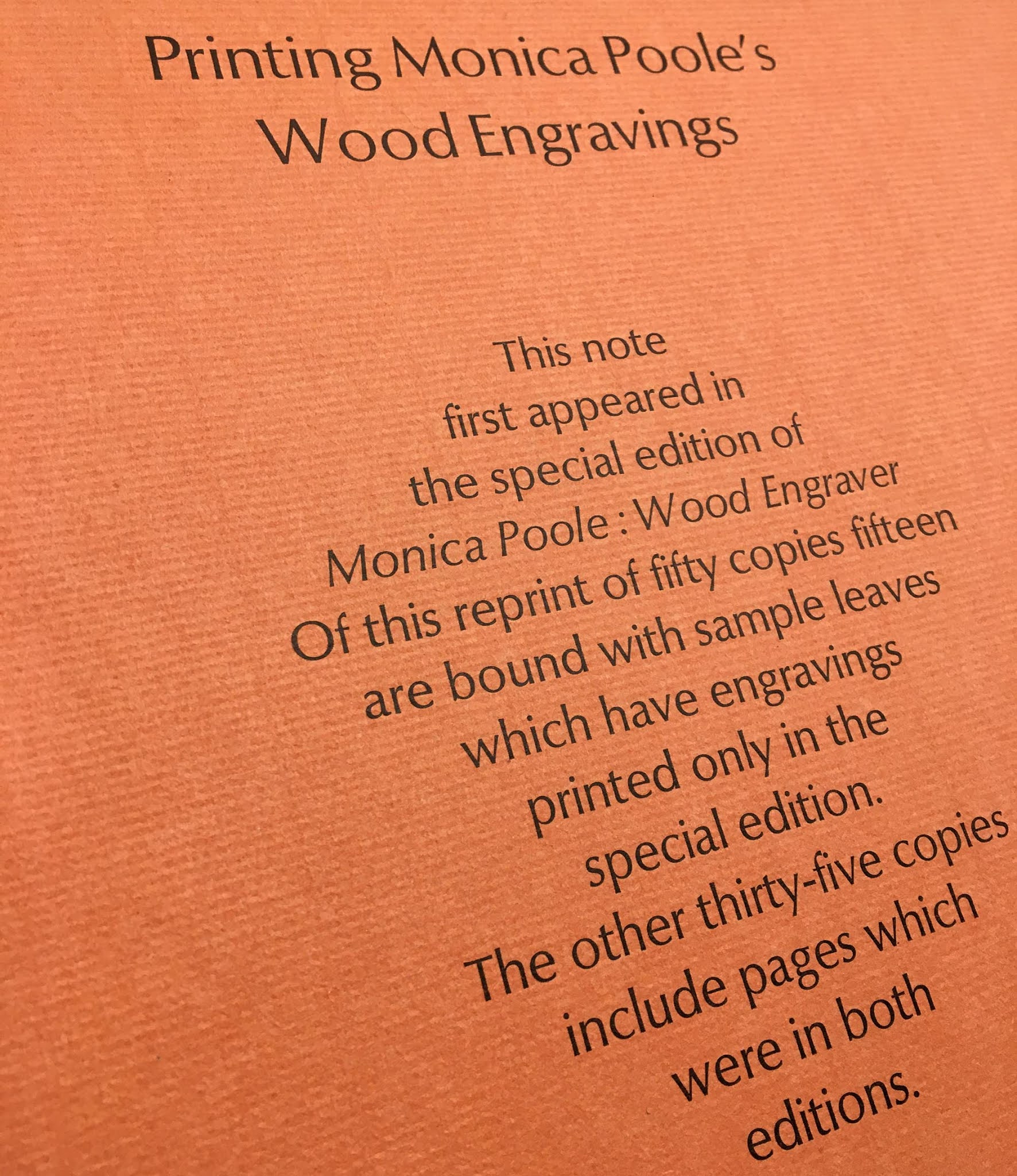
Blog visitors may recall previous mentions here of the Florin Press’s beautiful Wood Engravings of Monica Poole (1985). The few deluxe copies of that book included a short essay by Graham about printing the engravings. This kind of (not too) technical discussion assists in appreciating the work of both the artist and the printer. Graham has been printing with handpresses for over five decades, and believes they “are the very best tools for a printer to use to give life to a wood block.”

 
The first of his new trio of books is Thomas Bewick Engraver & the Performance of Woodblocks. “This book is not a biography of the man but an account of how his talent evolved and how his blocks can still perform their magic,” the prospectus reports. It is printed offset, which normally might not excite me, but it is undeniably the best method to achieve the books purpose, which is to illustrate differences between impressions from the same blocks, as part of a broader discussion of how his blocks were used. 

 
The first 100 copies of the standard edition will include a leaf from his next new book (due summer 2021), A Collection of Printing from Woodblocks on a diversity of papers. This book is similar in concept to HMs Paper Should Not Always Be White, only much, much more. “What works to print from Thomas Bewicks blocks will also work for older blocks, and be relevant for contemporary wood engraving as well. This collection includes nine different designs.The leaves, printed on a diversity of papers, encourage an exploration of how the same image changes from one paper to another.” This volume has the additional appeal of the content - the combination of printing and paper - being actually printed by Graham.

 
The third volume focuses specifically on paper, “how we can make our own assessments of three distinct attributes of paper - aesthetic, practical and permanence.” (Image of scary paper mold above.) Like Performance of Woodblocks, this will be printed commercially (offset) and cased in cloth, with a few copies extra-bound and also a less expensive softcover version.

Im a big believer in collectors reading these kinds of books, to develop an eye and appreciation for methods and materials. Too often people seem to place importance on a particular material or method, e.g. handmade paper or a leather binding, without an understanding for how it should (and should not!) be best employed. Its the combination of material, application (function) and execution that matter, and assessing the sum of those elements requires some experience and knowledge. 

 
The inclusion of illustrations of some kind seems to be essential for many people who collect contemporary press books. Relief prints are the easiest for a letterpress printer to include (I find the combination of letterpress with intaglio more interesting), and wood engravings have become the most common choice, but Im not sure always for reasons that have to do with specific characteristics of the medium. It often feels like the inclusion of a wood engraving or two is simply a formality - how many books have been described as quarter cloth, patterned paper over boards, wood engraving frontis? Yawn. Too often printers (publishers) go to an already known name for the engraving, rather than making the effort to find new talents: too often the artists arent expanding or challenging the traditional wood engraving aesthetic, and too often the engravings are simply illustrations. The truly interesting press books that incorporate illustration add more than (just) a visual element. One of my favorite examples is Constantin Brancusis frontis (below) for Joyces Tales Told of Shem and Shaun (Black Sun Press, 1929). I had a copy once, but the setting was so indifferent I didnt feel the need to keep it; still, a cool frontis, and I believe the only print he ever made for a book. It makes my point about thought-provoking or evocative art vs simple illustrations. 

 
(I need to interrupt myself & clarify that the above comments primarily apply to fiction. Im all for incorporating images to a story when they add something beyond simple illustration, but I think thats all most fine press fiction books achieve. Its certainly true of contemporary faux fine press publishers like Folio, Suntup, Centipede et al, but their customers dont want art, they want graphics. The Arion Moby-Dick might be a positive example, where Barry Moser’s engravings were historically-accurate illustrations of whaling equipment and methods: Disconnected from the events and characters of the text, these beautiful pictures achieve a kind of abstraction of their own” (). Poetry can lend itself to interesting printmaking, if the publisher recruits an artist rather than an illustrator. Im primarily interested in non-fiction related to history, which generally is enlivened by illustration. My criticism is not of the inclusion of images, its of inclusion with no purpose or value beyond decoration.)
 
These are the reasons the Williams Monica Poole book has always appealed to me. Her work is unique and deeply engaging, the text is about her work so the inclusion of examples as illustrations is appropriate, and they are expertly printed by Williams. His new books should offer collectors and printers some useful insights to how he approaches wood engravings.  

ON THAT TOPIC...

 
The Performance of Woodblocks reminded me of a slighter publication from 1946, also employing Bewick blocks to illustrate how a chosen paper affects the appearance of an engraving (and also, like Paper Should Not..., much, much less than Grahams undertaking). The Wood Engravings of Thomas Bewick - An Experimental Printing, by Minne Jane de Thomas. Its one of the better-produced titles from Wesleyan Colleges Art Lab imprint, most of which were printed with a handpress, many of which were focused on some aspect of the books arts. Bromers currently has the most complete collection of WAL publications I've seen (but it doesn't include the Bewick pamphlet). 

 
STAND UP!


Natasha Herman has just launched a kickstarter campaign to share her excellent Stilt book stands with the world. The copies of Fragments & Glimpses she bound last year were each issued with one. The stands design is very clever, it knocks down flat for easy transport or storage, but is sturdy and well constructed. If you like having books on display, or need to keep valuable or fragile volumes open while working, the Stilt is perfect. 


AND THIS TOO!

 
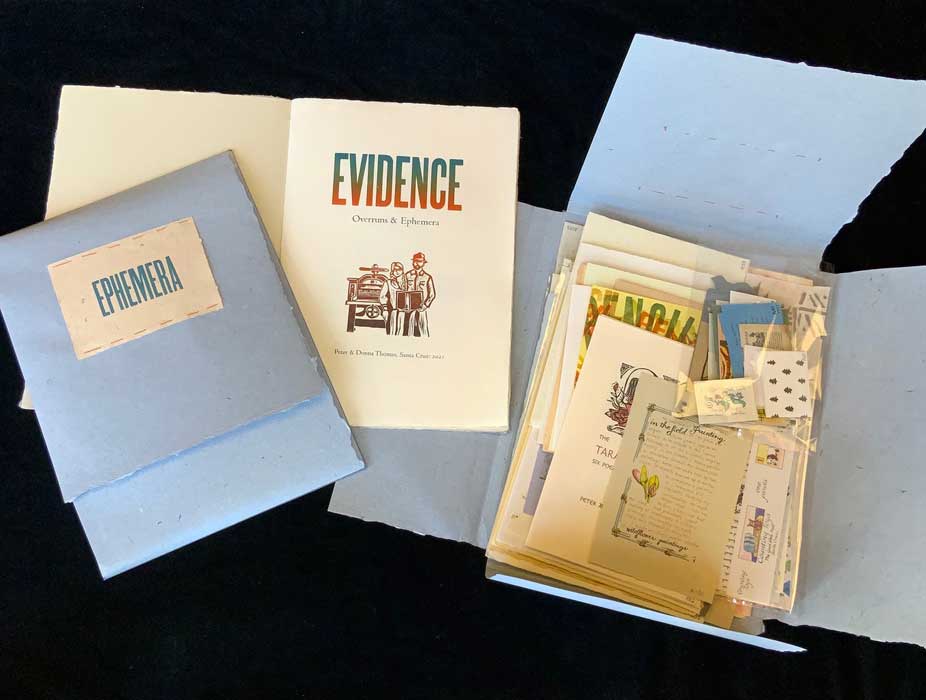
Legacy Press has published a bibliography of the several hundred books published by Peter & Donna Thomas since 1974. Their work is (or should be) well known in particular to fans of miniature books and books about papermaking. In parallel with the bibliography, Peter & Donna have issued 30 sets of sample sheets and ephemera, titled Evidence.

ENOUGH!

 
The history of printing continues to be the primary topic for reading around here. Got a book Id only recently heard of, Thomas Hornes An Introduction to the Study of Bibliography (1814). The titles misleading, the book is more like an encyclopedia, or at least a compendium, of information and sources on printing and related topics. Not rare, but many copies are lacking some or all of the 11 plates (not mine!). Anyone with copies of the more obscure Wm Blades publications from the 19th century, please get in touch.