I’ll try to tie this all together. It’s all related to a book project that might happen one day. There is a common thread, I just have to keep track of it...
I got myself a few books for Xmas, since it’s not exactly easy for others to pick ones I’ll be excited about. Without it being the primary intent or focus, they all ended up having something to do with the block books popular during the early and mid-15th century, and the protracted debates over exactly who invented movable type, when, and where.
Students of printing history will be familiar with debate over whether movable type was invented by Gutenberg or a Laurens Coster, a citizen of Haarlem. It generated a lot of hot air and convoluted opining among Europeans in the 19th century, until it was eventually settled in Gutenberg’s favor. To summarize it as briefly as possible, it boiled down to whether some of the block books incorporated moveable type, and whether that type might have been cut from wood, rather than cast from metal. A good summary of the block book debate, and how it ties into the invention of movable type can be found in William Blades’ Books in Chains (1892).
It was reading some histories of Caxton that led me down the rabbit holes of this debate. I stumbled across a short book listing known reproductions of Caxton productions published in 1879 by John Springer, a printer in Iowa – not a hot-spot of bibliographic inquiry or fine printing at the time. But Springer had ambition: the book was printed in an edition of 125 copies for the United States, consisting of three variants on different papers, the best printed with "carmine initials;" and 69 copies for Europe, also printed in three variants.
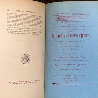
What I found most interesting about the book, aside from the limp vellum cover, is an advertisement on the inside back cover for an “expanded catalogue on the history and mystery of printing,” the second & revised impression, to be issued January 1880 (see image at top). A large octavo of 150 pages, an edition of 170 copies (two variants). The notice claims two-thirds of the book had been printed, but I can find no record of an issued copy. (If you have one, please send it along with an invoice.) What I did find was a catalogue with this title, issued by Springer in 1880, totaling just 52 pages The last sentence of Springer’s preface (which is dated 1878) states “Fifty-six copies have been printed on fine paper, nineteen copies on common paper, for private distribution only.” I hope this is a common paper issue; I’d hate to think anyone thought the paper was fine.
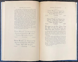
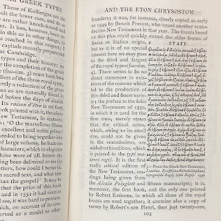
Getting back to our central thread, following a list of Springer’s books about the history of printing (many with amusingly arch comments appended), he weighs into the Coster/Gutenberg debate, but in what might have been considered a typically American, i.e. practical, way: he paid a wood type firm to cut a complete sentence in three lines on a block (sample #2 in the image). Then he cut the individual letters from the block and reset them as one would metal type (sample #4), and again using them to make different words. His thesis, which he believed he had proved, was the wood types could have achieved results as sharp as metal (arguments for & against this claim were central to the Gutenberg/Coster debate).
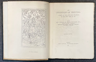
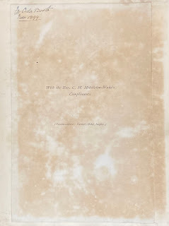
As I acquire books on the topic of early printing, the footnotes and references often introduce me to other sources. That’s how I was introduced to Charles Middleton-Wake’s The Invention of Printing (1897). Attractively printed on Van Gelder paper, with 15 plates, he really means the invention: the first three chapters (each a lecture he’d given) deal entirely with block books. I like the presentation note tipped to the front flyleaf – everyone should have custom stationery printed while residing in a hotel.
That was an Xmas present. So were two books by Robert Proctor. He was an English bibliographer whose career was cut short by a wrong (or possibly intentional) turn in the Alps in 1903. He was one of the first to study the incunables in the British Library from a specifically typographic perspective, as detailed in his Index to the Early Printed Books in the British Museum: From the Invention of Printing to the Year 1500 (four parts, 1898-1903). His studies included an interest in Greek types, and he designed one himself – the Otter type – shortly before his death.
I knew Proctor’s name from the Greek type chapter in Fragments & Glimpses, and various publications of the Bibliographic Society, which issued some interesting & well-printed monographs c.1900. One is an early article by Proctor on the Dutch printer Jan van Doesborgh. Most of it is hardcore bibliographic descriptions, but there’s an informative preface and some lovely plates.
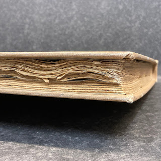
The copy I ordered was a library discard (having been donated by no less than Ellen Browning Scripps): does something look odd in that shot above? Upon initial inspection, I wondered if a second work had been bound in. Nope.
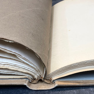
The book had been put in boards at some point after publication, probably by the library, and for no obvious reason, it had been doubled in thickness with blanks. Where they just filling it out so they could use a case that had already been made? Dunno.
I also got a copy of Proctor’s collected essays, elegantly set and printed at the Chiswick Press (200 copies, 1905). It includes a memoir about Proctor by Alfred Pollard, and all of RB’s published essays along with numerous facsimiles and plates. Several of these he’d had printed by Chiswisk over the years, for private distribution.
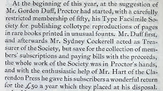
Stepping slightly off-topic for a second, Pollard’s essay includes the following:
I haven’t been able to track down much information about this society, much less any of its reproductions offered for sale. The closest thing I’ve found is this set of photographs of incunable types.
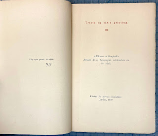
It wasn’t until I got the collected essays that I realized a pamphlet I’d had sitting in my Abe basket for the past year (I dump a lot of stuff in there, then come back in a few months to see if I still want it...) was one of Proctor's privately-issued pamphlets! It is perhaps the driest of his three tracts on early printing, and the paper isn’t nearly as nice as the collected edition, but still, cool.
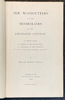
The book also includes several of Proctor’s essays on early (Dutch) woodcuts, so I was back with the block books. Realizing that this was were my reading was going anyway, I also ordered a copy of William Conway’s The Woodcutters of the Netherlands in the 15th Century (1884). I haven’t cracked it yet; looks pretty dense and dry, and surprisingly has no plates. We’ll see.
All of this started a year ago, when I had some vague idea for a project related to the Gutenberg/Coster debate. It’s been a case of the research taking on a life of its own, but hopefully I’ll get things back on track in 2022.
AND ANOTHER THING!
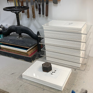
Believe it or not, I’m still collating copies of This Monkey’s Gone to Heaven. That’s the entire edition of 40 copies below, the printed sheets trimmed, collated and waiting for the sample leaves to be inserted before sewing. That bit takes ages because each of the sample leaves has to be inserted in a particular way. But I have the cases all figured out, so it’s just a matter of pushing through. Still on track for publication in April.