24.12.21

Starman

Peace, shalom, as-salaam ’alaykum, wa chxw yuu & etc. for 2022. Don't blow it.

1.12.21

HM Studio Tour, Just This Once

Sometimes people ask to visit HM. I say no. It’s where I work (& play), so it’s private. Anyone interested in printing won’t find anything unusual. But here are a few highlights, parts I think are interesting. 

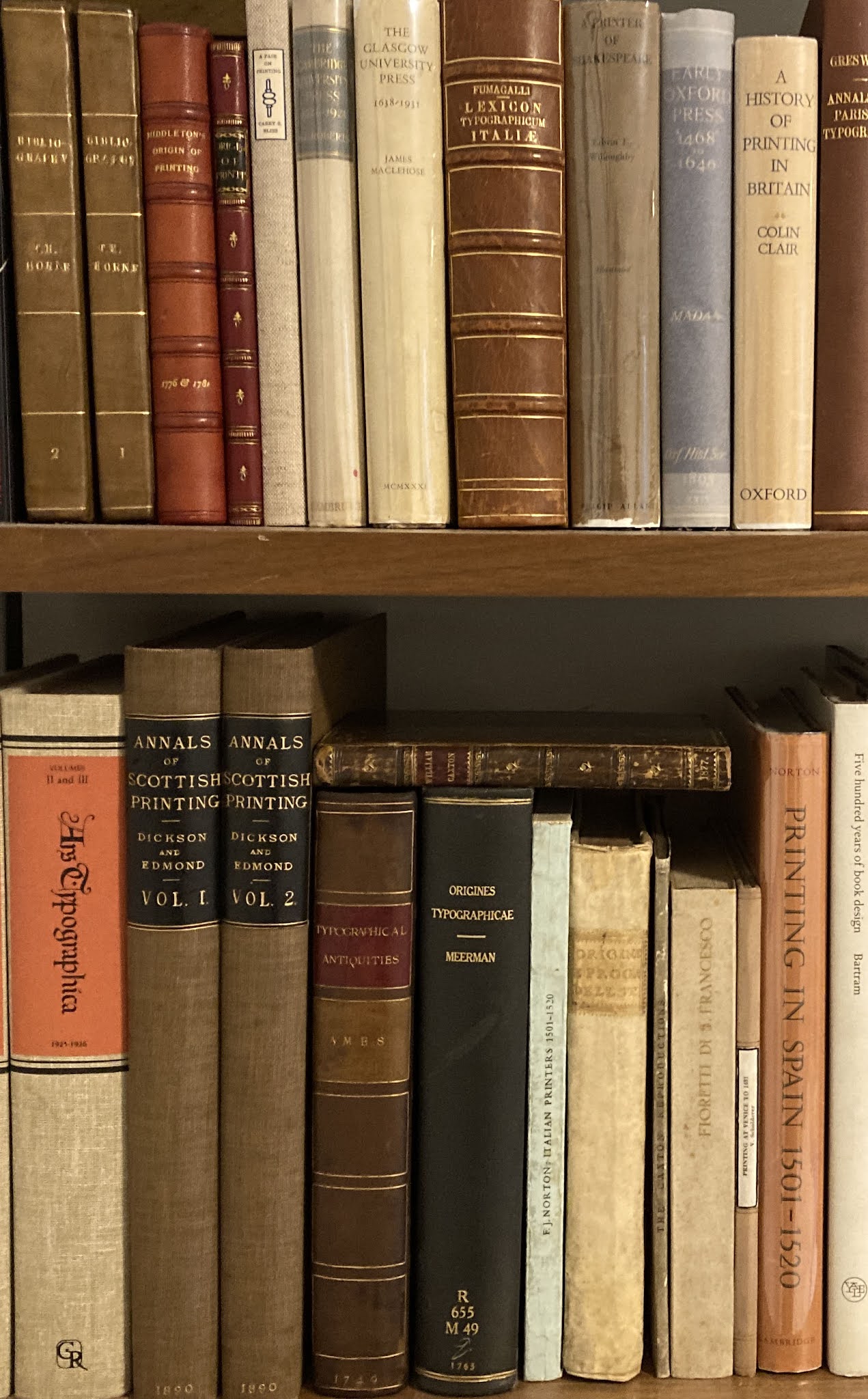
The shelves shown above hold some of the books that have been the focus of most of my work-related reading (& acquiring) this year. 

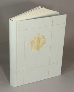
This was my first book press, and remains my most used. I learned from Claire Van Vliet to adhere mill board to the bed & platen (I use double-sided tape). Less chance of doing damage to the covers of a book. But I generally use 0.25-inch acrylic boards to sandwich anything going into the press anyway. That’s the first trial binding for HM=XX.


When HM=XX is released, next spring, I’m going to have a garage sale of remnants and samples left over, all sewn up into some presentable form.


Big books are kind of a pain. You rarely pull them off a shelf on a whim. I keep my folios in the studio because it’s the only place I know there will always be somewhere to put them down. 

I love this print. It’s an etching. I can’t read the artist’s name, but she came from a family of printers and made this when she was living in Montreal. For me, it captures how exhausting printing by hand can be, but you can’t stop because the run’s not finished. 

That's my “Yannick Jauzion” Laguiole knife on the lanyard. It’s not actually that useful in the studio, but it’s gorgeous. And you can never have too many knives around. 

I love old drafting instruments, interesting looking bits of machinery (especially brass), and any small tool that looks like it might be useful. That mechanical pencil is Italian. David Clifford used it back in his pre-digital designer days. I have no idea what that brass crucible, with nested ones inside, is for. The Kern stainless steel dividers I use when binding. The butterfly knife was made by a guy I met in Buenos Aires. I’m still learning to open it without slicing off my fingers.

Good ink (which always means oil-based) is getting hard to source. I keep a stash under the bench. 

I have to start using some of the printing papers I’ve been hoarding. It’s always a struggle because I know I’ll probably never get more like it, so saving until maybe the next project always seems the prudent decision.

As I said, hoarding. That package of 300 g Fabriano came to me from the artist Takao Tanabe. He’d purchased it in the late 1950s, when he was working as a job printer, and never used it. Paper hoarding must be a common affliction for printers. 


Then there are the drawers of paper...

And at the end of a day of work at HM, this is what it looks like outside the studio (seriously):


I probably will post once or twice more this month. I have some show-&-tell from a 19th-century American printer that should be amusing. Stay safe, be kind to each other. 

1.11.21

The Heavenly Monkey Edition!


That's my proposed artwork for a new Cocteau Twins album cover. Something with inky in the title seems apropos – Inky Reverb maybe. Last month I promised some photos illustrating the steps of inking & printing a (damp) sheet with a handpress. It needs some more work, but as a precursor, here’s a demonstration of one of the qualities that result from printing damp...

HOLD THE PRESS!


One of the best aspects of my work life is I spend all day, every day listening to music. It
s a very specific kind of music, and it seems unbound by country or culture. I recently heard a piece titled Music for Fields by sokpb avabodha, a musician who lives in Russia. It warranted more listening so I tried to find a copy. No surprise for someone who prints & binds books, I prefer to actually buy a physical thing (but not vinyl, too much hassle), i.e. a CD. Long story short, the CD version of Music for Fields sold out years ago, but Sokpb very kindly offered to burn me a copy and put it in a sleeve of his original design. You can see on his bandcamp page that he has created a number of releases in hand-crafted packages. He was sufficiently pleased with what he came up with for my CD that he asked if he could release it as a special version, the Heavenly Monkey edition! This will undoubtedly be the closest I ever get to actually releasing a CD. 

If youre interested in pursuing this specific musical thread, check out the streaming stations Drone Zone, Ambient Sleeping Pill and Planet Ambi (it was on one of these I would have heard Music for Fields). If youre interested in artists who span music and graphic arts, check out loscils recent (fantastic) release, Lux

IT SHRUNK

Below is a detail of a sheet from HM=XX. The paper is 120 g Arches wove, the type is 12-pt Perpetua. The horizontal line printed here is exactly 4.5 inches long. When printing was completed, the sheets were dried by pressing between 1/32” thick coaster board for about 12 to 18 hours (depends when I get around to it the next day). 


Dampening a sheet of rag paper before printing softens the fibers, making them more receptive to the impression of the type and the ink. This means dampened paper requires (much) less ink and impression, and yields the sharpest possible representation of the type. That sharpness increases when the paper dries: dampening paper causes it to relax, i.e. the fibers expand. The entire sheet gets slightly larger. With mouldmades, the increases usually is entirely perpendicular to the grain direction, but with handmades (which have no grain) it’s in all directions. 

As the image shows, when completely dried, the 4.5-inch line on the Arches sheet contracted by about 1/16”, or roughly 1.5%, which is pretty much average. (A sheet that expanded a lot when dampened probably isn’t one you should be printing on.) Interestingly, the Arches also expanded about the same amount vertically. Some mouldmades don’t change at all in the grain direction. 

The result of all this expanding and shrinking is that the type gets a final slight crimp, sharpening the density and edges. According to Edwin Grabhorn, not damping good rag paper requires four times more impression and ink, resulting in a muddier, heavier result. As I’ve said before, I don’t understand why people printing letterpress in this day & age with the goal of “fine printing” use mid-20th century standards for commercial printing as their guide. I wrote a whole book about this.


One of the most useful tricks I learned from Gabriel Rummonds’ was using tape to build up sections of roller bearers to (ever so slightly) lessen the rollers’ pass over the edges of type blocks and the end of lines that extend beyond the bulk of the page. I’ll go into some details with the how-to post. 


I’ve all-but-finished printing Paper Botanists, and now it goes to the hand-embellishment phase, followed by binding. While I was printing Barbara was going through the 40 copies of HM=XX, adding various amendments and comments. Turns out you’re supposed to proofread before you print – who knew? It’ll be more fun this way. 

AND ANOTHER THING!

Xmas gift idea for the binder on your list: anything from Illtyd Perkins workshop. HM is getting a shiny new finishing press with stand! Beautiful work and very reasonably priced for what you get. 

DSCN1790


1.10.21

Sinful Publishers & Other Oddities


For visitors from outside Canada, I’m writing this on September 30, which is now National Day for Truth & Reconciliation, honoring the lost children & survivors of the country’s odious residential schools for Indigenous people. Holiday isn’t the right word, but a day of reflection. 

Printing of Paper Botanists, the next book from Barbara Hodgson & Claudia Cohen, is well underway. Next month I’ll post a series of photos showing the steps of printing a sheet, starting with set up in the press. But for this month, it’s just a few unrelated things pillaged from the HM shelves that will hopefully be somewhat interesting to people interested in printing...


I was fortunate to stumble across this pamphlet, issued in 1950. I’ve never seen another copy listed. It’s the size of the two-volume Life Work of Dard Hunter (1981-3). Quite lovely, beautifully set & printed by DH Jr. Maybe I've already shown it here, but it’s cool and worth showing again.


This thing is stranger than I had realized: It’s a small pamphlet advertising a book to be published. The book didn’t end up being particularly noteworthy (the 21 shillings a copy cost in 1891 would now equate to about $700, which is about ten times more than a decent copy would cost you today). But this pamphlet tells an interesting story about the book: it seems some scoundrel was attempting to quickly assemble some book generally of the same content, and specifically of the same title, to extort Leadenhall with the threat of losing the registration (copyright, sort of) to the Loftie book they’d already been working on. It was the note appended to the front cover that initially caught my eye, but more than anything else, I think of myself as a publisher, so that aspect of its story is equally appealing. I guess I’m an unrepentant publisher, but hopefully not of the Piratical kind. Here’s the full story:


I’ve fallen down a Caxton well this year. This piece was printed by Fameorshame Press, which I’ve never heard of. But I have heard of Paul Moxon – the Vandercook guru – whose imprint it is. 


No idea how this got in the house, especially since the label on the wraps cover is half torn away. But an interesting essay, perhaps especially relevant today: “The graduate schools, I repeat, tend to mould their students into narrow specialists, who see only from the point of view of their subject, or of a special branch of their subject, and fail to recognize the importance of looking even at their own subject from other than its own point of view.”


In the late ’90s I once had the opportunity to buy a copy of the Arion Moby-Dick for $6,000. I exercised restraint, but it probably would have been a better return than whatever I ended up investing that six grand in. I eased my regret by looking for copies of the trade edition – not the “limited” trade edition, which isn’t terribly well bound (i.e. cased) based on the one copy I’ve seen, but the regular trade edition. Even then it was becoming scarce and priced accordingly, but you could find copies for $10 or $20 if you looked. I later found this card printed at Arion with a quote from the book, so my copy is almost exactly like the real thing. 

31.8.21

The Printer in Bronze


That’s what was staring back at me when I was cleaning my roller one day last month. Never looked better...

The start of fall seems a good time to offer some details on what HM will be up to for the foreseeable future....

 
The summer was spent printing HM = XX, a.k.a. Checklist No. 4, a.k.a. This Monkey’s Gone to Heaven. It is a bibliography of the 62 books published by Heavenly Monkey and HM Editions (2000–2020), the listings liberally interleaved with samples from 16 of the titles. The edition is 40 copies, the first ten being issued in a box along with additional samples. The books will be quarter bound with papers that have been painted and printed. But not till early next year: the sheets have been tucked away, as I must immediately turn my attention to printing another book...

 
Paper Botanists will be the debut publication from Barbara Hodgson’s imprint, Byzantium. Her ongoing collaboration with Claudia Cohen continues, this time exploring “everything to do with paper and botany, especially the arts of illustrating plants on paper: drawing, painting, printing and photography.” The text covers these media across eight chapters, each one to be illustrated with samples culled from historical sources (e.g. prints from broken copies of notable herbaria) and original works created by the authors. I’ll spend the rest of this year printing the book (8 x 12 inches, 50 pp. + samples), then there will be some months of assembling and binding, so the edition of 30 copies should appear by early summer 2022. Shortly after copies of HM=XX appear on newsstands everywhere.

There are a few other projects bubbling...

Two short stories (details TBA) to be issued in a simplified dos-à-dos format, each featuring a color frontispiece by Walter Bachinski, editioned at his Shanty Bay Press. (Fall 2022)


An account of Reg Lissel
s adventures in papermaking, printed on his lovely HM Text wove sheet, and featuring many samples. Maybe well ask Andrea Taylor if we can re-use her linocut portrait of him from Elements in Correlation (above). (2023?)

An English translation of a 19th century French commentary on fine printing. (2023?)

Please don’t ask for more details, each new title will be fully announced when it is ready for issue. Now, I have to get busy or B&C will yell at me....

1.8.21

Out With the Old, In With the Older

[This post ☟ has nothing to do with that ☝︎ image, but this isnt the place to come for narrative cohesion. Scroll down to second last paragraph to see how you can help clear space...]

I think the resource-gathering phase of my still vaguely defined Gutenberg project has come to a logical completion, with the addition of Joseph Ames’ Typographical Antiquities (1749). I found a lovely copy. I wanted this book, rather than the more expansive Dibdin version, because I simply prefer the printing, the paper and the types. To my eye, an increasingly mechanical ugliness crept into English books in the 19th century, and the paper often was not nearly as good as that used in books from the previous century. 


Most of the book consists of short biographies of printers, ordered chronologically, along with lists of their publications. 
 

Some of these biographies include woodcut portraits, which came from the Harleian collection. This collection was purchased by the British Library four years after Ames' book was issued. It's not clear whether he purchased the blocks from the estate, or  borrowed them. I guess if they're included in the BL's holdings, it would be the latter, but I can't be bothered to chase that down today. It's hot and muggy. 


This device has been penciled on to the front flyleaf. Someone who acquired the copy in 1946? 


I also added a copy of Gerard Meerman’s Origines Typographicae (Hague, 1765). This is the text that was translated (in greatly condensed form) in Bowyers’ Origin of Printing. My copy is ex-library, but aside from (too many) Brooklyn Library blind stamps, it’s in fine condition, and interesting to examine next to the Ames: the paper, printing and type are all superior, but English printing almost always comes up short during that period. I’m not exactly expecting to muddle through the main text, which is in Latin, but the many references and footnotes will be useful for pointing me in directions. Plus, it’s a cool book. 


As my book interests become increasingly antiquarian, I become increasingly impatient with books outside this realm taking up space on my shelves. To that end I have just posted a number of new titles to the Etc. page on the HM site, books that need new homes, and which I have tried to offer at tempting prices (if insufficiently so, we can talk). Please take a look, tell all your friends etc etc. Unfortunately, with this lot I’ve culled about as much as I can without cutting into specific topic areas. 


Here’s something that might be of interest, one of the best gifts I ever received, courtesy of Will Rueter: a set of four brass rules or varying widths (1/8 inch, 1/4, 1/2 and 3/4). Infinitely useful, especially when when making cases and boxes.
(Also great for holding pages flat while taking photos.) No measuring, just lay one of these down and make your marks. Especially useful for setting the joint distance between spine and board, if the joint is 1/8 or 1/4 inch; too often mine end up being 3 or 5/16, and in those cases I turn to my almost-as-useful table saw set-up blocks. These are pieces of aluminum precisely machined to widths from 1/16 to 11/16 inch, which can be used singly or combined. Available from Lee Valley.

3.7.21

Why Press Bibliographies?

When I was first getting interested in “fine printing,” press bibliographies became a particular interest because each one offered a variety of specimens from which I could learn about typography, printing and paper. I used to say that I started HM so that one day I could print my own bibliography. Unfortunately, now that the time has come, my interest in press bibliographies has waned somewhat. Apparently I’m not alone: last year a bookseller who knows whats what told me press bibliographies are not in high demand, no matter how beautifully printed. Once again, my timing is perfect. Nonetheless, for several reasons, Im pushing ahead with a bibliography of the five dozen books HM issued from 2000 to 2020, and it will come out next year. In hopes of reigniting my interest in the form, I took a tour of some of the press bibliographies on my shelves.... 


While not the first (private) press bibliography, the one against which all others are measured (& which most model themselves on, at least to some degree) is the Ashendene Presss. It combined all the elements that made its books so highly regarded from the start, plus facsimile pages from various projects. (Its important to note that these were resettings, not unused sheets from the actual edition.) In a sense, this combination of Ashendene types, printing, paper and binding, was a stand-in for an actual collection of the books it described. It also includes a selection of engravings and cuts from projects, and has a section on Graily Hewitts calligraphic contributions. 
 

My one complaint would be that the facsimile leaves from the larger books are folded and sideways, so the book (or your head) has to turn 90 degrees to look at them. I never like that in a book. But the only alternative would have been to make the bibliography larger, which would have posed other hassles.


Kelmscott issued a checklist, and Doves issued a (final) catalogue raisonné, both of which precede the Ashendene bibliography, but neither is as elaborate. I had a copy of the Kelmscott bibliography once, but it had been rebound, and done so badly I could not keep it. Imagine that Spanish fresco of Jesus that was “restored” a few years ago, and you
ll have an idea... The book itself is what the title claims, and an example of Kelmscott printing, but if you just need a reference, one of the facsimile editions will do fine. In some ways it might be the most modest Kelmscott book, perhaps appropriately so as the last. 


The Doves catalogue is more visually interesting, and more than just a description of the books published: it includes a brief farewell from C-S (Salve Aeternum), all of the 11 ephemeral parerga items (“a piece of work that is supplementary to or a byproduct of a larger work”
) C-S published during the life of the press, and some of the publication announcements. 
 

My copy even came in a signed Doves binding (with terrifically acidic turn-ins). But if you really need a Doves bibliography to rely on, you need Tidcombe
s The Doves Press (2002). 
 
 
Whether Ashendene spurred an interest in more elaborate bibliographies I cannot say, but the next few decades saw most active private presses issue some kind of listing of their publications. The Grabhorn brothers arguably outdid Ashendene, with their three volumes (1940, 1956 and 1966), all large folios, all stuffed with sample leaves (not facsimiles). The recto in the opening below shows a leaf from Leaves of Grass in volume I. They also added incidental comments about projects, giving some insight to the design and printing processes. The only problem is you cant have just one of the volumes, you need the set. Henry Morris also issued a series of bibliographies for his Bird & Bull Press. Im not interested in serial publications, so I dont have any of those. 


The next major press bibliography on my shelves is from the Allen Press (1981), which displays the various types used in its publications, comments from the printers, and sample leaves throughout. Like the Ashendene, as a representation of the press
s work, it was almost as good as having a collection on the shelf. 
 

The book was so engaging that in 1985 the Book Club of California published an almost exact facsimile (but updated with new publications), right down to the inserted sample leaves. It
s one of the BCCs high points. Unfortunately, they were so enthusiastic that they printed 750 copies, which was far too many. Copies of the facsimile can be found at criminally low prices. Anyone with any interest in fine printing should get a copy. 
 
 
I once bought a copy in sheets, and spent a few years gathering additional original leaves, and then had it all bound up by Hélène Francoeur. It was monumental. I sold it to buy something else, probably one of Dard Hunters books.
 

After Ward Ritchie retired from commercial printing, he got a handpress and set up a private press, Laguna Verde Imprenta. In 1988 he published a catalogue of the 26 items hed printed since 1975. The projects he chose to publish werent particularly interesting to me, but hes an important person in 20th century American printing, and I like having the bibliography. Thats another advantage they offer: a press’s publishing may not be to your taste, but you can still admire the talent and skill in the productions, and enjoy having a sample on your shelf. 
 
 
Much of the appeal of Ritchies book for me is it having been printed (by him) on a handpress; his inking was a bit shaky, but he was clearly enjoying the opportunities to play that the press offers. 
 

Thomas Taylor issued (1993) an elegant bibliography of Gabriel Rummondss work at Plain Wrapper Press and Ex Ophidia, 300 copies printed on Superfine & issued in wraps, and 40 printed on Magnani and issued in a quarter vellum binding. The paper, typography, color, printing and binding of the special copies combine to achieve a result I envy. The color plates are beautiful, but Id still have liked to have some original leaves. Gabriel himself issued sets of sheets; this may have been in conjunction with the Taylor bibliography, I dont know, Ive never seen a set or even a listing for one. I believe there were 40 sets issued, at a price of around $4,000.  


One press bibliography I do not have, and will not, is Yellow Barn
s. Im sorry thats the case because I admire Neil Shavers work, but the bibliography includes no sample leaves, and just doesnt seem on par with his other publications. 


I have a copy of the Alembic Press
s bibliography (1989, above), which I guess I got cheap when I was buying any press bibliography I found. For all their interest in type and book history, Alembics printing really was atrocious, as the samples and original content in the book show. It also is an example of how sample leaves (or folios) should not be handled: the easiest way to stick a leaf into a book is to run a line of adhesive along the gutter edge and stick it on the page. This is defendable if there is nothing printed on the verso, but most leaves do have something on the verso, so you have to a force a fold into the leaf to see it! The appropriate technique is to hinge the leaf in. If it is close to the size of the book, the hinge can be incorporated to the sewing. If its notably smaller, the hinge can be used to mount the leaf on the page (see the two photos just below, from Officina Bodoni). Be alert for lazy leaves. 


Geoffrey Wakeman
s Plough Press issued a bibliography in 1982. My copy is the only one Ive encountered, but there are another 119 out there. Wakeman wasnt the greatest printer, but where technical deficiencies overshadow the Alembic effort, Wakemans exuberance, and the trove of samples folded & otherwise jammed in, make this an entertaining book. 


I could dispute my own lead to this post by pointing out that the Officina Bodoni
s The Operation of a Hand-Press During the First Six Years of its Work (1929) predates the Ashendene bibliography. You might consider a book chronicling the output of a press that was just six years old at the time audacious, but when you look at the quantity and quality of what was produced, you would shut up. 


My favorite part of the book is the sequence of woodcuts by Frans Masereel illustrating the printing of a book at the shop. The book was issued in English, German and Italian versions, all containing various samples (on sewn or mounted hinges). But where most press bibliographies are by definition backward looking, the OB book seems more like a statement of intent, so maybe my lead can stand. I found a copy in a beat-up case years ago, and somehow talked Claudia Cohen into rebinding it for me. A lovely job, no surprise. 


After Mardersteig
s death a comprehensive bibliography of the Officina Bodoni was issued, and copies can still be found very reasonably priced. One hundred copies were issued with a companion volume containing a selection of leaves, and thats the one you want, especially if youre a handpress fan. 


In conjunction with a series of exhibitions in 1992, the Bridwell Library issued a catalogue of Leonard Baskin
s Gehenna Press. It was conceived as a trade publication (2,000 copies), well designed by LBs son Hosea, and printed offset at Oxbow Press. (They printed Baskins Hermaika, Gehennas only offset limited edition, and not a great success, a result of collectors bias against offset, even though it was the best medium to produce that particular book, just as it was the best choice for this one: it is full of color reproductions of pages and prints.) Again, no sample pages, but that can be fixed by finding your own to salt in. 
 

Fifty copies were specially bound at David Bourbeau
s Thistle Bindery, printed on a lovely Magnani sheet, with an extra section of Gehenna press marks printed by Art Larson added. These copies come close to the feel of a Gehenna publication. Where Gehenna bindings favored leather and paste papers, Bourbeau uses a simple heavy handmade paper over boards with some gilt tooling to achieve an elegant harmony with Gehenna publications. Some kind of supplement needs to be published, covering the years between this catalogue and Baskins death in 2000. If the familys interested, please call!

 
It will be no surprise that the HM handpress library includes a copy of Printing & the Mind of Merker, covering Kim Merkers career with a handpress. Most of his publications are exactly the kinds of things Im not interested in, but I admire his work, so a bibliography is the perfect sample to have on my shelves. Unfortunately the book looks and feels like a commercial catalogue (it was part of an exhibition mounted by the Grolier Club, in 1997), printed offset on a very smooth paper. Unlike the Gehenna catalogue, it doesnt capture the spirit of Merkers (letterpress) books. But the production and edition size (500 copies) reflect the interest in his work, which can only be counted to his credit. (Fifty [not very] special copies were issued with sample leaves, and this is the state handpress fans would want, but it still looks and feels like an exhibition catalogue.) 
 

The particular joy of this book is the comments about each project that compiler Sidney Berger wrangled from Merker: it
s these kinds of inside-baseball details about design decisions and technical issues that will appeal to students of the book arts. Most bibliographies include these kinds of appended comments, some more than others, and they are what raise a simple list of books published, to a rich history of a presss work. Word of advice to printers thinking of maybe one day issuing a bibliography: make these insightful, rueful and/or confessional notes when the project is just wrapping up: dont count on remembering any of it when the time comes to compile everything. Do as I say, not as I didnt do...
 
AND ANOTHER THING!
 
An omission from last months post about printing on vellum: I was certain I had a pamphlet on the subject from Paul Nashs Strawberry Press, but find it I could not, and I even started thinking Id imagined it. Then it popped out with Making a Book at the Officina Bodoni. Good luck tracking a copy down, and dont dither if you see a one.