1.11.22
The Five Books That....
1.6.22
Everything Went Green
The 10 “boxed” copies of HM=XX were finally assembled & issued at the end of May. Each one contains between 35 and 40 loose sample leaves in printed folders, along with the book. If the source book wasn’t obvious a note was added in pencil.
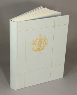
The five copies issued in a slipcase were also finished. These contain an accompanying portfolio with eight loose samples, all from projects not included in the bibliography due to their ephemeral or hors commerce nature. I had fun painting the papers to cover the portfolios and slipcases – this project turned out to be much greener than had been my initial intent. As usual, things just started & then went in a direction.
I told someone that HM=XX had rid me of my fascination with press bibliographies. Despite that, I acquired two last month. Both had been on my want list for ages, and by coincidence copies appeared almost simultaneously.
Memorials of C.H.O. Daniel is neither uncommon nor expensive. It was printed in 1921 in an edition of 560 copies, many many many of which are for sale today. It includes a bibliography of his eponymous press, about which I know nothing because I haven’t read the book yet. Over a decade ago I saw a listing from (the very cool) Michael R. Thompson for a large-paper copy with extra samples, but it was gone by the time I inquired. Since then I’ve kept my eyes peeled but not until a few weeks did one appear. Which explains why I bought it despite being in boards that appear to have been chewed by rodents (the book itself is fine – that’s what bindings are for).
The collection of facsimile pages at the back were printed by collotype (cool) or letterpress. These large-paper copies were printed on A. Millbourn & Co. handmade paper, and include ten extra facsimiles and complete folded octavo sections from three of his books bound in. Cool! Plus it appears he did his printing with a handpress, so he must have been a good egg.
A possible Vale Press project has been orbiting for a few years, and as a result I’ve been looking for a copy of the bibliography. It’s online, and there’s a facsimile from the 1970s, but if your primary interest is printing, you need the original (as I explained to my accountant). So I got that too.
Ricketts’ style of ornamentation (= maximal) is not my scene, but I don’t find his work as heavy and intruding as Morris’. It was interesting to see that the bibliography’s title page incorporates the start of the text. This is something I did on Types Paper Print. I never imagined I was an original in doing this, but I hadn’t run into another example until now. I think I did it because it was the only way to make the text fit on the following three pages (i.e. typical HM laziness).
AND ANOTHER THING!
Here’s the lesson from HM=XX I offer to young printers: throw a copy of the title page from every book you publish in a file. I didn’t do that and wish I had.
3.7.21
Why Press Bibliographies?
When I was first getting interested in “fine printing,” press bibliographies became a particular interest because each one offered a variety of specimens from which I could learn about typography, printing and paper. I used to say that I started HM so that one day I could print my own bibliography. Unfortunately, now that the time has come, my interest in press bibliographies has waned somewhat. Apparently I’m not alone: last year a bookseller who knows what’s what told me press bibliographies are not in high demand, no matter how beautifully printed. Once again, my timing is perfect. Nonetheless, for several reasons, I’m pushing ahead with a bibliography of the five dozen books HM issued from 2000 to 2020, and it will come out next year. In hopes of reigniting my interest in the form, I took a tour of some of the press bibliographies on my shelves....
My one complaint would be that the facsimile leaves from the larger books are folded and sideways, so the book (or your head) has to turn 90 degrees to look at them. I never like that in a book. But the only alternative would have been to make the bibliography larger, which would have posed other hassles.
Kelmscott issued a checklist, and Doves issued a (final) catalogue raisonné, both of which precede the Ashendene bibliography, but neither is as elaborate. I had a copy of the Kelmscott bibliography once, but it had been rebound, and done so badly I could not keep it. Imagine that Spanish fresco of Jesus that was “restored” a few years ago, and you’ll have an idea... The book itself is what the title claims, and an example of Kelmscott printing, but if you just need a reference, one of the facsimile editions will do fine. In some ways it might be the most modest Kelmscott book, perhaps appropriately so as the last.
The Doves catalogue is more visually interesting, and more than just a description of the books published: it includes a brief farewell from C-S (Salve Aeternum), all of the 11 ephemeral parerga items (“a piece of work that is supplementary to or a byproduct of a larger work”) C-S published during the life of the press, and some of the publication announcements.
My copy even came in a signed Doves binding (with terrifically acidic turn-ins). But if you really need a Doves bibliography to rely on, you need Tidcombe’s The Doves Press (2002).
The next major press bibliography on my shelves is from the Allen Press (1981), which displays the various types used in its publications, comments from the printers, and sample leaves throughout. Like the Ashendene, as a representation of the press’s work, it was almost as good as having a collection on the shelf.
The book was so engaging that in 1985 the Book Club of California published an almost exact facsimile (but updated with new publications), right down to the inserted sample leaves. It’s one of the BCC’s high points. Unfortunately, they were so enthusiastic that they printed 750 copies, which was far too many. Copies of the facsimile can be found at criminally low prices. Anyone with any interest in fine printing should get a copy.
One press bibliography I do not have, and will not, is Yellow Barn’s. I’m sorry that’s the case because I admire Neil Shaver’s work, but the bibliography includes no sample leaves, and just doesn’t seem on par with his other publications.
I have a copy of the Alembic Press’s bibliography (1989, above), which I guess I got cheap when I was buying any press bibliography I found. For all their interest in type and book history, Alembic’s printing really was atrocious, as the samples and original content in the book show. It also is an example of how sample leaves (or folios) should not be handled: the easiest way to stick a leaf into a book is to run a line of adhesive along the gutter edge and stick it on the page. This is defendable if there is nothing printed on the verso, but most leaves do have something on the verso, so you have to a force a fold into the leaf to see it! The appropriate technique is to hinge the leaf in. If it is close to the size of the book, the hinge can be incorporated to the sewing. If it’s notably smaller, the hinge can be used to mount the leaf on the page (see the two photos just below, from Officina Bodoni). Be alert for lazy leaves.
Geoffrey Wakeman’s Plough Press issued a bibliography in 1982. My copy is the only one I’ve encountered, but there are another 119 out there. Wakeman wasn’t the greatest printer, but where technical deficiencies overshadow the Alembic effort, Wakeman’s exuberance, and the trove of samples folded & otherwise jammed in, make this an entertaining book.
I could dispute my own lead to this post by pointing out that the Officina Bodoni’s The Operation of a Hand-Press During the First Six Years of its Work (1929) predates the Ashendene bibliography. You might consider a book chronicling the output of a press that was just six years old at the time audacious, but when you look at the quantity and quality of what was produced, you would shut up.
My favorite part of the book is the sequence of woodcuts by Frans Masereel illustrating the printing of a book at the shop. The book was issued in English, German and Italian versions, all containing various samples (on sewn or mounted hinges). But where most press bibliographies are by definition backward looking, the OB book seems more like a statement of intent, so maybe my lead can stand. I found a copy in a beat-up case years ago, and somehow talked Claudia Cohen into rebinding it for me. A lovely job, no surprise.
After Mardersteig’s death a comprehensive bibliography of the Officina Bodoni was issued, and copies can still be found very reasonably priced. One hundred copies were issued with a companion volume containing a selection of leaves, and that’s the one you want, especially if you’re a handpress fan.
In conjunction with a series of exhibitions in 1992, the Bridwell Library issued a catalogue of Leonard Baskin’s Gehenna Press. It was conceived as a trade publication (2,000 copies), well designed by LB’s son Hosea, and printed offset at Oxbow Press. (They printed Baskin’s Hermaika, Gehenna’s only offset limited edition, and not a great success, a result of collectors’ bias against offset, even though it was the best medium to produce that particular book, just as it was the best choice for this one: it is full of color reproductions of pages and prints.) Again, no sample pages, but that can be fixed by finding your own to salt in.
Fifty copies were specially bound at David Bourbeau’s Thistle Bindery, printed on a lovely Magnani sheet, with an extra section of Gehenna press marks printed by Art Larson added. These copies come close to the feel of a Gehenna publication. Where Gehenna bindings favored leather and paste papers, Bourbeau uses a simple heavy handmade paper over boards with some gilt tooling to achieve an elegant harmony with Gehenna publications. Some kind of supplement needs to be published, covering the years between this catalogue and Baskin’s death in 2000. If the family’s interested, please call!
The particular joy of this book is the comments about each project that compiler Sidney Berger wrangled from Merker: it’s these kinds of inside-baseball details about design decisions and technical issues that will appeal to students of the book arts. Most bibliographies include these kinds of appended comments, some more than others, and they are what raise a simple list of books published, to a rich history of a press’s work. Word of advice to printers thinking of maybe one day issuing a bibliography: make these insightful, rueful and/or confessional notes when the project is just wrapping up: don’t count on remembering any of it when the time comes to compile everything. Do as I say, not as I didn’t do...
1.6.21
Handpress Library #9: Vellum
When someone starts getting interested in letterpress and fine printing, they pretty soon become enamoured with the idea of printing on vellum. Much of the attraction is down to the mystique of vellum* – its cost and related scarcity, and its tactile qualities. Depending how much knowledge acolytes have acquired, they may also appreciate the difficulty of printing on vellum, and the sheer terror fear of wasting a skin with a bad impression.
One question I’ve never answered unequivocally is whether printers dampened vellum before printing, as they would (should) paper. Anyone familiar with vellum knows how it reacts to the slightest change in humidity, so I’m not sure how one would dampen a skin, or if it even helps the impression (as it greatly does with paper). Rummonds, our best contemporary resource for letterpress questions, offers just a page and a half on the subject, and gives most of that to the Kelmscott pressroom overseer: place a skin between (not very) damp blotters for 30 – 45 seconds immediately before printing. The chapter’s unspoken sentiment seems to be, you’re on your own, good luck.
Robert Baris’ Wind & Harlot Press issued a pamphlet on the subject in 1976 (25 copies, re-printed as a miniature in 1992, 23 copies), printing an exchange of letters between D.B. Updike and St. John Hornby in which the latter reported he printed his vellum dry.
I forgot to include one of Will Rueter’s publications in last month’s post about printing Bewick’s wood engravings: A Brief Description of His Method of Engraving on Wood, Taken from His Memoir, c.1827. Edition of 100 copies published in 1978, a single signature sewn in wraps. Not sure what the two blocks included are from, probably metal cuts, he’d have mentioned if they were original blocks. Beautifully printed on mulberry paper.