Showing posts with label An Alphabetical Accumulation. Show all posts

1.11.17

Pictures, Mostly


More pictures, less words this month. Francesca Lohmann's An Alphabetical Accumulation was published in October, copies sent out. See the usual suspects listed at right if interested in acquiring. The edition is 36 copies, but only 30 were for sale.


The calligraphy on book and box is original, not printed. The book was printed on three different, intermingled papers, the sections then sewn by Claudia Cohen onto a chemise made from old parchment documents. Vellum slips were attached to the chemise, and the sewn block laced into a limp vellum case.


The image above shows the "doublures," with the vellum slips laces through the case and the parchment chemise becoming the equivalent of front and rear pastedowns (though no adhesive is used, just the vellum slips).


Look close & maybe you'll see the embellishments Francesca added to the printed title page.


The first letter. Francesca's calligraphy throughout is in red, the printed facsimiles in black.


And a lovely little coda added by her to the last page of each copy...


A publisher couldn't ask for two more inspiring and easy collaborators than Francesca & Claudia. Preliminary work on another book with a calligrapher, whose identity will be revealed soon, is underway. Possible publication in late 2018; depends how ambitious he gets with the original calligraphy to be added to each copy. 

AND ANOTHER THING!

HM is all about leaf books these days. Progress is being made with Labour Vertue Glorie. Here's a sheet pulled on Halloween, right off the tympan & added to the stack, interleaved with boards for drying:


A couple of leaf books came my way recently. I'm keeping the acquisitions down by focusing primarily on incunabla, and there probably aren't a dozen leaf books with incunables. And of those, some include the leaf in a pocke, or some similar scheme: if they aren't tipped in - preferably to a tab, to make turning the leaf easy - I'm not interested. Anyway, an early Book Club of California title with a leaf from Aldus' Hypnerotomachia Poliphili came my way!


De Vinne's essay was originally published in 1881, and it is one of the first sources that perpetuated the Anthony Panizzi's incorrect assertion that Aldus' types were cut by a goldsmith named Francesco Raibolini. (De Vinne's essay was also published in 1983 by Targ Editions.) The text is set in Poliphilus (natch), and printed (and/or inked) rather heavily on Barcham Green Hammer & Anvil paper. I suspect they didn't dampen the paper, which is a waste, and accounts for the muddy result. (For some good handpress printing, see the Allen Press item mentioned further down this post..)

I justified the purchase as a necessary reference for the expanded second edition of Fragments & Glimpses, which is starting to take form. Here's the leaf:


Vancouver had an antiquarian book fair last month, and it didn't suck! It was a modest affair but included maybe 20 dealers including several from central Canada. For printing nerds, the best stuff was found at Bill Matthews' table. I got a hors commerce Allen Press sheet, printed for a Roxburghers dinner; a copy of the prospectus for volume 2 of the Grabhorn Bibliography, to be tucked into my copy of said volume; and another BCC leaf book, A leaf from the 1583 Rembert Dodoens herbal, printed by Christopher Plantin. Yes, it's outside my preferred timeframe, and its printed on awful, smooth white machine-made paper, but it's Christopher Plantin. And it was cheap.


AND THAT'S NOT ALL!


Finally, remember I mentioned the Florin Press' book of wood engravings by Monica Poole recently, and that there was a deluxe issue with a section about printing the engravings that I wanted to get my hands on? Well, I didn't, but I did get a copy of the text from that section, which is what I'm really interested in anyway. It seems to be some kind of offprint that the printer probably gave away. So, I graingered it right into my copy of the book.

1.9.17

The Man in the Window...


…and other stories.

This post might atone for the lightweight stuff that’s been going up over the summer.

Sometimes while at work, particularly when doing detailed, picky stuff, my brain needs a break. If I’m at the computer, one distraction I occasionally indulge is surfing the local craigslist for “letterpress,” or “book press,” or my favorite, “etching.”

I happened to have heard recently an interview on Fresh Air with Robert Wright. He’s a visiting professor of science and theology at Union Theological Seminary, and the author of a recent book (Why Buddhism Is True) that examines connections between Buddhism and Darwin’s theory of evolution, to explain why we seek pleasure but are never satisfied. Speaking to Terry Gross he said:

“The problem of paying attention is a problem of controlling your feelings. If I’m working on a piece of writing, and it’s getting to this problematic stage where I don’t know what to do next, that starts feeling unpleasant. Then suddenly it pops into my mind that there’s this smartphone I want to research because I need a new smartphone. And I enjoy that, I like researching smartphones, and that’s a good feeling. If you really pay attention to what’s going on, when you get distracted and fire up your browser, it’s just a contest of feelings. There’s a kind of thirst you’re surrendering to.”

So that explains the craigslist surfing. But just for printing equipment and prints, nothing else. 

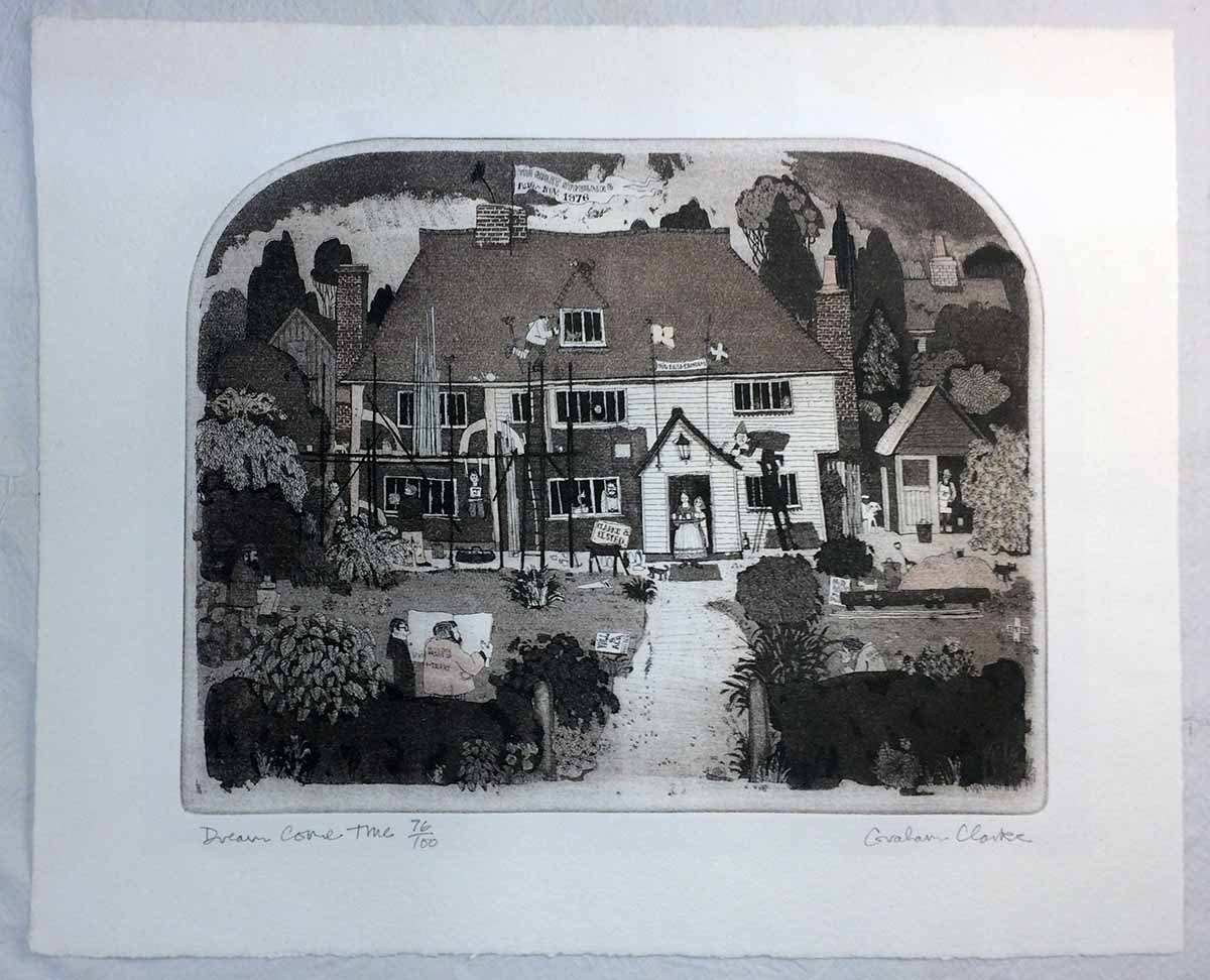
I got distracted from the point of this post, which is a print I found: Scrolling through the dreck posted for sale, I spotted one print unlike the others, most immediately because of the shape of the image area: the top was arched. I’d seen prints like this years ago, the shape and the style, at the home of Jan and Crispin Elsted, aka Barbarian Press. I recognized the artist’s name from their prints: Graham Clarke. I’m not a particular fan of his work, it’s too folksy in content and execution for me. (Folk, as an adjective, is a word I pronounce with a sustained short U substituted for the ol: uuuuu…) It reminds me of Rigby Graham, and I never understood his appeal either.


This particular print of Clarke's also reminds me of the newspaper cartoonist Giles, for the level of activity crammed in. Every anglo kid who grew up in Canada in the ‘70s had at least one, often many, copies of the Giles annuals published at Christmas. They often ended up in the bathroom, and with nothing else to do, kids looked through them. We were oblivious to the specific political or social topics, but his cartoons were great for being packed with all kinds of visual gags and details. There was a shaggy little doughboy with a jacket that was held closed with a safety pin. He didn’t seem to be part of the “Giles” family, but he was always in the background. A proto-Bart Simpson without any speaking lines. I liked him.

Anyway, what really caught my attention about this Clarke print on offer was a sheet attached to the back of the frame. I append it here; see if you can spot what caught my attention…


Pip is what Crispin’s family and friends call him. I knew he and Jan were in the UK in 1978, that’s when they first got into printing. And they were introduced to it by Graham Williams, of the Florin Press. Now we’re getting to what really interested me about this print: not so much the etching, but this sheet on the back, printed by Williams.


One of the first press books I bought, and to this day one of the best I’ve ever bought, was a copy of Monica Poole, Wood Engraver, beautifully printed by Williams on not just one but three handpresses - a Columbian and two Albions. Poole’s work was stunning in detail and execution, and not dull pastoral studies seen in too much wood engraving. Even when her images do stray to the countryside, there’s a sense of menace, and often details that almost seem surreal. Very kool.


The book was set in Optima, which might seem an incongruous choice but it works. Fantastic book, immaculate printing. A cornerstone of the HM Handpress Library. I’d love to get my hands on a deluxe copy, which includes an extra section by Williams about printing the blocks. He was actively printing and publishing through the 1980s, but seems to have devoted himself primarily to sculpting.


I sent Crispin a photo of the print and sheet, and asked specifically about the plans for Clarke & Elsted. My inquiry generated one of his charming notes in reply, part of which I share here (with his blessing): 

"I remember the print. In fact we have one inscribed to us by Graham with its original title, which was "Restoration Comedy", but his dealer in Cranbrook, Kent, thought that it was a bit too lofty, so Graham changed it. We were staying with Graham and Wendy when he made the etching (we were looking in the area for a place to live) and I guess he thought the two names sounded euphonius! The job in question was in fact some restoration work on the front of their cottage, which dates from the 15th century (there’s a date carved in the mantel) in which they still live.

Graham Clarke continues to issue prints, and prices for earlier ones (his career seems to date from around 1971) start at a few hundred pounds. The print on craigslist was just a few pounds, so I bought the thing. I’d thought of laying the text sheet into my copy of the Poole book, a kool piece of (unrelated) Florin ephemera, but it’s slightly too big for that. The print I extracted from its acidic matting. I’ve wondered if finding someone who can cut the arched window in a mat would be difficult, but it’s moot for now.

AND ANOTHER THING!

Francesca's An Alphabetical Accumulation is being sewn & stuffed into limp vellum covers as this is being posted. Copies should be on display at next month's book fair in Seattle. I've added a page on the HM site, under books, with some photos.

I have likewise added a pre-publication page for the Rollenhagen/Wither leaf book, Labour Vertue Glorie, with some production and edition details. I'll be posting images of the book as work progresses, illustrating some of the specific parts, like the working lotterie volvelles.

Anyone interested in either book should get in touch with one of HM's booksellers; they'll have all the details and can assist in reserving a copy.

4.7.17

See U


I'll be posting a regular monthly update in a few days, featuring info and images from the just-released Folding Paper. Until then, here are a couple of images of HM's next publication, currently being bound (in a non-adhesive limp vellum structure) at Claudia's studio: Francesca Lohmann's An Alphabetical Accumulation. See you before the end of the week...


20.3.17

ABCDone


Finished printing the sheets for An Alphabetical Accumulation, no dramas. Now the sheets go off to Francesca to have the next letter added to each page, which will take at least a few weeks for the edition of 36 copies. I'll post some shots of her work when she gets into it. 

13.3.17

Printing Leafy Letters


Back at the press this month, printing a calligraphic ABC by Seattle artist Francesca Lohmann. (She did the calligraphy for 2015’s Bromer bibliography, XI LXIVmos.) The inspiration for the book was a manuscript copy she created a few years ago (pages shown above). Titled An Alphabetical Accumulation, it presented 26 rectos, each adding the next letter of the alphabet, call done in red ink on a very thin, blue-tinged J. Whatman handmade paper. When I first saw it, the potential to make it a printed book was obvious: I would print (in black) the previous page’s accumulation, and Francesca could add the new letter to each page (in red) by hand, thus presenting the complete alphabet done by hand in each copy. 


While we kept the basic size (approx. 4 by 6 inches, 28 printed rectos) and format, Francesca decided to redo all of the calligraphy for this edition. The  presentation for each page changes to best present the letters included, and allow space for the letter to be added by hand. The book is entirely calligraphic - there is no type used. The reproductions of her calligraphy are done with polymer plates, printed on three different papers - T.H. Saunders, J. Whatman, and Crown & Sceptre - all printed damp.


The pictures above and below are proof sheets. I like overprinting different pages on the same sheet, a different kind of accumulation.


Printing will be completed within the week, and then Francesca will begin adding the calligraphy. The edition is 36 copies, so it will take her a while. Once that work is completed, the sheets will go to Claudia Cohen for binding. She is still pondering options, but we expect it to be a vellum structure of some sort.

With all the work still to be done after printing is completed, we don’t expect to have copies ready for issue before the end of the year - just in time for Christmas!

Folding Paper Update

An incomplete copy was assembled in time for display at the Codex book fair, in February, thanks to our friends Vamp & Tramp. I wasn’t there but I heard it received an enthusiastic response, which is partially responsible for it now being fully subscribed. We expect to ship copies in early summer.

2.1.17

Start with ABCs, Finish with Some Moralls


We’re going to maintain the momentum (finally!) achieved in 2016 through the New Year, with three major publications for 2017.

First in the press, but probably the last of the three to be issued, will be Francesca Lohmann’s calligraphic ABC book, An Accumulated Alphabet. This was originally created in 2014 as three manuscript copies. Over 26 leaves (rectos only) Francesca renders the alphabet, nestled among leafy vines, each page adding the next letter to the sequence. For HM’s printed edition, the previous page will be printed (in black) from polymer plates, and the new letter will be added (in red) by Francesca. Thus, each copy will contain, over 26 leaves, a complete calligraphic alphabet. The title page and colophon will also feature her original embellishments.


The reason this book is first up & last out is all the work to be done by Francesca after the printing, then the binding by Claudia Cohen, who is still pondering the details but has been making vague comments about limp vellum structures. The book will be 28 printed leaves (approximately 5 x 7 inches), the paper being a combination of Crown & Sceptre, T. H. Saunders, and Whatman handmades. The edition will be 30 numbered copies and six A.P. Hopefully issued, through HM Editions, by the end of 2017.


The first book that will be issued in 2017, by HM Editions, is the latest collaboration between Barbara Hodgson and Claudia Cohen: Folding Paper: Technique, Design, Obsession. In a similar manner and format as Cutting Paper, the book explores the art of folded paper, and presents a collection of samples on the pages and laid into the accompanying box. Brief essays discuss approaches to folding techniques, the process of creating illustrated pieces, and paper choices. Interspersed will be over 150 tipped-in examples from pleating, education, computational geometry, toy making, origami and packaging (some examples will be presented shown in progress, as well as finished pieces, in a variety of papers).


Folding Paper (9.5 x 12.5 in., 80 pp.) was designed and set in Monotype Fournier by Barbara. It has been printed on 200 g Arches Wove by David Clifford at Black Stone Press. (For technical reasons, the title page - which will itself be a piece of folded art - was printed at HM on the handpress.) Copies will be uniformly bound by Claudia, with an accompanying two-piece box. The box that will also contain about 15 three-dimensional pieces and a separate Zhen Xian Bao (a magical Chinese thread box). All of the pieces will be created specifically for the book. The edition will be 30 numbered copies, signed by both contributors, plus six A.P. copies. Publication is planned for late spring/early summer. 


The long-promised book featuring original leaves from George Wither’s Collection of  Emblemes Ancient & Moderne (England, 1635) is finally going to hit the press. Details are still being finalized, but at this point we can report that the book will be approximately 8 x 12 inches, 50 pages (plus sample leaves), issued in two states from a total edition of 66 copies.

This is the start of the new publishing schedule, so this is it until he start of February, at which time I'll be posting more images & details about Folding Paper. Please note that if you have any interest in that book, contact one of the booksellers listed to the left for details and discuss reserving a copy.