Showing posts with label Printing History. Show all posts

1.1.26

What Was, What Is & What Might Be (’25/26)


Looking back at ’25, the project with Scott Morgan hadn’t even been conceived at the start of the year. It was fun working with him and I’m better-than-usual pleased with our effort. (Thanx to everyone for not mentioning the typo...) The covers for the book rekindled my interest in airbrushing.* I’d like to do some more intaglio work with his photos, we’ll see. 

* Speaking of airbrushing, Barbara & Claudia will be working on a book about stencils (maybe 2027?), with lots of Barbara’s original designs airbrushed in. Here’s one:
 

The Wisso Weiss pamphlet was fun though I still think the blue text paper was maybe just a little too transparent. 


I don’t buy many books these days – I’m more focused on shedding possessions (anyone interested in a large Ostrander-Seymour handpress, please get in touch...) – but I did get a couple over the year, all of them previously unknown to me. One was an Elston Press collection (1902) of three talks by William Morris on early (gothic) woodcuts and woodcut books. I think the text is much the same as the Kelmscott’s German Woodcuts (1898), but with fewer facsimiles. It’s my first book from Elston, which was hugely influenced by Morris but it seems in good ways – a focus on fundamentals like materials and execution, but not on horrible vines and gothic letters everywhere. 


I could afford this copy because it appears to have been found under a leaky basement sink. The boards (shown above) were ruined and the spine decayed but the textblock was fine. I managed to separate it from the boards and spine 
 and preserve the original owner's signature and bookplate!  and resew it. I decided to put it in a limp vellum binding rather than attempt a facsimile. This required much less intrusion to the textblock: I simply used wheat paste on the spine and outer edges of the pastedown sheets, so it can all be easily undone one day. 


The most recent acquisition probably will form the basis for a project in 2026. It’s a portfolio issued in Lausanne in 1944 by Jacques Chevalley, launching his new enterprise as a paper dealer. He commissioned a short text from Charles Ramuz, and four large wood engravings by Henry Bischoff
 

The edition of 50 copies was issued loose in a portfolio. The text paper is from the Guarro mill, the same mill that produced the paper used for many HM books over the past 15 years. I’d never heard of the thing until I happened across one of the engravings in a catalogue. 
 

It’s not rare, there are a couple of copies out there, but they’re pricey (mine was very much not) and none are in good condition. I’m thinking of printing a translation of the text (which as far as I know has not appeared in English) with facsimiles of the engravings. I want to find out a bit more about Chevalley: it seems his father had been a stationer, but Jacques didn’t stick with it long, as most of his life was spent working as a museum curator. Even in Switzerland, 1944 seems an odd time to be launching a business selling specialty papers. 

Here’s what 2026 is looking like for HM...


The text sheets for Sci-Fi Violence were printed last spring. I hope I remember where I put them. The colophons have been travelling to Vermont and Boston, for the artist and poet to sign. I hope they don’t get lost. Briony’s show last year took more of her time and energy than she’d anticipated, which is why we pushed publication of Sci-Fi back. There’s a lot of printmaking involved: five double-page internal prints (approx 10 x 16 inches) plus one being added to the title page, and the sheets to cover the boards. She’s been at it for some time now, and posted some excellent videos on Instagram detailing aspects of her process. The current schedule is for the prints to land in Vancouver at the beginning of March, and the binding to be completed by May. Even though I haven’t solicited orders yet, I can see demand for the edition of 26 copies will exceed supply.  


While Briony’s finishing the prints, I will be printing sheets for a sampler of Reg Lissel’s handmade papers. When he quit/retired c.2014, I bought most of what he had left, and ended up with a lot of diverse sheets. We have enough to assemble 20 sets (18 for sale), each with about 20 samples. Most will be full 13 x 18 inch sheets folded once (i.e. a folio), a few will be half sheets (i.e. leaves). They’ll be issued unbound, probably in a clamshell box, to allow for close examination. The text includes some technical commentary on materials and methods by Reg, and an introduction & short history of the white printing paper he developed for HM by me. Making the boxes (if they happen) will take ages and not happen until after Sci-Fi Violence is issued, so publication fall of 2026? Then maybe there will be time to print, bind & publish the Moulins à papier translation before the end of the year, we’ll see. 

Thanx to all the old friends still interested in what HM gets up to, & thanx to all the new ones who’ve connected over the past year.

31.5.25

The Printers’ Blues


What follows is a long-winded announcement for a new chapbook from HM, with some additional information on the topic it addresses appended...
 
 
The first blue paper copy of a book I saw was not auspicious: it was Black Sparrow Press’ 1973 edition of D. H. Lawrence’s The Escaped Cock. The blue paper looked like cheap copy stock. But it started me wondering about blue paper copies. Why blue?
 
That was about 30 years ago. I didn’t spend all that time pondering blue copies, but the question did recur a few years ago while working on the Griffo project – Aldus was the first publisher to issue a few copies of a new book printed on blue paper – and I did some searching. I thought surely some academic or bibliophile would have researched the whys & hows of blue paper copies, but apparently not, or at least not the answer to my specific question of Why blue? I did find an essay in the 1959 edition of Gutenberg Jahrbuch by Wisso Weiss (a German paper historian & “watermarker” among other vocations), but it didn’t seem to ever have been translated from the original German. So I had our new AI overlords do a quick pass, just to get a sense of the article.
 
It is broader in scope than simply why blue, but a few sections speak to it directly. This month HM issues a chapbook printing English translations of these sections, along with a foreword and postscript that provide some historical context and additional details. 
 

The chapbook is similar in form and style to Francesco Griffo’s Foreword to Petrarch (2021), although sewn in a handmade paper wrap rather than cased in boards. Like that book, it is set in Pablo Impallari’s digital version of Cancelleresca Bastarda. It was printed on my small stash of blue-tinged J Whatman mouldmade paper. Not as blue as Aldus’ blue paper, but blue enough. Given my unreliable printing, I anticipated getting no more than 40 acceptable copies from the paper available, but I actually netted 42. Each copy is sewn in a wrap of Reg Lissel’s handmade rag paper that has been dyed blue. The cover and text pages have been enlivened with calligraphic flourishes taken from J.B. Preusse’s Vollständige Anleitung zum Schreiben für die Land-Schulen (1792) and G. Bickham’s The Universal Penman (1733).
 
The Whatman paper is very thin and therefore somewhat transparent, more than one might ideally want, but it prints beautifully. I’d been hording it for years, and there was just enough for this small project, so I just decided to live with the transparency.  
 
The HM email list was offered pre-publication purchase, with a discount, and those copies have all been shipped. The remaining copies are available priced at US$150 plus shipping. A page with some photos has been added to the HM site. 
 

A FEW INTERESTING BLUE PAPER COPIES

Blue is not the only color to be used for a few special copies: pink, yellow and red are also known, but blue has been the most common colored paper used. While the examples of blue paper copies I’ve seen do have an intriguing appearance, the blue doesn’t seem to make the printing more legible or beautiful in any way. Book collectors being what they are, that intriguing oddness probably is all it took to make the practise a satisfying addition for publishers. I’ve answered my own question.
 
The study of blue paper has become an active field of research over the past few decades, something Weiss anticipated in his article. In recent years there was a large symposium on the topic, coinciding with an exhibition at the Getty. But if the answer to my question lies in the sympoisum papers, I have not found it. One academic, Paolo Sachet, touches on the question in his paper ‘Exploiting Antiquarian Sale Catalogues: A Blueprint for the Study of Sixteenth-Century Books on Blue Paper,’ and provides what probably is the best answer we’ll have (which is included in the new chapbook), barring the discovery of some note from Aldus explaining why he decided to add a few blue sheets to the pile when he was printing Scriptores rei rusticae in 1514 (a plain, boring white paper copy shown below).
 

Printing a few ‘special’ copies on blue paper was clearly inspired by artists who had begun using it for drawings and prints, experimenting with the tonal effects that could be achieved. Using it for type quickly spread from Adlus to other printers in Venice, then across Italy & into France over the next century, and then to other European printing centers through the 19th century. But it seems to have largely died out during the 20th century; I’d have thought the fine press revival of the early 20th century would have been ripe for blue copies, but seems not. The use of special, or at least different, paper for a few copies persisted, but not blue so much. Corvinus Press issued a few copies of Lawrence of Arabia (1936) on blue paper, but also used three other papers for the edition, which makes the blue variant a little less notable.


Incline Press printed a small volume on blue paper in 2013, celebrating Boccaccio
s birth, but it seems the entire edition of 250 copies was printed on the same paper, so not just a few special ones.

Tragara Press printed a short essay (Autumn Thoughts) on blue paper in 1975, but again the entire edition of 90 copies, not just a few.  
 
Here are some links to a few interesting blue paper copies...


A forged blue copy Aldine! I’d have thought the easiest way to forge a blue copy would be to simply dye the sheets of a regular copy, but apparently this an actual printed forger. Seems a lot of effort. 
 

PrPh Books has issued one catalogue devoted to blue paper copies, and another catalogue with many examples included. Lots of great images. The book above is the first and only edition of the heroic poem that recounts the true events of a duke
s fall from his horse during a tournament, said duke being the authors patron. Ripe for translation & reprinting. 

The first Italian edition of Euclid’s Elements, printed in Urbino, 1575. 

 
I found a reference stating the 1553 edition of Ludovico Dolce’s translation of Metapmorphosis is the earliest known fully illustrated book printed on blue paper, but I can’t find anything to back that claim up. Either way, lovely book. 

Two Essays on Slavery (Gehenna Press) includes an 8-page section at the end printed on blue paper. The text in this section is set in 8-pt type, which combined with the dark blue paper doesnt make for easy reading. The books title page is dated 1970, but the blue section includes the colophon, which is dated 1975. 
 
Just to tie things off, I wasn’t the only person wondering about blue paper. Thea Burns has just published a much more thorough investigation, Blue Paper: The Overlooked History of a Drawing, Printing & writing Material 1400-1600. Probably a good thing I didn’t know about it until after printing my measly 12 pages. 
 
See you in September, by which time I should have news about another project moving through the press.

1.6.24

Tails of Dunwich


The tailpieces that appear in early printed books weren
t simply decorative, they had a function. If the space filled by a tailpiece (which appears at the bottom of a short page, i.e. one with fewer than the book’s normal number of lines of text) was left empty, it affects the impression across the sheet: the platen falls lower (harder) over the empty space, printing the surrounding areas of text more heavily but reducing the impression in the area opposite. 
 

Adding a tailpiece helps balance the impression across the sheet. It serves the same purpose as the platen bearers used at HM, one at each corner of the bed, adjusted by adding or removing pieces of mylar or paper between the bearer and bed, to even the overall impression for each form. (Image above is from Manni
s Vita di Aldo, 1759; below is from Marcheses Origine e progressi della stampa, 1722.)


Eight of the ten chapters in The Dunwich Horror fall short. Anticipating the impression issues, I had the idea of adding tailpieces. I considered using some 16th century tailpieces, but decided they would clash with Briony
s prints. Playing around with a fount of Bodoni ornaments one day, I started making little creatures, and thought they’d make excellent tailpieces. 

Now, the fact that they’re being printed in a second color – i.e. not with the short page of text – renders them useless as tailpieces, but they fill the spaces in interesting ways. And I have my platen bearers to deal with the impression balance. I’ve never been able to use modern types like Bodoni, I just can’t make them work, but the ornaments are fun to play with. The boxed copies of Dunwich (numbers 1 20) will contain an eight-page pamphlet with some designs that didn’t get used in the book. Like the sheets that will cover the book’s boards, the pamphlet is a palimpsest: it’s printed on waste leaves of Reg Lissel’s HM Text paper, from Elements in Correlation (HM 2009), that were painted with a mixture of sumi ink and black acrylic paint. 


Briony expects to complete printing all of the aquatints for the book this month, and then turn her attention to the board sheets. While she’s doing that, I’ll be sewing copies and getting ready to make the cases. We
re having so much fun that were trading ideas for a new project. Ill end with a tailpiece from a volume of Blaeu’s Atlas Maior (c.1665)...
 

1.5.23

Agrippa (A Book of the Dead) Lives!


A two-day symposium (actual & virtual) about the infamous disappearing Agrippa: A Book of the Dead will be held this month in London. The event addresses some of the many conceptual questions the project sparked, or at least brought into sharp relief: what is a book? What is a book in the digital age? 

The text of Agrippa, published in 1992, was a long free-verse poem by cyberpunk author William Gibson. It was to have been issued in two versions, both limited in number, presenting the same concept: a physical book whose printed text was essentially gibberish, with accompanying etchings by David Ashbaugh. Gibson’s poem was included on a 3.5 computer disc that would auto-encrypt itself after being read once. Similarly, the prints were supposed to have been photo-sensitive, so just opening the book would initiate a change the art. So, Agrippa would present a “reader” with a conundrum: opening the book would change its printed pages irrevocably. Booting the disc to see if Gibson’s text could be read would result in permanently encrypting the text (if it hadn’t already been).  


The symposium is being organized by a PhD candidate, Justine Provino, and most of the participants are scholars who have thought & written deeply about the broad questions Agrippa posed. I’ve been included  because (I think) I’m one of few people interested strictly in the physical aspects of its production, i.e. the most traditional and perhaps mundane aspects. But these mundane aspects posed a number of technical problems to the publisher, and I’m fascinated by the stories about the making of a book, particularly when things go wrong. (See here for a long post about Agrippa and an account of its production I wrote in 2015). 


How much of what was promised in Agrippa’s prospectus ended up happening was long a matter of debate, and answering some of these questions was the focus of my monograph. They couldn’t get the photo-sensitive concept to work, but someone came up with a clever alternative that achieved much the same result. I’ve never been clear on whether the self-encrypting program worked; the copies of Agrippa I’ve seen were issued without a disc. The whole endeavor became somewhat shambolic in the end, but its ambition and provocation inspired many broader discussions (and graduate degrees). 


Agrippa
wouldn’t be classified as fine press by the people who made it or people for whom that phrase means something specific: the production was not the finest. It’s more firmly in the artist’s book realm. Copies rarely come to market. When I wrote my monograph, I found two listed in recent years. One sold on Abebooks for about $5,000, from a bookseller who had it on commission and didn’t really know what it was. The other sold in a modern art auction, for a paltry $800, once again showing that books aren’t really considered art by the market.

If you’re interested in discussions around artists books, what constitutes a book, what is the role of physical books in the 21st century etc etc, this free symposium might be worth dialing in. 
 
AND ANOTHER THING!
 

I
ll print Barbara Hodgson’s Marbling Paper: Experiments to Show That Paper Really Does Matter this month. That’s the title page above: she’ll marble the sheet, then I'll print the text in the white areas. We’ll see how that goes...


1.1.23

Will, Might & Could Happen 2023


Not only is it the first of a month again, it’s the start of another year. Come back in December to see how much of the following happened...
 

Will Happen: In about a month HM will issue two short stories by Frank L. Stockton, each featuring an original color frontispiece by Walter Bachinski, plus illustrations by him throughout the text. Image above intentionally vague; I’ll post picture of a bound copy next month. 
 

Will Happen
: I’ve been invited to participate (virtually) in a panel discussion about Agrippa: A Book of the Dead, part of a two-day conference about the book/project/concept/thing being organized by a Cambridge PhD student in May. Four scholars and me; think I’ll mostly keep my mouth shut. I believe it’s being streamed, details to follow. 
 

Will Probably Happen:
Shortly after Jim Rimmer’s death, in 2010, I purchased a small collection of color linocuts from two of his publications, all initialed by Jim. I also acquired multiple copies from a set of 13 cards displaying the various rules and fleurons he could cast on order (date of issue unclear, possibly early 1980s). I’ve spent the years since pondering what to do with it all and have settled on a plan: a short book (about 24 pages) reprinting an article about Jim and his metal types by Will Rueter originally published in DA in 2003, plus a checklist of the books (only) issued by Jim’s Pie Tree Press, and samples of his metal and digital type designs. Each copy will include one of the initialed linocuts and several of the cards. 


Could Happen: I want to publish a short history on the above topic but need to find a German translator & it’s been proving difficult...


Might Happen (but probably not in ’23): I’m working on a chronological history of recorded (written or printed) references to printing with moveable type up to 1550. There’s a lot of Latin to cope with. 

The device at the top was used by the Wesleyan Art Laboratory in the 1940s. Students issued some interesting works on printing history & techniques. 

Happy 2023, let’s all try to do better.

1.10.22

Faking It (A Different One)

Ever since I first heard about Robert Green’s project to create a digital version of the Doves type, I’d wondered if anyone (besides Green, presumably) had used it to recreate an original Doves letterpress page, to see how the two compare. If anyone has, I don’t know about it. So I finally decided to give it a try, partly as a limbering-up exercise before starting to print the next HM project (I haven’t done any extended printing since the end of last year).
 
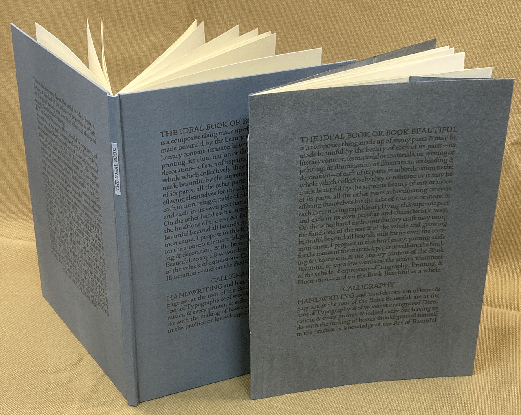
The first question was, how to conduct the experiment. Ideally my facsimile setting could be directly compared to the original. Since part of the experiment is for people to see how the digital compares to the metal original, it seemed appropriate to pick a work that was reasonably well known. I thought about Credo (1908), but all those I believes get tiresome. So I settled on The Ideal Book. It’s just 10 pages, so three sheets.

But the idea of being able to compare my facsimile directly to the original lingered. Some years ago I acquired a few dozen copies of Cobden-Sanderson’s “Note on a Passage in Anthony and Cleopatra” (1913) This is one of the ephemeral parerga C-S issued over the years. The copies have been lost & rediscovered on my shelves a few times, and I finally had an idea for putting them to use: I could set the first page in facsimile, and present it opposite a copy of the original. I have 25 copies of the Note...so it will be included in that many copies of my Ideal Book facsimile. 
 

I grabbed the text for Ideal Book from a digitized copy online, then went through and found all the scanning errors. The digital text conveniently had breaks at the end of each printed line, so that work was already done for me. I pulled out my copy of the original, and measured the page, the margins, the line measure, the type size, and the leading. 
 
In using these measurements to create a digital version, I had to take into consideration the shrinkage of the paper after printing. Like all good handpress printers, Cobden-Sanderson’s paper was dampened for printing, which causes it to expand. When dry it contracts, thereby shrinking whatever was printed ever so slightly. In general I have found paper shrinks 1 – 1.5%. The text line in the book measured exactly 4 inches, so I made the measure in my file 4-1/16 inches to allow for the shrinkage.


The photos above illustrate the shrinkage. For each the ruler’s 4-inch mark is centered under the period at the end of the line (despite what the first image suggests). The second image shows the line on a sheet of proofing paper (i.e. printed dry), measuring just past the 8-inch mark (i.e. a little over 4 inches long). The third image is a sheet of the Saunders paper, printed damp and then dried; it shows the same line ending just under the 8 inch mark, a difference of about 1/16 inch.The fourth is the Barcham Green paper, likewise just under 4 inches. The last picture is the Doves original.  
 
I use Affinity Publisher for doing layouts, & its a poor substitute for InDesign. I created a document with page size 6.5 x 9.25 inches. By my estimate, the printed (metal) type equated to 16.1 pt in digital; the leading was 15.4 pt. Kerning was off (I never use auto or font kerning), just as it would be when setting metal.  
 
I dumped the digital text into the text boxes, and was surprised at how well it all fit right off the bat. When it didn’t it was because the word spacing resisted (there are some very tightly-set lines), so I had to make those adjustments as required.  
 
While all of the lines fell into the measure easily enough, what I noticed was very slight variations in where a given letter in the line fell with relation to the ones above and below. Sometimes a hair or two ahead, sometimes behind. Much of this I put down to discrepancies in the word spacing, and I wasn’t going to attempt a facsimile setting to that degree of detail. 
 
The italic words in “Note...” posed a problem: As everyone knows, there is no italic companion to the Doves roman. When an italic was required, C-S used one provided by the Miller & Richard foundry. The closest approximation of it I could find (digitally) was Garamond; without the actual face, my setting can’t really be called a facsimile. 
 
I also had to come up with a pilcrow. Green’s font doesn’t include one, so I simply scanned one from “Note...” and dropped it in.  
 
When output to my cheap Epson inkjet printer, the text looked a little heavy, but I put that down to the printer.  
 
As with all my polymer printing, the plates are KF 95 plastic backed. The slim plates (vs the thicker 152 used by most letterpress shops) allow for sharper details (e.g. serifs) and finer lines without risk of breaking. I have my plates made by a nearby commercial letterpress shop that I’m not naming because they do it as a favor to me and don’t want to be in the plate-making business.  
 
I pulled plate proofs on newsprint with no makeready or particular care, I’m just looking to see if there are any flaws. The type in the proofs looked noticeably heavier than the metal original. I hoped this was due to my offhand proofing, but knew it could also be a result of decisions Green made.


To make the comparison as accurate as possible, the digital version needed to be printed the same way the original was – inked by hand, and printed on a handpress – on paper as close as possible to the original used. The image above shows (l to r) the roller, ink slab, and pile of damp paper under a towel waiting to be printed. 
 
The Doves books were printed on a laid sheet made by Batchelor & Son. I couldn’t get any of that. I did have paper that the (old) wrapping in which it was found claimed to be Saunders c.1950s, but there is no watermark. It’s more cream than the Doves, which might be described as off-white, but it has a similar weight and finish. It was dampened in the usual manner, with blotters, five printing sheets per blotter. I also had a few sheets of Barcham Green Bodleain, also more cream than white, laid, and with a little more tooth than the Doves or Saunders sheets. I printed five copies on this paper. 
 
I started printing with the facsimile page from “Note...” Because of the potential thickening issue, I’d decided to print with as little ink as possible, which thus might require more impression than normal. I rolled out a minimal amount of ink – less than I have ever used to print – and pulled an impression. It was essentially perfect. This never happens for me; there are always agonies and torments getting a form to print well. The impression was good – about the same as on the Doves original – and the ink coverage was solid. And the type still looked thicker than the original. 
 
I checked with the person who made the plates, in case something in how the plate was made (i.e. exposed) would noticeably affect a type’s weight. She compared what I’d printed with a digital print from their good printer, and the two were the same – the type was printing as it was designed to look. So Green had thickened up the strokes, which is not an unusual decision when adapting a metal face for use in offset, digital or Web use. 


The image above shows a form being printed. The four red squares at the corners highlight the platen bearers, the two rectanular squares show the roller bearers with tape added in places to adjust the inking in those areas.
 
 
Printing a sheet at HM typically take two days, one for each side. It takes two to three hours in the morning to get a form set up and the makeready settled (sample below), then I average about 15 impressions an hour. I have printed up to 120 impressions in a day, but am not good for much the next day. After backing up, the sheets are (gently) pressed between blotting boards overnight, to dry. They usually require drying in a second set of boards for another day. (Note that it’s not the ink that’s drying – it’s dry almost as soon as it’s printed – it’s a question of extracting the moisture that was added to the fibers for printing.)
 

The 25 copies with the “Note...” facsimile and leaf (above) will be cased in printed blue paper over thin boards. I ended up with another 13 copies, which have been sewn into a painted handmade paper wrap (see top for both versions). 
 
So that’s the experiment. My conclusion is that, if you wanted to use the digital Doves font to make a truly accurate facsimile, you’d have to make some alterations to the font to decrease the stroke weight. And I can’t really think of a legitimate use for the font outside a facsimile. Cobden-Sanderson went to such lengths to prevent its use by others (unscrupulously, given the agreement he had made, in my opinion), that appropriating it for some other use would be jarring. I considered using it for the Pollard project, for about a minute, before realizing it was just a bad idea. 


Attempting to replicate someone else’s setting of type ended up being an interesting exercise. It resulted in a deeper understanding of C-S’s aesthetic through all the small decisions involved. Several of his lines are set so tight the words have to be picked apart, while others employ an ampersand when there was plenty of room for the word and. I imagine it’s similar to young writers typing out their favorite novel, to gain some insight to the author’s process. 
 
I feel limbered up and am looking forward to the new project, which will entail printing more colors than any five previous HM books combined! 
 
AND ANOTHER THING!
 
I’m sorry for all of you not in Vancouver tonight because you’ll miss the loscil/RafaelAnton Irisarri double bill. An ambient mega-bash.