31.3.14

Flattened Out & Getting Krazy With a Kelsey


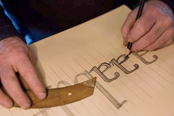
Trawling for printing stuff online (i.e. avoiding real work), ran across this item on eBay: a set of gauges for adjusting (leveling) the platen of a C&P-style press, even the ubiquitous tabletop Kelseys and Adanas that seem to be everywhere now. These gauges essentially function like the platen bearers that (should be) used when printing with a handpress: put one in each corner of the bed, and then adjust the platen so it is just touching all four at impression.  These, however, have the advantage of being magnetic, which makes them much easier to use on a platen press's (vertical) bed. And the extra feature of being a gauge to check roller height is clever. All for what seems a reasonable price. I'm tempted to get a set just to have them. And if you have a handpress but don't yet have platen bearers, these would work just fine.


When I was printing with a Kelsey 5 x 8, a million years ago, I quickly learned that the only way to get even impression on forms that weren't equally distributed (e.g. a partial page facing a full page) was to adjust the platen accordingly. Makeready can do only so much. Those little presses are so small & weak, it often resulted in adjusting the platen wildly out of alignment to equalize the impression, and then getting adjusted back to level was always a hassle.

(WHY YOU SHOULDN'T TRY) 
PRINTING WITH A KELSEY TABLETOP PRESS

http://www.porcuprints.com/wp-content/uploads/2011/09/excel_press-300x249.jpg

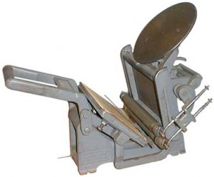
Writing that just now reminded me that four years ago I'd been contacted by someone who ran a site about Kelseys, asking me to write something about using one of those little presses to print a book. I did, but for whatever reason the guy didn't post it; maybe he didn't like my repeated warnings to Do Not Do What I Did. I found a copy of what I wrote, and so published here for the first time are my abbreviated notes for printing two-up on a 5 x 8 tabletop press. Sorry, no action shots to go with it.

   ❑   ❑   ❑  

NO TABLETOP PRESS is really intended for bookwork. There just isn't (can't be) enough impression. But a beginner wouldn't know that until they've tried (as was my case), so if you're trying, here are a few tips.

First, what I printed on my Kelsey:

El Autobus Azul (1998): A miniature book with about 14 ages of text, about Costa Rican handmade papers. Just 15 copies issued. Set in 8-pt Centaur and Arrighi. Printed on a commercial "coffee" paper made is Costa Rica. Nothing special, & not ideal for letterpress. Lots of makeready, but reasonable results for a first effort. A 10th anniversary reprint (printed by David Clifford on his Heidelberg windmill) was published in an edition of 50 copies.


Fragments & Glimpses: Francesco Griffo da Bologna (1999). An 80-page biography of Aldus' typecutter, Francesco Griffo. Set in 8-pt Bembo. Page size 3.25 x 5 inches (two-up form measured 5 inches across, 3.5 inches tall; each page within the form was 2 inches wide, 3.5 inches tall). Printed in two colors on dampened Lana Wove (beautiful paper for books but they stopped making it around 2000). Edition of 32 copies. Just about killed me. Simon Fraser University has posted scans of the complete book.

Duensing Titling (2003). A miniature book with brief text (about 12 pages) by Jim Rimmer about designing & cutting Duensing Titling. (This book also had a linear fold-out section with all the letters printed in 60-pt on my Washington.) Set in 8-pt Bembo, printed damp, I think on Hahnemuhle.

Ars Anatomica (2004). A miniature book with text by Shinsuke Minegishi, and a series of his wood engravings laid in (he printed those, not me). Printed on Rives, dry.

Plus a handful of ephemeral things. The Kelsey was my go-to press for quick & recreational printing during the first few years, while I was still learning how to handle the Washington. I haven't used it in about five years [i.e. 2005] except for a day last Christmas when a friend brought a couple of her young art students by for a morning's introduction to printing. It's a great thing to have around for kids.


As a general rule, with any press the area being printed (your form) shouldn't be much more than 50% the area of the bed/platen. (The advertisement above, which measures 6 x 8.5 inches, disproves this general rule, but it's a single page printed on coated paper - not something you'd want to use for a book.) Thus, if printing two-up on a 5 x 8, your book can't be much more than a 16mo. Miniatures (pages no more than 3 inches in either dimension) probably are the best format to work within, particularly as there's a whole subculture of people interested in miniatures. You could print one page at a time, but I suspect the registration across the sheet becomes tricky, and there's risk of the half sticking up from the press flopping onto the rollers or ink wheel.


I knew quality & evenness of impression would be a problem with Griffo, with a form that was at the upper limit for my press. I decided that damping the paper would help (in addition to resulting in lovelier printing, as damping always will). Nonetheless, I typically spent 4-6 hours doing makeready for each form on Griffo, and even then there would be unpredictable variations from impression to impression. Thus, a sheet took two days to print, then two days to distribute & set the next sheet, so I averaged about a sheet a week.

When I started, I tried to be very strict and pure about levelling the bed, keeping it level, and compensating for uneven forms with makeready. That's a mug's game: the bed falls unevenly much too easily on such small presses for makeready to truly compensate. After much frustration, I abandoned what I'd considered good press hygiene, and did what works:  I noted & marked where the five platen adjustment bolts rested for a balanced impression, and then adjusted these settings for each new form, to achieve even/balanced impression (or as close as possible). Makeready was still required, but this at least got me closer to the desired result. The trick is to remember to return the platen to your original balanced settings after each form, so that you can begin again for the next.

[Balancing the bed: I put a 1-in piece of good wood type in each corner of the chase & pulled impressions until all four were printing evenly.]

Unbalanced forms also caused problems with the rollers: if there is text or an image on one side but not the other (assuming two-up), the rollers can be pulled below type height on the empty side, and thus lifted above type height on the opposite end, which should be inking your form. Remember, tiny differences can have big consequences with these presses. Adjusting the compression springs on the roller arms can help, but like the bed, you must have a way of marking the balanced (ideal) setting. I found it easier to build up layers of tape along the roller bearer on the side of the form without type. How much depends on the particular form, but you're looking to make the roller remain parallel as it travels across the type.

Using tape to adjust your rollers as they travel over different parts of the type is a good trick in many circumstances: e.g. to minimize the over-inking that can happen on a long line, or to smooth the rollers' transition on to and off of the type. This technique is crucial in handpress printing.


I pack my platen basically the same way I do a handpress. Beneath the tympan sheet:
- various weights of paper and Mylar (the type & combination decided when you balance your bed; your "ideal" of standard packing).

Above the tympan sheet:
- a Mylar base sheet, to which I affix guide pins
- a second, smaller Mylar sheet (within the area bounded by the guide pins, but beyond your printing area) to which I affix a register sheet (changed for each new form) on which makeready is done
- a hinged Mylar "window" which lies over the register/makeready sheet

Unless there's a reason not too, I print head down. Makeready is easier (the print on the register sheet is oriented for easy reading when your head's bent over the platen) and the foot of the sheet (which typically has a larger margin) can stick up/out from the platen if necessary.

That's really all there is to it:
- Work within the reasonable limits of your press.
- Be prepared to spend the time necessary on makeready.
- Consider the advantages of damping your paper (but also realize this means you must use a paper that can, & should be dampened).
- When frustrated with results, remind yourself that these presses really weren't meant for fine and/or ambitious printing.

Finally, I recommend that anyone interested in letterpress printing - regardless of the kind of press - read Gabriel Rummonds' Printing with the Iron Handpress. It has much background information on materials and techniques useful to people interested in fine (i.e. good) printing.

AND ANOTHER THING


Did you catch the story about the 14-year-old kid who started a project in 2011 to compare how much is ink is used by different digital faces, with the goal of finding one that is most efficient? Suvir Mirchandani's results were published recently in Harvard's Journal of Emerging Investigators. Very clever the way he assessed ink usage by converting the surface area of enlarged samples to volumes (on a standard substrate), and then compared weights. Similar to how Jim Rimmer transferred his type designs on a pantograph from enlarged maquettes (each copy of his book Leaves From the Pie Tree included an original letterform maquette tipped in). On one level, the visual weight of a face is an obvious consideration for choosing a face: the lighter the face, the less ink is required. Scaled up to a national level, that represents millions of dollars. Typographic considerations don't seem to have been a factor in the analysis, but maybe no typeface is up to the challenge of making a letter from the government less anxiety or rage inducing.

http://tmagazine.blogs.nytimes.com/2011/06/01/graphic-content-heavy-metal/?_php=true&_type=blogs&_r=0

24.3.14

Siht Si Eht Eltit


A Monday mélange...


First, something to watch: a short film by David Lynch taking you on a tour of a small printshop in Paris. An old mechanized stone litho press at work. Makes sense that the inverted images of printing would appeal to the director who gave us the Black Lodge.


Second, I am a dumbass: there is a page with some info about the printer of last week's Royal Bank book. My excuse for not seeing it before is twofold: it's in a weird place, and the book is so painfully dull that I couldn't force myself to flip through all the prelims. As expected, it was printed in Montreal, by the great Ronalds Printing. I also was wrong about the letterpress & intaglio being done in different shops. Dumbass.


Interesting factoid: my introduction to printing was a tour of the Ronalds plant in Montreal, c.1989 (I worked for a sweatshop publisher of medical journals at the time & Ronalds did all our printing). That was when comic publishers were starting to invest in better production and materials, and Ronalds was the place doing the printing. They even printed Frank Miller's Dark Knight series, which really opened publishers' eyes to the technical and graphic opportunities available. If you don't believe me, check out this guy's blog about it.

Third, fellow handpress printer Paul Ritscher (Devil's Tail Press) sent a note after reading the Light & Simple post, with some news about the Pratt Albion: while Pratt Wagon Works will continue to operate under Steve's son Ben, he won't be making any more presses. A loss for us all.


Fourth, & this should probably be first since it's actually about HM but we've already established that I am a dumbass: publication notice about the final volume in Barbara & Claudia's colo[u]r series went out to subscribers last week. Around the World in Colour is in the bindery & copies will begin to appear in May. The edition is completely subscribed. Get in touch with HM's booksellers (listed at right) if interested.

16.3.14

A Canadian Bank, Spanish Paper, & Marks


America was built by cowboys and oilmen, Canada was built by bankers and insurance salesmen. Something like that. Here's a story to illustrate the point.

Walked by a local used book shop last week. Chalkboard sign out front announced "Antiquarian Sale." There was a table of dreck inside: orphans from sets, a few books in polished leather bindings with the boards detached, general detritus. Most interesting thing I saw was a monograph titled Esoteric Astrology. Talking to the very pleasant woman who seemed to own the place, she explained they were getting out of antiquarian books, focusing just on newer used books. I wasn't sure they'd ever been in the antiquarian books business, but whatever. I spied, at the bottom of a tottering pile behind her desk, a slipcase. What's that? It was this:


And first glance, and even second, the book is deathly dull, lying somewhere between annual report and a high school yearbook. But for thems like us, before you even get to the title page & realize what a bore it is, you notice the paper, and the watermarks:


None other than the same Guarro mill that provided the 1960s mouldmade upon which HM has published several books over the past ten years, including Oddballs and Types/Paper/Print. (My suspicion about the nice lady's bona fides as an antiquarian bookseller were confirmed when she asked, What's a watermark?) I have previously seen just one full sheet of handmade paper bearing the Guarro watermark, at an intaglio studio. I've never seen a book printed on handmade Guarro. I tried to resist, but for $25 I was saving a fortune in beautiful paper from the scrap heap.


As a piece of publishing, it's an interesting specimen (I'm not justifying the $25 here: I'm justifying the space this thing will take up in my life). There's a copyright (Montreal, 1920) but no colophon or information about the printer. The typography is functional and of a journeyman caliber for the period. The text is set in some Caslon variant, the word spacing none too carefully attended. The text was not printed damp as it should have been on this lovely paper, trop mal. Maybe that's why they used the hot pressed surface for the text, but still.


The numerous photogravures, however, are beautifully printed on the NOT paper (damp, as this method would require), rectos only, and nested into signatures to alternate with text pages. They are protected by sewn-in sheets of whisper-thin handmade gampi (looks like; might be kozo, but I think gampi). Most of the images - various directors & other important personages - are interesting only for the glimpses into muttonchop fashions of the time, but there are also some images of the bank's various offices near & far that are skillfully rendered and architecturally interesting. So, for someone simply interested in printing, it's worth $25.


Laid into this copy is a presentation card from one Mr E. L. Pease. Flipping through the book we find he was Managing Director of the head office when this book was issued.


Old Peasey was even high enough on the ladder to get his mugshot in the book:


I've not seen the José watermark on any of the (admittedly few) Guarro sheets that have come my way. The book appears to be printed on two different stocks of wove, of approximately 120-150 grammage: the text on a hot pressed stock, and the intaglio on a cold pressed (i.e. textured) stock. The watermarks are identical on both. The book seems to have been printed on half-sheets (i.e. full sheets printed in quarto). On the pages that bear a mark, Guarro or José is roughly centered, reading vertically. There also was a watermark in the center of the full sheet. I couldn't find a complete mark anywhere, but the pieces include a crown, a shield, and the designation 1a.


Trawling the Web for information about Guarro handmade paper, only a few reference come up. The company still exists, but in a very different form from its glory days as a maker of fine papers. No mention on their history page of a José Guarro.
 
No surprise that lots of books printed in Spain (pre-Civil War) used Guarro paper. Here's a link to a fantastic 144-pg catalogue from a Barcelona auction house's 2013 catalogue: lots of images and more than a few mentions of Guarro (including the lady above).

http://www.britishmuseum.org/research/collection_online/collection_object_details.aspx?objectId=764817&partId=1&searchText=caprichos+34&view=list&page=1

At the British Museum, an early 20th century impression of a plate ("Las reinde el sueño") from Goya's 1799 series Los Caprichos is noted to be printed on paper with the watermark. According to the description of a copy of the suite offered at auction by Sotheby's in 2008, those early 20th century impressions were from a 10th edition of the suite, and all were printed on paper with the José Guarro watermark (and a watermark portrait of Goya wearing a cap).


There was also published, in Madrid in 1916, an edition of Goya's Los Proverbios: 50 sets, all 18 etchings with aquatint and drypoint, on laid paper watermarked "José Guarro Catalunya." The image above is one of the plates from the edition offered by Davidson Galleries of Seattle: excellent dealer of prints from all periods, including new works by HM fave Briony Morrow-Cribbs.

 
Apparently the 11th edition (1929) of Los Proverbios also used (different) laid paper with a Guarro watermark. Sample above: not as elaborate as the ones in our book.


Perhaps oddly, perhaps not, one of the handmade Guarro references that turns up has a Canadian angle: The Canadian poet Francis Sherman (1871-1926) had a few things printed on José Guarro paper. Turns out poetry was his avocation, while his vocation (or profession) was banking: he was even the Royal Bank's man in Havana in 1899. (He may have had a poem printed by Will Bradley, in 1897: see here for that story.) According to a Sherman bibliography on the Canadian Poetry site, the bank's archive still holds manuscripts and some unique copies of Sherman's books. Look, he's even listed in the book, right under our benefactor Mr Pease:


Here's a twist in that plot line: the two pieces of Shermania printed on José Guarro paper ("In The South" and the collection Canadian Calendar: XII Lyrics) were printed in Havana, in 1899 and 1901. When the bank decided to print a book to mark its diamond jubilee, might the powers have turned to their in-house poet & bibliophile to suggest how the book might be made suitably luxe? Might he have suggested they use his old printer in Havana? That seems unlikely, given the distance and the ready availability of printers in Montreal at the time. But he could have suggested the paper. If, however, Sherman the bibliophile was involved in the planning, you'd think a colophon, or some mention of the printer (printers; the letterpress & photogravures probably were done by different companies) and production would have been included.

No other information about José Guarro handmade paper, laid or wove, has bubbled up since acquiring the book. Why so much was spent on what really is an exercise in corporate vanity, who knows. One partial reason might be the recent end of the Great War: a significant portion of the book is dedicated to listing the names & regiments of employees who served. But bibliophilia was fashionable among the professional & commerce class in 1920 - think of all the books John Henry Nash talked rich patrons into commissioning - so there probably was some showing off involved. To this day, much of the value & growth in the Canadian economy comes from the financial sector. Our banks consistently report some of the highest profits for the industry internationally. The previous governor of the Bank of Canada was recruited last year to become the first foreign Governor of the Bank of England. Buried in the Royal Bank's financial report for 1919, in small type, is a hint at how this future success would be achieved:


10.3.14

Leonard, Crimilda & Harold


The bagger that keeps on giving: Last fall, when scratching about for a post topic, HM wrote about a pamphlet titled The Instruments of Writing printed in 1948 by one Crimilda Pontes. The post offered a brief summary of her subsequent career as a designer and calligrapher.


I recently & finally got a copy of Leonard Baskin's 1966 lecture To Colour Thought, printed by Giovanni Mardersteig at his Officina Bodoni and issued by Yale University Press in 1967. (Interesting & odd that this American publication uses the superfluous & vestigial u in the verb...) The edition was 300 copies. It's not a rare book, or even uncommon. The reason I had delayed so long in securing a copy was because I wanted one of 10 that were specially bound in full leather for distribution by the publisher. (The balance of the edition was bound in quarter leather.) One turned up in the last Veatchs Arts of the Book catalogue, and glory goes not to those who hesitate.


This copy was presented to Harold Hugo, president of the Meridan Gravure Company, where the illustrations for the book were printed. All except the frontis (from Blake) are black and white, like this:


My copy bears Hugo's ex libris as well as his daughter's (see top). It also contains a presentation note from the library, in lovely script, folded over the flyleaf. On the recto immediately preceding the title page is printed a (sort of) half title rendered in the same script as the laid-in note.


What I had not known about the book, until reading the colophon, was that the calligraphy was by Crimilda Pontes, a name I recognized only because of the blog I'd written on a slow news day last fall. So, in addition to getting one of the coveted publisher's copies, it came with an original sample of Crimilda's calligraphy! An unexpected & kool coincidence.


No information provided in the colophon about the binder, but the time, location & execution all point it being done by to Arno Werner (who was Baskin's go-to binder of the time).

Haven't actually had a chance to read the lecture yet; HM's Great Move continues. Shifted about 2,000 lbs of iron, steel & lead yesterday: type (2 cabinets, 48 drawers) and the two foolscap-sized book presses used for damping & drying paper. Moving a bit slow today, but must press on. Here's what a significant portion of HM's paper stash looked like on the way into secure & heated storage last week:

3.3.14

Light & Simple


 A Yahoo group of handpress nerds recently mooted the idea of fabricating "a lightweight modern basic hand press replicating a simple design" to solve the compound problem of a) finding a handpress for sale, and b) being able to afford the price. (The premise reminded me of the kool rifle Edward Fox has custom made in Day of the Jackal.) I was surprised to hear that handpresses seem even more scarce in the U.K. and Europe than in North America. Too many of them seem to end up in museums or similarly frozen in amber, treating them as objects of antiquarian curiosity rather than unique tools for innovative use by contemporary artists and printers. So, what are the options for someone who is willing to make the commitment to learn the craft of printing with a handpress?

http://www.harryrochat.com/harry-rochat-refurbishment.htm

Buying an old (i.e. pre-20th century) press is the obvious approach, but supply is limited and apparently dwindling. Remember the post from last year about the handpresses in the mid-West for sale at sky high prices? The best option for sourcing any press is to find out where as many of the kind you want are located as possible, and let those people know you want one. If you're really lucky, someone will be happy to have you remove the hundreds of pounds of iron from their premises. Next best, those are the folks who will hear when something comes available.

Another source for presses can be movers who specialize in heavy items. I once had to move a C&P out of the studio, and the guys who did the work told me they had two just like it sitting in the warehouse wanting a home; someone paid to have them moved out, but never said where they should be moved to!

On the market your options are limited to eBay, Briar's classified, and used equipment dealers.

If you don't have the patience for all that sleuthing, you could buy a new press. Until last year that were two options I knew of: Steve Pratt in Utah, and Rochat in the U.K.

 
Steve's small foolscap Pratt Albion was made from castings taken from an original, with all the steel parts machined by hand. It's beautiful (tho his preferred institutional green, while perhaps historically accurate, is much uglier than black; he'd paint it whichever color you preferred). A Pratt Albion was made to order. It took four to six months, and cost about $6,000 plus shipping. That's about what you could expect to pay for a vintage Albion the same size. Given the choice, I'd rather have a Pratt, made with modern metals and tolerances.

Steve died last year. He worked with his son, who I heard was going to continue making the presses to order, but I know nothing definitive. Steve didn't have a Web site and didn't do email; he liked to talk on the phone.

(One odd thing about presses is, smaller sizes often are more sought after than bigger ones simply because they're easier to move and accommodate. A tabletop style like the Albion small foolscap probably would command a similar price to a floor-standing version.)


Harry F. Rochat Ltd looks to be a good source for restored presses of all type, but I've heard they are not cheap (restoration never is). Several years ago they announced a scheme to design and build Albion-style handpresses in three sizes, and posted images & details of the program on their site. The first (a large foolscap size) was completed at the end of 2010, and discussed in this article from 2011. This page on the Rochat site has details & the price ($10,000+); bizarrely, they offer the option of buying it without the tympan, frisket etc etc, which seems like buying a car without a dashboard and instrumentation. If you're using a handpress without the tympan and frisket, you should just use an etching press. Most old presses that are rescued from obscurity are missing the tympan & frisket, and so follows a complicated search to find someone who can make a decent replacement. It's almost like a dust jacket on a modern first: lose the jacket and suddenly it's just another hardcover.

So far we haven't found a contemporary option for would-be handpress printers that is lightweight and affordable. There's a reason presses are heavy: it takes a lot of metal to make a frame strong enough to provide sufficient pressure for printing. A handpress looks simple enough from a distance, but it also represents a few hundred years of development.


A common press might be an easier option for DIYers. In 1978 David Godine published The Common Press: Being a Record, Description & Delineation of the Early Eighteenth-Century Handpress in the Smithsonian Institution, with a History & Documentation of the Press by Elizabeth Harris & Clinton Sisson, with detailed plans. Copies are still easily found. However, as this thread of comments over at Briar points out, getting the appropriate materials will take some sourcing. And in the end you've still only got a common press, which isn't as strong or versatile as the (iron) handpress.


Here's one stripped-down approach to building a press: Charles Morgan's Bottle Jack Press. It's well thought out & looks functional if all you're printing is blocks, but I wouldn't want to have to print type (much less pages of type) on it. Morgan is a printmaker based in Victoria, B.C.


When I first knew Reg Lissel - 20 years ago? - he was using a "press" made from 4-inch posts, plywood platens, and a car jack to press the paper he was making. Then we got the Big Gun, above. Morgan's plan isn't much different than a book or copy press*, so maybe that's the easiest option for people who want to print blocks. You don't need one like the Big Gun; a foolscap size copy press would be perfect. It's good enough for David Esslemont's last book, and that ain't bad.


* A copy press (above) was used for copying documents; a book press for binding (pressing) books. The easiest way to tell the difference is how tall the cheeks are: the platen of a copy press had to be raised only enough to slip a few sheets in; a book press (below) must have enough clearance to hold several books at once.


AND ANOTHER THING!

Whatever kind of press you have access to, the submission deadline for the next BIMPE mini-print exhibition approaches, so get printing. Details here. I bought a couple of prints by first-prize winner Tomiyuki Sakuta last time; very kool.

http://www.bimpe.com/bimpe/

Here's another new article about Harold, this one a bit more insightful than The Guardian's.

http://www.youtube.com/watch?v=u8bK67_lJ54&feature=player_embedded