Showing posts with label The Kelmscott & Doves Presses. Show all posts

1.6.23

Adagio's C-S , The Master Craftsman


I had a couple of days between projects last month so I attended to a few binding projects. I’d recently acquired a copy of Leonard Bahr’s C-S, The Master Craftsman (Adagio Press 1969) in sheets. I’d seen the book over the years but never felt the beed to own a copy. The copy in sheets was cheap, plus it included several proof and trial-setting sheets, including a completely different title page, which are always of interest to a printer. 


The two Doves leaves required were lacking, but there are enough Doves leaves kicking around HM from the Pollard project Ideal Book projects to easily fix that shortcoming. 


One of the two sheets included in the edition was from the Bible. I still have some of those and chose a bifolium (half a printed sheet; the Bible was printed four up) that showed some of the foxing for which Vol. 1 is infamous.  For the second I acquired a leaf from Paradise Regain
d from the excellent Kelmscott Bookshop.
 

It’s not an uncommon book, copies can be found. It seems to have been bankrolled by the bibliophile Norman Strouse, who provided the leaves and a brief essay about Cobden-Sanderson’s career. There’s nothing new in his essay but it’s engaging enough, and includes a paragraph on
the purpose and value of leaf books, for the boneheads who need it explained. John Dreyfus contributed a more penetrating essay, about the partnership between C-S and Emery Walker, with some speculation  – based on previously unpublished legal documents – on why it disintegrated and C-S later dumped all the Doves type and matrices in the Thames. It paints a sympathetic but not apologetic portrait of C-S. 


This was Bahr’s most ambitious project. The Adagio Press was a private endeavor, a break from the duller jobbing work that paid his bills. (See Will Rueter’s Pressing Matters for more about Bahr and Adagio.)

It’s all the more ambitious when one reads, in his colophon, that whatever he was printing with could only manage a single page at a time, which means each bilofium sheet had to go thru the press four times just for the black, and most sheets have one, sometimes two additional colors! He explains that printing each sheet took so long that dampening the handmade Tovil paper, although preferable, was impossible. At least he acknowledges this shortcoming, and his results were acceptable enough. 
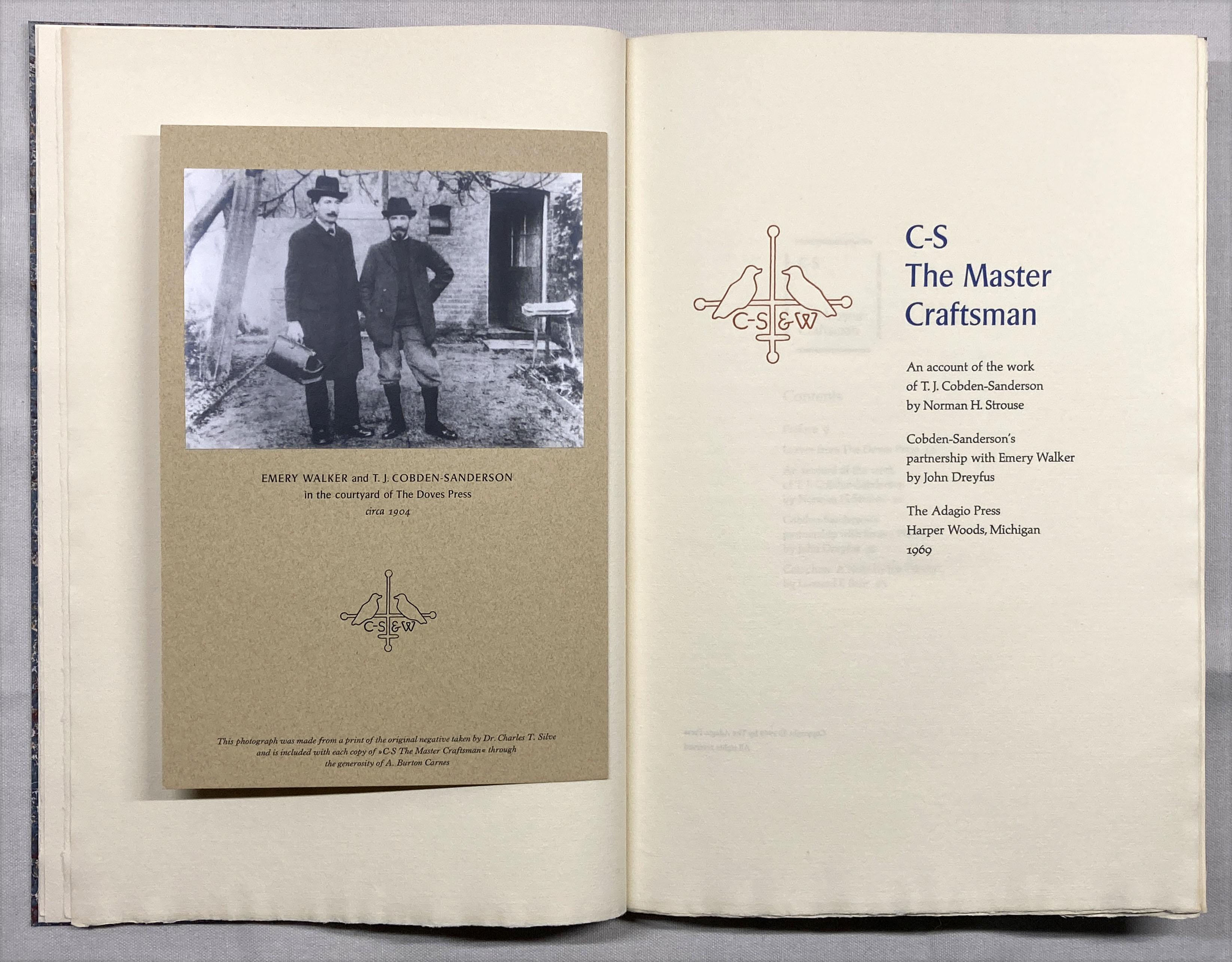

One of the things I didn’t like about the book as issued was the inclusion of a sheet with a photo of C-S and Walker tipped on. (C-S always looks like an insufferable ponce.) This sheet was simply laid into the book. I suspect it might have been an afterthought. I really don’t like books with items laid in (unless there
s a box, and even then...), so I mounted the sheet in my copy opposite the title page. 
 

There were 10 copies  “retree” copies bound up at some time by Campbell-Logan. My copy includes the little slip inserted identifying these as such, so I guess my copy was part of that exercise (i.e. an extra set beyond the 10). I annotated it so as not to defame Campbell-Logan.

AND ANOTHER THING!


Before I got to the binding, I printed the seven sheets that make up the text for Byzantium’s upcoming book about marbling on different papers. For the title page Barbara marbled the sheet, leaving a blank area for the text. She used acrylics so I was able to dampen the sheets for printing (as I did with all the others) without everything running. Each copy will include original marbled samples on at least 51 different papers, grouped by type (handmade, mouldmade, machine-made) and source (Western or Eastern). I believe the edition of 17 copies, uniformly bound by Claudia, will be ready for issue in the fall. 

This month I start printing the next HM book, which also should be ready for publication in the fall. 

Last months Agrippa symposium in London has sparked some requests for copies of HMs About Agrippa. The edition was exhausted some years ago, but Im considering a second printing. If interested send an email please (address at right somewhere).

Next month Ive lined up another guest, Will Rueter, who will share some details and images about what will be The Aliquando Press final book, and an updated bibliography. 


5.6.19

An Interview with Martin Jackson


Extending the fun we had working together on HM’s latest publication, The Kelmscott & Doves Presses, Martin Jackson kindly agreed to an interview via email. (In person our conversations are too fast and inclined toward tangents to yield a cohesive interview…). While much of the focus in that book is on the original leaves from the two presses included, it’s Martin’s calligraphy that gives it a spark of contemporary life. The images included with this post are of various trial and test sheets he made during the project (except below, which is from BRC's film).


There’s a short film  by Black Rhino Collective featuring you and your work. In it you mention that the calligraphic spark for you was seeing a letter written by an uncle, and being intrigued by how beautiful it looked. Where you already attuned to reading and writing and designs at that time?

The letter from my Uncle Geoffrey when I was fourteen certainly was the trigger, prior to this I had no awareness of calligraphy, but I had always liked drawing, art was my favourite subject at school.

It is true that initially I copied this letter using an ordinary fountain pen, this gave me some of the ‘italics’ flavour, but there was something missing, but it did become my everyday writing style.

It was a couple of years before I found a small book by Tom Gourdie, I think it was called Italics for Beginners. In this book I discovered one needs a special type of nib that is cut square at the tip, we call this a broad edged nib, it is this feature that allows us to give our letters thicks and thins. What a revelation this was, it was magic.


When did you first study or train in calligraphy? How did it become your vocation?

I have never had any formal training in calligraphy, and it was never my intention to make it anything more than doing something that gave me great joy and satisfaction.

I got my first job (1956) as a junior in a design studio entirely on the strength of my handwritten job application letter, my style of writing set me above any of the other applicants. I worked in this studio for five years while also attending design classes at the Sheffield School of Art. All the senior designers in the studio were skilled at almost everything: design, retouching, lettering, typography etc., I learned so much from them, particularly hand lettering, and the love of type and letterforms, but I also became very good at making tea for them twice a day, a big part of my training.

After this (1961) I had to do two years of compulsory National Service in the RAF. Not fun, but I did get lucky to be posted to the Royal Air Force Design and Display Unit in London.


After these two years I found a job in a small ad agency studio in the south west of England, until they eventually went bankrupt, and in 1966 my wife, Patsy, and I decided to emigrate to Canada, about which we knew very little, having no idea about job prospects, or even knowing anyone here. I found it very hard to find a job, so in desperation tried freelancing. It took some time but eventually I found some clients, one of my strengths being hand lettering and the occasional piece of calligraphy.

Then in the ’70s calligraphy caught fire in California and Oregon and eventually it arrived in British Columbia. Reed College in Portland was a major centre due to two teachers: Father Edward Catich, THE expert on Roman Capitals, and Lloyd Reynolds, an early calligraphy pioneer. Soon after Vancouver caught the calligraphy bug, and instructors were few, and in great demand, so there was lots happening for me. Soon after I spread my wings and began teaching workshops all over the U.S., and also to Australia, Belgium, and Japan.


For our Kelmscott & Doves book, you started by preparing about seven different calligraphy styles. Unlike the calligraphy that appeared in Doves books, the scripts you proposed all were what I would describe as more obviously calligraphic – more obviously written with a pen than drawn (or engraved). Do you recall why that immediately felt like the right choice for the book?

Choosing a style for your book was a challenge. It would have been so easy and too obvious to take one of the beautiful ‘Kelmscott’ typefaces and give it a calligraphic slant, so I decided to give you various different styles to try to find a direction that was pleasing to you. Also, I was always aware that I would be hand writing these letters many time in many books, so it needed to be a style that could be written quite flowingly without having to go back and build up letters or adding too many little extras. Fortunately when decision time came we were in agreement about the final choice.

This style was loosely based on some letter samples a friend in Belgium sent me, from a workshop he had taken with the very talented calligrapher Brody Neuenschwander. It has no name.

A few people have asked me for some technical details on materials used…

The red colour is Holbein Pure Red gouache, which I bought in Japan. I mixed this with distilled water to a consistency that would allow it to flow easily through my pens. The nibs used were Brause, and Mitchell, in various sizes. The gilding is 23.5 carat gold leaf on a gum ammoniac base, applied using a goose quill and burnished with a dog tooth agate burnisher.


Could you describe one or two challenges – in conception or execution – that were unique to this project, and how you approached them?

Any challenges were mainly physical. The sheets were quite large [folios 20 x 15 inches] and I built an extension on my drawing board to accommodate them. I was terrified of putting a crease anywhere, so each time I  finished one spread I had to find somewhere to put it while the ink dried, and making sure they were always in the same sequence, every flat surface in my studio, floor, tables, desks etc were put to use.

Without any doubt this was the most enjoyable project I have ever worked on, for many reasons: You (Rollin) were so open to suggestions and we were able to work together so easily. The paper [Arches wove 120g] was amazing, it was a joy to write on, I was never fighting the paper. And there was no pressure, the deadline was very generous, and with every project there is a budget, and you never questioned my estimate.

Your approach to this project was perfect. You allowed me to make suggestions based on my calligraphy skills about what might or might not work, working together on the timing, keeping me informed so I could make sure I could set aside time for the project, it was all very reasonable and civilized. I would be very happy to work on any project working this way.


Why do you think that revival of calligraphy started in the ’70s, and what place, or role, do you think it has in contemporary design and art?

There has been a fairly strong calligraphy movement in England ever since Edward Johnston ‘rediscovered’ the craft. His monumental book, Writing & Illuminating, & Lettering, which was published in 1906 became the ‘Bible’ for calligraphers, although William Morris also ‘revived’ the craft and was a pioneer in using calligraphy.

In the U.S. there were also some fine calligraphers working, but they did not have such a high profile as in the U.K. It is difficult to determine exactly how and why and when it caught fire in the U.S. It came along at the same time as other crafts such as leather work and macrame etc. became popular, maybe this was all part of the ‘hippie culture’ in the ’70s and ’80s. I do know that when Donald Jackson, the ‘Queen’s Scribe’ made his first visit to the U.S. it brought about a huge response, and I think this may have been the catalyst.

I am not sure if calligraphy has much of a part in contemporary design and art. It’s still associated with something like ‘Auntie Pamela’s knitting class,’ i.e. it is just a little hobby. One very talented and well known calligrapher said that “the word calligraphy is pure poison in the arts community.” He may be right.


I’m not sure what the project will be, but I look forward to working with Martin again.

1.6.19

What? And, Why?


I have an interview with Martin Jackson, about his career and work as a calligrapher, for this month's blog post, but we're just putting the final polish to it; as a placeholder, I present a short bibliomystery...


It was discovered in a recently published book someone brought home from the library. Page 303 has what I initially thought was a cancel inserted, but the verso (page 304) actually is cut about 1 cm short (the cancel is cut to the proper depth). The stub is adhered by a wide strip of rust-colored adhesive tape. A cencel in a modern book would be unusual enough, but peeling the stub back shows that there is nothing printed beneath - no text to cancel.


Then we discovered a similar stub on the leaf with pages 281/282. That leaf also is cut about 1 cm short, and presumably might be the conjugate to leaf 303/304? (Naturally, the book is perfect bound, so it's difficult to tell where a section starts and ends.) The stub is the same height as the other, but the adhesive strip is differently placed (see image of the closed book's fore edge at bottom).


But here's the weirdest part: the paper was like this when it went though the press. You can see the line of text printed across the overlap of the stub on leaf 281/282. Is this simply how one roll of paper is spliced to the next for offset web presses? If so, why doesn't it appear in the whole section of this copy? Something to ponder while waiting for Martin's interview to go up.


2.5.19

That's All She Wrote


The 20 "written" copies of The Kelmscott & Doves Presses shipped out from Claudia Cohen's bindery this week, and I saw the finished piece for the first time just like everyone else. She and I had had long discussions about aspects of the structure, materials & overall design, but she always has a degree of freedom with these projects to proceed as she deems appropriate ‑ there’s not much point in working with someone like Claudia if you don’t take advantage of her opinions and inspirations. My main direction was that I wanted the binding to be muted and light in appearance, to contrast the large format. 


These copies are quarter-bound in vellum, the sections sewn on vellum slips which were then laced through the vellum spine. The boards are covered in a subtle paste paper Claudia made for the project. The tooling on the front board reflects parts of Pollard's essay, about page proportions. The endpapers are Japanese echizen metallic silver, with a red leather hinge. 


In addition to adding all of the calligraphy to each of these copies, Martin Jackson signed the colophon. They also include the liveliest Kelmscott leaves from what was available. The book is issued in a box covered in light gray Japanese cloth, edged with the echizen.


With these copies now distributed, the project is truly completed (and happily, no copies of other issue remain available). I'll be spending the summer working on the Griffo project. Ciao.


29.4.19

(Come back later...)


This month's post will be up by the weekend; you'll see why then. (All is well.) Back soon...

3.3.19

Pollard Redux (& Again)


SO I was at the University of British Columbia library last month, doing some digging for the Griffo project. I always get distracted in the typography and history-of-the-book sections, just pulling off anything that looks interesting. That’s how I found the Monotype pamphlet shown here, featuring an essay by none other than Alfred W. Pollard, recently featured in HM’s newest publication.


Couple of interesting things:

First, this is a promotional pamphlet for the Centaur and Arrighi types. When I was designing The Kelmscott & Doves Presses, the question of type proved particularly tricky. As anyone familiar with HM books probably knows, I am happy working with a small repertoire of types (& find people who raise type above all other elements of a book wrong-headed, and generally dull). Whatever type I used for the book had to suit the two very different types on the Kelmscott and Doves leaves to be included. It also had to work with the calligraphy Martin Jackson and I had planned. I tried about a half-dozen different faces (including my favored Dante), in various sizes and leadings. Despite feeling that Centaur seemed an overly obvious and safe choice, it was the face to which we kept returning.

Second, both the content and structure of the essay in this pamphlet are remarkably close to the one reprinted in the HM book. That essay was originally written for the 1921 catalogue of William Clark’s Kelmscott and Doves collections. An unkind person might suggest Pollard got paid twice for same essay. I try not to be unkind.

Finally, it’s interesting that his essay, however recycled it might be, was used to promote Centaur and Arrighi. Pollard must have been whispering in our ears when we were looking at the mock-ups. 


1.2.19

All Lined Up


If only for my own future reference, here’s a quick look ahead at what HM will be up to over the next 12 to 18 months…

I’m almost finished casing in copies of The Kelmscott & Doves Presses. A few of the “Printed” issue will be on display with some of our booksellers at the upcoming Oakland, Pasadena and New York book fairs. Vamp & Tramp will have a special copy on display at CODEX: it contains a copy of the title page with original calligraphy by Martin Jackson, as it will appear in the “Written” copies. Those are currently being bound up by Claudia Cohen: quarter vellum, sewn on slips laced into boards covered with original paste paper that has been tooled in gilt. We expect the “Written” copies to be ready in April.


While Claudia finishes the bindings, I will have started printing her next collaboration with Barbara Hodgson, PatternPattern. The book explores traditional and modern systems of analyzing symmetrical, decorative patterns. These systems — grid, proportion, tessellation, symmetry, motif, and style and culture — will each be introduced in a brief overview and accompanied by illustrations, most of them examples hand-drawn by the authors. The focus will be on design development, progression and variety, emphasizing the possibilities for infinite interpretations of basic styles.


The book (9 inches square, 51 pp.) will be set in Fournier, printed with the handpress on dampened Arches paper, and issued in an edition of 30 numbered and six H.C. copies. Copies1-10 will be extra-bound and include additional samples. As usual with their books, the extensive drawing, colouring and tipping-in will take a few months after printing is completed. Publication is scheduled for the end of 2019. A mock-up, with 8 pages of sample text and illustrations, will be on display with Vamp & Tramp at CODEX.


It’s fitting that I’ll be printing PatternPattern, as it will be the final publication from HM Editions. That imprint was initially conceived as an outlet for working with people who had projects I found interesting, but not the means to get them produced. When it was started there were lots of people with interesting ideas around, but I haven’t been encountering them in recent years. Barbara & Claudia haven’t actually needed my assistance in ages, so there really isn’t any reason to keep the parallel imprint going. They will continue their collaborations under their own imprint, and we’ll all still be in each other’s business. Nothing’s really changed except what appears on the title page.


Printing PatternPattern will take about three months, during which time I’ll also be working with The Aliquando Press’s Will Rueter to prepare a collaboration of our own. It will be the second in what I hope will be a short series of calligraphic books that began with Francesca Lohmann’s An Alphabetical Accumulation. Will’s book will present a series of bookish quotations (about 15), each rendered calligraphically by him, in a variety of styles. (Shown above is the piece he included in deluxe copies of Pressing Matters.) Each quote will be printed on a recto, with some elements then added by him, so every page will combine printed and original calligraphy. At this time I’m expecting to have the book printed by the fall; he’ll then spend a few months adding the calligraphy, and then the sheets will go to Claudia Cohen for binding. So, a spring 2020 publication? The edition will be 36 copies, uniformly bound.


Before this year ends, I hope to begin printing the second, expanded edition of Fragments & Glimpses, the biography-in-quotations of Aldus’s typecutter, Francesco Griffo. I’ve spent the past year gathering source materials that weren’t available to me when I did the original (1998-9), which will be added to the text. I also intend to include reproductions of specific books and types referred to in the text, and I found leaves from a copy of the 1502 Ovid (Heroidum), which was set in Griffo’s original italic type, and will be including these in a special issue of the book. Publication will be some time in 2020.

8.1.19

Written & Printed


January will be spent sewing copies of The Kelmscott & Doves Presses, and putting them into cases. Much of December was spent figuring out the fussy details and painting the papers that will cover the boards.


Because the book has such a large page, but is not terribly thick (it's 28 printed pages, seven folios), I was concerned that it might be bendy across the horizontal. I was also concerned that the size of the boards might make them tend to bow as they dried (a little concavity can be tolerated, but not too much, and certainly not any convexity). Too often books are bound (cased) with boards that are too thick - one should use the thinnest boards possible. To avoid the warping problem, I got thin boards and laminated two pieces together, making them more rigid. This and a well-lined spine solved the issue of bendy books.

The board papers were painted with two layers of acrylic wash, black over a metallic blue base. The endpapers were stained with a diluted pearlescent white.


The two sample leaves were adhered to hosho hinges and sewn in, leaving them secure and easily turned to view both sides.


While I was figuring out the cases, Martin charged ahead and got all the calligraphy for the 20 "Written" copies completed. The title and opening pages are shown at the top of this post. The pages he completed by hand look simultaneously exactly like the printed versions (because the lettering is the same), and entirely different (because they're written, not printed). There really is nothing like having original calligraphy combined with type on the printed page.


The Written copies are now with Claudia Cohen, and will be getting bound up over the next few months. I'll be holding off issuing copies until all are ready, but a few of the "Printed" ones (i.e. cased at HM) will be on hand with booksellers at the upcoming book fairs in Pasadena, Oakland and New York. There will also be a special copy on display with Vamp & Tramp at Codex, containing a copy of the title page written out by Martin.


Anyone interested in reserving a copy of the book should contact one of HM's regular booksellers listed at the top right of this blog.

30.11.18

Calligraphy, Printing & Books


https://www.blackrhinocreative.com/video/creative-mornings-profile-martin-jackson/#

To end the Year of Wither, an update on the Kelmscott & Doves leaf book project, followed by some seasonal gift suggestions for the bibliophile in your life. Bibliophiles, if you’re lucky. If you don’t have one, much less several, feel free to purchase any of the items in this month’s post & have them shipped to HM….


Last month I spent a few hours on a rainy Sunday sorting the Kelmscott Golden Legend and Doves Bible leaves to be included in the next book. Looking at an unbound or broken book is different than flipping through a bound copy: some aspects of the printing and setting stand out in ways they wouldn’t otherwise. For example, the Kelmscott printing isn’t actually that great - the inking is inconsistent, tending toward too much. The Bible is much more consistent in its printing, but one thing that struck me is Cobden-Sanderson’s type doesn’t really suit a book the size of his Bible (large quarto). In the essay by Pollard included in the new book, he comments on the type’s readability: “…I must confess to being unable to read more than twenty or thirty pages in the Doves Press type without feeling perceptibly chilled.” The Bible pages are dense, the lines are long, and the text is already somewhat impenetrable. The type is perfect for the octavo format employed for most Doves books, but on a Bible page I started noticing qualities of the majuscules that looked odd. The H in particular sticks out, like a sort taken from the wrong type case.


The batch of Bible leaves I found were from volume I, infamous for the unspecified “paper flaw” that resulted in so many of those copies looking like they’d been dipped in tea. Luckily none of the leaves being used for this leaf book are afflicted: they’re all lovely examples of the Doves watermarked handmade paper.


Printing of the book was finished in mid-November. The 20 copies that will have all of Martin Jackson’s calligraphy actually written in are with him now. He did the colophon for the entire edition first, so I can get to work on the 30 (printed) copies that will be cased here while he’s working on the calligraphy. The image above shows (top) a sheet with the initial letter printed with (below) one added by Martin, both of them editioned by him. Claudia and I are still discussing design ideas for the copies (with Martin’s calligraphy) that she’ll bind. A printed copy of the book, along with one page of Martin’s original calligraphy (probably the title page) will be on display with Vamp & Tramp at Codex, next February. With luck Claudia could have her copies completed by March, so we’re on track for an early 2019 issue.

https://www.hordern.com/pages/books/3805638/william-shakespeare/the-works-of-shakespeare-the-text-of-the-first-folio-with-quarto-variants-and-a-selection-of-modern

 Pollard’s essay in the new HM book starts with a brief discussion of why neither the Kelmscott nor Doves presses could be considered private. For many people the term “private press” has come to be synonymous with “fine press,” which gets me to my point: How is it that some people include the Folio Society in discussions of fine press publishers? For the past 100 years pedants have been tying themselves into all kinds of pretzels while crafting criteria that suit their agendas for what it & is not a fine or private press, but none of them could be looped & twisted enough to include the Folio Society. It’s a book club that issues hardcovers made with slightly better-than-average paper and cases, on par with Heritage or Easton! (And what’s the difference between Easton and Franklin Mint? The books look the same.) There’s nothing wrong with that, but don’t pretend it’s more than it is (I don’t believe the FS itself has every made claims to being a “fine press”). If you want a well-printed Shakespeare, check out the Nonesuch seven-volume set issued in 1929. Understated elegance in design and production, the books are a joy to hold and read. The Strand seems to have two sets on offer right now…


Will Rueter, over at The Aliquando Press, has just finished a new book that nicely overlaps with HM’s own current production: A Visit With William Morris is a “reconstructed interview taken from essays printed in the Pall Mall Gazette of 1891, the Daily Chronicle of 1893, the English Illustrated Magazine of 1895, and Bookselling of 1895.”


The edition of 40 copies (41 pp, approximately 12mo in size) was set in Jim Rimmer’s Nephi Medieval and Tell Text 5 (a copy of the Chaucer type), printed throughout in colour - the title page in seven colors. The four signatures are sewn on tapes and laced into a limp “saddle back” binding, covered in chiyogami paper, with a paper slipcase. An exuberant example of The Aliquando Press’s distinctive style in every way, and a bargain at C$150. To order contact Will directly (dovecotte@cogeco.ca).


That’s one for Morris, now one for C-S: John Howell for Books had this beauty on offer at the Seattle book fair. Remarkably it remains available…

COBDEN-SANDERSON, Thomas James (1840-1922). The Book Beautiful. [San Francisco: Printed by John J. Johnck, Lawton R Kennedy, Samuel T. Farquhar for the Roxburghe Club, 1930. 8vo. 7 3/4 x 5 1/2 inches. 14 pp. Beautifully printed on vellum; text clean, unmarked. Bound in full gilt-stamped vellum; binding square and tight, light soiling and tanning to the covers, rear paste-down coming up on the fore-edge. With the bookplate of Carl I. Wheat on the front paste-down. Very Good.
LIMITED EDITION, this is copy number 6 of 85 copies, being 1 of 10 printed on vellum. This volume was prepared as a keepsake for the October 29th 1930 dinner honoring William Edwin Rudge and George W. Jones held at the Fairmont Hotel. T. J. Cobden-Sanderson’s text regarding the elements that go into creating an ideal book was an inspiration to many American fine printers in the first half of the twentieth century. It received many treatments over the years, but few can rival this lovely setting printed on vellum. Samuel Farquhar’s copy, Number 1, on vellum, is at the Clark Library in Los Angeles. PROVENANCE: Carl Irving Wheat (1892-1966) was a California lawyer and historian and a historical cartographer of the American West. Wheat was a member of San Francisco’s Bohemian Club and participated in the resurrection of E Clampus Vitus. It was Henry R. Wagner who introduced Wheat to California history. Wheat moved to Los Angeles in 1893; it was in Los Angeles that Wheat issued most of his work on California history and the cartography of the American West, including Mapping the Transmississippi West, 1540-1861, which appeared in 5 volumes between 1957 and 1963.

John has lots of cool books, and this one is a STEAL at $1,500. I seriously considered stealing it myself, but I’m saving up for the new 2019 all-black Vespa. If you have one Vespa, you may as well have two…


I stumbled across a recent (2016) publication of a HP Lovecraft short story, by an American press I wasn’t familiar with, Amy Borezo’s Shelter Bookworks. So many of the people who publish (and purchase) Lovecraft default to the lurid aesthetic of EC Comics circa 1955. Borezo demonstrates the writer offers the potential for more subtle and abstract interpretation. Based on her site’s description and images, this looks like a well-produced and engaging book. My only quibble is typographic: I don’t like the line spaces between paragraphs, especially for fiction. But overall the book, and especially its binding, looks lovely. This mention is, however, a bit of a tease, as no copies seem to be available. I think the issue price was $350, which seems like a bargain for this book. Lux Mentis had a copy listed at $500 as recently as a month ago, but it’s gone now. Keep your eyes peeled (but not in the lurid, EC sense)..


Here’s an early Christmas present to myself (because who’s going to even know I want it?): Antoine Renouard’s history of the books published by Aldus and his sons. This is the second edition of 1825, which added some wonderful facsimile plates of types and manuscripts in the third volume. Of particular interest with this set is a note added to the front flyleaf of volume two, stating the set was “hand bound by John H. Nash for Mr. W.R.K. Young.”


According to the transcript of an oral history with Oscar Lewis (a great read, BTW), Young was an executive with the C&H Sugar Company in the 1920s (and probably before then), and an early president of the Book Club of California. He seems to have been an active collector and bibliophile, based on the material included in the Online Archive of California. He was married to Belle McMurtry, who Lewis describes as a “very able bookbinder,” which makes one wonder why she didn’t bind this set; maybe they predate her binding work. So Young and Nash were in the same orbit, which lends some credence to this set’s claim. Plus I bought it from a San Francisco bookseller. It’s interesting to me because I have not previously seen any mention of Nash doing any binding work. The books are providing some helpful material for next year’s Francesco Griffo project…


Last year this blog posted some Desert Island all-time top-ten album lists from fellow printers and publishers. Because printing and music go hand-in-hand, this year I’ll simply list a few people who were new & notable on the HM playlist in 2018. Thanks to all the regular visitors of this blog - there’s some interesting project news planned for early next year, so keep checking in. Pax fucus
Sarah Davachi

Jannick Schou

Olan Mill

Listening Mirror

Kwajbasket