29.12.15

A Sharp End for the Year


I'm on vacation so don't expect a lot of blogging. Couple of sharp Xmas highlights:


Handmade Merchant & Mills draper's scissors, perfect for the bindery. Beautiful. But being a custom enterprise, M&M should invest a little more in the printing of their wrapping sheets & labels. Get some letterpress happening. I'm sure there's someone with a press in Sheffield.


One of Deejo's elegant pocket knives. I covet minimalist pocket knives, i.e. ones with the fewest possible parts, to slide unobtrusively into one's trouser pocket. The Deejos get about as spare as possible without being a fixed blade. Might get one of the larger models to use for slitting paper...


Happy New Year. If all goes well, HM will have a new Web site by the start of 2016. Only about a decade overdue. I'll also have started printing Harold's chapbook Sunblind Highway. His Vancouver gig rapidly approaches!

22.12.15

Escape velocity


Too busy for blogging this week. Just found out Xmas is on Friday, not Saturday as I'd been planning around, so bit of a scramble. During scrambles this broadside popped up from the mass of stuff. It was printed by a couple of friends c.2007 at the now-defunct Strathcona Press. They organized a small show of their broadsides, inviting a few people to write something about their connection to the land. Yes, they were hippy types, but I liked them anyway. I was surprised when I was included in the invitees, but wanted to reply and so this is the best I could come up with. Defying gravity seems a suitable topic at this time of year. Merry merry to all. 


14.12.15

Harold Budd in Print


Update: see the article about Harold & his Aurora Teardrops gigs in today's Guardian...

The next two projects in the press come from the pen of Harold Budd. This week he and  Bradford Ellis will perform at The Kitchen, accompanied by Jane Maru reading selected poems from HM's upcoming publication Aroura Teardrops. Below is a shot from their performance earlier this fall in Joshua Tree...


To mark the trio's appearance in Vancouver next January, HM will be publishing a chapbook with eight poems selected from Colorful Fortune, 4, Angel and Aurora Teardrops, plus two that will be unique to this collection. The book, titled Sunblind Highway, is offered as an introduction to Harold's poetry, and an affordable alternative to the more costly original publications for his admirers.

Sunblind Highway (6 x 10 inches, 16 pages plus cover) will be printed by hand, letterpress, at Heavenly Monkey, in exactly the same manner as Aurora Teardrops. One of Harold's distinctive arabesque drawings is reproduced as a frontispiece. The text will be set in Bodoni types and printed in two colors. The edition will be 100 numbered copies. The first 20 (Publisher's copies) will be signed by Harold & printed on Arches wove paper, sewn into a handmade paper wrap. Copies 21-100 (Author's copies) will be printed on Somerset Book paper, sewn into a stiff printed paper wrap.

Copies of Sunblind Highway will be available for purchase at the Vancouver show. Any remaining copies will be offered for sale; details to follow.


Aurora Teardrops (8 x 10 inches, approximately 80 pages) will be set in Cancelleresca Bastarda and Umbra types, printed on dampened Arches Wove paper. The text pages will also feature details from four of Harold's arabesque drawings, treated with color paint washes, bleeding off the edges. Inserted between text spreads will be full-page bleed reproductions of Jane Maru's intense and mesmerizing batik paintings, printed on semi-transparent vellum paper that replicates the original silk's quality of seeing the painting from either side.


We're particularly pleased that the new collection includes to include a two-page introduction by David Sylvian, Harold's friend and colleague. Written in David's characteristic evocative style, it is a beautiful encapsulation of the poetry and the poet.


Aurora Teardrops as described above will be published in an edition of just 26 press-lettered copies (plus 8 numbered contributor copies) signed by Harold and Jane. We do, however, have plans to to publish a second edition in a simpler format, but printed at the same time, the same way, from the same setting. While this edition will probably not number more than 50 copies, it will offer Harold's admirers a more affordable option for securing their own copy of his most extensive collection of poetry to date.

Aurora Teardrops is scheduled for publication in Spring, 2016.

7.12.15

Paper Beats Pixel


Doing some fall cleaning, largely a function of long, long overdue revamp (revivification?) of the HM Web site. Along the way I found a few interesting files, like the one above. No record of the original source, but I post it unattributed with the hope that the original authors would agree with the message being carried.


An unpublished arabesque drawing by Harold Budd, which will make an appearance in Aurora Teardrops next year. Did you hear that his gig at the Kitchen sold out in less than an hour?


This (below) is what Christmas looked like in our neighborhood this past week: Vancouver's first Yule Duel choir sing-off. Naturally the choir with HM affiliation took people's choice.


30.11.15

Aurora Teardrops, Live


We're still finalizing the setting & layout of Aurora Teardrops, the next poetry collection by Harold Budd, but he's already taking the poems on tour. The book, which promises to be on of HM's most colorful publications to date, will include batik paintings by Jane Maru (detail above). The two of them will be appearing on December in New York City at the famed Kitchen, for an improvised performance (by Harold) and reading (by Jane). They will also be appearing as part of Vancouver's annual PuSh Festival next January. I plan on having them sign the colophons for Aurora Teardrops when they're in town. More details to come.


This is why we need bookstores! You stumble across books you didn't know about, like this collection of provocative & engaging essays by Rick Poynor, Rules No More. One of the designers whose work is discussed is David Carson ("looks increasingly like a coruscating one-off"). I first encountered his design work in Ray Gun magazine in the early '90s. It ran some excellent articles, but they often were rendered unreadable, or at least undecipherable, by his layouts.


Another recent find, this odd book from Steidl. I think it basically is a facsimile of a unique manuscript copy, but the details in the book and on Steidl's site are fuzzy. A single sewn signature in a slipcase, it's a brief text by Keanu Reeves with drawings by Alexandra Grant. To be frank I could take or leave the content (written & visual). What caught my eye, in addition to the format, are the beautifully printed reproductions of monochromatic washes. I think it would have been improved by having the text set in type.

If you go on a bookshop tour this week, you might see a copy of a newly published paperback reproducing Jim Westergard's Oddball engravings. I haven't seen it, but I can confirm it is not a facsimile of HM's original publication. I'll try to get some news about it from Jim for next week... I'm not a fan of books that attempt to replicate one print medium with another (i.e. offset reproductions of wood engravings), but if it introduces a new audience to Jim's talent, that's a good thing.

26.11.15

A Flash of Red


XI LXIVMOS update: that's one of the deluxe copies above, being sewn up by Sarah Creighton. Check out the peak at Francesca Lohmann's calligraphy on the title page... All of the deluxe copies available from HM are reserved; Bromers may still have one or two available. We expect to be shipping them in early January.


Recently acquired a copy of Dard Hunter's Papermaking in India. It came with a pre-publication letter from the publisher, which was accompanied by a clipping from the New York Times Magazine from May 15, 1938. It's an article by DH about his trip. Kool. I'll post something about this book & its companion (Japan, Korea & China), specifically about the challenges of binding paper samples of different sizes into a book.


17.11.15

The Roman Empire All Stitched Up


Why buy an orphaned volume from an 1833 American four-volume edition of Gibbon's The History of the Decline & Fall of the Roman Empire? Especially one printed on such poor paper? Because of this map!


More precisely, because of the restoration done to the paper on the map's lower right corner (verso shown below)...


UNESCO's RAMP (Records & Archives Management Program?) site tells us, "The oldest method of repairing tears in parchment was by stitching, preferably using herring-bone stitch and twine, gut or in more modern times, nylon. However, this method is clearly not suitable as it involves perforating the original support and, despite the remarkable nature of some of the sewing, it is always an anti-aesthetic solution."

That last bit is much too dogmatic. For example, Sherwin Beach Press' edition of Ballet for Opening Day (2002) is one of the koolest books produced ever, in no small part because of the ingenious way they married the text sheets to the (different paper) etching sheets (I believe this was the idea of Trisha Hammer). Beautiful. One of the few remaining books on my Wish-I-Had list. 


9.11.15

Piling Up & Cutting Out


Entering a less verbal, more visual period for the blog ... Sheets for Barbara Hodgson's Mrs Delany Meets Herr Haeckel are piling up. Most (i.e. the ones shown here that are mostly border, with just brief captions at the bottom) will have her original papercuts mounted on them. Same for a frontis across from the title page.


She comes by once a week to pick up the latest batch, goes home & sets to the painstaking work of finishing & mounting the cuts.


Found this gem about rocks last week. Should probably go to Barbara's color reference library. We'll see. For now it's mine.


Not only is it a kool color-related book, it was printed by Enschedé! Sort of: I can't find anything in English that explains what Huyskes-Enschedé was, but it seems to have been some kind of publisher specializing in geological topics. In Holland with Enschedé attached, it has to be tied to the foundry somehow.


Barbara never reads this blog, so I have no fear about her finding out I have the thing & demanding I had it over. Same with Claudia.


Remember, if you're in LA tomorrow, that Barbara will be giving this year's Lieberman Lecture, talking about The WunderCabinet. Claudia, who claims she can't speak in public, will be hiding in the audience, no doubt piping up with questions & comments.

2.11.15

Just Say No to Perfect Binding


Last summer I spotted a spine that stood out from all the thrift-shop tattered & dull ones around it: Luna Bella Luna - A Portrait of Vesale, Italy (1997). It's fundamentally a book of photos - black & white, duotone & color - by Paul Elledge taken in the northern Italian city, with some fun typography and printer's flowers thrown in. Flipping through, what caught my interest was the imprint: published by Mohawk Paper Mills Inc. Paper companies have long sponsored projects that show off their products, but LBL is interesting for being a showcase also of printing and, more to today's point, binding.


The 96-page book employs five variations/kinds of Mohawk's Superfine paper (an admirable paper for this kind of trade publication, but its use in letterpress limited editions reflects a lack of imagination). It was printed at the Stinehour Press, and while the extensive colophon even includes details about the inks, there is no mention of who did the binding, only that the book is "bound by the lay-flat Otabind process. The ability to open this book at any place, and it will remain open, is due to advanced adhesive binding technology and a patented free-floating cover, of this type of binding."

I'd first read about Otabind on the site of Hyphen Press, an English publisher with a long list of interesting & beautifully-produced books related to typography & design. Even before the disappearance of bookstores, Hyphen's title weren't commonly encountered, and they tended to go out of print quickly. You had to look in shops that specialized in design, architecture etc. Most are issued in softcover (i.e. stiff wrap) with a printed jacket.


The Hyphen site includes a long article by publisher Robin Kinross about Otabind, written in 2007. In it he makes passing mention to softcover being his preferred format, but doesn't explain why. I share a fondness for softcovers if & when they are sewn, and especially when a jacket is added. Perfect binding is an abomination that should never be used. So I was surprised & highly skeptical when I read Kinross' article about Otabind, and the fact that despite relying entirely on glue to hold the pages in (like perfect binding), it also allows the book to open flat (which only happens with perfect-bound books when you crack the spine) without destroying the adhesive connection between spine and page. So, the Vesale book, found in a thrift shop for a few bucks, offered an opportunity to test Otabind's claims.


As Kinross explains in his article (and as a trade binder who offers the process also describes, here), the difference between Otabind and perfect binding lies in the type of glue, how it's applied, and the structure of the cover. Here's another article about it, from a Dutch design periodical (Works That Work) that switched to Otabind in 2014.

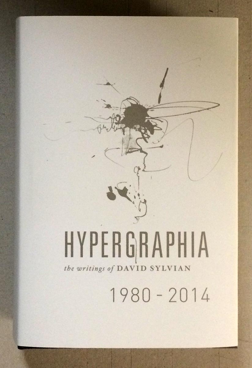
Interesting to note in Kinross' article that he seems to prefer a variation in which a book is still sewn, and the sections then glued-up using the Otabind process, which really just means the spine is lined (but with cold glue, leaving it flexible), as it should be anyway. Casing-in (whether in boards or a stiff wrap) still relies entirely on the pastedowns, which is asking quite a bit (e.g. like the topic of last week's post, David Sylvian's new 600+ page opus). The Vesale book, in comparison, had had the section folds sheared off - there is no sewing.


Having experimented with Vesale - holding it up by a single page, flattening it open in a manner that would instantly crack a perfect-bound spine - it does seem to hold up to the claims made for it. There are a few binderies in the U.S. that offer the proprietary process; none I could find in Canada. But I still disdain bindings that rely entirely on adhesive: it's lazy & inelegant. A sewn book can open flat when properly constructed (here's a tip - don't put so many sheets in a signature!).

So that's the story of Otabind. There really is no excuse for publishers to be using perfect binding. One way or another, sew your books.

The koolest Hyphen Press book I have is Morton Feldman Says... It's also one of the scarcest Hyphen titles. Not an Otabind (think it predates the imprints shift to the technique).

29.10.15

Hypergraphia, anticipated


It's not supposed to be released until next week, but my copy of David Sylvian's massive, beautiful, incredible new book Hypergraphia arrived via Royal Mail today. I've had a chance only to flip through it; what follows is superficial, except for the enthusiasm.

Sylvian's longtime designer, Chris Bigg, did a brilliant job with what must have been a mind-boggling amount of source material. Sylvian's art has always extended to the visual, both his own work and in collaborations with painters, photographers and graphic designers. The image below might sum up the degree of detail invested in the publication of Hypergraphia: the outside of the jacket is Sylvian's characteristic hazy cool, and the inside is also printed, with a contrasting collage of darks.


Look who appears neat the front of the book - Atsushi Fukui's original painting of "The Botanist," which previously appeared as a simple line drawing in HM's publication of Sylvian's prose poem Uncommon Deities (of which I still have one copy of, FYI...).


The book is published in an edition of 3,000 copies, and seems to already be nearing depletion. (Five hundred copies from the edition were signed by Sylvian and Bigg, & if you have one of those, call me.) It's priced just over C$100, which is nothing considering what producing the thing must have cost. (My only quibble is that the thing is so thick - over 600 pages of heavy coated paper - the text block is already straining from its case. Rounding could have helped tremendously, but who knows if that's even something commercial binderies can do these days.) Hypergraphia could genuinely be called an artist's book, a term I generally despise but which seems apropos here, in content & form. If you have any interest in Sylvian, 23 Envelope/Chris Bigg, or just kool things, hunt a copy down.

AND ANOTHER THING


Though it is dull & meager by comparison, I finally got around to printing the "jackets" for the 12 deluxe large-paper copies of An Anticipated History.


It's a lovely handmade gampi, with the printed title positioned to perfectly overlay the same line on the Roma wrap. Because the gampi is so thin, it's a little tricky fitting it around the book & getting it to stay in place - keeping the two lines in register - while sewing.


Here's the extra sheet included, with the leaf from a deluxe copy of XI LXIVMOS hinged to the verso.


19.10.15

Vintage Papers in the Stacks


Had to kill some time at the University of British Columbia last weekend. Went to the general stacks to peruse the "history of printing" section. In about 10 lateral feet of shelving was a fantastic cross-section of vintage European handmade papers, many used in relatively pedestrian books. For example, the above census of books printed by William Caxton.


A census basically is simply a list of all known copies in collections. The book contains about a dozen facsimile pages from Caxton books, primarily illustrating the different types, but after that it makes for very dull reading. Nonetheless, the publisher deemed it worthy of printing on a lovely laid paper bearing the watermark Chiers. That's the name of a river that passes through Belgium and France, but a lazy Google search turns up no specific references (there were numerous papermills along the river). Pulling out Le Clert's Le Papier is always fun, but shed no light on the question (probably because his book focuses on papermaking in a different part of France).


On another shelf I spotted some lovely deckles poking out from a tattered buckram case binding, inside which was a more engaging book than the Caxton census, printed on an even lovelier paper. H.C. Brooks' 1927 study of books printed by Giovanni Bodoni remains a primary resource on the influential Italian printer, in part because it was produced in a manner appropriate for the topic.


The bulk of the edition was printed on a handmade laid (vergata) sheet, but this copy is one of 50 printed on a opaque wove sheet with a hard, smooth surface (e.g. calendered) and a large gothic watermark (all were partials, along the fore edges). A few copies of this book are listed on Abe, but all seem to be from the main edition.


As shown above, the name of the recipient (probably a subscriber) was printed on the limitation page, and it gives this copy an interesting provenance. Winship was a famous American librarian and scholar of printing history. He also was a private pressman who published under the imprint Sign of the George. How his copy of Brooks' Bodoni got to Vancouver is a wonder (or not; bookseller catalogue issued some time after his death in 1952?).


The smooth Fabriano sheet shows off the facsimiles, some of which include intaglio illustrations, beautifully.


There's a brief section on types at the back, plus - for those of you excited by Barbarian Press' current fundraising campaign for their book about Curwen Press borders - a few pages showing samples of borders used by Bodoni. If you've seen the horrible Taschen edition of Bodoni's Manual of Typography, indifferently printed on blinding-white paper & stuffed into a case binding that isn't up to the task, Brooks' book is a balm for your eyes.


Both the Caxton & the Bodoni books are in the most mundane and purely functional case bindings that reflect exactly what these books are: reference materials. At the time they were published, handmade paper was sufficiently available and affordable that using it for a book was not a deluxe affair.

AND ANOTHER THING!
Barbara Hodgson has been invited to give this year's J. Ben Lieberman Lecture for the American Printing History Assoc! She'll be talking about her collaboration with Claudia Cohen for The WunderCabinet. She's an engaging public speaker, and this will be a rare opportunity to gain first-hand insight to their work. Claudia will there but I can't go: have to stay home & work at printing her next book...