Showing posts with label Cool stuff. Show all posts

3.7.26

Art vs Illustration (& etc.)

 
The past month has been so busy I forgot I had a July 1 deadline for this blog. I'm sure what follows will read like something bashed out in a hurry...

Most of the recent activity was related to issuing and shipping Sci-Fi Violence. Thanks to everyone who sent comments and thoughts about the poem and the book; apologies to all who didnt get a chance to order a copy. For those who responded to reserve a copy of the chapbook reprinting, its in the press right this minute, but Briony needs a month or so to finish the frontis. Copies will be ready by the end of the summer.

The next HM publication is in the pre-press stage. The artist has signed on and were finalizing things, foremost the paper(s) well use. I won’t share details of the who and what until its closer to publication, but I will share that the book feels like a complementary follow-up to Sci-Fi Violence in tone and ambiguity (although it is prose). Its a story Ive wanted to print for some years but only last year did the artist whose work suited appear. 
 

Beyond that, 
Im hoping to a series of books, each one a collaboration with an artist featuring new, small prints around some theme or topic or their choice. The format is entirely inspired by (copied after) Barry Mosers Cirsia. Intaglio prints will be featured but its not a requirement. There will be no text beyond a title page, a very brief introduction, and colophon. Each print will be presented on a recto. The editions will be small – probably no more than 30 copies – because the artist will be doing all their own printing, and uniformly bound at HM (that is to say, each edition will be uniformly bound, but series will not be uniform in size or binding).
 
 
On that point, a quick aside: I had an interesting conversation with an artist today (not the one wholl be collaborating on the new book) about how operations like HM approach the incorporation of art (i.e. prints*) to a project. If the word illustration is used in a books description, I think it says a lot about how much freedom the artist is given to respond to, or expand on the text. Ive never seen the point of inviting an artist to contribute, and then telling them what to do. I've also never been interested in publishing books with images that simply & literally illustrate what's happening in the text. There are logistical issues and physical parameters that need to be set down – e.g. page size, the number of prints, how & where theyll be inserted to the text block   all ideally decided in consultation with the artist. However, in terms of what their contribution – the art – ends up being, the publishers role is to pick the artist and then stay out of their way. I didnt see any of the prints, or even sketches, for Sci-Fi Violence until they all arrived, ready for binding. We discussed how many prints, the paper, and whether the double-page prints should fold out or be presented as two halves, but ultimately these decisions were hers. I can imagine instances when illustration is what the publisher wants, but in that case you dont need an artist. This is basically the story of Barry Mosers dis-satisfaction with his experience working with Andrew Hoyem on the Arion Moby-Dick. Ive always wondered if Hoyem didnt fully explain to Moser from the start what he wanted (historically accurate technical illustrations), or if Moser didnt fully hear or believe what Hoyem said. 

* Unless the original image matrix is digital (like Scotts were for Epilogue), photo-offsets and digitals arent prints, theyre reproductions. Combining letterpress with photo-offset reproductions seems contradictory. Unless its what the artist wants to do, in which case it might be interesting. But if the artist wants to do it because they dont know how to make actual prints, its just reproductions. 


I
ve also been pulling together items for the promised summer book sale on the HM site. Its gotten bigger than originally planned, for a few reasons. In addition to a group of books pulled off my own shelves, and a small group of HM titles (last copies mostly), there will be a number of HM titles from the library of long-time HM friend David Clifford, plus an interesting group of Aliquando Press books that fell out of Will Rueters move to a new studio. Ill be sending a notice out to the mail list when the sale pages go live (before the end of July). 

Finally, another conversation I had since the last post, about the phrase handpress, as in printed with a handpress: a handpress is a type of press wherein what
s being printed is inked by hand, rolled under a platen (by hand), and printed (by hand). A press operated by hand is not necessarily a handpress: a Kelsey or Adana tabletop, or even a C&P treadle, is not a handpress (even though the printer is risking their hand every time they feed a sheet into the clamshell). I guess a Vandercook with its inking unit removed (so the type is inked by hand) would be a handpress, but I dont think may people use Vandercooks that way. When all this started, I was offered a beautiful Korrex Nürnberg Hand press gratis but for reasons that remain vague, I wanted to print on a handpress. So I gave the Korrex away and spent loadsadough to buy my big ugly & beautiful green & yellow O-S. Life could have been so much easier with the Korrex, but probably less fun. Having said that, if anyones looking for a big green & yellow press, get in touch... 

Much of this post must sound dogmatic, for which I do and do not apologize. In pursuits like this, one needs clear definitions and opinions. I promise not to miss the October 1 deadline. 
 

1.4.26

Reg Lissel, Papermaker


This month HM is issuing Reg Lissel, Papermaker presenting a variety of his handmade papers, along with brief commentaries by him. The papers used to assemble the 20 sets were purchased when he retired from papermaking in 2013, a somewhat forced retirement sparked by a renoviction from his longtime living space and workshop in Vancouver's Chinatown. I bought most of what he had on hand at the time, a mishmash of different sheets from over the years, and put it all in a box with the vague plan of issuing them as some kind of record of his work. 
 
© Andrea Taylor 2008 
 
The following profile of Reg was originally written for the FPBA’s journal Parenthesis (No. 13, 2007). A slightly revised version was the first chapter of HM’s Elements in Correlation (2009). The sketch of Reg above was a preperatory drawing by Andrea Taylor, for a linocut included with that chapter. The paper for that book was the largest order I’d committed to at the time, and it took Reg about a year to make the hundreds of sheets needed. The sections below in italic are quotes from Reg. The sample booklets shown are from HM’s collection and date from 2000 to around 2010.
 * * *
2007: I FIRST KNEW REG LISSEL as a bookseller, in the early 1990s, a few years before he quit the business. It was his second storefront in downtown Vancouver. His first, in an even dodgier part of town, had been in the same building as Cobblestone Press, the printing shop of the infamous Gerald Giampa. Reg did not quit bookselling to make paper, but he started making paper when he quit bookselling.

When I was starting, there just weren’t that many papermakers around so I was working in my isolated little universe. I built my own moulds and my first beater. There were some initial fumbling attempts, recycling newsprint and stuff. Finally I got a book, The Art of Papermaking by Bernard Toale. It’s got so much great information, all the basic stuff for Western and Japanese papermaking. It let me see other papers and figure out how they were made, and it gave me something to aim for.
 

By 2001 I had printed a few books, even damping the (mouldmade) papers on a couple. Having crossed paths with Reg frequently since his shop closed I knew what he was up to. When I started getting ambitious and wanted to work with handmade sheets, I chased him down.

My first attempt printing text on Reg’s paper was a disaster, all of my own making. Printing on a Washington press, I was using four different batches of cotton paper, none of which damped particularly well (or rather, they damped too well). And so I learned the importance of size, what it does and why it matters. And here is the beauty of HM’s relationship with Reg: I went back and told him what had happened, and he understood immediately what the problem was. He made up a new batch, ratcheting up the internal size. Better, but still a bit too absorbent. He cranked it up again, and by 2003 we had a decent sheet that damped well and consistently.

But the surface was still very rough, fine for books octavo or larger in size, preferably with type no smaller than 14 point. Below that the paper’s texture took on too much prominence. This, Reg explained, was the result of the beater he was using, a contraption of his own fabrication...

Reg couching a stack of paper

I built the tub for that beater out of scraps of wood. I bought a motor from a scrap yard, and some pulleys and pillow bearings and a steel shaft. The roll was built out of wood too, with steel bars set in. I worked with that beater for about eight years. It did the job but it wasn’t heavy and tough enough to really deal with stronger fibers. It could beat cotton, but it took a long time.


The next breakthrough in what we christened HM Text came with the arrival from northern B.C. of a professional lab beater. It could beat the fibers much more thoroughly, resulting in a smoother sheet. Then, shortly after the first batches from the new beater were turned out, yet another plateau: the most gorgeous, crisp, smooth white sheets imaginable, the result of a tweak to the recipe and a refined drying technique.

The first HM Text paper was just pure cotton with size in it, made with the old beater, & the paper’s a bit soft. The new beater beats the fiber much better, so it makes a crisper, denser paper. The latest batches of HM Text have some titanium oxide, kaolin clay and chalk added to the cotton pulp. It makes the paper more opaque and acts as a filler, so the paper is really smooth. I also added a step to the drying: I cold press and then let the sheets air dry for about two hours – just laid out, maybe two sheets together, turned after an hour. I let it dry in the air a bit but before it starts to shrink, I restack and give it a couple more heavy pressings. I’ve always been cold pressing and then just air drying, without the extra pressings. That extra stage of letting it dry and then pressing makes the sheet even smoother and denser.

The arrival of the beater in 2004, and a visit that same summer from Claire Van Vliet, resulted in another breakthrough sheet, what I call Reg’s vellum paper. It is a sheet that feels and acts like vellum. He can adjust the translucence and tone, from white to dirty old mottled parchment, in the pulp. The stuff is incredibly tough and makes beautiful limp vellum-style bindings.

Claire was inspiring. I really enjoyed the lecture she gave when she was in Vancouver. She was giving a workshop so I stopped by one day, and she was very generous with her time. She showed me the abaca vellum she’d been making and it inspired me. I knew how it was done, so I just had to try it. That was around the same time I got the new beater, so I had the equipment it required to beat the fiber stuff for three hours. It’s the long beating time that results in the paper’s translucence. I just wanted to make it. That’s the real appeal for me, the beauty of the paper. Sometimes it’s an experiment to see what a certain fiber will result in. But mostly going for a certain paper is just to see the beauty of it. I enjoy the process, the movement, the rhythm, the physical work. Making the same sheet consistently.

2026: EPILOGUE

Vancouver’s Chinatown is on the eastern edge of the downtown core, and is one of the oldest in North America. It also abuts the Downtown Eastside, which has the dubious claim to being the most destitute urban neighborhood in Canada. While Chinatown enjoyed a vibrant community and culture for most of the 20th century, by the 1990s it was becoming run-down and somewhat grim. Its proximity to the downtown core, however, makes it appealing to commercial and residential developers, and tension has grown between the established Chinese community, advocates for the Downtown Eastside, and proponents for civic revitalization.

Many of the buildings in Chinatown are owned by non-profit benevolent associations, and for many years Reg lived in one of these. It was pretty run down, but that meant it was affordable. In 2013 he was notified the building would be renovated. While his apartment was being done, he moved to a space on the opposite side of the building. That lasted for about six months. When his place was ready, he couldn’t afford the increased rent. Not only did that mean needing a new home, it meant the likely end to his papermaking adventures.

By that time the physical demands had worn on him, and in some ways he was ready to hang up his moulds. With a few months’ notice, he sold all the paper he’d stockpiled (as much as I could afford to me!), some early pulp paintings, and most of his equipment.

Wood engraving by Shinsuke Minegishi on gampi made by 
Reg Lissel, from Good & Evil in the Garden (HM, 2003)

The next year was not easy for Reg, as he looked for a place to live in one of Canada’s most expensive cities. Papermaking was not on the agenda. During all this HM had moved as well, to Strathcona, a neighborhood just east of Chinatown. It’s one of the city’s oldest neighborhoods, and enjoys a more eclectic range of residential architecture and people than is typical for Vancouver. Across the street from our new home is a Ukrainian community hall adjoining a three-storey apartment building for people of a certain age. By luck, chance and the lobbying efforts of friends, Reg got an apartment there, and since 2015 we’ve lived across the street from each other. I often see him walking to or from the community garden, where he has several plots that occupy most of his free time. He’s always liked to cook, and obviously has a fondness for plants, so it comes naturally.

Reg giving a papermaking demo at a community event (2016)
 * * *
Reg Lissel, Papermaker (HM, 2026) is issued in an edition of 20 sets (18 for sale). Each set includes 23 different sample sheets (13 x 18 inches). Most of the sheets are presented as folios (i.e. folded); a few sheets in short supply are presented as single leaves. Reg contributed brief commentaries about the stages of papermaking, from choosing fibers through beating, forming and drying. HM wrote a brief introduction and note about the ongoing collaboration with Reg to perfect a white sheet for printing damp.

The text was set in Optima with Huxley Vertical for display. Most of the sheets where dampened for printing. The colophons were press-numbered and signed by Reg. The sheets are presented loose, in a clamshell box, to allow for each to be held and closely examined. The boxes were made at HM, using four different colors of Japanese cloth, with painted paper for the trays.


1.1.26

What Was, What Is & What Might Be (’25/26)


Looking back at ’25, the project with Scott Morgan hadn’t even been conceived at the start of the year. It was fun working with him and I’m better-than-usual pleased with our effort. (Thanx to everyone for not mentioning the typo...) The covers for the book rekindled my interest in airbrushing.* I’d like to do some more intaglio work with his photos, we’ll see. 

* Speaking of airbrushing, Barbara & Claudia will be working on a book about stencils (maybe 2027?), with lots of Barbara’s original designs airbrushed in. Here’s one:
 

The Wisso Weiss pamphlet was fun though I still think the blue text paper was maybe just a little too transparent. 


I don’t buy many books these days – I’m more focused on shedding possessions (anyone interested in a large Ostrander-Seymour handpress, please get in touch...) – but I did get a couple over the year, all of them previously unknown to me. One was an Elston Press collection (1902) of three talks by William Morris on early (gothic) woodcuts and woodcut books. I think the text is much the same as the Kelmscott’s German Woodcuts (1898), but with fewer facsimiles. It’s my first book from Elston, which was hugely influenced by Morris but it seems in good ways – a focus on fundamentals like materials and execution, but not on horrible vines and gothic letters everywhere. 


I could afford this copy because it appears to have been found under a leaky basement sink. The boards (shown above) were ruined and the spine decayed but the textblock was fine. I managed to separate it from the boards and spine 
 and preserve the original owner's signature and bookplate!  and resew it. I decided to put it in a limp vellum binding rather than attempt a facsimile. This required much less intrusion to the textblock: I simply used wheat paste on the spine and outer edges of the pastedown sheets, so it can all be easily undone one day. 


The most recent acquisition probably will form the basis for a project in 2026. It’s a portfolio issued in Lausanne in 1944 by Jacques Chevalley, launching his new enterprise as a paper dealer. He commissioned a short text from Charles Ramuz, and four large wood engravings by Henry Bischoff
 

The edition of 50 copies was issued loose in a portfolio. The text paper is from the Guarro mill, the same mill that produced the paper used for many HM books over the past 15 years. I’d never heard of the thing until I happened across one of the engravings in a catalogue. 
 

It’s not rare, there are a couple of copies out there, but they’re pricey (mine was very much not) and none are in good condition. I’m thinking of printing a translation of the text (which as far as I know has not appeared in English) with facsimiles of the engravings. I want to find out a bit more about Chevalley: it seems his father had been a stationer, but Jacques didn’t stick with it long, as most of his life was spent working as a museum curator. Even in Switzerland, 1944 seems an odd time to be launching a business selling specialty papers. 

Here’s what 2026 is looking like for HM...


The text sheets for Sci-Fi Violence were printed last spring. I hope I remember where I put them. The colophons have been travelling to Vermont and Boston, for the artist and poet to sign. I hope they don’t get lost. Briony’s show last year took more of her time and energy than she’d anticipated, which is why we pushed publication of Sci-Fi back. There’s a lot of printmaking involved: five double-page internal prints (approx 10 x 16 inches) plus one being added to the title page, and the sheets to cover the boards. She’s been at it for some time now, and posted some excellent videos on Instagram detailing aspects of her process. The current schedule is for the prints to land in Vancouver at the beginning of March, and the binding to be completed by May. Even though I haven’t solicited orders yet, I can see demand for the edition of 26 copies will exceed supply.  


While Briony’s finishing the prints, I will be printing sheets for a sampler of Reg Lissel’s handmade papers. When he quit/retired c.2014, I bought most of what he had left, and ended up with a lot of diverse sheets. We have enough to assemble 20 sets (18 for sale), each with about 20 samples. Most will be full 13 x 18 inch sheets folded once (i.e. a folio), a few will be half sheets (i.e. leaves). They’ll be issued unbound, probably in a clamshell box, to allow for close examination. The text includes some technical commentary on materials and methods by Reg, and an introduction & short history of the white printing paper he developed for HM by me. Making the boxes (if they happen) will take ages and not happen until after Sci-Fi Violence is issued, so publication fall of 2026? Then maybe there will be time to print, bind & publish the Moulins à papier translation before the end of the year, we’ll see. 

Thanx to all the old friends still interested in what HM gets up to, & thanx to all the new ones who’ve connected over the past year.

1.4.25

HM Enters Early 21st Century


A few housekeeping notes for this post, but first something that might actually be interesting...

March was Women’s History Month. Kelmscott Books has issued three catalogs that mark the event, highlighting work from female artists and printers. For some reason they aren’t listed under Catalogs on the shop’s site, maybe they will be. But the catalog for the New York Book Fair, which is listed on the site, includes some items that reflect the shop’s interest in issues social and political. It’s encouraging to see a business not shying away from these topics.

I wondered if a book that made a big splash when published in 1995 was included in the women’s catalogs: The Ladies Printing Bee. No. Not surprising, it sold out pretty quickly. The edition was just 195 copies, and a chunk of that had to go to the 36 contributing presses from around the world. It was a fantastic collection of work, artistically, technically and intellectually. Published & shepherded by Jules Remedios Faye, I think with some help from her partner at the time, Chris Stern. No copies on Abe, but weirdly there’s one (discounted) on amazon.com.


There were a few collaborative projects like this in the ’80s and ’90s. Aside from some things Codex has done, I don’t know of any more recently (maybe I just don’t get invited, and for good reasons). Printer’s Choice in 1983. Alan James Robinson spearheaded one to celebrate the work of printer Harold McGrath that was very cool. There was one for John DePol, I think organized by Neil Shaver (Yellow Barn Press) that you couldn’t find for love or money for many years, but copies are around now.


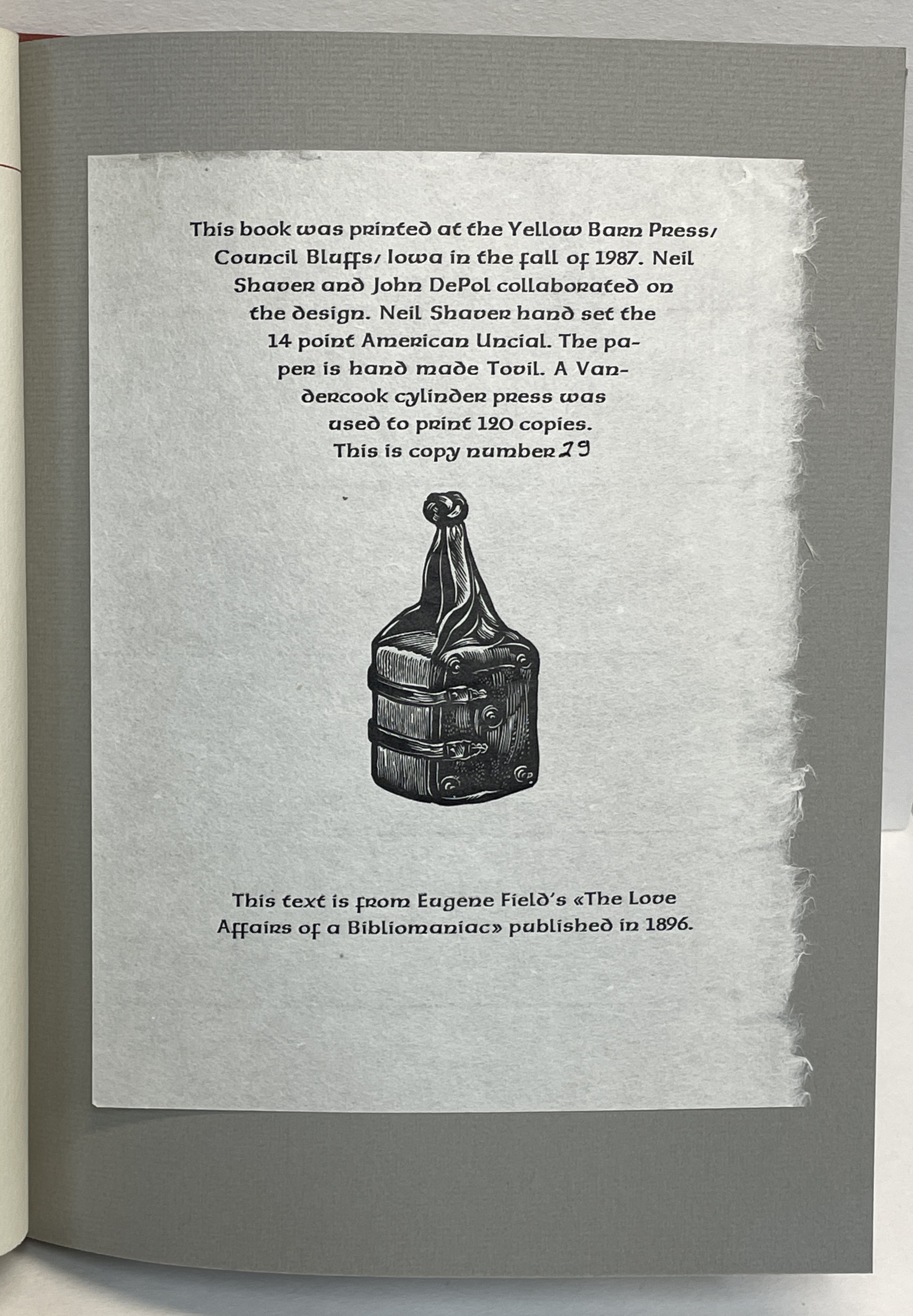
Speaking of Neil and John DePol: In the mid-1990s, before the Internet really took off, Portland’s Powell’s Books was a fantastic place to trawl for press books. The poetry section was especially rich (for obvious reasons), but a press book could be found tucked into almost any section. This was before the Internet protected know-nothing book buyers from their ignorance, and books could be found shockingly underpriced. Here’s one of my favorite finds (it was in History-England):


Interesting two-signature format; maybe the Tovil was in limited supply, which would explain the lack of blanks fore & aft (and the horrible tipped-on endsheets) & ex folius colophon printed on different paper. Very well printed, rectos only. All for $5. A weekend safari to Powell’s every year or so was a lot of fun while it lasted. These days, on the rare occasion I encounter an unrecognized treasure on a shelf, I’m generally inclined not to disturb it.
 
HOUSEKEEPING
 
A new HM web site went up in February. Hopefully more user friendly, definitely better images & fewer typos. 
 
Moving forward, new HM publications will be offered for sale directly from the studio. Distributing books soley through booksellers worked for a long time – it greatly reduced shipping & invoicing work, and the booksellers got the books into collections I never could have reached – but the booksellers have been disappearing and aren’t being replaced by new ones.
 
The tradition of fine press printing I wanted to be part of was already in decline when I started 25 years ago, I just didn’t realize it. I suspect the majority of HM publications will continue to be out of step with what most collectors are interested in today, but my projects have always been simply about entertaining myself; if a handful of others are interested as well, great.
 
The new site’s Upcoming page will be updated with details of what’s in the works. It also has a form for subscribing to emails that will offer pre-publication details and a discounted price. A new project, similar in scope and focus to 2022’s The IdealBook, will be featured in the next blog update (June 1).
 

Finally, should you know someone needing a handpress, the big Ostrander-Seymour Extra-Heavy that most HM books have been printed with will need a new home in the next year or so. (I’ll finally start putting the Albion folio press to regular use.) The colors are horrific but, to the best of my knowledge, original. It could be painted black & shiny, but that seems dishonest. I didnt want a pretty press, I wanted a good one, and it is. I’ll miss it but not the 2,000 lbs it adds to my life.
 
 
Is it just me or has blogger gotten really awful and impossible to format, i.e. worse than it already was? Like, I'm trying to format this para to align left and it won't. And why do I have to use special characters to insert proper apostrophes? (Which I'm too bored to do at this point.) And why is this para appearing in the editing view as the wrong font, but correct in preview/post view? Unless you're using a phone in which case it is wrong. Because blogger...

1.8.24

What Happens After The Dunwich Horror?

 
I’ll be updating the The Dunwich Horror site this month, with a few images of a bound copy. Above & below are a few glimpses at the first bound copy with slipcase. Brionys completed printing all the aquatints and covers, so now its all on me to make with the thread, glue & boards. 


I am disinclined to show much of the book before publication
, particularly the prints. For now, below (taken through a glassine filter) is all you get. I want the first experience for people who’ve ordered it to be the complete book held in their hands, not select parts on a screen. Plus, I take lousy photos (again, see above). Once it’s issued I’ll update the Dunwich site a final time, with photos of the prints & bindings. Then the site goes away in January, to be replaced by something new. Exactly what the something new will be is getting much attention recently. Working on Dunwich with Briony has reminded me how much fun we have, and how we we bring the inspire each other to dig deeper. So I’m hoping – her schedule and interest pending – to do several more projects with her over the next year or two. My eyes are failing, my body aches (the handpress takes a toll), I may only have a few more ambitious publishing projects in me (given that a “few projects” would span five years or more), so I want to take advantage of Briony answering my phone calls as much as I can during that time.


I have three projects planned that will pair a brief (& narratively self-contained) excerpt from a novel with original prints, a different artist for each one. The brevity of these texts will allow me to play with some different types and papers, without having to devout an entire year of my life to the project. I think I’ll call them HM XRTS, although Intersticials is good too. We’ll see. The first one should will be ready by the start of next summer. Details to follow. I’m still talking to artists for the other two.


For years Reg Lissel and I have been idly talking about publishing a book about his adventures in papermaking, loaded with samples. I think we’ve finally settled on what the text could be. The next step is for each of us to pull out our stashes of his various papers, sort through them, and figure out what will be included, and how. I’d like to print that book in 2025, and issue it in early 2026. We’ll see.

Before any of these things happen, I’ve promised to print Byzantium’s next book. Titled Textile Designs on Paper: An Archive from Early 19th-Century France, it will continue their exploration of historical methods and materials in the graphic arts. In November 2023, the two were invited by textile historian Susan Meller to look at her collection of 19th-century French pattern books. These large, timeworn albums were filled with small, exquisite gouache designs painted on paper and created as patterns for printed cotton. The idea of combining paper with fabric arts was instantly beguiling, and so their next project began. Each copy of Textile Designs on Paper (4to, approx. 56 pp. + samples) will include approximately one hundred of these gouache paintings, along with an essay by Susan on the history of the designs, techniques and uses of printed French textiles; and an essay by Barbara on the pigments and dyes used to produce the paintings and the related fabrics. 


Each book will also include textile swatches that complement the gouache designs, and a dye book, containing cotton samples of the hues typical of the time. Claudia will bind the edition, in two formats: deluxe (copies 1–10) and regular (copies 11–26). Publication is slated for the second half of 2025.

AND ANOTHER THING!

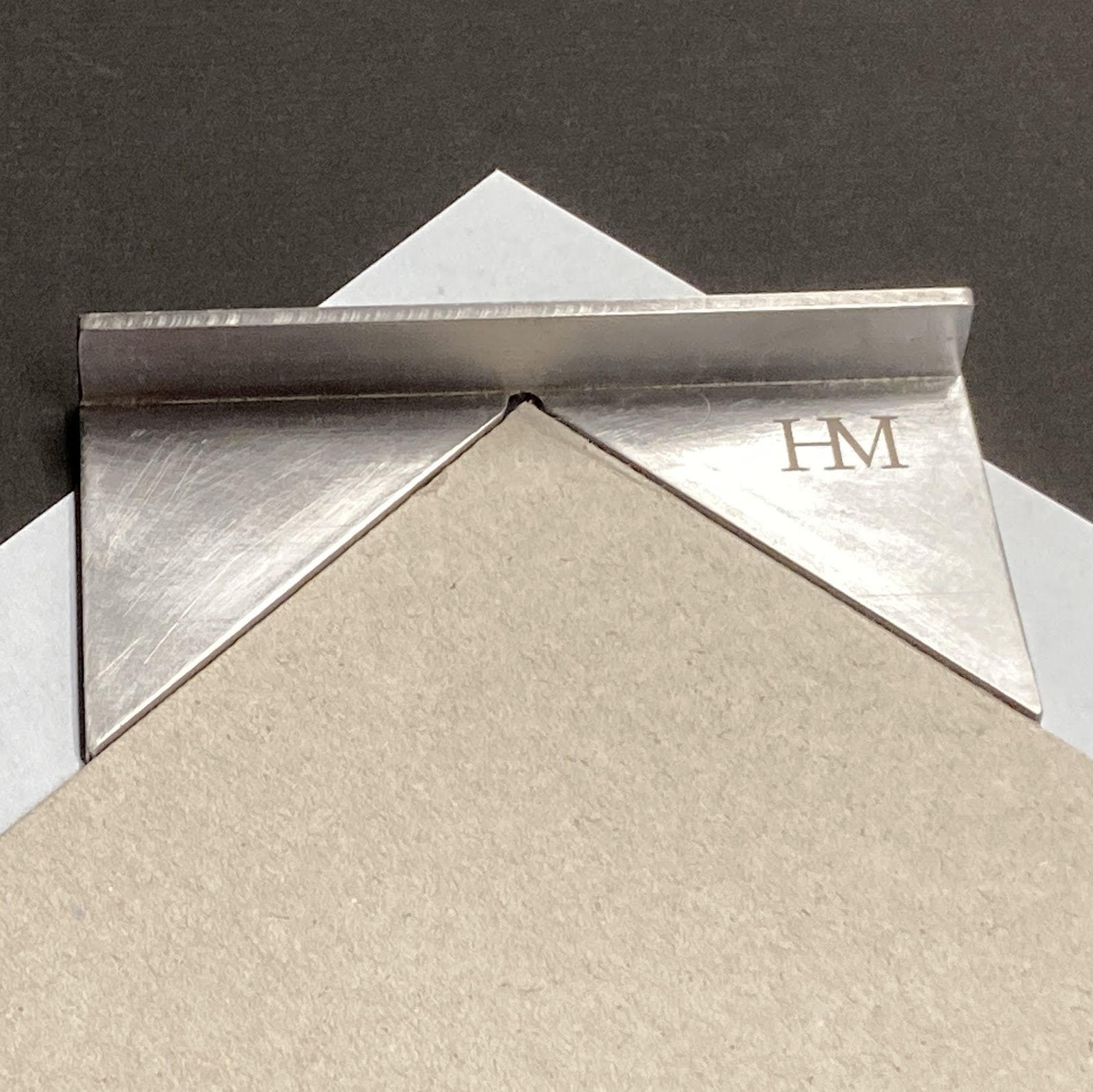
I had a local metal fabricator make this cool jig for trimming the corners of my turn-ins. I’m sure real binders can just eyeball it. We might make a few more, now that he has the pattern on file; send a note if interested.

1.12.23

Santa Better Get It Right This Year!


When I first started printing, for reasons I cannot remember I was under the impression printers typically produced some kind of Christmas/New Year ephemera. Maybe that's because it was 1997 and that was the year I was hanging around Barbarian Press, and they printed a little chapbook to send out to friends and patrons. It was a short poem (I think?) by John Clare, with a wood engraving and a patterned paper wrap. I don't have a copy and I can't find much mention of it online, but maybe that was the seed. 

So I ended up doing five or six Christmas “books,” finally stopping when I realized how much work they were, and people didn't really seem to care that much anyway. That up there is the cover to the last one I did, and here's the inside:


It was printed on paper that fell out of an early 17th century book, that I dyed black. 
 

Since before I knew him, the most excellent Shinsuke Minegishi has done a special engraving to mark the start of each new year, all of them including a snowman. One day (soon?) we might publish a collection of them in a book. I have to remember to follow up on that. I have to call Shin too, it
s been a long time. 


Some of the most commonly encountered Christmas keepsakes were produced by A.R. Tommasini, who started his career as a compositor at the University of California Press, and fell into some early renown for setting the original printed version of the U.N. Charter (see here for a few details). His first xmas book was issued in 1948, and he continued until sometime in the ’70s (possibly 1980, the search results are ambiguous), the editions ranging from 50 to over 900 copies. 


All the ones I’ve seen were cased in printed boards, small but not quite miniatures. In 1962 he issued one with linocuts by Vancouvers George Kuthan, with a second (different) edition in 1968.
 

Every year David Clifford’s Black Stone Press (i.e. his kid, Yasmine) would print a calendar to mark the new year; here are a couple...


One of the fun things with books is, you can find a rabbit hole to fall into anywhere you choose to look. Try a few variations of Christmas “private press” keepsake in Abe and see what turns up. J.H. Nash – always on the hunt for rich commissions – printed a bunch. From 1929–1931 Frederic Warde designed at least three xmas books (maybe five? and there’s a ’31 Encschedé version – was he involved with that?) featuring stories by Washington Irving – figure out what all the permutations are and run them down! Or ask Santa to. 


I’m sure there are lots of others out there sharing xmas printing, I’m just not on the mailing list. Which is OK. I enjoy seeing things, I do not need to own a copy. My ongoing battle to winnow things down to a single shelf of non plus ultra continues to make progress, I see victory within a few years. Just don't ask me yet how long the shelf will be...
 
Lately my rabbit holes are all in Japan, and they’re filled with obscure CDs. Merry merry to all. 
 
AND ANOTHER THING!
 
Come back in about two weeks, Ill post some images of Barbara Hodgsons new book about marbling. Copies are shipping next week (its OP).