Had to kill some time at the University of British Columbia last weekend. Went to the general stacks to peruse the "history of printing" section. In about 10 lateral feet of shelving was a fantastic cross-section of vintage European handmade papers, many used in relatively pedestrian books. For example, the above census of books printed by William Caxton.
A census basically is simply a list of all known copies in collections. The book contains about a dozen facsimile pages from Caxton books, primarily illustrating the different types, but after that it makes for very dull reading. Nonetheless, the publisher deemed it worthy of printing on a lovely laid paper bearing the watermark
Chiers. That's the name of a river that passes through Belgium and France, but a lazy Google search turns up no specific references (there were numerous papermills along the river). Pulling out Le Clert's
Le Papier is always fun, but shed no light on the question (probably because his book focuses on papermaking in a different part of France).
On another shelf I spotted some lovely deckles poking out from a tattered buckram case binding, inside which was a more engaging book than the Caxton census, printed on an even lovelier paper. H.C. Brooks' 1927 study of books printed by Giovanni Bodoni remains a primary resource on the influential Italian printer, in part because it was produced in a manner appropriate for the topic.
The bulk of the edition was printed on a handmade laid (vergata) sheet, but this copy is one of 50 printed on a opaque wove sheet with a hard, smooth surface (e.g. calendered) and a large gothic watermark (all were partials, along the fore edges). A few
copies of this book are listed on Abe, but all seem to be from the main
edition.
As shown above, the name of the recipient (probably a subscriber) was printed on the limitation page, and it gives this copy an interesting provenance.
Winship was a famous American librarian and scholar of printing history. He also was a private pressman who published under the imprint
Sign of the George. How his copy of Brooks'
Bodoni got to Vancouver is a wonder (or not; bookseller catalogue issued some time after his death in 1952?).
The smooth Fabriano sheet shows off the facsimiles, some of which include intaglio illustrations, beautifully.
There's a brief section on types at the back, plus - for those of you excited by Barbarian Press' current
fundraising campaign for their book about Curwen Press borders - a few pages showing samples of borders used by Bodoni. If you've seen the horrible Taschen edition of Bodoni's
Manual of Typography, indifferently printed on blinding-white paper & stuffed into a case binding that isn't up to the task, Brooks' book is a balm for your eyes.
Both the Caxton & the Bodoni books are in the most mundane and purely functional case bindings that reflect exactly what these books are: reference materials. At the time they were published, handmade paper was sufficiently available and affordable that using it for a book was not a
deluxe affair.
AND ANOTHER THING!
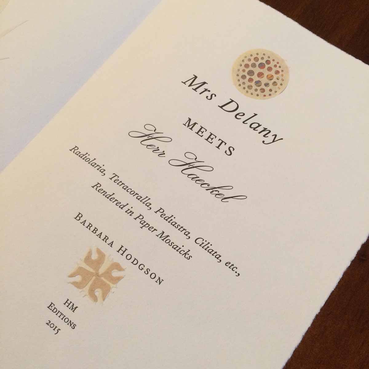
Barbara Hodgson has been invited to give this year's J. Ben Lieberman Lecture for the American Printing History Assoc! She'll be talking about her collaboration with Claudia Cohen for
The WunderCabinet. She's an engaging public speaker, and this will be a rare opportunity to gain first-hand insight to their work. Claudia will there but I can't go: have to stay home & work at printing her next book...