1.12.24

The Allen Press’ Pernicious Paper


When I finished printing Dunwich, I collected some of the Bodoni ornament tailpieces used in the book into a single broadside. Twenty-five were editioned, and numbers 1 through 20 were issued with the corresponding book. I also pulled some initial proofs and a handful of extras, all on a variety of papers. I have a small pile of miscellaneous sheets, generally decent sheets but insufficient in quantity to be useful for a project. The 25 numbered copies were printed on Golden Hind; there were proofs on hosho, and exactly 8 on a handmade sheet that was showing significant foxing caused by something in the pulp. It was clearly a handmade sheet, about 150 g, without much (or any) size (i.e. soft). 

These four sheets came in a strange group of papers I acquired from the home of a deceased printmaker in town. He had a hoard of interesting papers, but being a printmaker, none in great quantity. The four foxed sheets split to the size of the broadside, and the foxing seemed appropriate for a Dunwich poster, so I added them to the proofing pile. 

 
I obviously didn’t look past all the foxing. I marked the verso of these eight broadsides Pernicious Paper. It was only when I was trimming one down to fit inside a box that I noticed the watermark:


It is also watermarked British Hand Made.

Huh. According to the Allen Press bibliography, the first book they issued with their watermark was Murders at the Rue Morgue, in 1958. It was made by Richard de Bas (probably in 1957, since it would have had to be ready before they started printing the book). They say it was the most beautiful paper they ever used, so probably not what we have here. Plus, wrong country. 

For 1968’s The Brothers they switch to a custom sheet from Wookey Hole. I checked that book, it’s a different watermark. 

They stick with that until 1972’s The Bacchae, which goes back to R. de Bas. 

1974’s Temptation of St Anthony introduces a mouldmade sheet [!], then 1975’s Quartet was printed on a new custom sheet from the St Cuthbert mill. 

I lost interest at that point in the pursuit. The real question is, how did a few sheets of the Allens paper wind up in the home printing studio of a Vancouver artist who had nothing to do with books or letterpress? We’ll never know, and that’s my favorite kind of ending.

1.11.24

Farewell Dunwich


HM’s new edition of The Dunwich Horror was issued about two weeks ahead of schedule. Things had to be accelerated when news of a possible/probable Canada Post strike bubbled up. There were a few days of intensive invoicing, packing and shipping, but all the copies got out. All except the five bound by Claudia Cohen, which were always going to lag by a week or two. 

Claudia sewed the copies on four vellum slips, which were then laced into a quarter vellum case (with vellum tips). The boards were covered in Briony’s thorn etching, with a title label inset to the front. Endpapers are early 20th century Italian marble, a different pattern in each copy. The boxes are covered in the same Japanese cloth used for the rest of the edition. 


Like the other boxed copies (numbers 6–20), these include a suite of first state proofs and the Dunwich Tails pamphlet. They also include a suite of the eight aquatints printed on handmade Royal Watercolour Society paper, painted by the artist, and one of the copper plates (cancelled). This week I
m making folders (see below) to contain each of the plates within its box. 

Think thats it. Thanks to everyone who followed along.

1.10.24

Dunwich in Bronze


All of the copies of Dunwich are in their cases, all that’s left to do is making slipcases for those that need them, and assembling the bits that will go into the boxed copies. There was a lot of painting of papers for this project last summer. The endpapers were all roller printed in bronze (both sides), then painted on one side with acrylics. They’re all kinda the same, but none are the same, as the two copies shown above illustrate.


The slipcases were (just) painted. The result reminds me of the cover to the 4AD compilation Lonely Is An Eyesore. The paper is an Italian machinemade that’s just the right weight for covering a slipcase. The insides are lined with some printed (boo) marble paper I bought when young & ignorant. Lining the inside of a box is a good use for it. 


The portfolios included in the boxed copies are 300g Fabriano mouldmade that was roller printed and then painted. Like the endpapers, but different. When you’re painting sheets like this, some paint always seeps around to the other side’s edges, so you need to work bigger than required, to trim that seepage away.


The board sheets are leaves of Reg Lissel’s handmade rag paper from an old HM book. Palimpsests. Most but not all were blank on one side. I painted them with an iridescent black acrylic last spring, then Briony printed an etching with bronze ink on them over the summer. The impression of what had been printed on them years ago shows a little more on some than others, if the light hits just right. 


Here’s some paper I used for a trial case. I was just playing around with leftover bronze ink and black paint.


So next month should be the end of the Dunwich posts. Copies will ship at the beginning of November, then I’ll find something else to do.

1.9.24

The Dunwich Papers


More than a decade ago, I saw a craiglslist posting for about 170 sheets of Barcham Green Hayle paper offered at the low low price of C$2 per. Apparently the seller was clearing out her dead father’s basement, or something like that. Not believing my luck in being the first to contact the seller, the sheets went into the storage locker where most of my paper is stashed, waiting for the right project to come along.

The tricky part of buying stacks of vintage or odd-lot paper like this is, you need a project that will use most of what you have, and have dimensions that suit whatever the sheet folds down to (e.g. folio, quarto, etc). Theres no point in using just a portion, then having to wait for another project that will accommodate the remainder. Otherwise youre just wasting the paper. 

(The 2021 reprinting of Francesco Griffos foreword to his 1501 Petrarch is an example of a project conceived simply to make good use of a small stash of paper: Years ago I inherited about a dozen sheets of Richard de Bas. Lovely paper, but what do you do with a dozen sheets? I finally decided to think of something before it got lost or damaged.) 

For most HM projects, the one factor thats essentially set from the beginning is the edition size: 50 is a typical maximum, and fewer copies is OK too. Ive gotten a little better at printing over the years, and can now feel reasonably confident Ill end up with 50 good sheets from a run if I print 65 (for a long time Id print 75, because I was a crap printer). So, if my edition is going to be 50, I need enough paper to print at least 65 copies of each sheet. 

It was not my initial intention to use the Hayle for Dunwich. It was only after Id been playing with design and format options for a while that I realized it would fit the page proportions I had settled on perfectly. And I had enough sheets to make 56 copies (the editions 50 numbered copies and the contributors six H.C. copies), with about 20 sheets left over to cover disasters. Almost: with the way I had the text run out, I was short one leaf (two pages), either the first (title page and ©) or last (storys ending and colophon). I probably could have revised the setting to cram the text enough to free up two pages, but that wouldnt be satisfactory. My solution was to print the title page on a leaf of different Barcham Green paper, Penhurst. Its about the same weight as the Hayle, but a cream hue. Ive always liked books that mix different papers, and I liked the way the title page stands out this way. 

Then another problem popped up: somewhere along the way, the number of sheets listed on the wrapper of my Hayle stash and the actual number decohered: I actually had only enough to make 52 copies. That meant (1) no mistakes, and (2) four of the 56 copies had to be on some other paper. 

Hmmm. 

I was already planning on using my old standby, Guarro laid, for the necessary initial sheets printed while fine-tuning the inking and makeready, so I could just add a few more sheets and make the four needed copies from Guarro. 


While pondering all this, I found in the paper vault a slim package with another English handmade, F. J. Head. It was about the same weight as the Hayle, but a cream hue, and just slightly smaller in one dimension. I had enough to print just three copies of Dunwich. That
s why in the end, 48 of the numbered copies and four of the H.C. are printed on Hayle; two of the numbered and one H.C. on F.J. Head, and one H.C. on Guarro. (If Id had any disasters during printing, the number of copies on Guarro would have gone up.) The colophons of copies not printed on Hayle note which paper was used. From the exterior, the only way to tell is the FJH copies are about 1/8" narrower. 

So thats a few downstream issues to be aware of if you start hording odd packages of old paper for use one day...

DUNWICH DETAILS

Ill update dunwich.ca this month with photos of Brionys prints and the completed book. We remain on track to issue copies in November. Meanwhile, the bookseller Jacob Quinlan will have a copy (ARC/NFS) on display at the Thomas Fisher Press Fair on September 7th. If youre in Toronto, drop by. Jacob always has cool stuff.

1.8.24

What Happens After The Dunwich Horror?

 
I’ll be updating the The Dunwich Horror site this month, with a few images of a bound copy. Above & below are a few glimpses at the first bound copy with slipcase. Brionys completed printing all the aquatints and covers, so now its all on me to make with the thread, glue & boards. 


I am disinclined to show much of the book before publication
, particularly the prints. For now, below (taken through a glassine filter) is all you get. I want the first experience for people who’ve ordered it to be the complete book held in their hands, not select parts on a screen. Plus, I take lousy photos (again, see above). Once it’s issued I’ll update the Dunwich site a final time, with photos of the prints & bindings. Then the site goes away in January, to be replaced by something new. Exactly what the something new will be is getting much attention recently. Working on Dunwich with Briony has reminded me how much fun we have, and how we we bring the inspire each other to dig deeper. So I’m hoping – her schedule and interest pending – to do several more projects with her over the next year or two. My eyes are failing, my body aches (the handpress takes a toll), I may only have a few more ambitious publishing projects in me (given that a “few projects” would span five years or more), so I want to take advantage of Briony answering my phone calls as much as I can during that time.


I have three projects planned that will pair a brief (& narratively self-contained) excerpt from a novel with original prints, a different artist for each one. The brevity of these texts will allow me to play with some different types and papers, without having to devout an entire year of my life to the project. I think I’ll call them HM XRTS, although Intersticials is good too. We’ll see. The first one should will be ready by the start of next summer. Details to follow. I’m still talking to artists for the other two.


For years Reg Lissel and I have been idly talking about publishing a book about his adventures in papermaking, loaded with samples. I think we’ve finally settled on what the text could be. The next step is for each of us to pull out our stashes of his various papers, sort through them, and figure out what will be included, and how. I’d like to print that book in 2025, and issue it in early 2026. We’ll see.

Before any of these things happen, I’ve promised to print Byzantium’s next book. Titled Textile Designs on Paper: An Archive from Early 19th-Century France, it will continue their exploration of historical methods and materials in the graphic arts. In November 2023, the two were invited by textile historian Susan Meller to look at her collection of 19th-century French pattern books. These large, timeworn albums were filled with small, exquisite gouache designs painted on paper and created as patterns for printed cotton. The idea of combining paper with fabric arts was instantly beguiling, and so their next project began. Each copy of Textile Designs on Paper (4to, approx. 56 pp. + samples) will include approximately one hundred of these gouache paintings, along with an essay by Susan on the history of the designs, techniques and uses of printed French textiles; and an essay by Barbara on the pigments and dyes used to produce the paintings and the related fabrics. 


Each book will also include textile swatches that complement the gouache designs, and a dye book, containing cotton samples of the hues typical of the time. Claudia will bind the edition, in two formats: deluxe (copies 1–10) and regular (copies 11–26). Publication is slated for the second half of 2025.

AND ANOTHER THING!

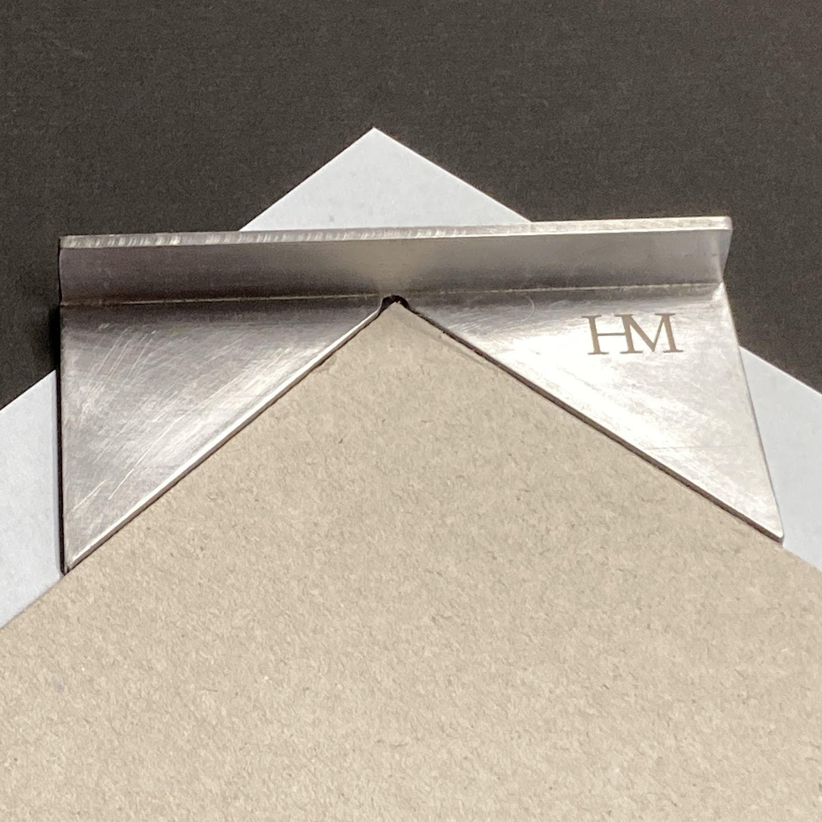
I had a local metal fabricator make this cool jig for trimming the corners of my turn-ins. I’m sure real binders can just eyeball it. We might make a few more, now that he has the pattern on file; send a note if interested.

1.7.24

[no title given]


[Warning: this post assembled during day 5 of a wild summer not-covid-but-crazy-flu trip. Treat all claims accordingly...]

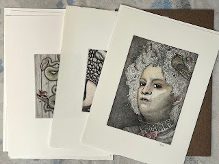
This month’s post features some ephemeral drawings by Briony Morrow-Cribbs, never published before & probably never to be seen again. They adorned the box that delivered 20 sets of first-state proofs (i.e. etchings) of her eight prints for The Dunwich Horror. She also sent a set of the prints after aquatinting. These first-state proofs, which will be included with the 20 boxed copies, will offer an engaging opportunity to see the tonal and depth qualities that aquatint adds to an etched plate. The image above is a detail from one. Right this minute Briony’s working on the etching that will be printed on the sheets for the quarter binding, and she reports that it is so sexy. The last I heard, her plan was for it to be a tangle of thorns, but if anyone could make that sexy it’s BMC. 


My brain fever was preceded by one of my frequent bouts of feeling overly encumbered with stuff, and I decided to clear out any books I haven’t looked at in over a year, especially big ones - they take up so much real estate. (To be clear, I’m talking about things I’ve “collected” over the years, not HM books.) Some have gone to a local bookseller interested in book arts, design & etc. The more obscure titles have been wrangled into a list, which can be seen here. Tell any & all friends who might be interested - highly motivated seller. This is the link to the list.


(p.s. to kind people who want to send me books or etc., thank you but please don’t! I’m entirely focused on losing the psychic and actual weight of possessions. I want to get my books down to a single small shelf, and my wardrobe to a single narrow rack.)

With luck and industry, I may have a complete, bound copy of Dunwich to show for the August blog. 


1.6.24

Tails of Dunwich


The tailpieces that appear in early printed books weren
t simply decorative, they had a function. If the space filled by a tailpiece (which appears at the bottom of a short page, i.e. one with fewer than the book’s normal number of lines of text) was left empty, it affects the impression across the sheet: the platen falls lower (harder) over the empty space, printing the surrounding areas of text more heavily but reducing the impression in the area opposite. 
 

Adding a tailpiece helps balance the impression across the sheet. It serves the same purpose as the platen bearers used at HM, one at each corner of the bed, adjusted by adding or removing pieces of mylar or paper between the bearer and bed, to even the overall impression for each form. (Image above is from Manni
s Vita di Aldo, 1759; below is from Marcheses Origine e progressi della stampa, 1722.)


Eight of the ten chapters in The Dunwich Horror fall short. Anticipating the impression issues, I had the idea of adding tailpieces. I considered using some 16th century tailpieces, but decided they would clash with Briony
s prints. Playing around with a fount of Bodoni ornaments one day, I started making little creatures, and thought they’d make excellent tailpieces. 

Now, the fact that they’re being printed in a second color – i.e. not with the short page of text – renders them useless as tailpieces, but they fill the spaces in interesting ways. And I have my platen bearers to deal with the impression balance. I’ve never been able to use modern types like Bodoni, I just can’t make them work, but the ornaments are fun to play with. The boxed copies of Dunwich (numbers 1 20) will contain an eight-page pamphlet with some designs that didn’t get used in the book. Like the sheets that will cover the book’s boards, the pamphlet is a palimpsest: it’s printed on waste leaves of Reg Lissel’s HM Text paper, from Elements in Correlation (HM 2009), that were painted with a mixture of sumi ink and black acrylic paint. 


Briony expects to complete printing all of the aquatints for the book this month, and then turn her attention to the board sheets. While she’s doing that, I’ll be sewing copies and getting ready to make the cases. We
re having so much fun that were trading ideas for a new project. Ill end with a tailpiece from a volume of Blaeu’s Atlas Maior (c.1665)...
 

1.5.24

Briony’s Books & Art

 
Text printing for The Dunwich Horror was completed in a couple of weeks ago, and Briony’s working on the aquatint plates. This month’s post is a quick tour through some of her adventures in printmaking. 
 
The February post featured Buzz II, the print that made me think of recruiting Briony for Dunwich. Going through my Briony box for this post, I found a couple more prints with coincidental associations. Doesn’t the guy above look a little like Lovecraft? And the guy below looks like a Buzz’s cousin!


I met Briony through David Clifford (Black Stone Press), when he was teaching a book arts class at Emily Carr. He told me about one student whose work really stood out from the crowd, and that he was printing text sheets for her book of etchings of weird creatures. It was part of a larger graduate project/installation. Once I saw the book, titled The Cat Skinner Press Catalogue of Quixotic Chimera, I had to have a copy. The book consists of 12 etchings printed on kitakata (the same paper she’s using for Dunwich), each accompanied by a brief taxonomic description printed by David on Mohawk. Briony’s non-adhesive binding features Japanese cloth over boards, each folio sheet sewn with a running stitch. There were only 8 in the edition, and I can’t remember what I said or offered to get one. Fun & hilarious fact: Briony bound one copy, for the grad project, and then lost the text sheets before she got around to binding the rest! David had to reprint them. So I guess all but the one copy are second printings.


In 2009 Briony was commissioned to create illustrations for a book titled Wicked Plants, by Amy Stewart. The illustrations in the book are reproductions of 40 etchings Briony created. At the time I thought it was unfortunate the original prints wouldn’t get wider exposure, and suggested she issue them as a suite. Amy wrote a brief introduction, Briony printed an edition of 40, and Claudia Cohen made the box and chemise that held each suite. 


Briony often adds vibrant, rich watercolors to her prints. I suggested she paint one complete set of the botanical prints, and put one of the colored prints in each of the 40 sets. So each set has its own unique colored print.


For a few years in the mid-’00s Briony issued an annual suite of botanical prints, in editions of 20. For a bit extra you could have your prints colored. I weaseled into the act by offering to print the title and colophon sheets. 


I once saw, but do not own a copy of, a chapbook with a couple of drawings & taxonomic descriptions of quixotic creatures that were attributed to Briony. It was a tiny edition, and I’m not sure it was ever actually issued; I’ll have to ask her about it...

1.4.24

Come Back Next Month


Nothing much to report or talk about this month. Text printing for Dunwich will be completed this month. Briony’s well into the prints. The edition is fully subscribed, thanks to all for the interest. 

Next month’s post will be about Briony’s adventures in print- and bookmaking over the years. Pulling it together, I found another print (above) that, like Buzz II, would perfectly suit Dunwich. Lots of brambles and small creatures. And doesn’t the one below bear some resemblance to Lovecraft?

1.3.24

Dunwich Report No. 1


Printing The Dunwich Horror is underway, one sheet down, 12 more plus a few extras (incl. a prospectus) to go. I’m printing two up = two pages on each side of a sheet, folded to make 4 pages. Two sheets to each section. I can work off one side of a sheet in a day, so a sheet takes two days to complete. Unless there’s a second color, which adds a third day. I need to maintain some routine to life, so one-color sheets will get printed Monday/Tuesday, two-color sheets on Thursday/Friday/Saturday. Wednesday and Sunday are resupply days (groceries, wine), plus an hour to dampen the paper for the next day’s run. 


The paper is laid: I have to keep track of rough and smooth sides, so that verso and recto of each opening match (and thus alternate through the book, smooth/rough/smooth etc etc). Luckily the Hayle paper I’m using has two watermarks that make it easy. 
 
 
Winter in Vancouver is a good time for printing, it’s easy to keep the sheets damp. My system involves simply keeping the two stacks of paper - to be print & printed - under very thick cotton towels that have been soaked and thoroughly wrung out. They get spritzed with water a few times during the day, if & as required. Overnight the stack simply stays wrapped in a towel and put in a contractor-grade (= thick) garbage bag. 


I heard second-hand that Jim Rimmer counselled starting a new book somewhere in the middle, to bury any initial hiccups. I always start with the center opening from a section: since the two pages will be facing each other, it’s a good place to establish your color (impression, inking) for the project. 

Briony’s well into making sketches for her aquatints, but we’re not sharing those, at least not for now. (The image at top is an old plate, a test of paper to be used for covering the boards.)

The dunwich.ca site will be updated later this month with all the project details. Unlike previous HM books, this one will be available for direct reservation and purchase, and there will be a pre-publication discount.

Above is one of the book
s eight tailpieces concocted from Bodoni ornaments. These will be printed in bronze (how I will be spending my Saturdays).