A few
housekeeping notes for this post, but first something that might actually be
interesting...
March was Women’s History Month. Kelmscott Books has issued three catalogs that mark the event, highlighting work from female artists and printers. For some reason they aren’t listed under Catalogs on the shop’s site, maybe they will be. But the catalog for the New York Book Fair, which is listed on the site, includes some items that reflect the shop’s interest in issues social and political. It’s encouraging to see a business not shying away from these topics.
I wondered if a book that made a big splash when published in 1995 was included in the women’s catalogs: The Ladies Printing Bee. No. Not surprising, it sold out pretty quickly. The edition was just 195 copies, and a chunk of that had to go to the 36 contributing presses from around the world. It was a fantastic collection of work, artistically, technically and intellectually. Published & shepherded by Jules Remedios Faye, I think with some help from her partner at the time, Chris Stern. No copies on Abe, but weirdly there’s one (discounted) on amazon.com.
%20Lost%20Time%20Books.png)
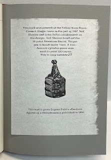
There were a few collaborative projects like this in the ’80s and ’90s. Aside from some things Codex has done, I don’t know of any more recently (maybe I just don’t get invited, and for good reasons). Printer’s Choice in 1983. Alan James Robinson spearheaded one to celebrate the work of printer Harold McGrath that was very cool. There was one for John DePol, I think organized by Neil Shaver (Yellow Barn Press) that you couldn’t find for love or money for many years, but copies are around now.
Speaking of Neil and John DePol: In the
mid-1990s, before the Internet really took off, Portland’s Powell’s Books was a
fantastic place to trawl for press books. The poetry section was especially
rich (for obvious reasons), but a press book could be found tucked into almost
any section. This was before the Internet protected know-nothing book buyers
from their ignorance, and books could be found shockingly underpriced. Here’s
one of my favorite finds (it was in History-England):


Interesting two-signature format; maybe the Tovil was in limited supply, which would
explain the lack of blanks fore & aft (and the horrible tipped-on
endsheets) & ex folius colophon printed on different paper. Very well printed, rectos only. All for $5. A weekend safari to
Powell’s every year or so was a lot of fun while it lasted. These days, on the
rare occasion I encounter an unrecognized treasure on a shelf, I’m generally
inclined not to disturb it.
HOUSEKEEPING
A new HM web site went up in February. Hopefully more user friendly, definitely better
images & fewer typos.
Moving
forward, new HM publications will be offered for sale directly from the studio.
Distributing books soley through booksellers worked for a long time – it
greatly reduced shipping & invoicing work, and the booksellers got the
books into collections I never could have reached – but the booksellers have
been disappearing and aren’t being replaced by new ones.
The
tradition of fine press printing I wanted to be part of was already in decline
when I started 25 years ago, I just didn’t realize it. I suspect the majority of HM publications
will continue to be out of step with what most collectors are interested in
today, but my projects have always been simply about entertaining myself; if a
handful of others are interested as well, great.
The new
site’s Upcoming page will be updated with details of what’s in the works. It
also has a form
for subscribing to emails that will offer pre-publication details and a
discounted price. A new project, similar in scope and focus to 2022’s The IdealBook, will be featured in the next blog update (June 1).
Finally,
should you know someone needing a handpress, the big Ostrander-Seymour Extra-Heavy
that most HM books have been printed with will need a new home in the next year
or so. (I’ll finally start putting the Albion folio press to regular use.) The colors are horrific but, to the best of my knowledge, original. It could be painted black & shiny, but that seems dishonest. I didn’t want a pretty press, I wanted a good one, and it is. I’ll miss it but not the 2,000 lbs it adds to my life.
Is it just me or has blogger gotten really awful and impossible to format, i.e. worse than it already was? Like, I'm trying to format this para to align left and it won't. And why do I have to use special characters to insert proper apostrophes? (Which I'm too bored to do at this point.) And why is this para appearing in the editing view as the wrong font, but correct in preview/post view? Unless you're using a phone in which case it is wrong. Because blogger...


%20Lost%20Time%20Books.png)


