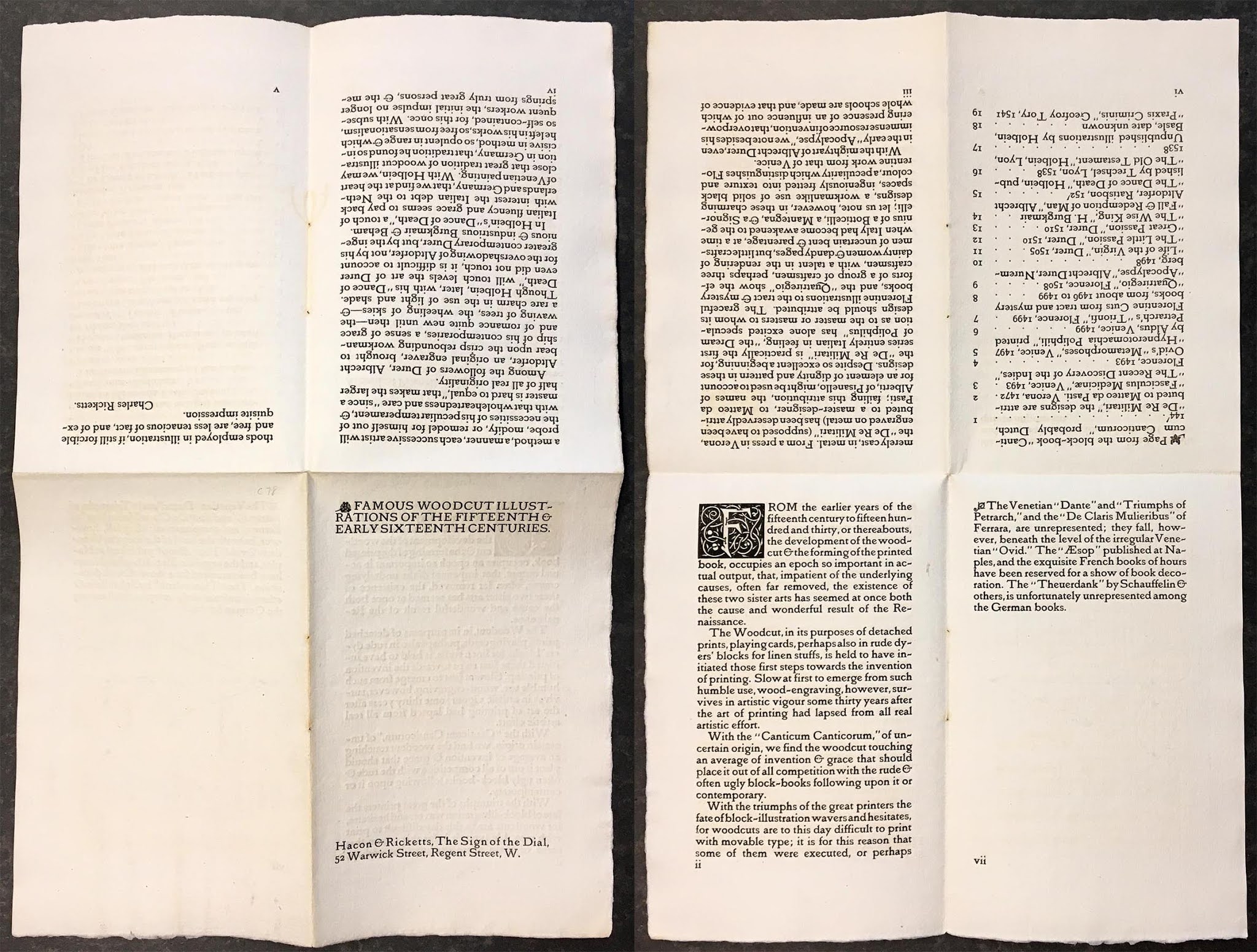
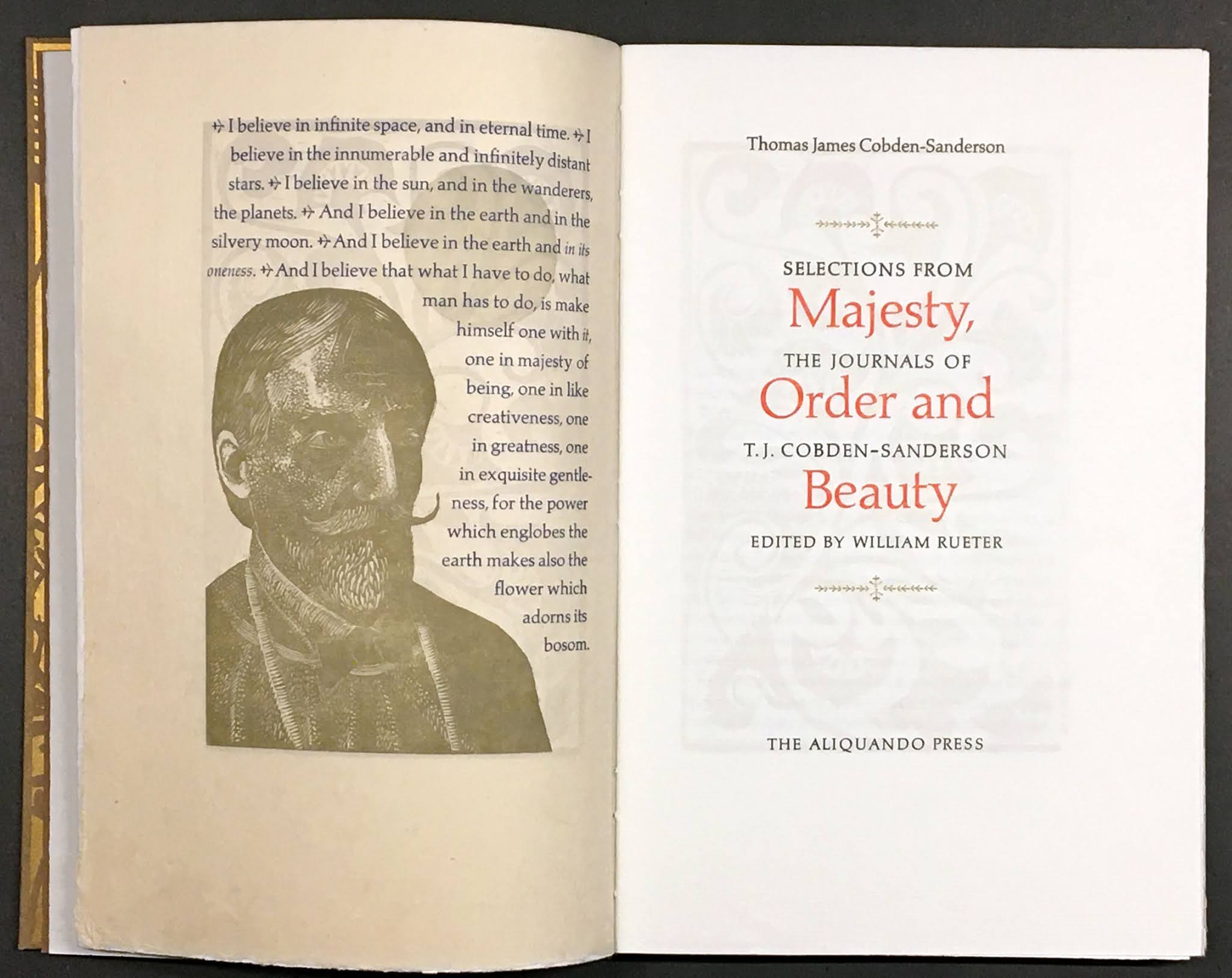
Recent news via Mark Askam’s excellent fine press Instagram page: three new publications from Graham Williams’ Florin Press of particular interest to enthusiasts of wood engravings, and anyone simply wanting to educate their eye and taste.
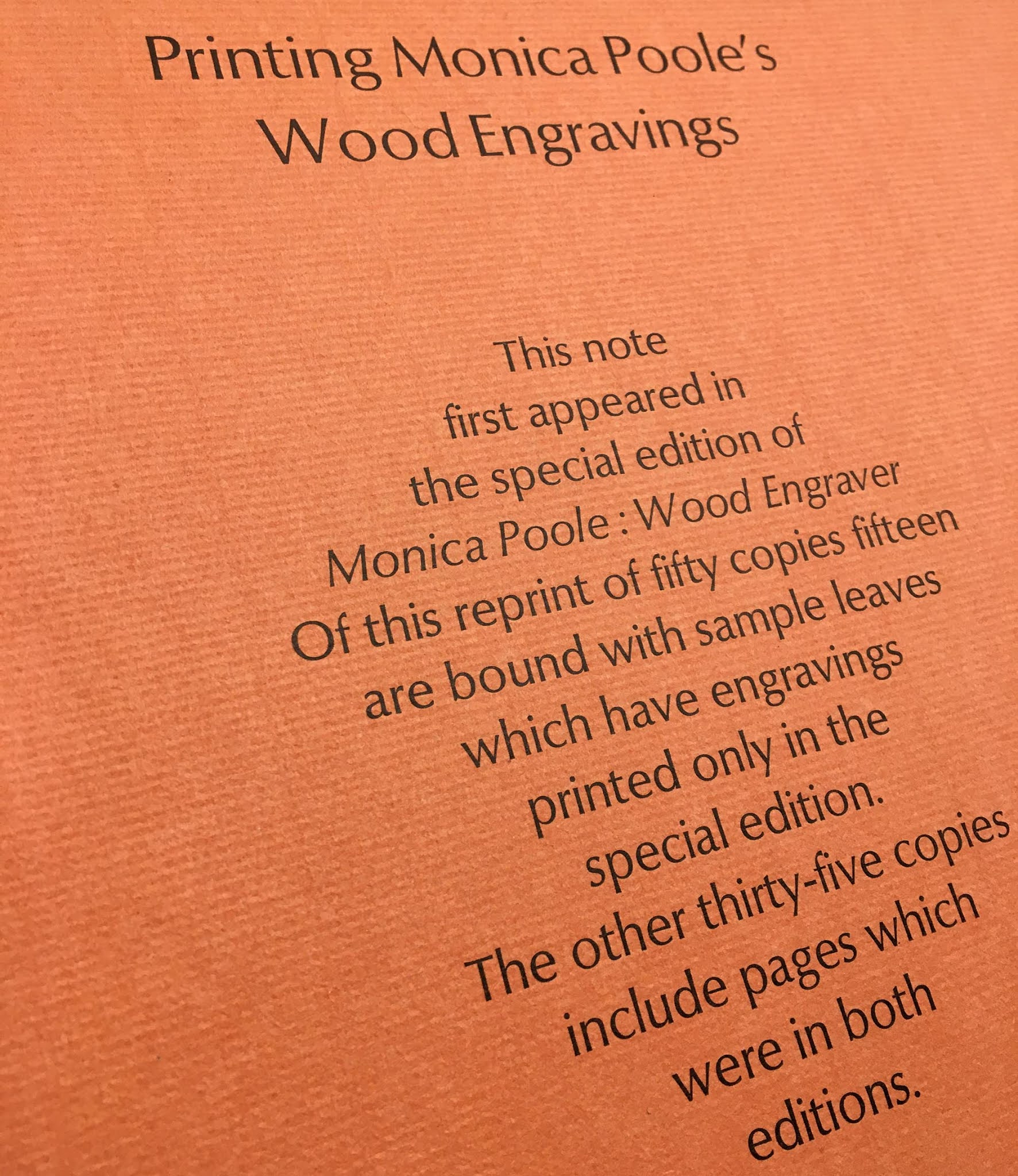
Blog visitors may recall previous mentions here of the Florin Press’s beautiful Wood Engravings of Monica Poole (1985). The few deluxe copies of that book included a short essay by Graham about printing the engravings. This kind of (not too) technical discussion assists in appreciating the work of both the artist and the printer. Graham has been printing with handpresses for over five decades, and believes they “are the very best tools for a printer to use to give life to a wood block.”

The first of his new trio of books is Thomas Bewick Engraver & the Performance of Woodblocks. “This book is not a biography of the man but an account of how his talent evolved and how his blocks can still perform their magic,” the prospectus reports. It is printed offset, which normally might not excite me, but it is undeniably the best method to achieve the book’s purpose, which is to illustrate differences between impressions from the same blocks, as part of a broader discussion of how his blocks were used.

The first 100 copies of the standard edition will include a leaf from his next new book (due summer 2021), A Collection of Printing from Woodblocks on a diversity of papers. This book is similar in concept to HM’s Paper Should Not Always Be White, only much, much more. “What works to print from Thomas Bewick’s blocks will also work for older blocks, and be relevant for contemporary wood engraving as well. This collection includes nine different designs.The leaves, printed on a diversity of papers, encourage an exploration of how the same image changes from one paper to another.” This volume has the additional appeal of the content - the combination of printing and paper - being actually printed by Graham.

The third volume focuses specifically on paper, “how we can make our own assessments of three distinct attributes of paper - aesthetic, practical and permanence.” (Image of scary paper mold above.) Like Performance of Woodblocks, this will be printed commercially (offset) and cased in cloth, with a few copies extra-bound and also a less expensive softcover version.
I’m a big believer in collectors reading these kinds of books, to develop an eye and appreciation for methods and materials. Too often people seem to place importance on a particular material or method, e.g. handmade paper or a leather binding, without an understanding for how it should (and should not!) be best employed. It’s the combination of material, application (function) and execution that matter, and assessing the sum of those elements requires some experience and knowledge.

The inclusion of illustrations of some kind seems to be essential for many people who collect contemporary press books. Relief prints are the easiest for a letterpress printer to include (I find the combination of letterpress with intaglio more interesting), and wood engravings have become the most common choice, but I’m not sure always for reasons that have to do with specific characteristics of the medium. It often feels like the inclusion of a wood engraving or two is simply a formality - how many books have been described as quarter cloth, patterned paper over boards, wood engraving frontis? Yawn. Too often printers (publishers) go to an already known name for the engraving, rather than making the effort to find new talents: too often the artists aren’t expanding or challenging the traditional wood engraving aesthetic, and too often the engravings are simply illustrations. The truly interesting press books that incorporate illustration add more than (just) a visual element. One of my favorite examples is Constantin Brancusi’s frontis (below) for Joyce’s Tales Told of Shem and Shaun (Black Sun Press, 1929). I had a copy once, but the setting was so indifferent I didn’t feel the need to keep it; still, a cool frontis, and I believe the only print he ever made for a book. It makes my point about thought-provoking or evocative art vs simple illustrations.

(I need to interrupt myself & clarify that the above comments primarily apply to fiction. I’m all for incorporating images to a story when they add something beyond simple illustration, but I think that’s all most fine press fiction books achieve. It’s certainly true of contemporary faux fine press publishers like Folio, Suntup, Centipede et al, but their customers don’t want art, they want graphics. The Arion Moby-Dick might be a positive example, where Barry Moser’s engravings were historically-accurate illustrations of whaling equipment and methods: “Disconnected from the events and characters of the text, these beautiful pictures achieve a kind of abstraction of their own” (Matthew Kerr). Poetry can lend itself to interesting printmaking, if the publisher recruits an artist rather than an illustrator. I’m primarily interested in non-fiction related to history, which generally is enlivened by illustration. My criticism is not of the inclusion of images, it’s of inclusion with no purpose or value beyond decoration.)
These are the reasons the William’s Monica Poole book has always appealed to me. Her work is unique and deeply engaging, the text is about her work so the inclusion of examples as illustrations is appropriate, and they are expertly printed by Williams. His new books should offer collectors and printers some useful insights to how he approaches wood engravings.

The Performance of Woodblocks reminded me of a slighter publication from 1946, also employing Bewick blocks to illustrate how a chosen paper affects the appearance of an engraving (and also, like Paper Should Not..., much, much less than Graham’s undertaking). The Wood Engravings of Thomas Bewick - An Experimental Printing, by Minne Jane de Thomas. It’s one of the better-produced titles from Wesleyan College’s Art Lab imprint, most of which were printed with a handpress, many of which were focused on some aspect of the books arts. Bromers currently has the most complete collection of WAL publications I've seen (but it doesn't include the Bewick pamphlet).

STAND UP!

Natasha Herman has just launched a kickstarter campaign to share her excellent Stilt book stands with the world. The copies of Fragments & Glimpses she bound last year were each issued with one. The stand’s design is very clever, it knocks down flat for easy transport or storage, but is sturdy and well constructed. If you like having books on display, or need to keep valuable or fragile volumes open while working, the Stilt is perfect.

AND THIS TOO!
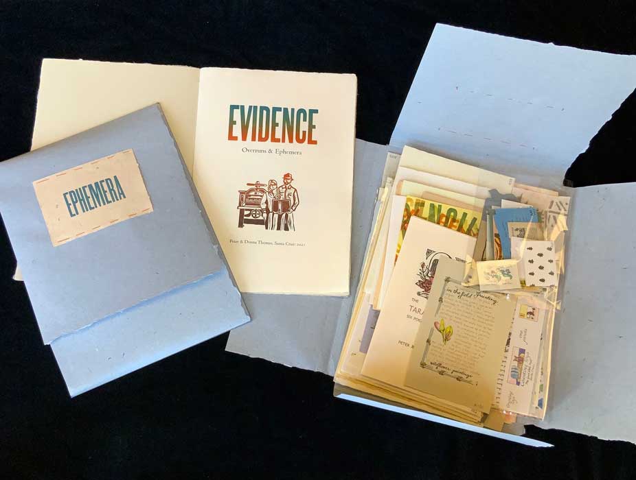
Legacy Press has published a bibliography of the several hundred books published by Peter & Donna Thomas since 1974. Their work is (or should be) well known in particular to fans of miniature books and books about papermaking. In parallel with the bibliography, Peter & Donna have issued 30 sets of sample sheets and ephemera, titled Evidence.
ENOUGH!

The history of printing continues to be the primary topic for reading around here. Got a book I’d only recently heard of, Thomas Horne’s An Introduction to the Study of Bibliography (1814). The title’s misleading, the book is more like an encyclopedia, or at least a compendium, of information and sources on printing and related topics. Not rare, but many copies are lacking some or all of the 11 plates (not mine!). Anyone with copies of the more obscure Wm Blades publications from the 19th century, please get in touch.