1.10.23

A Visit With Jim Rimmer (Pt. 2)

 
HM’s new book, about Jim Rimmer’s Pie Tree Press & Type Foundry, is out this month. It includes a short essay about Jim’s work by The Aliquando Press’s Will Rueter, followed by a descriptive checklist of the books Jim issued from his press. Each copy also includes an original, initialed color linocut by Jim from one of his books. I had 45 prints, so the edition is just 40 numbered and five hors commerce copies. 


For a variety of reasons, Jim’s books are more widely known of than actually seen. HM’s book was conceived to provide some sense of Jim’s work for people who haven’t had the chance to own one of his books. 
 

Each copy also includes two cards (from a set of 13) he issued in 1981, showing the various “unobtainable ornaments” available from his foundry. Every copy includes Jim’s Apologia (below, left), plus one of the display cards.


Much of the fun in compiling the bibliography was running down variant issues of several books. To augment the new book, here follow images of some of the more unusual items and variations....


The first book issued (but not the first printed...) by Pie Tree was done in an edition of just one copy. Luckily he bound up a second, and it now resides, along with a large archive of Jim’s work, at Simon Fraser University. 


Pie Tree’s second book, Shadow River, has the most convoluted history, spanning three years, two settings, and three issue states (or four, depending how you count). Above is the true first (1996). Jim was teaching typography, printing and illustration at a two-year college program in 1994, and he proposed making the end result a book, produced by the students. Each would create a linocut for a Pauline Johnson poem, and everyone would participate in the setting and printing. The project fell apart, for several reasons, one being that much of the student’s work (including linoblocks) was thrown out during a Christmas break! 
 

Two of the students hadn’t left their blocks at the school, and were able to subsequently print them. Jim went ahead an produced the book himself, cutting blocks for each of the poems, and issued the book in an edition of 40. The last five copies (only) included the print the two students, Monica Serwa and Edward Vandervelden, had completed. Here’s Monica’s...


And here’s Edward’s...
 

If Jim’s intention had been that the two students get one of the copies with their print, it didn’t happen: Edward didn’t even know the book had been completed until I managed to track him down earlier this year.


That’s the title page from second (1997), & most commonly seen version. Notice the woman turned her chair around, and got bigger? It’s colophon hints at some of the turmoil in the book’s production...


Below is what might be a unique copy of the second issue, with a completely different colophon...


Finally, in 1999 Jim completely reset in the book, in Centaur, and printed 15 copies for family & friends... 


... except he later reported only seven were bound up. But at least one copy out there lacks this correction to the colophon. 


His fifth book was Leaves From the Pie Tree, in which he recounted how he was press-ganged into the compositing trade by his grandfather, eventually set out as a freelance graphic artist, and started designing metal and digital types. It’s an entertaining read, enlivened with various linocuts and type samples throughout. The edition was just 40 copies, but actually there were another 10, issued through the digital foundry P22. The idea for it must have come up after he’d finished the book; copies were only available with the purchase of Jim’s digital fonts from the foundry.

Time to start drinking brandy and do battle with this bug (again). I’ll end with different copies of Shadow River; each copy features its own unique printing with cedar fronds. 


1.9.23

A Visit With Jim Rimmer (Pt. 1)


HM’s checklist of books issued by Jim Rimmer’s Pie Tree Press & Type Foundry will be ready for distribution next month. To coincide with publication  – and augment the checklist – the October post will feature images of his books (& variants). Before all that, this month’s post features links to sources about Jim and his work as a printer and type designer.
 

Many people know of Jim’s books but haven’t actually ever seen one. There are several reasons for this: some editions were small, 50 copies or less. Some editions where never fully issued, his enthusiasm to complete binding waning as sales stalled, which happened because like many private printers, he found self-promotion distasteful. HM’s book was sparked by the acquisition of 45 linocuts from two of his books, and some typographic cards he printed, a year or two after his death in 2010. I had no idea what to do with them, so they sat in a box, but over the years the idea of using his prints as an introduction to his private printing, for the people who’ve never seen the actual books, developed.
 
As an introduction, the HM book includes a four-page profile of Jim written by Will Rueter (the text is adapted from a longer piece published in Devil’s Artisan in 2003), which focuses primarily on his typographic work. The book also includes samples of the types Jim designed and cut in metal, but those are just a slice of his typographic output. A more comprehensive accounting can be seen on Luc Devroye’s site
 
Jim lived most of his life in New Westminster, a city jammed up against Vancouver. I first met him in Colophon Books when he was accompanying a younger colleague who was soliciting orders for a book he was publishing (see here for the story about that ill-fated adventure). Anyone getting involved with letterpress in Vancouver in the 1990s would have known Jim’s name, but I had been cautioned away from contacting him for help by someone who said he wasn’t interested in casting type for other people. It was the irascible Washington state printer Chris Stern (Grey Spider Press) who informed me, a few years later, in heated & no uncertain terms, that this was not true, and that I and everyone else in Vancouver did not appreciate the living legend who walked among us. So I called Jim and he said what he probably said to anyone who called asking for help: come on by. 


From about 2002 until his death, I would go out to Jim’s house once or twice a year. In 2003 he gave me a font of his 60-pt Duensing Titling type, and I thought it was the perfect size for a miniature book. He agreed to write a short preface and we published it that same year. He also cast a couple of drawers of Garamont (an odd face) for me that year, which I used for HM’s first book with Barbara Hodgson. Around that time we talked about him designing and cutting a proprietary face for HM, and setting me up with my own casting equipment. I didn’t have a particular sense of what my own type might look like, and I had no desire to play with molten alloys, so neither proposal came to anything. But talking with Jim about those kinds of things was always fun. 

Jim’s past book, The Adventures of Tom Sawyer, was a tour de force of one person’s vision directing every aspect of design. He started by cutting in metal a 14-pt type, aptly named Hannibal, to set the text. He then created dozens of linocuts to illustrate the story, printed it all in a robust large quarto format, printed the binding papers with one of the elaborate printer’s ornament designs he was known for, and bound the copies. The only thing he didn’t do was make the paper. Here’s a link to an article from Parenthesis about the project, and here’s one from one of the local newspapers.  


Simon Fraser University’s retired head of special collections, Eric Swanick, has worked on an exhaustive checklist of items printed by Jim (most of his work was for others). It was first published in
Devil’s Artisan #66 (2010), followed by a supplement in #91 (2022). While at SFU he acquired a large archive of material by and about Jim (see here), including work from his early days as a freelance graphic designer (including a ’70s era logo for Heart). Eric’s 2012 discussion about Jim with Nigel Beale can be heard here
 

In 2006 Swanick and SFU Library organized a “Rimmerfest” to celebrate Jim and his work. A video of the evening, including the man himself, can be seen here. It captures his gentleness and humor, and the wide range of people he inspired and helped. 

Richard Kegler, founder of the digital foundry P22, made the documentary Making Faces about Jim in 2011. A review of the film can be found here.

 
The Boxcar Press blog posted three articles about/interviews with Jim, which can be found here

Jason Dewinetz’s Greenboathouse Press site includes this page about acquiring much of Jim’s casting equipment after his death. Jason has plans for his own Rimmer-related book in the next year or two.

Next month, some details of the HM book and images from the six books published by Pie Tree Press & Type Foundry.

1.8.23

Will Rueter's Last Aliquando Book (not really)


Another guest blog, this month Will Rueter of The Aliquando Press, writing about his avocation of six decades, over 100 books, and his latest & last (sort of)...
 
 + + +
 
Thanks to the suggestion (and generosity) of Our Heavenly Monkey himself, this is my first blog. I’m very honoured to use this space to celebrate The Aliquando Press’ 60th anniversary.
 
In December of last year The Aliquando Press completed the printing of its last book. My concentration needed for longer-term projects was diminishing, my eyesight wasn’t good enough for setting small sizes of type, and the realities of life outside my private press world needed more attention. It was time to stop printing before I really screwed up. 
 

For almost five months before and after the Press’ closure I packed, distributed, founted, and helped move seemingly tons of type and equipment, and then unpacked countless boxes in our basement, where I continue to discard detritus from the Press. (Moral: When in doubt - or not –
THROW OUT! You really can’t print on postage-stamp-sized offcuts or use two-decades-old grotty ink.) Happily, the temporal Press in all its manifestations has found good homes, most specifically at Massey College, University of Toronto, where students will be able to use my collection of typefaces that represents more than five centuries of letterform design. The idea of the Press and its potential remain with me, but I haven’t had time to grieve over its demise.
 
The last Aliquando Press book, Serious Play, is the summation of an idea that took root in December 1962. At art school I realized that I had found a passion for typographic design and specifically that I wanted to make books. Operating a private press as an avocation allowed me to learn the basic skills of book making and create books for pleasure. My fascination with book design led me to a career designing academic books for the University of Toronto Press and my naive early attempts at printing became a life-long obsession.

For about ten years I klutzed about, enjoying choosing texts, collecting and experimenting with type, colour, and paper, and learning simple binding. Eventually I realized that the pleasure element, while still evident, was giving way to the challenge of producing more serious books and printing.
 
I’ve always been obsessed with the austere beauty of books from T.J. Cobden-Sanderson’s Doves Press. His book design is magnificently minimal. In my own printing I’ve tried to strike a balance between C-S’s vision of the Book as a pure, sin-free ideal and the raucous, get-your-hands-dirty approach of the printer who actually enjoys printing. The truth lies somewhere in between.

For six decades the Press has been an alter ego, reflecting (I hope) my better qualities and tolerating my more objectionable ones. It has taught me as much patience and curiosity as I am ever likely to have. Through its activity I have met and made friends that I never expected, and I have been able to admire and (full disclosure) envy the work of many private presses. The solitary nature of operating a private press has been balanced by the Press’ many friends and mentors, from whom I have learned so much and whose camaraderie I value greatly.
 
HM asked me to add photos and comments about some recent Aliquando Press books that might be of interest to viewers. The final book from the Press is Serious Play, cobbled together from Daniel Berkeley Updike’s Printing Types: Their history, forms and use. I hadn’t paid much attention to Updike’s writings until relatively recently. His passion for typefaces, well-made books, and Doing.Things.Right. increases my respect for him. I added a fairly brief Afterword to Updike’s text as a ‘memoir’ of the Press and how much it has meant to me.

The book (25.5 x 16.5 cm, 41 pages) was set in Jim Rimmer’s  Nephi Medieval and Duensing Titling types and printed on Zerkall and Hahnemuhle papers. I played with Glint ornaments (the first ornaments bought for the Press decades ago) to create the initials. There are also a few photos showing my old studio. As with most Aliquando Press books, the edition is 40 copies, quarter bound in linen cloth with my own decorated paper on the boards.


In contrast, Steale Not Thys Book (11.5 x 9.5 cm, 31 pages) has gone over to the truly ridiculous side. It’s a small book of warnings and invectives, printed on Hahnemuhle  Archiv paper and using the full arsenal of the Press’ type, cuts, and ornaments, and bound in various marbled and decorated papers. Whenever I look at it I’m reminded why private printing is also supposed to be fun.


I’ve always enjoyed alternating the printing of prose and poetry. A chance encounter with Michelangelo’s sonnets in translation made them the perfect choice for a late Aliquando Press book. Beauteous Art’s Embrace (18 x 12cm, 28 pages) is set in Blado italic with Hadriano initials and Primula ornaments, printed on mouldmade Zerkall Nideggen paper, and quarter bound in Nepalese ‘sun print’ paper. I find Michelangelo’s thoughts on art and life very comforting at this stage of my life.


Having printed a number of Cobden-Sanderson’s thoughts on books and printing over the years, I wanted to complete the cycle with something more intimate. My final C-S book, Work & Beauty: Selected writings of Thomas James Cobden-Sanderson (16 x 11 cm, 33 pages) is set in the beautiful Trajanus type of Warren Chappell, printed on vintage Golden Hind paper, and produced to match – more or less – the format of C-S’s octavo Doves Press books.


William Morris has also received late attention from the Press. In A Visit with William Morris (16 x 12 cm, 41 pages) I reconstructed his words from four contemporary interviews to reveal an informal side of the master printer. The book was set in a version of his Kelmscott type and it includes my Cavatina ornaments and a reproduction of a wood-engraved portrait of Morris. It’s bound with a medieval-style overlapping cover.
 
I have loved music all my life and several Aliquando books have been inspired by music. My final offering is Laudes Musicae: Words in praise of music (18 x 12.5 cm, 45 pages), a compendium of quotations using a wide variety of type, paper, and ornaments. It’s my homage to the most consistent, comforting, and sustaining of the arts.


The general typographic style of The Aliquando Press has always been on the conservative side of conservatism (thanks to Cobden-Sanderson’s influence), but over the years I’ve enjoyed experimenting with ornament combinations, colour, formats, and papers. One of the biggest challenges has been to create bindings that were conduits to the text, yet were appropriate to the author’s ideas. I’ve run the gamut of experimental bindings and have found myself (as I do now) with printed sheets to bind after new projects are begun. An edition is only controllable if you completely bind at least ten copies reasonably promptly, then concentrate on completing each binding stage with the remaining copies before moving on to the next step. That approach seems to make edition binding less onerous: a fact I’m finally learning.
 
For anyone who fantasizes about letterpress and the craft aspect of relief printing, you would be well advised to think carefully before investing in what has become an obsolete craft. Some art schools have letterpress equipment and a good university may offer courses and/or equipment as part of a bibliography program. Staining your fingers with ink and producing an image from letterforms is addictive but it requires serious commitment as well as good humour and patience – and, always, love of the craft rather than hope of financial return.


Though I would never call myself a particularly good printer or binder, it’s been fun finding interesting texts to print and, I hope, being a reasonably good steward to the author’s words. Very sadly, I think the Golden Age of Letterpress has gone. But the Book as an ideal of perfection remains, and I hope the physical book will continue to inspire, delight, offend, and enlighten us all for many decades to come.
 
If you are interested in any Aliquando Press books still on hand or want to chat, send an email to me at dovecotte[at]cogeco.ca.

1.7.23


It’s Canada Day so we’ll keep this short: some photos of the Jim Rimmer book in progress. That’s a sketch of what the binding will look like, quarter black cloth with printed paper over boards, the text set in Jim’s 60-pt Duensing Titling. 
 

Printing will be finished in the next couple of weeks, then binding, so copies out early fall as planned.

The book’s last page:


Next month another guest blog: The Aliquando Press’ Will Rueter. Stay cool.

1.6.23

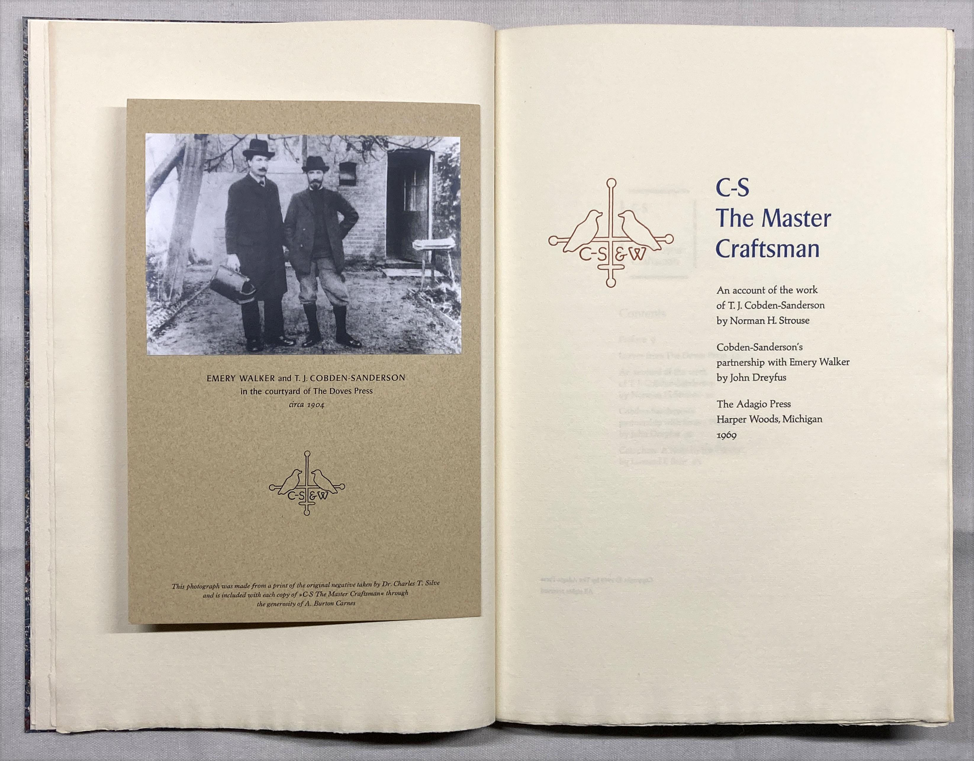
Adagio's C-S , The Master Craftsman


I had a couple of days between projects last month so I attended to a few binding projects. I’d recently acquired a copy of Leonard Bahr’s C-S, The Master Craftsman (Adagio Press 1969) in sheets. I’d seen the book over the years but never felt the beed to own a copy. The copy in sheets was cheap, plus it included several proof and trial-setting sheets, including a completely different title page, which are always of interest to a printer. 


The two Doves leaves required were lacking, but there are enough Doves leaves kicking around HM from the Pollard project Ideal Book projects to easily fix that shortcoming. 


One of the two sheets included in the edition was from the Bible. I still have some of those and chose a bifolium (half a printed sheet; the Bible was printed four up) that showed some of the foxing for which Vol. 1 is infamous.  For the second I acquired a leaf from Paradise Regain
d from the excellent Kelmscott Bookshop.
 

It’s not an uncommon book, copies can be found. It seems to have been bankrolled by the bibliophile Norman Strouse, who provided the leaves and a brief essay about Cobden-Sanderson’s career. There’s nothing new in his essay but it’s engaging enough, and includes a paragraph on
the purpose and value of leaf books, for the boneheads who need it explained. John Dreyfus contributed a more penetrating essay, about the partnership between C-S and Emery Walker, with some speculation  – based on previously unpublished legal documents – on why it disintegrated and C-S later dumped all the Doves type and matrices in the Thames. It paints a sympathetic but not apologetic portrait of C-S. 


This was Bahr’s most ambitious project. The Adagio Press was a private endeavor, a break from the duller jobbing work that paid his bills. (See Will Rueter’s Pressing Matters for more about Bahr and Adagio.)

It’s all the more ambitious when one reads, in his colophon, that whatever he was printing with could only manage a single page at a time, which means each bilofium sheet had to go thru the press four times just for the black, and most sheets have one, sometimes two additional colors! He explains that printing each sheet took so long that dampening the handmade Tovil paper, although preferable, was impossible. At least he acknowledges this shortcoming, and his results were acceptable enough. 


One of the things I didn’t like about the book as issued was the inclusion of a sheet with a photo of C-S and Walker tipped on. (C-S always looks like an insufferable ponce.) This sheet was simply laid into the book. I suspect it might have been an afterthought. I really don’t like books with items laid in (unless there
s a box, and even then...), so I mounted the sheet in my copy opposite the title page. 
 

There were 10 copies  “retree” copies bound up at some time by Campbell-Logan. My copy includes the little slip inserted identifying these as such, so I guess my copy was part of that exercise (i.e. an extra set beyond the 10). I annotated it so as not to defame Campbell-Logan.

AND ANOTHER THING!


Before I got to the binding, I printed the seven sheets that make up the text for Byzantium’s upcoming book about marbling on different papers. For the title page Barbara marbled the sheet, leaving a blank area for the text. She used acrylics so I was able to dampen the sheets for printing (as I did with all the others) without everything running. Each copy will include original marbled samples on at least 51 different papers, grouped by type (handmade, mouldmade, machine-made) and source (Western or Eastern). I believe the edition of 17 copies, uniformly bound by Claudia, will be ready for issue in the fall. 

This month I start printing the next HM book, which also should be ready for publication in the fall. 

Last months Agrippa symposium in London has sparked some requests for copies of HMs About Agrippa. The edition was exhausted some years ago, but Im considering a second printing. If interested send an email please (address at right somewhere).

Next month Ive lined up another guest, Will Rueter, who will share some details and images about what will be The Aliquando Press final book, and an updated bibliography. 


1.5.23

Agrippa (A Book of the Dead) Lives!


A two-day symposium (actual & virtual) about the infamous disappearing Agrippa: A Book of the Dead will be held this month in London. The event addresses some of the many conceptual questions the project sparked, or at least brought into sharp relief: what is a book? What is a book in the digital age? 

The text of Agrippa, published in 1992, was a long free-verse poem by cyberpunk author William Gibson. It was to have been issued in two versions, both limited in number, presenting the same concept: a physical book whose printed text was essentially gibberish, with accompanying etchings by David Ashbaugh. Gibson’s poem was included on a 3.5 computer disc that would auto-encrypt itself after being read once. Similarly, the prints were supposed to have been photo-sensitive, so just opening the book would initiate a change the art. So, Agrippa would present a “reader” with a conundrum: opening the book would change its printed pages irrevocably. Booting the disc to see if Gibson’s text could be read would result in permanently encrypting the text (if it hadn’t already been).  


The symposium is being organized by a PhD candidate, Justine Provino, and most of the participants are scholars who have thought & written deeply about the broad questions Agrippa posed. I’ve been included  because (I think) I’m one of few people interested strictly in the physical aspects of its production, i.e. the most traditional and perhaps mundane aspects. But these mundane aspects posed a number of technical problems to the publisher, and I’m fascinated by the stories about the making of a book, particularly when things go wrong. (See here for a long post about Agrippa and an account of its production I wrote in 2015). 


How much of what was promised in Agrippa’s prospectus ended up happening was long a matter of debate, and answering some of these questions was the focus of my monograph. They couldn’t get the photo-sensitive concept to work, but someone came up with a clever alternative that achieved much the same result. I’ve never been clear on whether the self-encrypting program worked; the copies of Agrippa I’ve seen were issued without a disc. The whole endeavor became somewhat shambolic in the end, but its ambition and provocation inspired many broader discussions (and graduate degrees). 


Agrippa
wouldn’t be classified as fine press by the people who made it or people for whom that phrase means something specific: the production was not the finest. It’s more firmly in the artist’s book realm. Copies rarely come to market. When I wrote my monograph, I found two listed in recent years. One sold on Abebooks for about $5,000, from a bookseller who had it on commission and didn’t really know what it was. The other sold in a modern art auction, for a paltry $800, once again showing that books aren’t really considered art by the market.

If you’re interested in discussions around artists books, what constitutes a book, what is the role of physical books in the 21st century etc etc, this free symposium might be worth dialing in. 
 
AND ANOTHER THING!
 

I
ll print Barbara Hodgson’s Marbling Paper: Experiments to Show That Paper Really Does Matter this month. That’s the title page above: she’ll marble the sheet, then I'll print the text in the white areas. We’ll see how that goes...