The blog of Seattle-based musician Tom Shear (aka Assemblage 23) recently passed along a mesmerizing recording, the sound of a dial-up modem slowed down 700%. Similar to the sound of a handpress at work, speeded up 700%? Either way, the perfect accompaniment for getting into a printing groove.
29.6.12
This Is What Slow Sounds Like
The blog of Seattle-based musician Tom Shear (aka Assemblage 23) recently passed along a mesmerizing recording, the sound of a dial-up modem slowed down 700%. Similar to the sound of a handpress at work, speeded up 700%? Either way, the perfect accompaniment for getting into a printing groove.
28.6.12
June's Paste Papers #2: HM's First Triple Decker
The deluxe copies of Types/Paper/Print were issued over the past week. Each copy presents the entire book repeated three times on different papers: the Guarro laid used for the entire edition, plus Arches Wove (our go-to mouldmade) and Reg Lissel's HM Text (our go-to handmade). The idea was to let people compare how a type face looks, at a given size, on different papers. As William Everson said (and as HM quoted him in Elements in Correlation), "Critics of the book generally focus on the type and when people get into printing, the first thing they get into is type...But the paper is more fundamental, that is where the beauty begins, and in the end, that is all that beauty can come back to - the substance of the paper, the field on which the whole thing can act."
Claudia Cohen bound the deluxe copies with leather spines and fore-edges, and her own paste papers. She leftover sheets originally created for other projects, so there are at least a half dozen variants among the 10 deluxe copies (plus two AP, hers and mine). Below are six of the copies. The green paper was originally created for Gehenna Press's Zapf Civilite Disclosed (1995).
Should also note that Shinsuke's frontis engraving is signed & dated in the deluxe copies.
We always enjoy having fun with the spine, especially the tail. This is what she came up with: perfect for a type sampler.
Most of the deluxe copies went to our regular booksellers, so if you're interested, contact one of them.
27.6.12
June's Paste Papers #1: Seeing Green
Saw Reg Lissel today. He showed off a sheet of the paste paper he recently made for the deluxe copies of the next issue of the FPBA's journal, Parenthesis. The base is his basic cotton sheet, about 200g, 18 x 27 inches (+/-). Not sure if they're being printed on or just folded up as jackets. Think that issue is due out around September. Reg's looking good; grinding through an order of HM Text (for someone else), then he's going to spend some time later in the summer making gampi.
Here's one of his cool folded-paper geometry sculpture creations.
24.6.12
Print by Example
More explanations & details to follow at a later date, but much time has been spent cruising for printmaking technique/process books which include actual sample prints (not reproductions). Stumbled across the site of one George C. Baxley, primarily devoted to stamps but with a serious side interest in Japanese art, and thus Japanese wood-block printing. The site is a little tricky to navigate, but that's due to the tremendous amount of information included. Many of the process books he has on offer are reproduced in full, along with significant sections of text. A great site for anyone wanting a quick introduction to the medium.
Anyone out there with technique books that include actual prints, especially pre-1950, any language, please get in touch. Or just send them.
12.6.12
Plata O Tinta
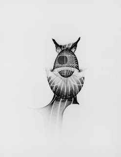
Back to work at the press, printing the second volume in HM's occasional Artists' Pamphlet series. My Dark Room is David George's two-tiered essay on his work with photograms, and the medium's unexplored artistic potential. It also presents the first ever reproduction of his photograms - each of which is, by definition, a unique work, not a matrix for reproduction (like film would be) - as photogravures. Two different original photograms were reproduced from copper photo-etchings at New Leaf Editions. Each copy of the pamphlet will feature one or the other of these as a frontis. The ten Patron copies of the book will feature both.
This project also marks our first experiment with using silver ink. Looks fantastic on the roller. The stuff we got was exactly stiff & tacky - runny would be the word. Not exactly how we like ink. However, rolled out, a little went a very long way: basically we just had to tell the roller the ink was in the room, and that was enough.
The next few days will be spent printing David's essay: one sheet, four pages, two colors both sides. One hundred & fifty impressions per day, which is a lot for a prosaic handpress outfit like HM. We'll see how it goes...
6.6.12
Ray Bradbury & the Printed Man
Subscribe to:
Comments (Atom)


