26.7.11

Done Like Dinner


At exactly 2:34 p.m. last Saturday we finished printing Oddballs. Above is one of the Heavenly Babes holding the last sheet (recto is the title page, verso is second half of the contents listing). Red was the last run. The day before we printed the black and pale gray (not really evident above, but maybe it is in the close-up below). Those two colors were done simultaneously, with the gray section being inked up separately and dropped into the form for each impression.


After a night, day and night of celebration and relaxation, we're into collating the sheets and tipping in the engravings, 41 in each copy (the 40 oddballs plus Jim's self-portrait frontis). With luck, copies will be ready for the Seattle book fair in early October, and the Vancouver wayzgoose later that month.

This Could Be Your Type


Michael Russem, over at Kat Ran Press, is selling off a bunch of his type. Unfortunately we were a bit late to the game and so some of the choice stuff is gone (like all the Dante, which was used in our favorite of his books, 2004's Sleep, featuring etchings by John Gibson, one of which is shown above just so there would be some kind of image with this post), but there's still lots worth looking at, and apparently he has more that's still to be listed.

14.7.11

Do You Have It In a Smaller Size...?


As previously mentioned somewhere in the past on this blog, last summer for fun & laughs we printed a few copies of a complete miniature version of The WunderCabinet. These shrunken heads came in at about 30% the size of the original, which means a page of about 3 x 4 inches, with text in 2-pt type (printed on dampened pieces of Reg Lissel's linen paper deemed too thin for the full-sized book). As is always the case with Barbara and Claudia, this little bit of off-hand hilarity snowballed out of all proportions, with everyone attempting to outdo the others, and has yielded this:


Which is to say, five miniature replicas of the deluxe issue of The WunderCabinet (plus 3 hors de commerce). It's the same full-leather binding with onlays, laid into a box covered in wood veneers, with accompanying oddments and disturbing bits.


These photos are the first completed copy: Claudia's been spending an unprofitably large amount of time with this little distraction, during which she reportedly has overcome much of her strong dislike for small books. Meanwhile, we'll continue pondering how to list this mini-WunderCabinet in the HM bibliography.

12.7.11

News From All Over

A longer break between posts than we usually take, all because of Oddballs. The colophon was printed, the sheets sent to Red Deer for Jim to sign, and then returned to HM. We carried on with the last few pages of printing. The end is in sight. Meanwhile, a few things of interest that have come our way lately...

Wicked Bugs: The Louse that Conquered Napoleon's Army and Other Diabolical Insects was released in May and has received extensive media attention. This is a sequel to Wicked Plants, written by Amy Stewart and featuring reproductions of original etchings by HM fave Briony Morrow-Cribbs. The New York Times site features a slideshow of seven illustrations from the new book, and there's even a Youtube clip of Briony and Amy talking about the project. Happily, unlike Wicked Plants, the publisher seems to have resisted the urge to incorporate additional illustrations (dull in comparison to BMC's) by a second artist in the new book.


Speaking of Briony, it's subscription print time: for the past three years, she and her partner at Twin Vixen Press, Helen O'Donnell, have offered a set of two original etchings to subscribers at a very reasonable price (2010's are shown above and below). Details for this year's offer can be seen at the TVP site.

Still speaking of Briony, check out this miniature etching press her mother Buffy recently made with at Bill Ritchie's Emeralda Works in Seattle. While even larger tabletop etching presses have poor reputations for printing ability, Ritchie's miniatures apparently are the real deal.


The gang at Shakman Press have just published a "small specimen of typefaces designed by Emil Rudolf Weiß, bound by Sarah Creighton in dashing pastepapers. The typefaces used all come from the spectacular collection of the Druckladen of the Gutenberg Musuem in Mainz. Weiß's designs—Antiqua Kursiv, Antiqua Fett, Kapitale, Lapidar Halbfett and Kapitale Halbfett—are reproduced in two colors and printed on mould-made Zerkall paper." The edition is just 25 copies in English, 10 in German, printed letterpress on a Korrex cylinder press. All that and a Sarah Creighton binding for just $60, it seems a steal.


Stumbled across "a blog about fine press books" called The Whole Book Experience written by one J. Davis. Might be of interest to people whose tastes run toward the genre's more conventional traditions and subjects.

A significant new addition to the HM handpress library is expected to arrive later this week. Watch this space...

22.6.11

Printing Oddball Stories


There's been a lot of whining on this blog in recent months about the work of printing Oddballs. Visitors - which HM's Webmaster reports now total in the several - have asked about the process of printing a sheet. So, in an effort to avoid the work we've been moaning about, we took some photos to illustrate the sequence of events. Each sheet is printed over a period of three days: on the afternoon of the first, we wet the paper. On the second day, we print the inner form, and on the third we back it up. 


We're using an abbreviated form of Gabriel Rummonds' recommended method for damping paper (which is to stack the sheets between dampened pressing boards). We need 37 good copies of the book (the edition is 30 plus six hors commerce and one binder's dummy), so we're printing 48 sheets. This takes between five and six hours, which is exactly how much time we have for work while HRH is at school.


We wet a sheet by running it through a vat of clean water, shaking off the excess and then laying it down on a dry sheet to start the stack. 


Then two dry sheets are smoothed across the wet sheet. The Guarro laid paper we're using doesn't cockle and react as violently to the water as many well-sized handmades would, so smoothing the dry sheets across the wet one is not difficult.


Once the stack is completed, it is put into a heavy garbage bag, put under light weight, and left for a few hours. Before going to bed, we restack the paper, simply starting at the top of the stack and moving each sheet over in turn to make a new stack. This reverses which sheet faces which, and helps disperse the surface water from the wet sheets. The stack is then wrapped again and pressed over night. 

Below is one of the four platen bearers on the bed of the press (this one manufactured & sold by Steve Heaver of the Hill Press). The bulk of Oddballs consists of the one-page biographies, which appear on versos. We're printing all of these first, so that the bearers could be adjusted to even the platen's fall on the one-sided form. This is done using Rummonds' "zero packing" system, adjusting pieces of the packing material between the back of the tympan and beneath the bearers. When it comes time to print the frontmatter (spreads), we'll return the bearers to a more level setting.  


In the morning of the second day we roll out the ink and leave it standing while getting the press ready. We use a piece of half-inch glass as an ink slab (on a non-slip mat) and a 60-dur roller from Takach Press


The text to be printed is set in place and a position proof is taken, plus a few impressions on tissue for makeready. The pages we're printing are pretty consistent in length and shape, the only difference being the number of lines, so makeready is straightforward. The hinged Mylar window that covers the makeready can be seen (with some text offsetting) on the left side. 


In addition to makeready, we make some adjustments to the roller bearers with tape, to ease the transition on to and off of the text block. (The bearers are locked up above and below the type, as the roller must pass perpendicular to the lines when inking.) As many as six pieces of tape may be required, arranged in a narrow band across the vertical area occupied by the first and last letters in the lines.


A few proofs are then pulled on newsprint to check impression and the roller's ink coverage. Then we tuck into the stack of dampened paper. After removing the stack from the plastic bag, it is covered in a thick layer of dampened cotton cloth. The stack is uncovered and a sheet removed only when the type has been inked and is ready for printing.

When properly dampened for printing, a sheet of paper should feel cool to the touch but not wet on its surface, and it should be completely relaxed (i.e. floppy).


Before being printed, the sheet must have holes pricked in exactly the correct position, to fit on the press' points.  We use a thick piece of foam core covered in plastic (so that it doesn't react to the papers' dampness) as a base. A piece of Mylar the same size as the printing sheet, with holes pierced in the proper spots, is then laid over the printing sheet, and a needle is used to make the holes. This all happens in less time than it takes to describe, so that the paper doesn't start drying out.


A mould-made sheet like the Guarro will expand almost entirely across the grain and very little (if at all) vertically, so it would theoretically be possible to prick the holes before damping the sheets, but we believe this creates too much potential for error. A handmade expands equally in all directions, between 2 and 4%. We once tried to gauge this expansion with test sheets, so that we could prick the holes before damping. But even the slightest error will ruin the whole point of printing on points, which is to achieve the most precise registration possible. So we make the holes in the dampened paper before printing the first form.

The sheet is then laid on the points. Between it and the Mylar window covering the makeready is a slip sheet, which is most important when backing up: if not used, the printed side will offset to the packing, and then transfer to subsequent sheets. But to ensure impression is consistent throughout, and to not "burnish" the verso against the Mylar when pulling an impression, the slipsheet must be used even for the inner form.


The frisket is lowered.....


the bed rolled in, an impression pulled, and voila....


The image above shows the impressions from the two roller bearers along the frisket (smeared here from various cleanings). Strips of tape are laid along the frisket in these areas, to prevent the ink from soaking through. Pieces of tape covering the area where the frisket contacts one of the platen bearers (top left) can also be seen; this tape is simply to help the paper withstand the repeated impressions (it will wear there first).


The slipsheet showing some cockling caused by the dampened printing sheet. It is replaced for each impression.


On Day One, the printed sheets are placed in a second stack, under a damp, heavy cotton cloth. If deemed prudent, each is lightly misted as it is laid on the stack, to maintain the ideal dampness.


On Day Two, after the last run (outer form), each printed sheet is interleaved with a pressing board, to wick out the moisture. When printing is completed, this stack is pressed tightly overnight. It is then restacked with fresh pressing boards the next day and pressed again, ultimately yielding dry, flat sheets. (When printing on handmade paper, we remove the sheets from the boards before they are completely dry, and press them very hard overnight, then restack them to complete drying. This pressing while still slightly damp gives the paper a wonderful crispness, but the process doesn't seem to yield the same results with mouldmades.) For Oddballs, the printed sheets are tucked away under the bench, the entire stack left under medium weights. The book will consist of 24 printed sheets; in the image below you can see we have completed 15 of the 24.  


When all the printing is completed, copies will be collated, and the engravings will be tipped to the rectos facing their biography. Here's Unn, awaiting her text...


19.6.11

Cow Pies

Came home the other day to discover a note left by one of HM's esteemed friends:


Esteemed or not, we won't be eating any pies at her place. 
17.6.11

Handpress Library 3 - H.D.C. Pepler


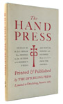
In 1934 Hilary Douglas Clarke Pepler published The Hand Press, based on his two decades of experience running St. Dominic's Press and working in collaboration with people such as Eric Gill and Hilaire Belloc. American printers were still in the thrall of their English counterparts at that time, but Pepler's book wouldn't have caused any technical envy among the Yanks: the greatest comfort we at HM take from The Hand Press is its unapologetic demonstration of the challenges posed by printing with a handpress. After a tough day in the studio, when printing a block of text with the crispness and consistency that we know is possible proves illusive, dipping into Pepler's book reminds us that others have suffered the same trials (and even issued their less-than-good results!).

The University of Notre-Dame's Hesburgh Libraries site offers this summary of Pepler's printing and publishing ambitions:

"Hilary Pepler lived in the Hammersmith neighborhood of London in the vicinity of the Kelmscott Press and early in life was an enthusiastic follower of the Arts and Crafts Movement. When he founded the St. Dominic's Press in 1916, however, he rejected the vision of the Book Beautiful embraced by William Morris over two decades earlier. Pepler printed the books he believed needed to be printed without undue concern setting especially high aesthetic standards. With his frequent collaborators the calligrapher and type designed Edward Johnston and the type designer and illustrator Eric Gill, he created books that were attractive while retaining their simplicity. Pepler printed books and the periodical The Game, but also a great range of ephemera, including posters, broadsides, calendars, and even labels for beer bottles. The commercial focus of the press allowed it to be successful well into the 1930s when many other private presses were failing. By 1940 it had gradually become less active while Pepler directed his energy elsewhere, and it was purchased and renamed the Ditchling Press."


Rejected the vision of the book beautiful; that's about right. Not that The Hand Press is ugly, but it is a bit rough and ready. The text was set in what seems to be a particularly poor casting (the T and H sorts all seem much too heavy compared to the other letters, but the printing is inconsistent throughout the book, with little evidence of attempts at makeready, so it's hard to tell if this is the casting or work-ups; the image below sanitizes much of the vagaries on the page). It is printed on a laid paper that is too thick for the page size and bound with the chain lines running horizontally; despite what some people claim, even handmade paper, if laid, prefers folding with the chain lines.


The text offers only passing technical information, focusing instead more on the esthetic and spiritual aspects of printing by hand (which is another reason for our fondness for the book). The stages of producing a book - from type selection through materials, to binding - are all covered in the text, often with anecdotes. There are a few facsimiles of title pages and early printing samples. It is not, however, a technical discourse, but one of taste and philosophy, and therefore of interest to both practising printers and those with an interest in the craft.


The book was apparently issued with a number of variants. Most copies seem to have been issued in a heavy brown wrap with a title band (see an image here); functional and not lovely. HM's copy is one of an unknown (to us) number - but probably very small - issued in quarter leather with patterned paper sides. This copy came from the excellent shop of Michael R. Thompson in Los Angeles, who can always be relied upon to provide cool books about printing.


This post probably reads as if written while looking down from a higher point than Pepler occupied: it shouldn't and isn't. When reading The Hand Press (which starts with the sentence, "The difference between a Hand Press and a Power Press is one of control") we are listening to a colleague discuss in an affectionate tone the vagaries and labors of a process that might seem outdated, slow, and overly complicated when more modern options exist. But Pepler also writes about why no other process offers the same results or satisfaction, and like Lewis Allen's book, the fun is in seeing pages printed in exactly the manner discussed in the text.

Next installment: Harry Duncan's The Technology of Hand Printing. Another book that makes us feel better about our own shortcomings.

P.S. a second edition of Pepler's book was issued in 1952 by the Ditchling Press, also in an edition of 250 copies. Haven't seen a copy but online descriptions make it sound like a resetting, not a facsimile. No idea how it was printed, but we'd bet not with a handpress.