1.2.22

Wood Type & the Invention of Printing

I’ll try to tie this all together. Its all related to a book project that might happen one day. There is a common thread, I just have to keep track of it...

I got myself a few books for Xmas, since it’s not exactly easy for others to pick ones I’ll be excited about. Without it being the primary intent or focus, they all ended up having something to do with the block books popular during the early and mid-15th century, and the protracted debates over exactly who invented movable type, when, and where.

Students of printing history will be familiar with debate over whether movable type was invented by Gutenberg or a Laurens Coster, a citizen of Haarlem. It generated a lot of hot air and convoluted opining among Europeans in the 19th century, until it was eventually settled in Gutenberg’s favor. To summarize it as briefly as possible, it boiled down to whether some of the block books incorporated moveable type, and whether that type might have been cut from wood, rather than cast from metal. A good summary of the block book debate, and how it ties into the invention of movable type can be found in William Blades’ Books in Chains (1892). 
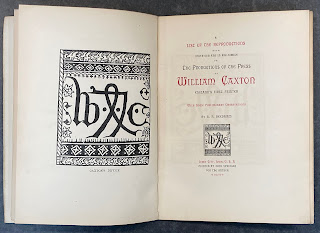

It was reading some histories of Caxton that led me down the rabbit holes of this debate. I stumbled across a short book listing known reproductions of Caxton productions published in 1879 by John Springer, a printer in Iowa – not a hot-spot of bibliographic inquiry or fine printing at the time. But Springer had ambition: the book was printed in an edition of 125 copies for the United States, consisting of three variants on different papers, the best printed with "carmine initials;" and 69 copies for Europe, also printed in three variants.
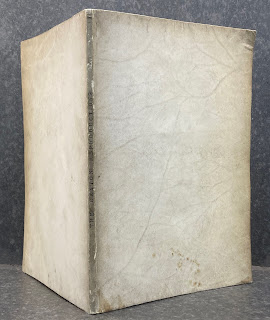

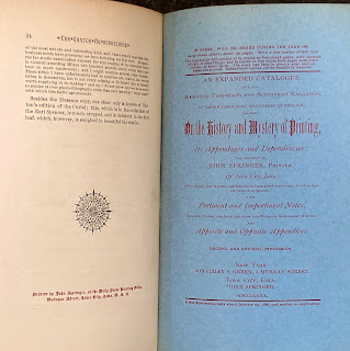
What I found most interesting about the book, aside from the limp vellum cover, is an advertisement on the inside back cover for an “expanded catalogue on the history and mystery of printing,” the second & revised impression, to be issued January 1880 (see image at top). A large octavo of 150 pages, an edition of 170 copies (two variants). The notice claims two-thirds of the book had been printed, but I can find no record of an issued copy. (If you have one, please send it along with an invoice.) What I did find was a catalogue with this title, issued by Springer in 1880, totaling just 52 pages The last sentence of Springer’s preface (which is dated 1878) states “Fifty-six copies have been printed on fine paper, nineteen copies on common paper, for private distribution only.” I hope this is a common paper issue; I’d hate to think anyone thought the paper was fine. 
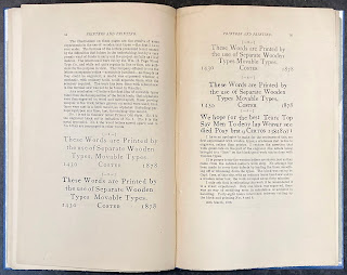

Getting back to our central thread, following a list of Springer’s books about the history of printing (many with amusingly arch comments appended), he weighs into the Coster/Gutenberg debate, but in what might have been considered a typically American, i.e. practical, way: he paid a wood type firm to cut a complete sentence in three lines on a block (sample #2 in the image). Then he cut the individual letters from the block and reset them as one would metal type (sample #4), and again using them to make different words. His thesis, which he believed he had proved, was the wood types could have achieved results as sharp as metal (arguments for & against this claim were central to the Gutenberg/Coster debate). 
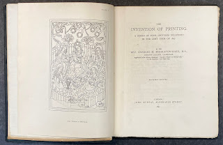

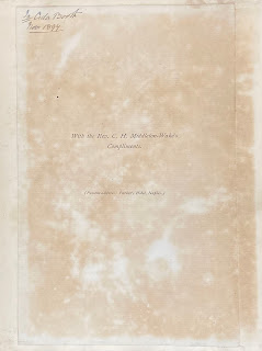
As I acquire books on the topic of early printing, the footnotes and references often introduce me to other sources. That’s how I was introduced to Charles Middleton-Wake’s The Invention of Printing (1897). Attractively printed on Van Gelder paper, with 15 plates, he really means the invention: the first three chapters (each a lecture he’d given) deal entirely with block books. I like the presentation note tipped to the front flyleaf – everyone should have custom stationery printed while residing in a hotel. 

That was an Xmas present. So were two books by Robert Proctor. He was an English bibliographer whose career was cut short by a wrong (or possibly intentional) turn in the Alps in 1903. He was one of the first to study the incunables in the British Library from a specifically typographic perspective, as detailed in his Index to the Early Printed Books in the British Museum: From the Invention of Printing to the Year 1500 (four parts, 1898-1903). His studies included an interest in Greek types, and he designed one himself – the Otter type  shortly before his death.

I knew Proctor’s name from the Greek type chapter in Fragments & Glimpses, and various publications of the Bibliographic Society, which issued some interesting & well-printed monographs c.1900. One is an early article by Proctor on the Dutch printer Jan van Doesborgh. Most of it is hardcore bibliographic descriptions, but there’s an informative preface and some lovely plates. 
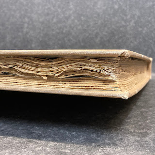
 

The copy I ordered was a library discard (having been donated by no less than Ellen Browning Scripps): does something look odd in that shot above? Upon initial inspection, I wondered if a second work had been bound in. Nope. 
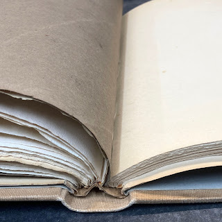
 

The book had been put in boards at some point after publication, probably by the library, and for no obvious reason, it had been doubled in thickness with blanks. Where they just filling it out so they could use a case that had already been made? Dunno. 
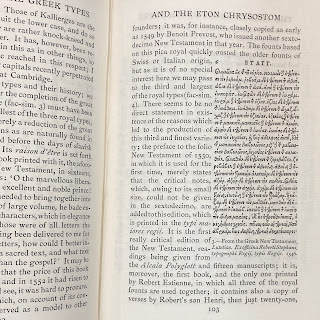

I also got a copy of Proctor’s collected essays, elegantly set and printed at the Chiswick Press (200 copies, 1905). It includes a memoir about Proctor by Alfred Pollard, and all of RB’s published essays along with numerous facsimiles and plates. Several of these he’d had printed by Chiswisk over the years, for private distribution. 
 
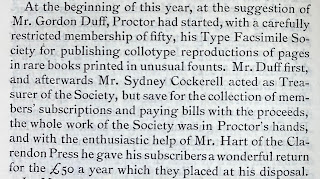
Stepping slightly off-topic for a second, Pollards essay includes the following:
 

I havent been able to track down much information about this society, much less any of its reproductions offered for sale. The closest thing Ive found is this set of photographs of incunable types.
 
It wasn’t until I got the collected essays that I realized a pamphlet I’d had sitting in my Abe basket for the past year (I dump a lot of stuff in there, then come back in a few months to see if I still want it...) was one of Proctor's privately-issued pamphlets! It is perhaps the driest of his three tracts on early printing, and the paper isnt nearly as nice as the collected edition, but still, cool. 
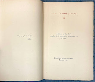

The book also includes several of Proctor
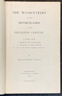
’s essays on early (Dutch) woodcuts, so I was back with the block books. Realizing that this was were my reading was going anyway, I also ordered a copy of William Conway’s The Woodcutters of the Netherlands in the 15th Century (1884). I haven’t cracked it yet; looks pretty dense and dry, and surprisingly has no plates. We’ll see. 

All of this started a year ago, when I had some vague idea for a project related to the Gutenberg/Coster debate. It’s been a case of the research taking on a life of its own, but hopefully I’ll get things back on track in 2022. 

AND ANOTHER THING!

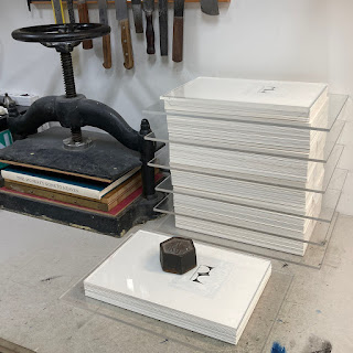
Believe it or not, I’m still collating copies of This Monkey’s Gone to Heaven. Thats the entire edition of 40 copies below, the printed sheets trimmed, collated and waiting for the sample leaves to be inserted before sewing. That bit takes ages because each of the sample leaves has to be inserted in a particular way. But I have the cases all figured out, so it’s just a matter of pushing through. Still on track for publication in April.
23.1.22

Robert R. Reid, Printer (1927-2022)

Robert Reid – the person I have called Canada’s first true private press printer – died last week. HM’s second publication was a bibliography of the five books his press issued. For just my second project on a handpress it was far too ambitious, but that seems apropos for a book about Bob. There will certainly be tributes to Bob’s career in the coming months. I’m going to limit mine to simply sharing the following three pages from a brochure he produced (c. mid-1980s?). I think it’s a concise representation of his typographic tastes, and the way he expressed his many passions in life (golf being a big one) through print.


1.1.22

HM’s Predicted Light Cone for 2022

So apparently people like more random pictures & less yak, based on all the new visitors to last month’s post. I’ll try to remember: this month, images from 2022 projects for HM: two that definitely will happen, one that probably might, and one likely to stray into ’23 (assuming HM also manages to stray into ’23...).

These incongruous parts are from a project that will feature original reduction (color) linocuts by Walter Bachinski of Shanty Bay Press fame. Needless to say he’ll be printing the linocuts himself, HM will do the text and binding. Scheduled for fall ’22.

A Jim Rimmer/Pie Tree Press thing (hard to describe at this point); summer-ish ’22? 

Got my new finishing press from Illtyd Perkins just in time to put it under the tree! It will be put to work on the two projects mentioned above.

The too-long-discussed HM=XX, which will be issued by April even if it kills me & makes the previous two projects mooted moot. I spent most of the Xmas hols painting in 40 Hs and 40 Ms. (Marginal notes in all copies courtesy Barbara Hodgson.)

I don’t know why I have this orphan brayer handle (tho it might have been one of the things I inherited when Black Stone Press closed up), but in 2022 I will load it with a roller, one from Lawrence in the UK. 

This one may take a while. I have to get my head around a few basics before anything gets printed, including Minkowski space (see top), not to mention staining all the old paper from broken books it will be printed on (sample above). We’ll leave it there for now, I still have 10 Hs and 10 Ms to paint in. I’ll show some of my bookish Xmas bounty next month (because it hasn’t arrived yet...). Happy happy, keep being nice to all.

24.12.21

Starman

Peace, shalom, as-salaam ’alaykum, wa chxw yuu & etc. for 2022. Don't blow it.

1.12.21

HM Studio Tour, Just This Once

Sometimes people ask to visit HM. I say no. It’s where I work (& play), so it’s private. Anyone interested in printing won’t find anything unusual. But here are a few highlights, parts I think are interesting. 

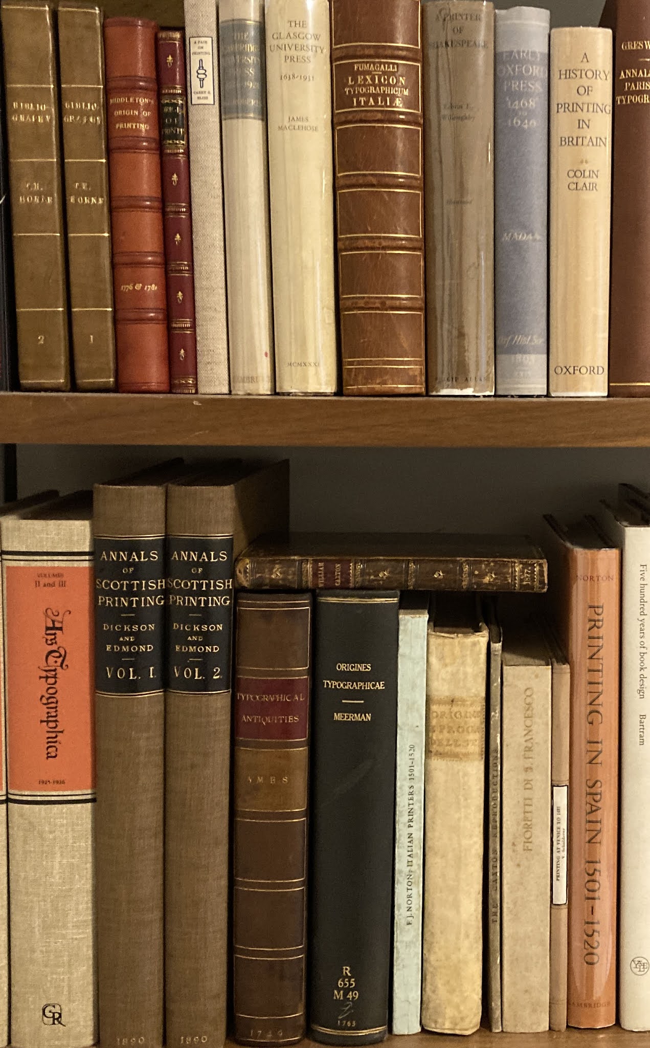
The shelves shown above hold some of the books that have been the focus of most of my work-related reading (& acquiring) this year. 

This was my first book press, and remains my most used. I learned from Claire Van Vliet to adhere mill board to the bed & platen (I use double-sided tape). Less chance of doing damage to the covers of a book. But I generally use 0.25-inch acrylic boards to sandwich anything going into the press anyway. That’s the first trial binding for HM=XX.


When HM=XX is released, next spring, I’m going to have a garage sale of remnants and samples left over, all sewn up into some presentable form.


Big books are kind of a pain. You rarely pull them off a shelf on a whim. I keep my folios in the studio because it’s the only place I know there will always be somewhere to put them down. 

I love this print. It’s an etching. I can’t read the artist’s name, but she came from a family of printers and made this when she was living in Montreal. For me, it captures how exhausting printing by hand can be, but you can’t stop because the run’s not finished. 

That's my “Yannick Jauzion” Laguiole knife on the lanyard. It’s not actually that useful in the studio, but it’s gorgeous. And you can never have too many knives around. 

I love old drafting instruments, interesting looking bits of machinery (especially brass), and any small tool that looks like it might be useful. That mechanical pencil is Italian. David Clifford used it back in his pre-digital designer days. I have no idea what that brass crucible, with nested ones inside, is for. The Kern stainless steel dividers I use when binding. The butterfly knife was made by a guy I met in Buenos Aires. I’m still learning to open it without slicing off my fingers.

Good ink (which always means oil-based) is getting hard to source. I keep a stash under the bench. 

I have to start using some of the printing papers I’ve been hoarding. It’s always a struggle because I know I’ll probably never get more like it, so saving until maybe the next project always seems the prudent decision.

As I said, hoarding. That package of 300 g Fabriano came to me from the artist Takao Tanabe. He’d purchased it in the late 1950s, when he was working as a job printer, and never used it. Paper hoarding must be a common affliction for printers. 


Then there are the drawers of paper...

And at the end of a day of work at HM, this is what it looks like outside the studio (seriously):


I probably will post once or twice more this month. I have some show-&-tell from a 19th-century American printer that should be amusing. Stay safe, be kind to each other. 

1.11.21

The Heavenly Monkey Edition!


That's my proposed artwork for a new Cocteau Twins album cover. Something with inky in the title seems apropos – Inky Reverb maybe. Last month I promised some photos illustrating the steps of inking & printing a (damp) sheet with a handpress. It needs some more work, but as a precursor, here’s a demonstration of one of the qualities that result from printing damp...

HOLD THE PRESS!


One of the best aspects of my work life is I spend all day, every day listening to music. It
s a very specific kind of music, and it seems unbound by country or culture. I recently heard a piece titled Music for Fields by sokpb avabodha, a musician who lives in Russia. It warranted more listening so I tried to find a copy. No surprise for someone who prints & binds books, I prefer to actually buy a physical thing (but not vinyl, too much hassle), i.e. a CD. Long story short, the CD version of Music for Fields sold out years ago, but Sokpb very kindly offered to burn me a copy and put it in a sleeve of his original design. You can see on his bandcamp page that he has created a number of releases in hand-crafted packages. He was sufficiently pleased with what he came up with for my CD that he asked if he could release it as a special version, the Heavenly Monkey edition! This will undoubtedly be the closest I ever get to actually releasing a CD. 

If youre interested in pursuing this specific musical thread, check out the streaming stations Drone Zone, Ambient Sleeping Pill and Planet Ambi (it was on one of these I would have heard Music for Fields). If youre interested in artists who span music and graphic arts, check out loscils recent (fantastic) release, Lux

IT SHRUNK

Below is a detail of a sheet from HM=XX. The paper is 120 g Arches wove, the type is 12-pt Perpetua. The horizontal line printed here is exactly 4.5 inches long. When printing was completed, the sheets were dried by pressing between 1/32” thick coaster board for about 12 to 18 hours (depends when I get around to it the next day). 


Dampening a sheet of rag paper before printing softens the fibers, making them more receptive to the impression of the type and the ink. This means dampened paper requires (much) less ink and impression, and yields the sharpest possible representation of the type. That sharpness increases when the paper dries: dampening paper causes it to relax, i.e. the fibers expand. The entire sheet gets slightly larger. With mouldmades, the increases usually is entirely perpendicular to the grain direction, but with handmades (which have no grain) it’s in all directions. 

As the image shows, when completely dried, the 4.5-inch line on the Arches sheet contracted by about 1/16”, or roughly 1.5%, which is pretty much average. (A sheet that expanded a lot when dampened probably isn’t one you should be printing on.) Interestingly, the Arches also expanded about the same amount vertically. Some mouldmades don’t change at all in the grain direction. 

The result of all this expanding and shrinking is that the type gets a final slight crimp, sharpening the density and edges. According to Edwin Grabhorn, not damping good rag paper requires four times more impression and ink, resulting in a muddier, heavier result. As I’ve said before, I don’t understand why people printing letterpress in this day & age with the goal of “fine printing” use mid-20th century standards for commercial printing as their guide. I wrote a whole book about this.


One of the most useful tricks I learned from Gabriel Rummonds’ was using tape to build up sections of roller bearers to (ever so slightly) lessen the rollers’ pass over the edges of type blocks and the end of lines that extend beyond the bulk of the page. I’ll go into some details with the how-to post. 


I’ve all-but-finished printing Paper Botanists, and now it goes to the hand-embellishment phase, followed by binding. While I was printing Barbara was going through the 40 copies of HM=XX, adding various amendments and comments. Turns out you’re supposed to proofread before you print – who knew? It’ll be more fun this way. 

AND ANOTHER THING!

Xmas gift idea for the binder on your list: anything from Illtyd Perkins workshop. HM is getting a shiny new finishing press with stand! Beautiful work and very reasonably priced for what you get. 

DSCN1790


1.10.21

Sinful Publishers & Other Oddities


For visitors from outside Canada, I’m writing this on September 30, which is now National Day for Truth & Reconciliation, honoring the lost children & survivors of the country’s odious residential schools for Indigenous people. Holiday isn’t the right word, but a day of reflection. 

Printing of Paper Botanists, the next book from Barbara Hodgson & Claudia Cohen, is well underway. Next month I’ll post a series of photos showing the steps of printing a sheet, starting with set up in the press. But for this month, it’s just a few unrelated things pillaged from the HM shelves that will hopefully be somewhat interesting to people interested in printing...


I was fortunate to stumble across this pamphlet, issued in 1950. I’ve never seen another copy listed. It’s the size of the two-volume Life Work of Dard Hunter (1981-3). Quite lovely, beautifully set & printed by DH Jr. Maybe I've already shown it here, but it’s cool and worth showing again.


This thing is stranger than I had realized: It’s a small pamphlet advertising a book to be published. The book didn’t end up being particularly noteworthy (the 21 shillings a copy cost in 1891 would now equate to about $700, which is about ten times more than a decent copy would cost you today). But this pamphlet tells an interesting story about the book: it seems some scoundrel was attempting to quickly assemble some book generally of the same content, and specifically of the same title, to extort Leadenhall with the threat of losing the registration (copyright, sort of) to the Loftie book they’d already been working on. It was the note appended to the front cover that initially caught my eye, but more than anything else, I think of myself as a publisher, so that aspect of its story is equally appealing. I guess I’m an unrepentant publisher, but hopefully not of the Piratical kind. Here’s the full story:


I’ve fallen down a Caxton well this year. This piece was printed by Fameorshame Press, which I’ve never heard of. But I have heard of Paul Moxon – the Vandercook guru – whose imprint it is. 


No idea how this got in the house, especially since the label on the wraps cover is half torn away. But an interesting essay, perhaps especially relevant today: “The graduate schools, I repeat, tend to mould their students into narrow specialists, who see only from the point of view of their subject, or of a special branch of their subject, and fail to recognize the importance of looking even at their own subject from other than its own point of view.”


In the late ’90s I once had the opportunity to buy a copy of the Arion Moby-Dick for $6,000. I exercised restraint, but it probably would have been a better return than whatever I ended up investing that six grand in. I eased my regret by looking for copies of the trade edition – not the “limited” trade edition, which isn’t terribly well bound (i.e. cased) based on the one copy I’ve seen, but the regular trade edition. Even then it was becoming scarce and priced accordingly, but you could find copies for $10 or $20 if you looked. I later found this card printed at Arion with a quote from the book, so my copy is almost exactly like the real thing.