1.7.22

Paper is Fundamental

“Critics of the book generally focus on the type and when people get into printing, the first thing they get into is type. They learn to recognize the different faces, and become pre-occupied with them. But the paper is more fundamental, because that is where the beauty begins, and in the end, that is all that beauty can come back to – the substance of the paper, the field on which the whole thing can act.” William Everson, On Printing

I had to get serious about finalizing the paper(s) for the Stockton book, which will be next in the press. It’s a small run, just 36 copies @ 32 pages = 8 sheets per copy = 325-ish sheets total, so some of the small batches of obscure handmades in the HM drawers were candidates. I don’t mind losing a little to trimming but more than a couple of inches seems a waste, so the first limiting factor is how a batch tears down for the book’s 9 x 12 sheet size.

The book will be two halves that meet in the middle, so I could use two different papers, but there couldn’t be too much variation in their weights or the sewn block would be awkward. I had enough of this F. J. Head (feels like it’s hot pressed, has a lovely smooth surface) but it’s quite light, about 80 g. The only other sheet I have similar in weight is Bodleian mouldmade, but it’s practically yellow. There’s going to be more color in the book than normal for HM, and the yellow would detract, so no good. 
 

This Camber Sand (145 g) would work – it’s not too creamy – but there’s only enough for one half; what would the other be? I don’t have a good companion. 


From a far corner that I thought held only heavy sheets (250
– 300 g) I found 100 sheets of Canterbury (120 g, off-white), which tears down with just over an inch of wastage in each direction. I guess I’d been saving it for some “special” project, but if this isn’t it I don’t know what will be. 
 
 
Walter Bachsinki has completed the two frontis prints, each a six-color pochoir, but I won’t be sharing those until the book is ready for publication. Late fall? We’ll see. 

Getting paper that’s good and interesting has required being constantly alert for whispers that someone is selling sheets they’ve been sitting on for decades. The only handmade sheet I’ve seen from St Armand that seemed a suitable weight for book work was their calligraphy sheet, although I know the mill will do custom orders. There’s Velké Losiny but I’ve never printed on their paper. Maybe I should place an order some day (while it’s an option). If you’re forced to buy what’s on offer, the choice is pretty much now restricted to Arches wove (cover is too heavy for most book applications & they don’t seem to make the lovely 120 g laid sheet any longer); Frankfurt; Nideggen (if you can work with the color, and the exaggerated rough sided doesn’t put you off); Rives BFK (tho I find it too soft for a book, the sheet marks easily when handled); or Somerset Book. There may still be some Zerkall Book out there, but that’ll be the end of it. Of the lot I prefer the Arches wove. But it will be fun to print on handmade again for the Stockton book. 

AND ANOTHER THING!

If you’re sitting on any stacks of handmade paper – preferably in the 80 to 150 g range – and feeling the need to cull, please get in touch!

1.6.22

Everything Went Green


The 10 “boxed” copies of HM=XX were finally assembled & issued at the end of May. Each one contains between 35 and 40 loose sample leaves in printed folders, along with the book. If the source book wasn’t obvious a note was added in pencil.

The five copies issued in a slipcase were also finished. These contain an accompanying portfolio with eight loose samples, all from projects not included in the bibliography due to their ephemeral or hors commerce nature. I had fun painting the papers to cover the portfolios and slipcases – this project turned out to be much greener than had been my initial intent. As usual, things just started & then went in a direction.


I told someone that HM=XX had rid me of my fascination with press bibliographies. Despite that, I acquired two last month. Both had been on my want list for ages, and by coincidence copies appeared almost simultaneously.

Memorials of C.H.O. Daniel is neither uncommon nor expensive. It was printed in 1921 in an edition of 560 copies, many many many of which are for sale today. It includes a bibliography of his eponymous press, about which I know nothing because I haven’t read the book yet. Over a decade ago I saw a listing from (the very cool) Michael R. Thompson for a large-paper copy with extra samples, but it was gone by the time I inquired. Since then I’ve kept my eyes peeled but not until a few weeks did one appear. Which explains why I bought it despite being in boards that appear to have been chewed by rodents (the book itself is fine – that’s what bindings are for).


The collection of facsimile pages at the back were printed by collotype (cool) or letterpress.
These large-paper copies were printed on A. Millbourn & Co. handmade paper, and include ten extra facsimiles and complete folded octavo sections from three of his books bound in. Cool! Plus it appears he did his printing with a handpress, so he must have been a good egg.

A possible Vale Press project has been orbiting for a few years, and as a result I’ve been looking for a copy of the bibliography. It’s online, and there’s a facsimile from the 1970s, but if your primary interest is printing, you need the original (as I explained to my accountant). So I got that too.


Ricketts’ style of ornamentation (= maximal) is not my scene, but I don’t find his work as heavy and intruding as Morris’. It was interesting to see that the bibliography’s title page incorporates the start of the text. This is something I did on Types Paper Print. I never imagined I was an original in doing this, but I hadn’t run into another example until now. I think I did it because it was the only way to make the text fit on the following three pages (i.e. typical HM laziness).


AND ANOTHER THING!

Here’s the lesson from HM=XX I offer to young printers: throw a copy of the title page from every book you publish in a file. I didn’t do that and wish I had.

1.5.22

HM Turned 20 (Two Years Ago)


I’m (finally) mailing out copies of the HM bibliography, This Monkey’s Gone to Heaven, this month. As I told a friend, I’ll have to come up with a new excuse for what’s taking up all my time.

I have never been interested in talking about my books. The fun of a book is opening it up and figuring it out for yourself. But I need to post something, and the marketing dept. says it should tie in with the new book, so here are a few anecdotes about some of HM’s books, not included in the bibliography...


The first HM book was the bibliography of books published by Charles van Sandwyk. At the time, and I suspect to this day, he didn’t understand why anyone would care, but we had fun and I think it’s a creditable first effort, especially from a handpress. I should see if he wants to do an updated version. Did you know he’s opened a charming storefront in downtown Vancouver? 


When I was binding copies of Good & Evil – HM’s first collaboration with Barbara Hodgson – I had decided the text on spines should read up, in the European manner. I think my reasoning was people’s heads more naturally tilt to the left when looking at a shelf of book spines, making reading up easier. Barbara objected emphatically, and requested that her copies at least read the other direction. I have come around to that way of thinking. 


The idea to have Briony create an etching to be used as the jacket for Iskandariya was inspired by the fold-out etching in Vija Celmins book The Stars (which Claudia had shown me because she bound the edition). And Briony really went to town with the idea. 


With the publication of The Temperamental Rose, lots of people (including booksellers) realized they didn’t know how to spell temperamental.


Reg Lissel made two different kinds of paper for The WunderCabinet, one entirely cotton and one (roughly) half cotton and half linen. His cotton paper is very easy to dampen, it relaxes without any issues, but the linen paper wanted to cockle. Basically it required a higher ratio of dry sheets to damping blotter, but even still it was tricky. There’s one leaf in HM=XX that is repeated, the extra being printed on some of Reg’s linen paper, to illustrate how paper can affect the look of a printed page. 


One of the coolest aspects of HM’s past was the days a poem by Harold Budd would arrive without warning.

I never take my own books off the shelf, not even the ones I’m happy with. In fact, it’s getting to the point that I don’t even have a copy of some books, and that’s OK.


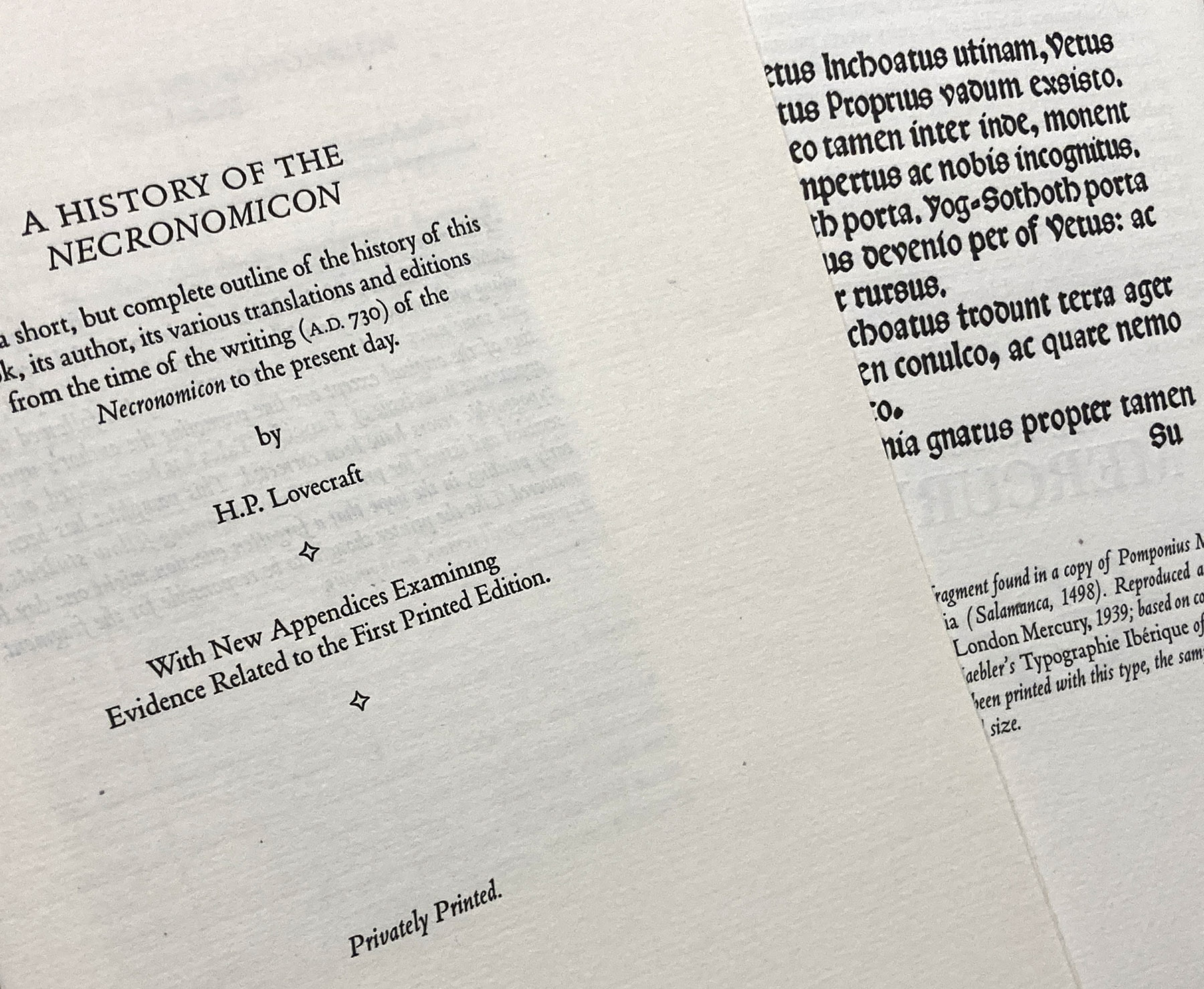
The printer of the pamphlet “A History of the Necronomicon” included in HM’s 2020 collected Lovecraft remains unidentified...

AND ANOTHER THING!

Barbara & Claudia’s new book, Paper Botanists, appears to be fully subscribed. A great debut for Byzantium.

1.4.22

Botany, Paper & Byzantium

Sometime toward the end of this month copies of the debut publication from a new Canadian private press will begin shipping from a bindery (in Seattle). Titled Paper Botanists, it is the latest collaboration from Barbara Hodgson and Claudia Cohen, and continues their tradition of delving into specific topics related to the graphic arts, richly illustrated and elaborately produced. It is also the first of their books published by Barbara’s own imprint, Byzantium.

Like all of their previous collaborations, Paper Botanists delves into an aspect of the graphic arts that appeals to their shared passion for history, materials, methods, and interesting stories. The book charts the history and development of how plants have been represented by artists who struggled to capture realism while aiming for an aesthetic ideal. The books chapters explore the primary techniques that have been used for visually recording flora, from herbaria (pressed plants) through drawing, various forms of printing, to photography and photomechanical reproductions. The text of each chapter is accompanied by a wealth of examples of techniques, about 140 in total. Some of these are historical pieces that the authors (primarily Claudia) have collected in sufficient number for the edition (the oldest included is a hand-colored woodcut from a mid-16th century edition of Hieronymous Bock’s Neue Kreuter Buch), some are illustrations printed with the text and then hand colored (e.g. all colors except black on the title page, at top, were applied by hand), and some are original prints by Barbara, tipped in.

“Since at least the 1980’s I’ve been buying herbaria as well as books, prints and drawings of a botanical nature, for pure pleasure,” Claudia says. “When Barbara and I began contemplating this project, more than two years ago, I started scouring eBay sites – British, American, German and French – for ‘orphan’ lots of botanical images from books, as well as interesting, affordable botanical tomes that were usually falling apart or incomplete wrecks/remnants. I also found items in Dutch auction house catalogues. Paper Botanists took shape as many thousands of samples accumulated. We chose what was best and I continued to search for specific samples where they seem to be needed.”


A few years ago I purchased a small etching press, thinking I might get around to printing a book that combines letterpress and intaglio on a page. I never did and it was taking up space. In the early stages of developing Paper Botanists Barbara borrowed it to play around and found she had a talent for printmaking (quel surprise). So she adopted the press and ran many hundreds of sheets through it over the past two years, both relief and intaglio, which are included as samples in the book (see bottom of this post for more about her printmaking).

One of the first questions that must be answered when designing a book that will include leaves or samples from other sources, especially a variety of sources, is page size: is it dictated by the dimensions of the largest leaf? Folding samples down isn’t always ideal, especially if two perpendicular folds are required.
“I try to be prepared to accommodate samples in ways that show them at their best; in other words, in proportion to the book and without trimming or folding. However, it is next to impossible to exclude an important example just because it does not fit as anticipated. The best way to get around the issue is to remain flexible about the book size for as long as possible,” Barbara says.


Byzantium is the imprint Barbara established in the mid-1990s, when her career expanded from commercial book design to creating her own works. Over the next 14 years Byzantium packaged her four novels and 11 non-fiction books, along with titles by other authors. Those last few years overlapped with an introduction to private press publishing by way of her first collaborations with HM: Good & Evil in the Garden and EXPRESSed: Ten Philatelic Fictions. When HM editions was wound down after the publication of their last book, PatternPattern, in 2019, Byzantium was revived with a new focus. 


My introduction to Barbara’s work was her debut novel, The Tattooed Map (1995). It wasn’t simply a text with accompanying illustrations, it was a book in which the author tells the story with a combination of the two elements. The imagery included original works by Barbara, found items, and collages. Her talent for combining visual and textual elements to create a narrative continued to develop in her subsequent novels, The Sensualist (1998) being my particular favorite. By their very nature her non-fiction books were more traditional in the use of images to support the text, but her passion for deep historical research (finding the most obscure images possible), and her additional role as designer, created lively and engaging works on topics ranging from soporifics (In the Arms of Morpheus, Opium) to peripatetic feminists (No Place for a Lady, Dreaming of East). 


Barbara’s trade books were expensive to produce – all that color printing, plus die-cuts and other tricky bits in some of her novels. By the mid-aughts the publishing industry was severely contracting (Vancouver’s Raincoast Books went from being one of the country’s largest publishers to defunct within a year of Harry Potter – on whom the company’s entire wealth seemed to stand – vanquishing Voldemort). Barbara was finding more labor, less joy and less remuneration in the work, and designing other people’s books had lost its appeal. Without it being an entirely deliberate decision, she started focusing on books that would fall under the general heading of
“fine press.”

Part of this move was the association with HM, but an equal influence was connecting with bookbinder Claudia Cohen. The two discovered shared passions for all things graphic and a steady stream of ideas for engrossing projects. Their first was The Temperamental Rose, which presented, and expanded on, intriguing references to color from Western sources. For example, Dante’s The Divine Comedy was represented as a hand-colored pop-up of Purgatory as a pyramid. It was colored with the hues used by Dante in his descriptions of the seven levels that mark the rise from the Inferno to Heaven.


The edition for Paper Botanists is 30 copies plus six artist proofs (i.e. hors commerce), which has been established as the upper limit for how many they can reasonably produce, given the amount of adornment to the printed sheets and the number of historical samples that must be sourced for inclusion. It was designed and set by Barbara in Fournier, printed at HM on dampened Arches cover, and bound & boxed by Claudia. The book will be issued in two states, each with an accompanying portfolio of additional samples: 20 copies will be bound in quarter leather with paste-paper sides (shown at top of this post); 10 will be extra-bound in full leather with additional samples.


Some cataloguers have referred to their books as “artists’ books,” but it’s not a term they use. “
I think of our books as traditional BOOKS, not ‘artist books.’ But it’s like a discussion about religion: there is no conclusive answer and everyone decides for themselves," Claudia says.
 
“The term suggests a focus on art at the expense of words, which is the opposite of what we are trying to achieve with our books,” Barbara says. If forced to adopt any label, she would accept private press – books by and for the primary enjoyment of the creator. Sustaining this enjoyment is one reason the editions are kept to only 30 copies. 

“The original goal of being able to devote unheard amounts of time on painstaking original work continues to hold its appeal. Paper Botanists reaffirmed the pleasure of such labor. In the past, I would occasionally consider slightly increasing the number of copies of a new work, but 30 copies continues to be the realistic maximum,
” Barbara says. 


Too often the small editions and cost of books like the ones they have produced are the first thing remarked upon by people who think all books should cost the same and it shouldn’t be much. Strangely these people don’t have the same reaction when discussing other art forms, such as painting (which by definition is much more exclusionary, there only ever being an edition of one). To this Barbara counters that many of their books end up in the kind of institutions whose purpose is to make them accessible. 

“To those who ask why our books aren’t more widely available, I suggest, if it is feasible, to visit one of the libraries that hold one or more of our books. Even though the books are held in Special Collections, getting to see them usually isn’t as difficult as it sounds, as librarians are generally pleased to be able to show books to interested patrons. There are also fortuitous encounters: I was astounded by the number of people from all over North America who told me they had seen The WunderCabinet on exhibit at the Huntington Library.” 

Details for Paper Botanists can be seen here. Copies should begin shipping by the end of this month. 

AND ANOTHER THING!

Next month HM=XX will be out, so I'll show some pictures & etc. Also, RIP Philip Jeck (see link at right).

APP. 1: BOTANICAL PRINTMAKING 
 
A few of Barbara’s adventures in printmaking that are included in Paper Botantists...


A Van Dyke print from an early 20th-century glass negative (5 x 7 inches) that Claudia found on eBay. It’s a plant pathogen called Guignardia that attacks grapes.

Image from a stochastic plate. The multiple colours on the plate are applied at the same time for one pass through the press. A sap green/ umber mix is put on in the background, then wiped; a carmine red/ Indian yellow/white mix is put on the flower area, then wiped. A bit of green fading into the edges of the petals helps give them a transparency.

An etching on thin brass.

A linocut adapted from a section of an illuminated manuscript of Bocaccio’s Famous Women.

Nature print of a magnolia grandiflora ‎leaf.

1.3.22

Parrot’s Uncommon Thorny Book

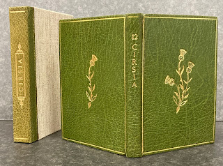
I have a new strategy for posting when there’s not a lot of news coming out of the studio. More by coincidence than intent, over the years I has acquired a number of publications by well known people and presses, which were issued as a very small edition. So small they could almost count as hors commerce “just for fun” projects, except some copies were sold or found their way into booksellers’ catalogues. For the inaugural post in this occasional series, Barry Moser’s Cirsia....
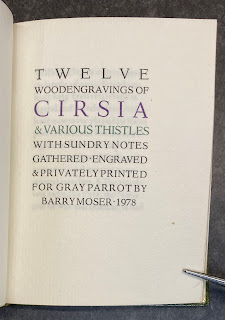

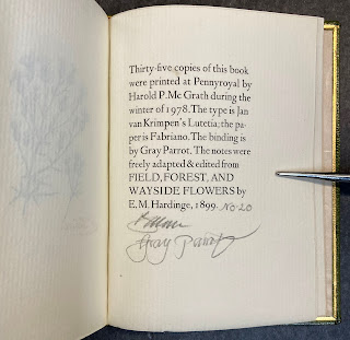
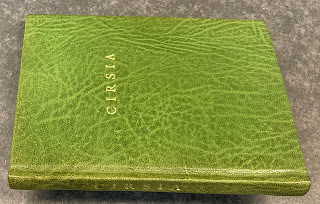
This is an interesting project on a number of fronts. It a sort-of collaboration with the binder Gray Parrot, who bound some of Moser’s Pennyroyal books in the 1970s. As such, it’s a small-scale example of Pennyroyal at its most luxe
– typography, art, printing, materials, binding. I’m a big admirer of Moser and GP, plus I like botanical art and uncommon books of just about any type.
 

To be accurate, Pennyroyal is nowhere mentioned or credited. The book is included in the Miscellany section of the 1986 Pennyroyal checklist.


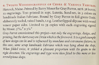
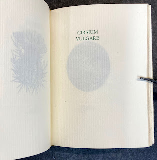
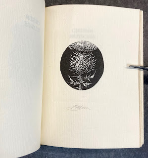
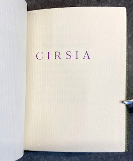
The title on the spine is 12 Cirsia. Each of the engravings is preceded by a page with the plant
’s Latin name printed in green. Five of the 12 engravings are black line, the balance white.


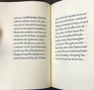
The plates (as they are called) are preceded by seven pages of notes on the topic, freely adapted from Field, Forest & Wayside Flowers by E.M. Hardinge (1899). Books like this always have to find some text, however brief and/or tenuously relevant, because no one seems to want a book of just prints. People want there to be some text, just so they can skip over it and get to the prints. 


The production details are laid out in the colophon, which is signed by Moser, as are each of the prints. Another piece of lovely Harold McGrath printing. The binding is everything you would expect and want in a GP binding. 
 

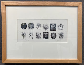
My copy of the book came with a proof sheet of all 12 engravings, which has been one of our favorite pieces since it went on a wall. 
 

I especially like that, even in a project of such comparatively small scope, people like Moser and McGrath can let a setting error escape their attention
– that were a wrong sort. Makes me feel better about all of the ones I’ve racked up...


Now here’s an odd addendum: I have a second copy. It looks to have been made up from proofs or waste sheets. It has just 11 engravings (Cirsium virginianum – the one shown top left on the proof sheet
– is lacking) and there are some odd blanks in the collation. The engravings all look good but some of the text pages are slightly under-inked. The colophon is signed by Moser but not the individual prints. Interestingly, it includes a half-title (which is followed by a blank) that does not appear in my numbered copy from the edition. 


The binding is a puzzle too. The leather is similar to that used by GP, but not exactly. The spine’s head and tail are rounded, like GP’s, but the actual spine is flat; little or no attempt was made to pare the leather. The endpapers are tipped on (boo). 
 
 
The endbands are made, not sewn. The head has been left unadorned. The book does not want to stay open. Overall it looks like something done by an amateur with some skills but new to leather, maybe someone who took lessons from GP using sheets he pulled out of his recycle bin. 

AND ANOTHER THING!
After this post first went up, one of HM’s friendly correspondents wrote to say he also had a copy of Cirsia and that it differed in several ways from mine....


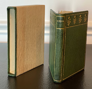
The leather looks the same, but the tooling is completely different and it has a (very attractive) slipcase instead of a clamshell box...
 

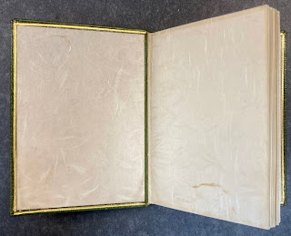
and the endpapers are marbled, not Japanese. So it seems Gray was having fun as he bound the edition, trying different things, which maybe was part of the project’s purpose & appeal for him in the first place.

IN CONCLUSION...
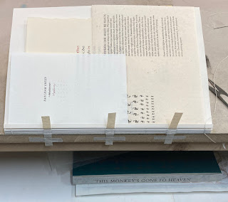
There will always be someone who moans Why did they make so few copies? and/or Why does it have to cost so much? I do not have the patience or ability to explain in a way that would help them understand. Part of the appeal of a project like this is you’re just making copies for yourself and a few people you think might share your enthusiasm for it. And the short answer to why so few copies is the amount of labor involved in making each copy. It’s not a question of just keeping a machine running for a few extra minutes. As I make my way through sewing copies of HM=XX I frequently think 40 copies is more than I have the patience for. It takes forever to sew just one copy, due to all the odd sample sheets incorporated to the text block. Good thing I bought the boards last year: apparently mill board is becoming a scarce commodity across North America.  
 

So, obscure or – better still – unannounced or anonymous publications from interesting presses are almost always worth keeping an eye open for. Maybe later this year I’ll be able to write a post about Gray Parrot’s impossible-to-find marbled paper sampler (I don’t have a copy, but I know where one is...).