30.9.12
Angel Close to Getting Its Wings
Silence a result of immersion in Angel. The BG Bodleian is glorious. Will post about how we're damping it soon, for those interested. Printed the colophons last week, press-lettered in 30-pt Monument, printed in silver. They go off to Harold for signing this week, while the last few sheets of the book are printed. Might all come together in time to have a copy ready to show off at the Seattle Book Fair. After printing, we need to make the paste paper wraps, which will reproduce one of Harold's arabesque drawings...
20.9.12
Heavweight Type Punch
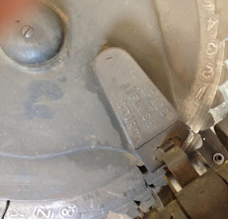
Was in a metal shop today, for reasons to be discussed next week. Saw this in a corner: the world's biggest tape label maker? It punches capitals on a 2-inch-wide strip of steel ribbon (spool's at the top of the wheel; reflection in mirror seen behind; copper tube is adjacent "art").
Check out the wheel's options for fine setting (SPACE, FINISH, START) and glyphs (– or &, your choice).
Senior member of the HM board denied an initial request to acquire the item. We'll see. The thing would pay for itself in no time at all...
18.9.12
Two New Books from HM
Two new books nearing the press...
First out will be a new collection of 12 poems by Harold Budd, titled Angel. The book will be printed on sheets of Barcham Green's Bodleian paper (80 g, white laid), of which we have just enough for an edition of 26 lettered copies (plus a few H.C.) The text will be set in 18-pt Perpetua italic (the same font we used for Iskandariya) with our newly acquired Monument for titles. It will be a single signature (28 pp, 7 x 10 inches) – the thinness of the paper avoiding any awkward bulking – sewn into a paste paper wrap, with a printed tissue jacket. Issued in a slipcase. Some portion of the edition will be offered for sale (price TBA). To be issued before the end of the year.
Angel was somewhat unplanned for in HM's schedule. The poems were initially considered for inclusion in what will now be our subsequent publication (title as yet undecided), a typographic frolic that will show off the metal types held at HM. The idea was sparked with the arrival of some new (to us) types this past summer, which led to a re-organization – and rediscovery – of all the metal type at the studio. As a showcase for our metal types, it will be something of a companion to Types/Paper/Print, and also underscore some of the challenges raised in that book around using metal types. Where Types/Paper/Print was purely focused in the types used for setting blocks of texts, the new book will instead be using the fonts on hand to create patterns, borders and any other designs that occur, incorporating a brief quote related in some manner to the face and/or its designer. Another difference between Types/Paper/Print (and most every previous HM title) and the new book will be an abundance of color on each page. A preliminary sketch for the Perpetua page is shown below.
The primary faces showcased (one per page, rectos only) will, in alphabetical order, be: American Uncial, Bembo, Centaur, Goudy (combining Old Style, Bold, and Bible!), Hannibal (with Duensing), Monument, Morris Black Face, Optima, Perpetua, Rubens, Unciala, and Verona (a.k.a. Bologna). Supplemental faces that may be sprinkled around include Columbus, Garamont, Shadow, Huxley Vertical, Lombardic, Reiner Script, and de Roos.
In addition to being a collection of types, the book will contain a unique collection of papers: so far we've assembled sufficient quantities of Van Gelder laid, two different laid sheets from Barcham Green, a W.A. Sanders cream laid from the 1950s, two different papers made by Reg Lissel, and kitikata.
The book (40 pp, 7 x 10 inches) will be uniformly cased in (various) marbled papers over thin boards, like the regular edition copies of Types/Paper/Print. The edition will be 26 press-lettered copies. Price TBA. Publication is planned for early spring 2013, with a copy being displayed at the Codex Book Fair in February.
10.9.12
Dampening Handmade Paper! Above the Fold
Our posts have become sluggish, but only because we're deep into the details of our next book. Details remain pending...
Subscribe to:
Comments (Atom)


